We turned 10 years of product design expertise into the ultimate AI design copilot
Posted on January 23, 2025 • 6 min read

By Jeremy Blaze
When facing a new design challenge, our approach has always been to look at how other people have solved it before rather than starting from zero every time. The obvious approach is to find direct comparisons—designing a checkout flow? Go look at other checkout flows. Designing an invoicing experience? Look up how any old accounting app does it.
But when things get more nuanced, this gets trickier. Say we’re designing a calendar UI for a SaaS. Sounds straightforward, but what if it also needs to highlight availability for different staff members and be directly editable? Now we’re dealing with something that likely hasn’t been done in this exact form before.
This is where research is critical. We don’t just look for exact matches—we break down the challenge into its individual problems and find multiple references that solve similar issues in different ways. Over the years, we’ve found that the best source of inspiration isn’t always external tools but our own past work.
Mobbin and Dribbble have been go-to resources for a while. More recently, v0 and Lovable have become favorites too.
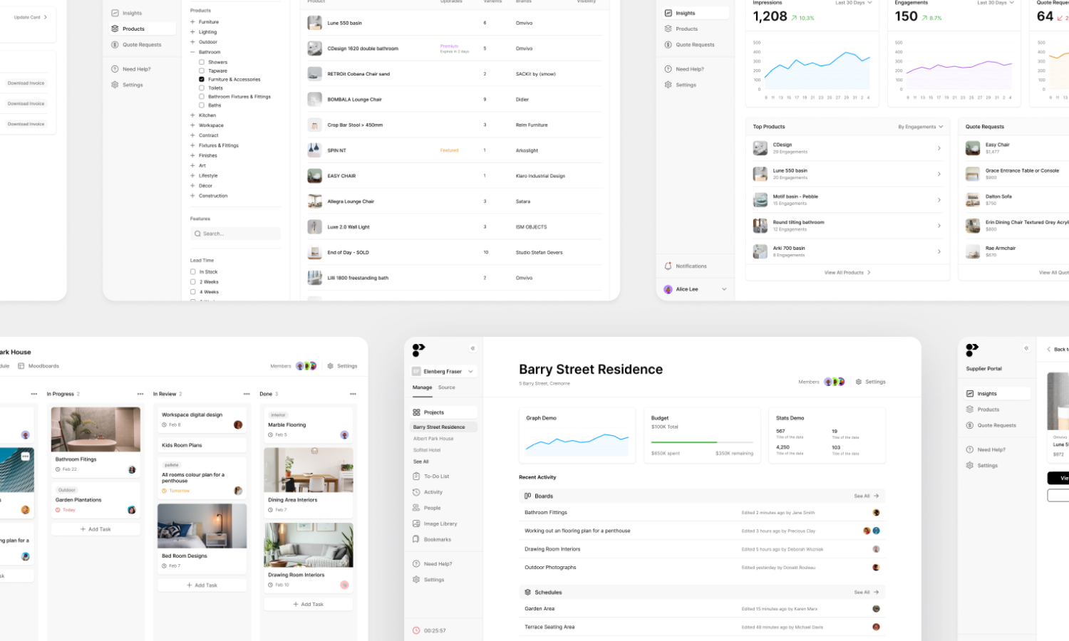
But honestly, the place we look the most? Our own back catalogue. We’ve been doing this for over 10 years now, and in that time, we’ve built thousands of UI mockups. More often than not, when we hit a new problem, we’ve solved something similar before.
Take our calendar example before—finding references for a standard date picker is easy. But when we needed a calendar that showed availability across multiple team members and allowed direct inline edits, things got trickier. There wasn’t a direct comparison, so we had to pull inspiration from different places—timetable interfaces, scheduling tools, even project management UIs.

Another major part of our process is real-time workshops with founders. These sessions are hugely valuable because they allow us to discuss problems and solutions right there and then. But speed is crucial. We’ll often sketch quick mockups in Figma, but the fastest way to visualize an idea is to... not mock it up at all.
If we can pull up a screenshot of a similar interface, that does two things: it gives us a starting point and helps us clarify the UX strategy. That’s why, when running workshops with clients, I’ll often dig through old work to find references. We’ll go through what works, what doesn’t, and use those insights to build out wireframes in real-time.
This massively speeds up the process. Instead of debating abstract ideas, we can look at real examples and make decisions quickly. The only downside? Finding the right files can be a pain. I know where everything is, but for anyone new to the team, it’s like searching for a needle in a haystack.
The downside? Finding the right files. I know where everything is, but for anyone new to the team, they almost certainly won't.
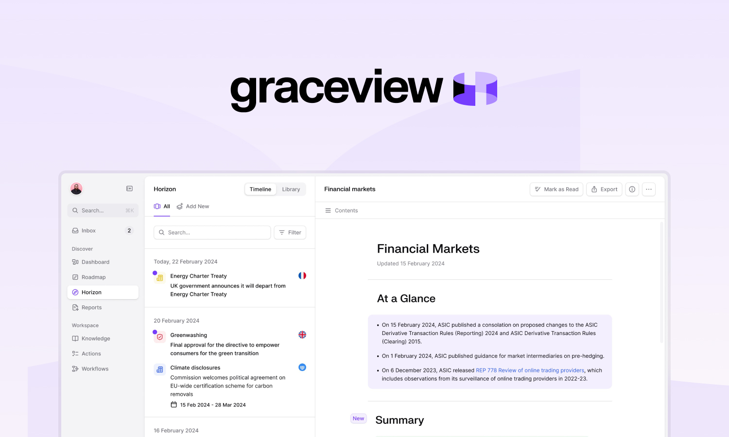
So, in late 2024, I set out to build an in-house design library—our own version of Mobbin, but tailored to our work.

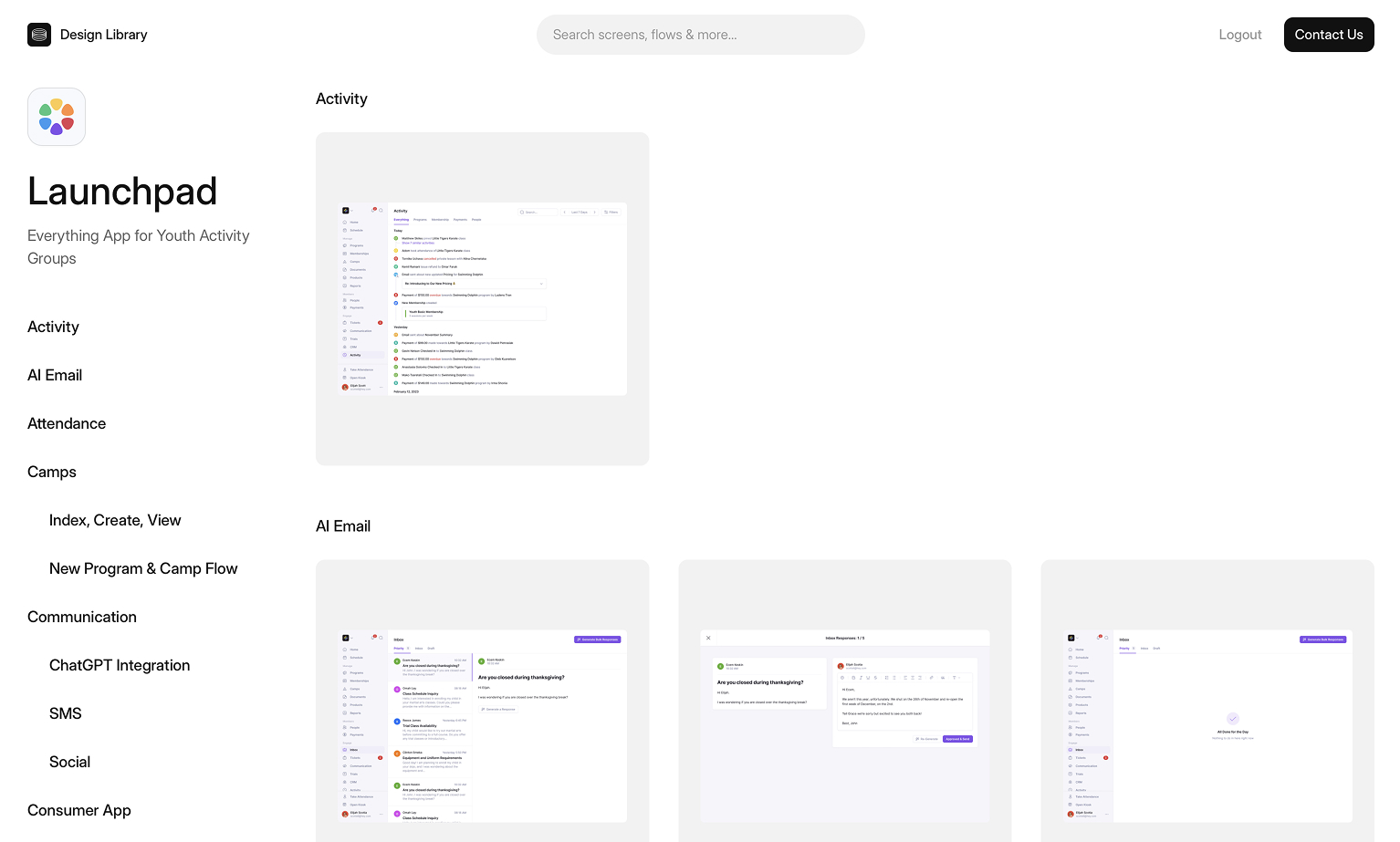
Compiling all the screens in one place was a good start. This gave us a structured way to retrieve UI patterns.
We used GPT Vision to auto-tag screens based on functionality, layout, and design style, so if someone needed a “dark mode dashboard,” they could just search for it and get relevant results instantly. It made looking up previous solutions easier – assuming you knew what to search for.
This was already a huge improvement over sifting through old Figma files. Instead of relying on memory (or just asking me where to find something), team members could now search and get answers in seconds.
But it wasn’t quite enough. A big part of design is pattern recognition—spotting familiar solutions and knowing where you’ve seen them before. And that’s not always easy. Sometimes the right reference is buried under an unrelated name, or the same pattern appears in wildly different contexts. I wanted something that could make those connections for us.
Once we had a tagged, searchable catalog of screens, we tasked AI with doing the hard part—recognizing patterns in our design challenges we gave it and then intelligently searching our past work to find helpful resources.
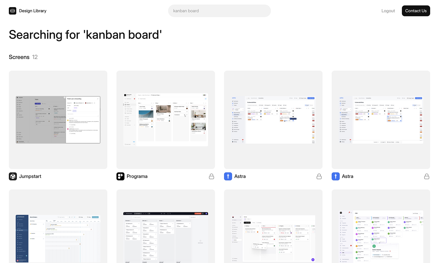
Instead of just searching for specific UI elements, we could now describe what we were working on in natural language. If someone typed, “I’m designing a fintech app and need a simple way to display transaction history,” the AI would pull up relevant screens—even if none of them were explicitly tagged as “transaction history.” This is essentially a simple form of RAG, retrieving the most relevant past work and augmenting it with AI-driven pattern recognition.
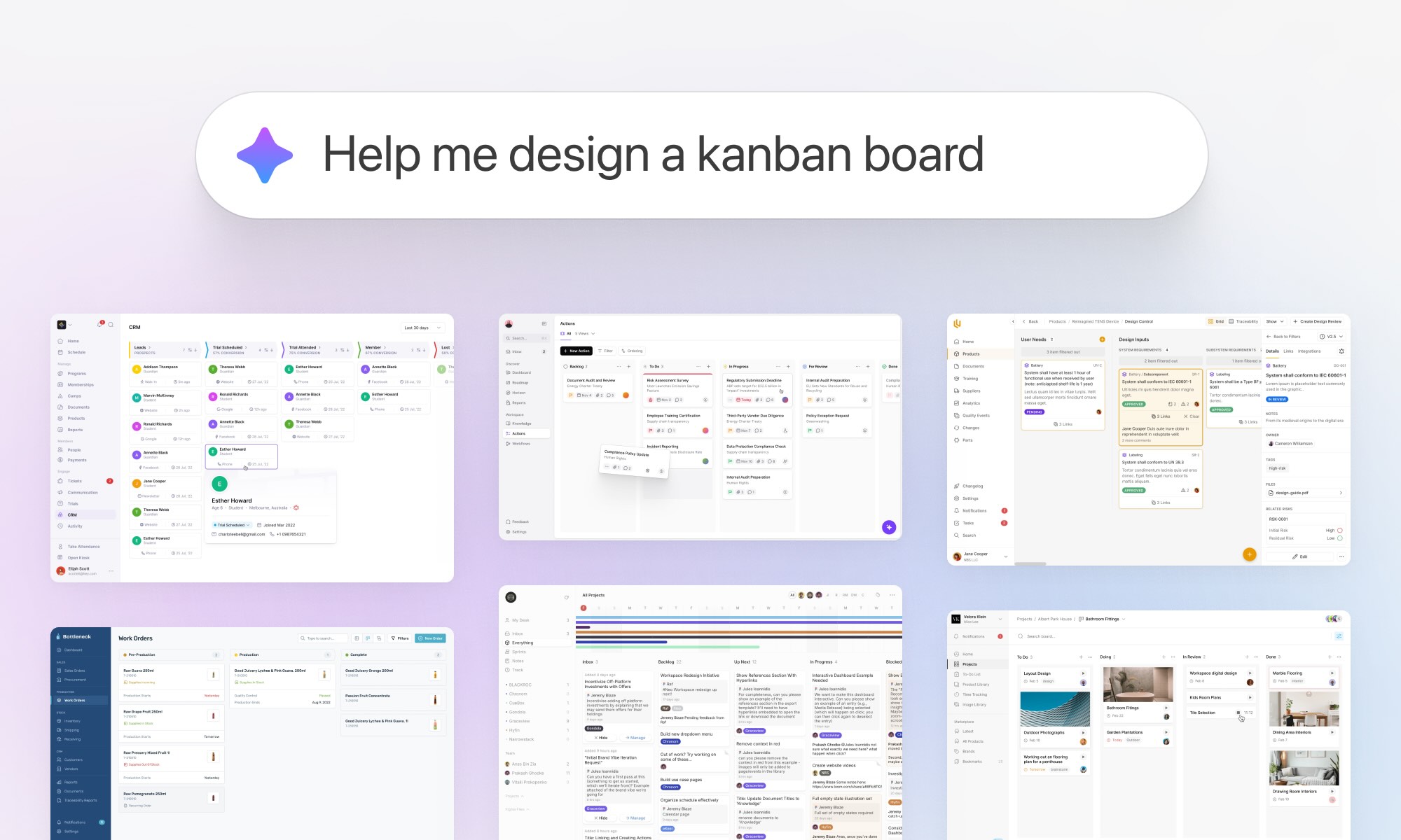
See how it works here:
This worked shockingly well. The AI could surface solutions we hadn’t even considered, sometimes pulling references from completely different industries that shared the same underlying structure. It was doing what a good designer does—recognizing familiar patterns in unfamiliar places.
This completely changed how we used past work. Instead of relying on structured categories, we could just describe the problem and let the AI do the rest. And because it wasn’t bound by conventional labels, it often surfaced unexpected but useful results.
With this setup, referencing past work is way faster. Instead of spending 30 minutes digging through old Figma files, we can now find what we need in seconds.
It’s also made onboarding easier. New team members no longer have to ask where to find old work—they can just search for it.
Next, we’re testing ways to improve it further. We’re experimenting with auto-generated annotations that explain why a particular UI works well for a given use case. We're also looking into integrating it into a Figma or Slack plugin, so it’s even easier to access without breaking focus.
This is a simple example of how AI can streamline design workflows—but also a reminder of why structured data and well-implemented RAG systems are essential for building great AI experiences. Without 10 years of work history, this tool wouldn’t have been remotely possible.
If you’d like to try the library yourself, you can check out a restricted version at library.neverbeforeseen.co.