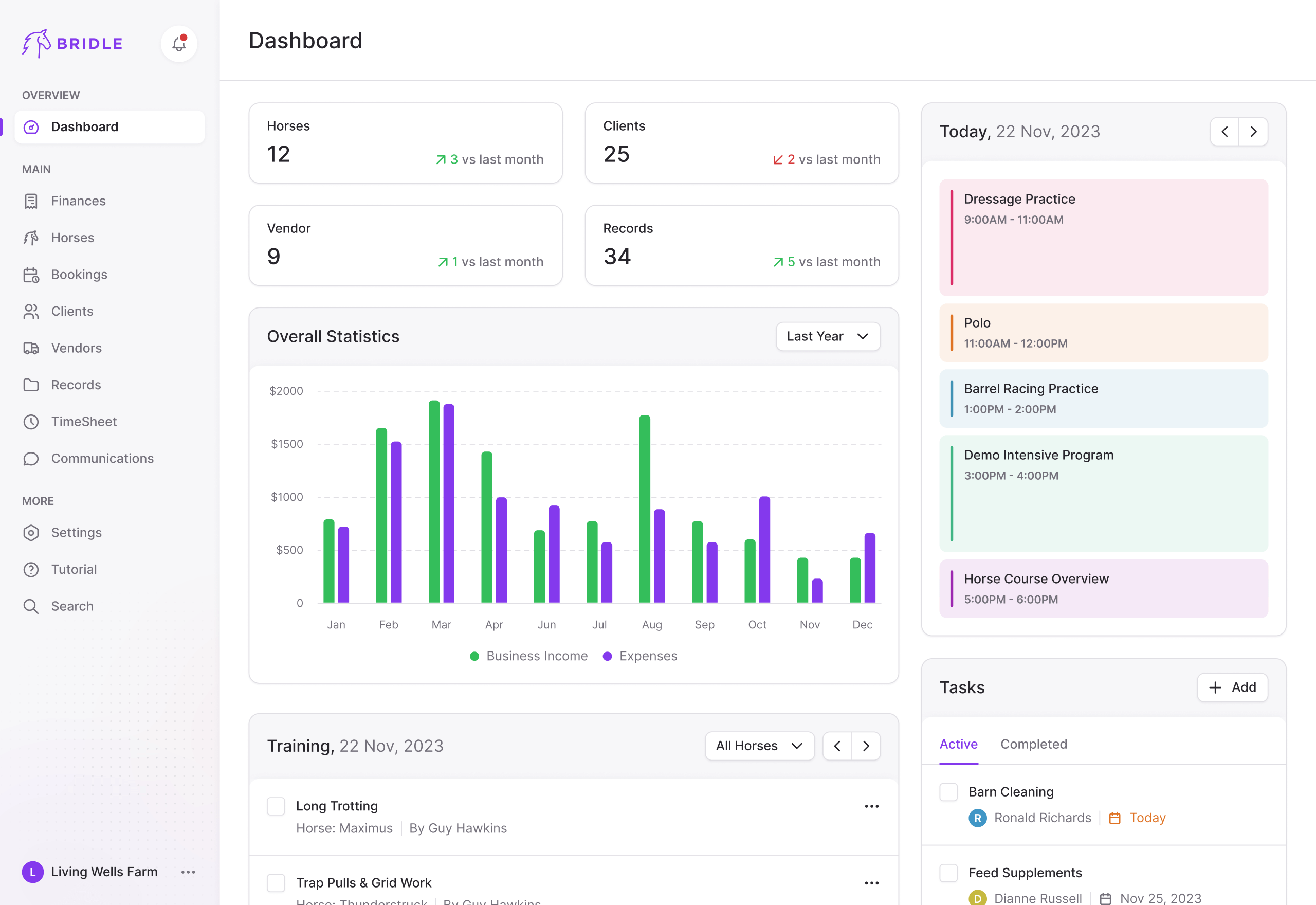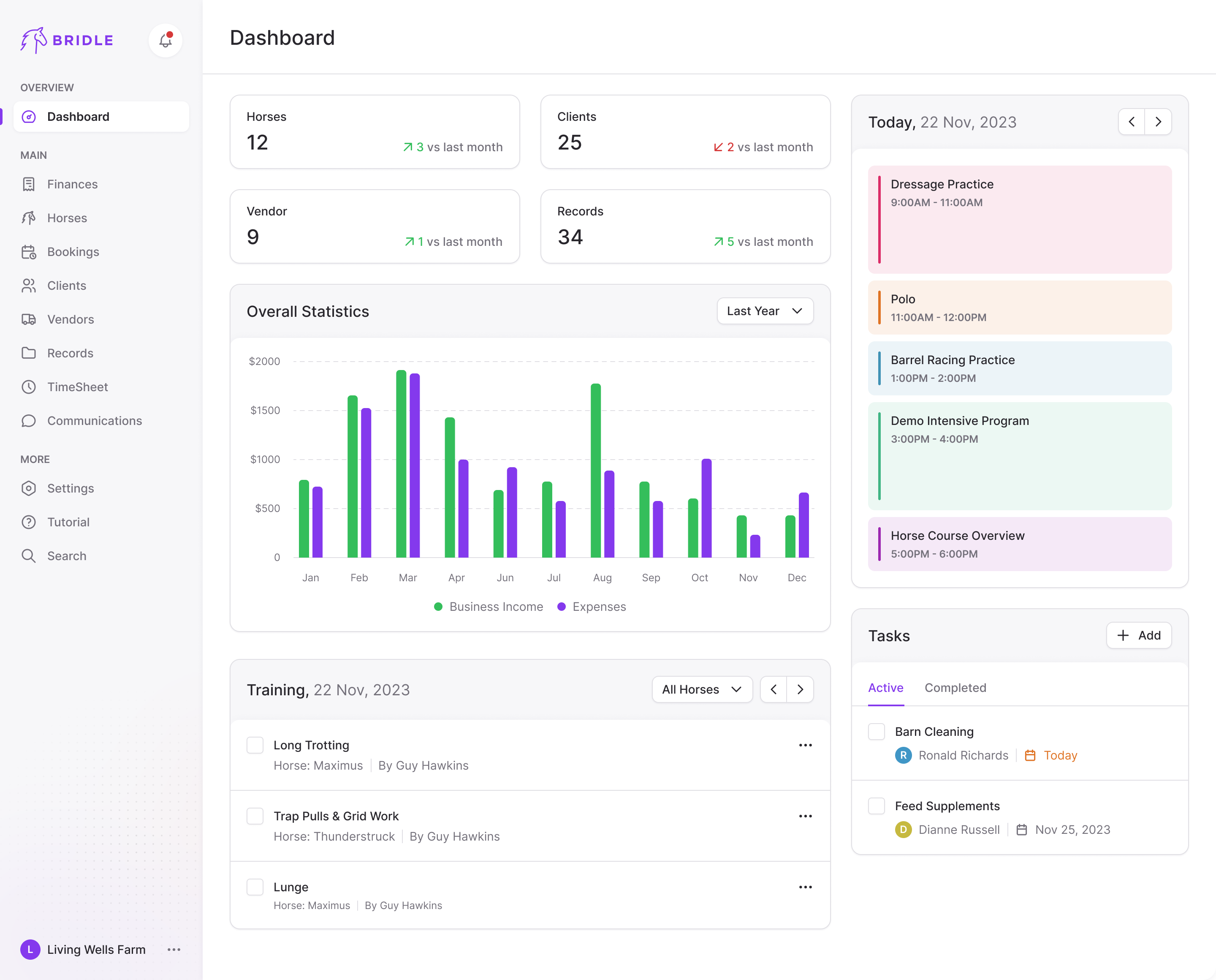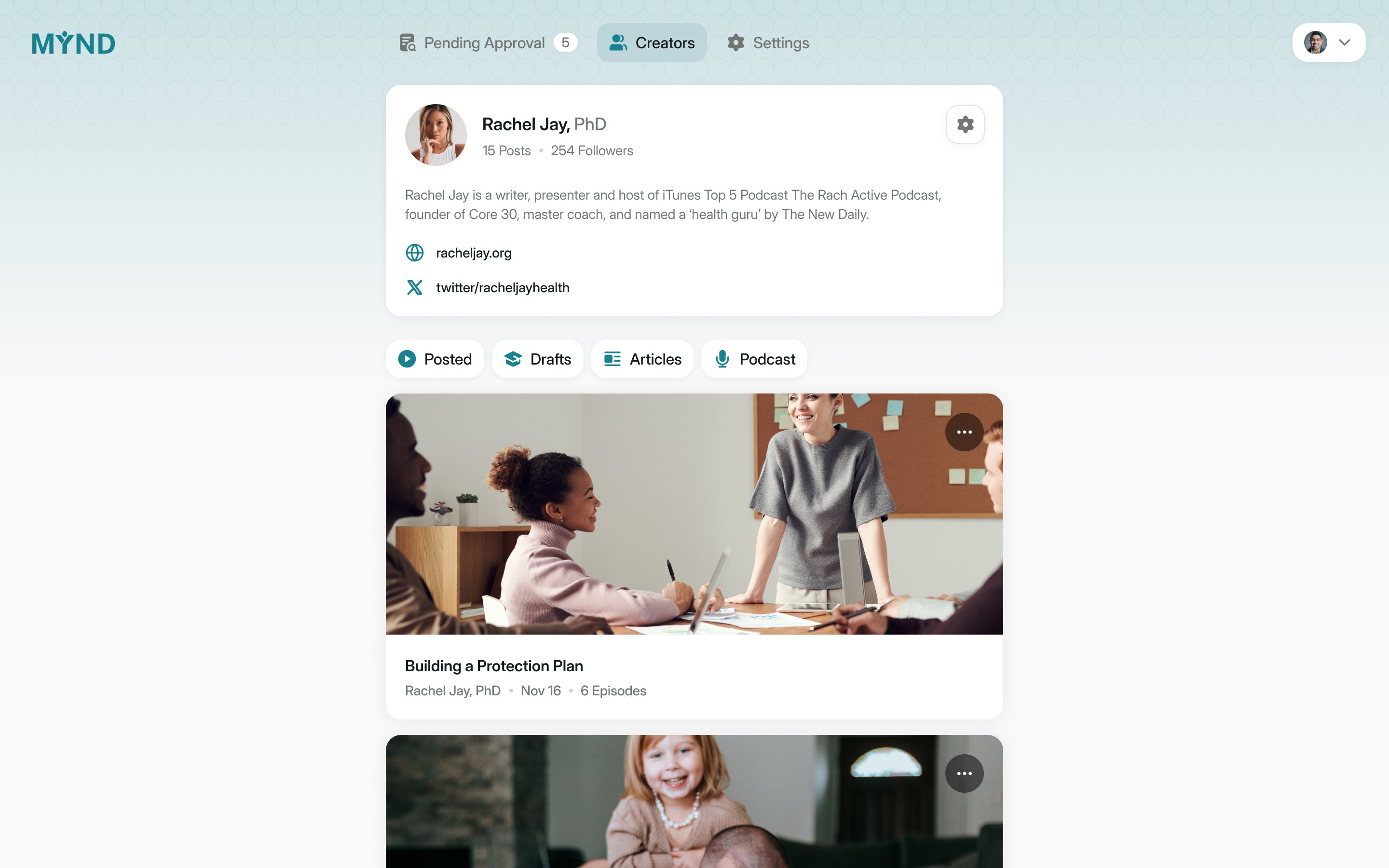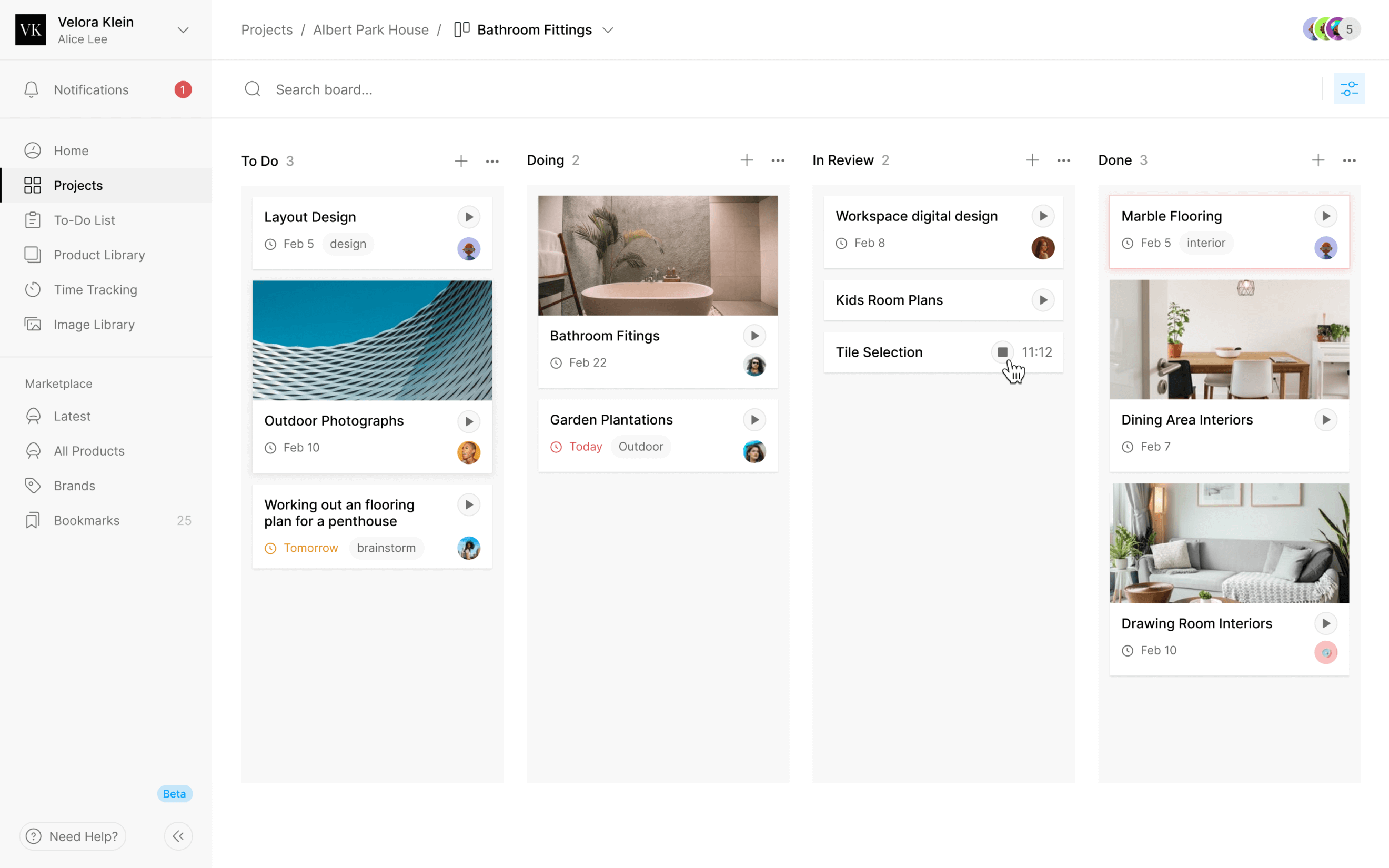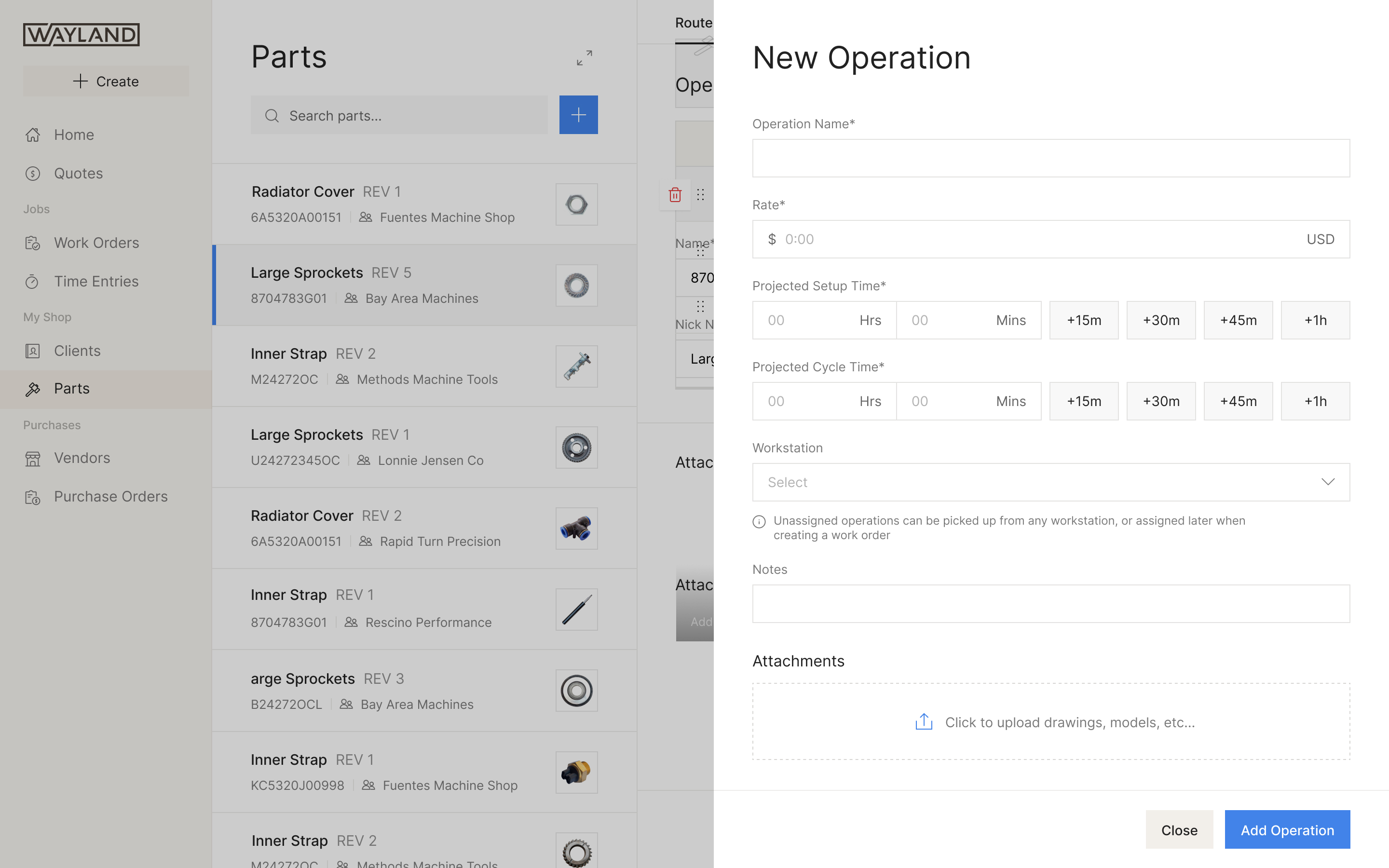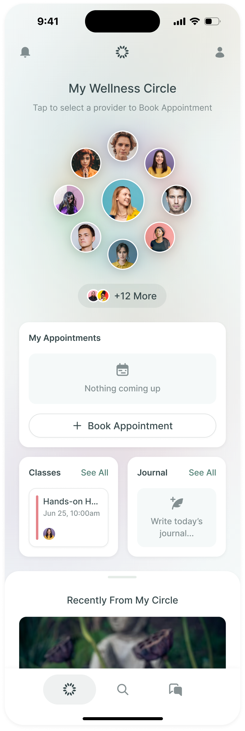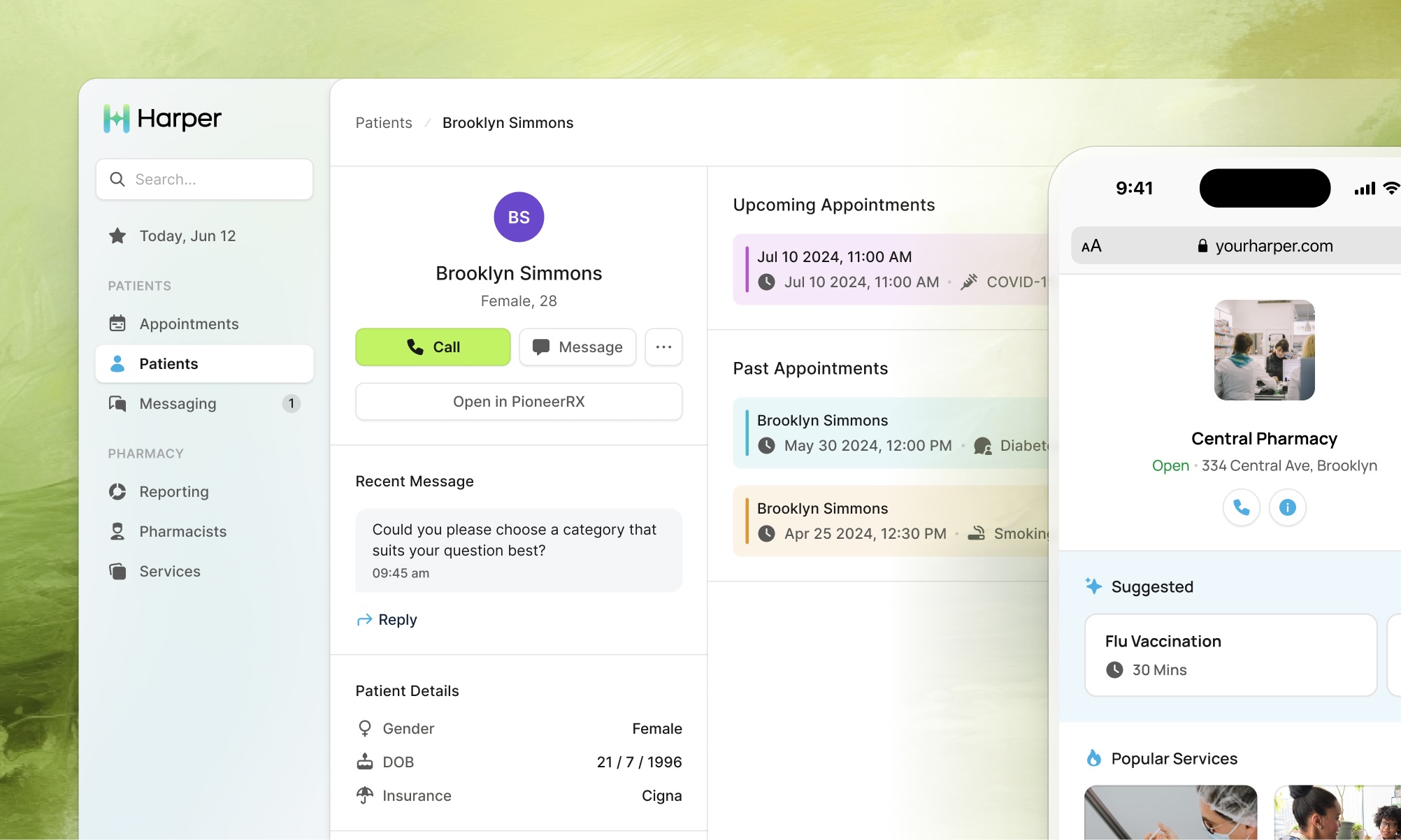
Harper lets a patient book an appointment with their local pharmacist the way they'd book a doctor. Independent pharmacies give vaccines and counsel people on medication, diabetes and quitting smoking. Harper’s founder, Tara Debek, saw an opportunity to help them organise and bill for care they were already giving away.
Tara first called us in June 2024. She wanted the first version designed in four weeks. We ran six, from the kickoff to mid-July: the patient's booking flow, the pharmacist's app, a design system, two prototypes and notes for the developers she was still hiring.
Two sides of the product, two different starting points
The patient is often over 50, with low health literacy, and books from a phone. "Imagine our end user is your great-grandma," Tara said. The other reader is an investor, or a health plan, and for them it had to look modern.
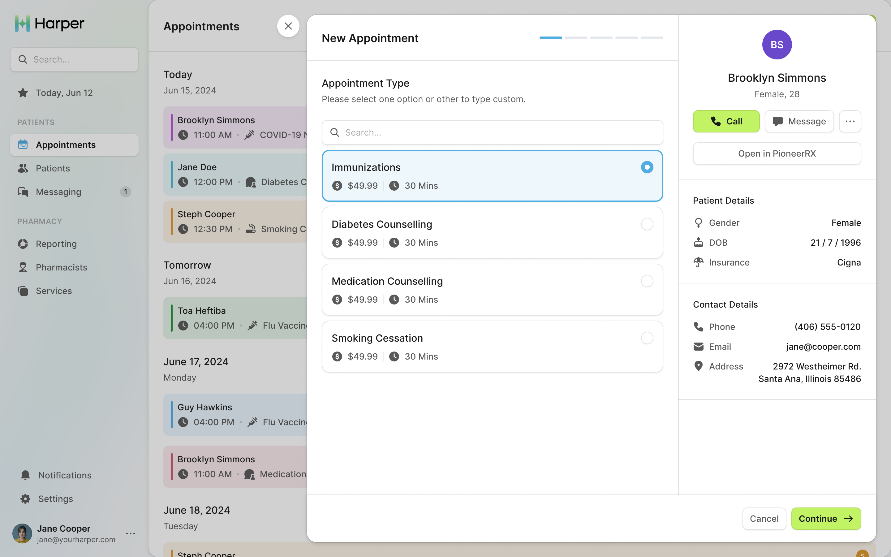
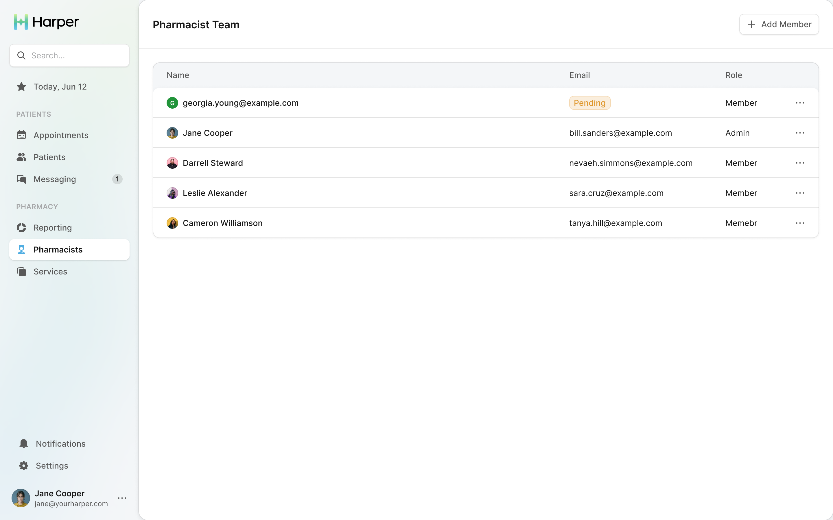
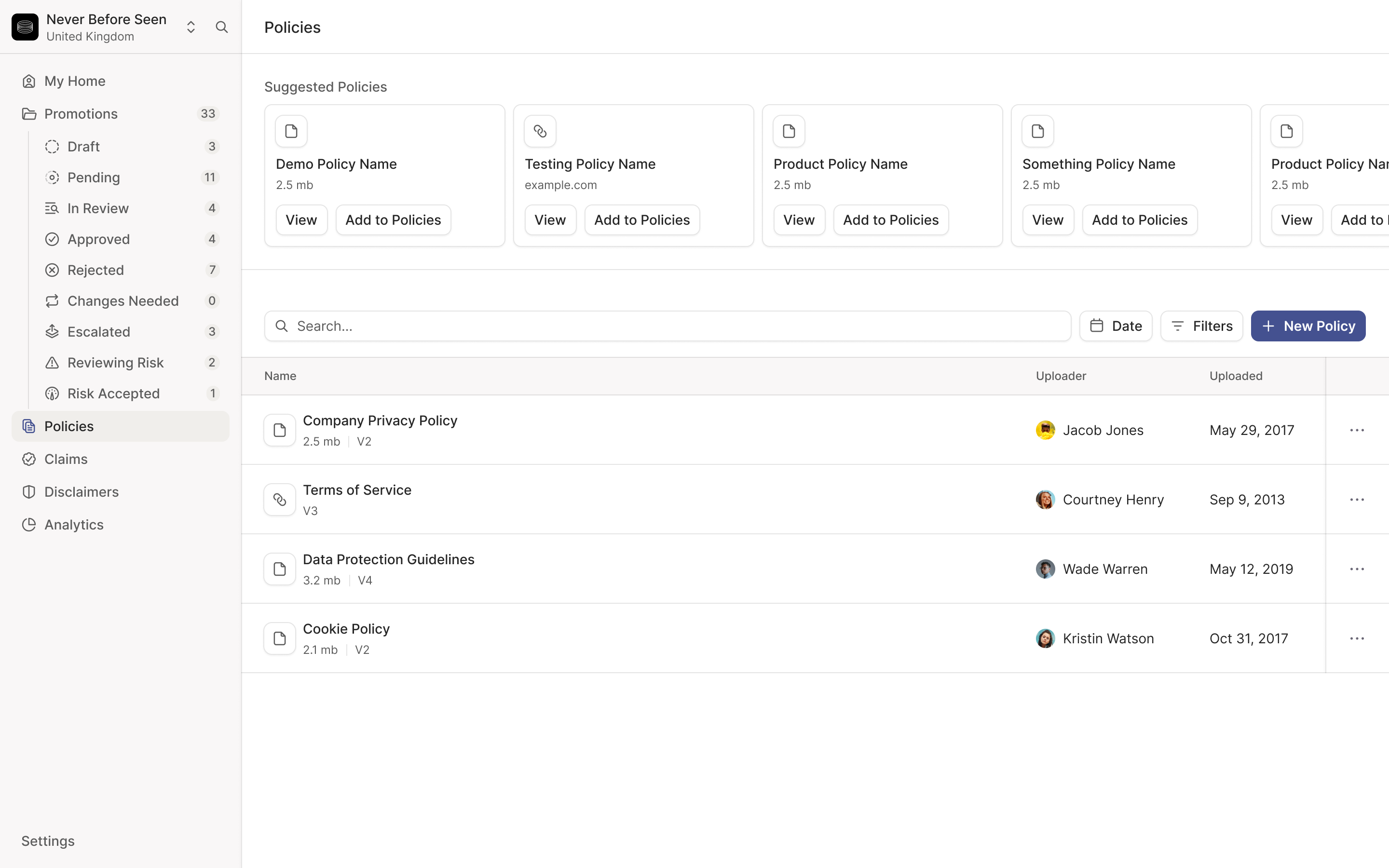
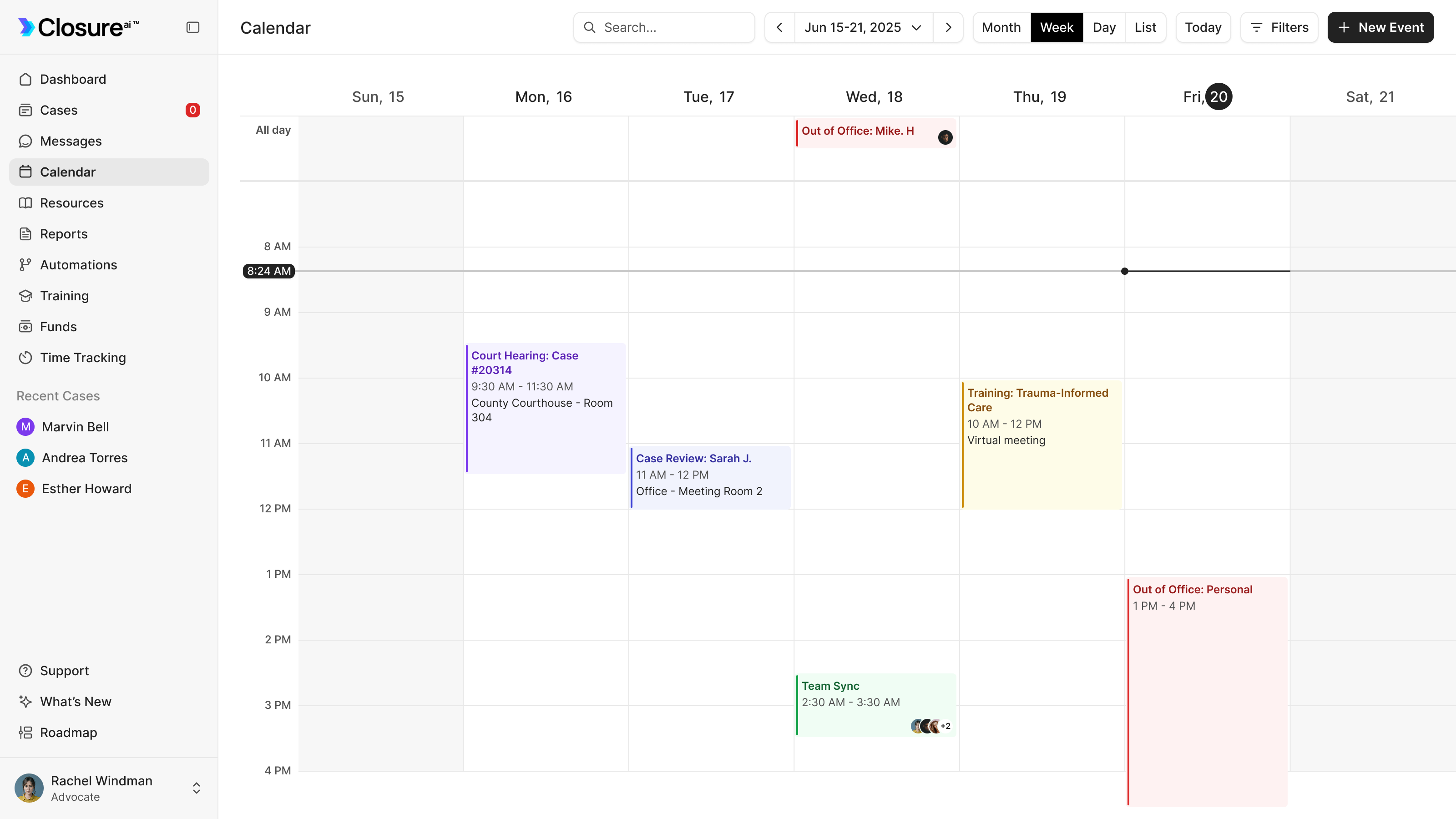
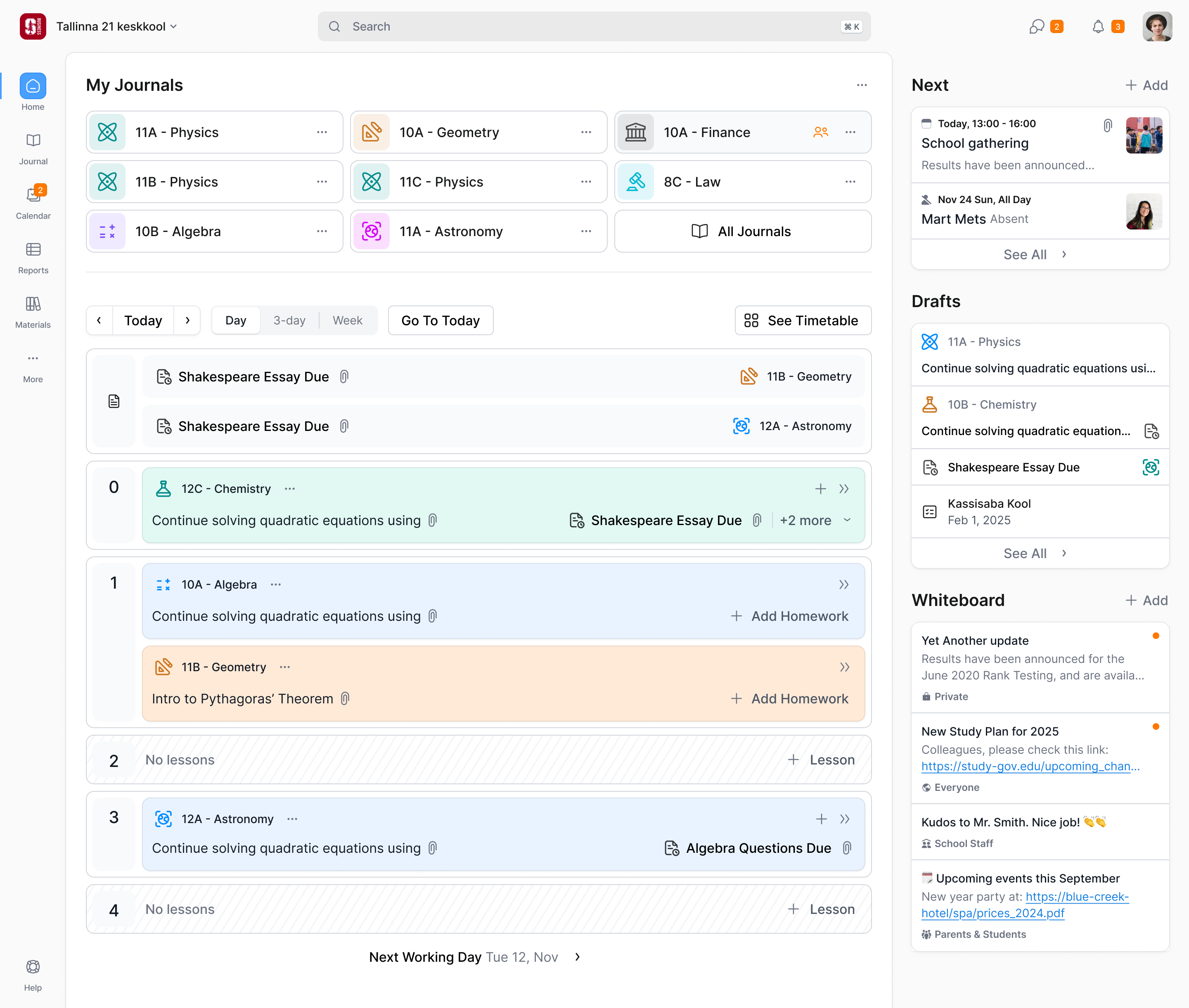
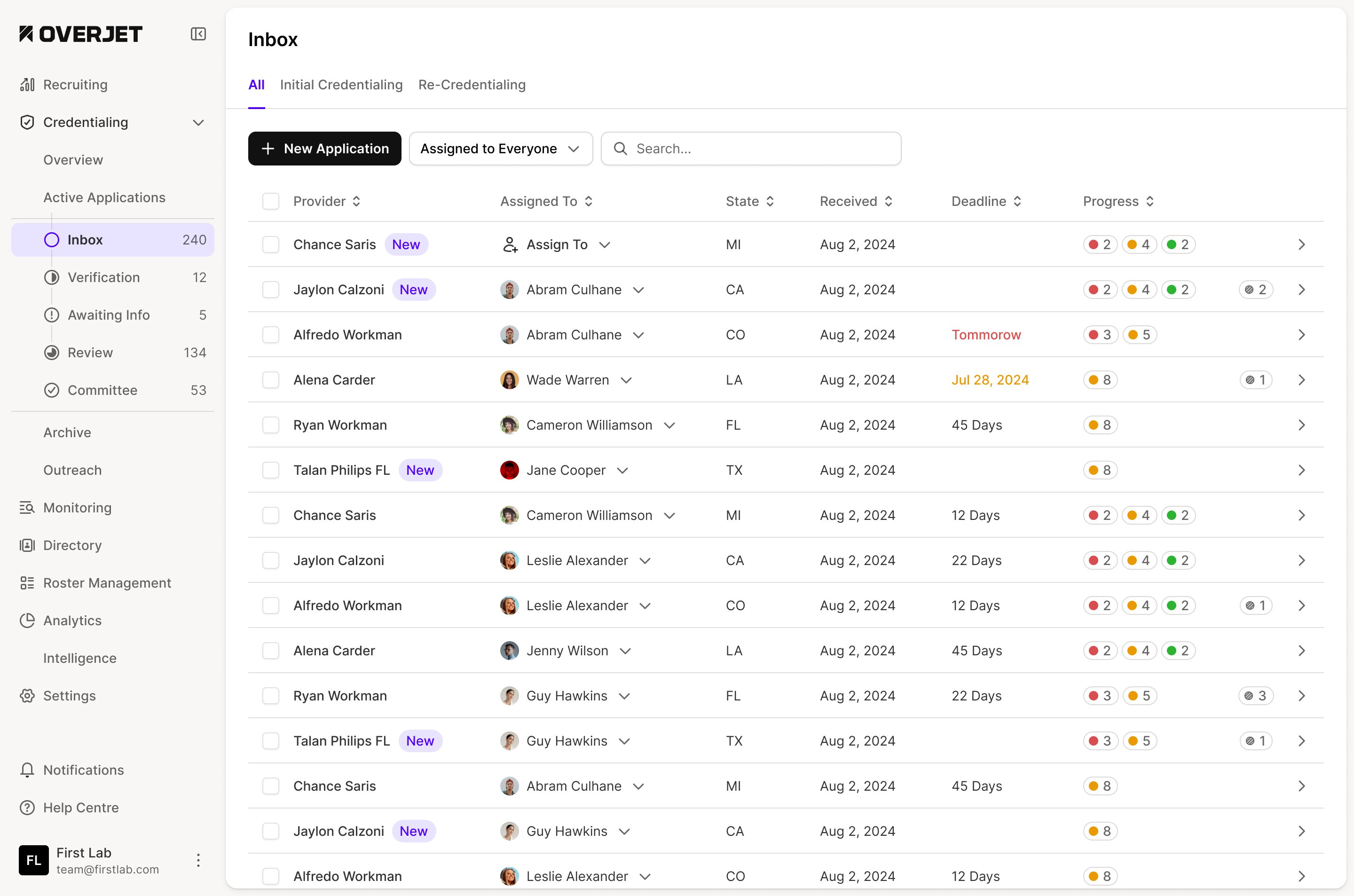
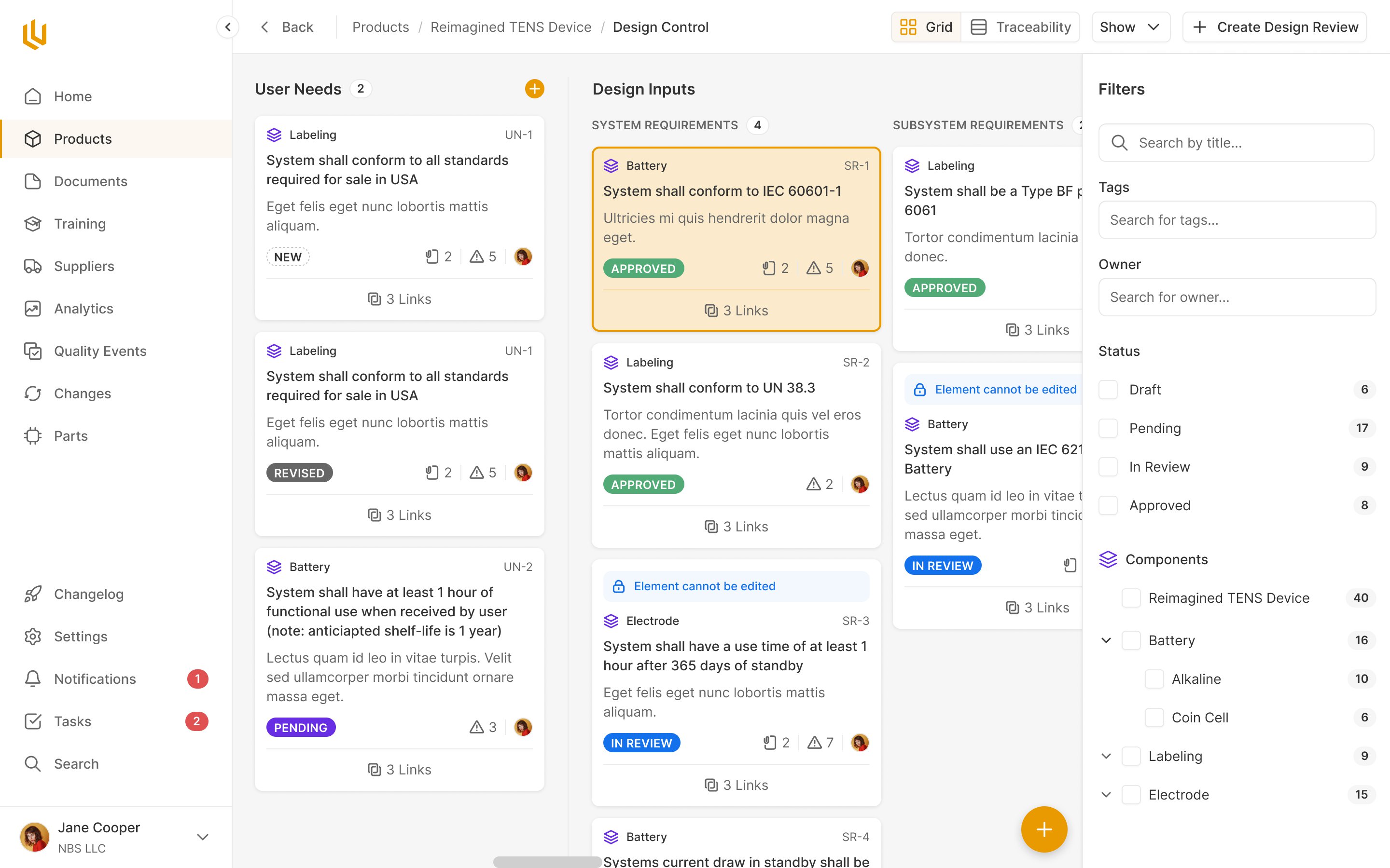
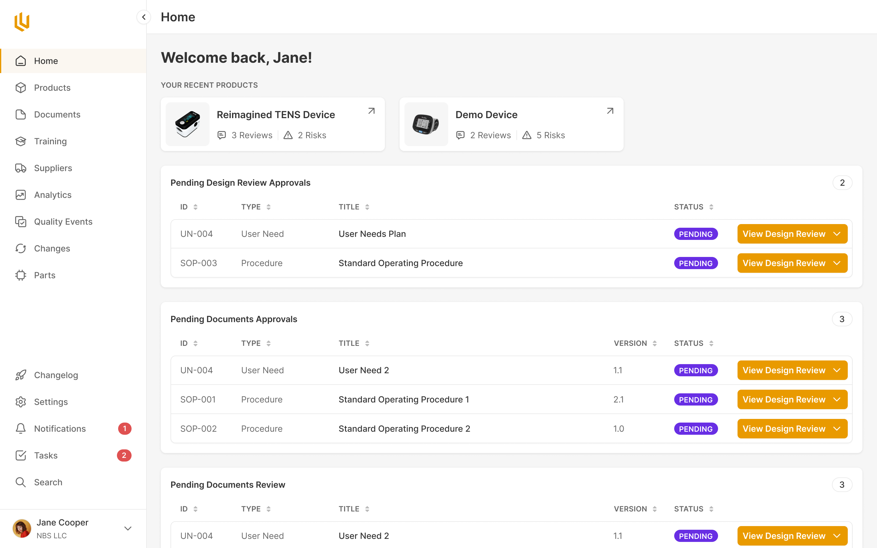
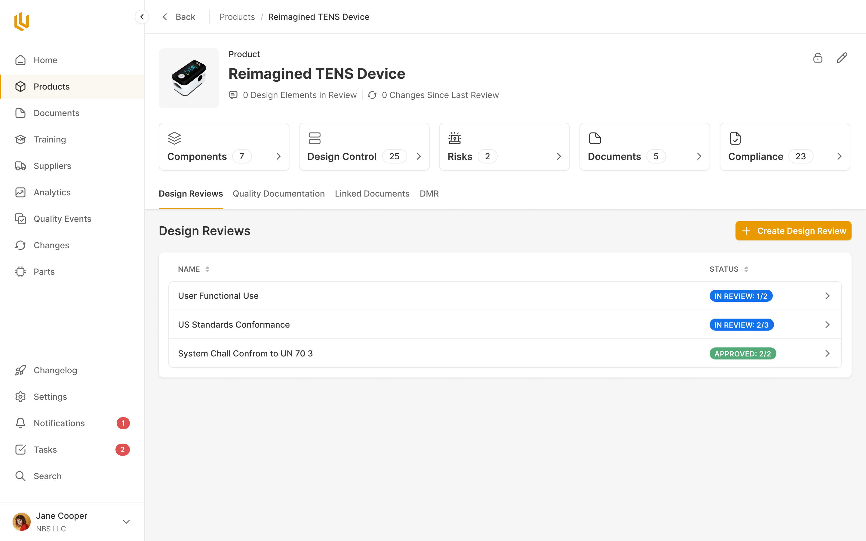
The pharmacy has a different job. A small team needs to see appointments, manage services and respond to patients while working at a desk. We designed that side for desktop and the patient side for mobile, using the same components without making the two experiences follow the same layout.
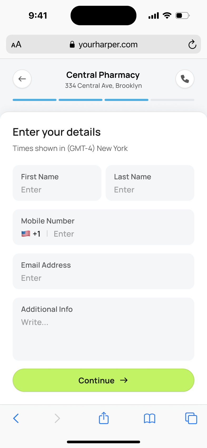
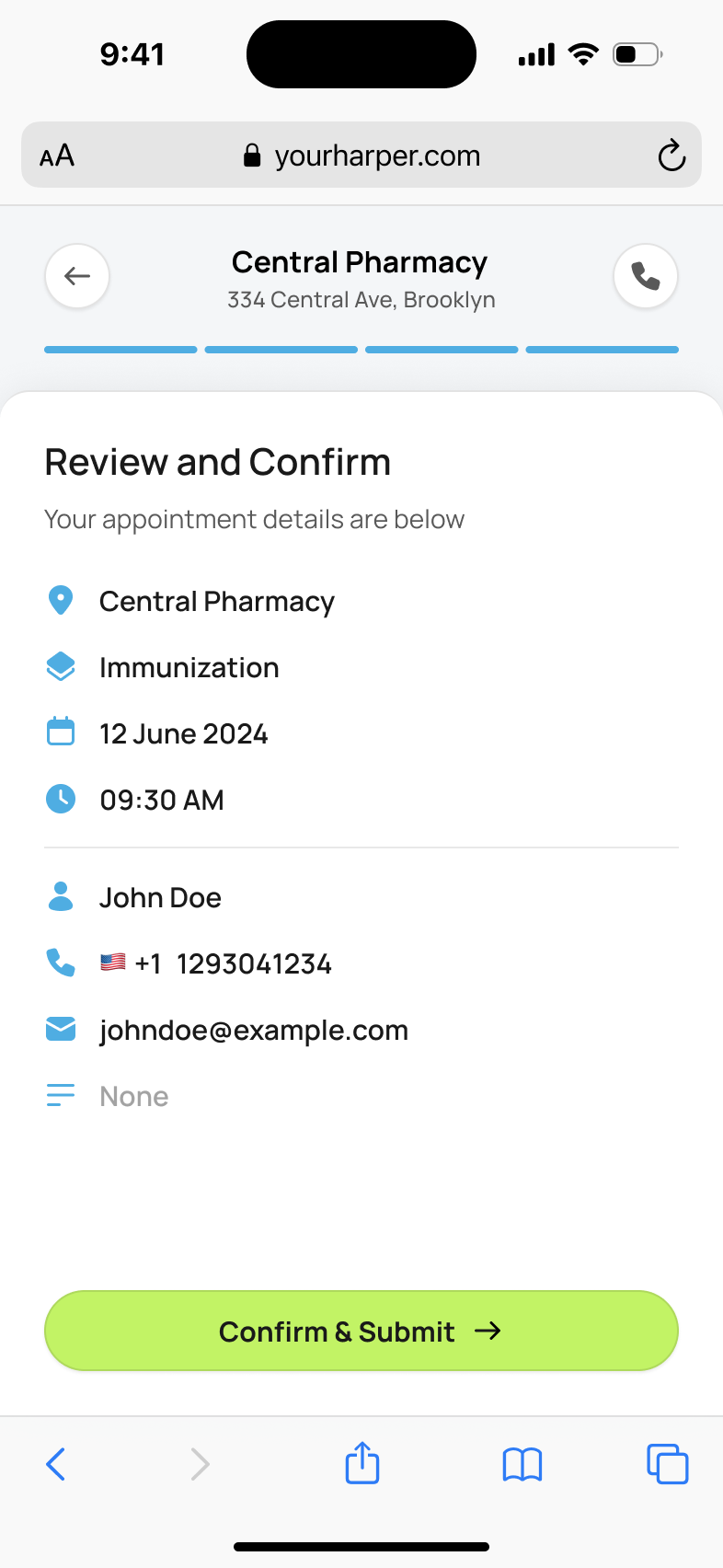
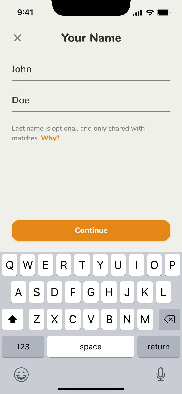
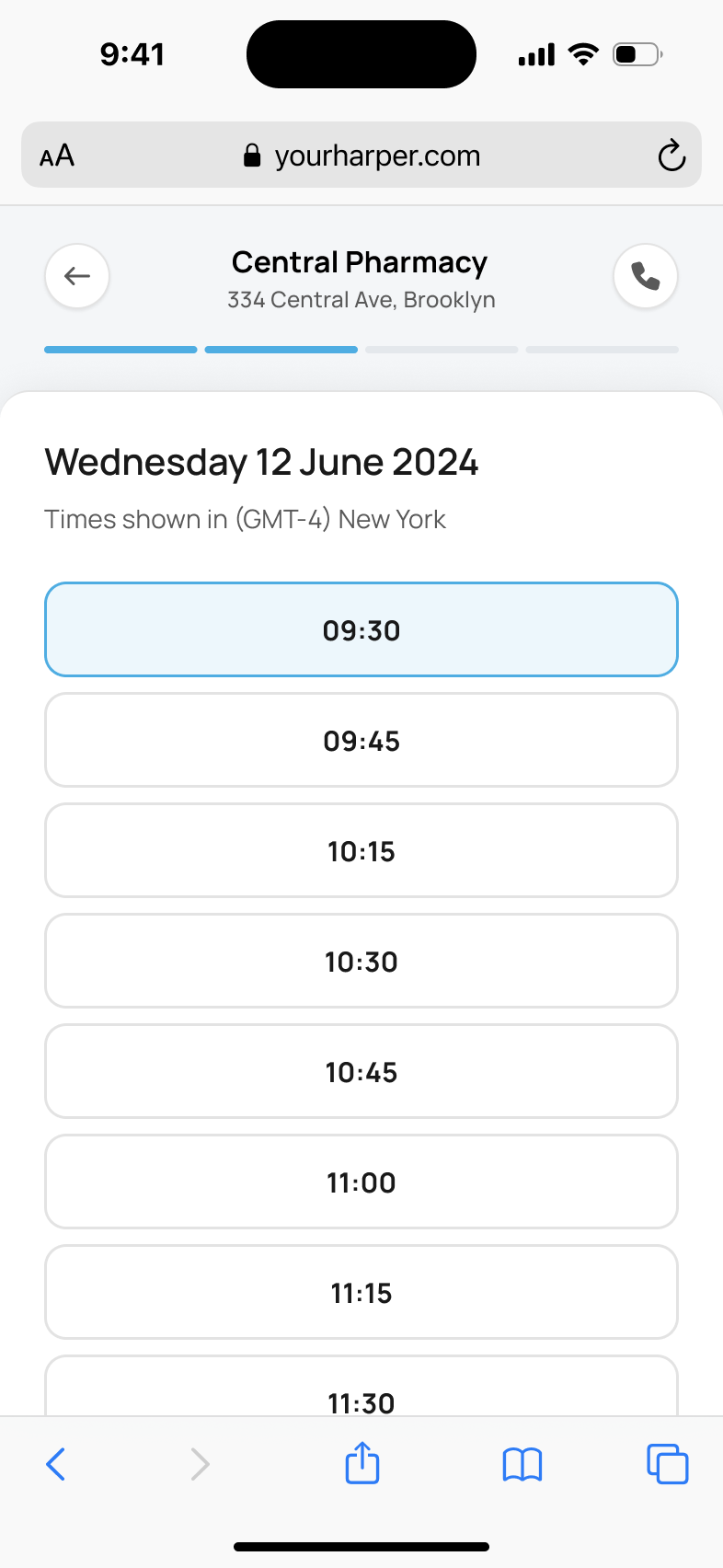
Book an appointment without creating an account
I ran the kickoff through the brief line by line, asking how far each piece needed to go. A patient account would bring login screens, password recovery and verification into a task that might only happen occasionally. Tara agreed that the first version could work without it. Everyone books as a guest. We also left billing out of the first version, keeping the scope on booking and managing the care.
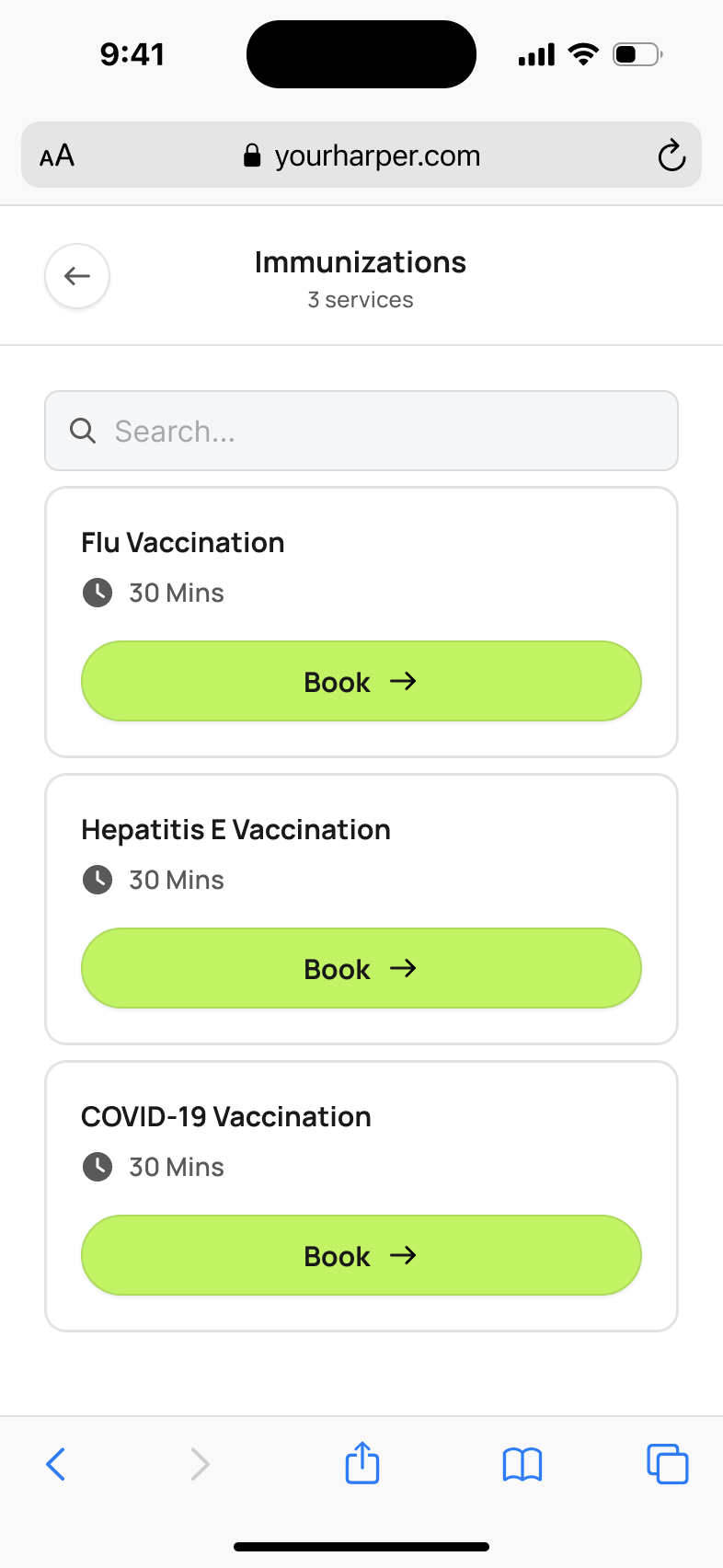
Keep the relationship without building a staff rota
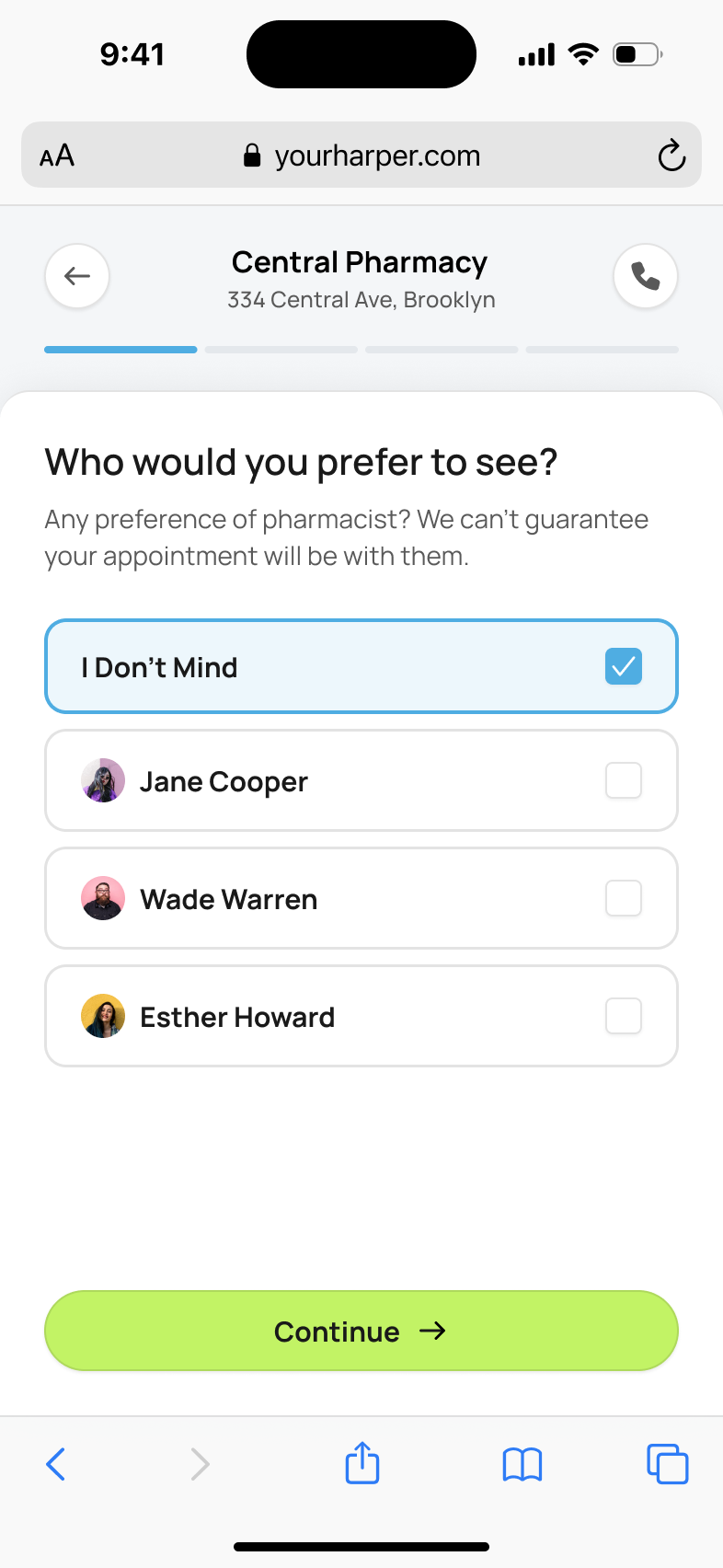
Tara wanted to keep the choice of pharmacist. In her patient interviews that relationship was "nine times out of ten the motivating factor" for turning up. I didn't want to collect every pharmacist's diary; a diary nobody updates on a sick day is worse than none. So the screen asks for a preference, defaults to "I don't mind", and says the pharmacy can't guarantee it.
a preference without a guaranteed pharmacist
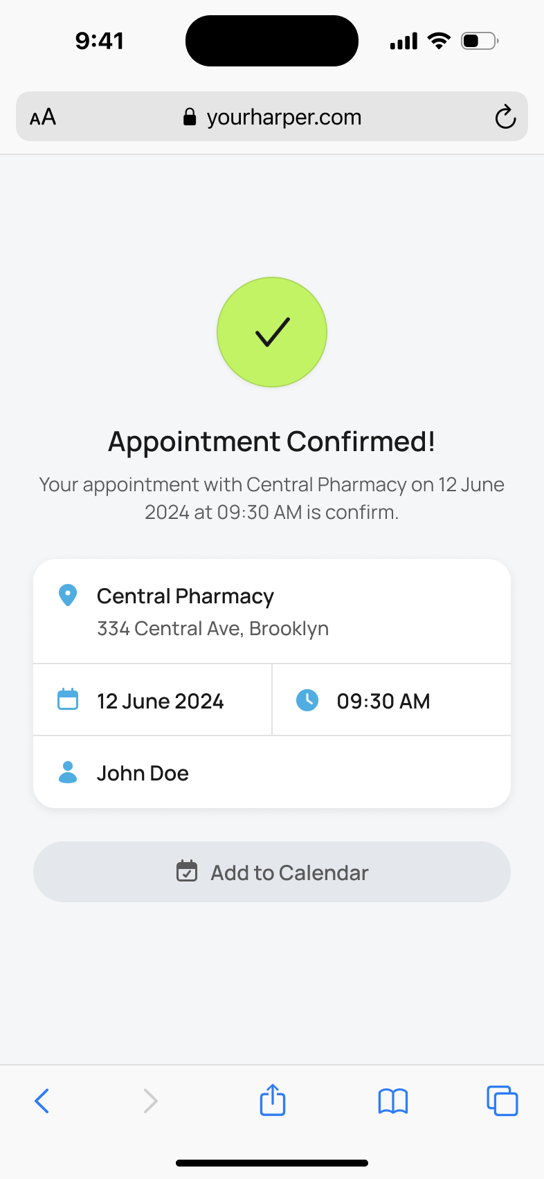
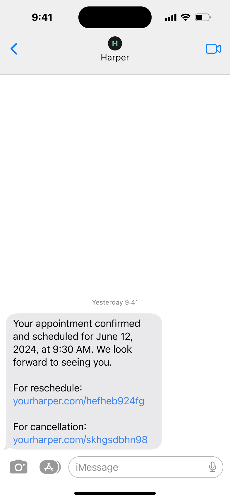
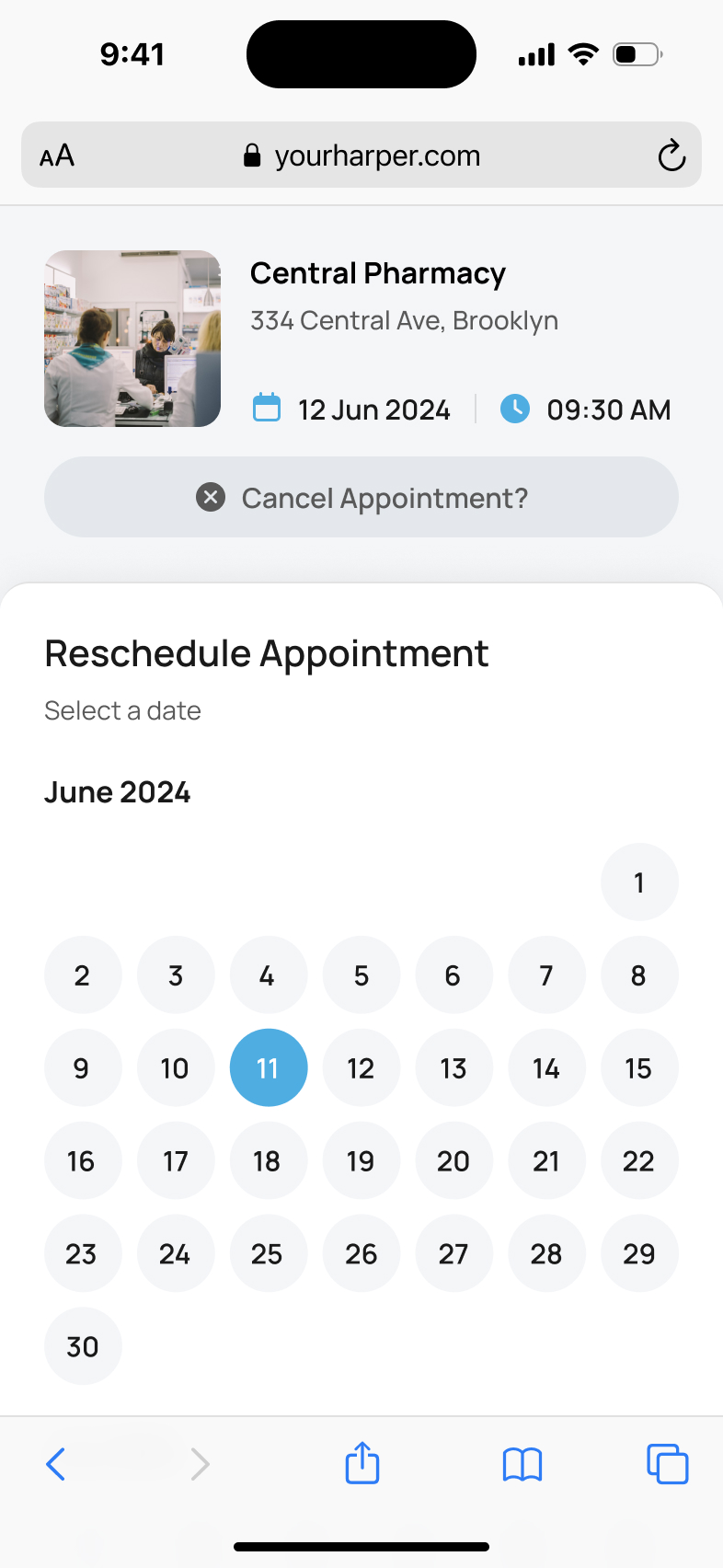
Without an account, patients still needed a way back to their booking. The confirmation text contains a link to reschedule and another to cancel, followed by a reminder 48 hours before the appointment. They can change the booking from the message they already received rather than signing into a separate product.
manage the booking from its confirmation text
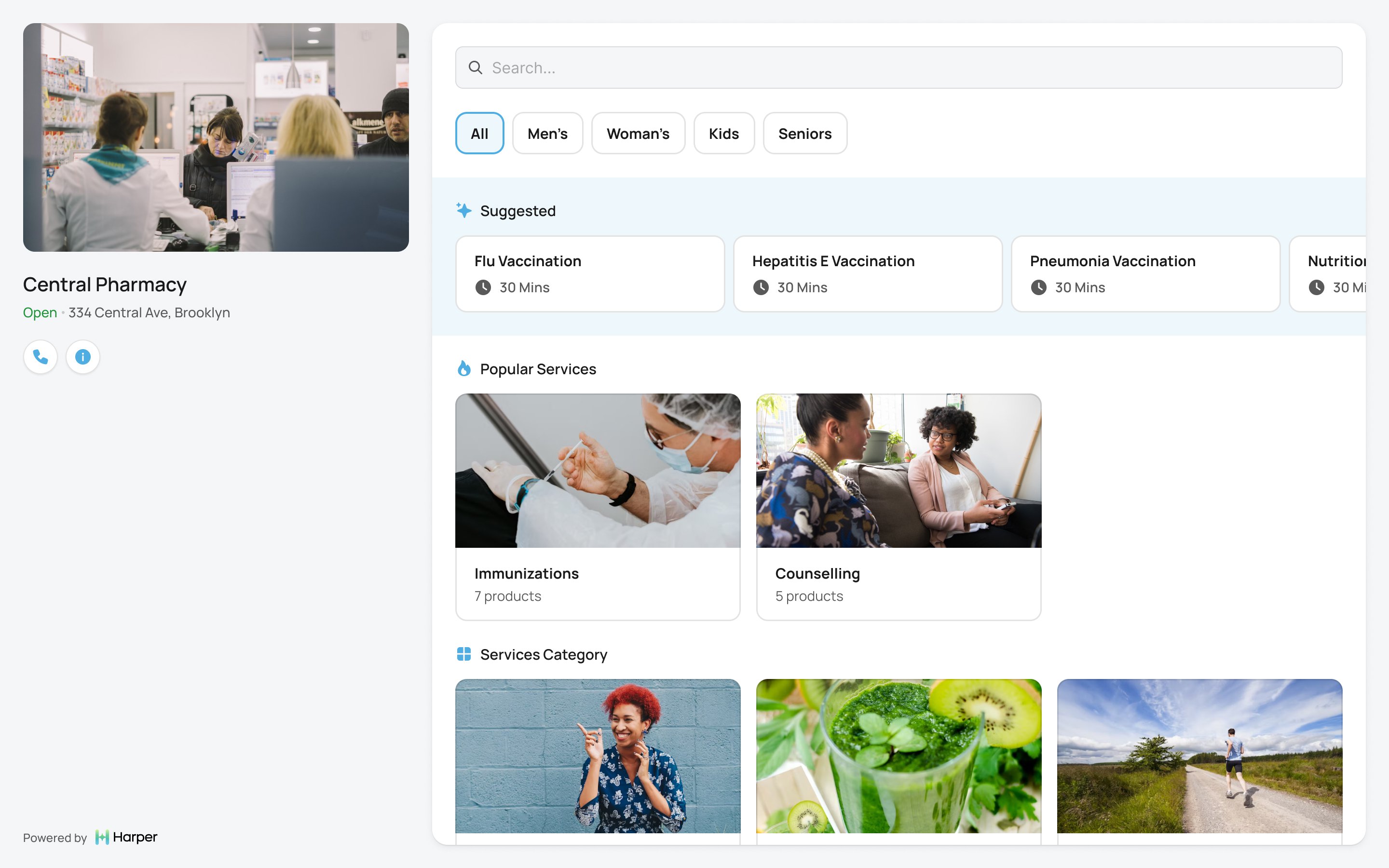
The booking page belongs to the pharmacy
I asked Tara how visible Harper should be to a patient. "Err on the side of generic." We took Harper’s brand off the booking page, leaving the pharmacy’s name, photo and address, and Harper once, small, at the foot. The person following a link from their pharmacy would still recognise whose care they were booking.
Pharmacies send patients the link or embed the page on their own site, from a share menu I asked Prakash to model on Loom's.
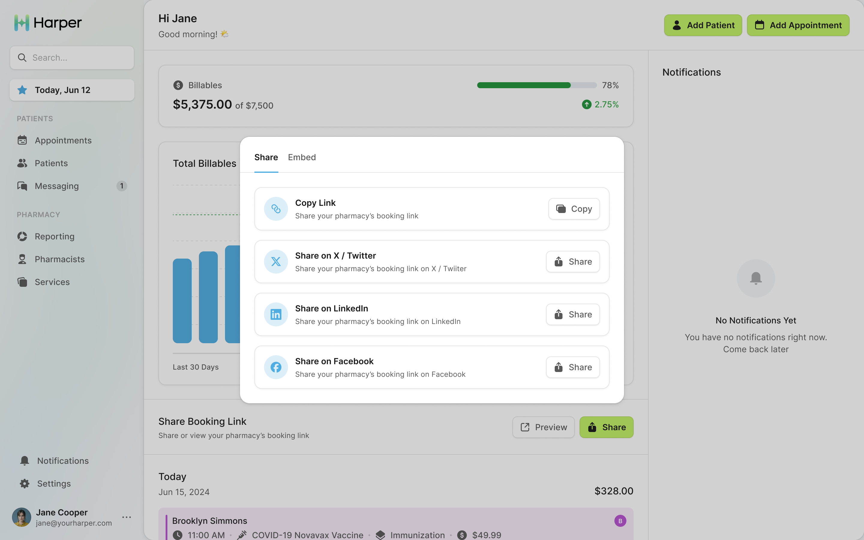
Make billable care visible to the pharmacy
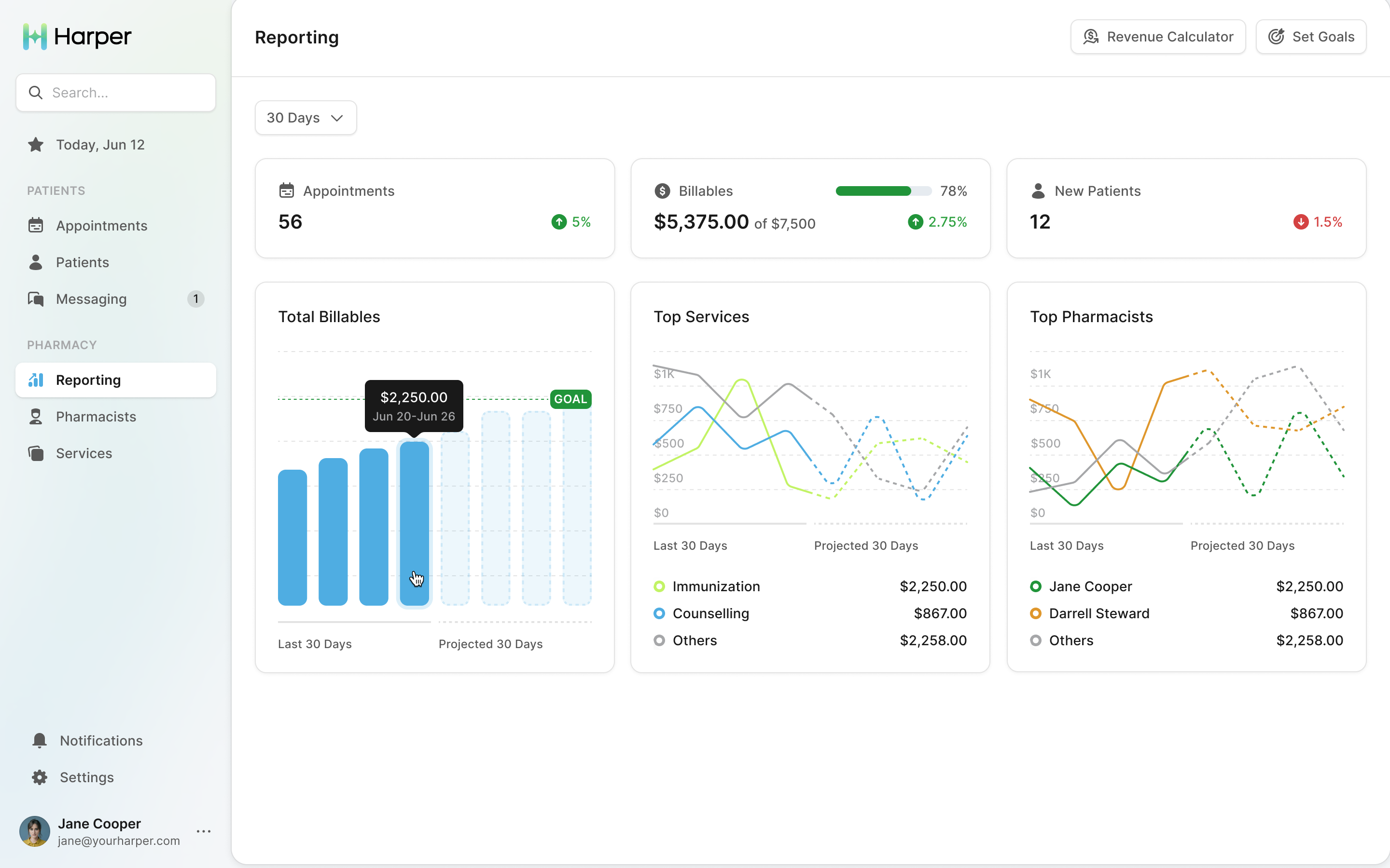
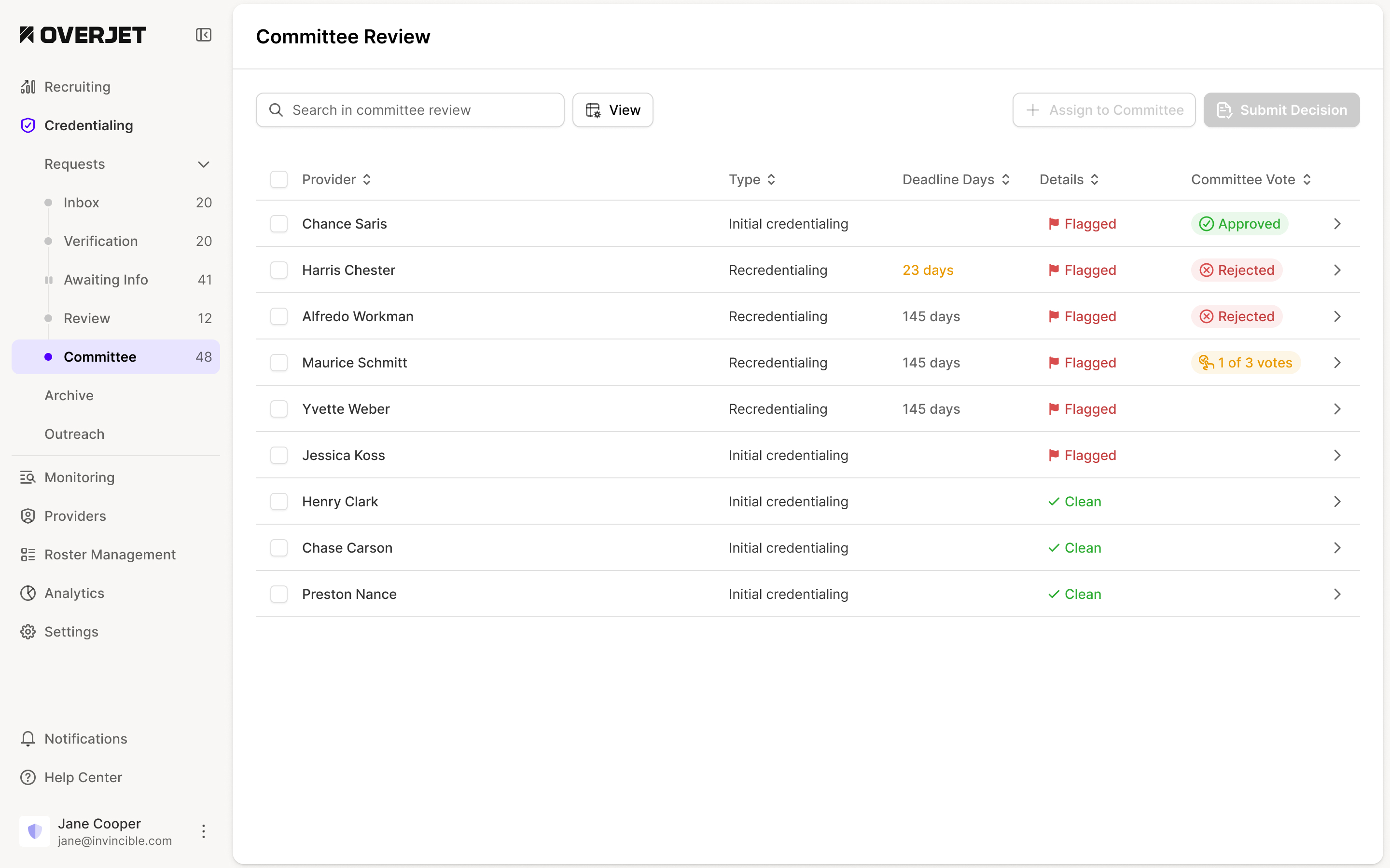
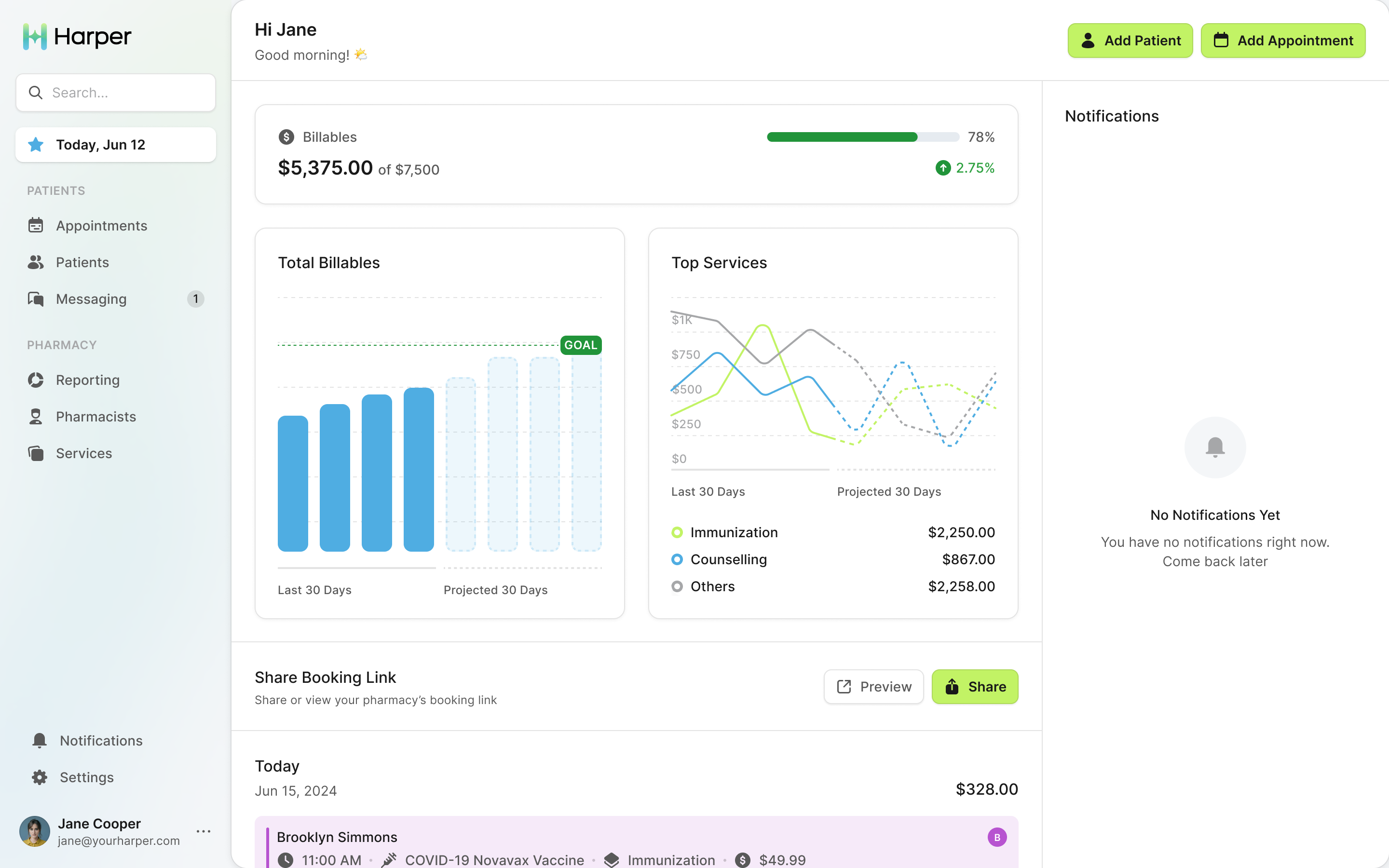
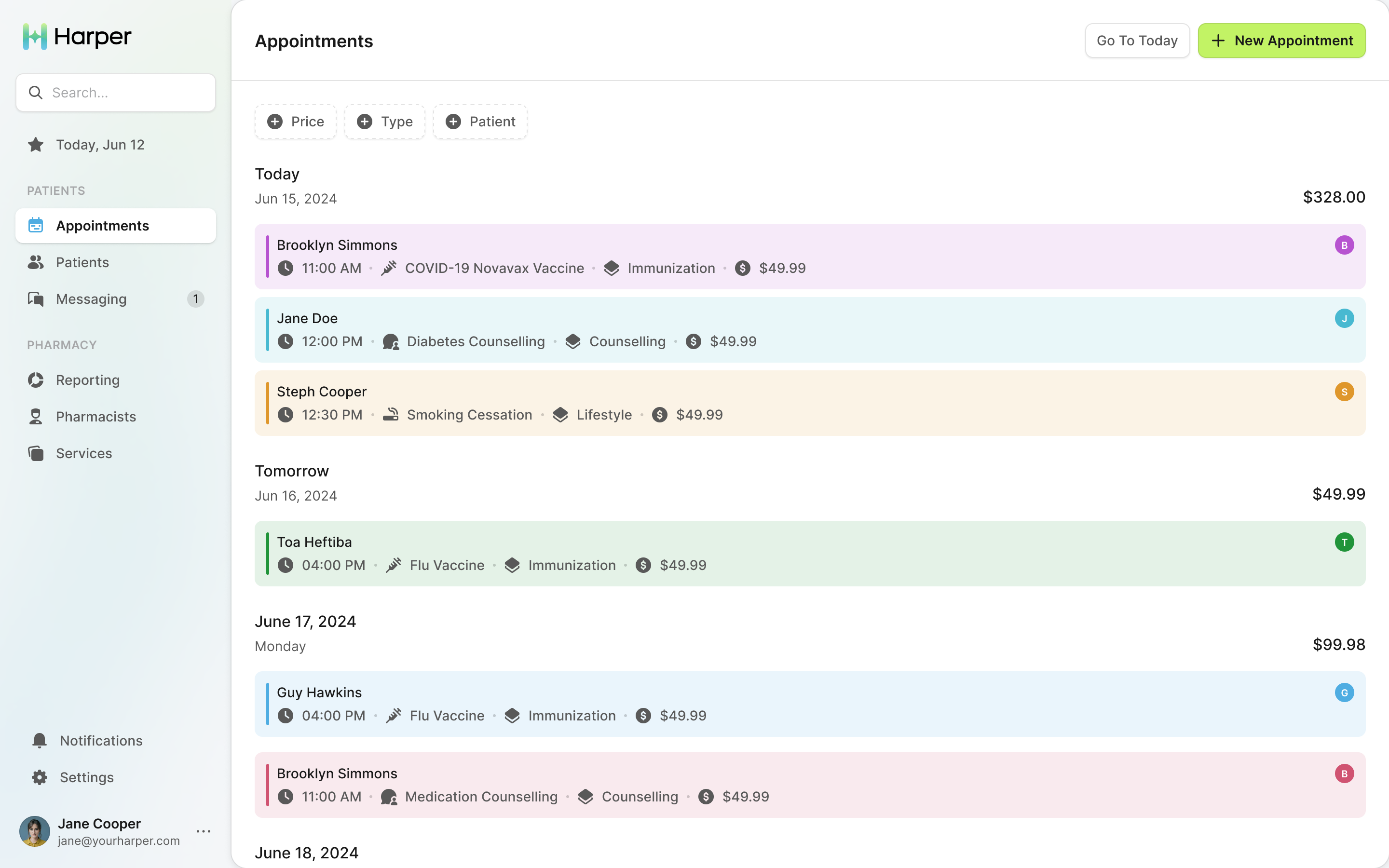
Harper needed to show a pharmacy what those appointments were worth, even though the first version would not process billing. The home screen opens on billables against a monthly goal. In the appointments list, every visit has its value beside it and each day has a total. A pharmacist can read the schedule and its potential revenue together.
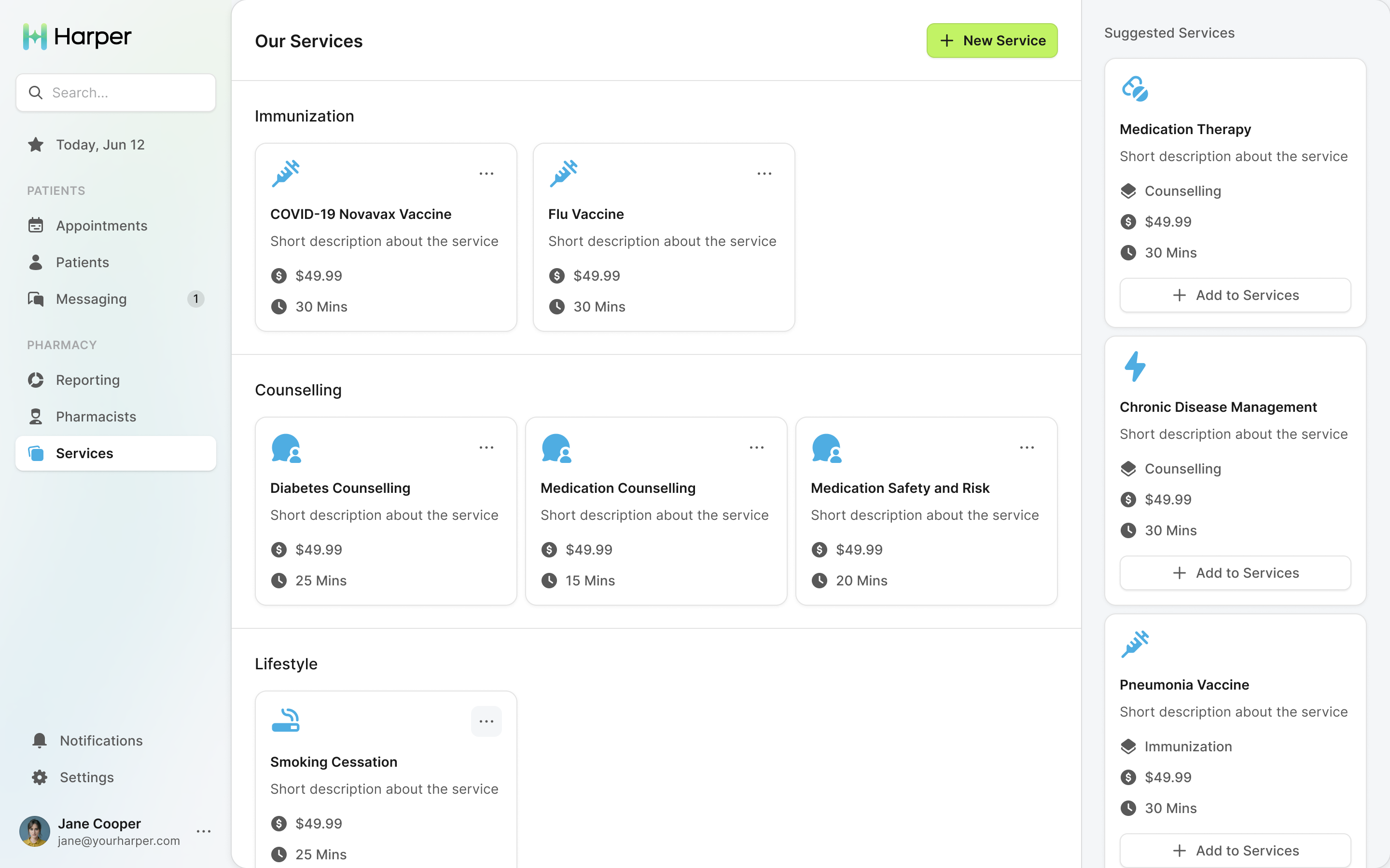
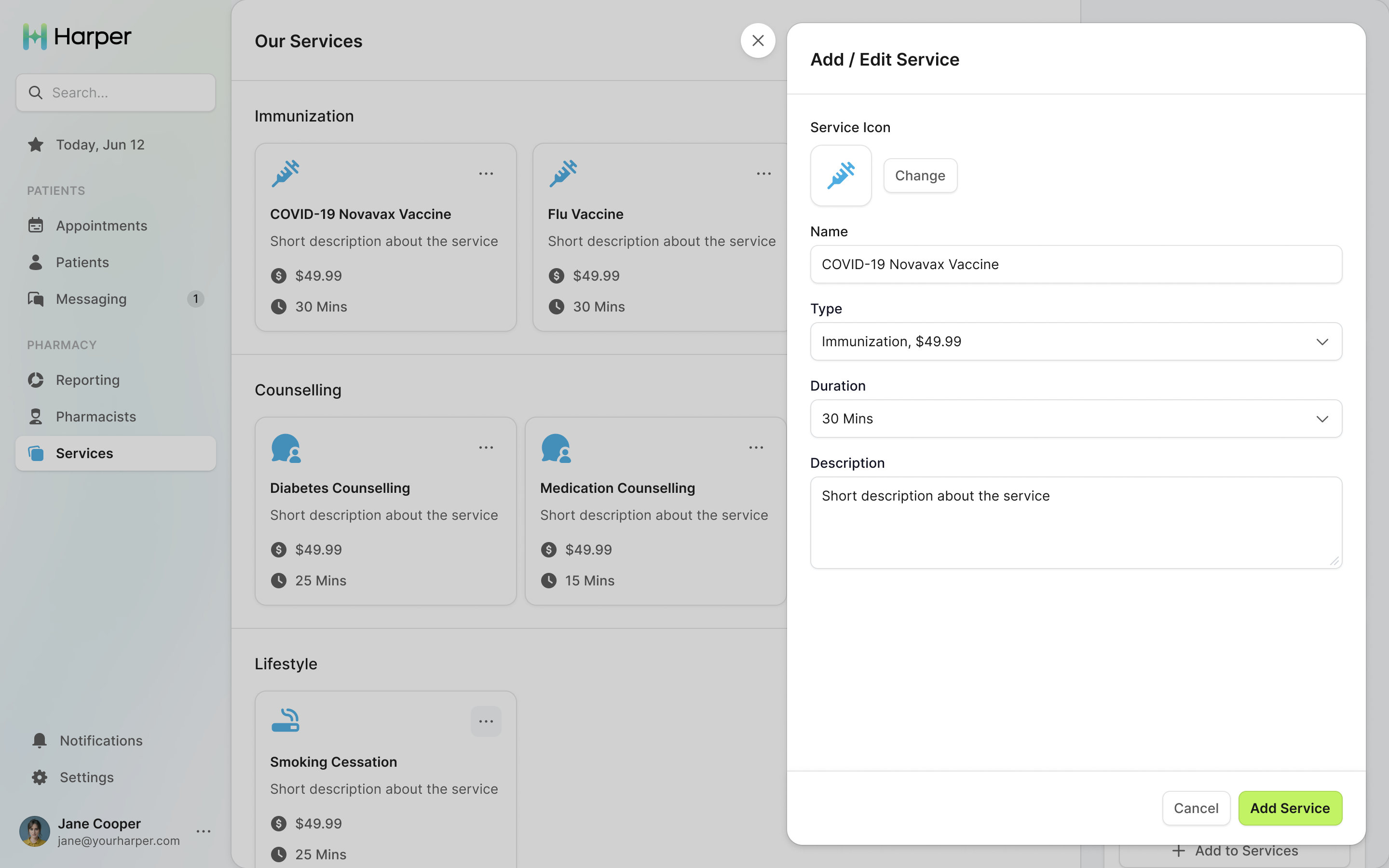
Services started as a table in settings. Tara described them as "profitable little chunks of time". I moved them into the main navigation as a grid, with suggested services a pharmacy could add in one click. The catalogue became something the pharmacy could actively develop, with the length and description of each service available to edit.
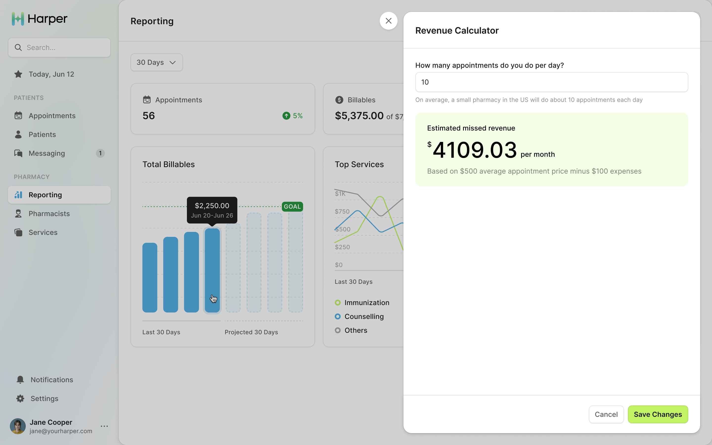
Late on, Tara asked in a Figma comment for a revenue calculator: five immunizations and five counselling appointments, what would a pharmacy make? The prices came off every patient-facing screen.
Availability is the pharmacy's opening hours
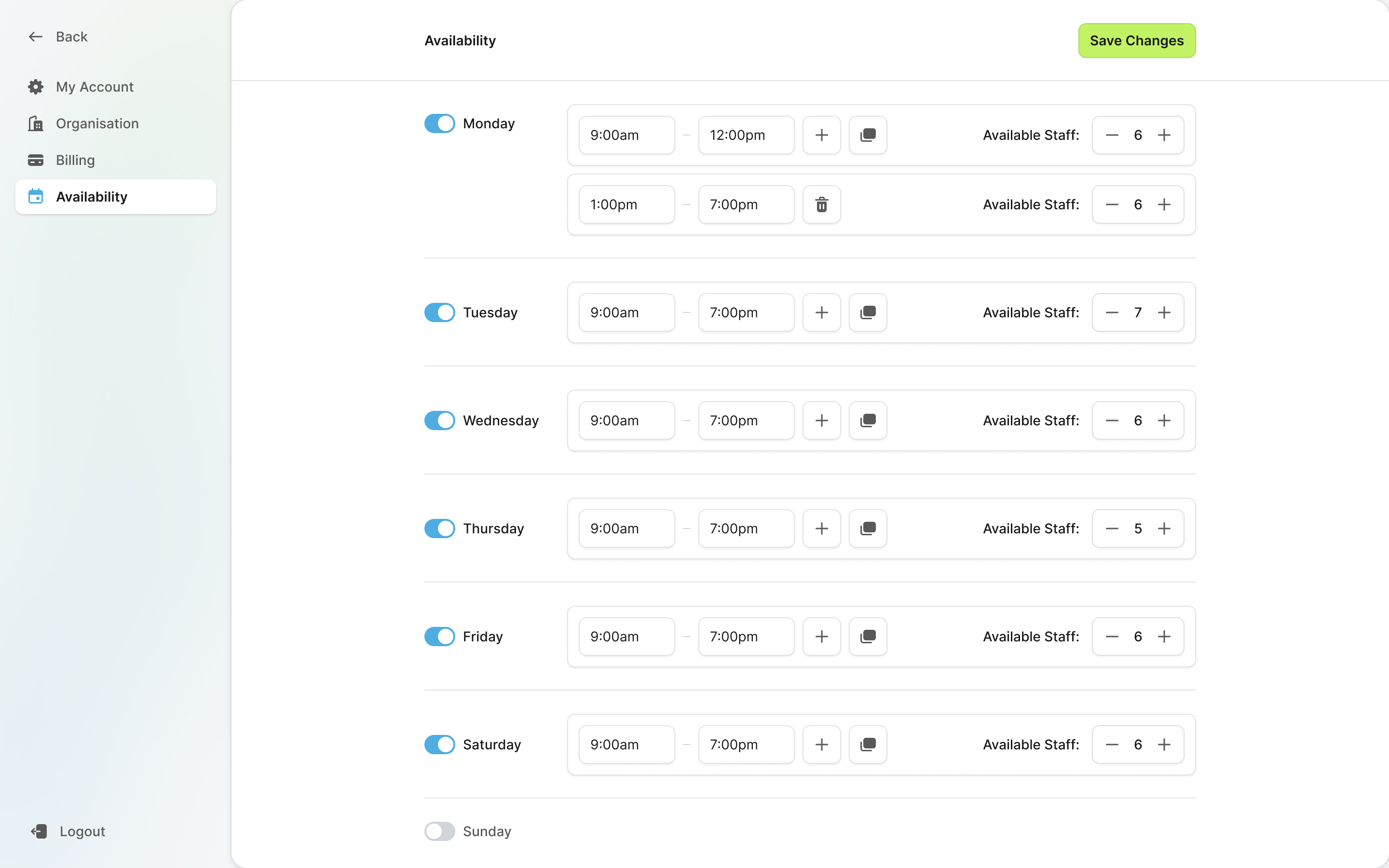
Per-pharmacist availability came back at the settings screens, and I called it off for good: it means building for leave and sick days. A pharmacy sets one set of hours, with as many blocks a day as it needs, and says how many pharmacists are working each day. That number is how many appointments can be booked at once. A pharmacy can represent a split day and its capacity without maintaining a separate calendar for each member of staff.
Messages are text messages
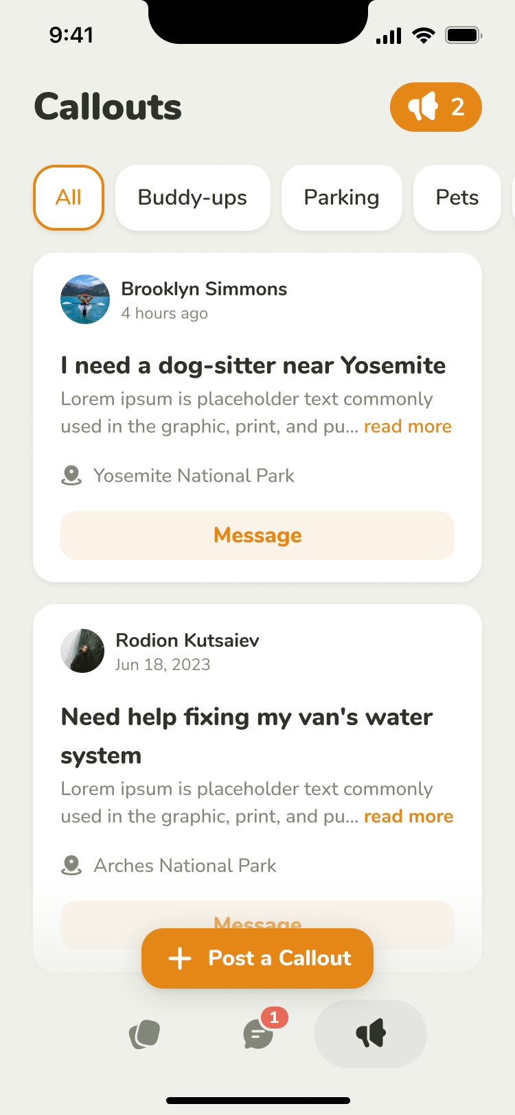
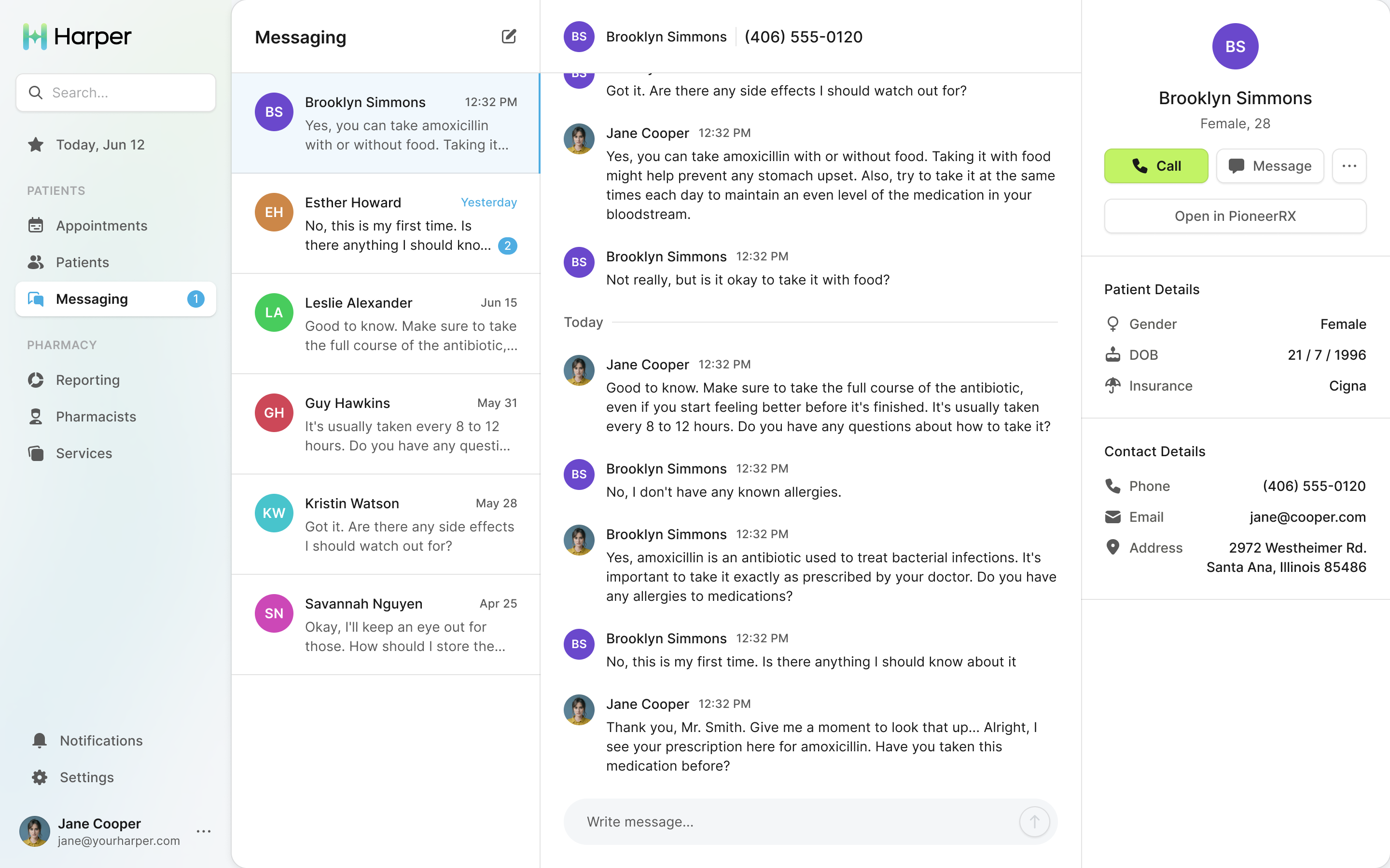
Patients have no inbox, so every conversation happens over SMS, and the messaging screen is the pharmacist's side of those texts. I asked Prakash to keep read and unread states, like email, and leave out a "mark as resolved" action. This was a conversation with a patient, with no separate support-ticket process to manage.
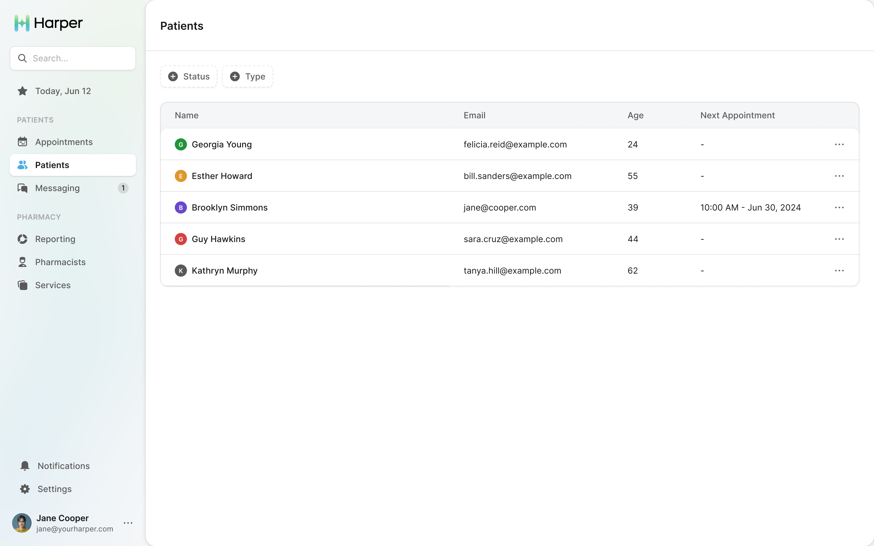
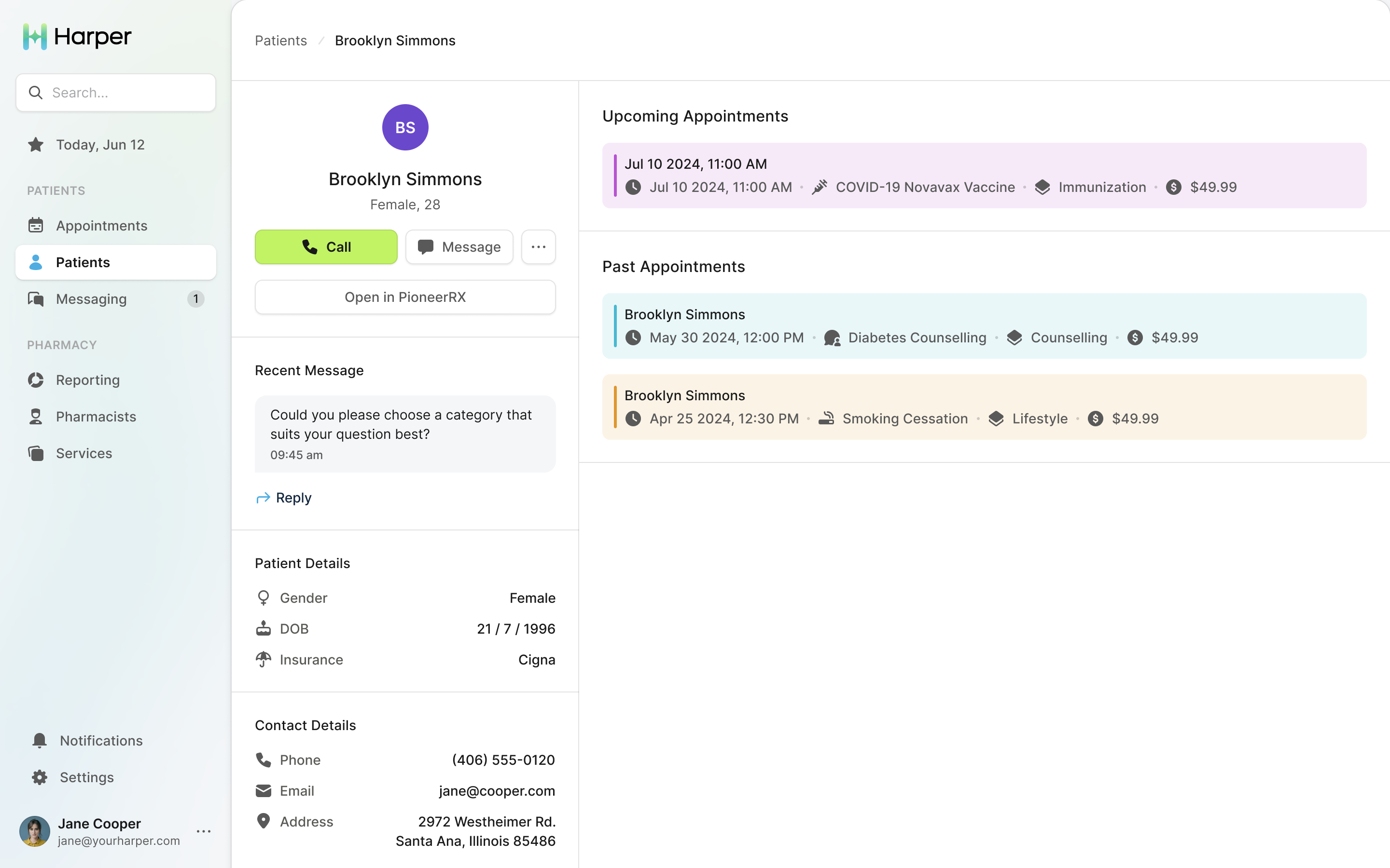
The patient profile holds appointments and the latest message. The rest of the record is in the pharmacy's own system, a button away.
What we handed over
Prakash Ghodke designed most of the screens, Vitalii Prokopenko built the component library and navigation, and Anas Bin Zia linked them into two clickable prototypes. By mid-July the developer documentation and icon set were done and Tara was collecting quotes.

"Working with NBS is like a breath of fresh air. I really appreciate how detail oriented they are and how they have the process on lock."
More from Harper