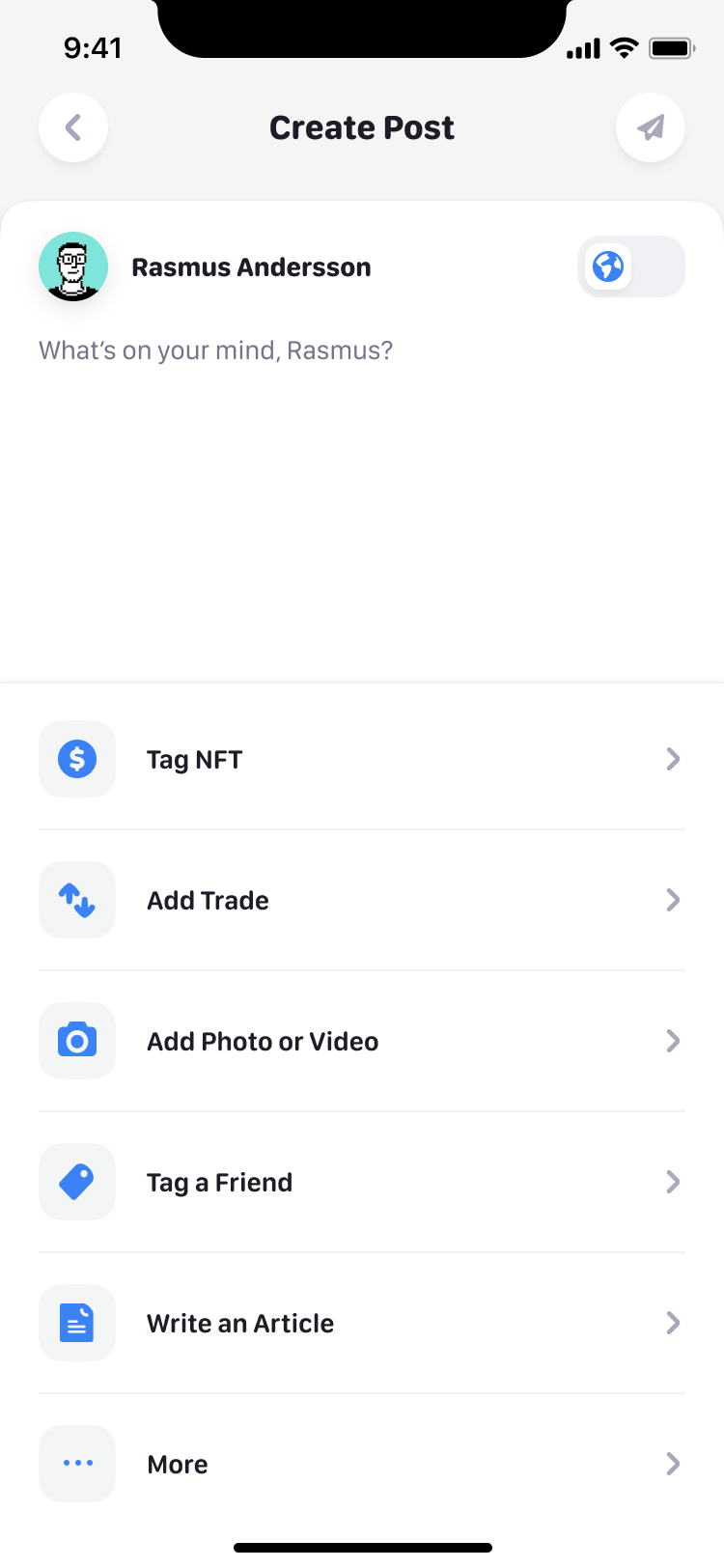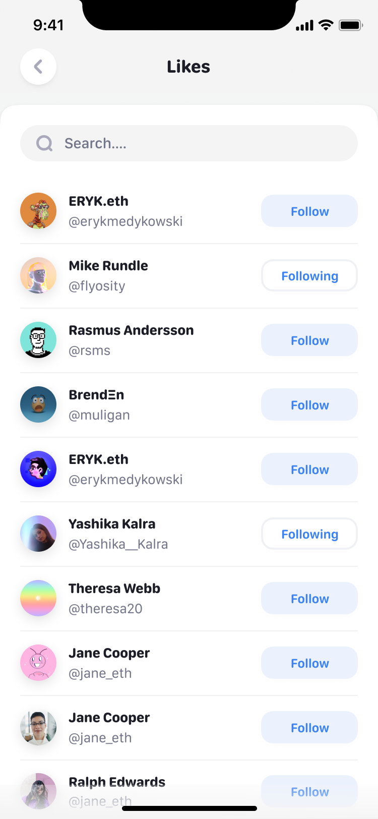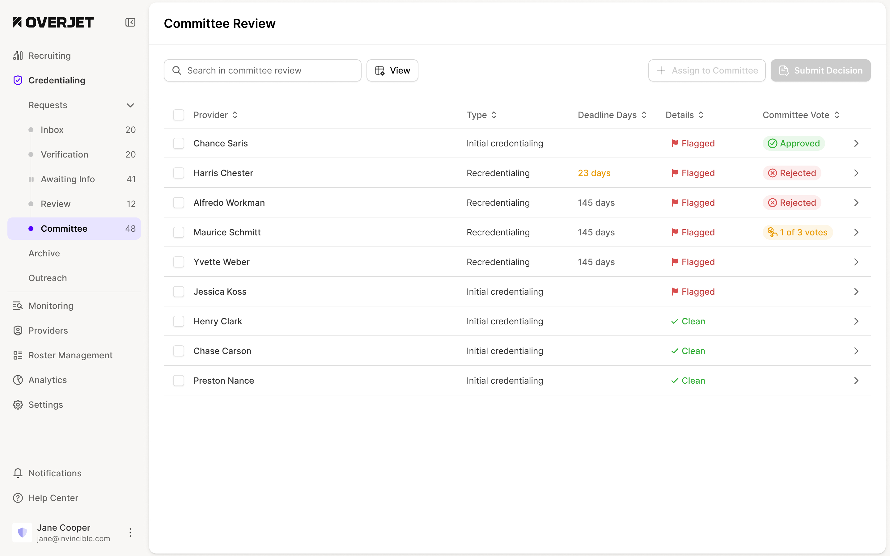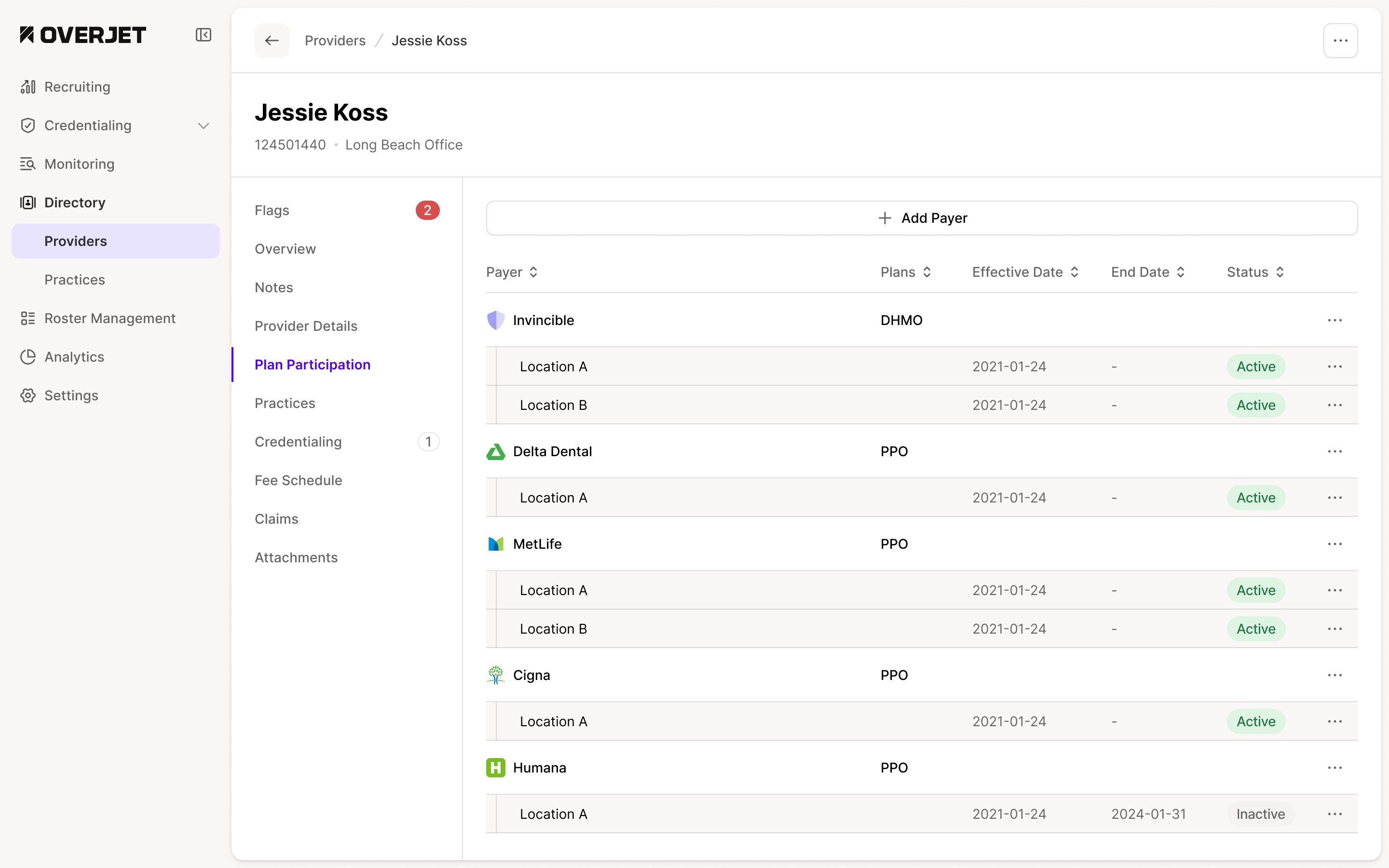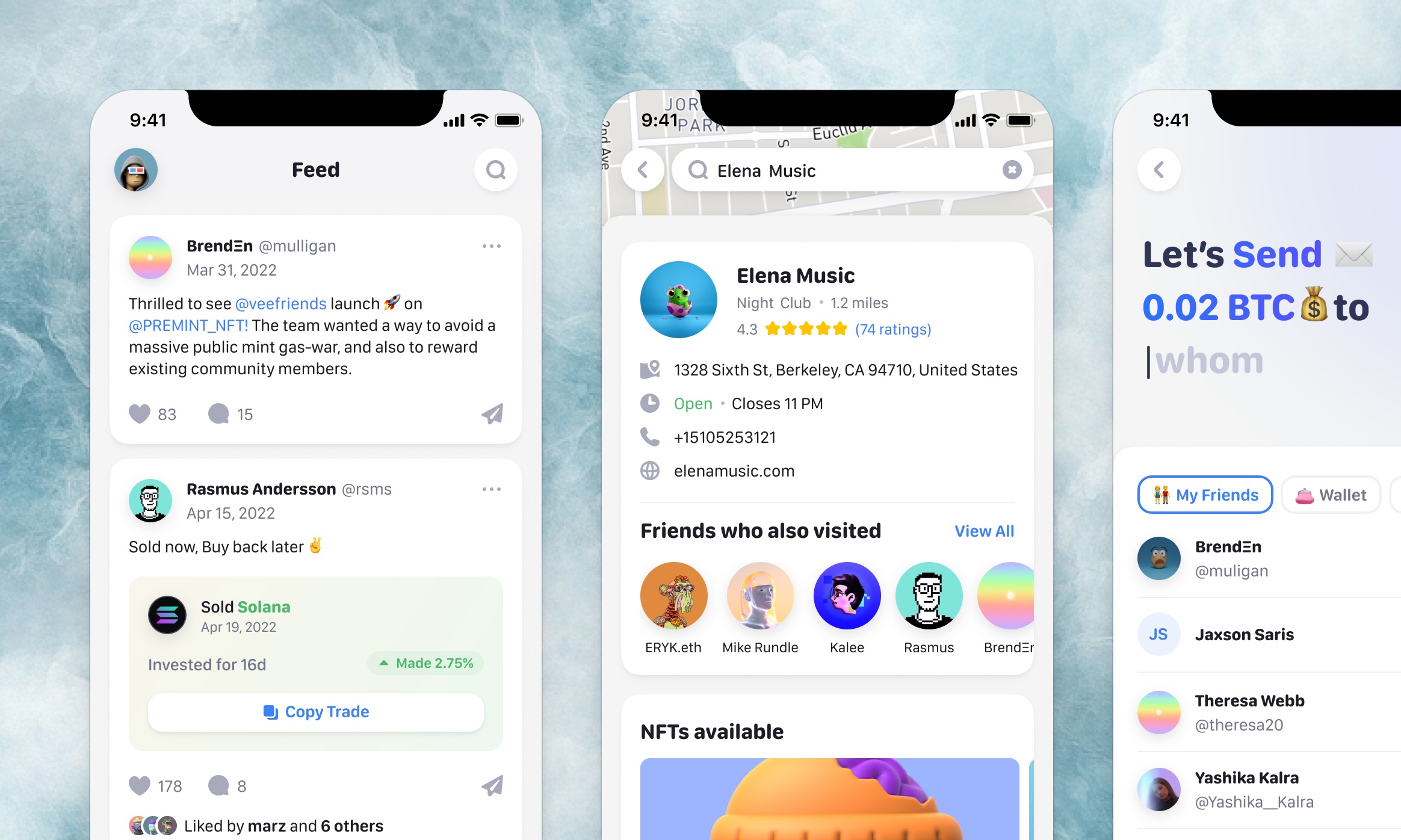
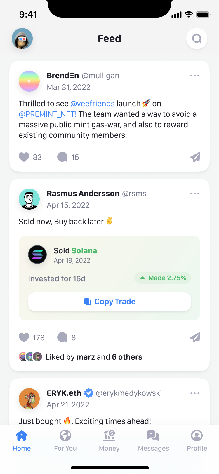
Jet was a social app for crypto. The home screen was a feed of what the people you follow were doing: posts, trades with a button to copy them, NFTs bought and sold. Around it sat a map of places with NFTs to collect, leaderboards, and a Money tab for sending dollars or crypto to friends.
The app already existed, and Jet wanted all of it to look new, fast. We started in April 2022 and the last screens went over two weeks later, in May. Prakash Ghodke set the visual direction, Sam, Moyi and Julian Wilkins designed the rest of the app in it, and I ran the work through Figma comments and short Loom videos.
Set the direction once, then design in parallel
I started with one designer so that the rest of the team could work from an agreed direction. Prakash took the feed alone, from a Loom I recorded and a Dribbble board. Two days later Sam and Moyi started on the rest, each asked to match "the aesthetic Prakash has set up".
Moyi built the design system alongside, because the app would "very quickly have a LOT of screens": cards, headers, the tab bar and the pill navigation became components early. Prakash added a rule of his own: icons are solid colour, never gradients.
Jet brought the product and its existing flows. Riddhi shared Rainbow as a reference for the look, and we worked through feedback with the client before spreading the direction across the remaining screens. Parallel work only helped once everyone had something concrete to match.
agree the first screens before multiplying the work
The feed borrows Instagram's habits
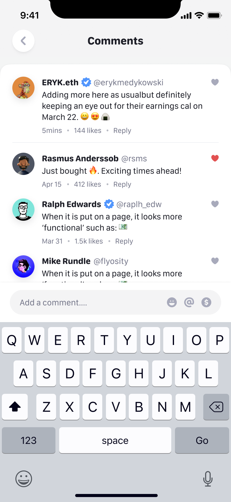
A feed full of unfamiliar financial activity still needed to behave like a social app. Wherever Instagram already had a habit, the feed used it, down to the comment icon and the paper plane for sharing. Prakash questioned the comment field sitting open under every post and suggested one comment with a link to the rest. I agreed, and borrowed one more thing: a tappable "3 more comments" line.
What a post can carry is new. A trade arrives as a card with the coin, how long it was held, the return and a Copy Trade button. My suggestion was to put the card on green when the trade made money and red when it lost, so the result reads before the numbers.
Where the old design worked, we kept it
I told Moyi in the first week this was "basically just a UI reskin": redesign the existing screens in Prakash's style, don't rethink them. The profile stayed close to its old layout, apart from a "people you may know" section the old design handled badly. When I asked Prakash what the profile header did once you'd scrolled, he had it collapse on the way down and return on the way up.
The leaderboard's first redesign came out less visual than the original, so it went back to the old style, and the original tab bar stayed. A two-week redesign leaves little room to rebuild interactions that already do their job. We spent that time on the screens where the new direction needed more thought.
NFTs are collected in places
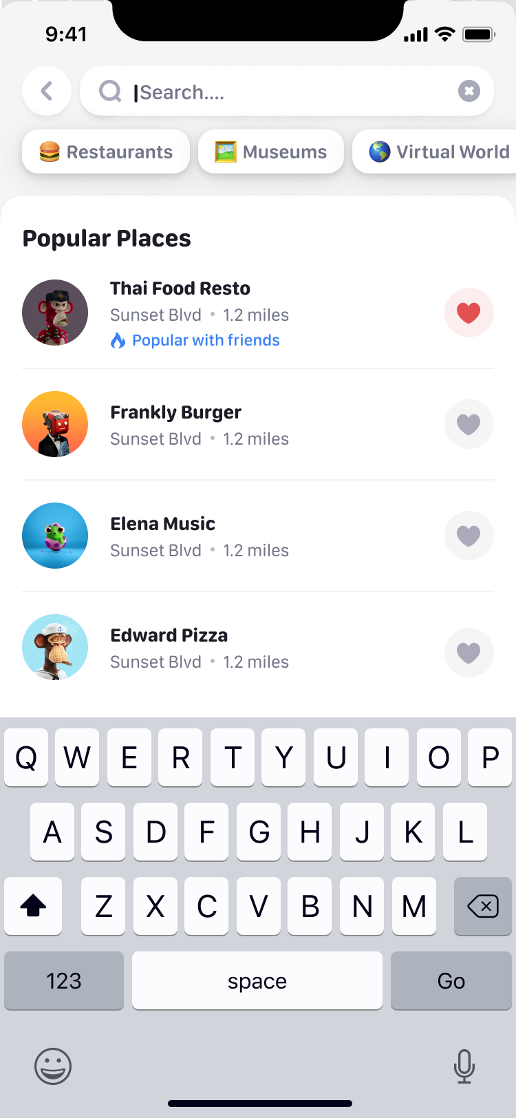
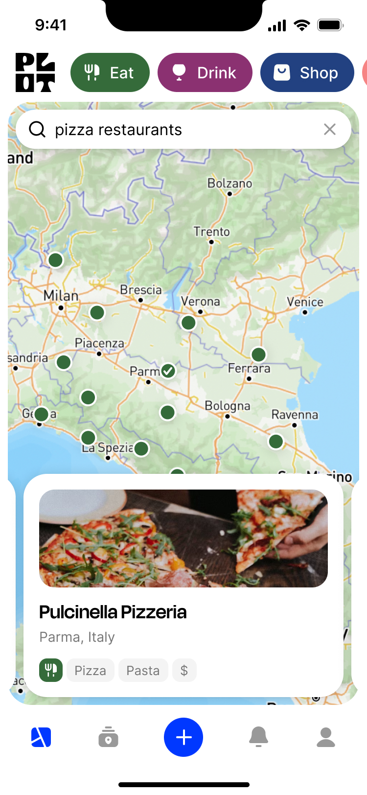
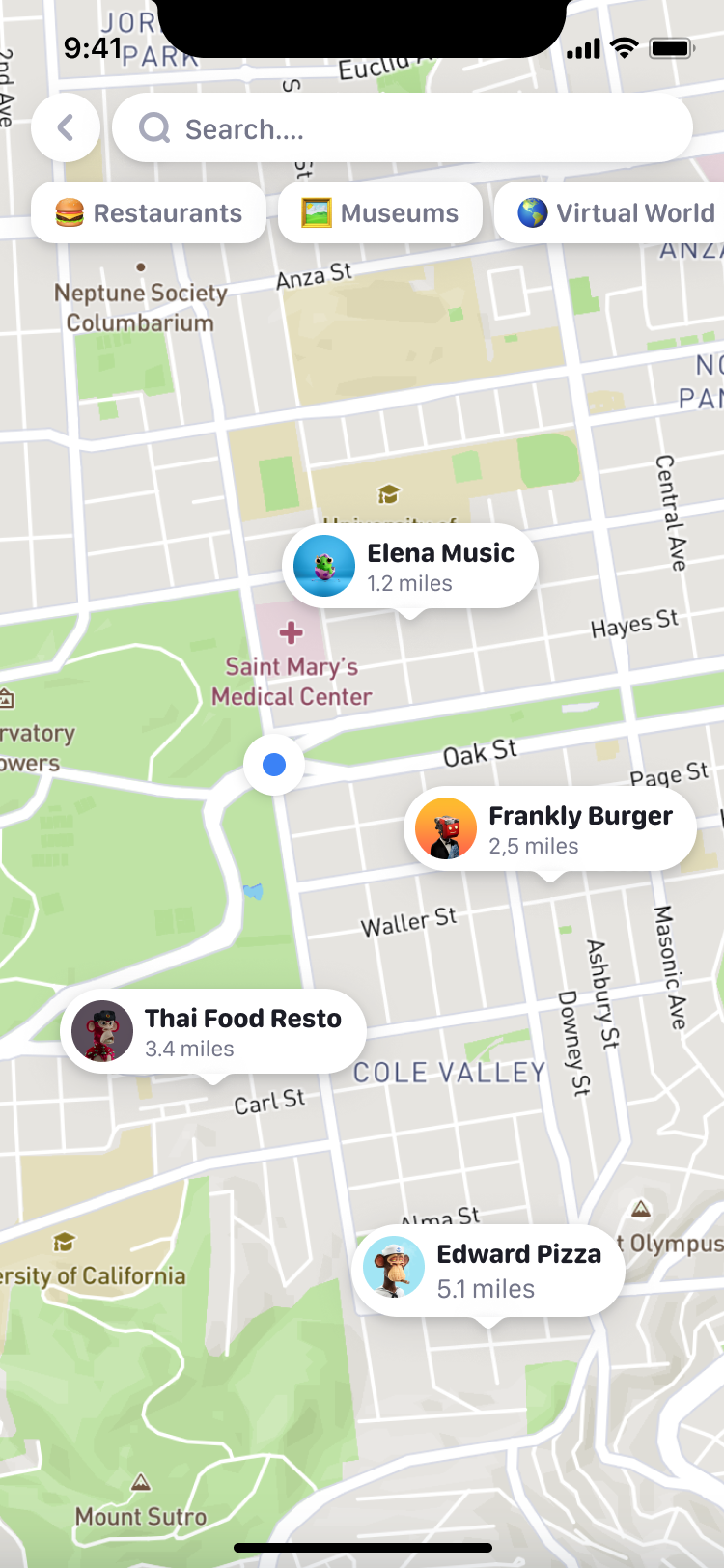
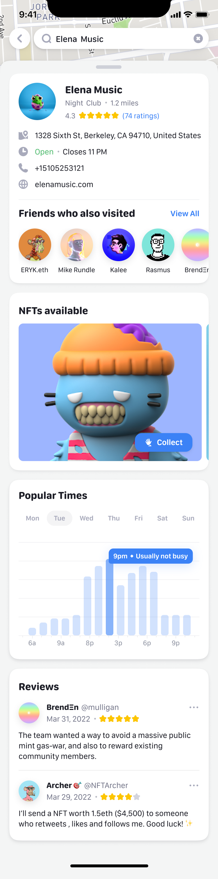
The For You page opens on a map of NFTs near you. Claiming one starts from an App Clip, the small part of an iOS app that runs before you've installed it, and carries on inside the app. On Moyi's map, a place shows its hours, the friends who've been there and the NFTs to collect, and opens over the map, which greys out behind it.
A payment reads as a sentence
With half the time gone, I moved a column of tasks into Paused and narrowed the brief to claiming an NFT and sending money. Most of the second week went into the Money tab.
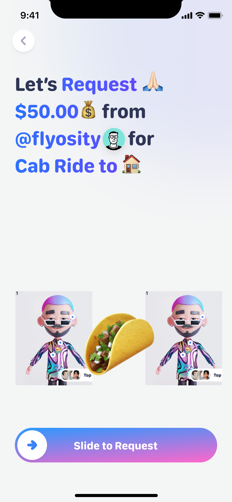
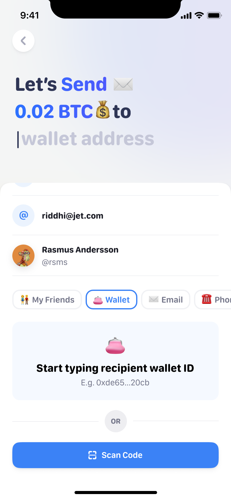
Sending builds a sentence as you go: "Let's send", an amount in dollars or a coin, "to" someone, "for" something. Each answer appears in purple with an emoji after it, and the sentence stays on screen until you slide to send. Where the sentence names a person, the emoji gave way to their avatar. Requesting reads the same way, and the person can be a friend, a wallet, an email or a phone number.
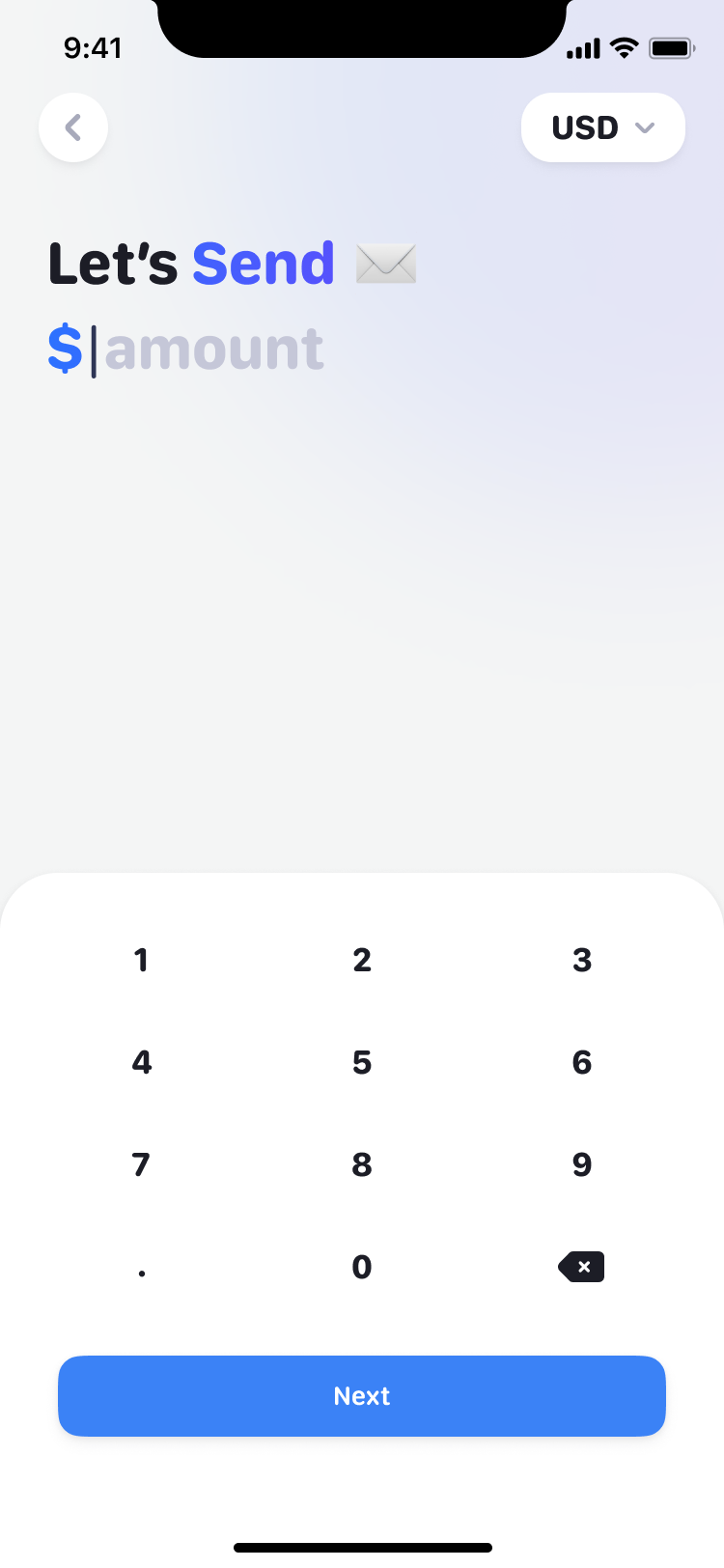
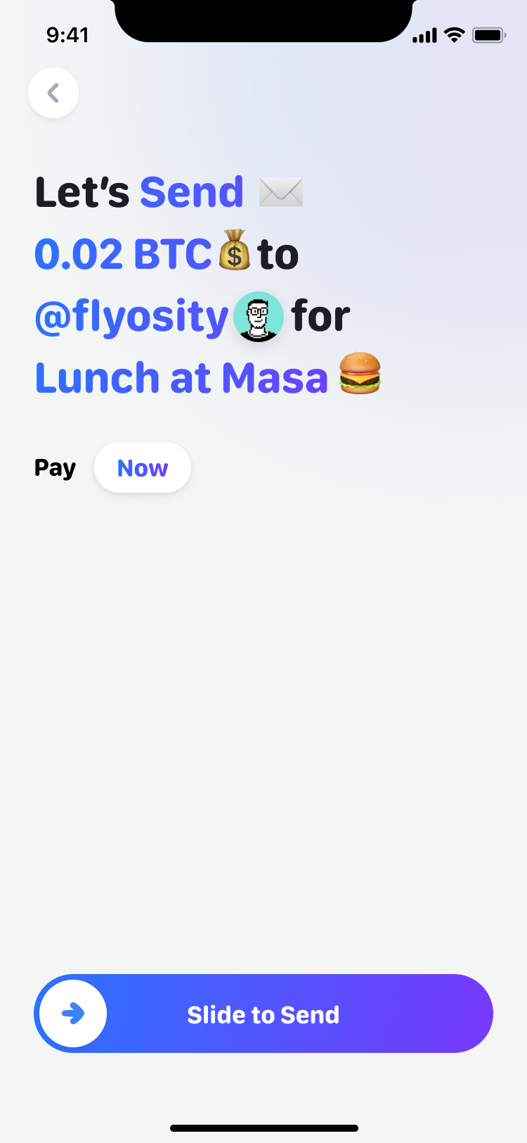
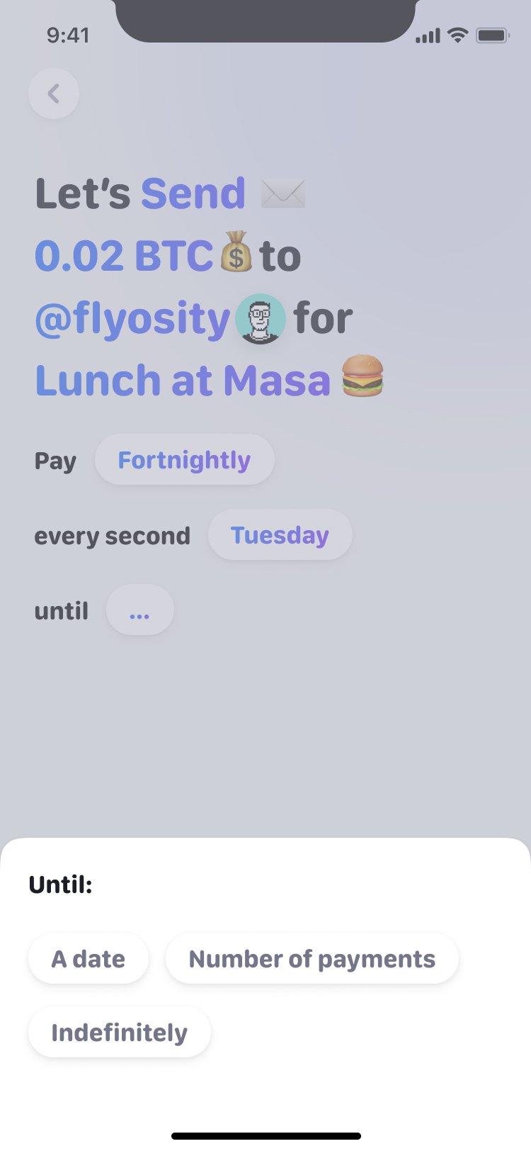
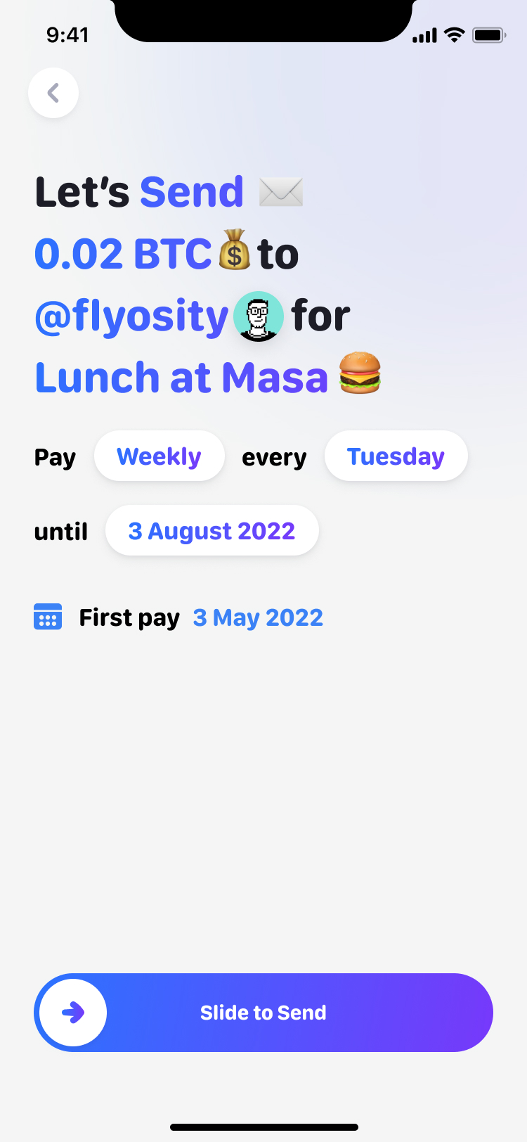
The sentence also keeps the choices together. Amount, recipient and purpose remain visible at the final step, rather than disappearing into previous forms. A repeating payment extends that same sentence with a frequency, an end and a start date. Scheduling a transfer doesn't introduce a second way to read it.
a recurring payment extends the sentence you already built
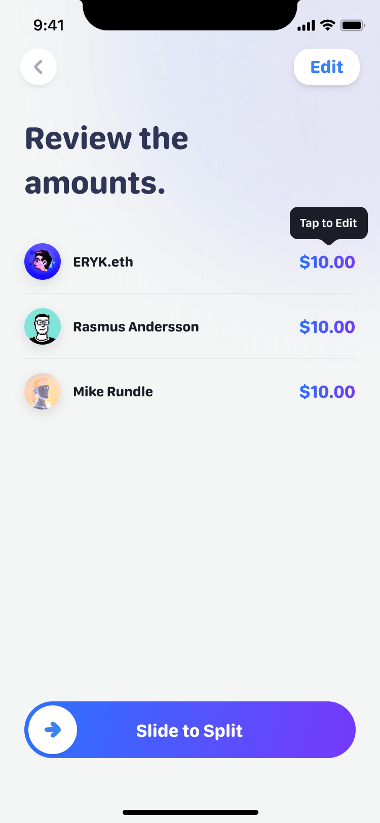
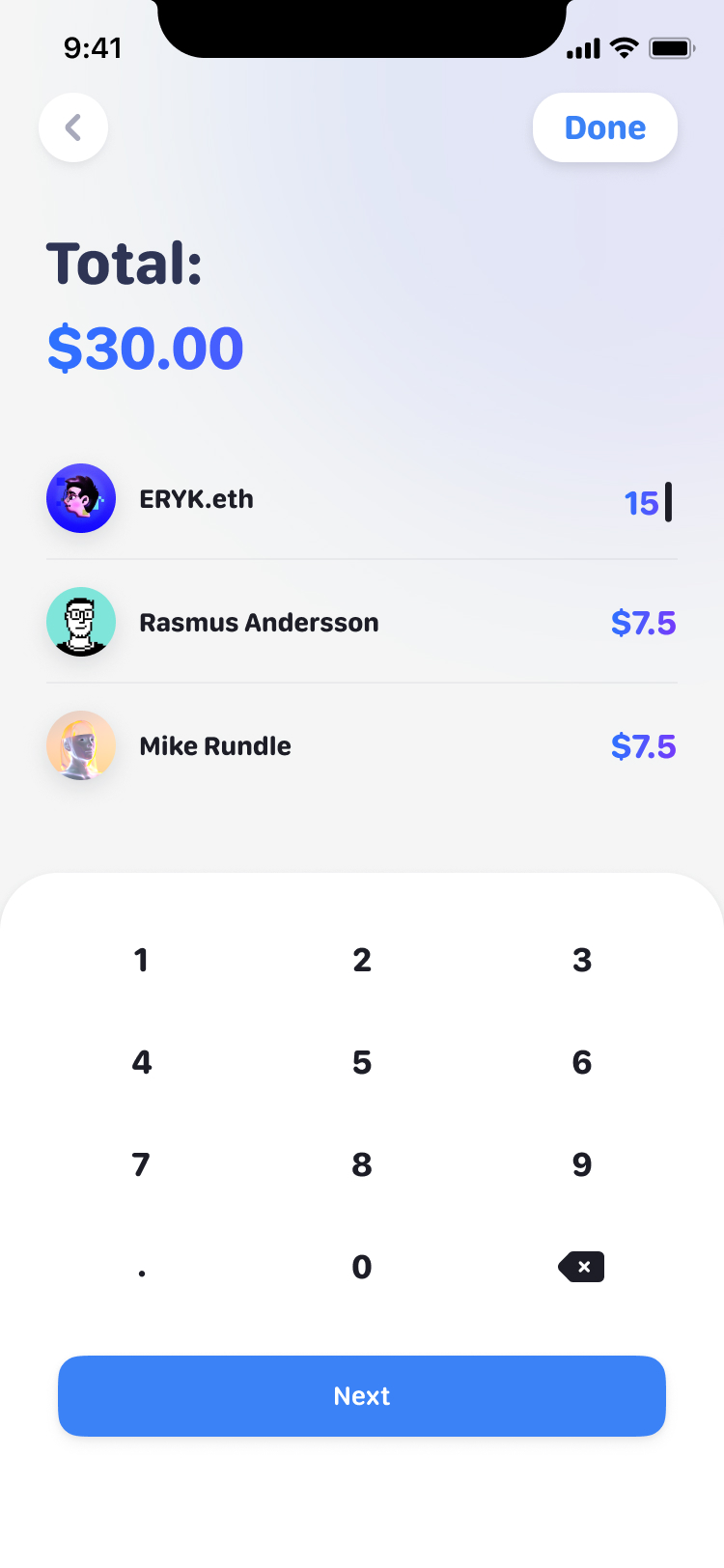
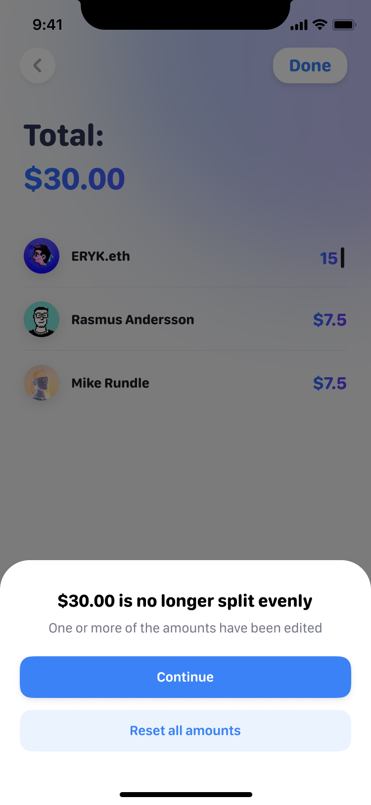
Splitting a bill starts even. Change anyone's share and the app says it's no longer split evenly and offers to reset it before you slide to split.
Getting paid doesn't need the app
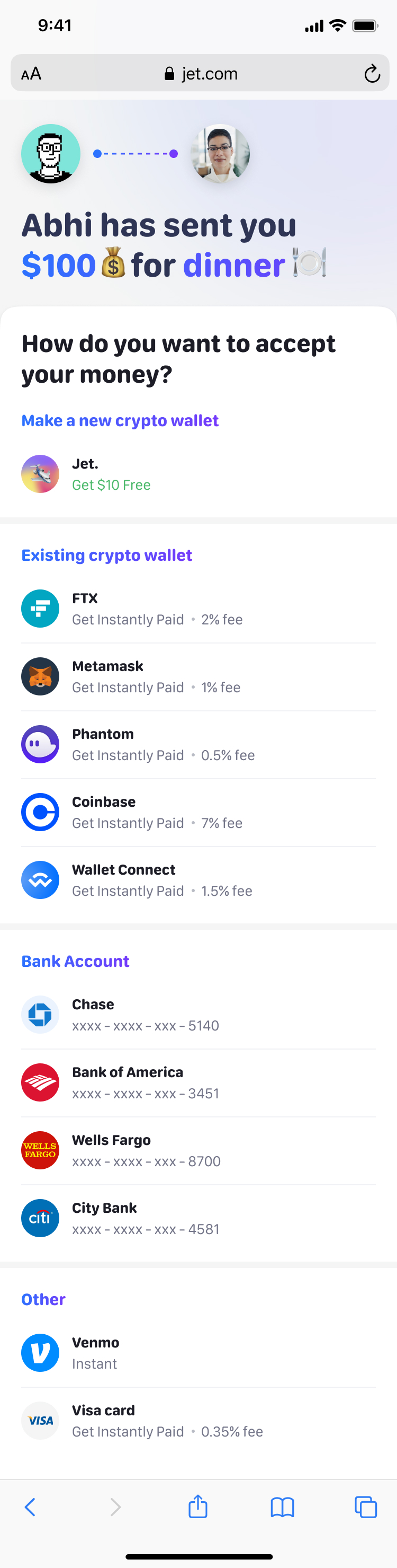
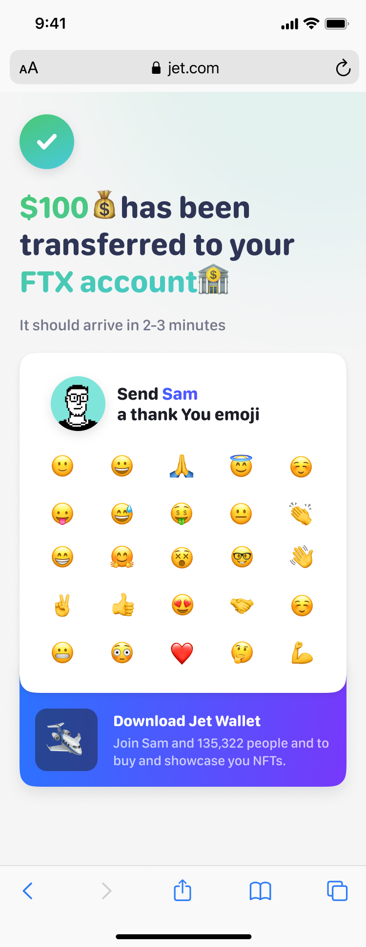
Accepting money happens on a web page at jet.com. The recipient takes the money into a new Jet wallet with $10 free, or a wallet or account they already have, each with its fee beside it, and can send back a thank-you emoji.
The components had to survive the handover
On the last day Julian noticed the payment modals' buttons were 10px taller than the design system's and asked before fixing them. Prakash answered with three sizes, 64, 42 and 32, and Julian rebuilt the P2P screens on them before the file went over. The shared system had to hold through those last changes, so the next person working on Jet would inherit components rather than a collection of similar-looking screens.
More from Jet