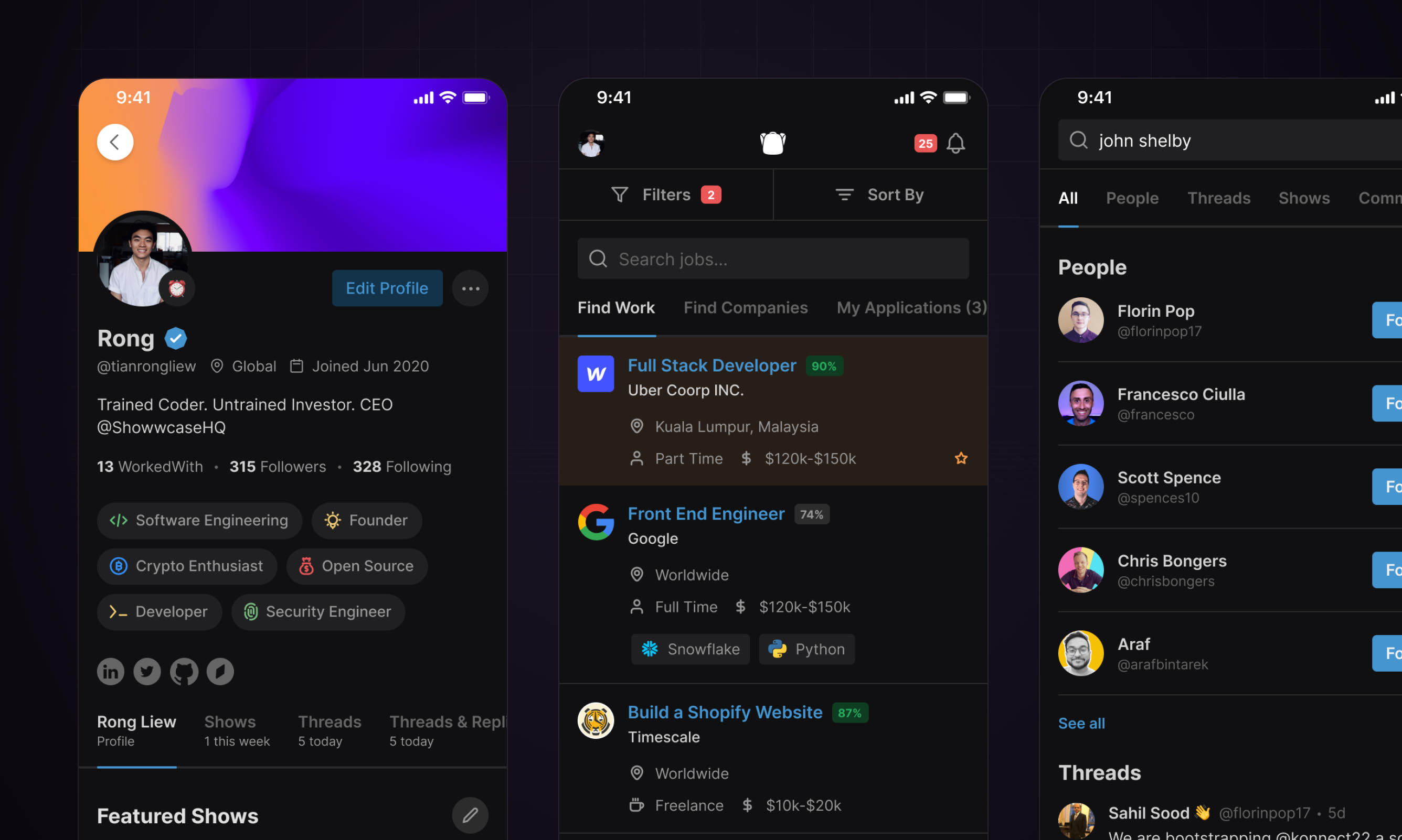
Showwcase is a professional network for developers. A developer keeps a profile that works as a portfolio, publishes Shows (articles, podcasts, videos and projects), joins communities and finds work. The same person might be publishing a project, finding collaborators and looking for their next role. We needed those activities to feel connected across web and iOS.
We were Showwcase's design partner from September 2021 to May 2022, working with co-founder and CEO Rong Liew. Rong brought the product direction, wireframes and notes. We worked through the interaction and interface with him, across onboarding, chat, hiring, teams and publishing. A recurring question shaped the work: how much could we assume of an audience that spends its working day in software?
Developers wanted it to look like their own tools
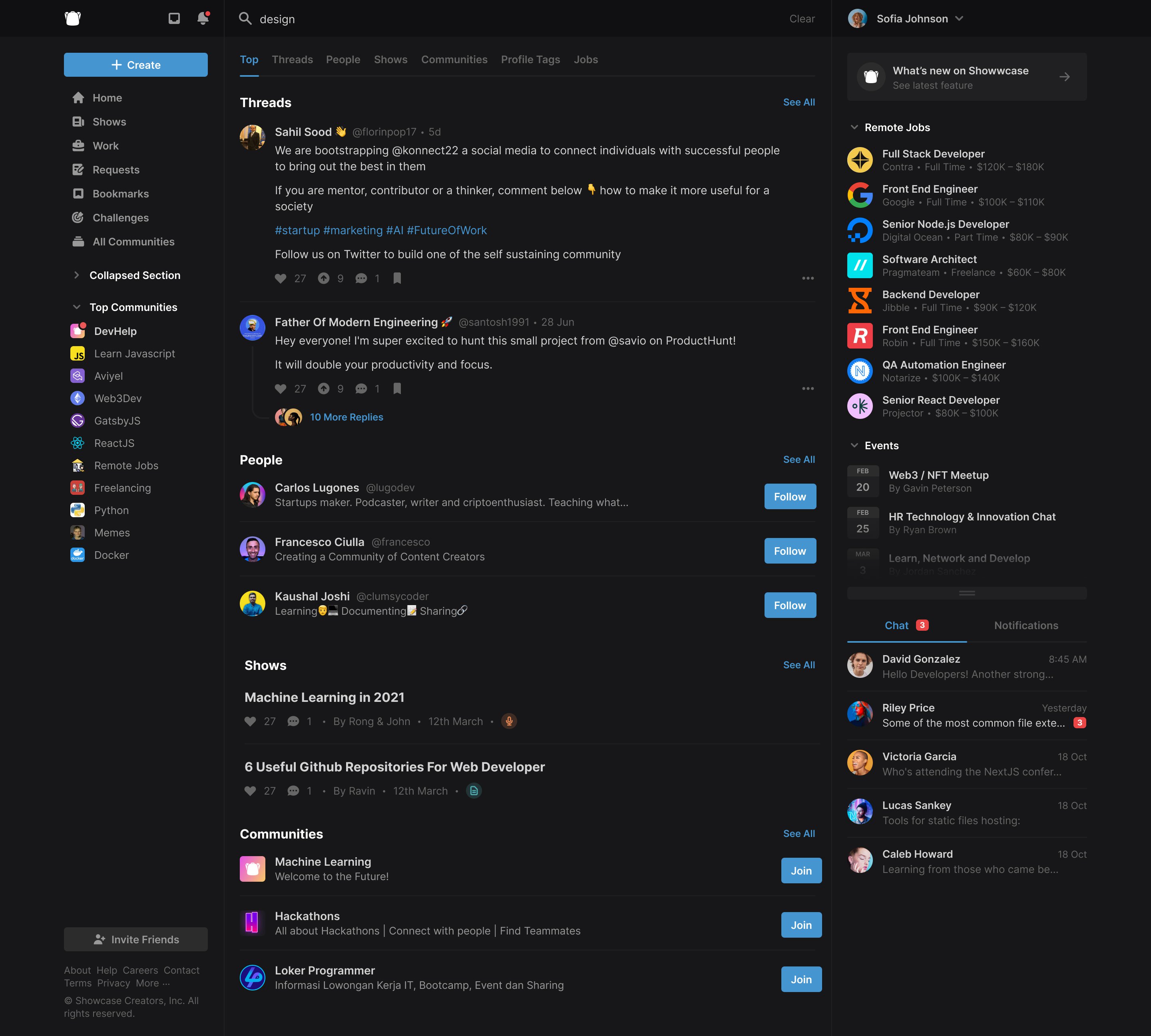
After an early call, Rong's feedback was that the designs felt "really designery". I agreed. We're designers, so of course we liked them, but the audience wasn't us. A week later he sent a mood board of what his users have open all day: GitHub, Stripe and its API docs, Discord, Superhuman. Our screens looked like Twitter, I told the team, and a developer should be able to glance at Showwcase and know it was built for them.
The references made the problem concrete. We were leaving too much space between information developers expected to see together. GitHub used around half the panel padding in our early designs. We could reduce that space, make the text smaller and let the interface carry more information without explaining every convention from scratch.
Put conversations beside the work
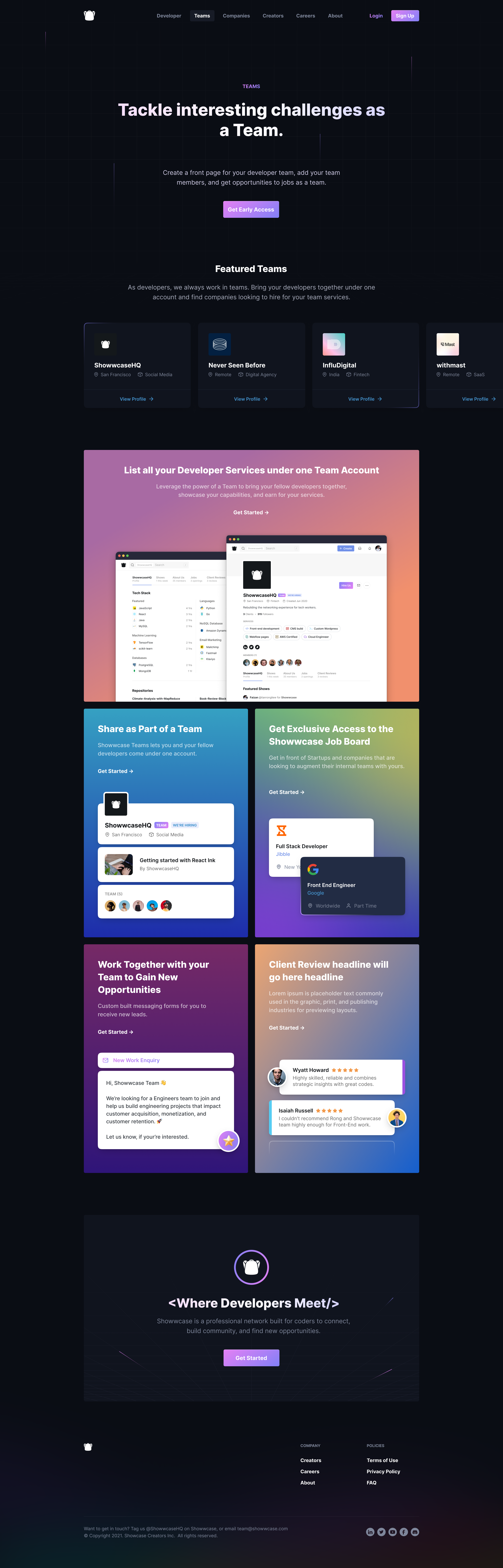
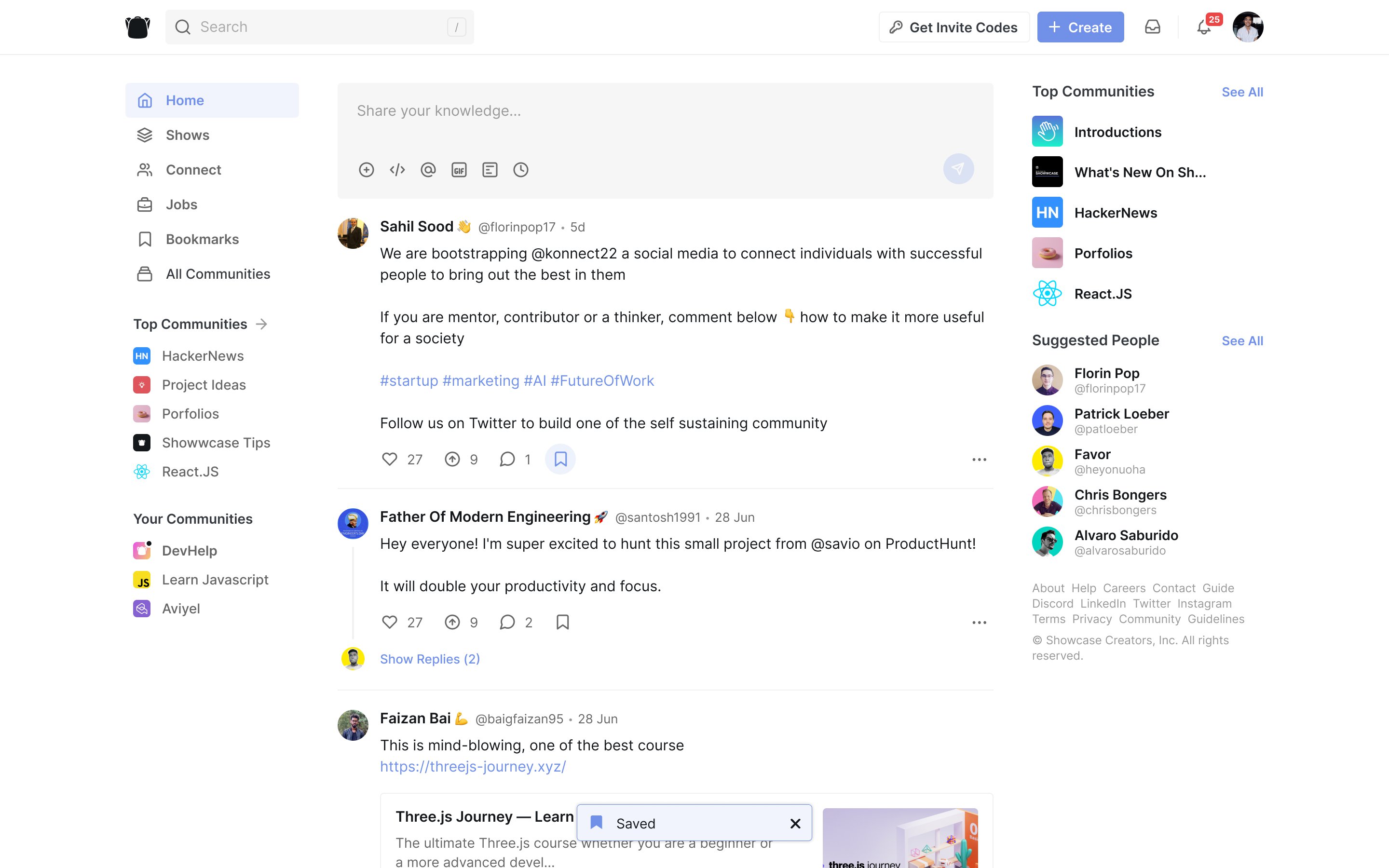
Rong and I put one developer's Showwcase profile next to the same person's profile on a rival network, and the rival's had far more character. Showwcase ran on a washed-out corporate blue, black and Inter. Swap the logo for Apple's, I said, and it could have been theirs. We carried a little of the new landing page's personality into the product: gradients on a few headings and dividers, a highlight font on some titles, nothing louder.
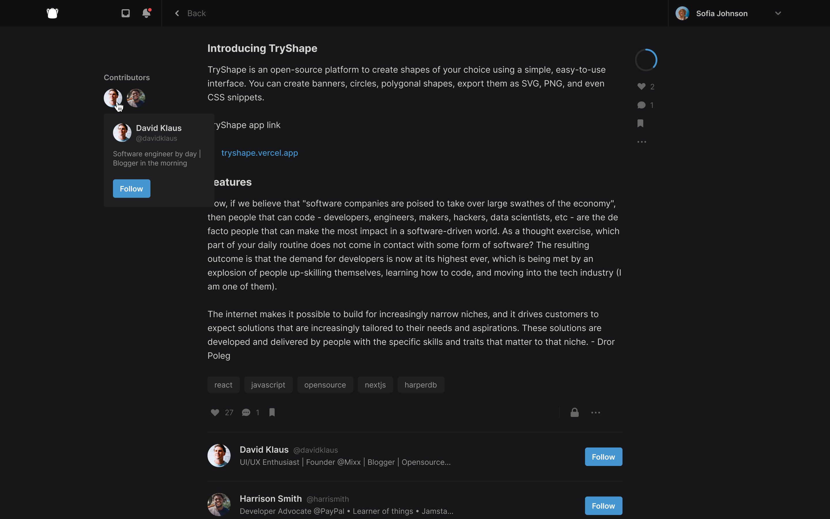
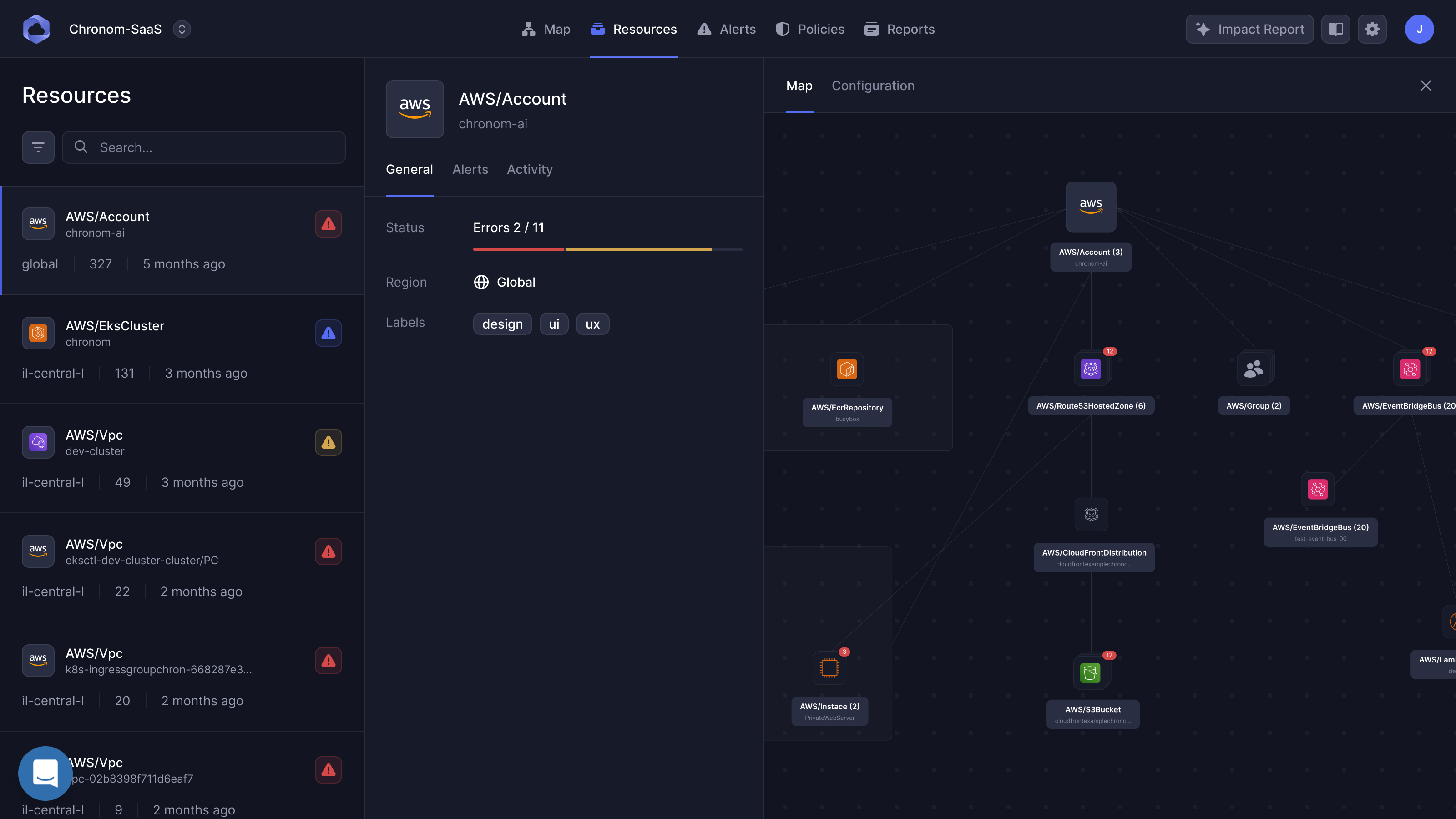
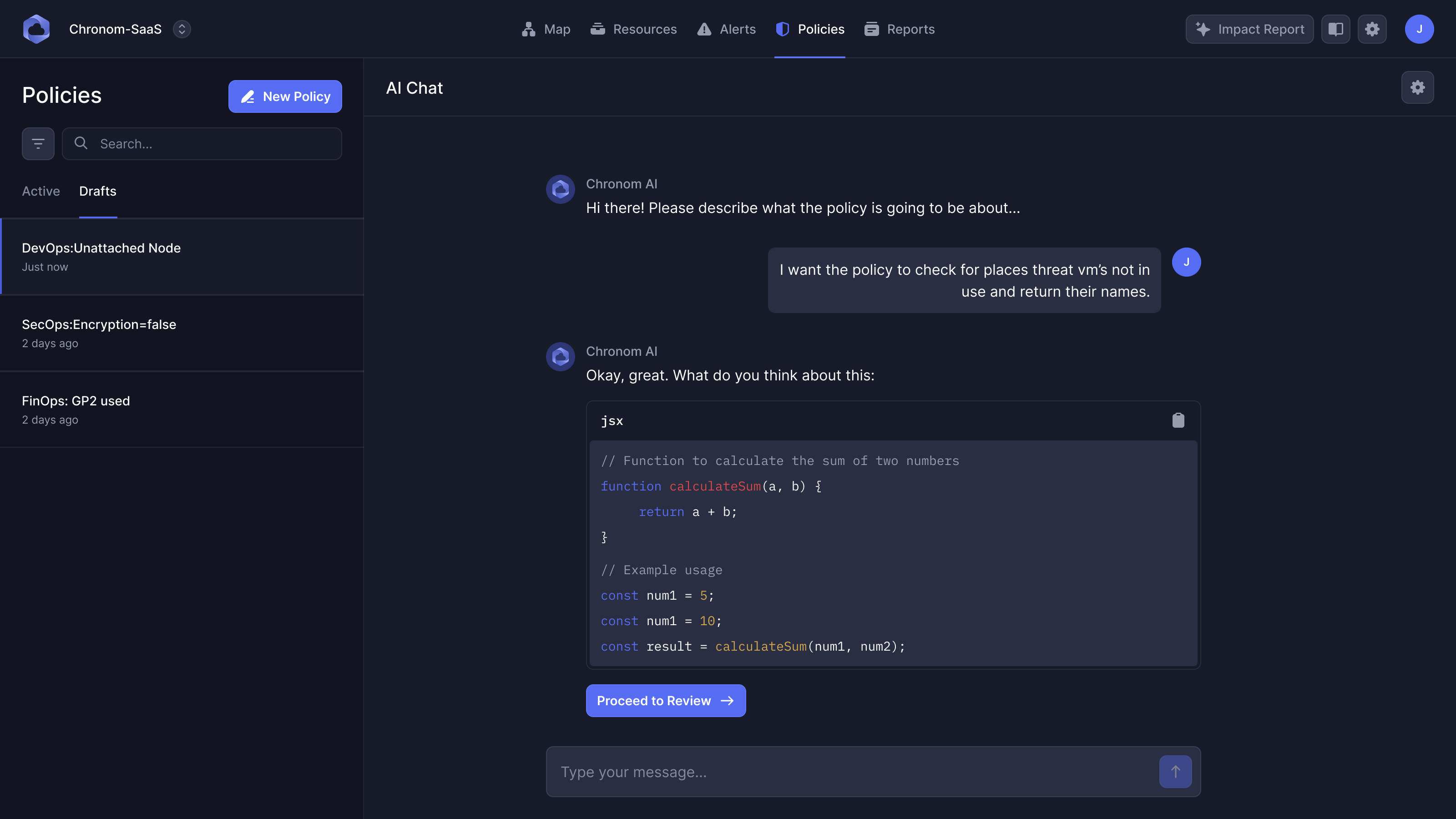
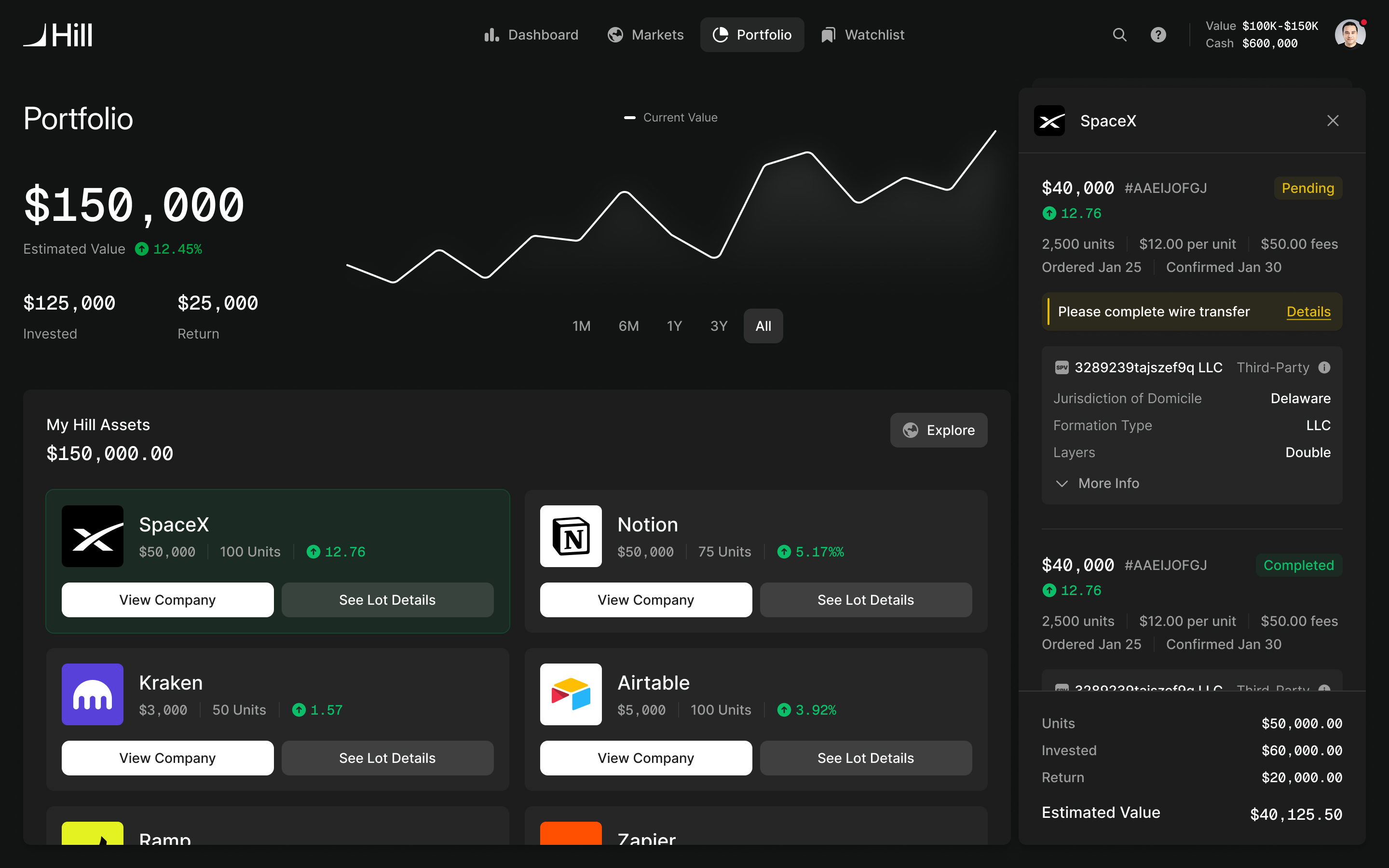
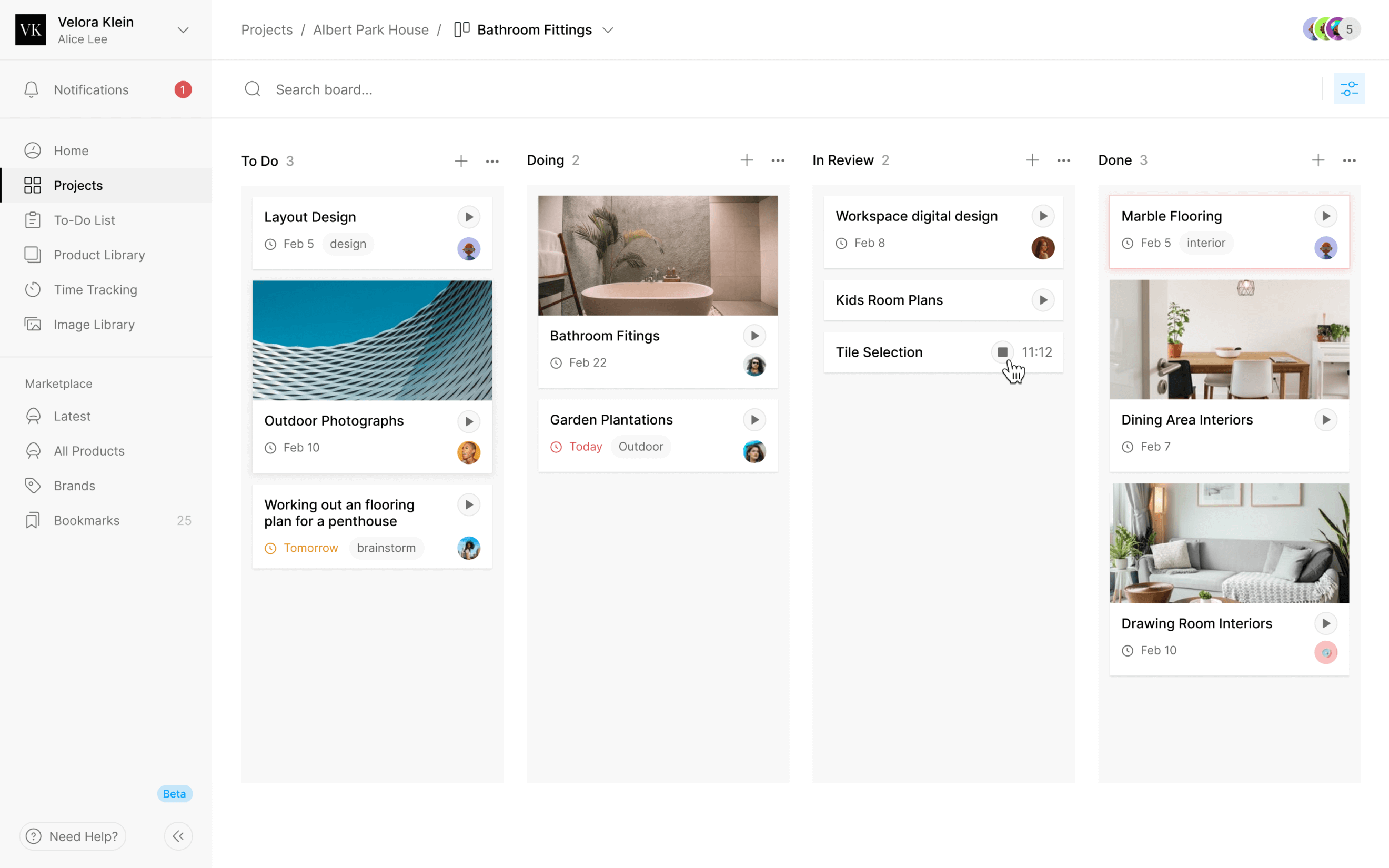
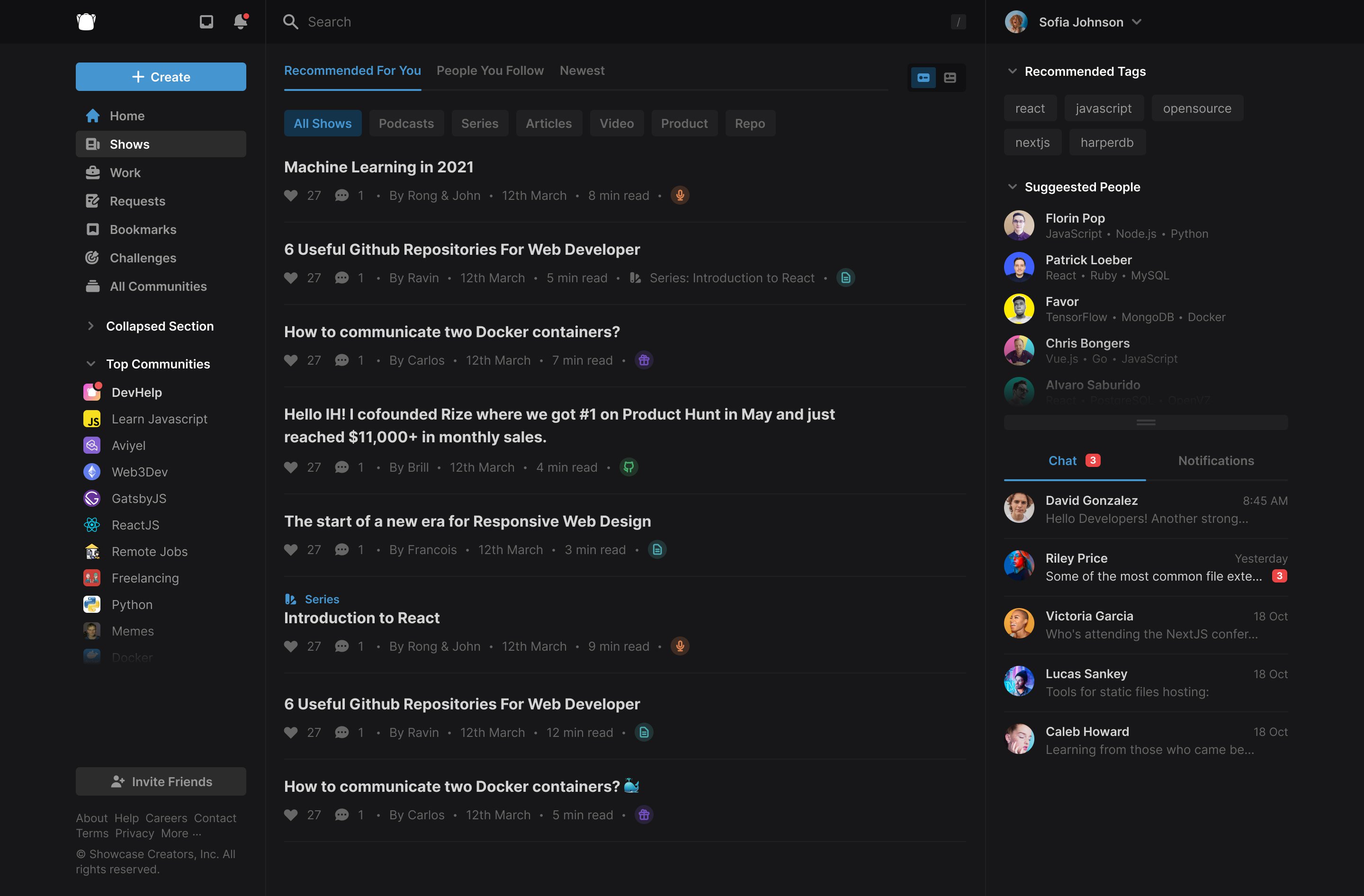
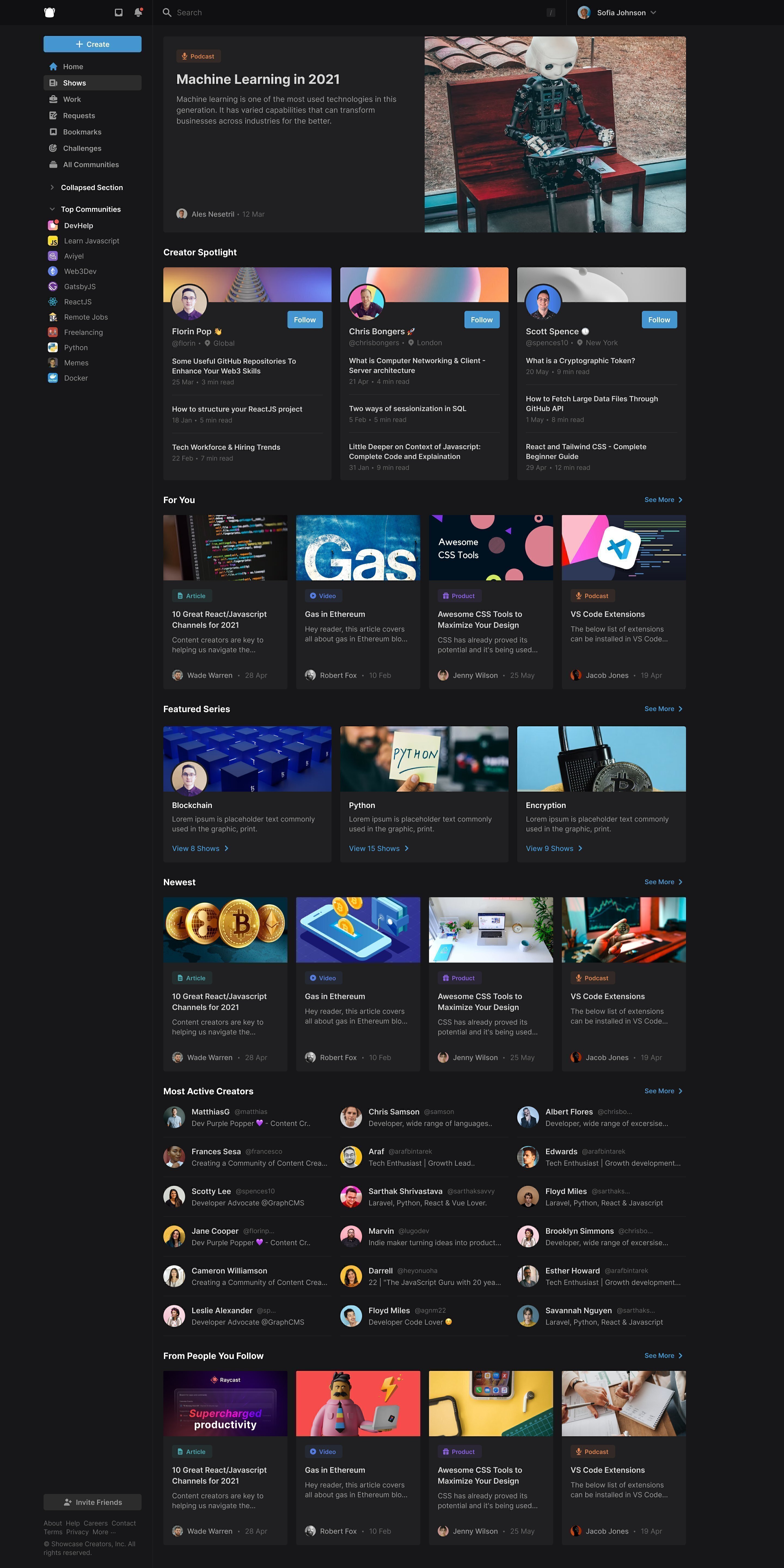
Around then the product went dark-first, and we borrowed from code editors: text down from 16 points to 14, small solid icons, and threads opening as pop-ups so you could glance at one and keep scrolling. The right sidebar took the panes developers split their editors into, with chat and notifications under a draggable divider. The pane structure kept conversation within reach while someone browsed or read. On a wide screen, making chat a separate destination would have meant moving away from the activity that prompted the conversation.
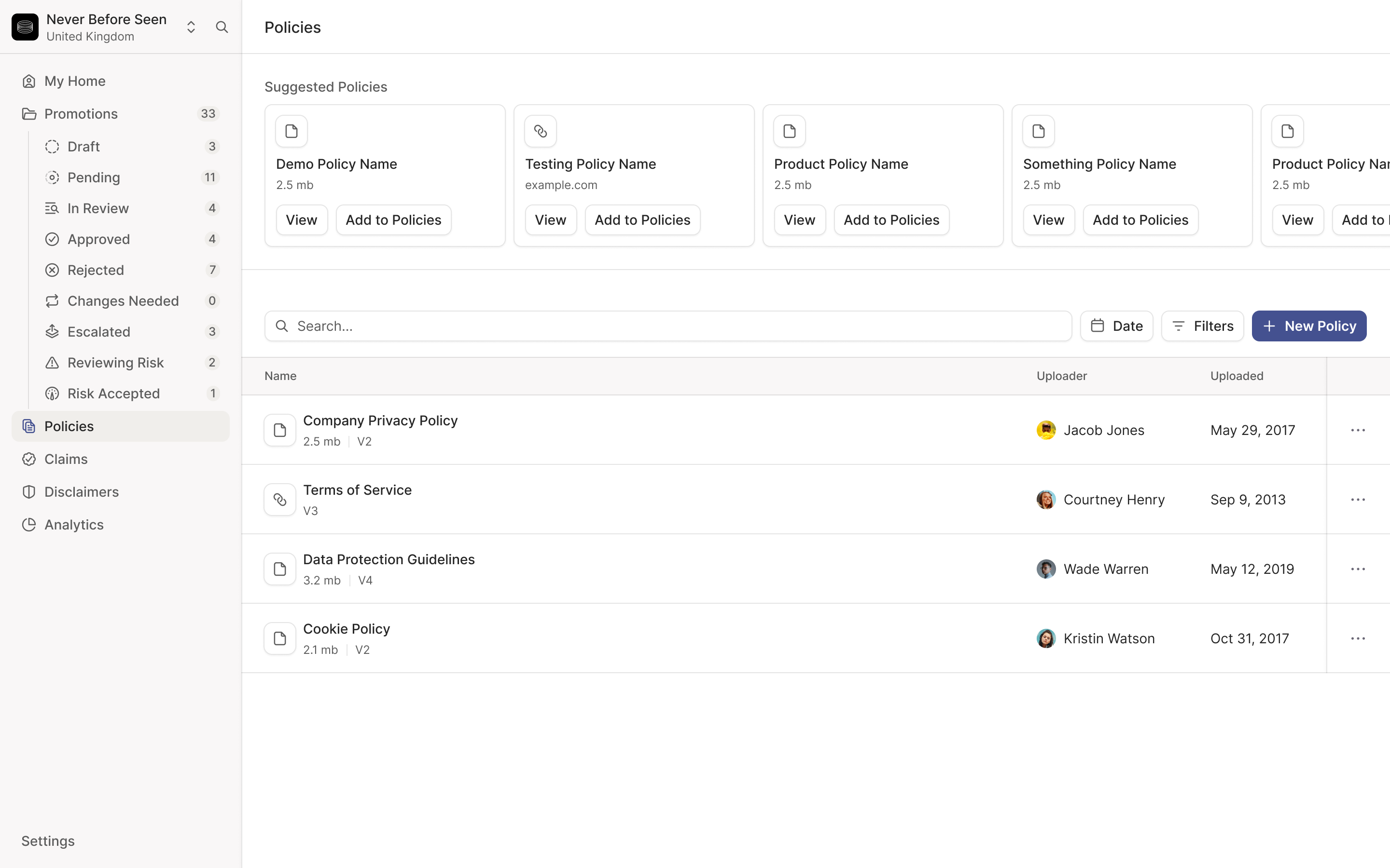
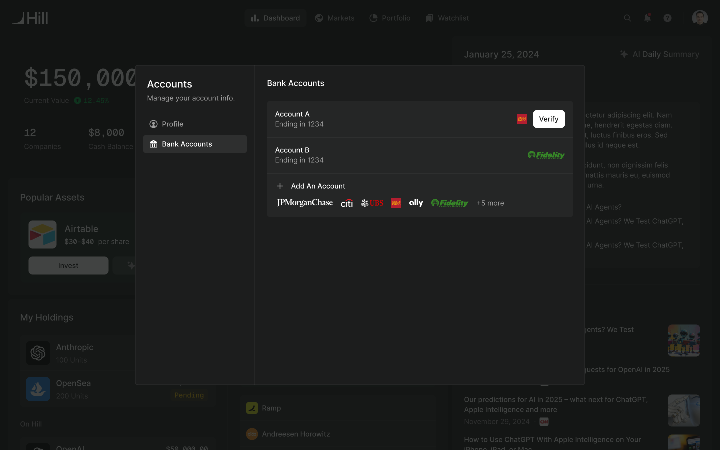
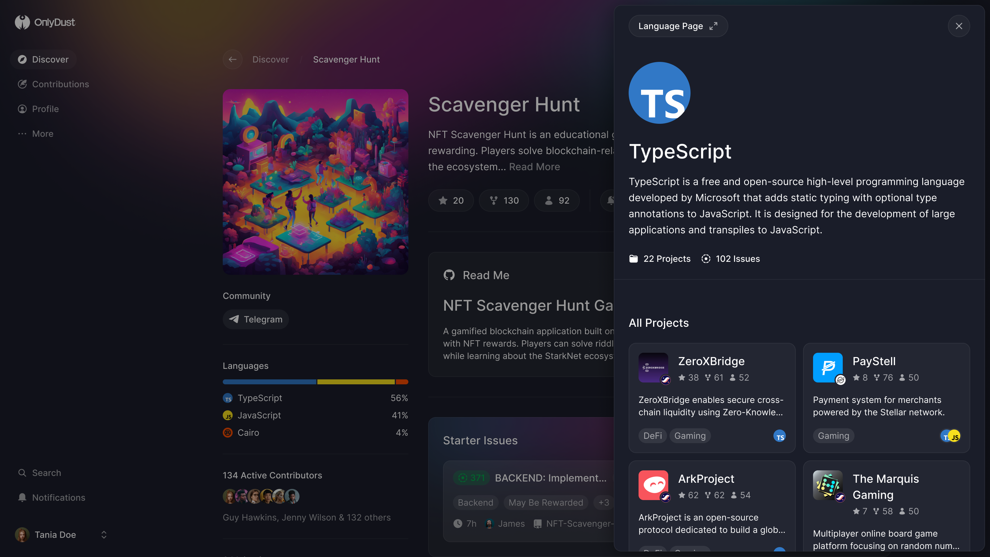
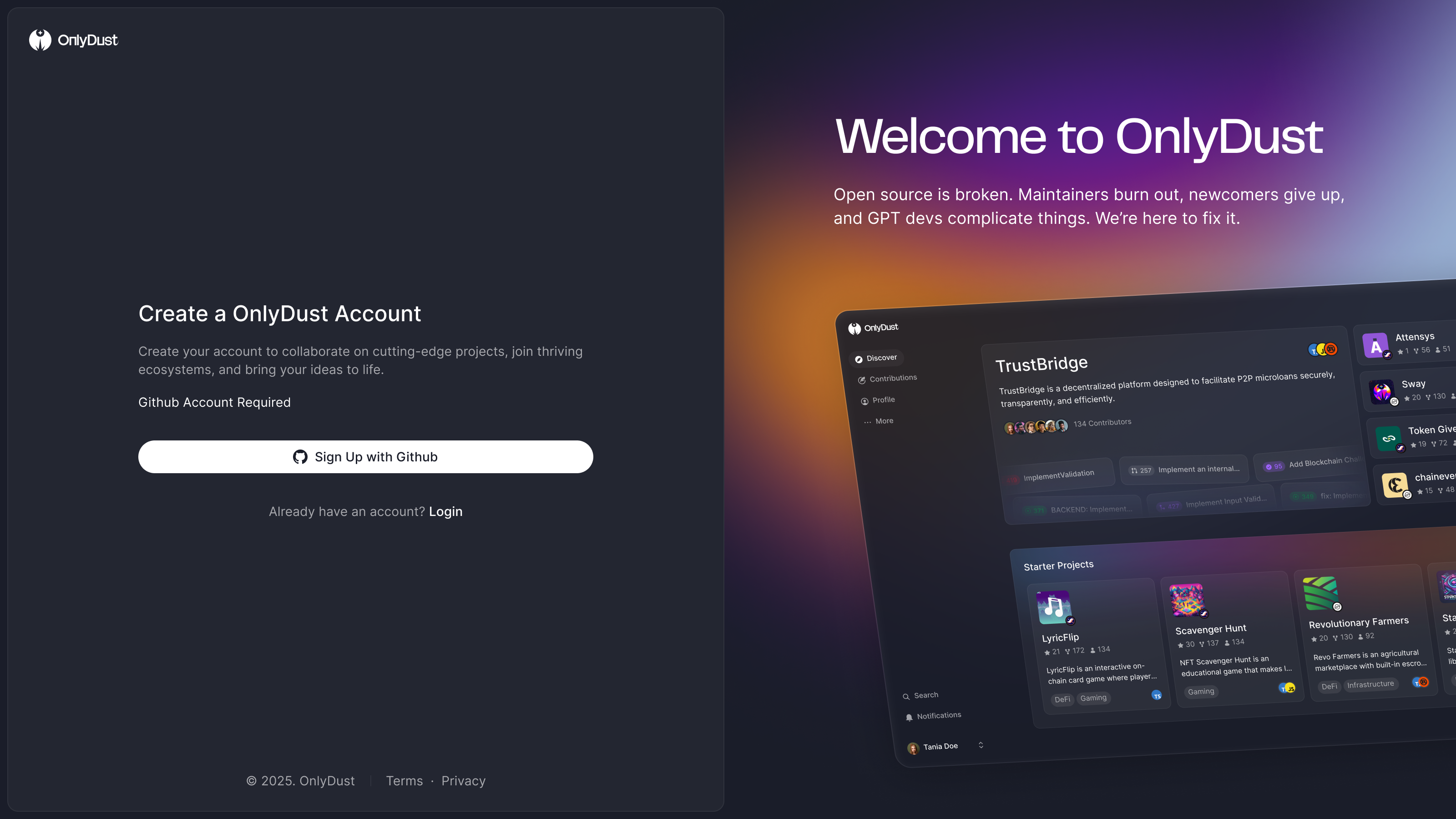
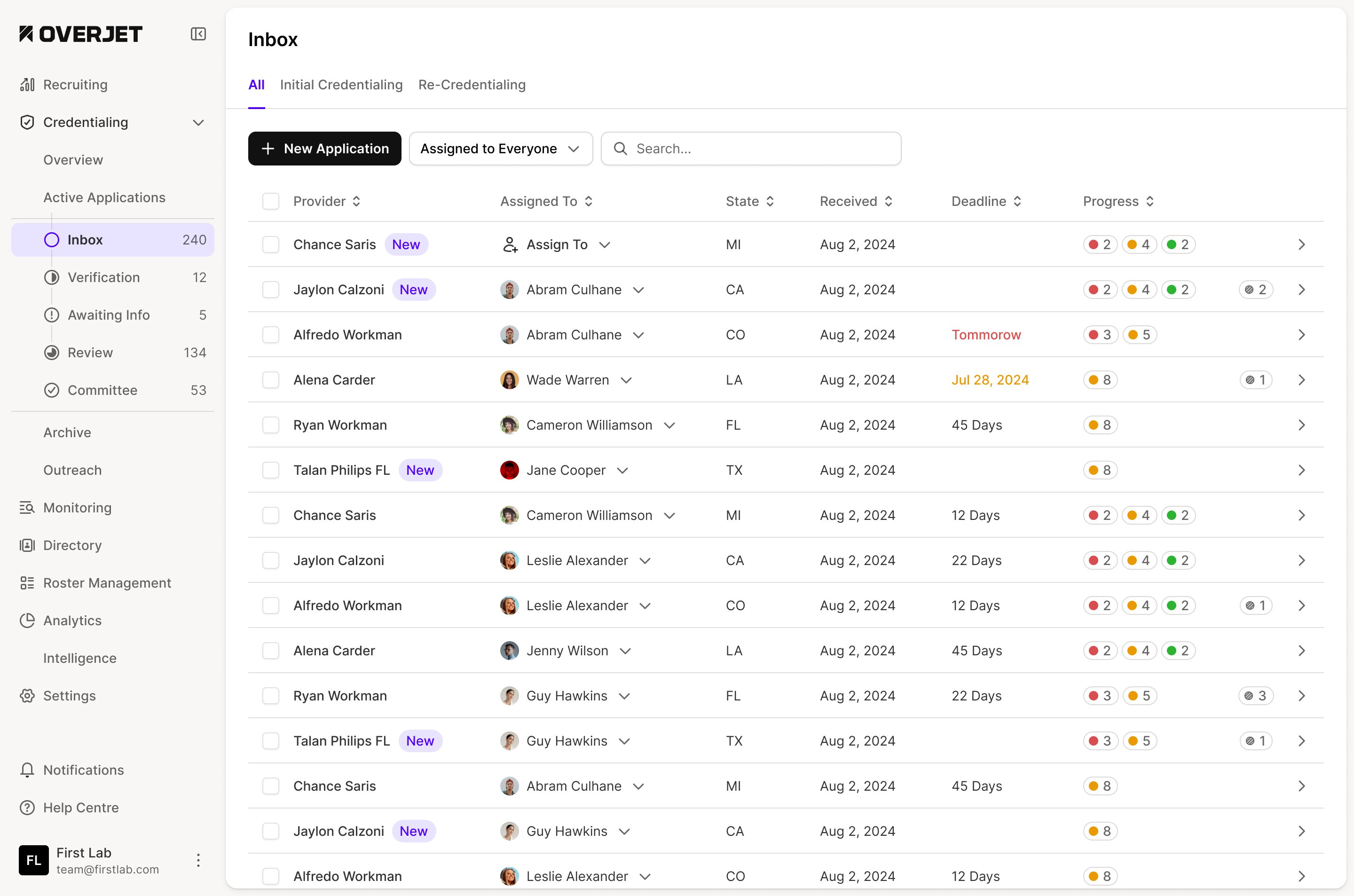
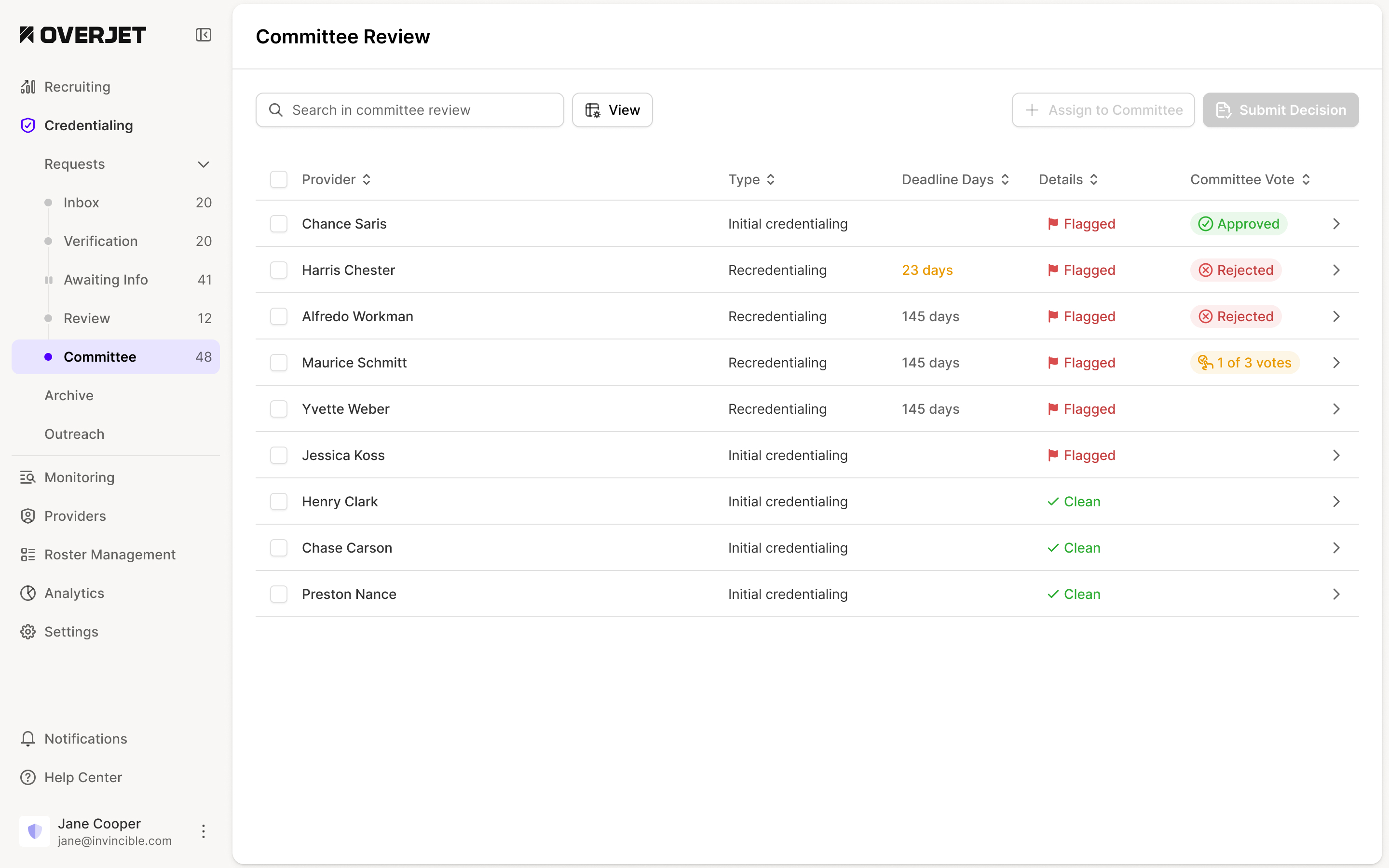
The change also had to fit an active product. We converted a section when we next worked on it, rather than stopping feature work to redraw every screen. That left a period when light and dark designs coexisted. The screens here show both generations.
convert each section when it next needs work
A new profile shouldn't open empty
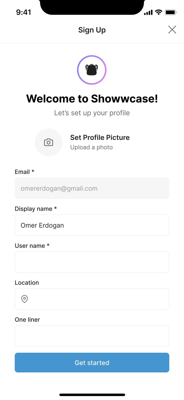
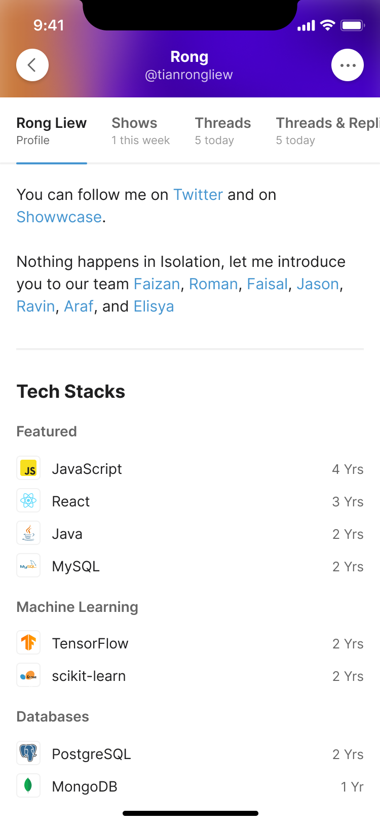
New users landed on an empty profile. We gave the first visit a progress meter asking for any five sections, and empty states that showed what each section would look like once completed. The prompt could explain the value of adding something, rather than leaving a person to work out what belonged in a blank box.
Worked With needed particular care. This was a record of people someone had actually worked alongside, with a request accepted by the other person. It could help developers find former colleagues and give employers a way to discover people who already knew how to work together.
We brought that connection step into profile onboarding, with search and connected-contact suggestions. I asked for a target of around five connections, but kept the Done action available throughout. A new developer might genuinely have nobody to add. Making the target compulsory would turn a useful prompt into a barrier for exactly that person.
the connection goal leaves room for people starting out
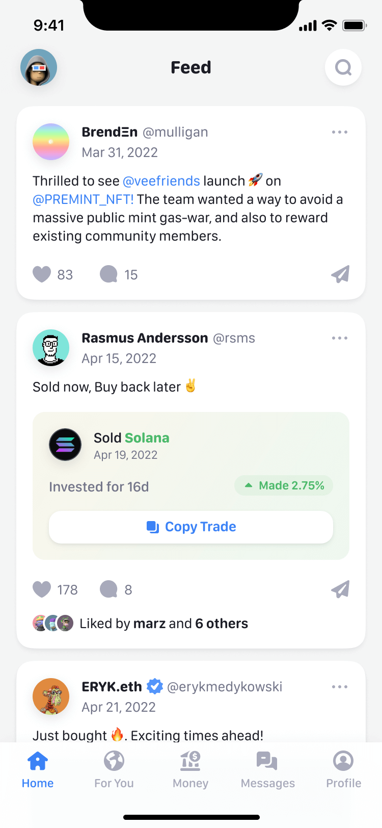
Feed onboarding had a different job. Interests, people and communities gave someone material to read on their first visit, while profile onboarding helped them build something other people could find.
Let people meet without giving strangers the inbox
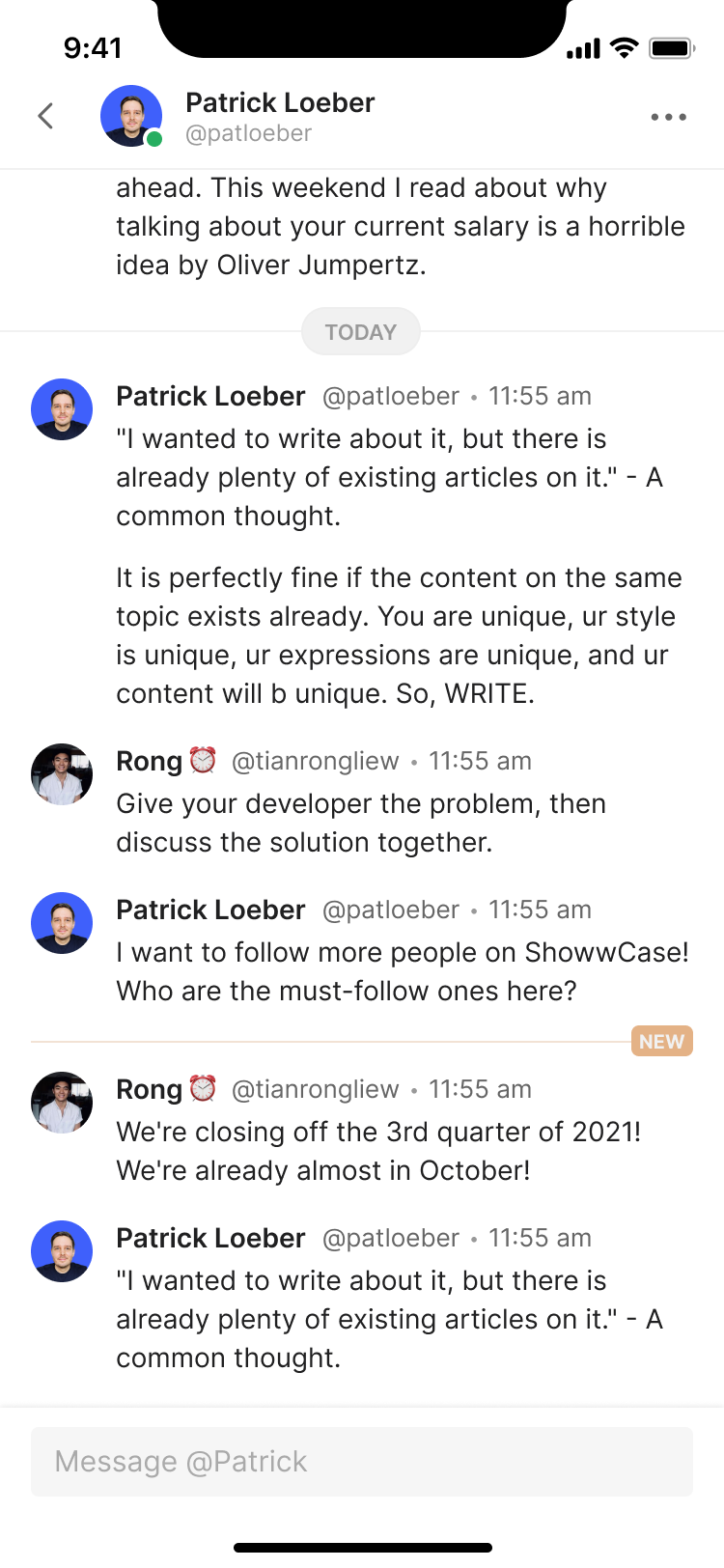
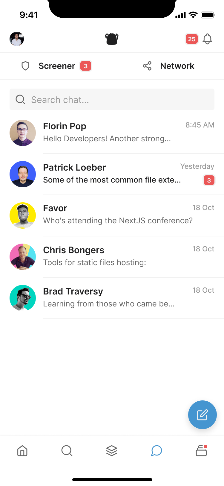
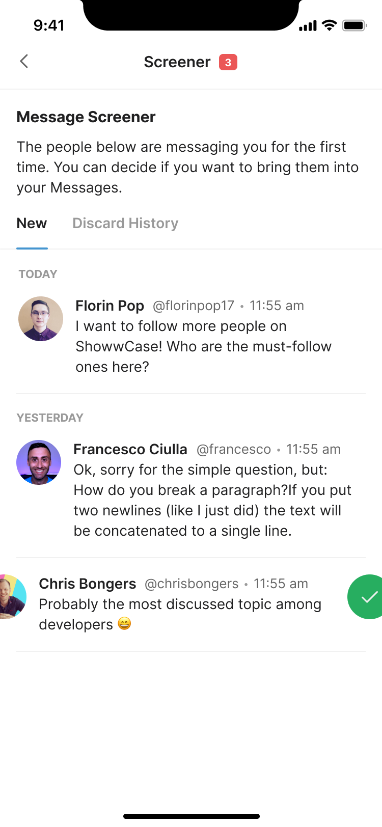
Anyone on Showwcase could message anyone else. The chat brief borrowed from Discord and Slack and left one question open: what to do with messages from people you don't follow. What came back was the Screener, where a first message from a stranger waits until you approve or discard it. Reason to Reach Out added context before the recipient had to decide: you choose what people may contact you about, like collaborating on an e-book, and anyone writing to you for the first time has to pick one, which the Screener shows beside their message.
Hiring on a network with no borders
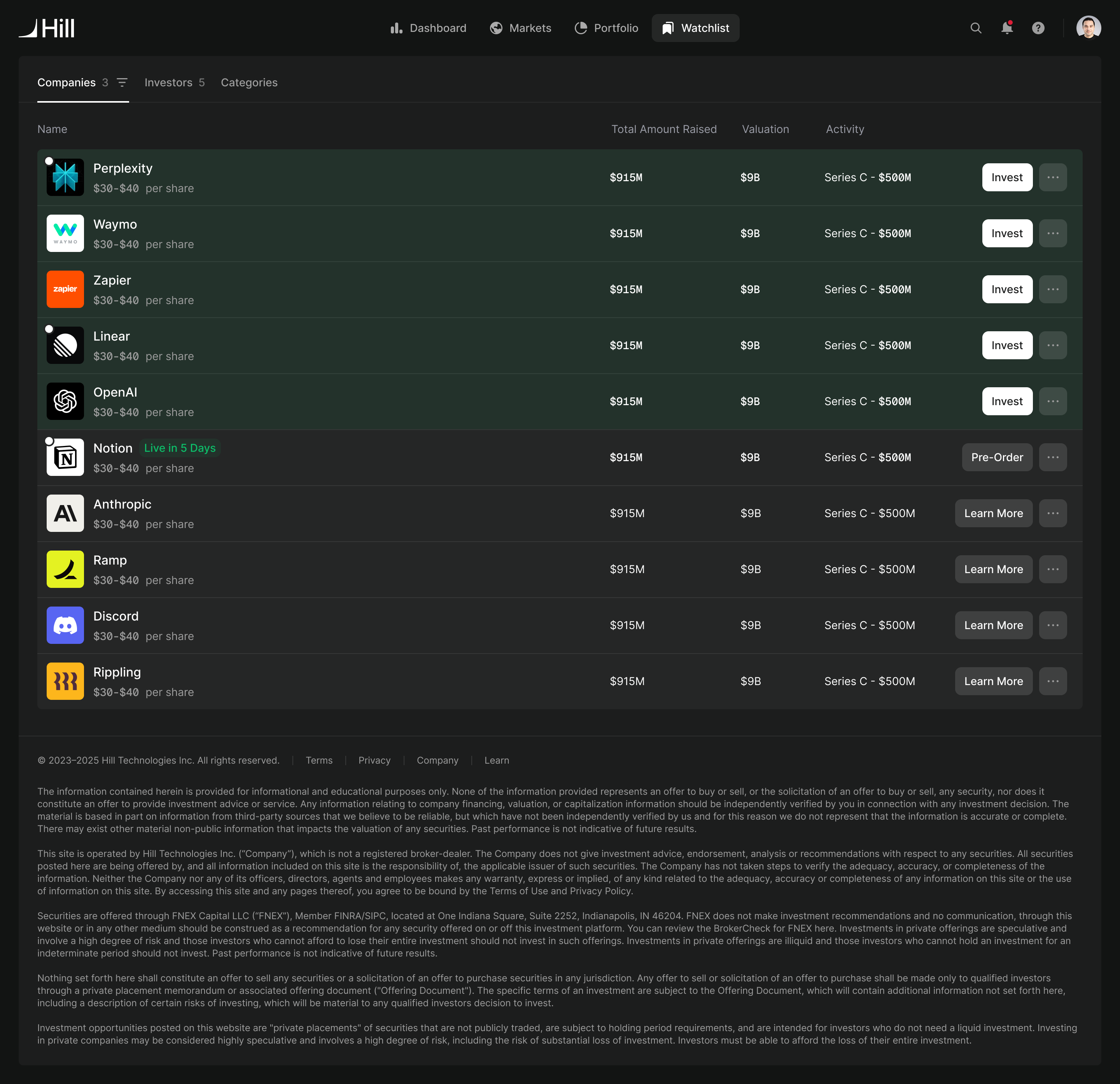
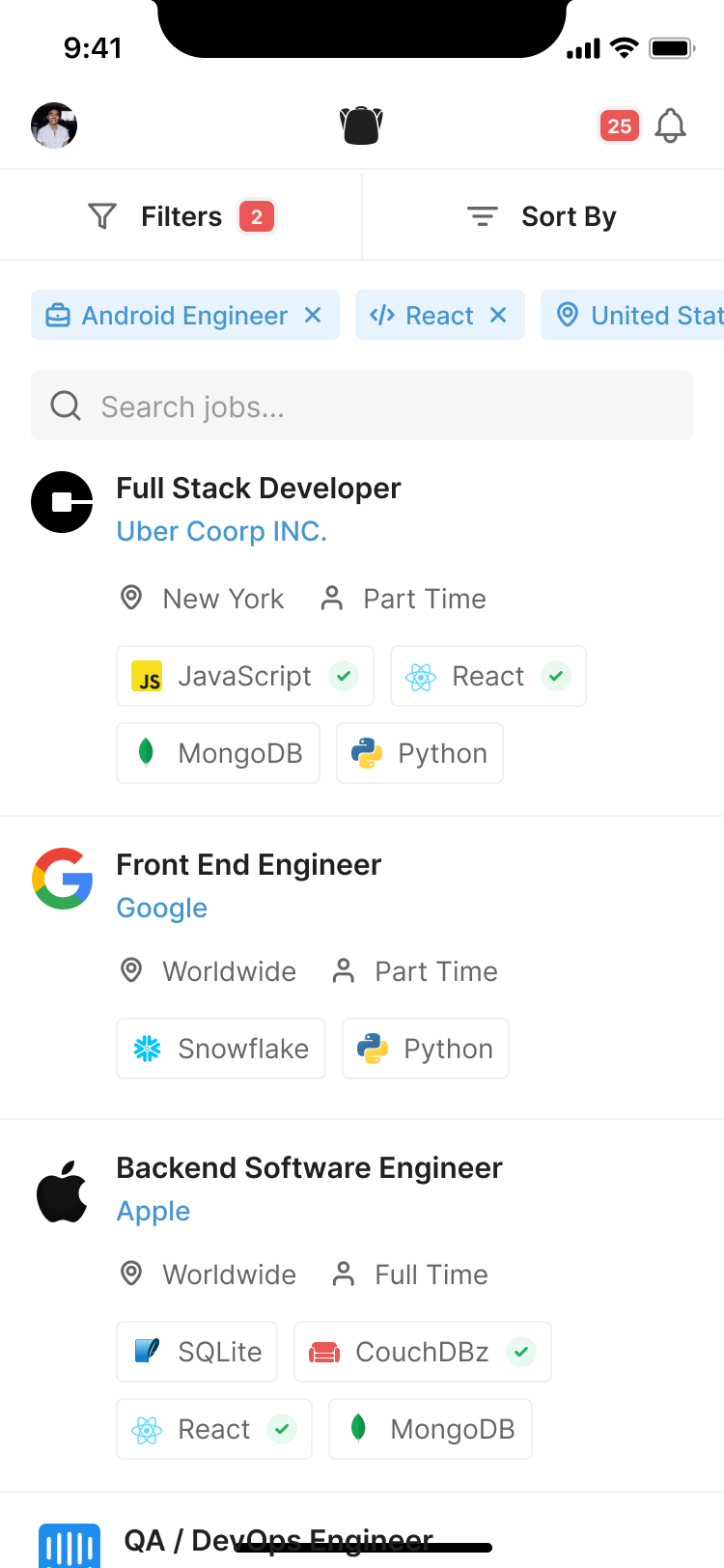
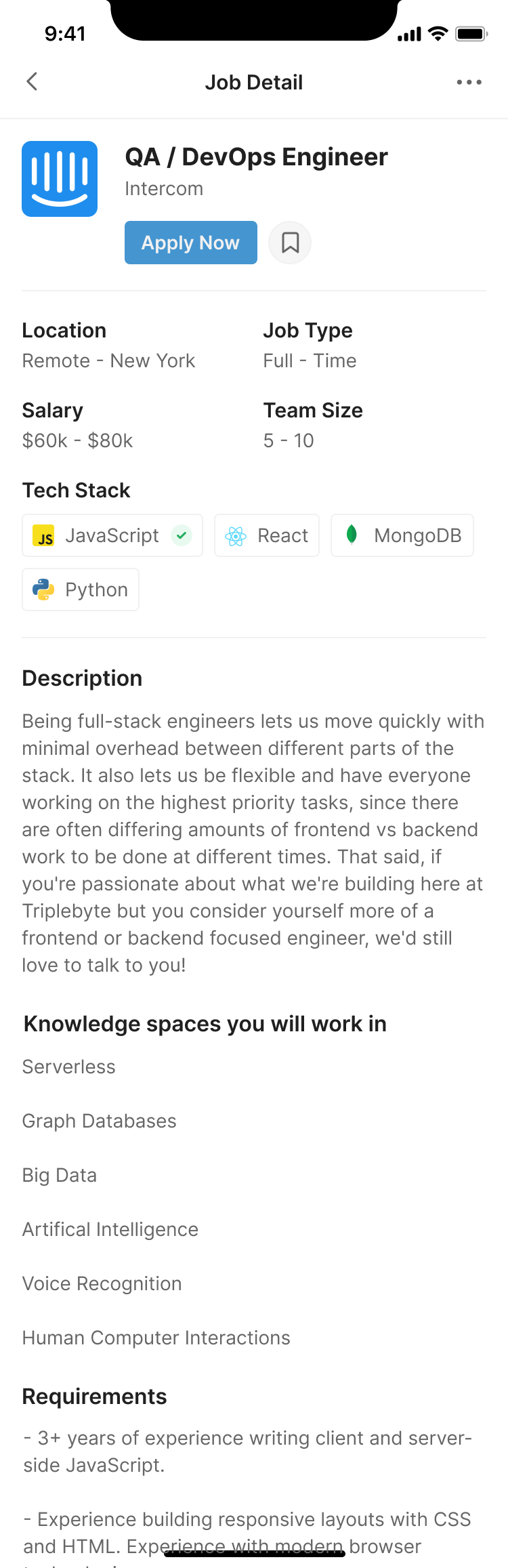
We designed an employer portal with its own accounts. Three weeks later Rong brought Teams, which overlapped with most of it, and we scrapped the portal for a model like Dribbble's: anyone can post a job and attach it to a team or a company.
On the employer side, I proposed a cross and a star for the first pass through applicants. A cross sent someone to Discard history; a star sent them to Shortlisted. Matching the star on the action to the star on the destination made the relationship visible. Profile and message actions could take less space, because this pass was about deciding who deserved a closer look. That was our product suggestion to Rong, rather than a requirement he had handed over.
shortlist and discard stay fixed; employers can organise their own stages around them
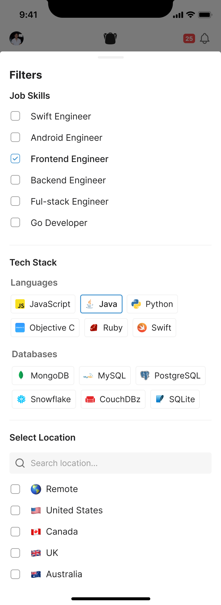
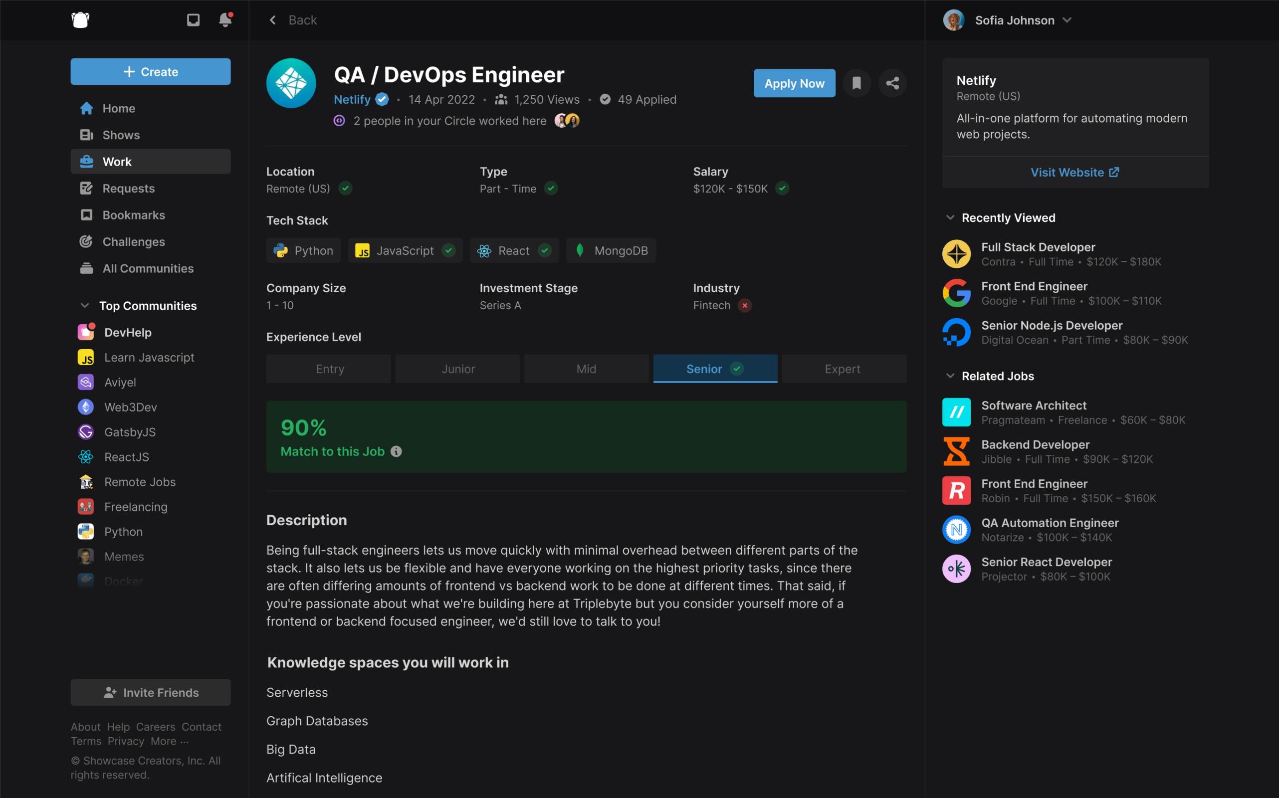
The candidate side started from Triplebyte's job preferences, which narrow location down to parts of San Francisco. Showwcase is fully remote and didn't want to encourage US-only hiring, so location became a map where you tick the time zones you'd work across. Worked With shows how many people in your circle have worked at a company, and later jobs gained a match score, which also became the upsell to Showwcase's talent subscription.
A team page to replace the team's website
A team already had much of the material needed for a website inside Showwcase: members, published Shows, jobs and GitHub repositories. The team page brought that together with its tech stack and a guest book. Keeping those things on one page gave visitors a way to understand the team through its work and the people doing it. Custom domains gave individuals a way to use their Showwcase presence as their own site.
Help people discover work they weren't searching for
Among the last things we designed was a magazine-style Shows screen with the App Store as its reference: a rotating banner, a spotlight on three creators, collections curated by Showwcase and the most active creators. Around it went paywalls, one-off purchases and ads on free content.
On the phone, those recommendations needed a home of their own. The desktop had a right sidebar for suggested people, trending Shows and remote jobs. Narrowing the layout would lose that whole part of the product. We turned Search into Discover, modelled on Medium's discovery page, and moved those recommendations there. Someone could browse for something interesting before they knew what to type into a search field.

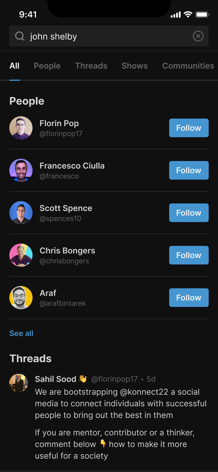
the desktop sidebar becomes a destination on mobile
More from Showwcase