Astra finds security holes in software before attackers do. A company points it at a web app, an API, a mobile app or a cloud account, and Astra's security engineers attack it by hand while a scanner checks it continuously. The dashboard is where customers start those tests, follow them and fix what they find.
Co-founder Ananda Krishna called us in January 2024. The dashboard worked, but it had been built for reading reports, and Astra was about to add scanners for cloud accounts and APIs. He wanted it reimagined rather than reskinned, and to make up for how tedious security is for the developers who do it. I asked for two weeks of workshops before anyone drew a screen, then four weeks of design. We were Astra's design partner through to mid-March, module by module in Figma, while Astra's engineers built it on shadcn and Tailwind. Astra brought the page list, the data models and its customer interviews.
A pentest has more moving parts than a scan
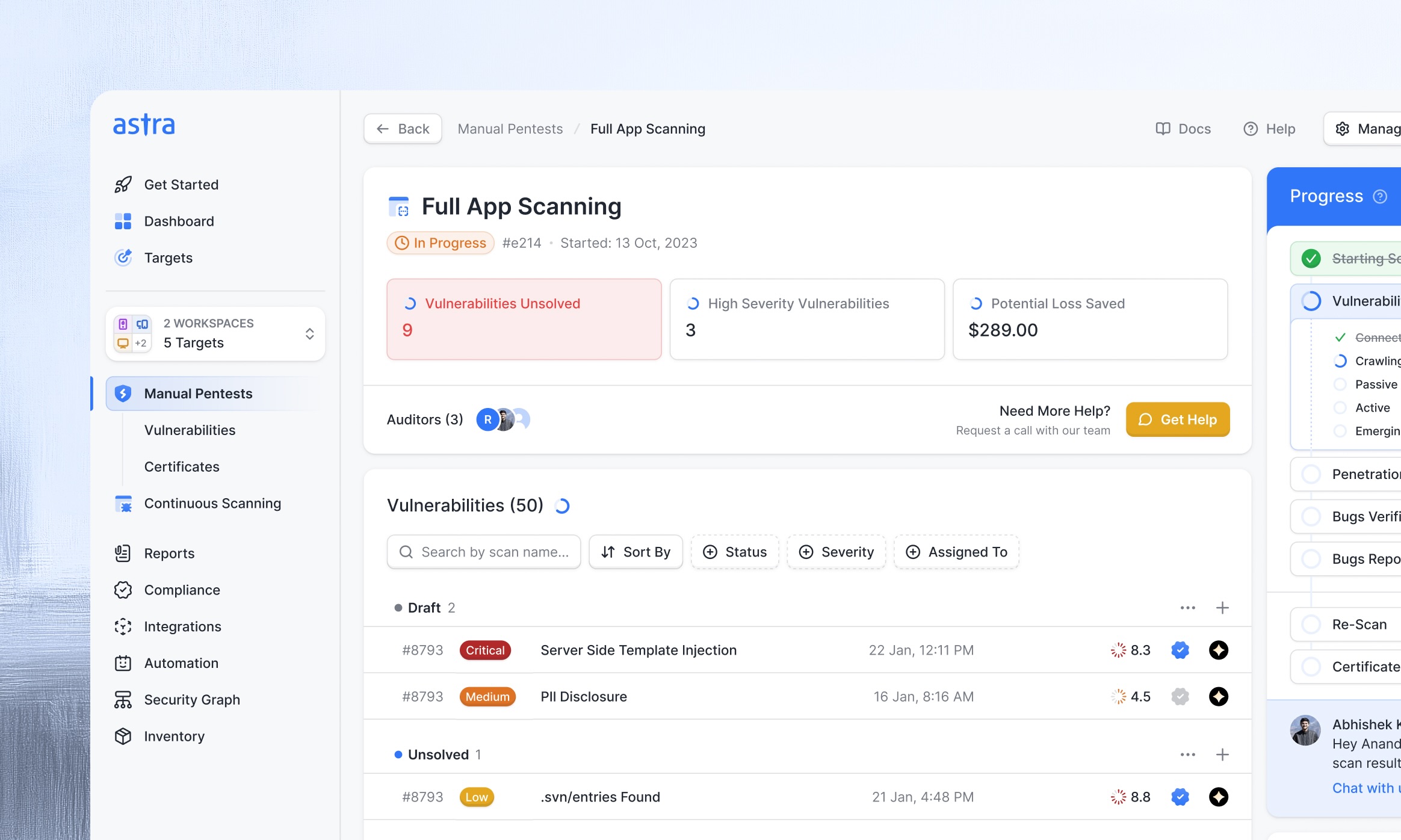
A manual pentest has a start and an end. It opens with an automated scan, then Astra's pentesters work through 50 to 100 test cases by hand, and their findings go through peer review. The customer fixes what they can and asks for a rescan, one or two of which come with every pentest.
Continuous scanning has no end. The scanner checks a target against around 9,000 kinds of vulnerability, on a schedule, by hand or from a CI/CD pipeline on every deploy.
And customers rarely run one of anything. A typical pentest customer tests two or three web apps, an Android app, an iOS app and a cloud account as separate targets, often in the same month. The old dashboard was organised by scan, so that customer had six places to look for their vulnerabilities.
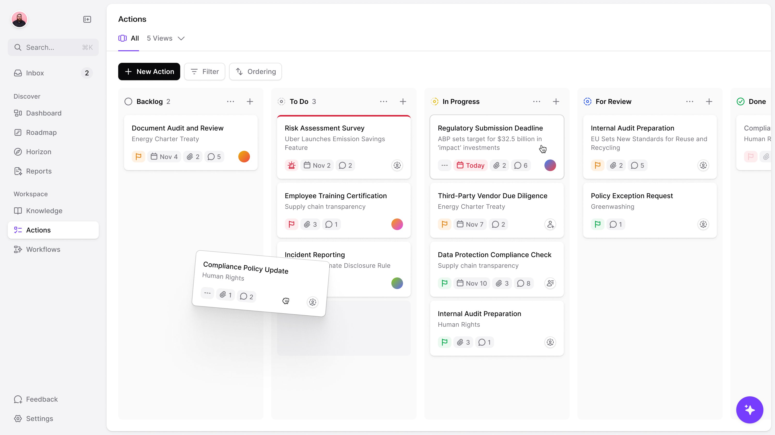
Our first concept got this half right: a dashboard per target, with everything unsolved across its scans. Ananda and Saurabh Miglani, on Astra's side, pointed out that the customer with six targets still had six dashboards. So targets became a shared filter for the testing views instead. Pick one, a few or all of them, and the scans and vulnerabilities narrow to match. Pentests and continuous scans got their own sections in the navigation, since they have different stages and buttons.
six targets should not mean six places to check for open vulnerabilities
Bring the findings together, keep their context
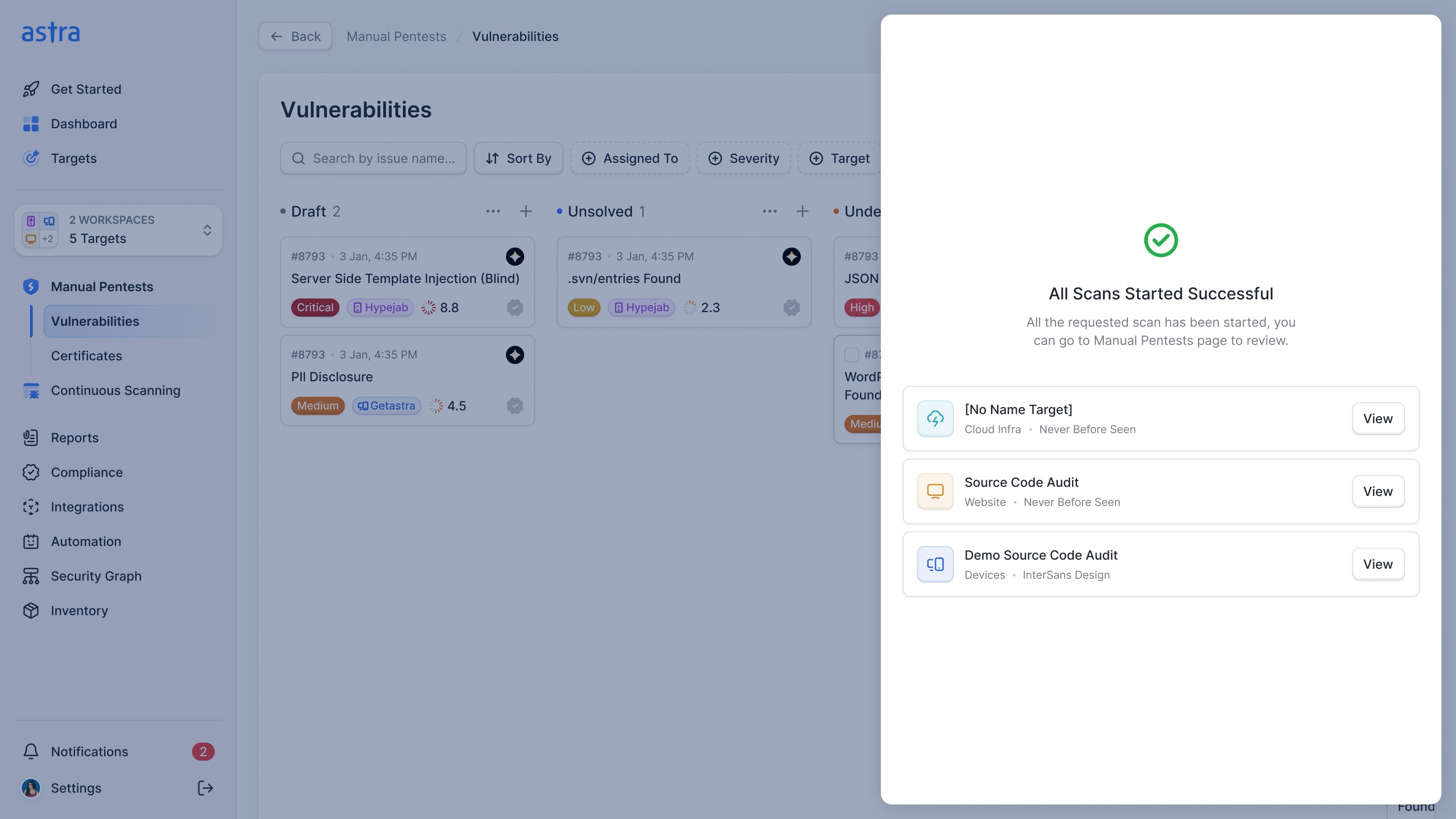
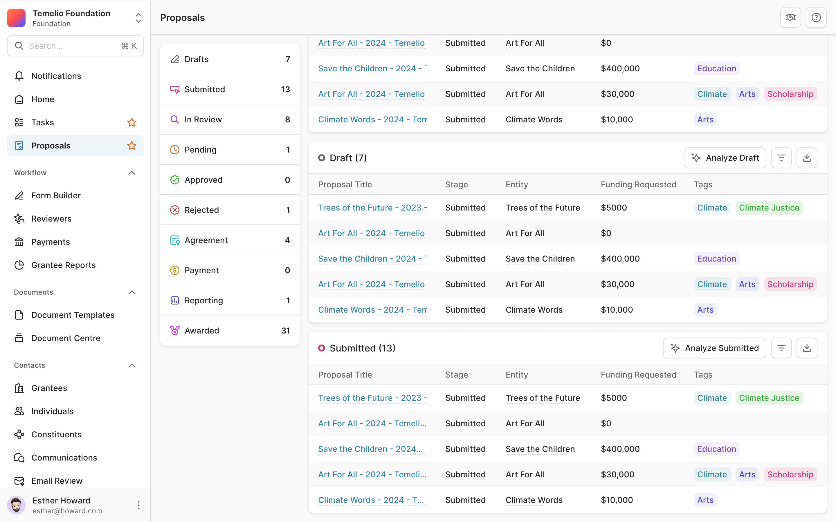
We modelled the vulnerabilities page on the trackers Astra's customers already used, Linear and Jira. Vulnerabilities are grouped by status, from draft to solved, and filter by severity, assignee, pentest and target, as a list or a board.
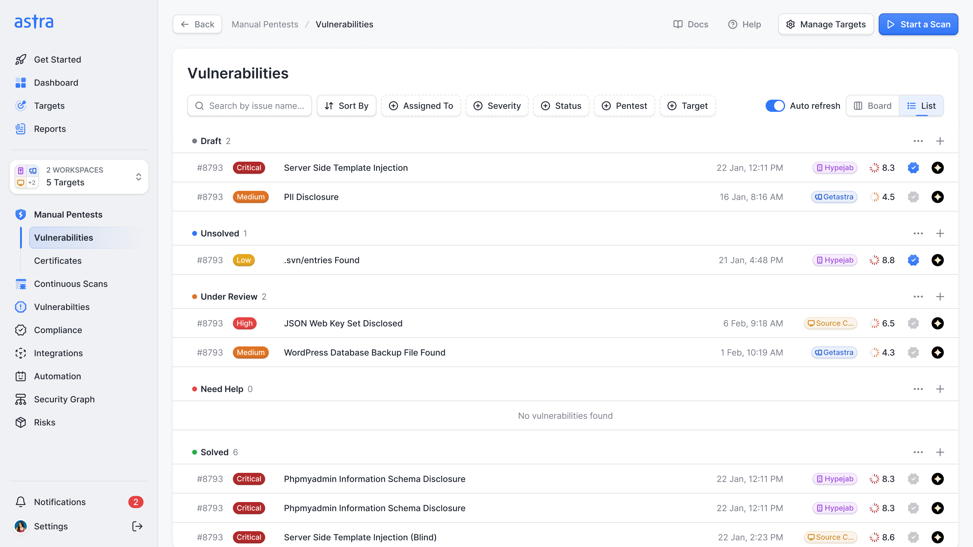
The target still appears on each finding, alongside severity and verification. A developer can see which application needs fixing while comparing open issues across the whole selection. The wider view keeps the information needed to act on an individual row.
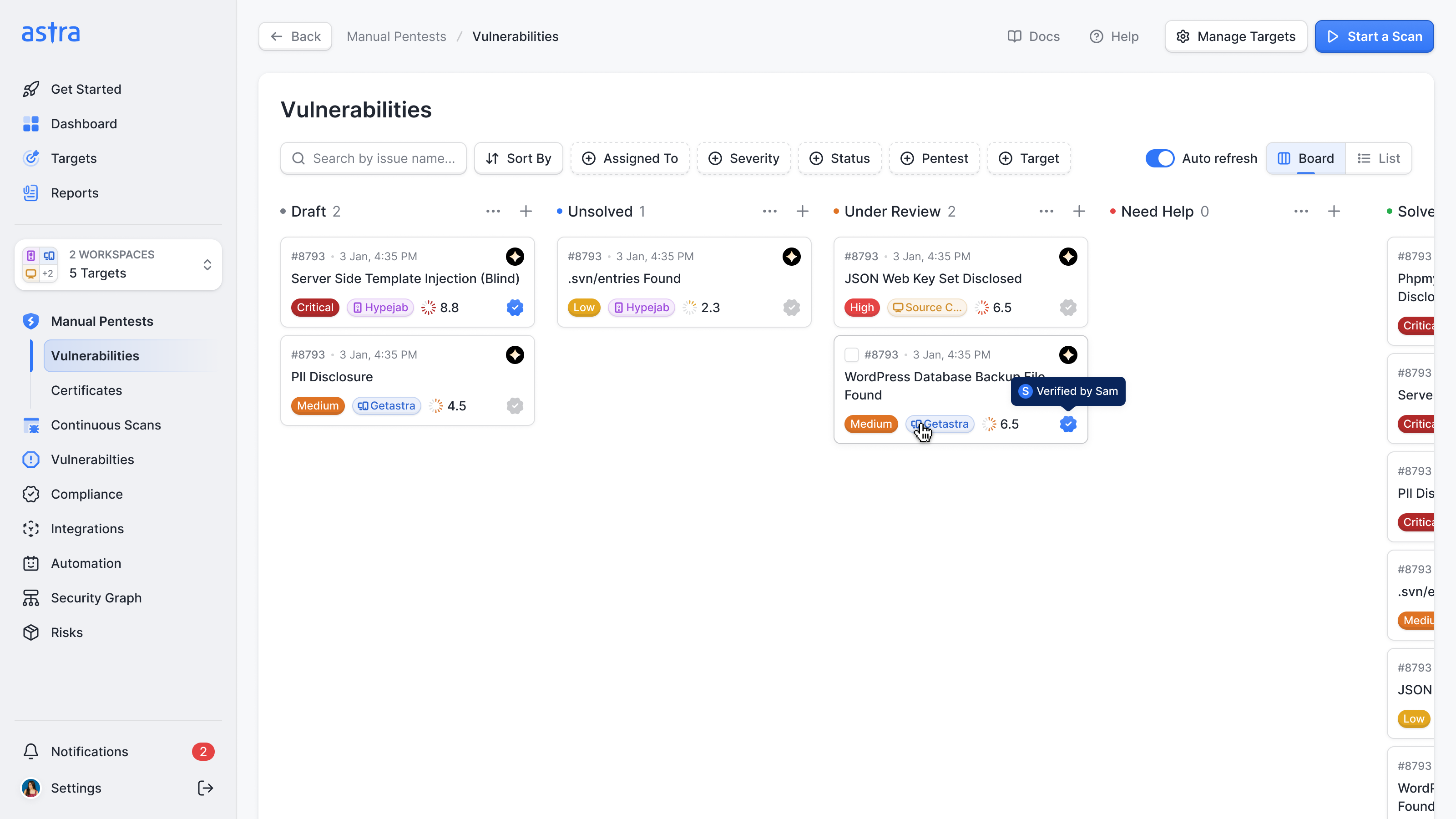
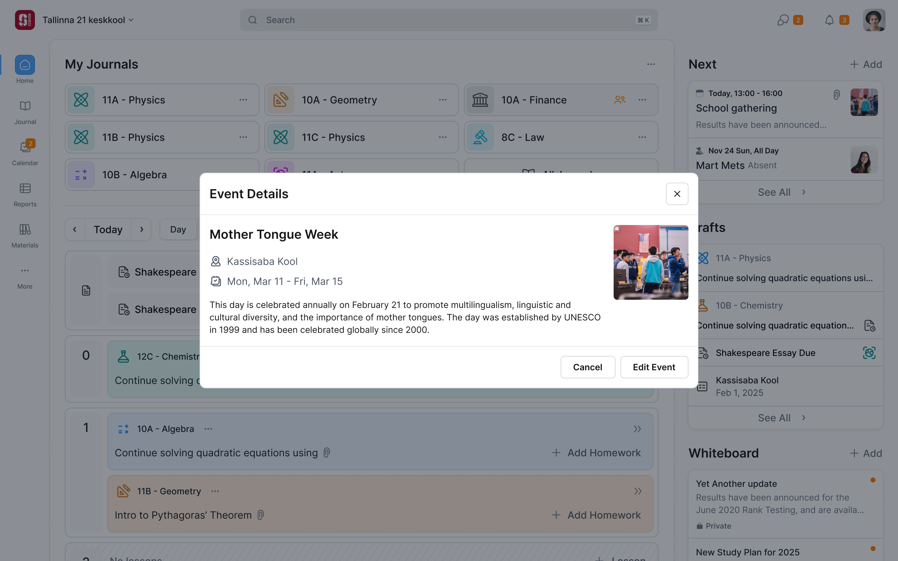
A vulnerability opens in a sheet over the list, so you keep your place, and it still has a link you can send. Each one is marked if an Astra engineer has verified it. Marking a false positive is still possible but less prominent, so customers wouldn't second-guess real findings.
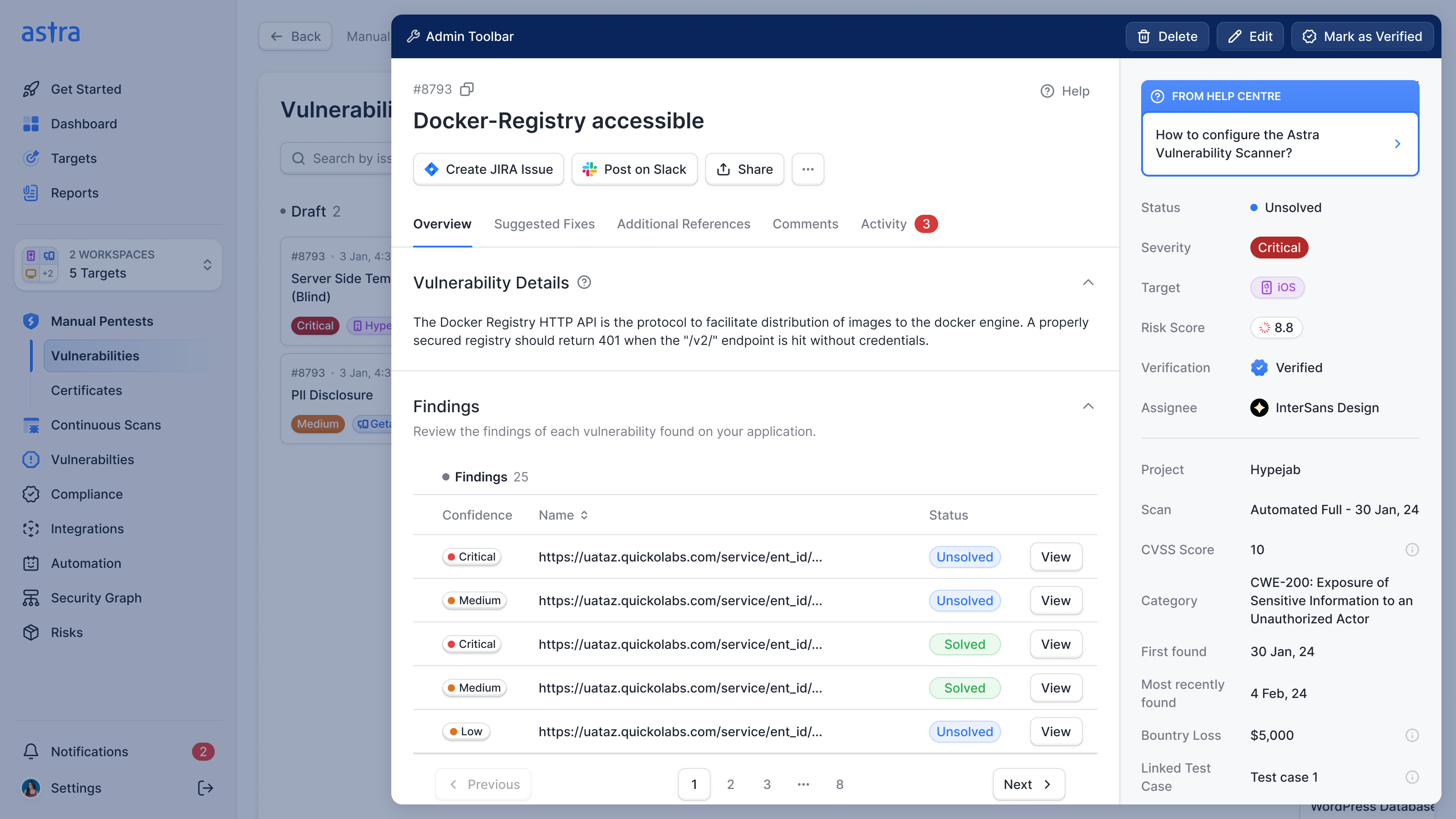
Comments stay on the vulnerability too. We looked at a chat for each scan and dropped it, because a comment is only useful next to what it's about.
While a pentest runs, its progress is the page
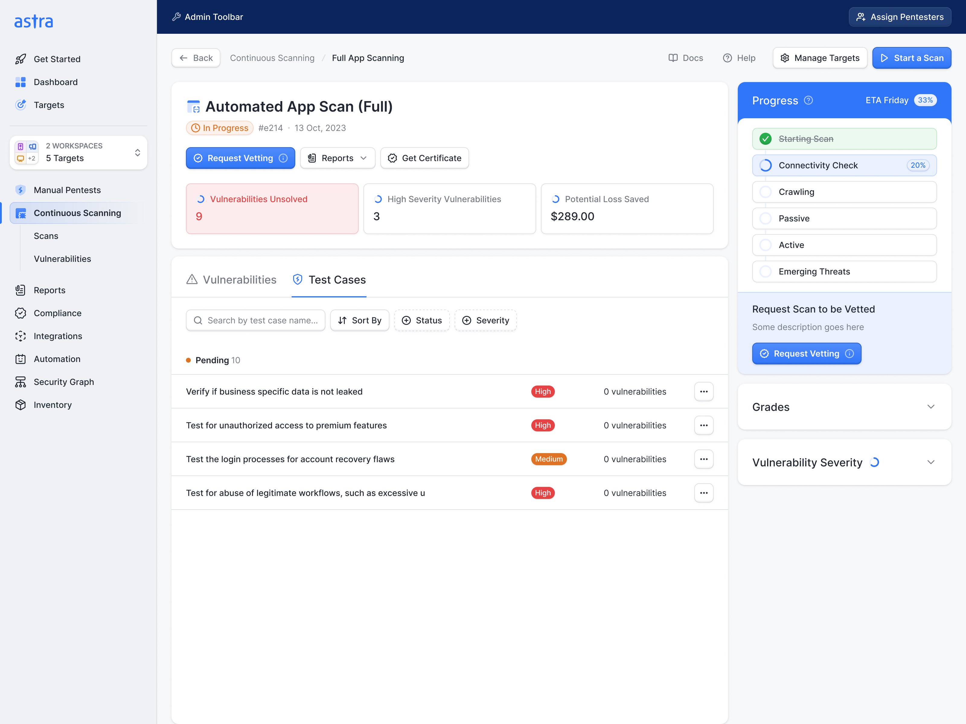
For the ten or fifteen days a pentest takes, the customer mostly wants to know where it's up to. I took the progress view from food delivery apps: the stages, who's on it, and an ETA. The first cut was horizontal and couldn't show sub-stages, so it turned vertical and moved to the side. Only the automated scan shows a percentage, since it's the one stage that can be measured honestly. The manual stages show an ETA, and the rescan button only appears once bugs are reported.
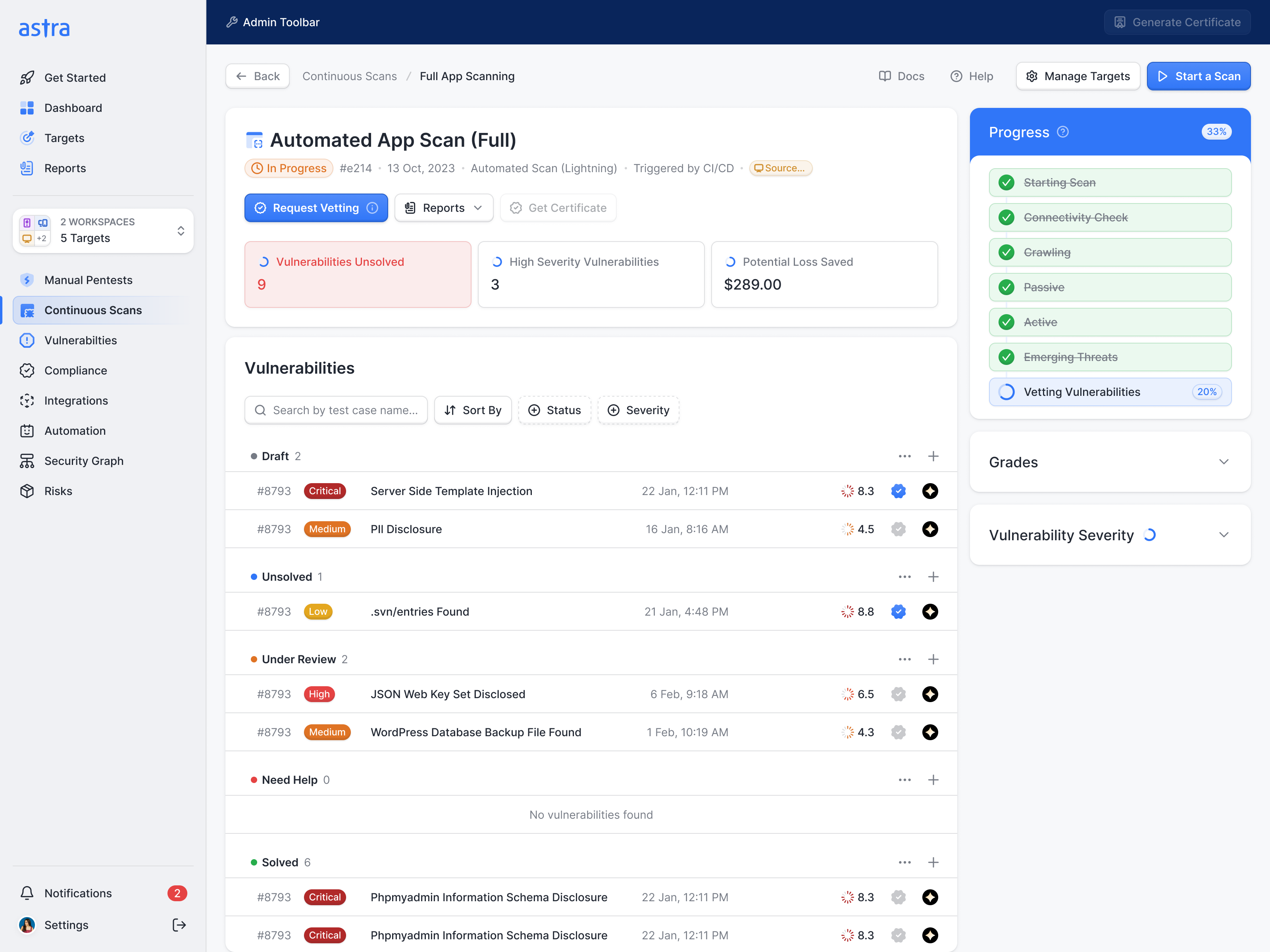
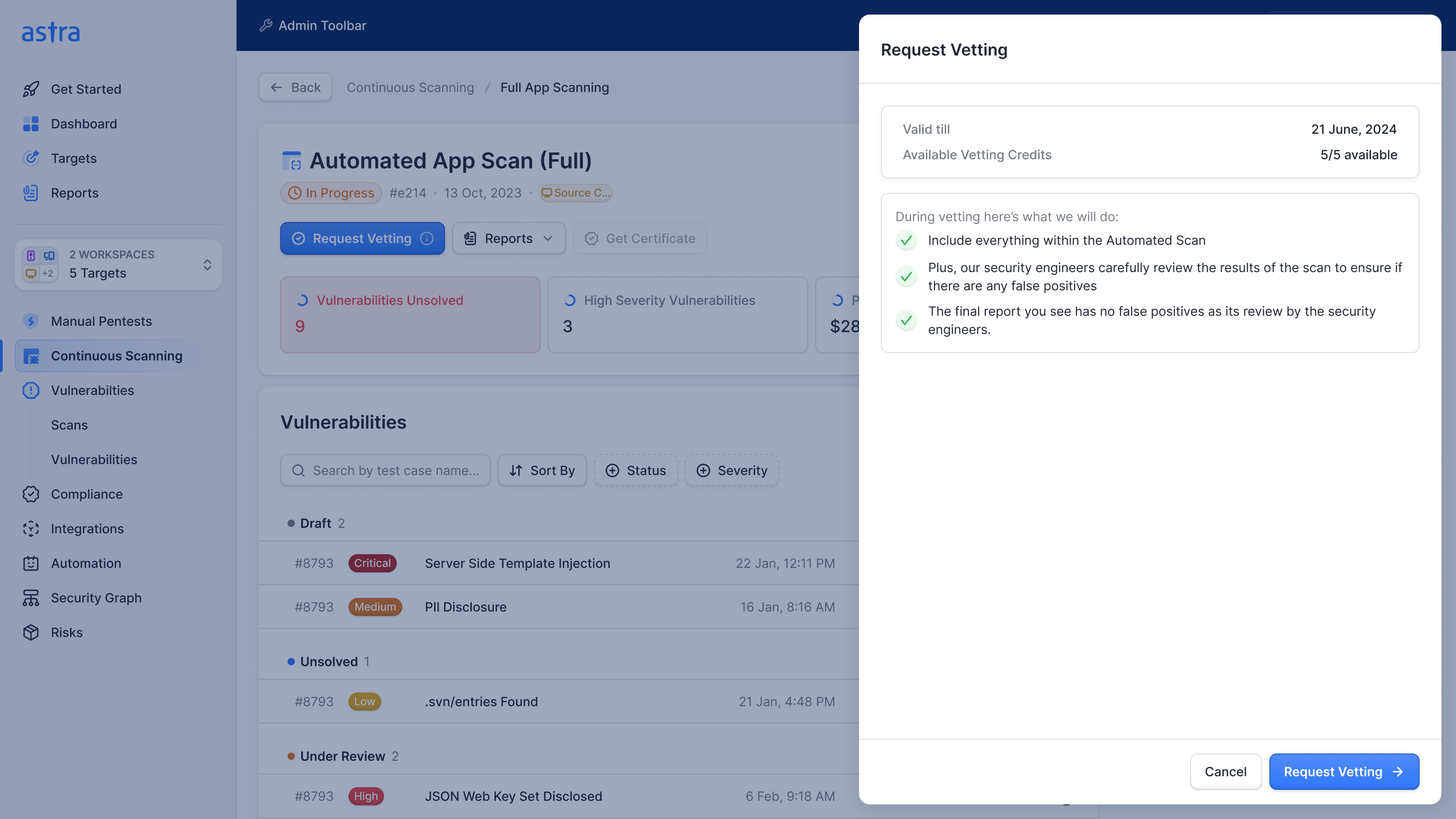
A continuous scan can be sent to Astra's engineers to vet for false positives, and the request sheet shows how many vetting credits are left before you spend one. It also explains what the human review adds to the automated result. A credit is a limited service, so the decision needs more context than a button labelled Request Vetting.
Rescans belong inside the pentest
Astra's brief gave rescans and certificates their own sections of the navigation. That cut against everything else the redesign was doing, so I opened a call with it.
Ananda's case was real. A customer testing five targets has five pentests, each needing its own rescan. In the old dashboard that meant five pages and the same button on each, so many customers emailed Astra's customer success team to do it for them. I asked whether Astra wanted to encourage rescans. A customer needs one before Astra can issue a certificate, so making the action easier had to be part of the answer.
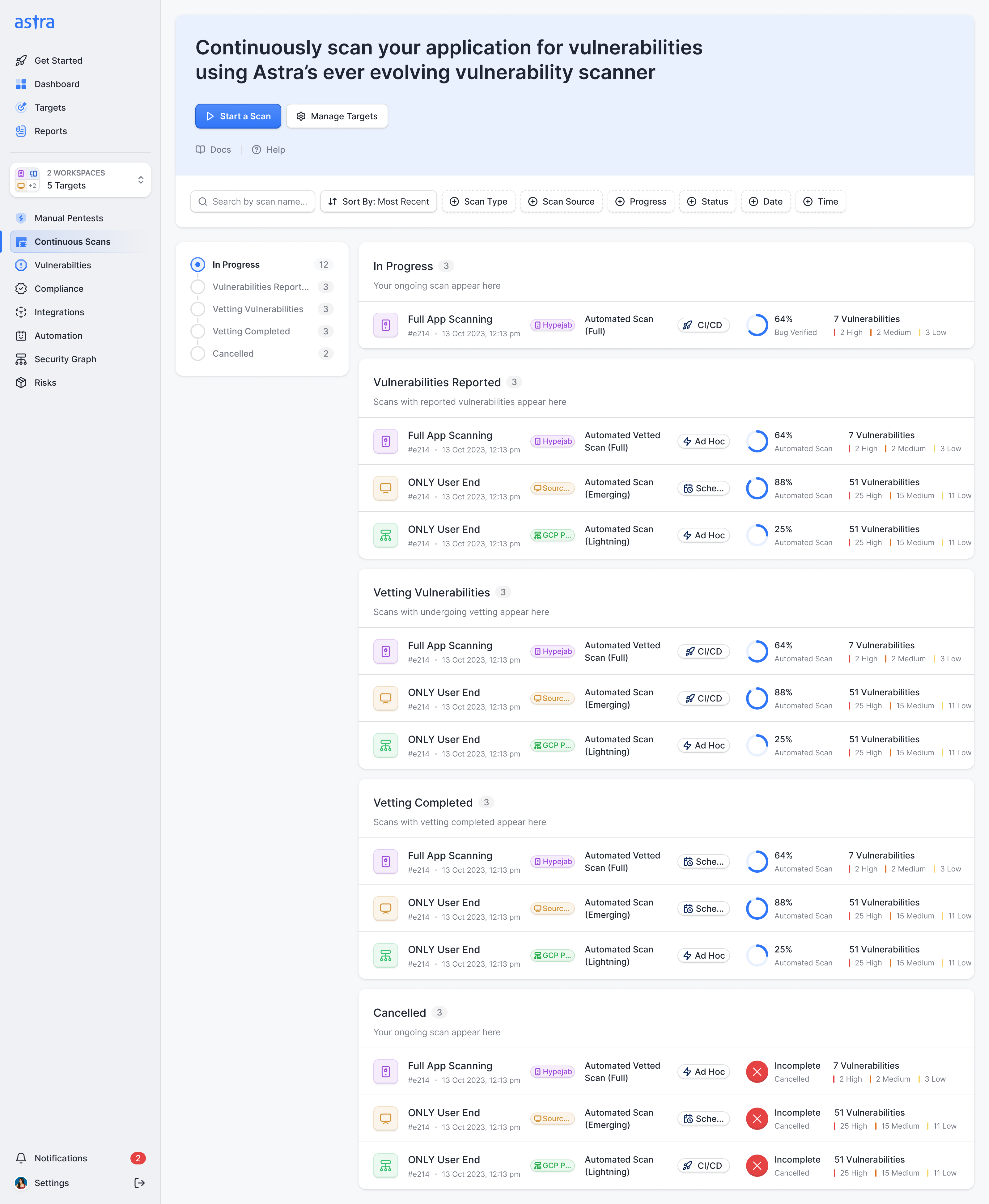
My objection was that a menu item makes a rescan look like a thing of its own, when it's a step in a pentest. So the pentests page split into sections by status, like the vulnerabilities page: in progress, vulnerabilities reported, rescan in progress and completed. Every pentest ready for a rescan sits together with the button on its row. Five rescans are five clicks on one page.
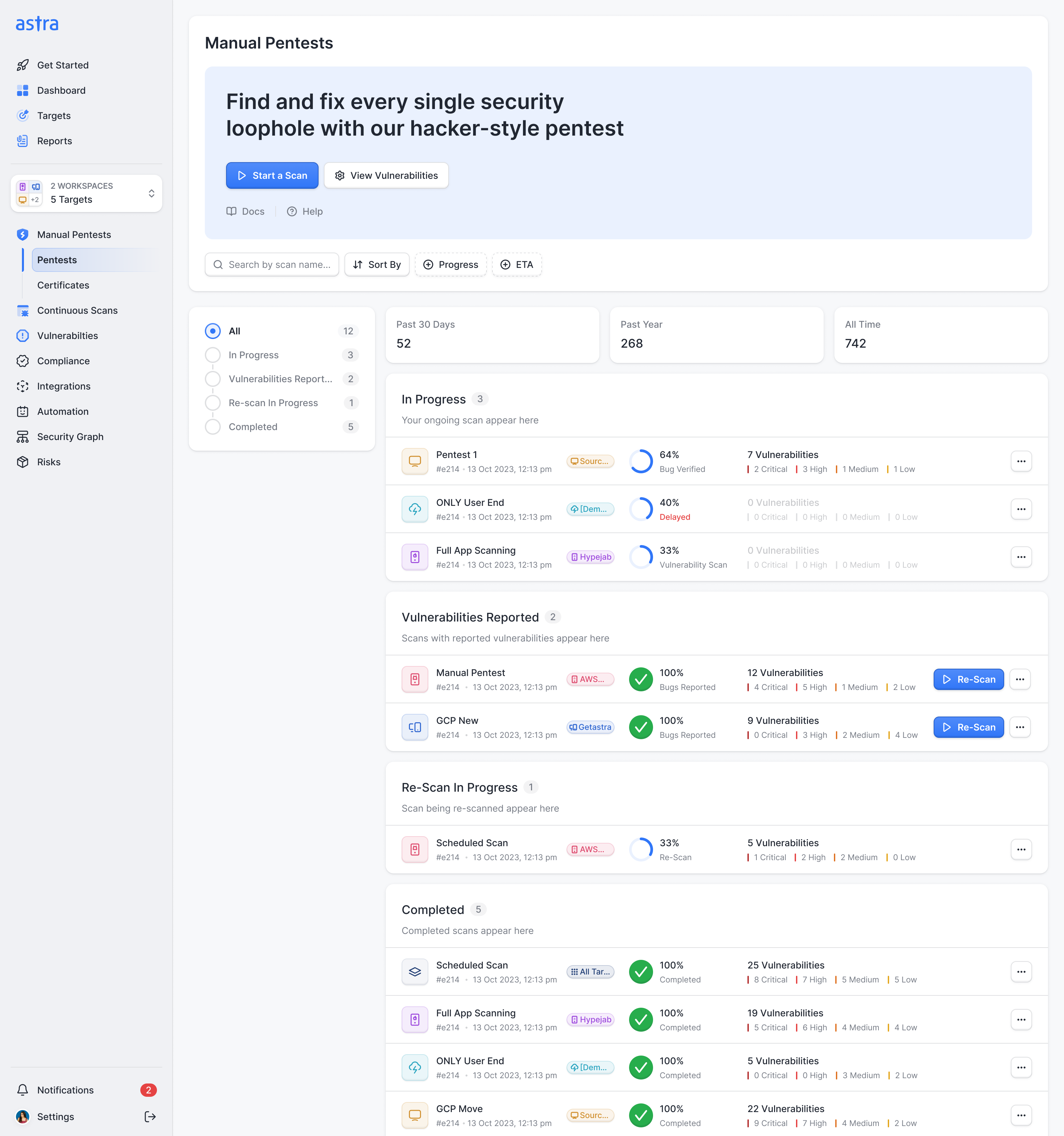
Saurabh pointed out that a pentest would jump down the page and back up each round. We kept one section per stage anyway, in order, and made them collapsible. Certificates kept their own page, because Astra wanted to build on them, and continuous scans use the same structure with their own stages.
It had to look like Astra and still look serious
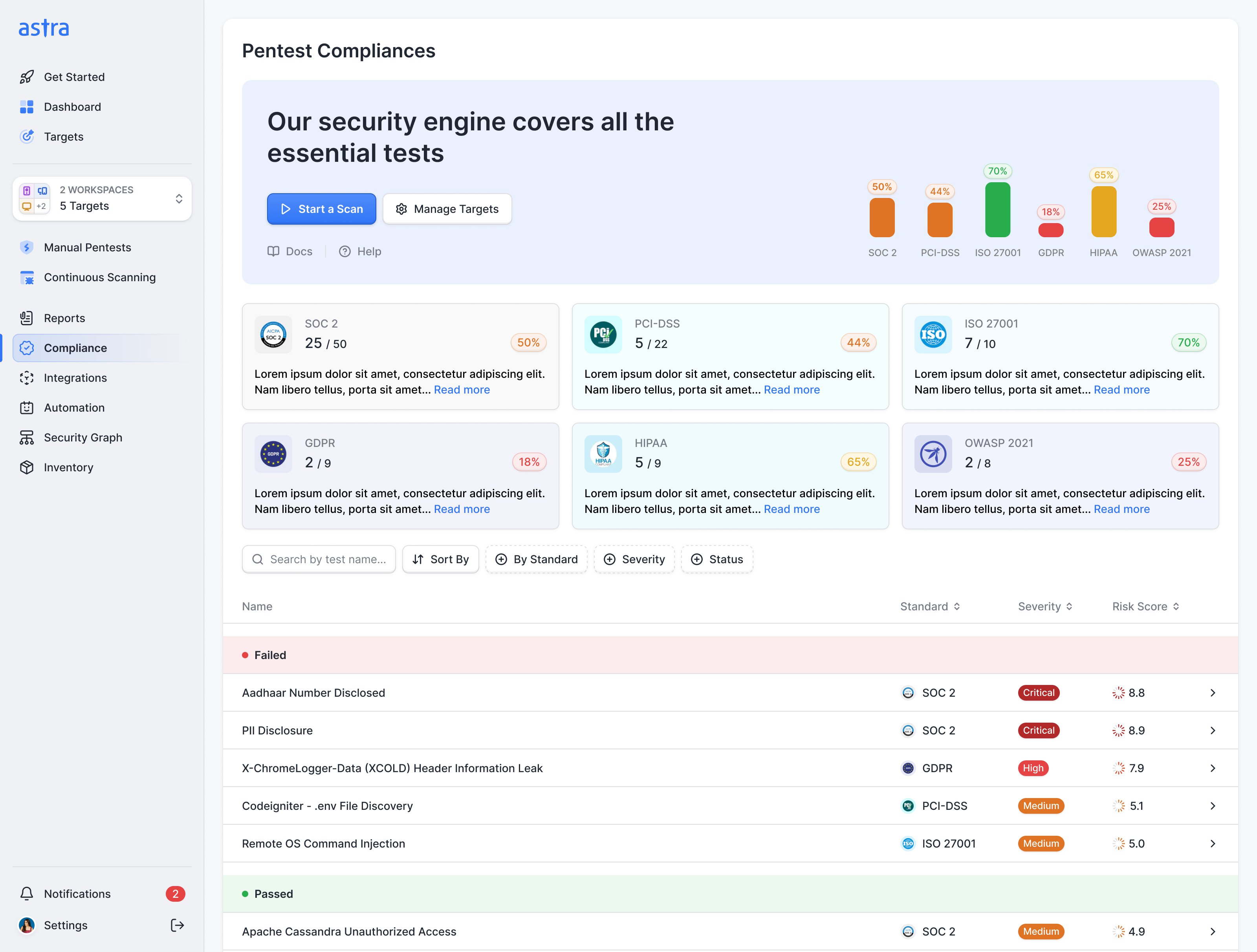
The look took three goes. Ananda felt the first screens could belong to any dashboard, and I agreed: swap the logo and they'd have passed for Jira. A pentest should feel like a service with people behind it, so some of the answer was content: messages from the pentesters on a test, and introductions to the analysts doing it.
The second go went too far the other way. I'd briefed our designer Prakash on the neue-skeuomorphic direction Apple and Airbnb were heading, with 3D buttons and raised cards, and Ananda felt it took the seriousness out of a security product. He was right. Taking the 3D out was cheap, because we'd kept it to buttons and cards, never illustration, which would have tied Astra to one illustrator when its team wanted to draw the next scanner's screens themselves.
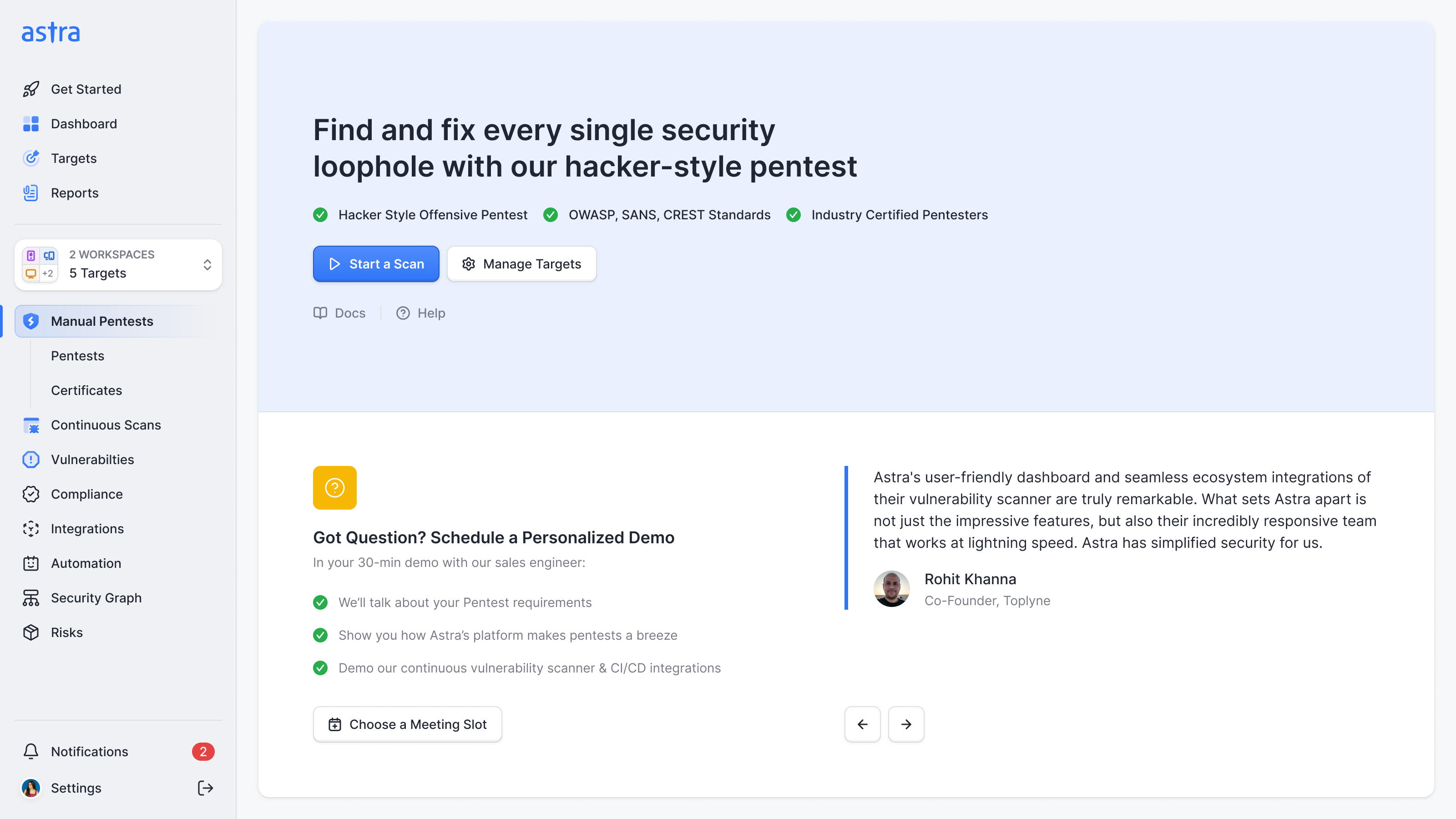
The third was more buttoned up, and I liked it. Ananda still found it too generic. The compromise was the dark sidebar from an earlier round, back to anchor the page, and the bright blue banners went paler.
Get to a first scan without configuring the whole company
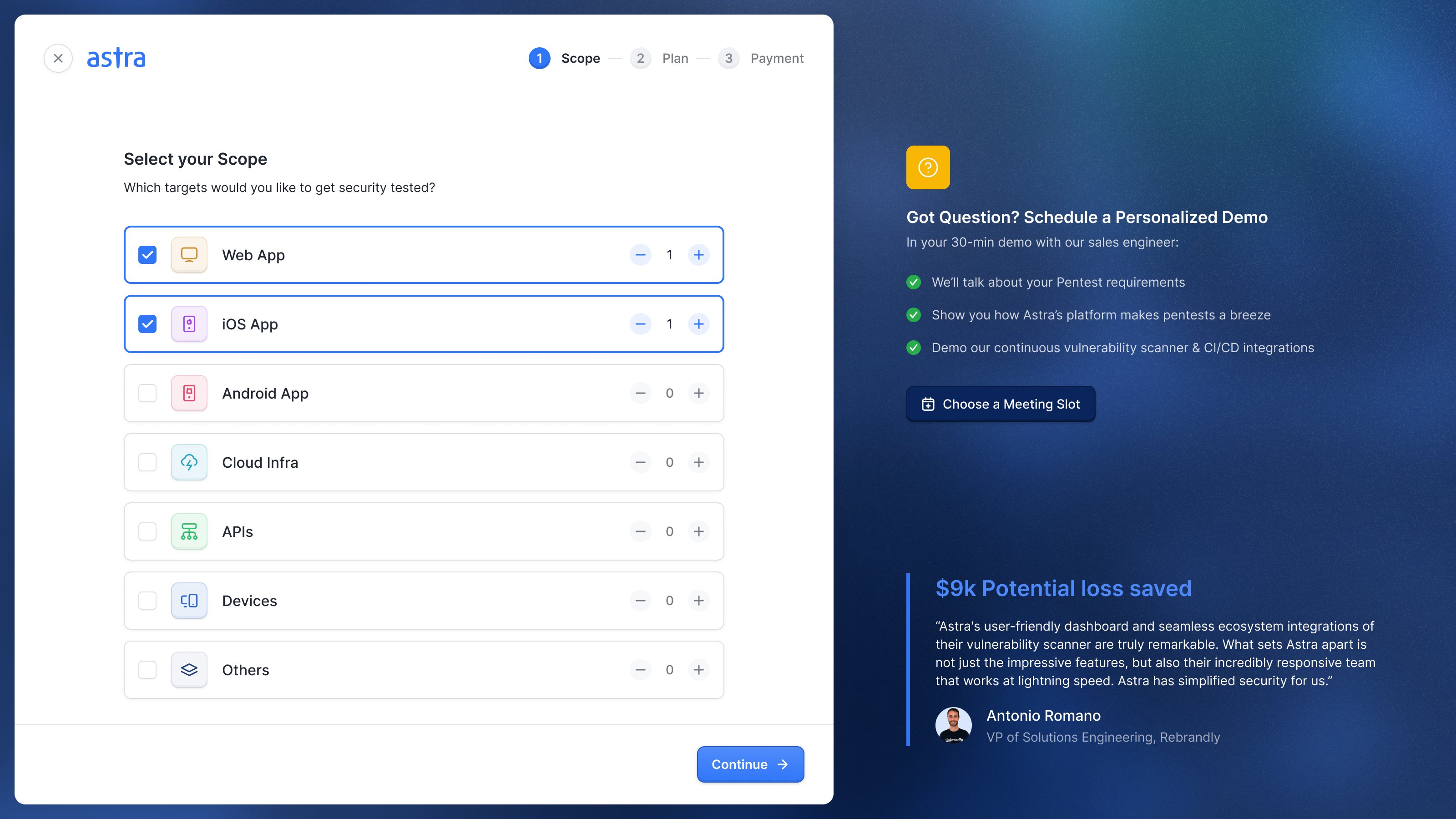
Onboarding exposed another difference between Astra’s customers. One person might want a single scan. A large company might want several teams, with different people allowed to access different targets. I initially explored taking new customers through workspace creation and team invitations before they reached the product.
Saurabh pushed back. Astra already created the workspace when someone registered, and the extra steps would stand between the customer and running a scan. We kept that route short: create the account, purchase a target, then finish setting it up in the app. Someone arriving through an invitation already had access to a target and could skip the purchase.
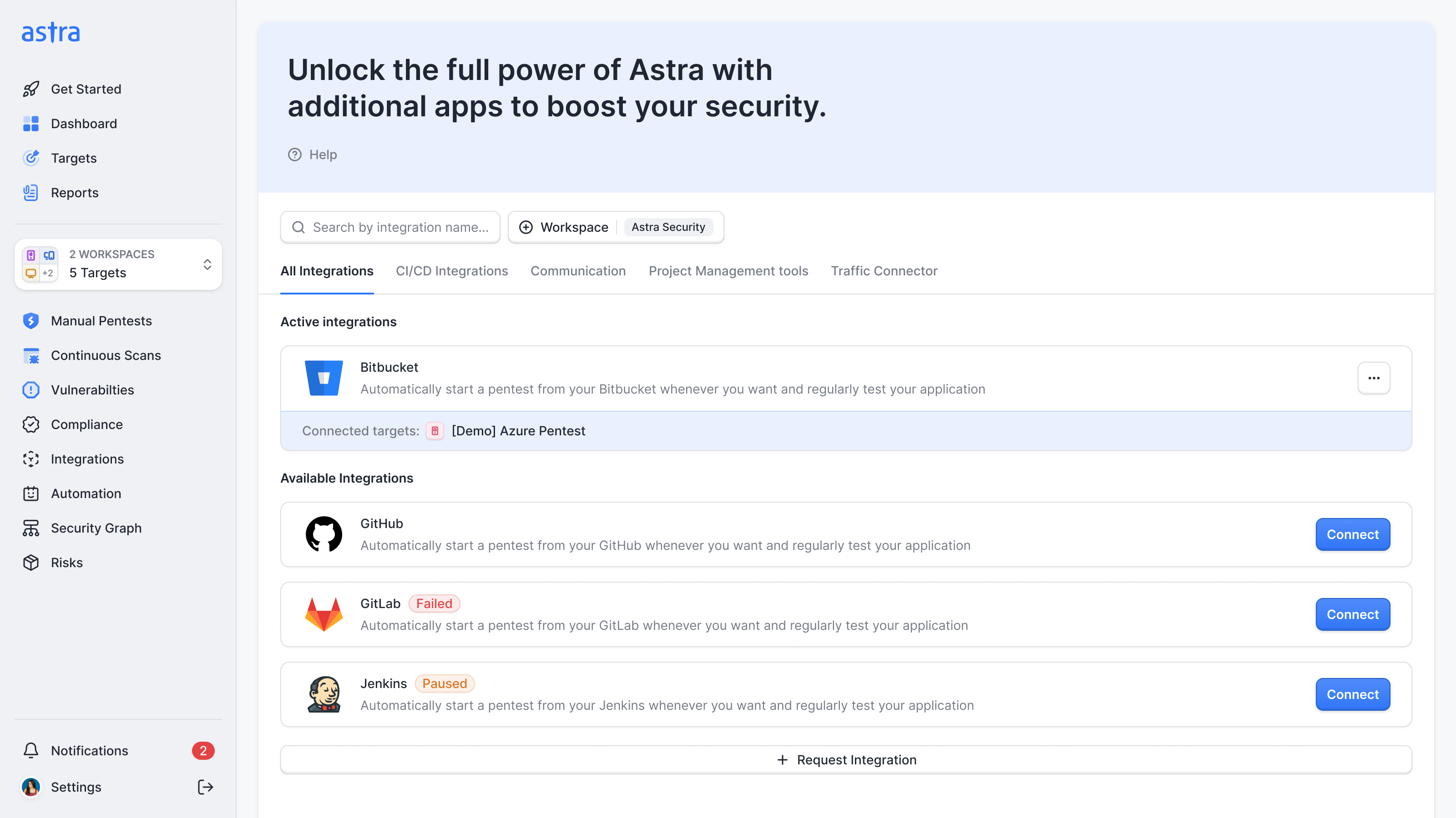
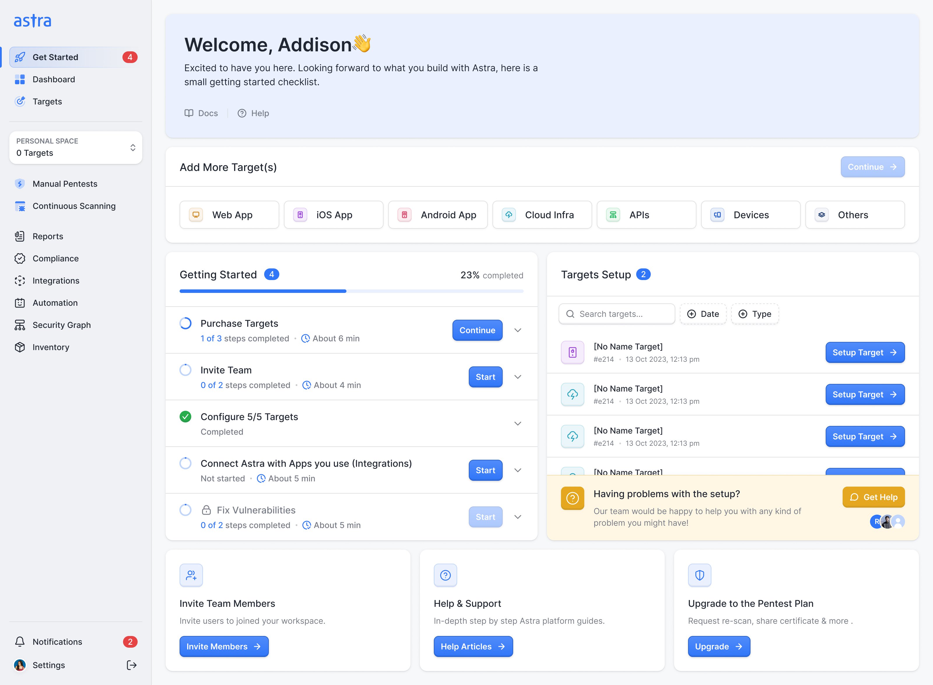
That left useful work which still needed a home. I proposed a getting-started checklist with direct routes to target setup, team invitations and integrations. Those tasks could stay visible after signup, rather than becoming a compulsory sequence everyone had to finish. Astra’s team wanted it to keep helping when a customer had bought a target but not verified it, or had yet to use a report or integration.
team setup can wait; getting the first target ready cannot
The overview has to serve several kinds of reader
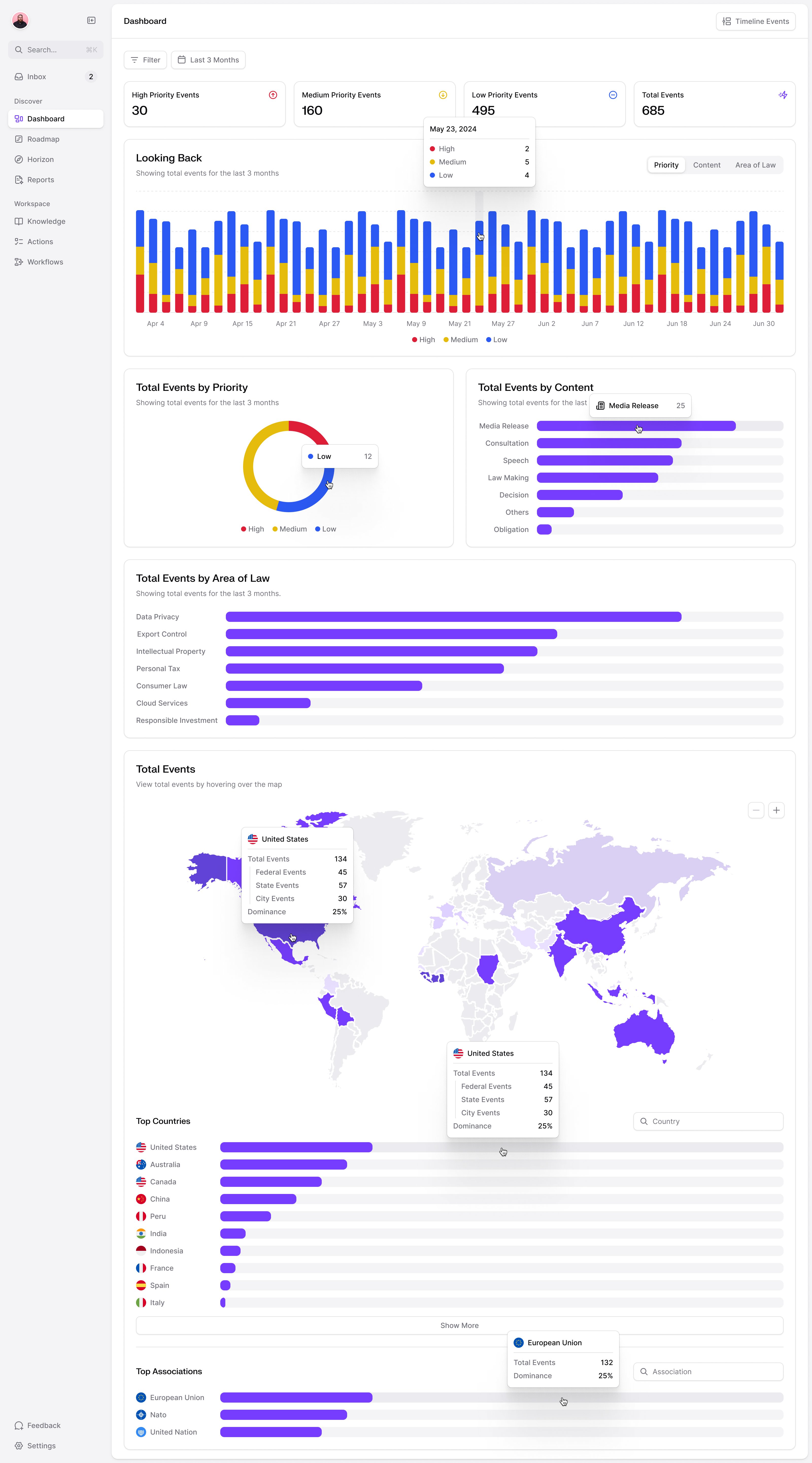
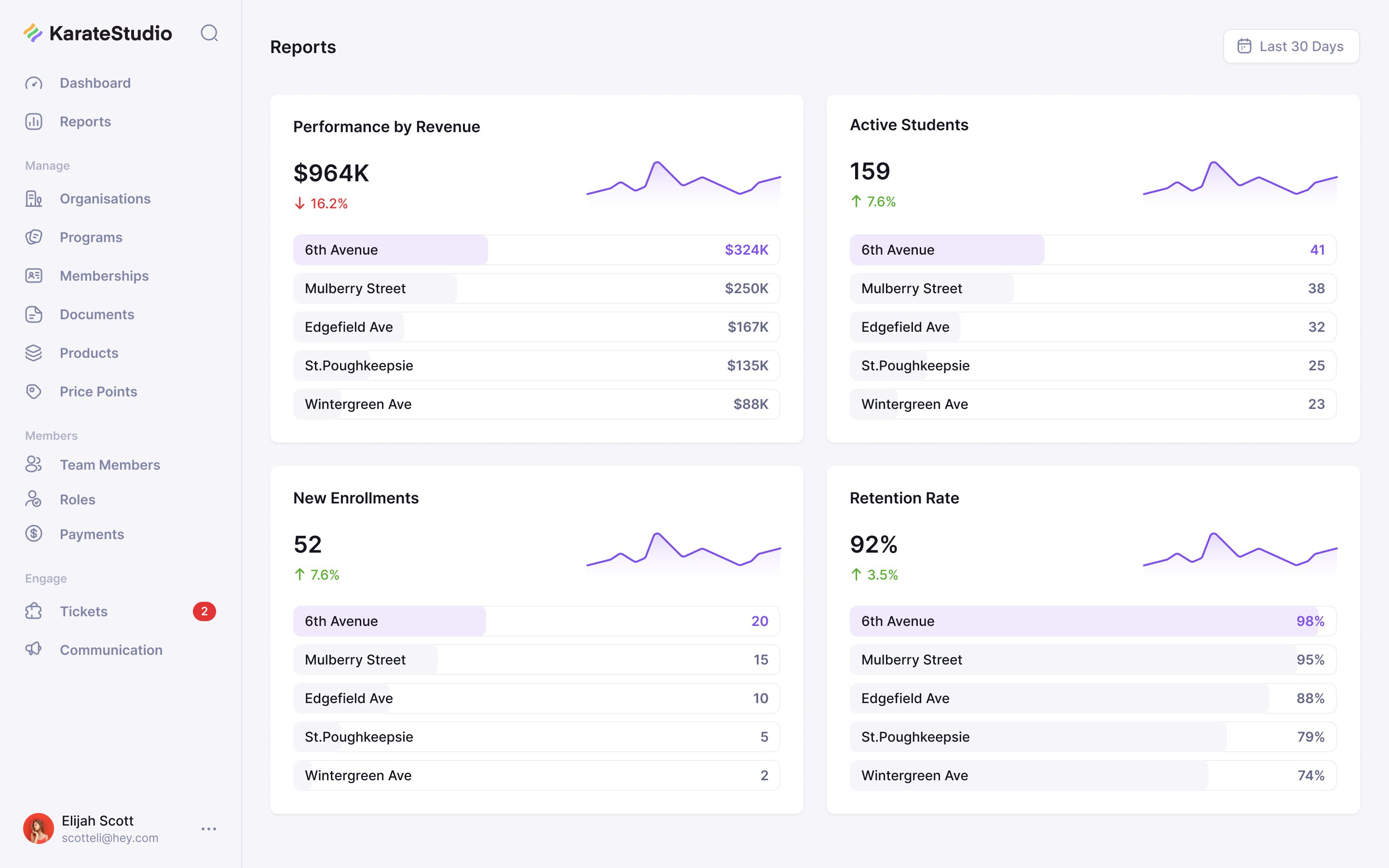
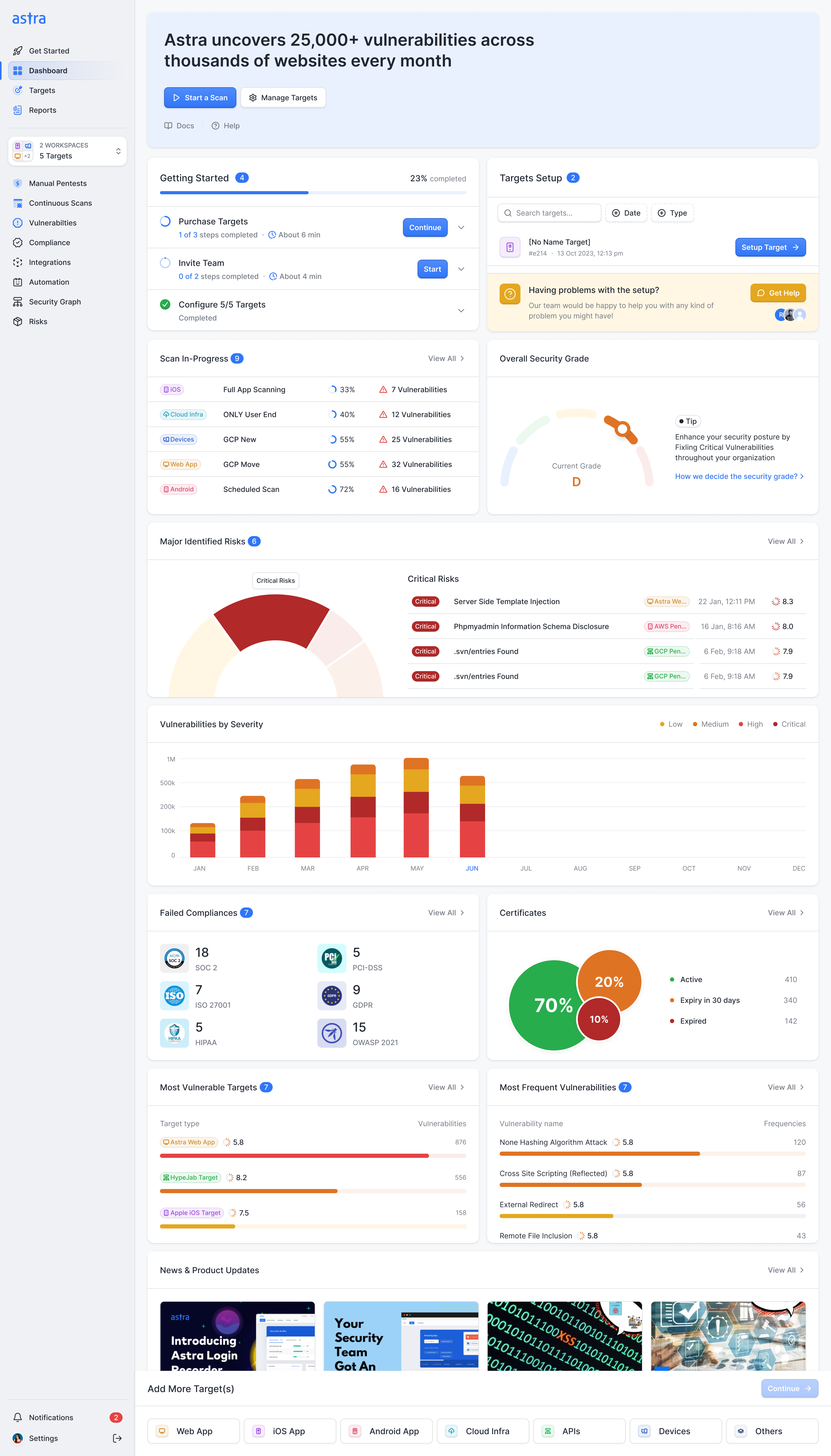
The main dashboard sits above the workspace switcher, so its position distinguishes the account-wide overview from the filtered testing views. We had to make it useful both to someone managing security and to someone doing the fixes. An executive wants the security grade and whether testing is on track, an engineer wants the open critical and high vulnerabilities, and a security lead wants what's been fixed and the trend.
Ask for the report type before asking what it covers
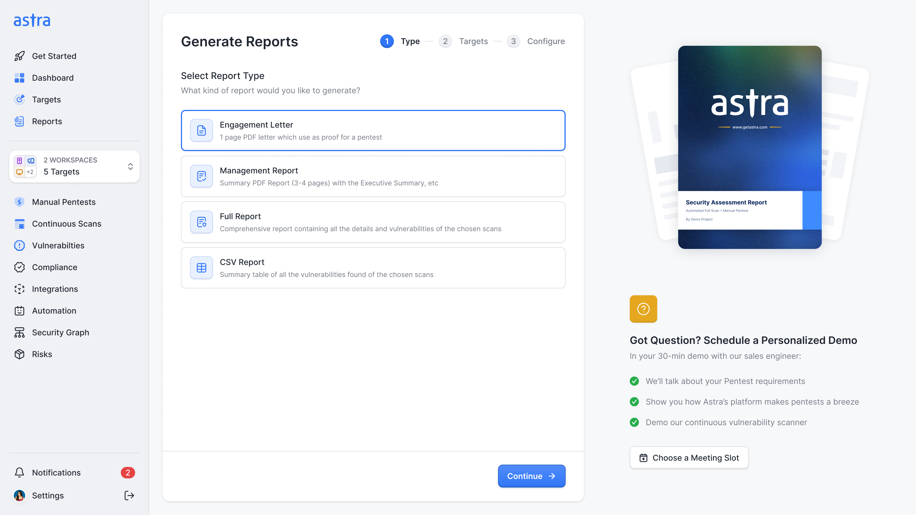
Astra makes an engagement letter proving a pentest happened, a management summary, a full technical report and a CSV of every finding. The old flow split these across different places. Some started from targets, others from scans. A list of completed scans could never be the right starting point for all of them.
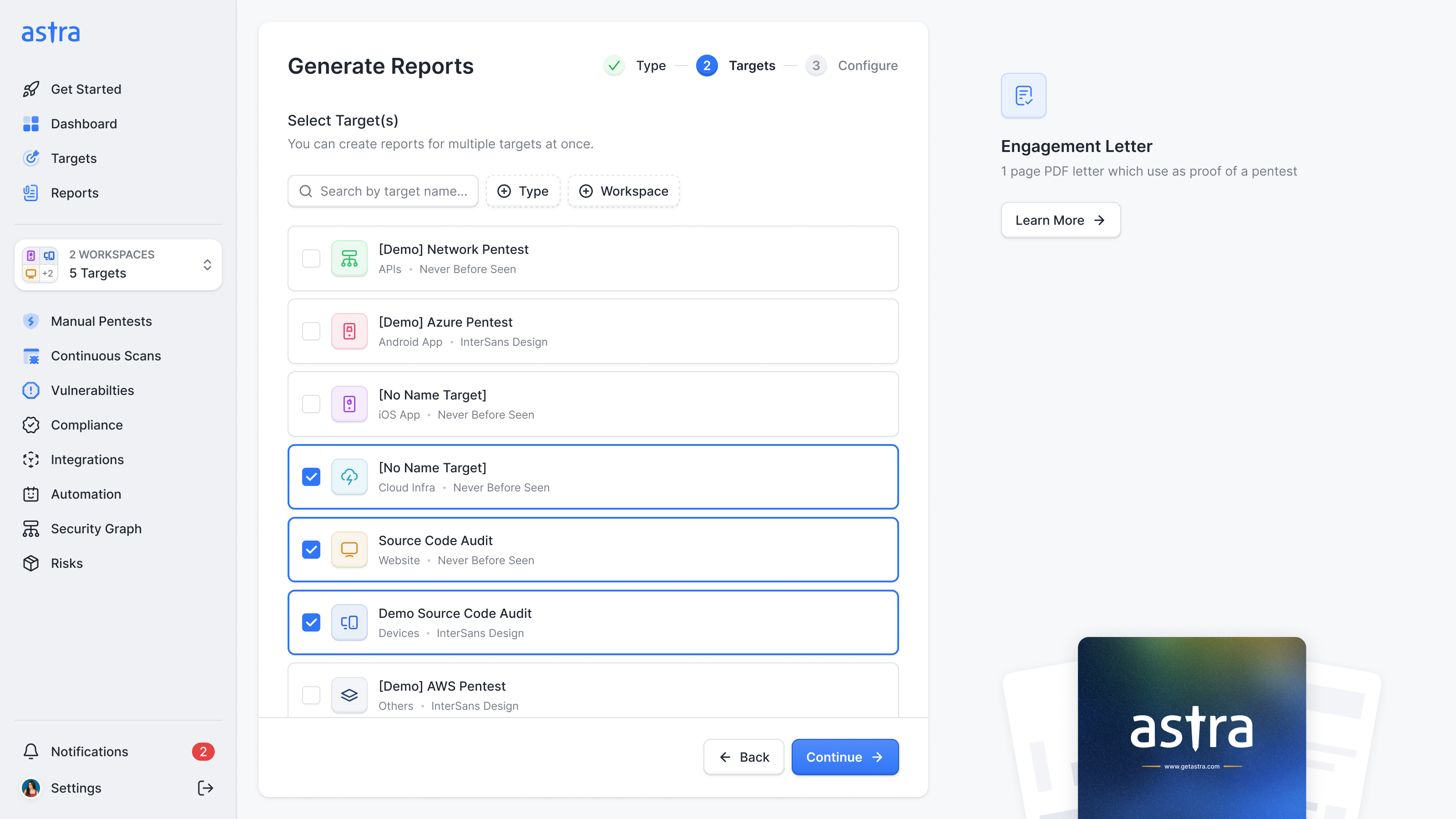
Ananda proposed asking for the report type first, then showing the inputs that type required. I wanted to make that sequence explicit. Our initial report screen looked like a collection of reports someone could open, but Astra generated reports and emailed them out. There was no historical library to browse.
We put the generation wizard directly on the Reports page. Each type explains what the customer will receive before they continue. The next step can then ask for targets or scans as appropriate, without first asking the person to make a selection that might turn out to be irrelevant.
Keep the context when a task opens another task
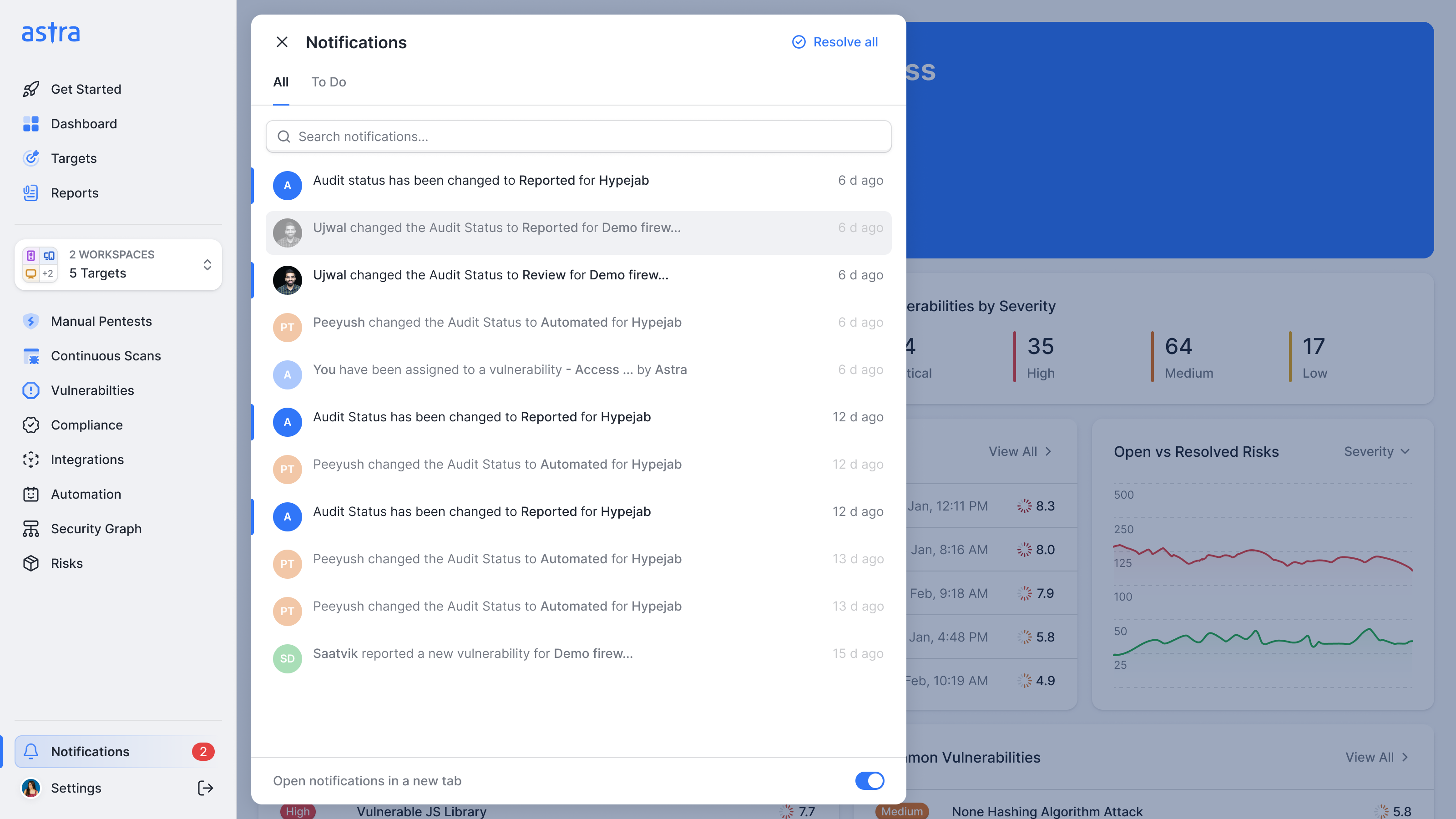
We used sheets for work that should keep its starting point visible, including vulnerability details and integration setup. But layering sheets became a problem of its own. A developer reviewing our authentication flow noticed that its steps opened in separate layers. Cancelling the upper one would send the person back to an earlier step, even though the interface also had a Back button.
Saurabh identified the distinction: a new layer should mean a change of context. I agreed that a linear setup flow belonged on one layer, with steps moving forward and back inside it. We corrected the authentication and scan-setup flows.
GitHub was a useful case for retaining the extra layer. First, the customer opens information about the integration. Connecting it starts a separate job: choosing a target, then following the setup instructions. The target is repeated above those instructions, so someone working between Astra and GitHub can still check which connection they are configuring.
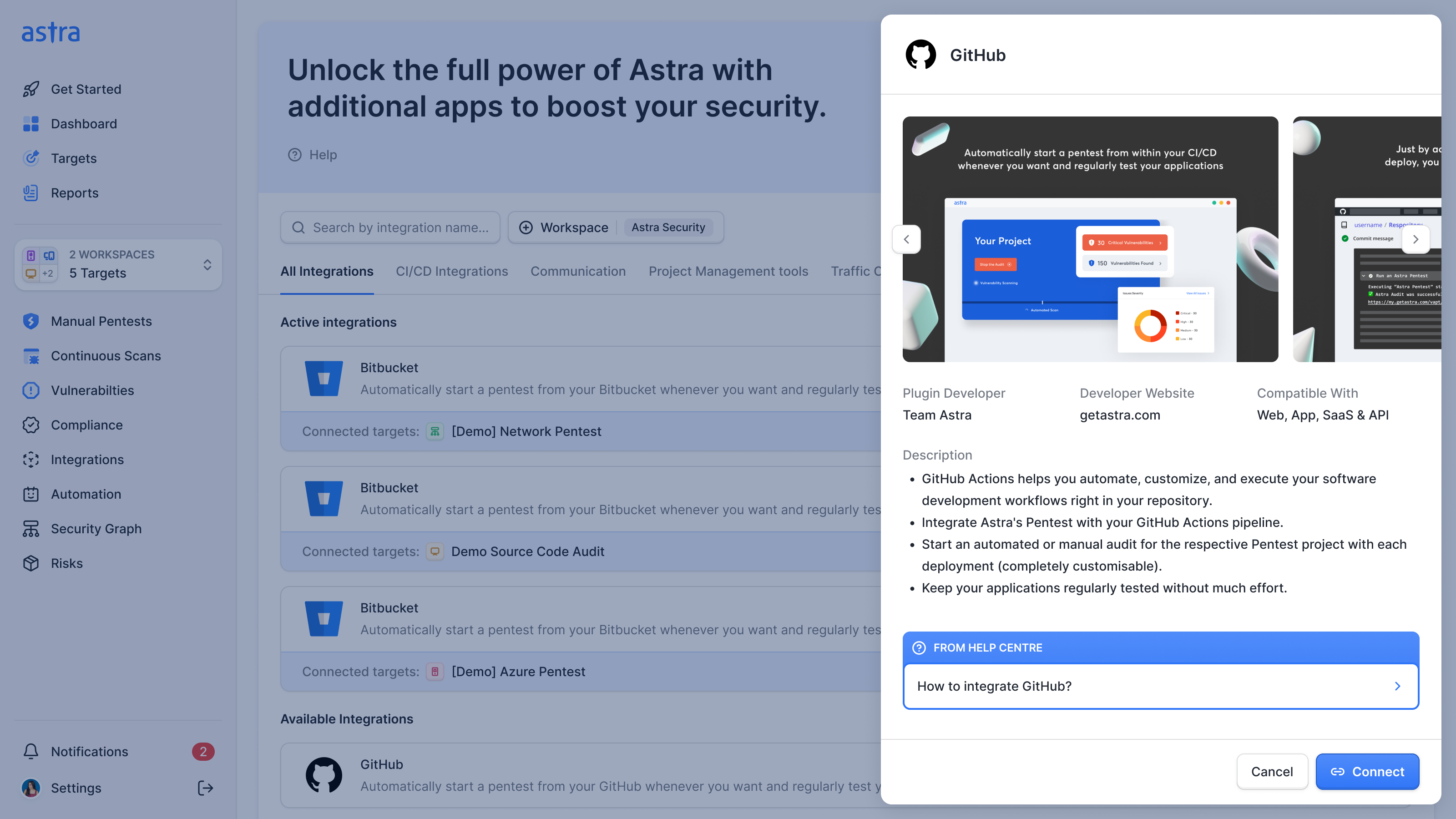
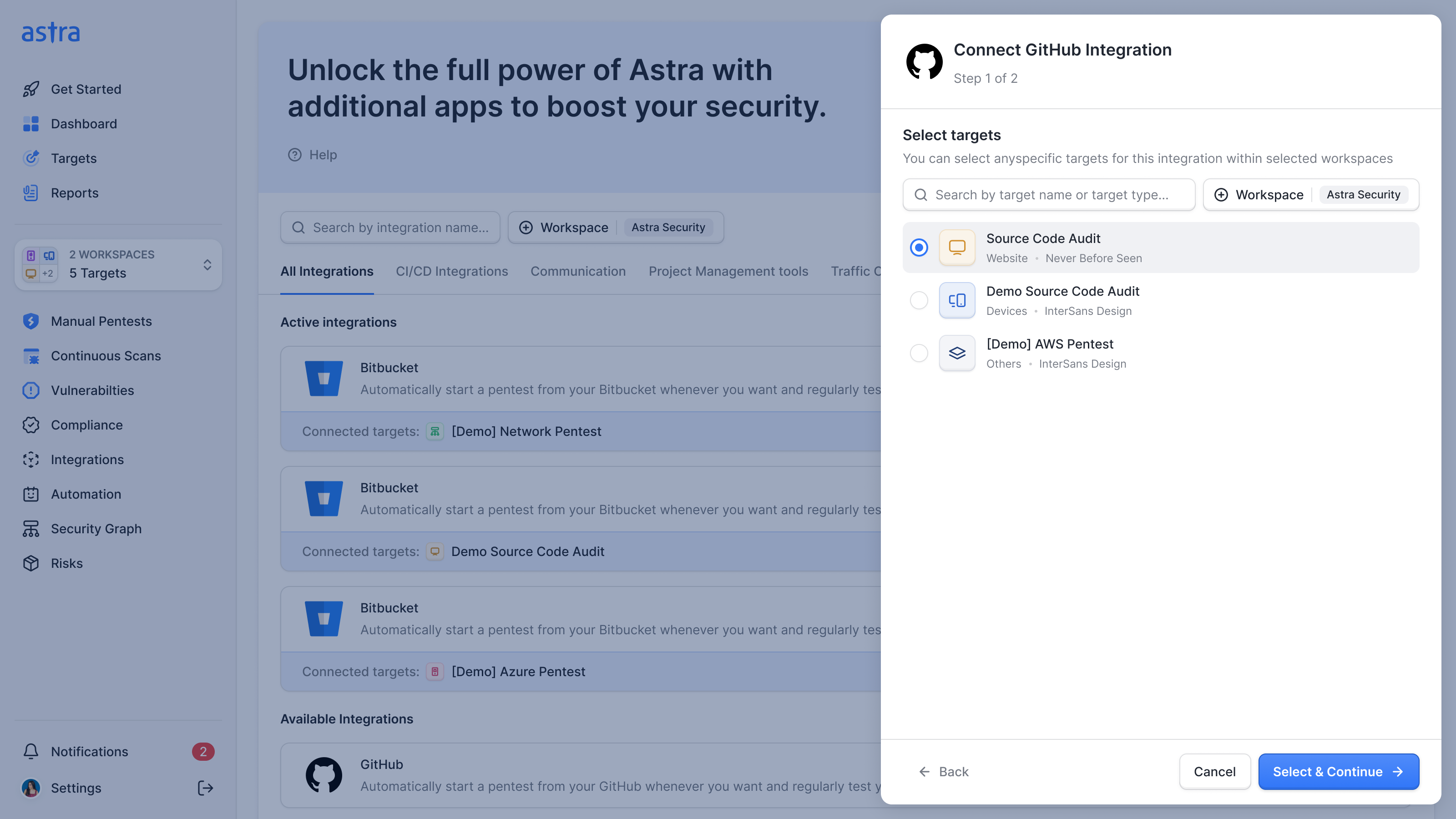
We also clarified the behaviour for engineering: Back returns to the previous step, while clicking the background page cancels the whole flow. We documented those behaviours alongside the screens so the implementation would preserve that distinction.
Where it went
By mid-March the design was ahead of the build, so we closed nine open feedback items and paused the next pieces, the cloud and API scanners, until the code caught up. On that call I proposed one last page listing every target, and Ananda trimmed its tabs by quoting a rule of ours back at me: don't give people two ways to do the same thing.
In February 2025 Astra raised $2.7 million in a round led by Emergent Ventures.

"NBS were a game-changer for us. Collaborating with them felt more like having a dedicated product and design team than dealing with an agency."
More from Astra