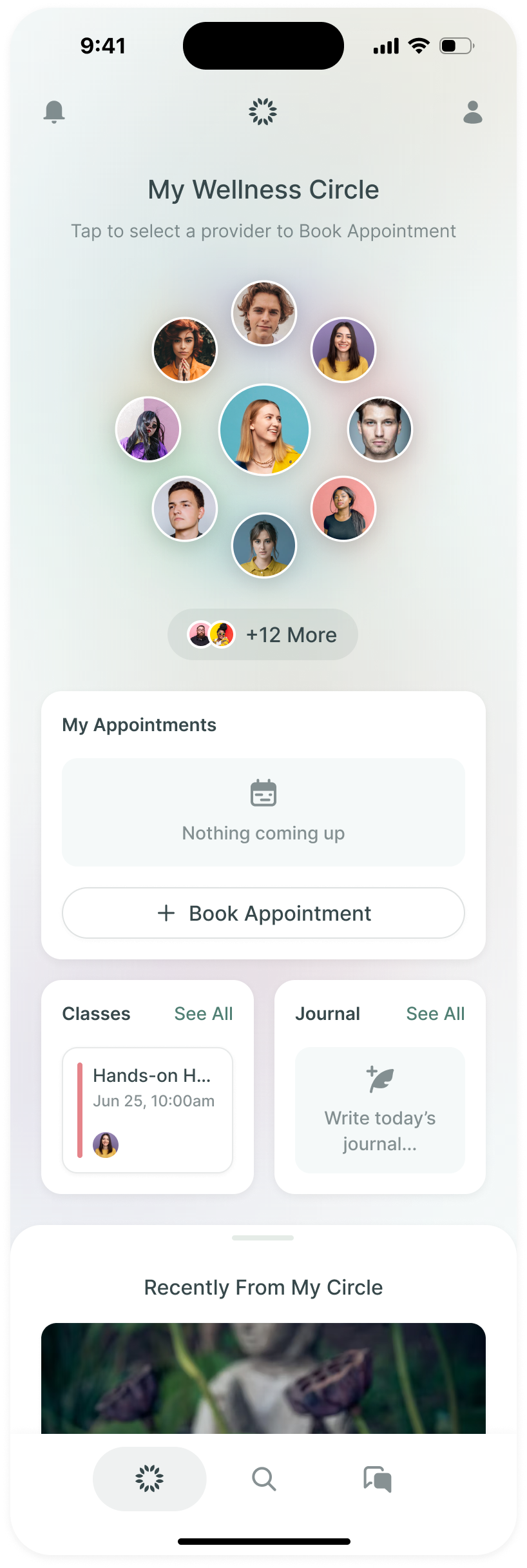
MYND is a mental health app a company gives its people: videos and courses from psychologists and coaches, a daily check-in, habits, an AI coach that's there at any hour, and a way to book a real therapist. It's made by Move Your Mind, founded by mental health advocate Nick Bracks.
We designed it over six weeks across December 2023 and January 2024, in weekly reviews with Nick and Colleen Davies. MYND's own developers were building, so we handed over the app and the creator portal, screen by screen.
Four kinds of help, and they can't blur
MYND offers four kinds of help, and they carry very different weight. Content is the lightest, made by creators someone has to vouch for. The AI coach is always there but isn't qualified to treat anyone. Human therapy brings booking, payment and potentially rebate paperwork. A person in crisis needs a phone number.
The challenge was to bring these into one app while making their limits clear. A chat could help someone reflect on their week. It could also look, especially beside a therapist booking button, like another way to get the same care. We worked with Nick and Colleen to separate those jobs through language, navigation and the point at which someone left MYND for a specialist service.
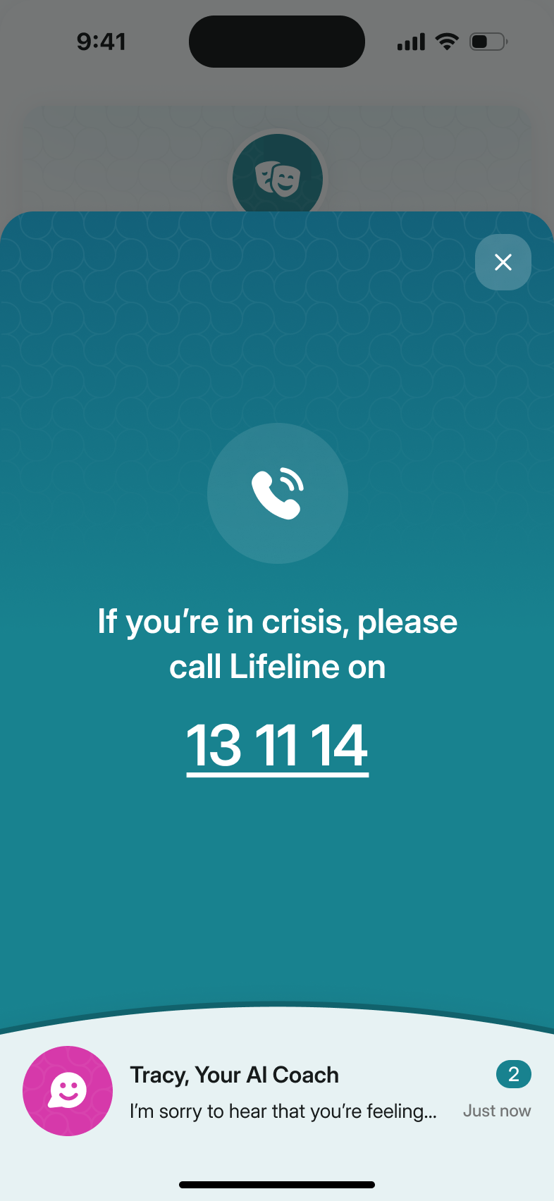
Crisis support has its own route
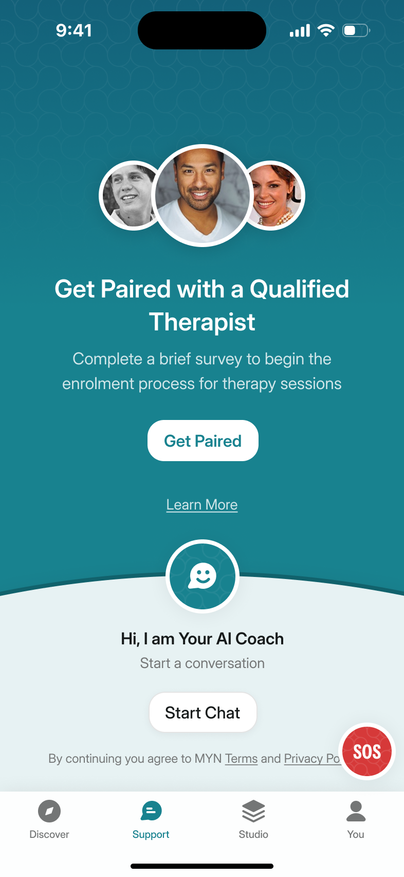
Colleen set the rule: the first thing you see in the support tab is the question "is this an emergency?". In a panic attack, she said, the last thing you want to do is go looking for answers.
We'd tried giving the coach's icon the job as well. It didn't read as an SOS, and this is the one button that can't be ambiguous, so it got its own corner and leads to a phone number and nothing else.
The AI therapist became an AI coach
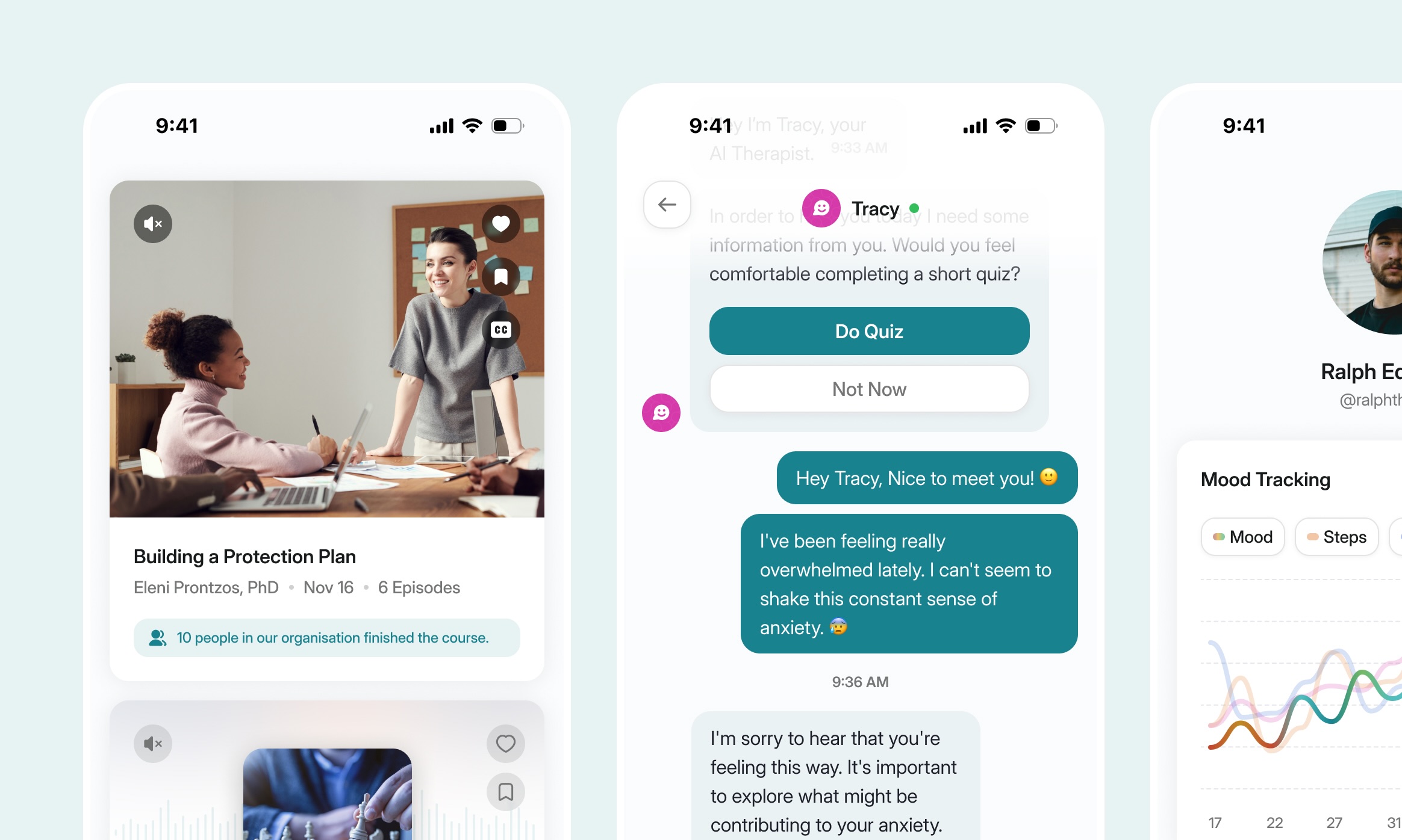
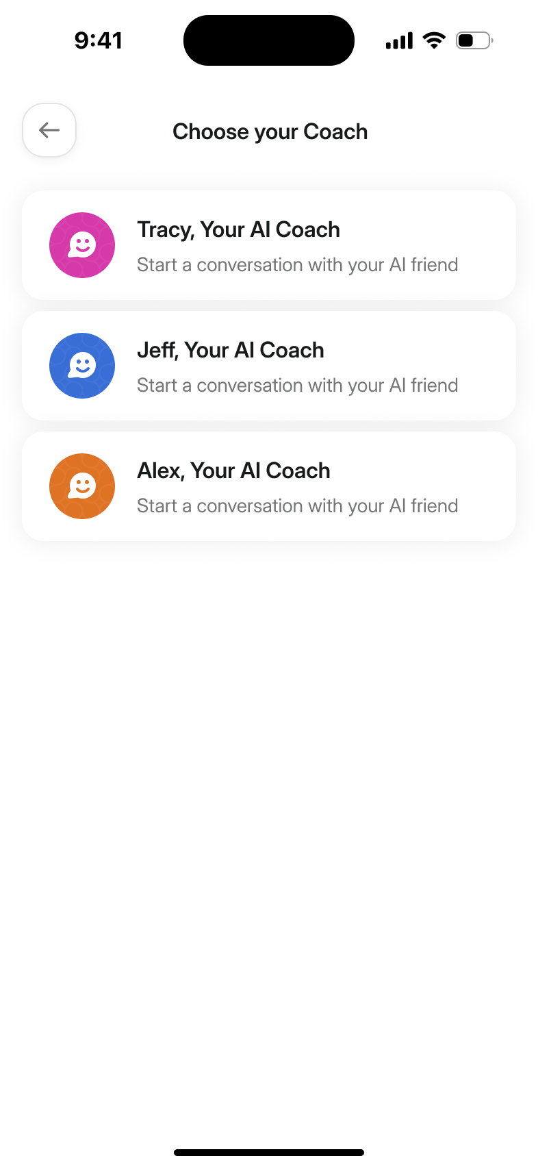
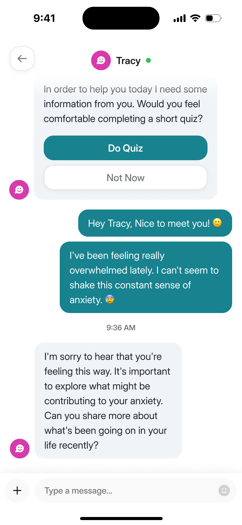
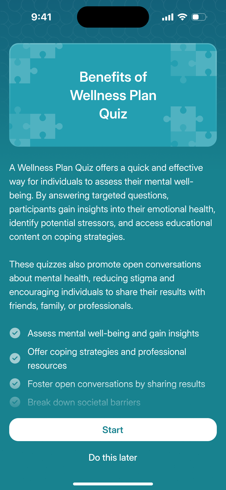
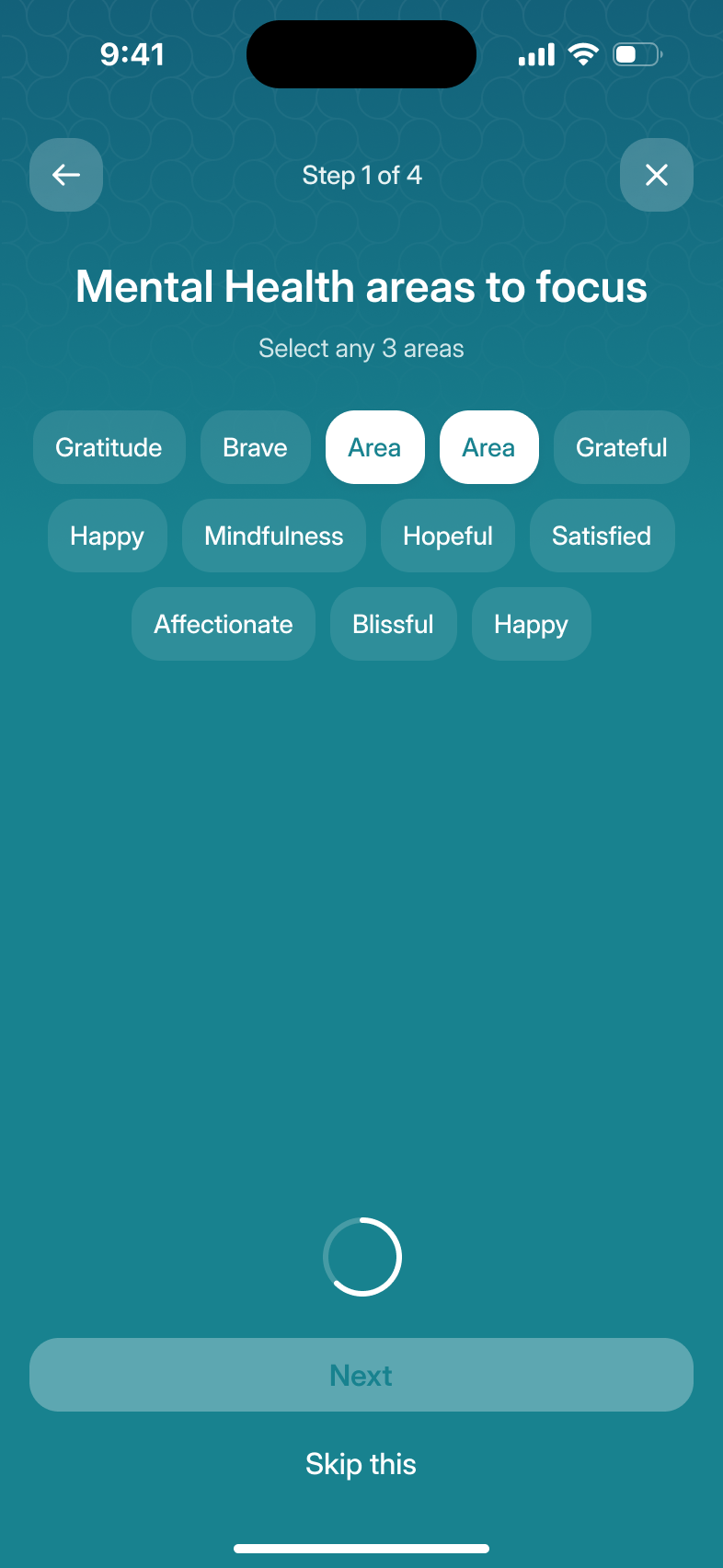
The chatbot came to us as the "AI Therapist". Colleen asked to rename it on the same call: a coach walks you through your week, a therapist sees you in a session. And offering a human therapist beside an AI one implies the bot can stand in for them, which it can't. So it's the AI Coach, and Tracy, Jeff and Alex are coloured bubbles rather than faces. Its first message offers the wellbeing quiz as a way to personalise the conversation.
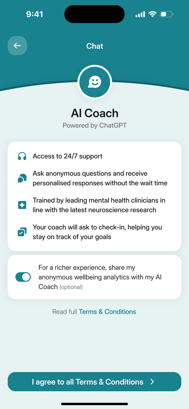
We also kept the therapy route independent of the coach. Colleen proposed using the chat to guide someone through the initial questions. I was concerned that someone reluctant to use AI would have to go through it to reach a human therapist. Asking the questions through an AI service would also introduce another data-sharing decision before they could get help.
reaching a human therapist must not depend on using the AI coach
Therapy brought a larger scope question. We had explored native matching and booking screens, but handling rebates and the accompanying paperwork would create another service for MYND to operate. I argued for leaving that with a specialist provider. Colleen was investigating the partners, and the team chose an external therapy service for the initial product. The native booking work remained a possible later direction.
The check-in is the one screen that looks different
The daily check-in asks how you feel on a slider from awful to amazing. I wanted it full colour while the rest of the app stays white, so it feels like an event. The first version used MYND's main teal. Colleen found it daunting. We explored a lighter colour and a subtly moving gradient, while Nick pushed to keep the interaction itself to a single screen.
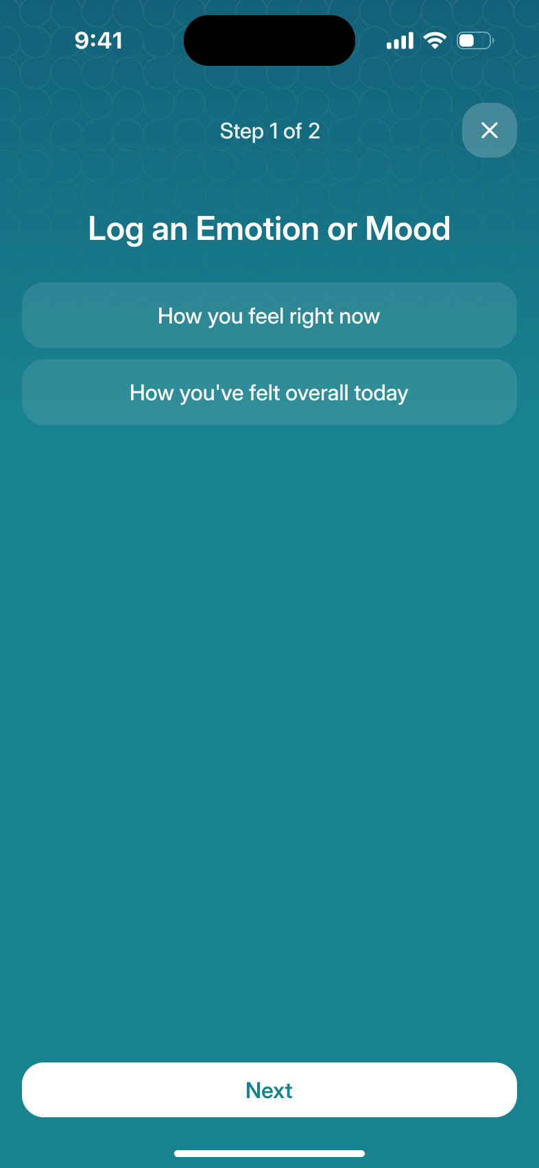
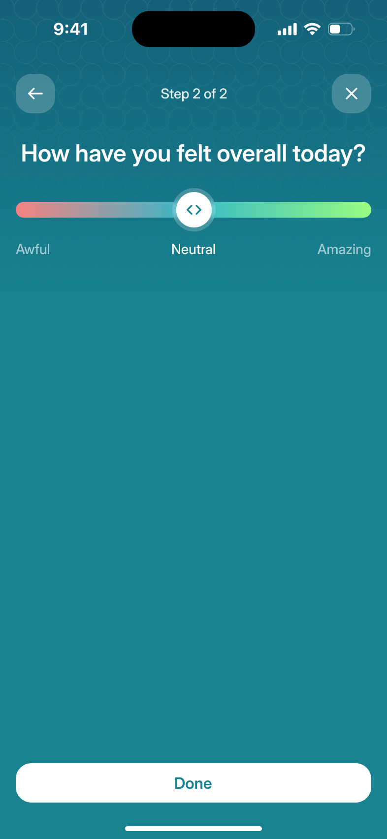
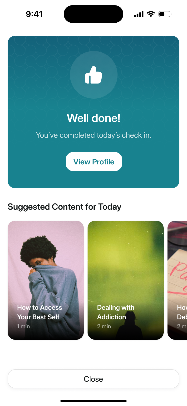
The check-in and the wellbeing quiz began as one flow, and we split them: a mood takes seconds, and the research questionnaires come every 14 days. Moods sit on the profile graph with sleep, steps and exercise. We proposed overlaying the trends so someone could compare them, with an individual metric showing its own scale when selected. That called for restraint: the chart could show patterns without pretending to explain what caused a change in mood.
Nick also pushed for a single slider rather than a set of expressive faces. Picking an angry face can feel different from saying you feel bad. We worked towards a scale someone could place themselves on, without asking them to identify with a particular expression.
Habits run in 30-day cycles with a forgiving rule
We gave habits some room for missed days, rather than ending a streak the first time someone missed one. A habit runs for 30 days, and doing it on 21 of them completes the cycle; the number isn't shown. Miss too many and it resets, with a warning first, and the days you did complete stay green.
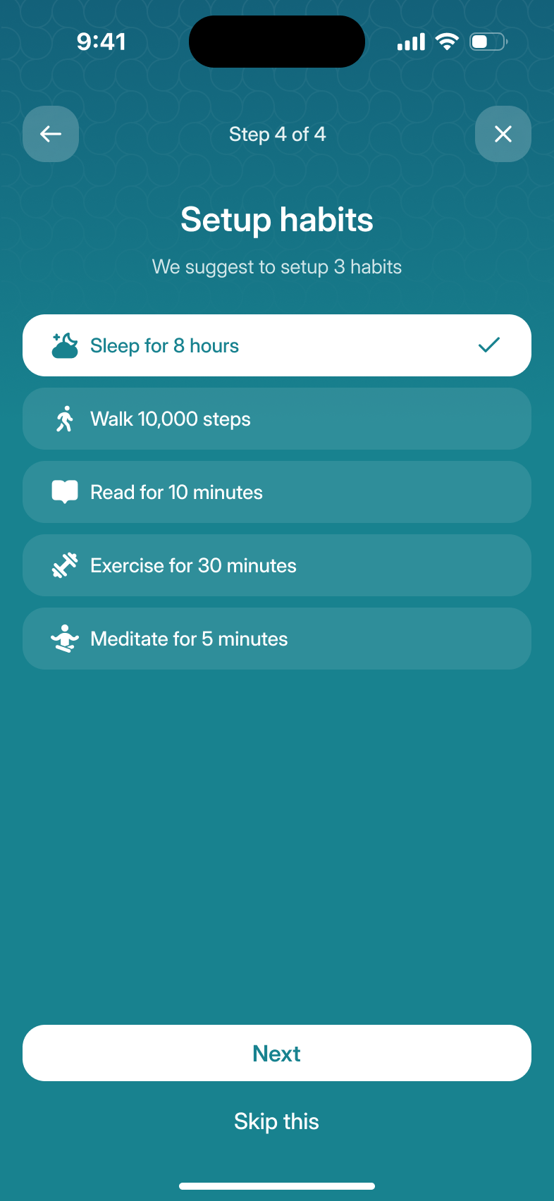
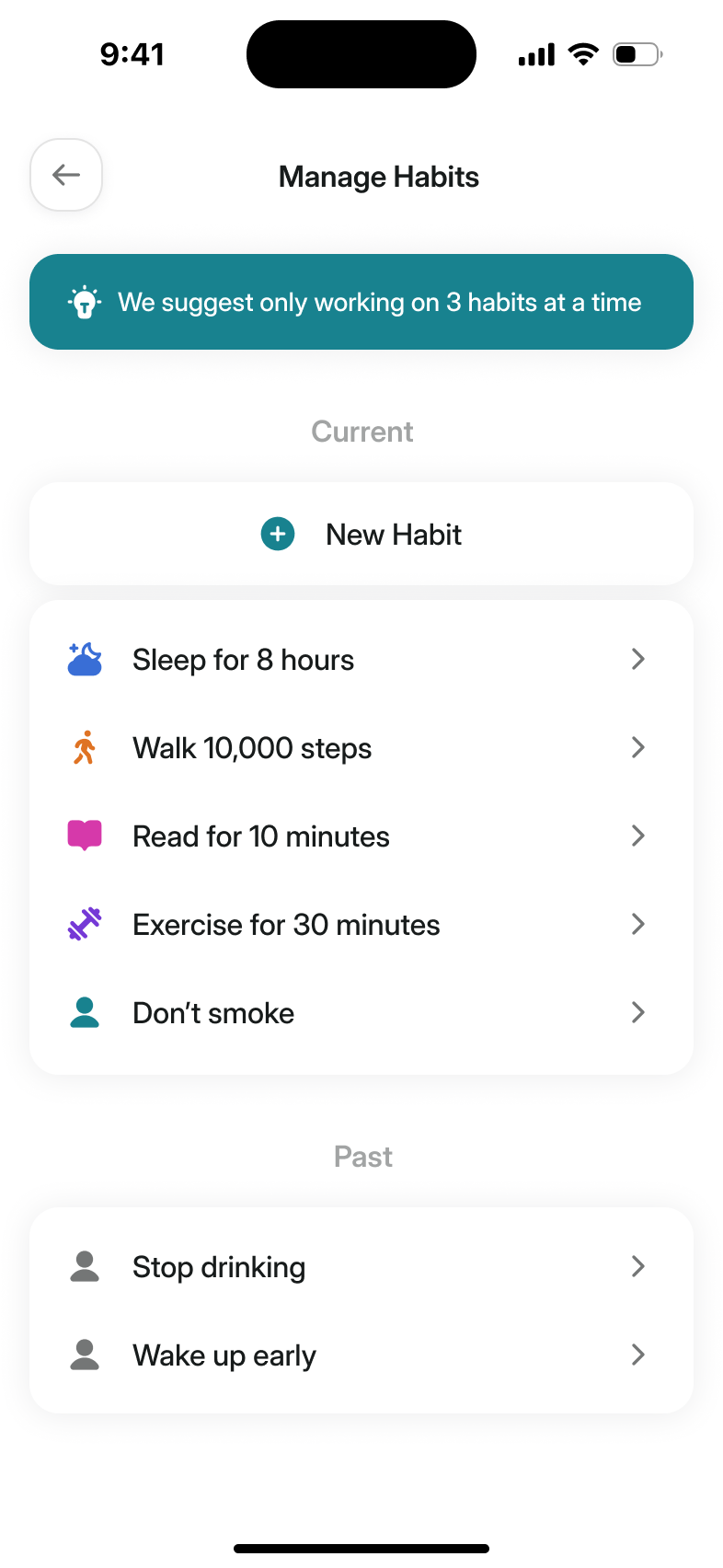
We'd planned to cap how many habits you could track. The cap went, replaced by advice to work on three at a time. A recommendation could help someone start with a manageable list without blocking the person who had a reason to add another.
one missed day doesn't erase the days already completed
Courses ask for commitment after the first video
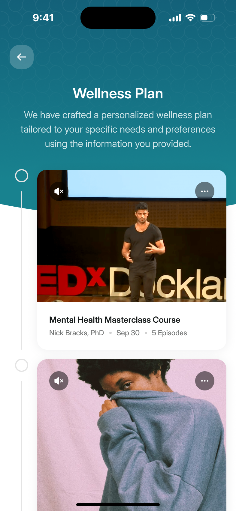
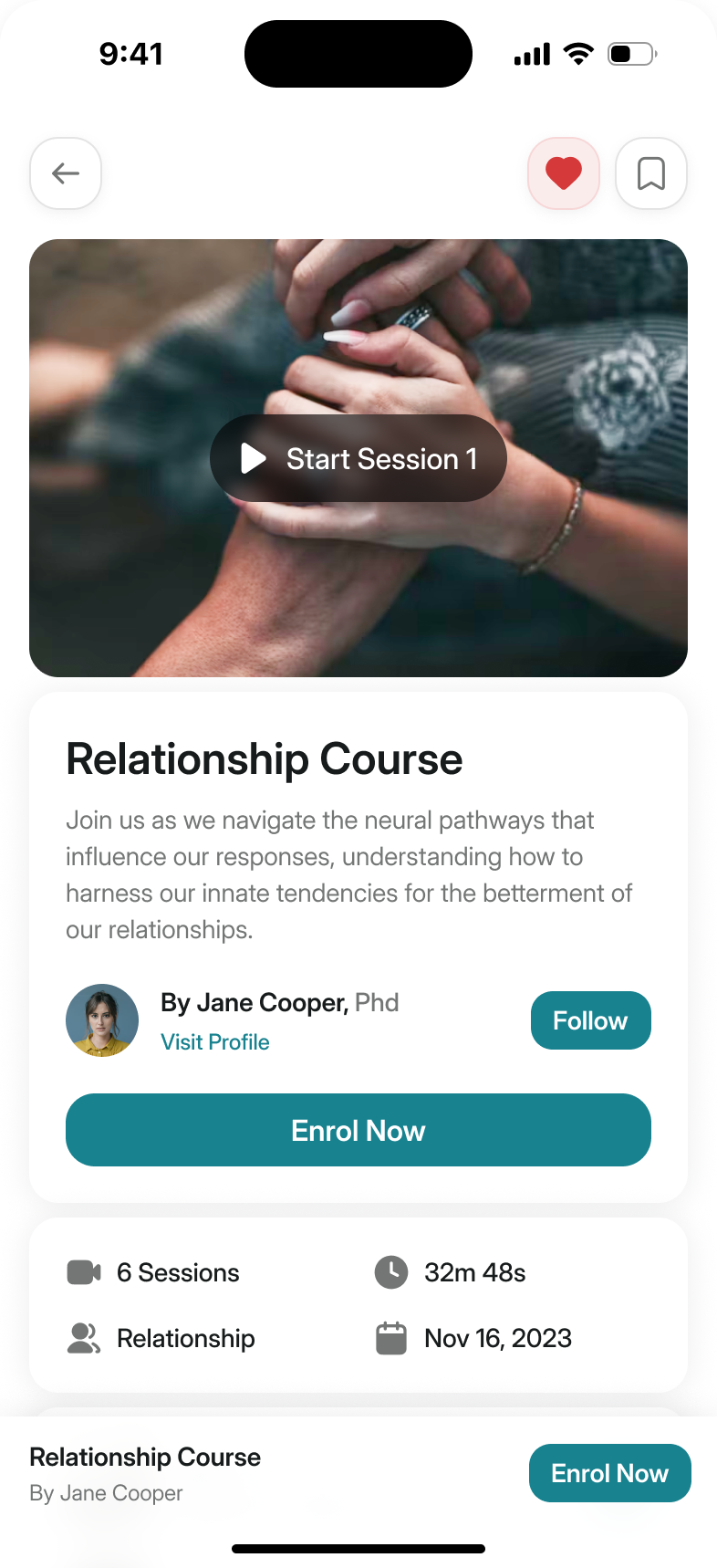
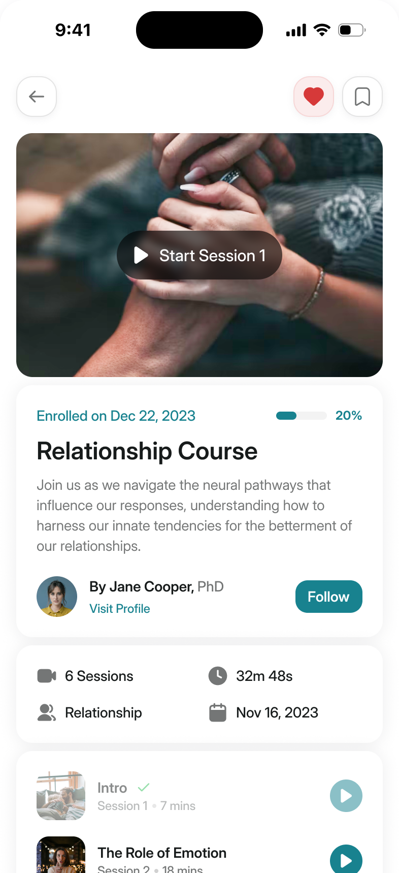
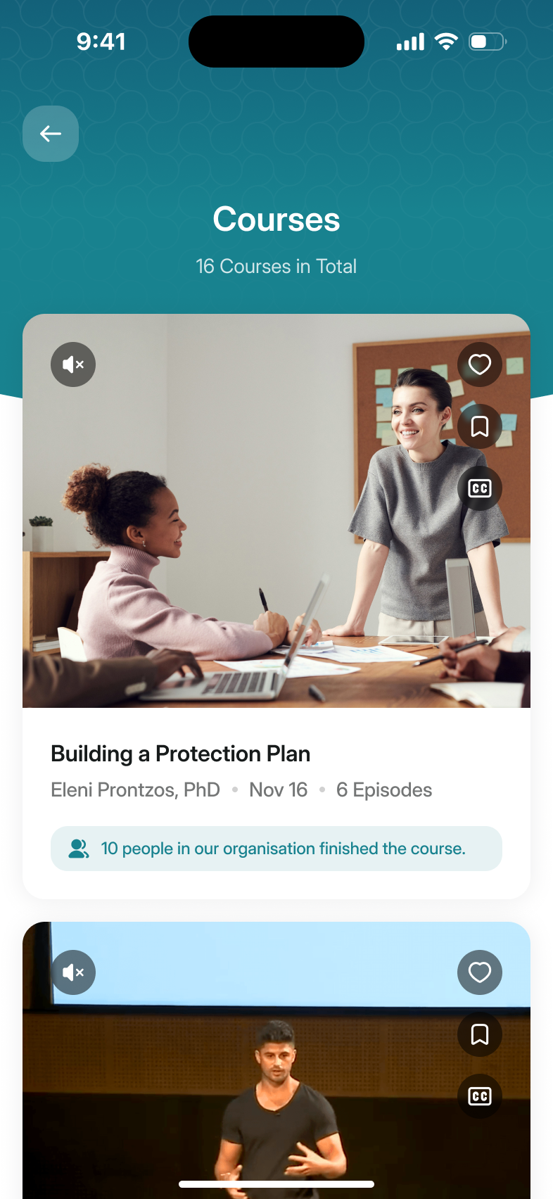
Courses are series of sessions from one creator. You can watch the first straight away, and MYND asks you to enrol as you come out of it. That gives someone a session to judge before asking them to commit to the rest. I'd drawn a progress ring around each session, then argued against it myself as fiddly to build for little benefit. The list says how many people in your organisation finished a course, and nothing more.
Creators publish through a review queue
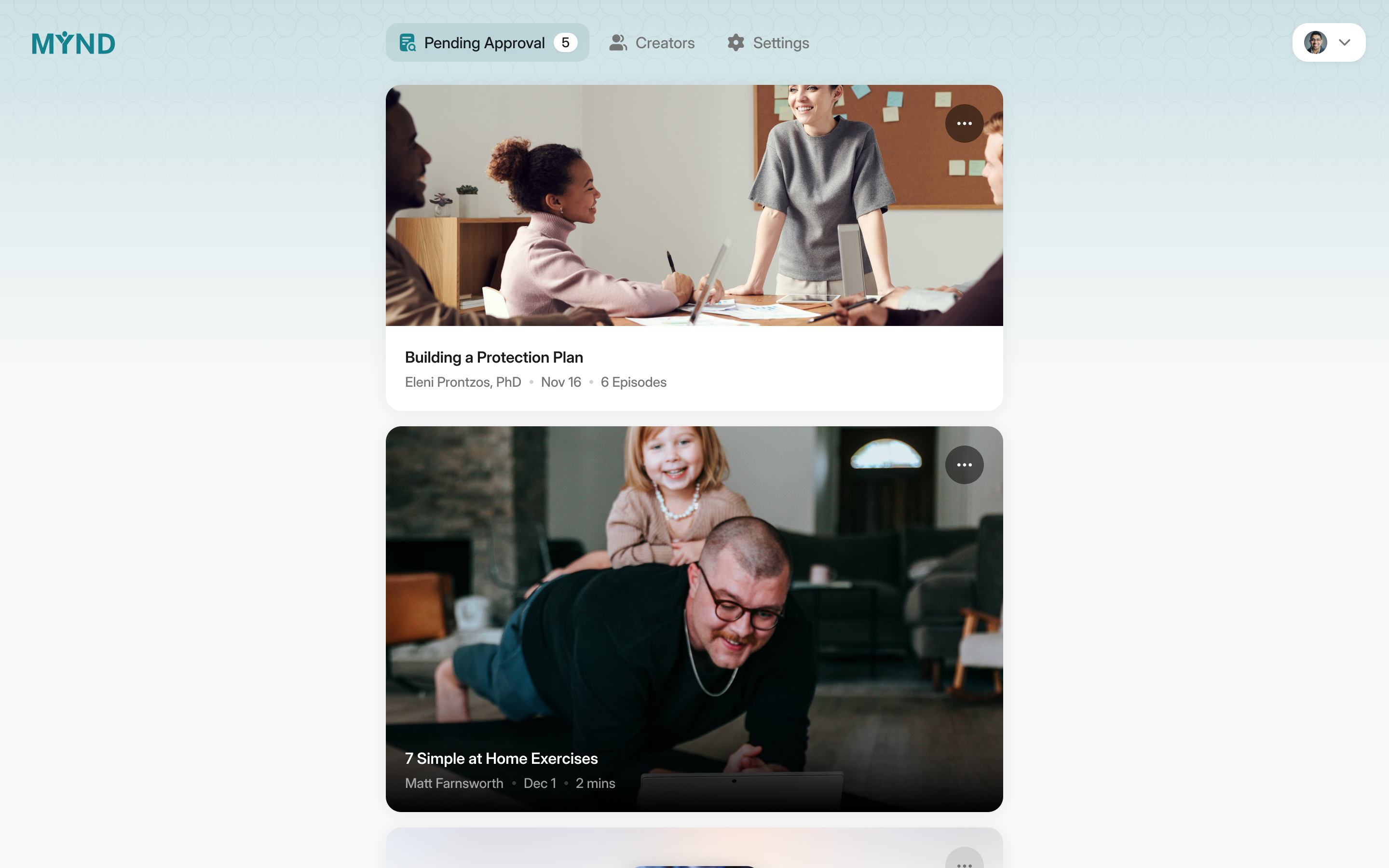
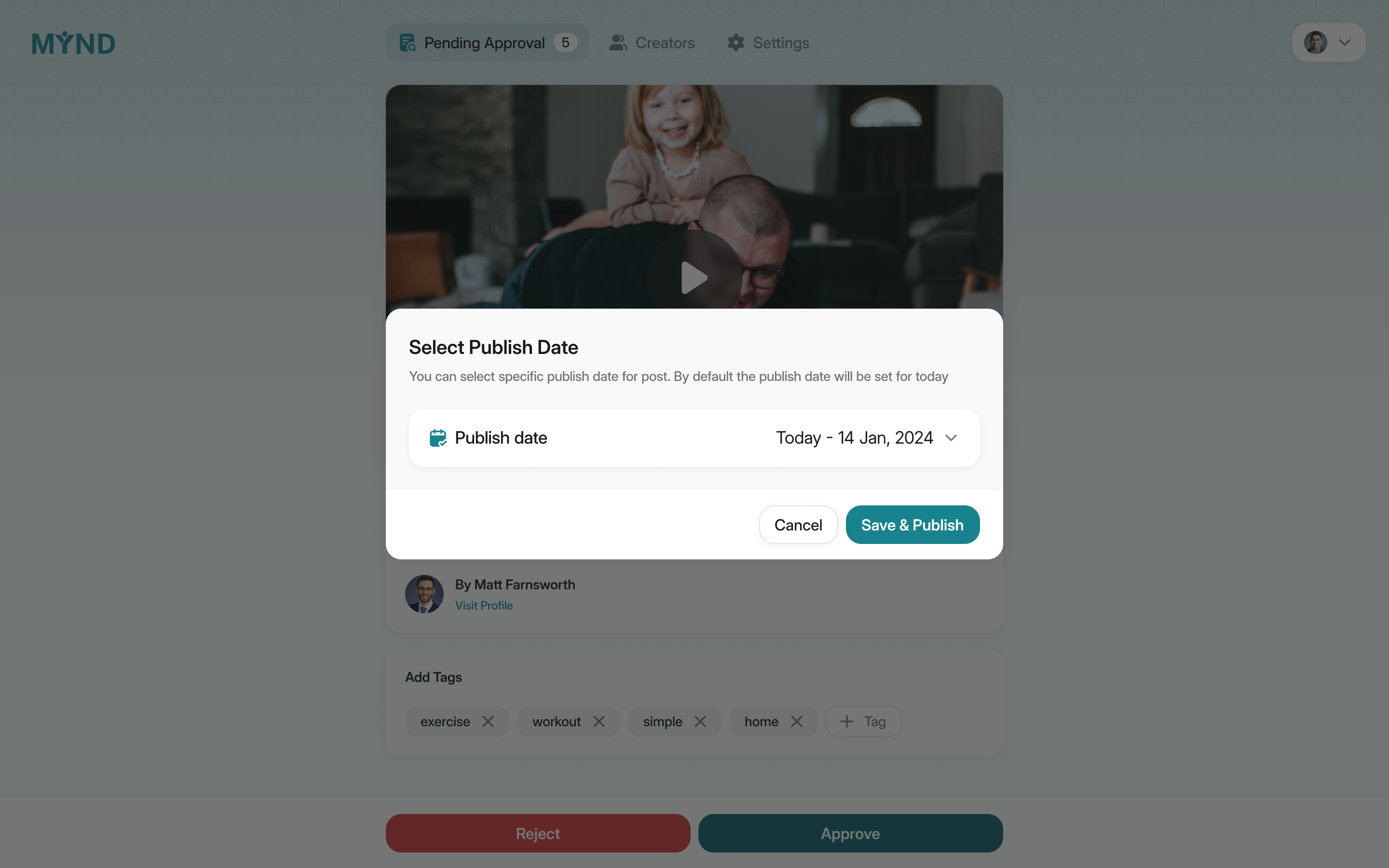
The app depended on content from people with different qualifications. That made the publishing tools part of the trust problem. Creators use a desktop web portal, where a post moves from draft to submission and then approval or rejection by MYND. A published post can't be quietly edited after review.
Colleen made the need for drafts concrete: a creator assembling a multi-part course might need to stop and come back. Saving work should not send half a course to MYND for review. We separated saving a draft from submitting it, while keeping changes to reviewed material out of the live editing flow.
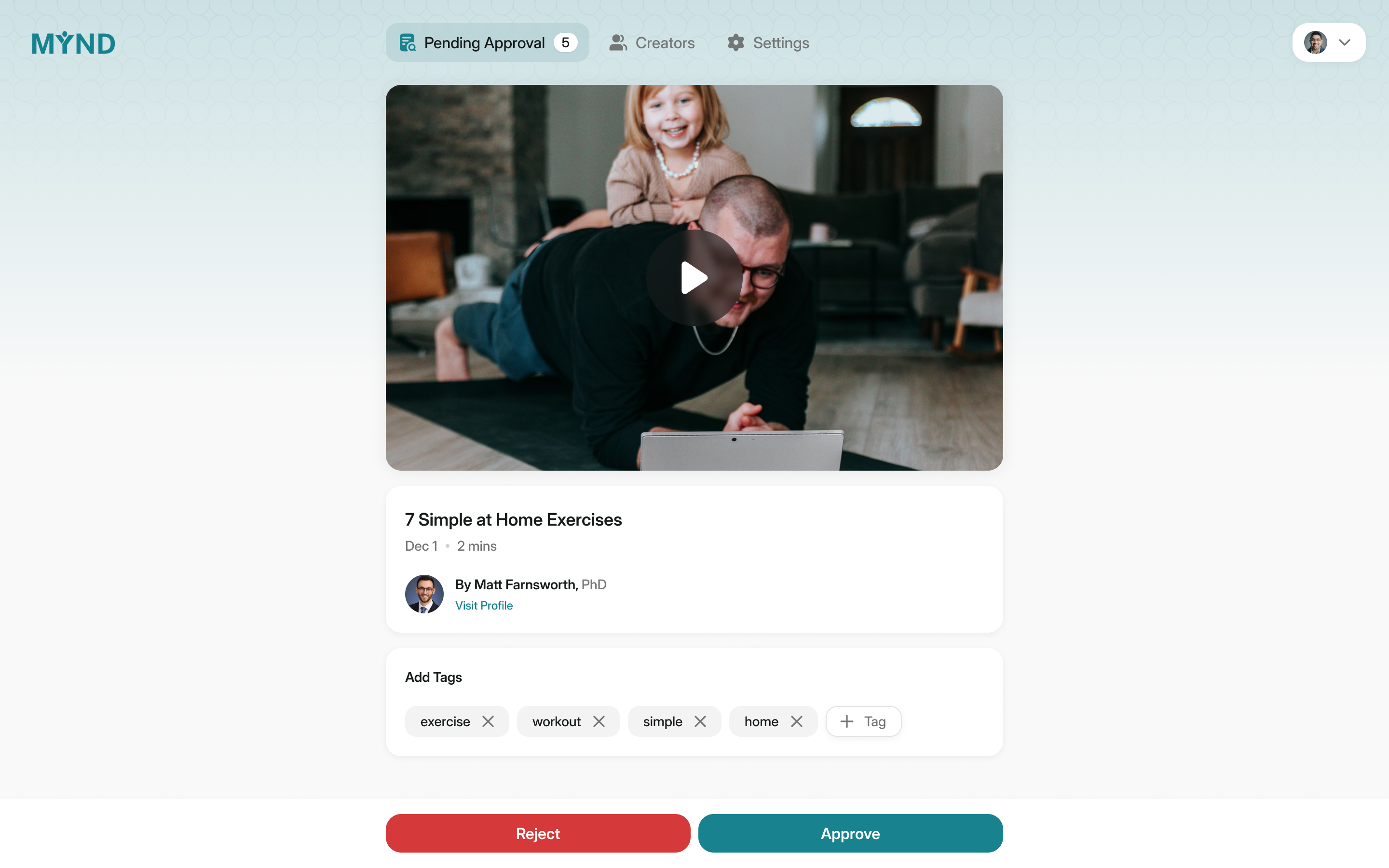
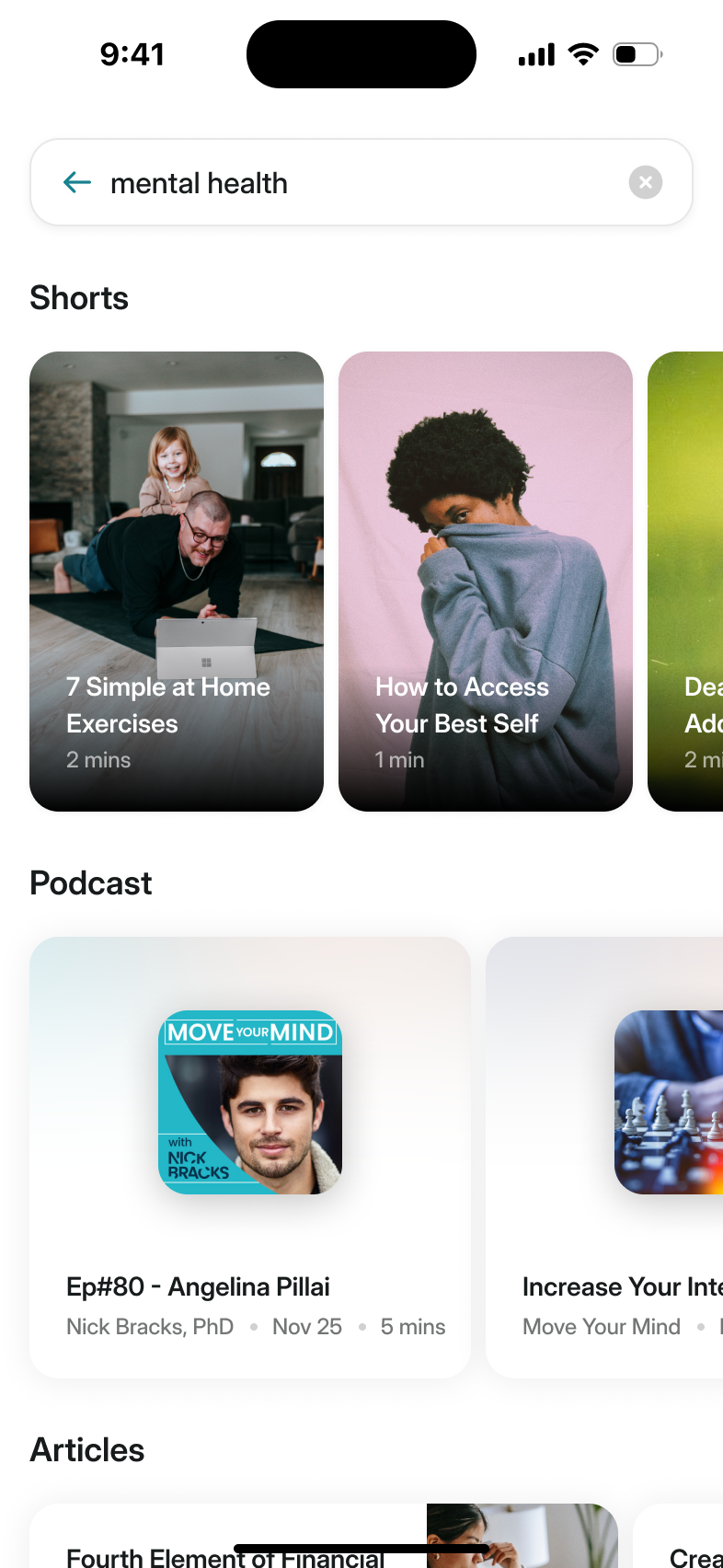
Approval is also where content gets the tags the feed matches to each user's chosen areas. The feed was intended to prioritise unseen content, then relevance, then recency. Someone's chosen areas therefore needed to connect to the labels on the material, rather than sit in a questionnaire that never affected what they saw.
MYND also sets each creator's type. A clinical psychologist and a personal trainer can both publish, but their profiles need to describe different qualifications. We gave the team controls for that distinction instead of leaving it to a free-form biography.
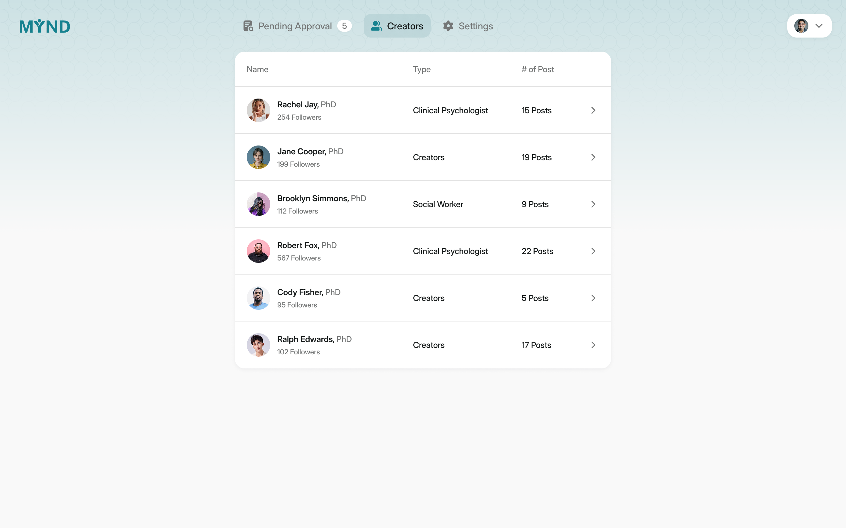
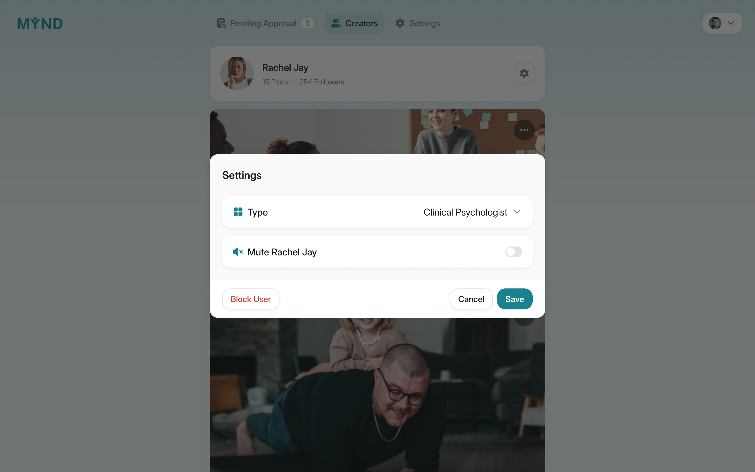
a psychologist and a personal trainer need different labels
Three ways in, depending on who's paying
You can sign up on your own, with a work email, or with a company code if you're a contractor. The first draft buried the company route, and I flagged it: most users will arrive through an employer. Company sign-ups also ask for a personal recovery email, so someone could recover the account after losing access to a work inbox. That is separate from whether their employer continues paying for it.
Colleen wanted onboarding to be three or four screens and then the app itself, so nothing asks for a permission until there's a reason: Apple Health on the empty health chart, notifications when you set a habit.
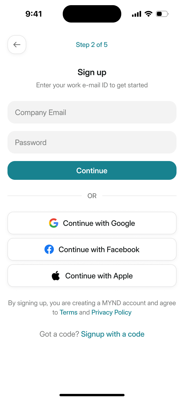
company email and contractor code are separate ways in
A smaller first release
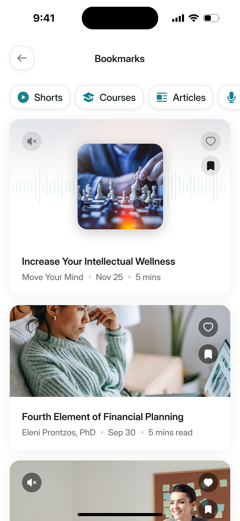
We went down the feature list and cut. Following creators went, and so did notes on bookmarks. What stayed: the check-in, the feed and its courses, habits, the coach, and a route to a therapist or a crisis line when the rest isn't enough.
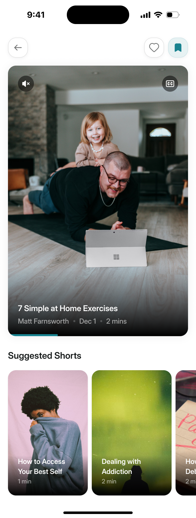
the follow buttons shown here were cut from the first-release scope
More from Move Your Mind