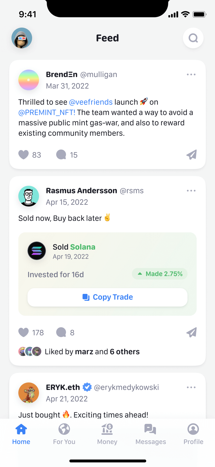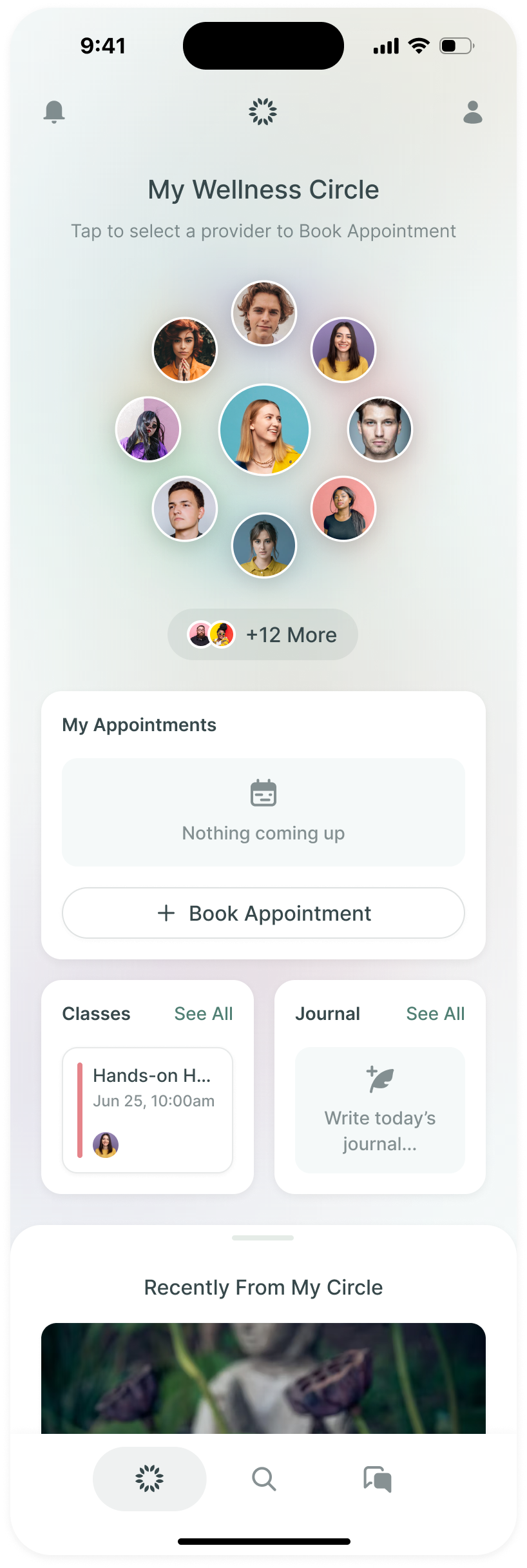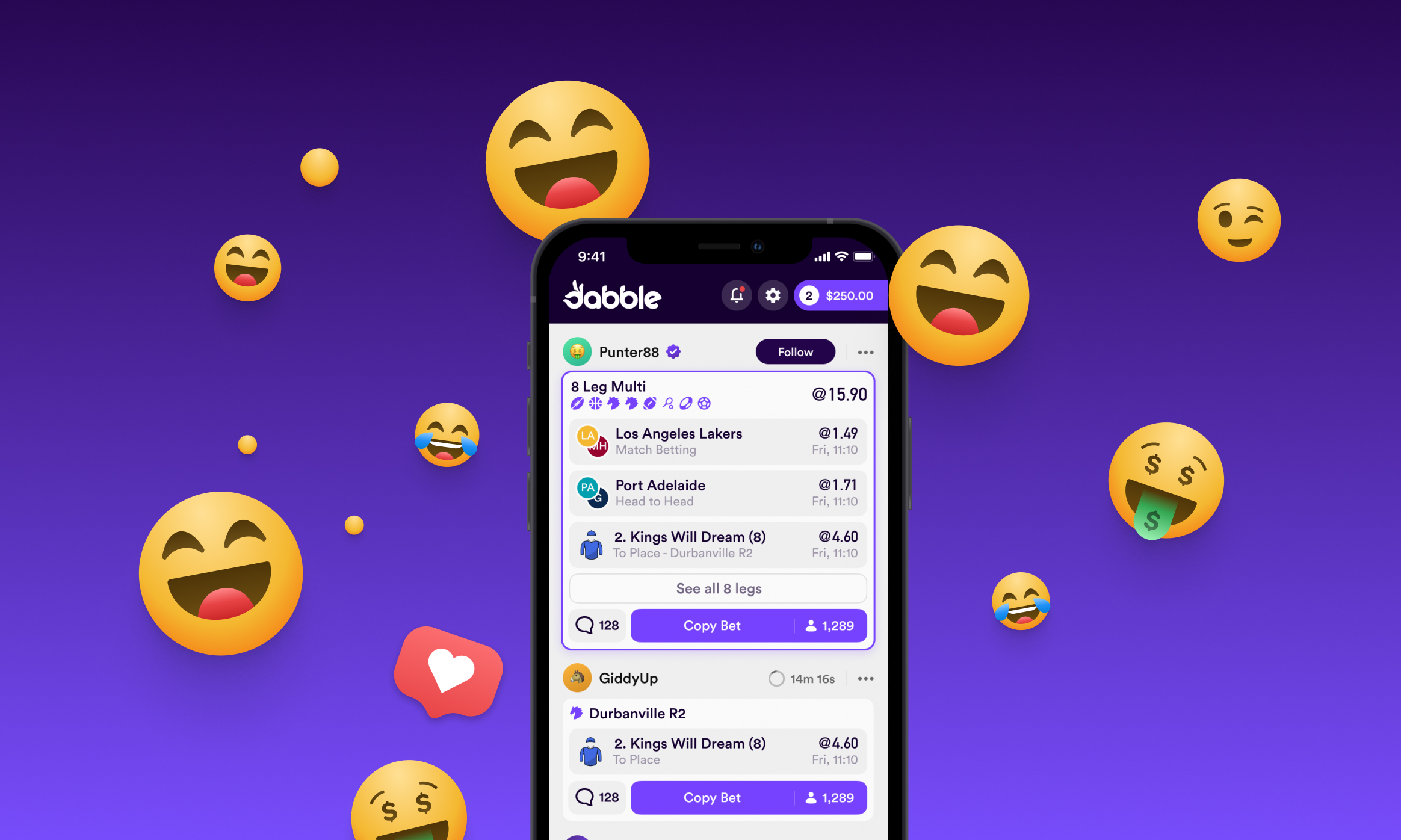
Dabble is a sports betting app built around other people's bets. Its home is a feed of bets placed by people you follow, each with a button to copy the selections onto your own slip. Making that idea work meant designing a bet as something people could read, discuss and copy, as well as something they could place.
We joined founders Dave and John Robin before the Australian product had launched, in August 2020. The first brief covered two pages. We went on to lead product design into 2023, working alongside Dabble's developers as they built from our files. The engagement grew to include the wagering experience, social features, onboarding and the brand.
One ticket has to work across the whole product
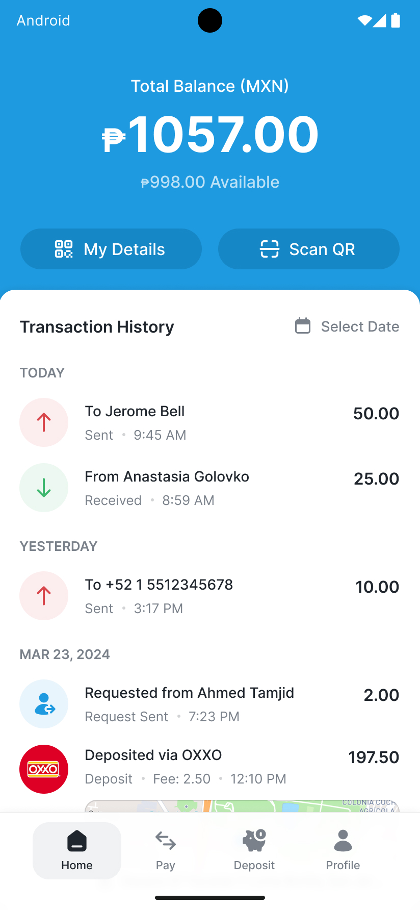
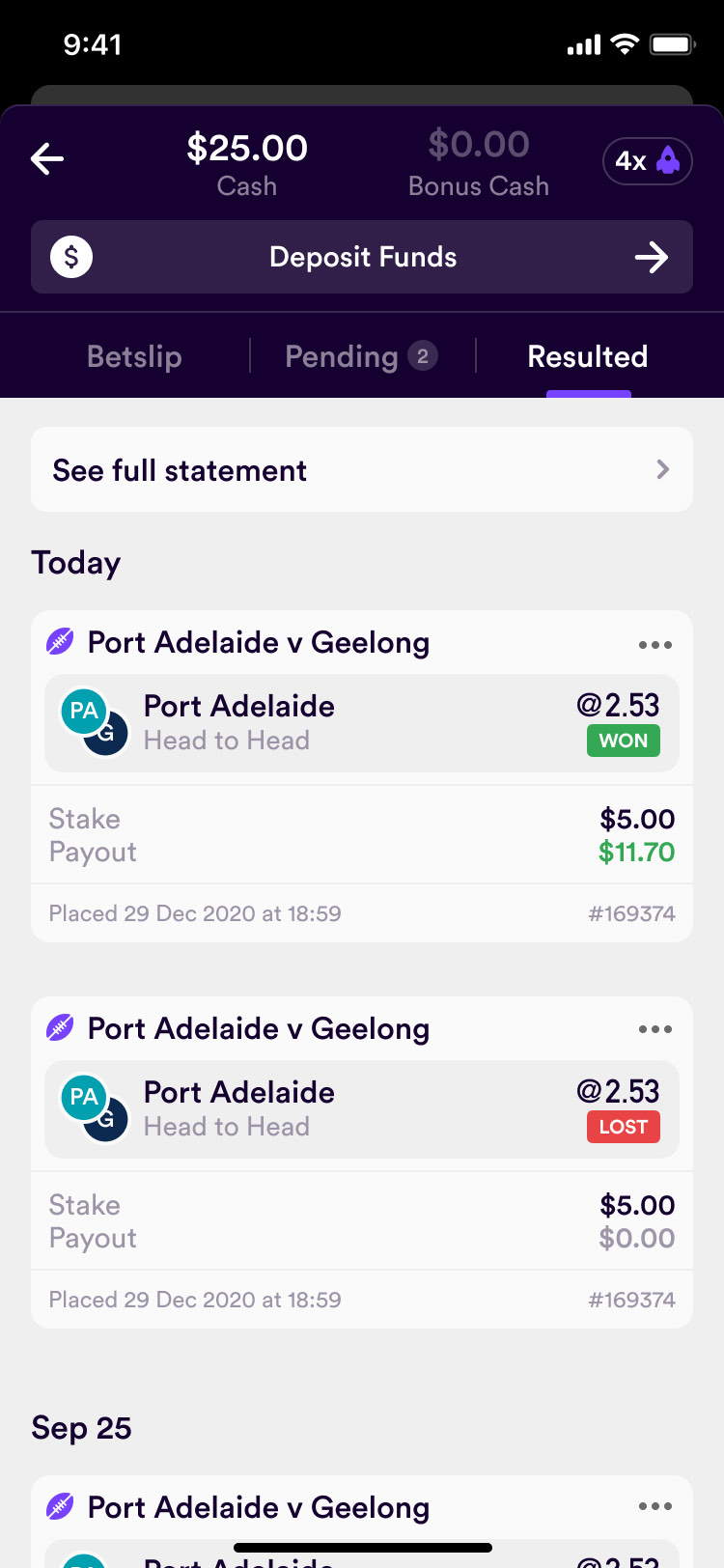
In any betting app you pick a market, add a selection to your slip, set a stake and place it. The bet sits in pending until the event runs, then resolves: won, lost, or void if your horse was scratched. The ticket needs to make all of those states clear.
Dabble adds a second life for that ticket. A placed bet becomes a post that appears in a feed, on a profile and beside the event itself. The same underlying bet has to read correctly in each place, whether it is a single selection, an eight-leg multi, a same-game multi or a racing bet. Someone looking at it needs to understand both the selections and what has happened to them.
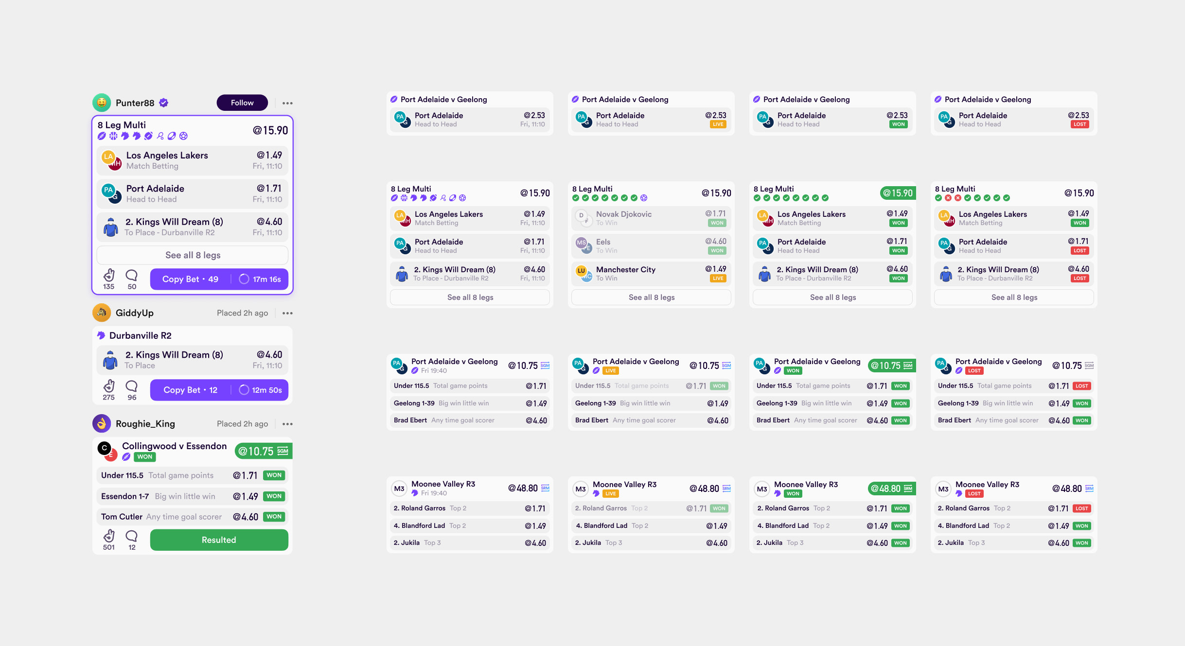
We counted around fifty variations and gave the tickets a Figma file of their own. In the main file, every ticket became a plain grey placeholder until the set was done. That gave the developers a clear boundary between a screen ready to build and a component still being worked out. Designing each feed or profile ticket independently would have left several versions of the same betting logic to keep aligned.
the ticket needs to mean the same thing on a feed, a profile and a racing screen
Make copying part of reading the bet
An early call with Dabble cut the navigation to three tabs, Feed, Bet and Banter, and pushed direct messages and a few other features out of version one.
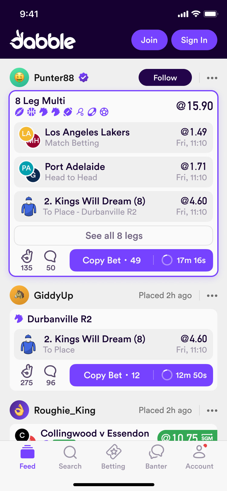
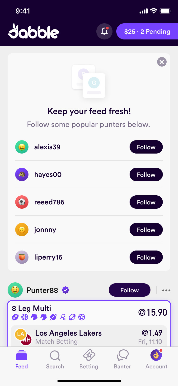
Copy Bet sits on every ticket with its copy count. I drew a few concepts to make that count louder, Prakash pushed them further, and the version that stuck put the copiers' avatars beside the number. The faces made the count feel connected to the people behind it. The action still lived on the ticket, close to the selections a person was deciding whether to copy.
Light, because people bet at the ground
The first mockups were dark, and everyone, us included, preferred them. I presented them to Dabble and they asked to see the same screens light. A lot of Dabble's betting happens outdoors at the game, where a dark screen is hard to read in sunlight. I said dark mode could come later, but not a dark-only app. It launched light.
The headers went dark purple anyway. 7ahang, who designed the launch screens, brought a reference with the light content rounding up over a dark header, and I asked for it everywhere. A fancier scroll, with the content riding over the header, was set aside: four developers had seven weeks left.
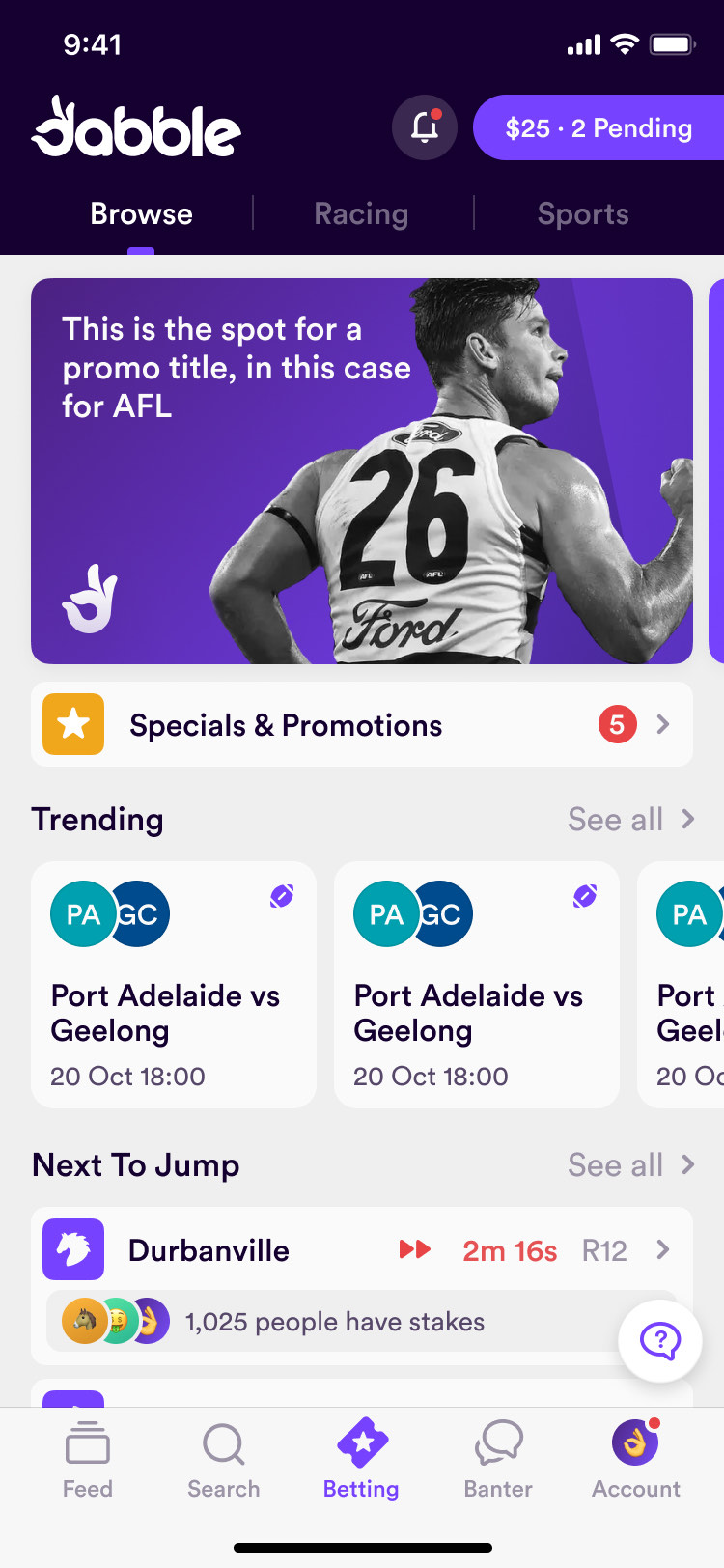
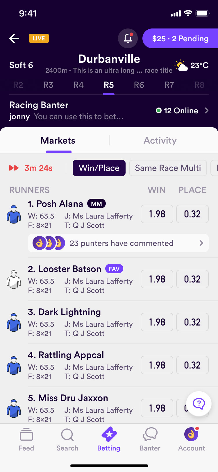
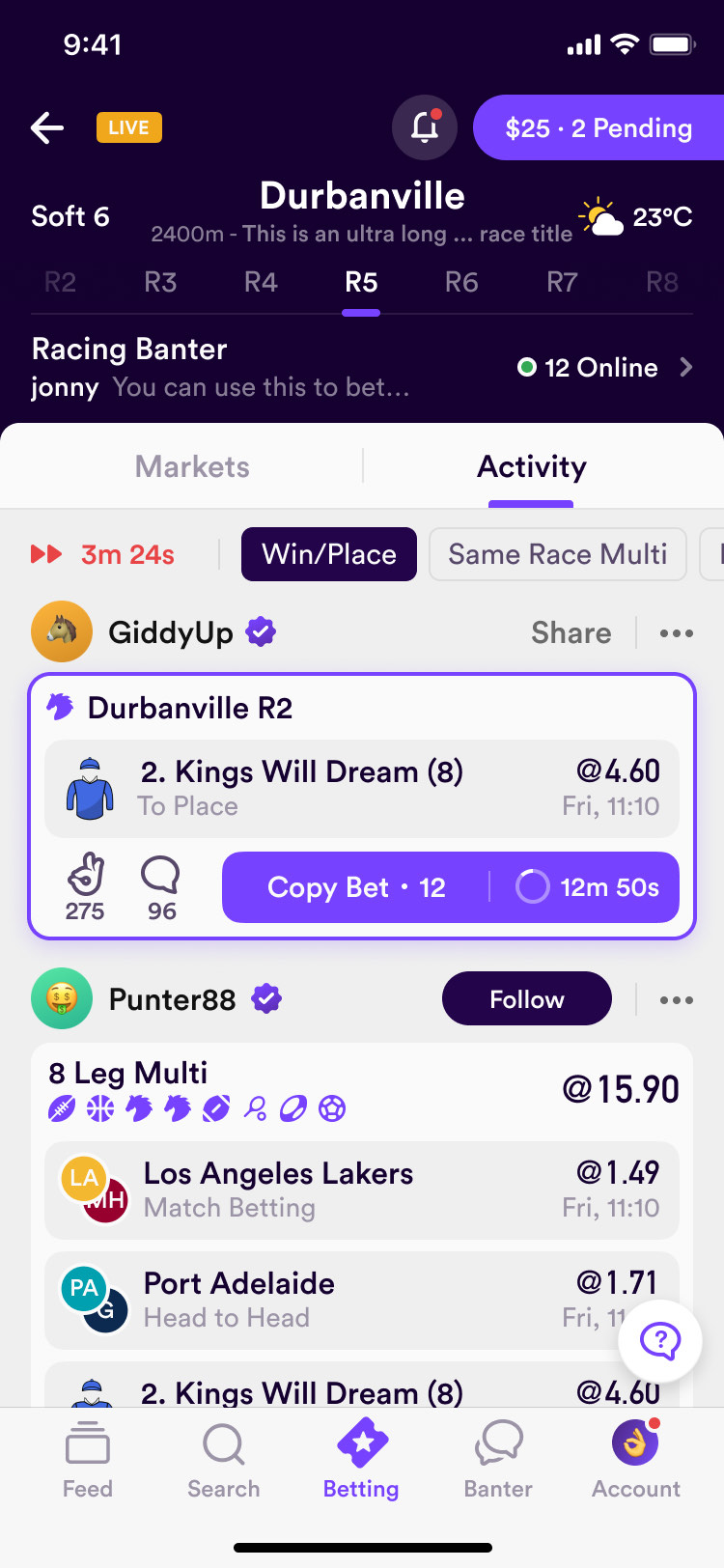
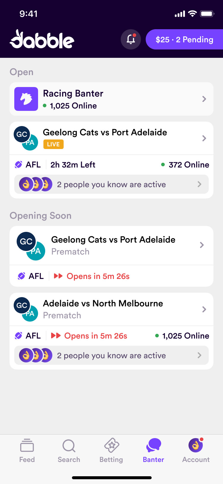
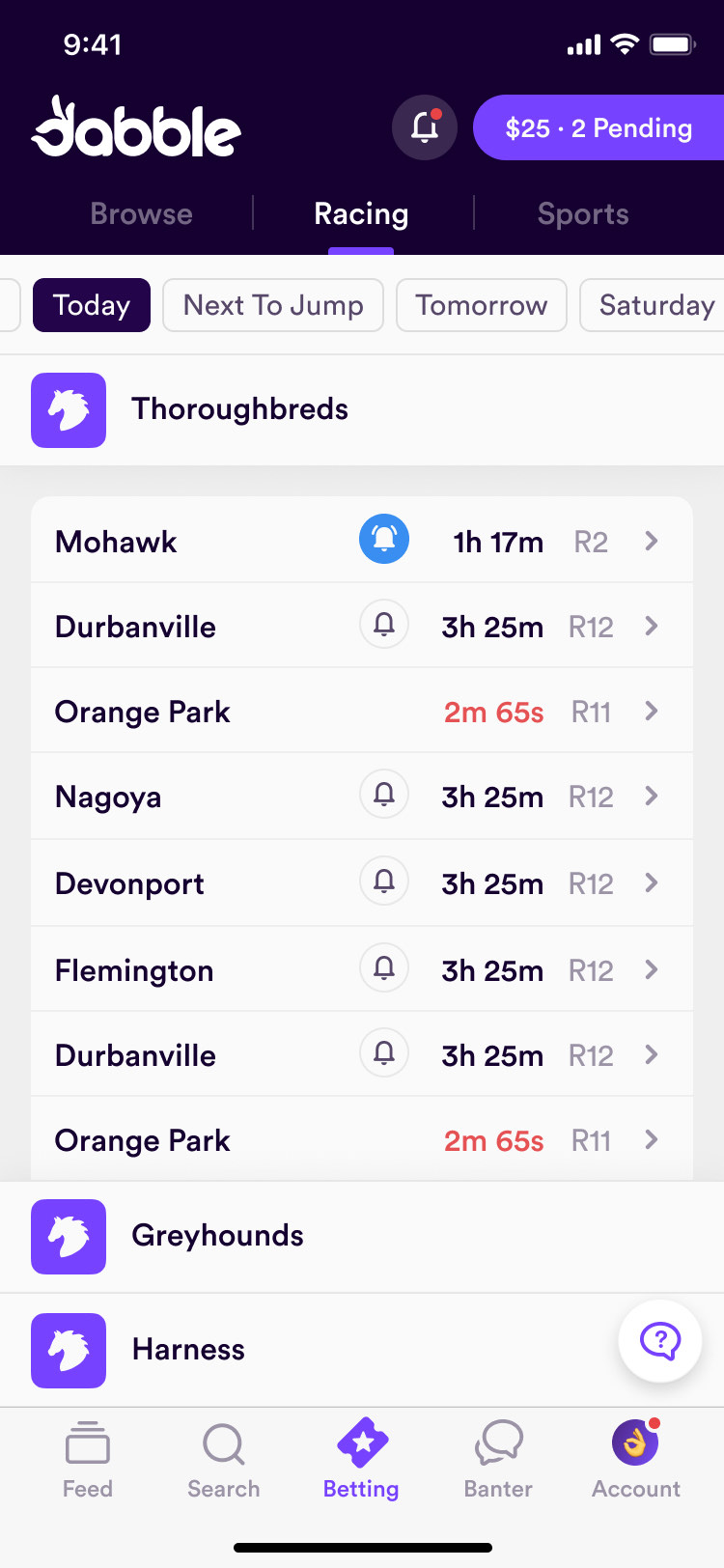
Each race also has an Activity tab for the bets placed on it. The social model works from either direction: start with a person in the feed, or start with an event and see what people have backed.
Keep placing the bet familiar
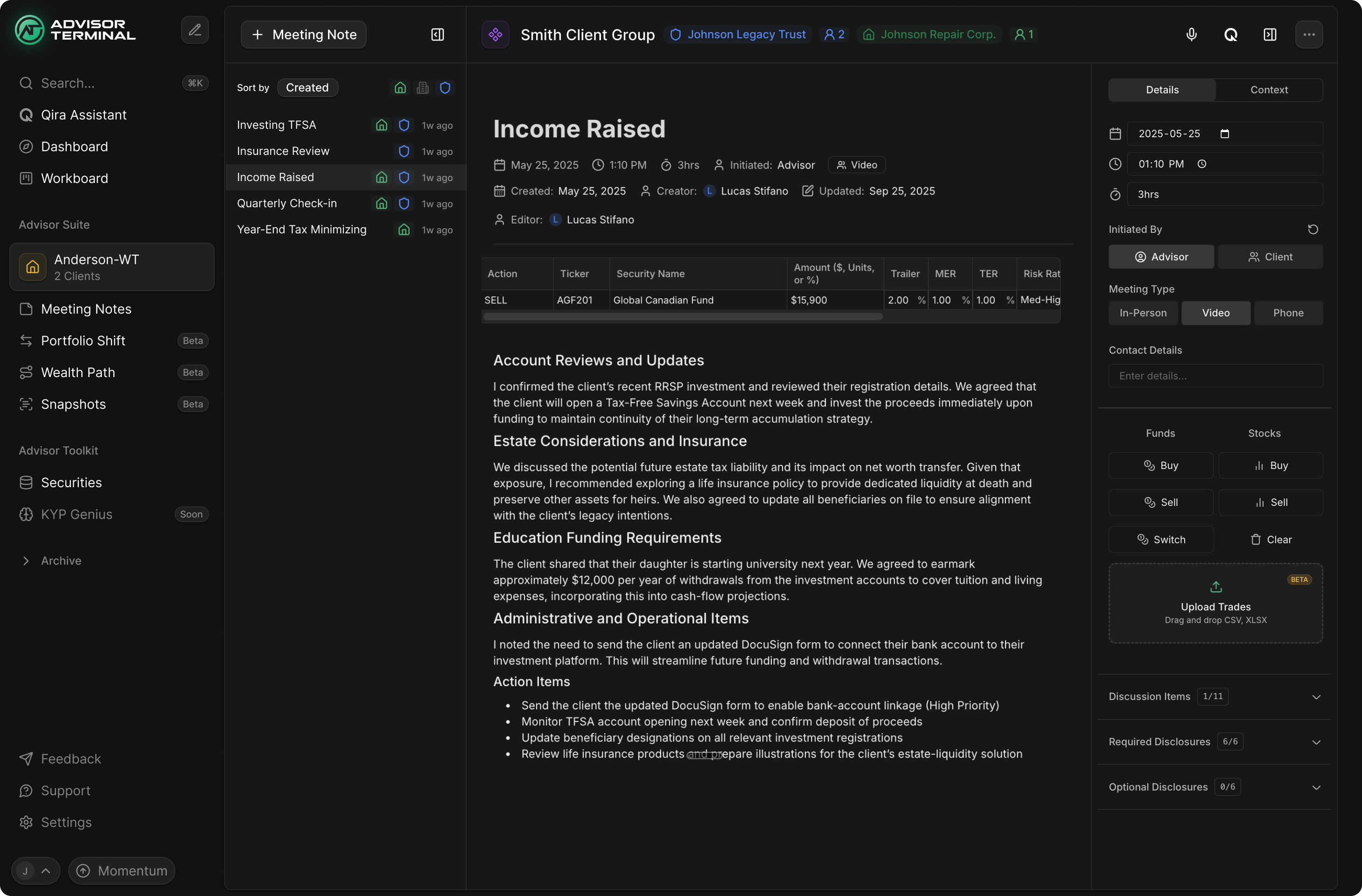
Copying a bet brings someone into a familiar wagering flow. They still need to choose their own stake, understand the price and place the bet. We kept the slip organised around that sequence: bets being built, pending bets and resulted bets. When odds move, the ticket shows the old and new price together, so the change is visible at the point where it affects the bet.
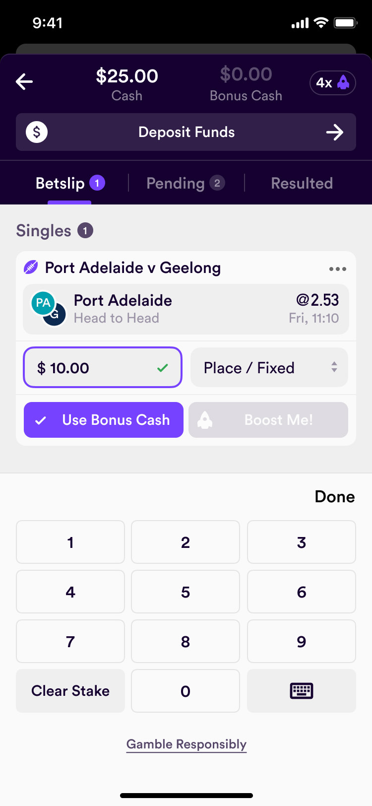
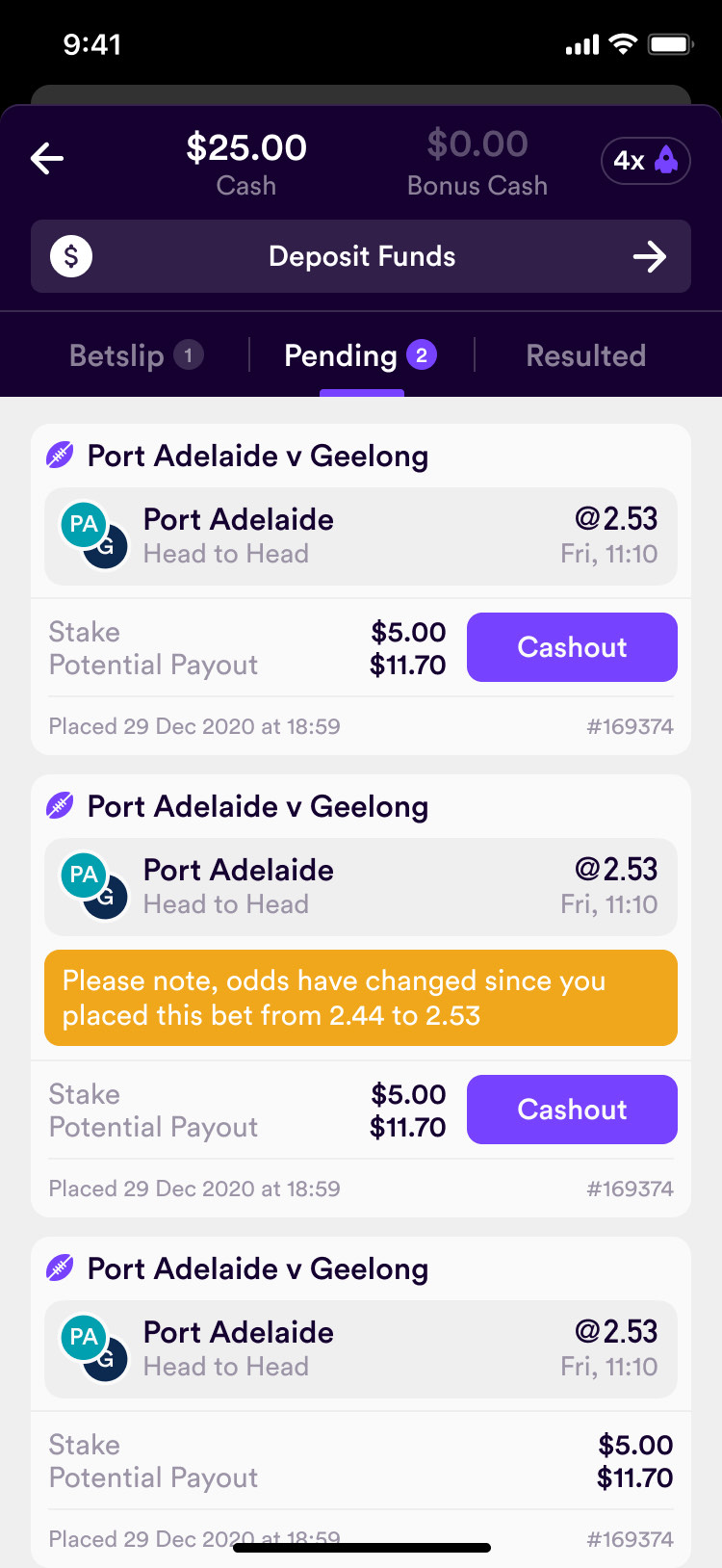
changed odds stay visible beside the bet they affect
Give an odds boost an identity
The odds-boost feature became a rocket minigame. A person launches the rocket and stops it before it crashes; the result changes the odds on their bet. The slip remains the place to start, and the result screen returns to the ticket with the boosted price beside the maximum available. The promotion has its own visual language, but the outcome is still expressed through the bet people already understand.
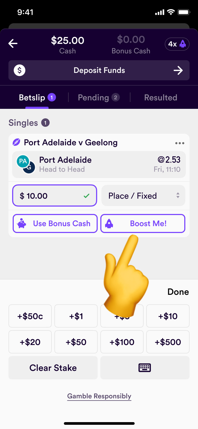

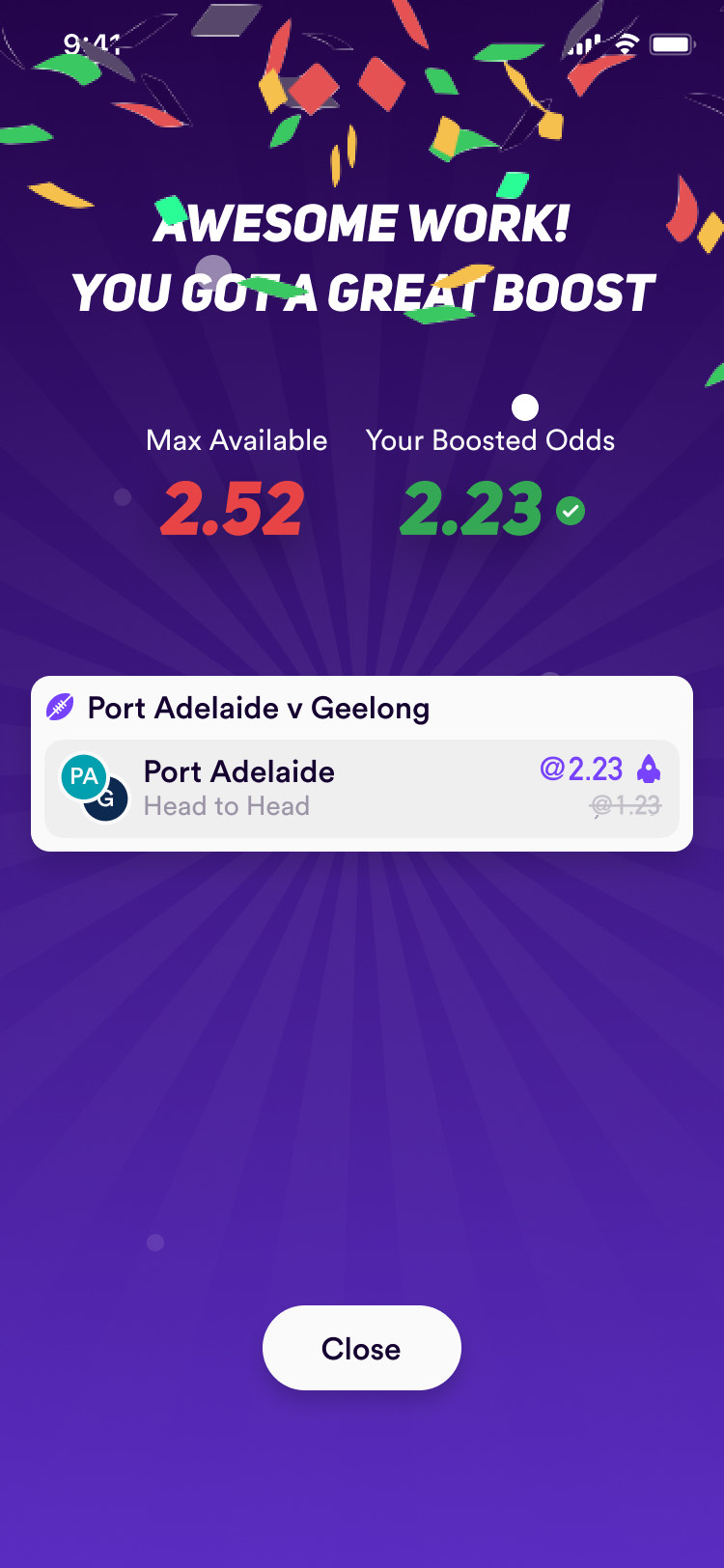
The rocket outgrew the minigame. It flies across the screen when the app opens, and it became Dabble's mascot.
Profiles show bets, never money
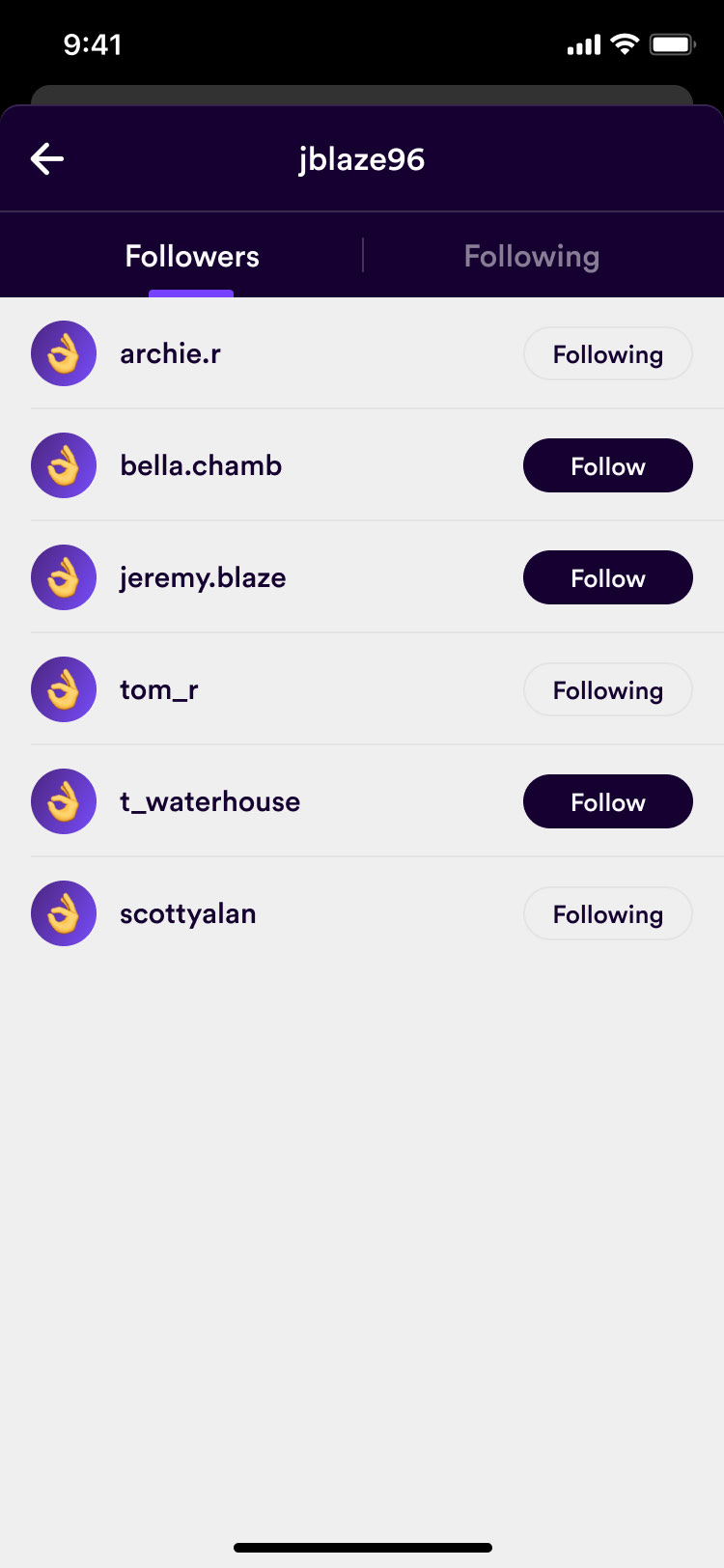
The first profile designs included how much someone had staked. I cut those stats in the first week. Making bets social didn't require making personal spending public. A profile shows the bets a person placed, under a username rather than a real name, and everyone builds an avatar in the app instead of uploading a photo.
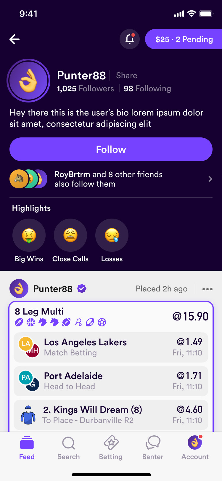
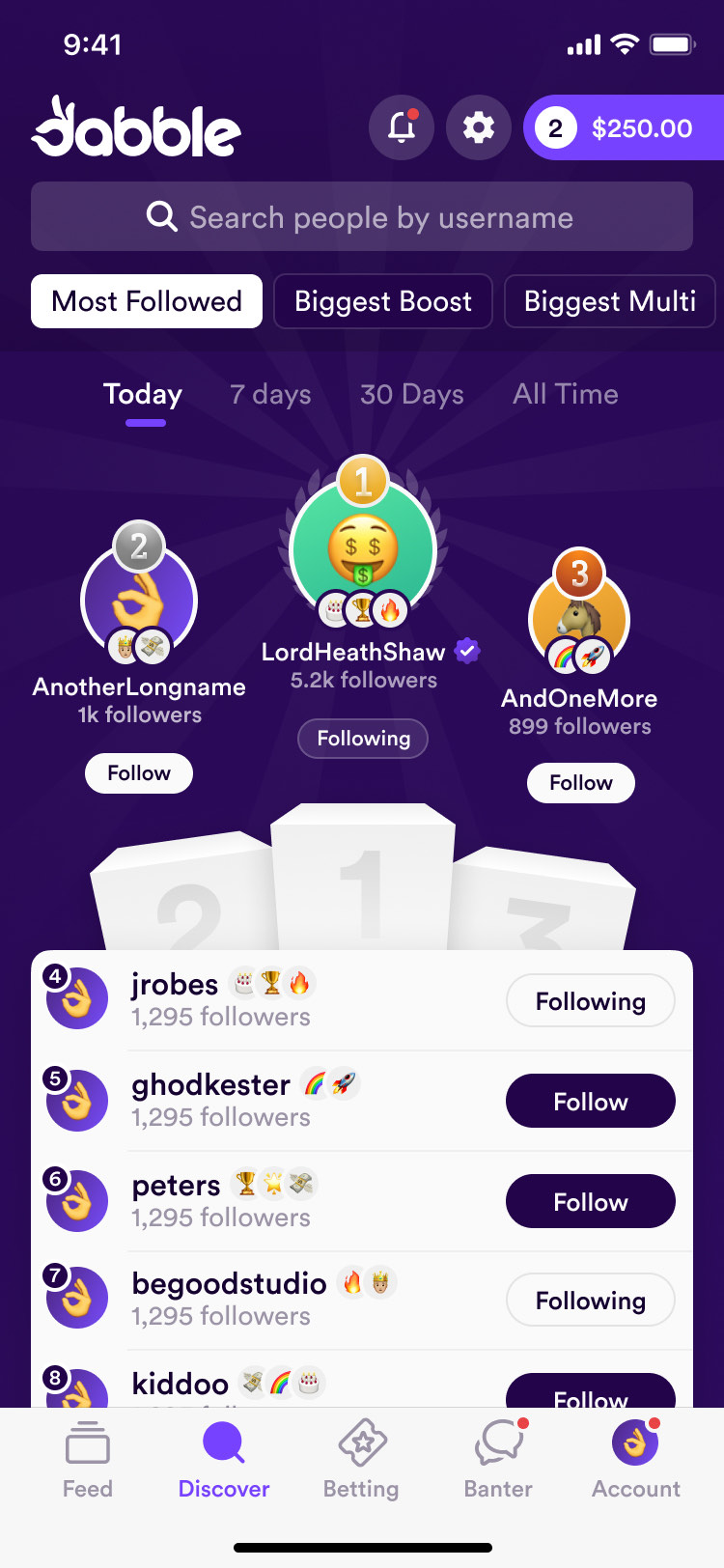
Leaderboards rank punters by followers, biggest boost, biggest multi and most copies.
show the bet, keep the person's spending private
Keep the same conversation controls
Every game and race has a chat room. My first brief for it wasn't clear enough and the first pass came back with the wrong structure, so I reworked the UX myself before 7ahang polished it. The rooms run on the same chat bar as the comments under a bet. A second, slightly different bar for comments crept into the file, and we deleted it.
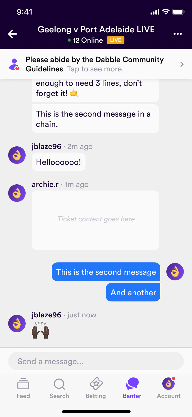
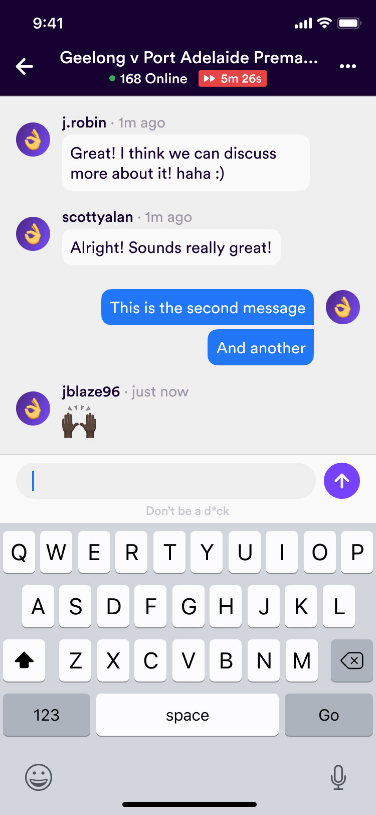
Rooms on big games hold thousands of people, so a pinned bar at the top points to the community guidelines, and nobody can close it.
Limits are part of signing up
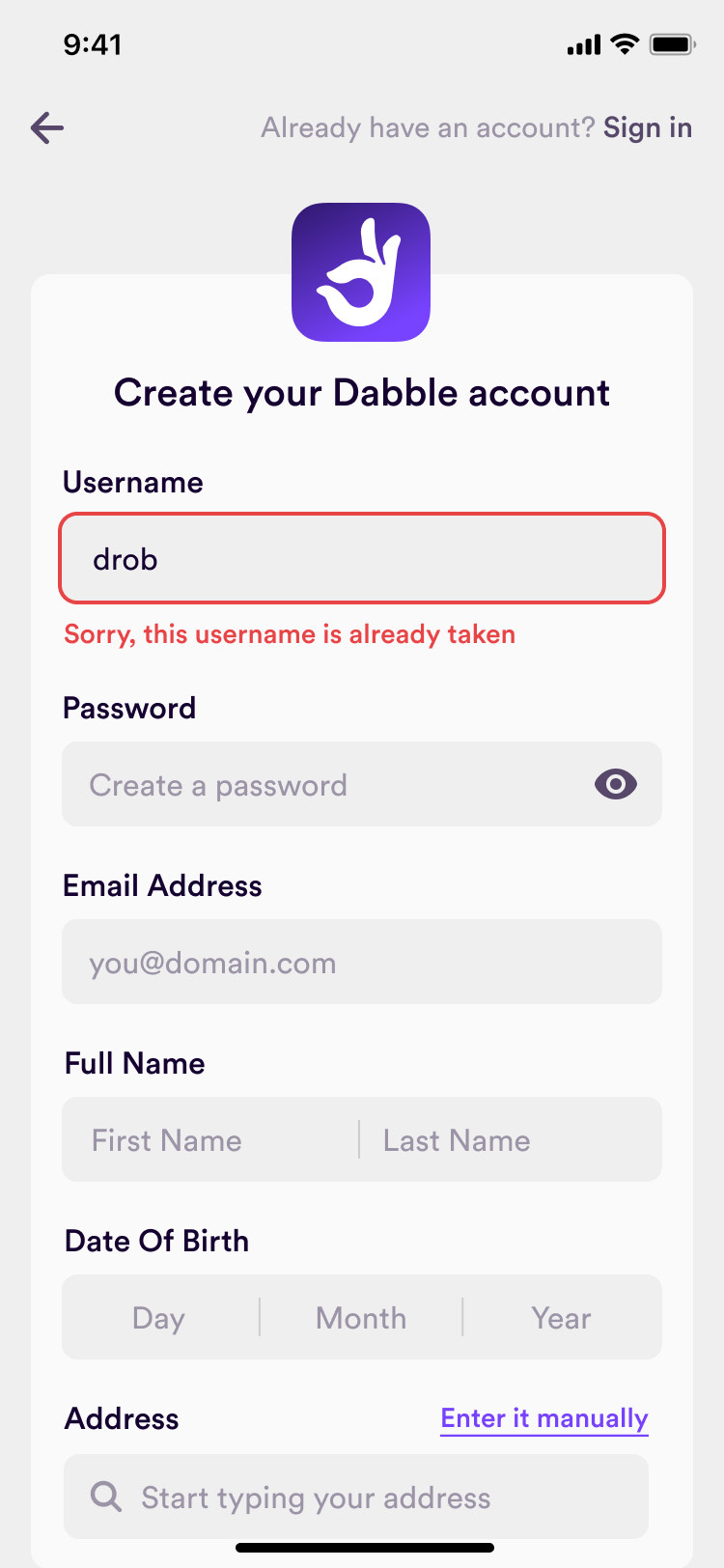
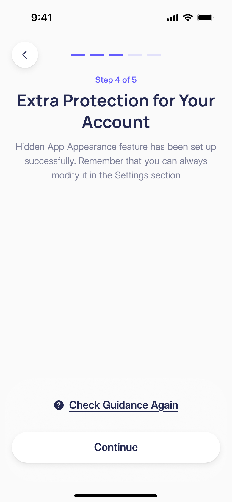
For the Australian launch, we gave someone under 18 a screen of their own rather than a form error. A deposit limit was one of the sign-up steps: under-25s started on $500 a week, and raising a limit only took effect after seven days.
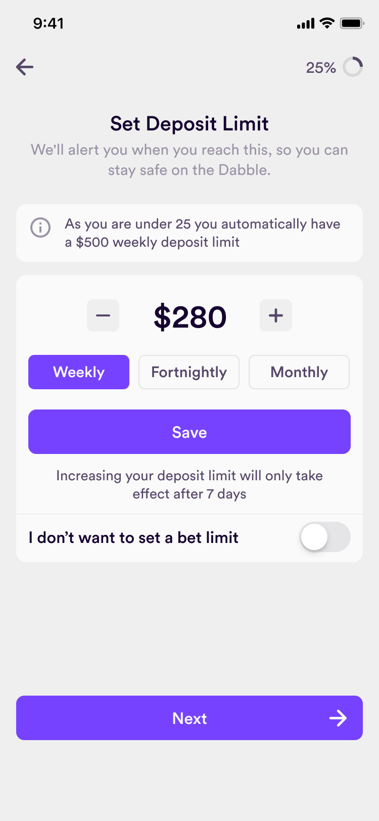
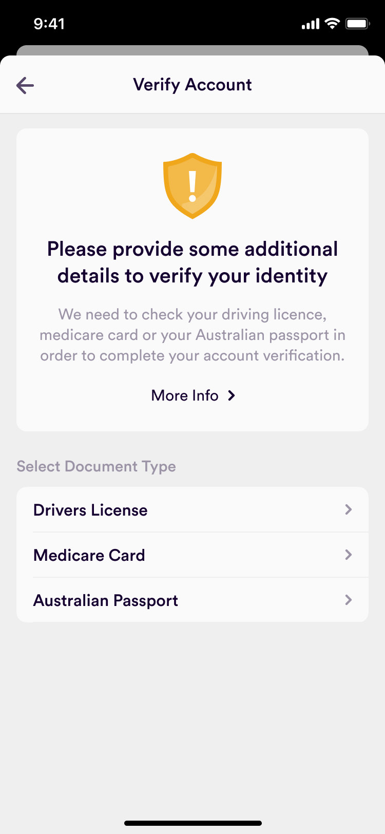
The limit is a distinct step in onboarding, with its own explanation and controls. A person can choose the period, see the amount and read the delay before an increase takes effect. Those decisions need more attention than another field in the account form. We kept later profile editing on a single screen, rather than repeating the length of the sign-up flow.
The brand had to work inside the product
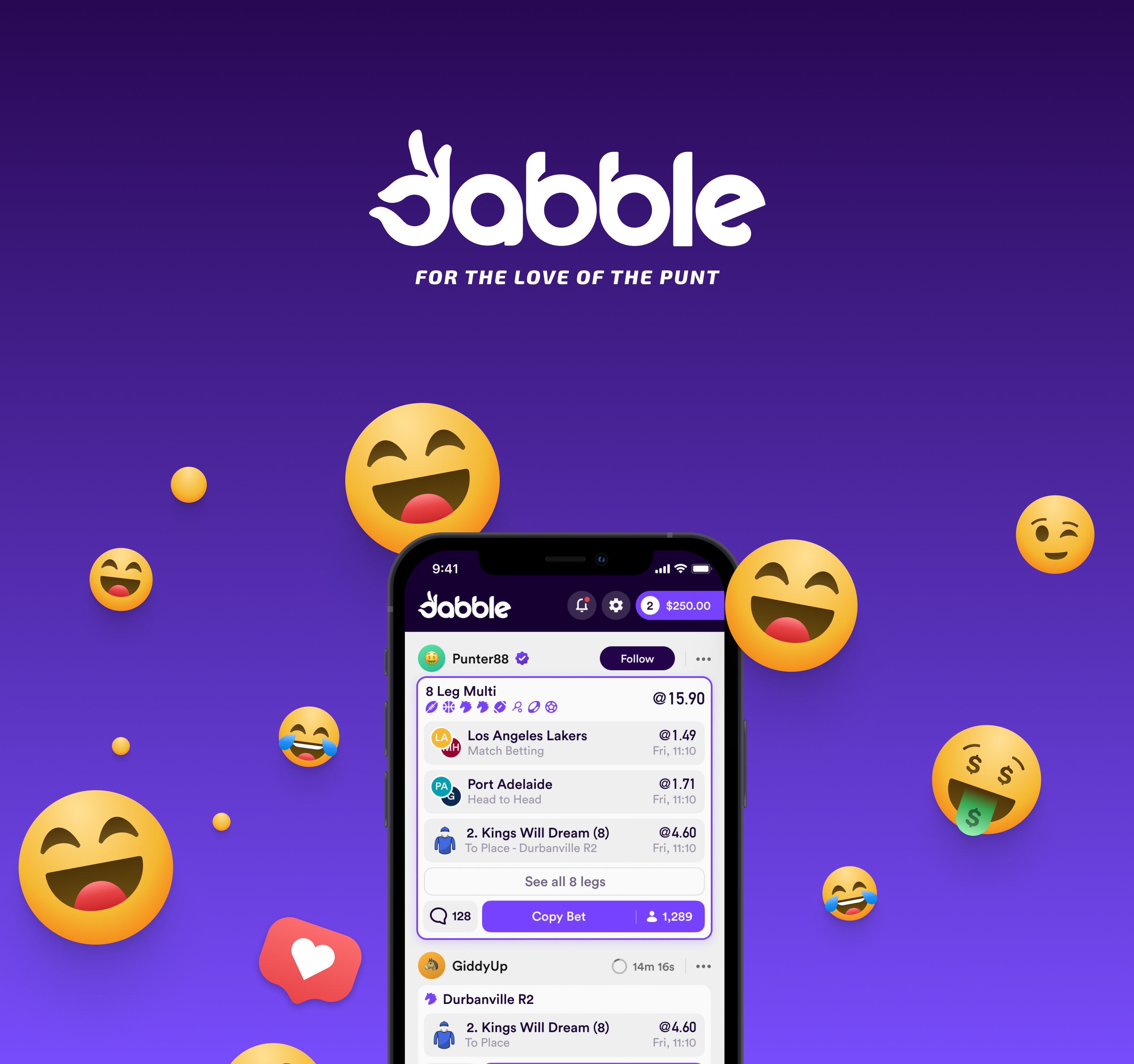
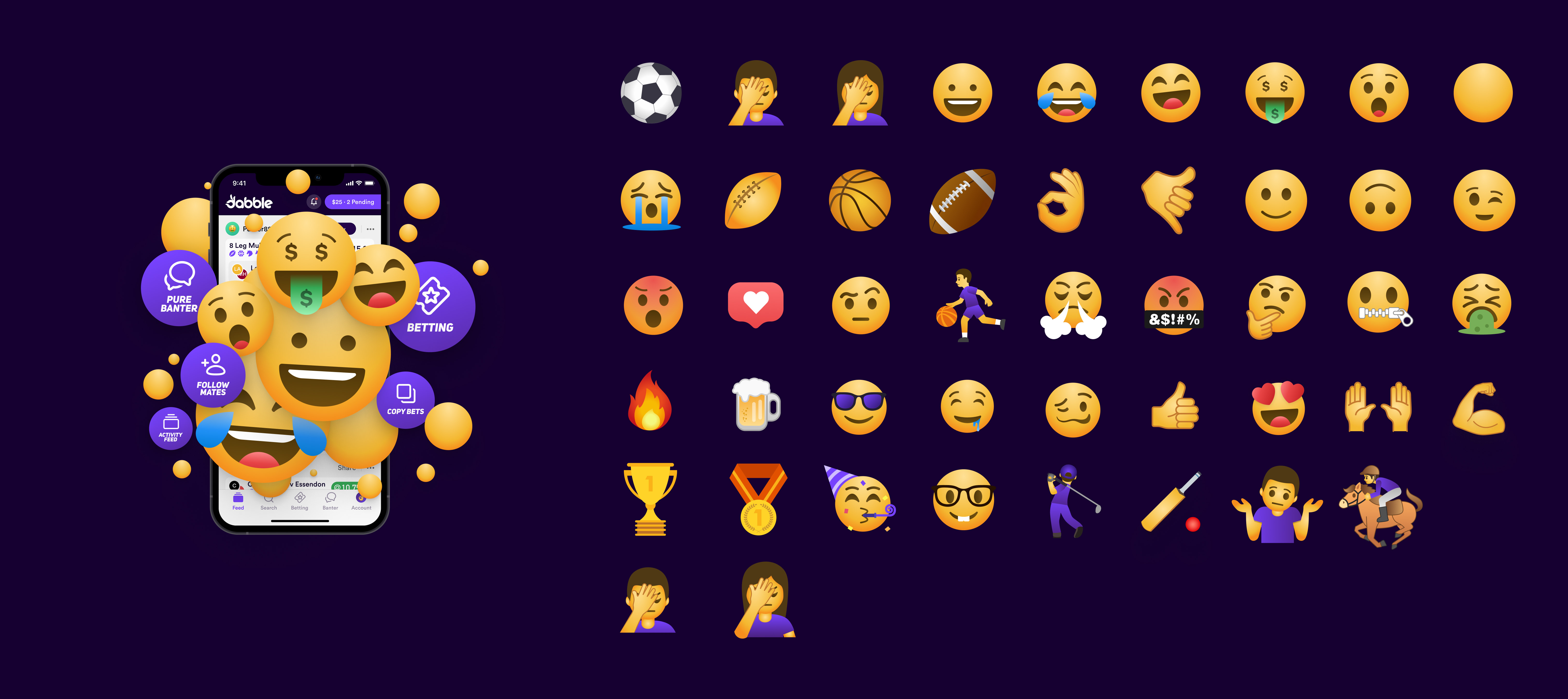
The product became Dabble, and the rebrand came down to a green palette and a purple one, put to a company vote. We argued for purple: 7ahang's early light-mode concept had already shown the green was hard to read on white. Purple won. We designed the logo that the team retained through a broader branding exercise, alongside a set of Dabble emojis. The brand needed to be usable in the places people would encounter it most: a small avatar, a ticket, a reaction and the app header.
Dabble has no rights to official logos, so every team jersey in the app is drawn from photos of the real kit, in team colours alone. The sets grew as Dabble added sports, from the NFL in 2021 to esports in 2023.
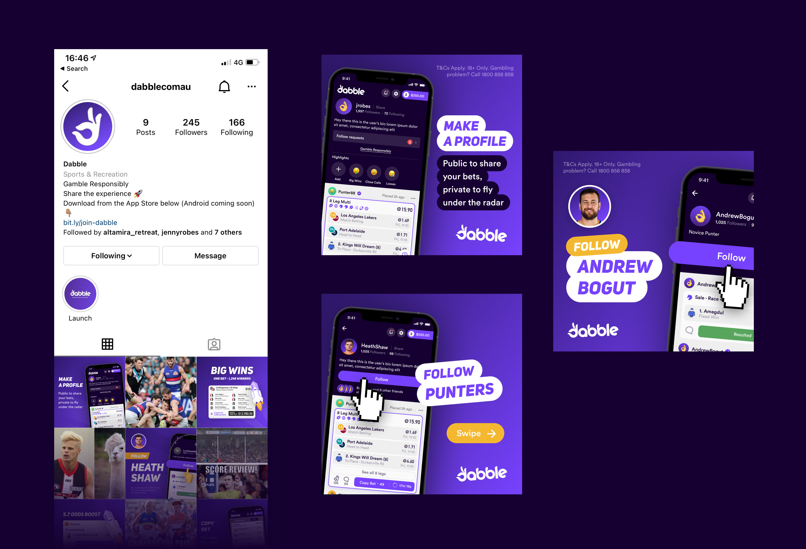
Because every bet in Dabble is public, its marketing could use real punters' bets and profiles. We designed the launch posts and the templates Dabble's marketing team could edit themselves. "Copy their bets" became "copy their tips", because a bet that's already won can't be copied.
From launch into the next two years
The app went to the App Store in June 2021, and we kept designing it for two more years: live racing video with Sky, a same-game multi builder, and a social builder for quaddies. Those additions extended the product around a ticket system that could appear in different contexts without changing how the bet was read. We later helped Dabble bring design in-house.
Our Australian engagement ran from 2020 to 2023. Dabble subsequently expanded into the US and UK with its own team.
More from Dabble