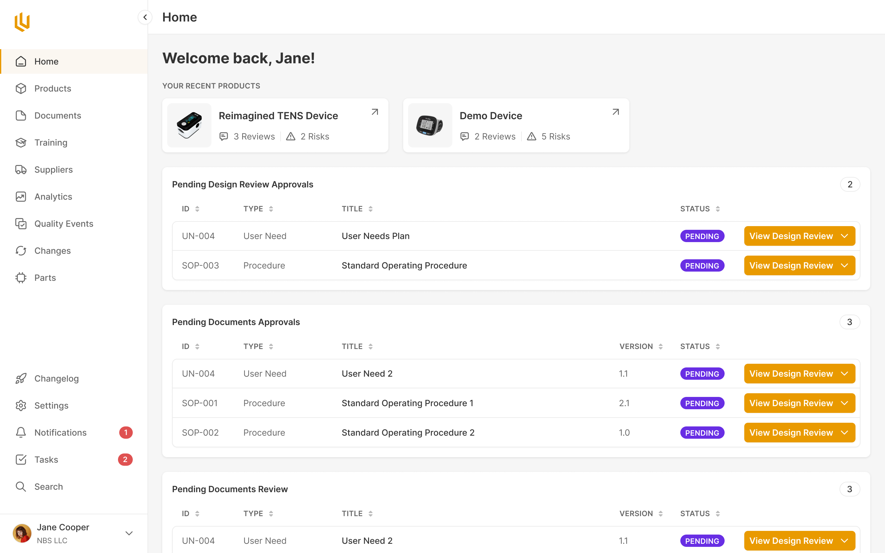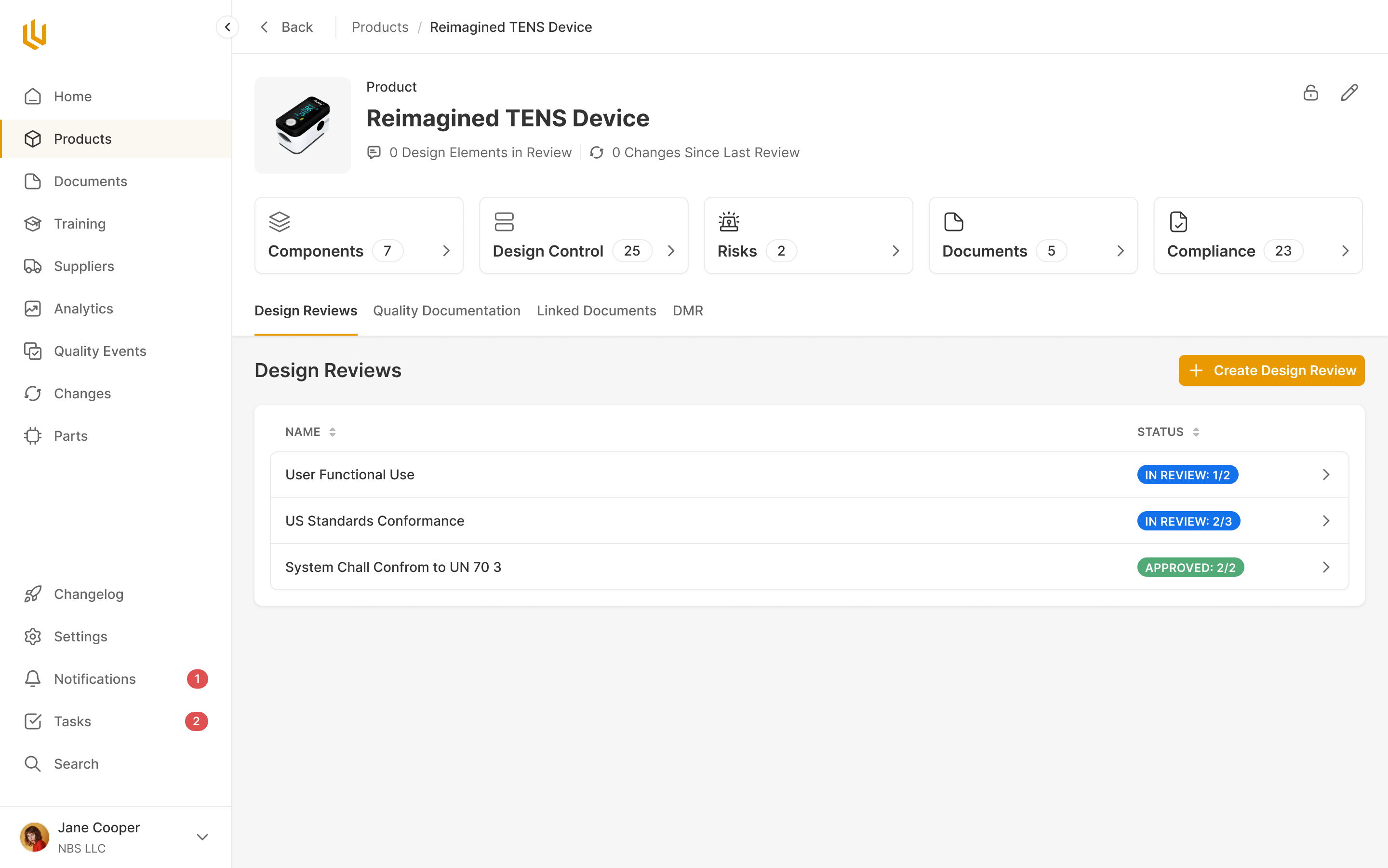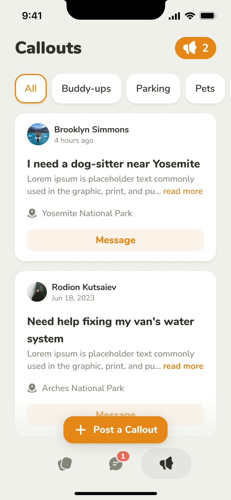
OnlyDust sat on top of GitHub and matched developers with open source projects that wanted more contributors. Developers found issues to work on and submitted code for maintainers to review. Accepted contributions built up a public record of their work. Foundations and companies paid OnlyDust to bring contributors into their open source communities.
Paco Villetard, one of its founders, got in touch in March 2025 with what he called urgent design problems. Its engineers each owned a feature and shipped every week, without a designer to bring those features together. He liked the speed, and not what two months of it had done to the product: too many menus, no hierarchy, a poor mobile experience. We began with a two-week trial and worked together through early May. The engineers built what we drew while we were still drawing it.
Contributors were ready before the projects were
New developers arrived on recommendations, then struggled to choose a project. The filterable list assumed they knew what they were looking for.
Paco called the deeper problem momentum. A developer would open a project and find no issues they could start on, while a maintainer's good first issue sat untouched. Once a month, ODHack lined the two sides up: participating projects wrote good first issues in advance and made themselves available for ten days. Newcomers could arrive knowing the projects were ready for them.
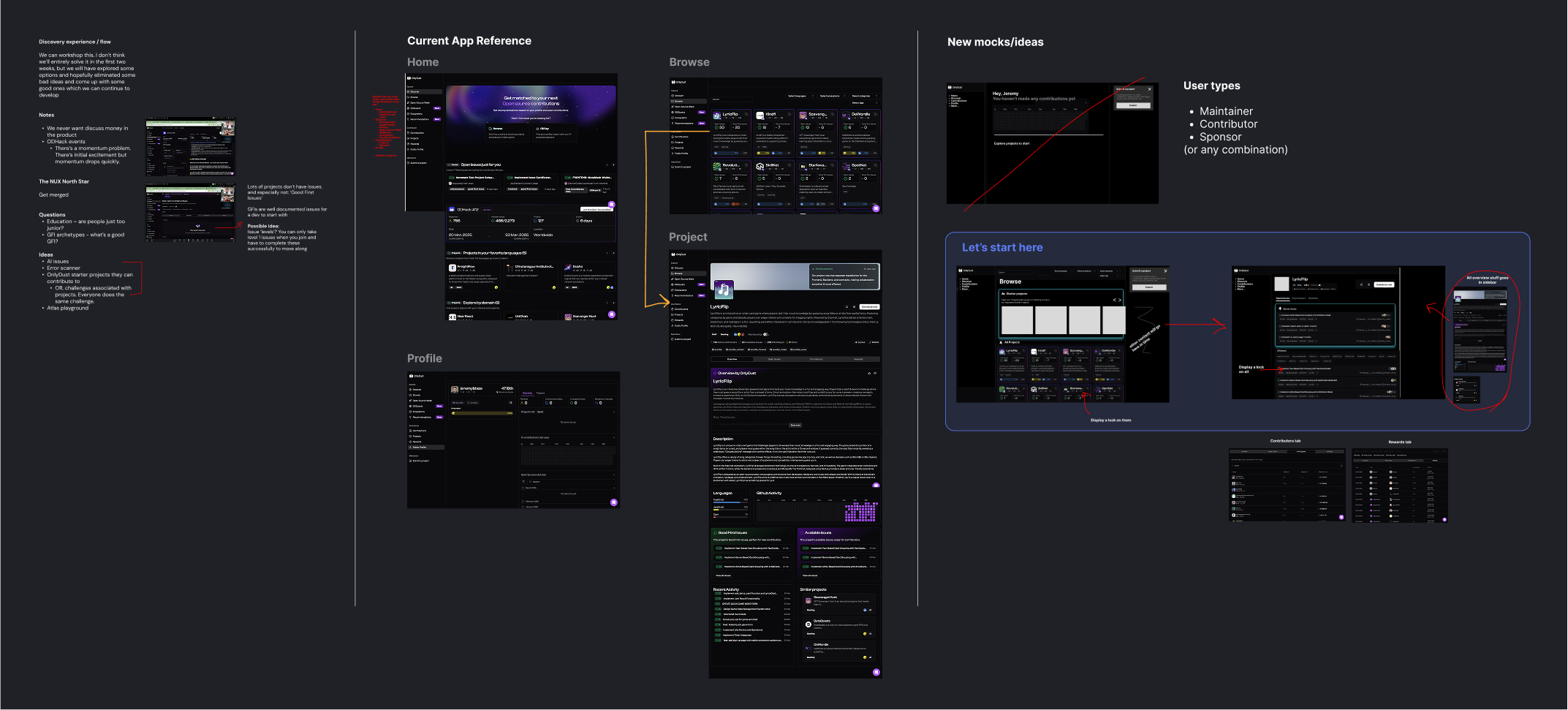
In our second call I asked who a good first issue was for. A junior? A senior who's new to the platform? It depends on the project, Paco said. A good first issue is well documented and sits apart from the roadmap, so a newcomer can finish it without knowing the whole codebase. Some are hard, which made matching people to issues automatically difficult.
a good first issue can be hard. it just can't depend on everything else
We agreed to focus on a developer's first merged pull request: the point at which a maintainer accepted their code into a project.
Paco wanted contributors who'd stay long enough to take responsibility for part of a codebase. That ruled out a directory of isolated tasks or paid bounties. Discovery would start from projects, with the issues inside them. And it had to work for projects that had never heard of OnlyDust: applying posts a comment on the GitHub issue, and ordinary GitHub comments come back as applications, so a maintainer sees one list either way. That connection was already part of OnlyDust. Our discovery work had to lead into it without asking a maintainer to adopt a new tool first.
Make the first contribution easy to find
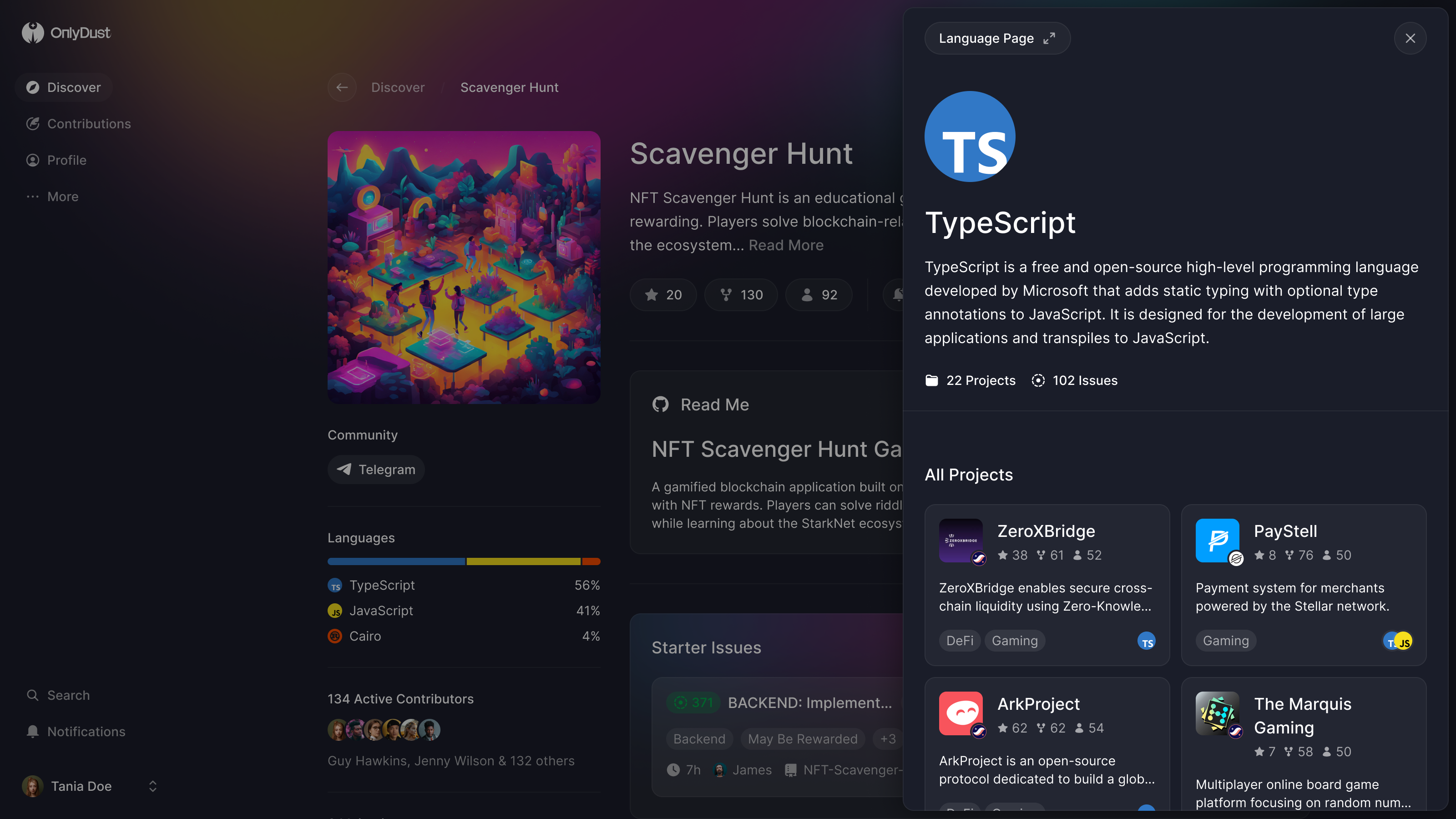
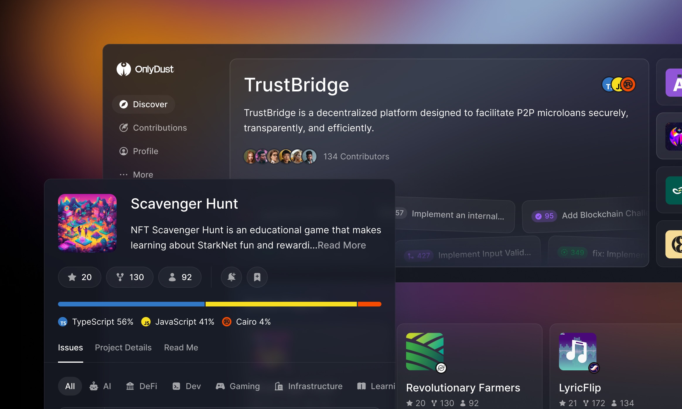
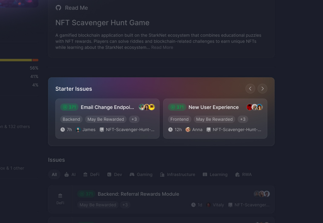
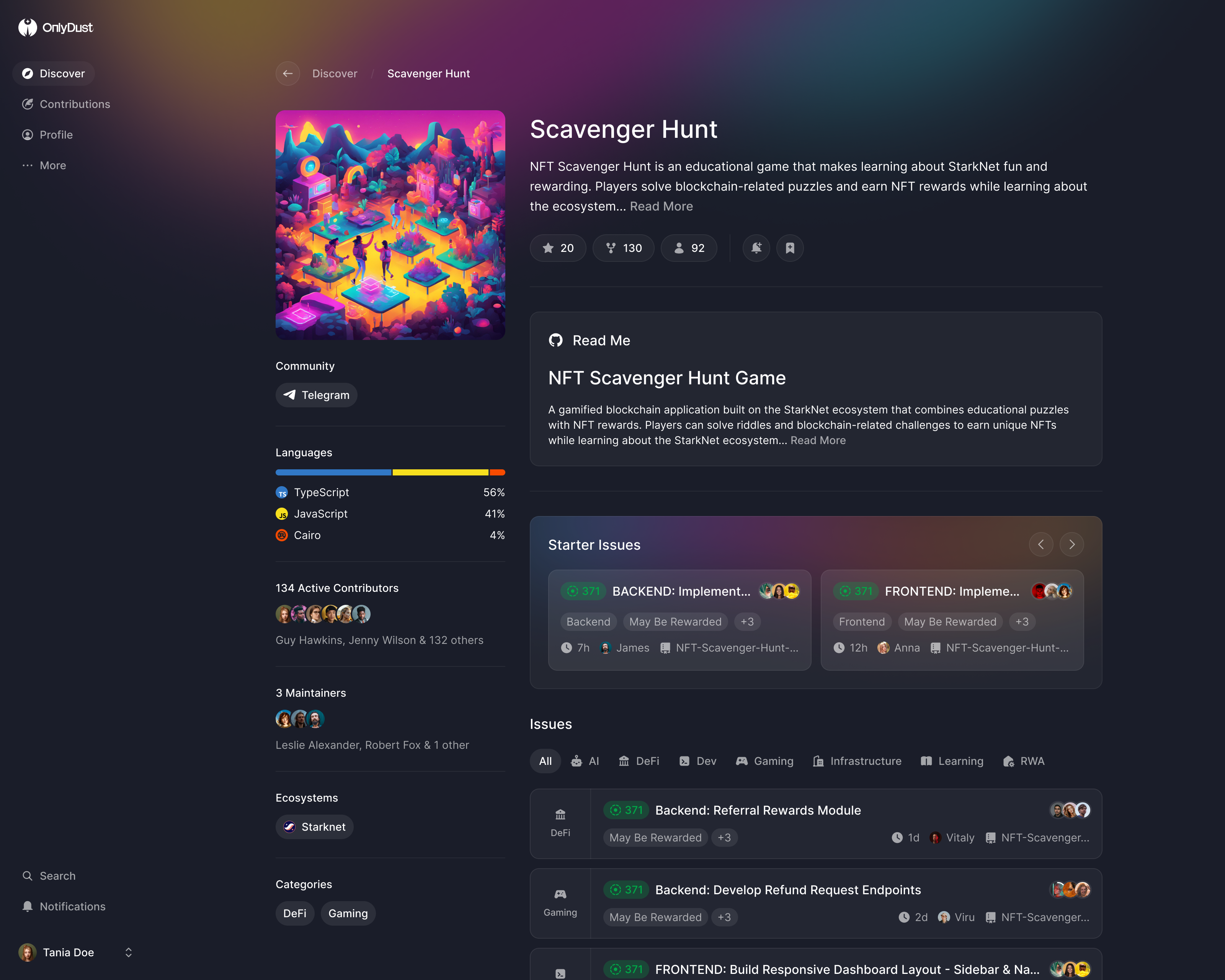
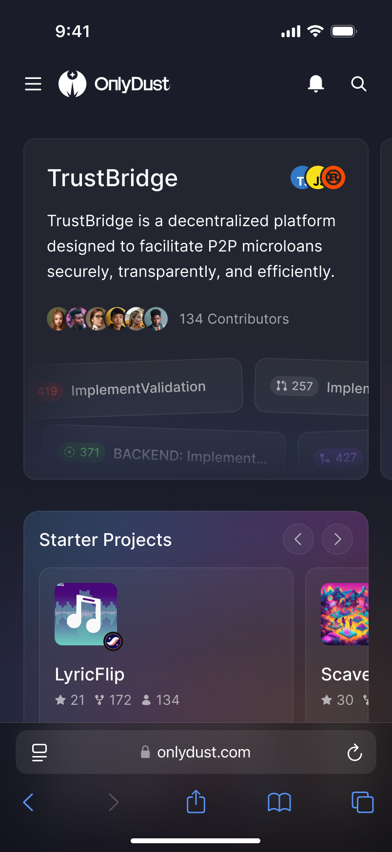
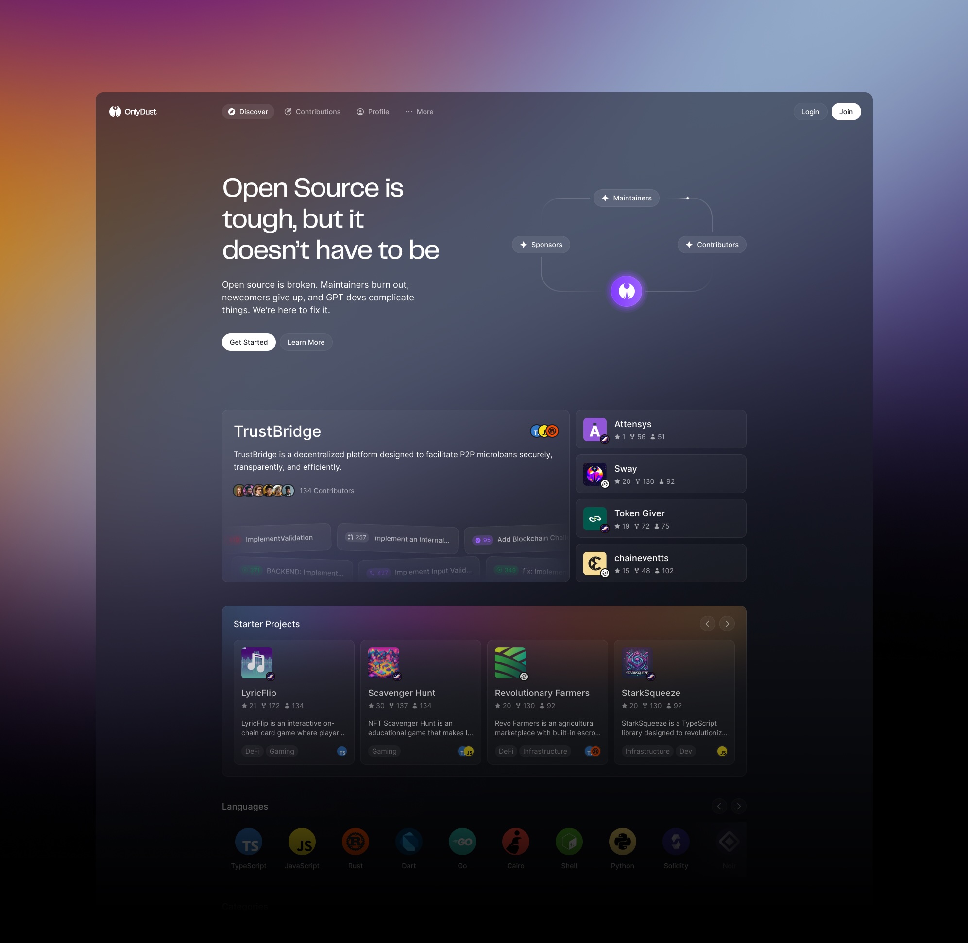
We gave starter projects a shelf near the top of Discover and starter issues a band of their own on each project page. A developer could understand the project, then find a bounded way to join it, before reaching the full backlog. The project remained the thing they were choosing to contribute to.
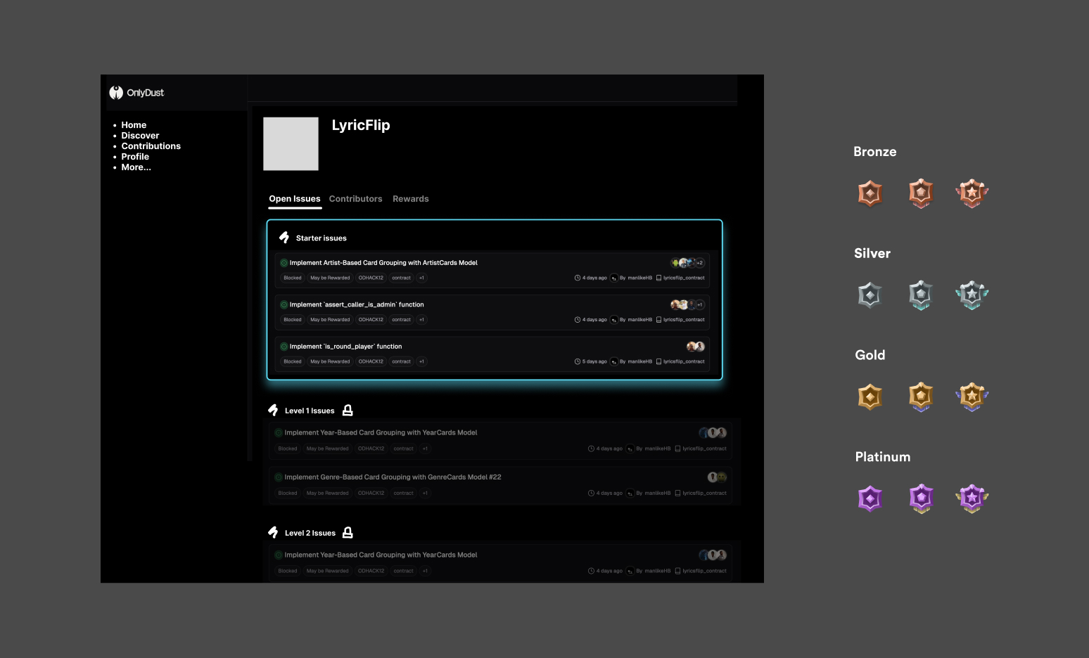
In that same call I floated levels: new developers could only take level one issues, and unlocked harder ones after enough merged pull requests. Paco had thought about it and never tried it, so we drew it, then left it as an exploration. The unresolved problem was assigning the levels: an issue could be independent enough for a newcomer and still require considerable experience. A universal ladder would need to account for those differences between projects before we could rely on it to restrict access.
Give an undecided developer several ways in
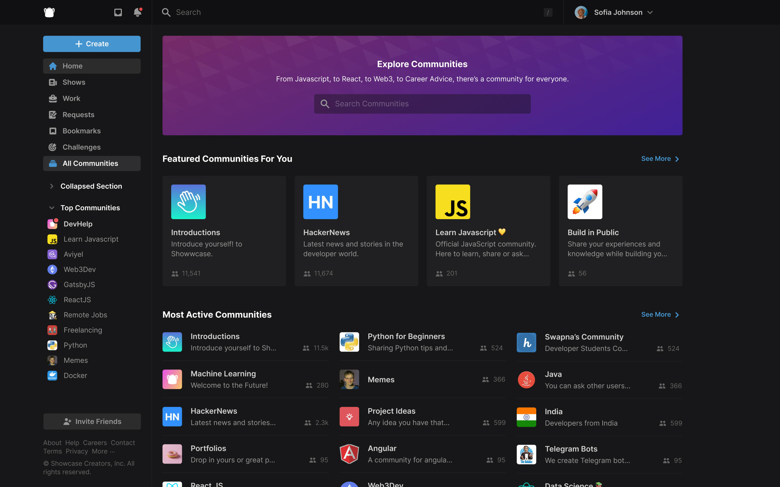
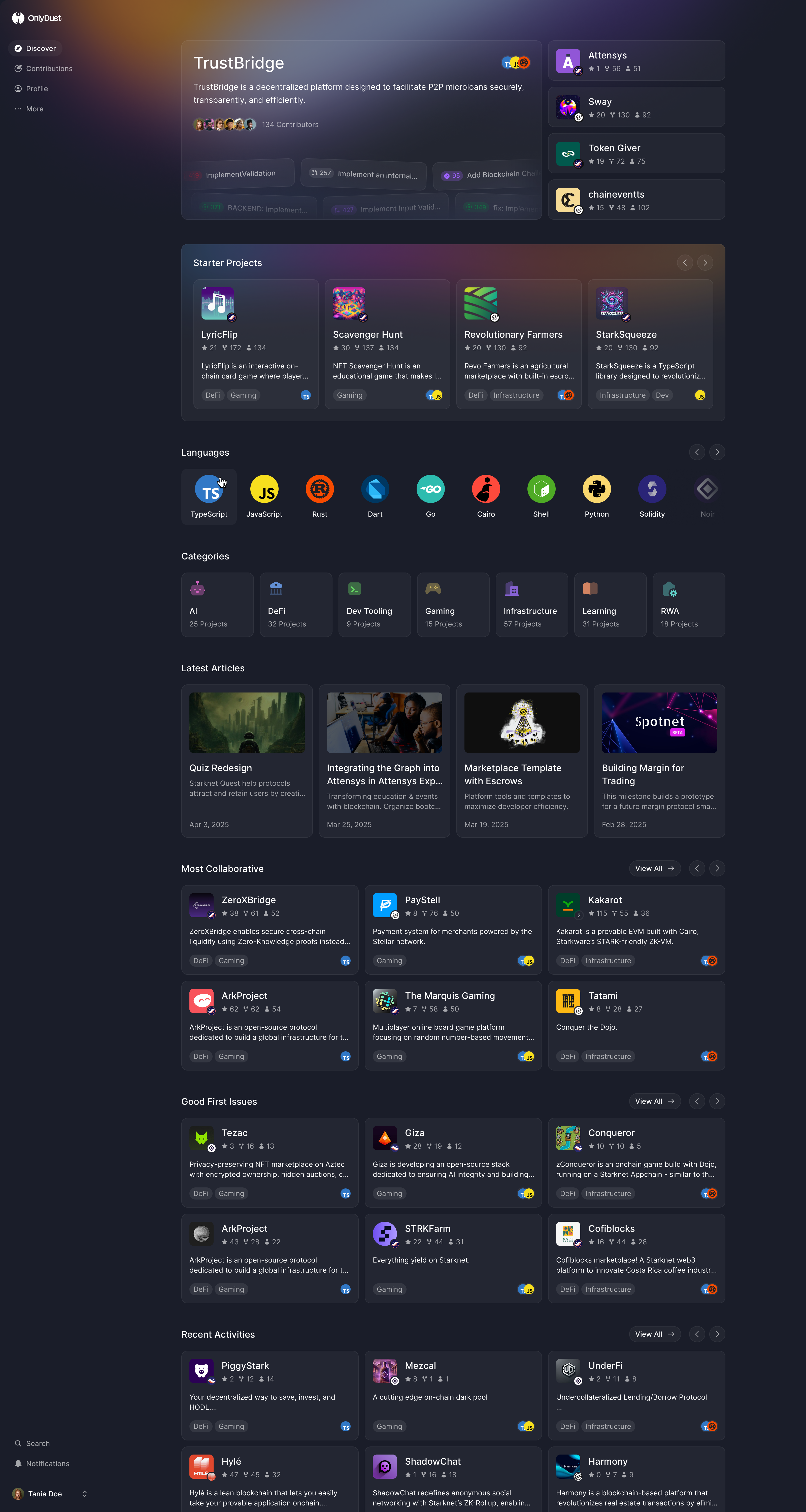
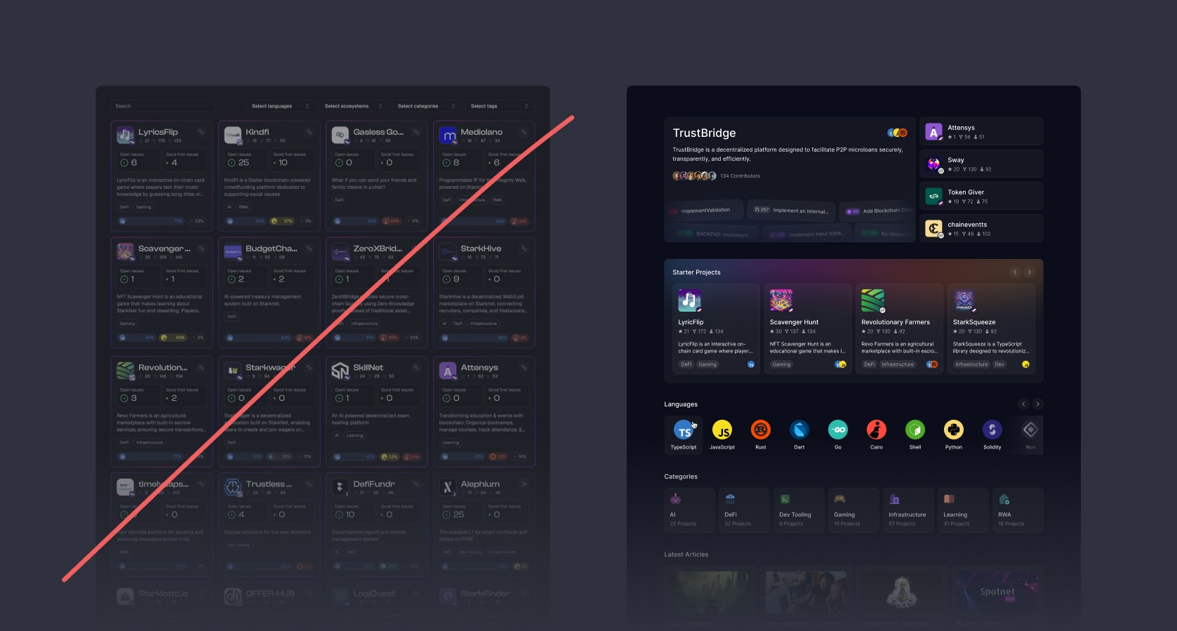
The old Discover page was a grid of every project with filters. Paco wanted something closer to Netflix, a page you could get lost in, chosen from what OnlyDust knew about you through GitHub. We replaced the grid with shelves (starter projects, languages, categories, articles, recent activity), each a different way in for a developer who doesn't know what they want. Someone might recognise a language they use, be drawn to a subject, or arrive through an article. They no longer had to formulate a useful filter query before seeing somewhere to begin.
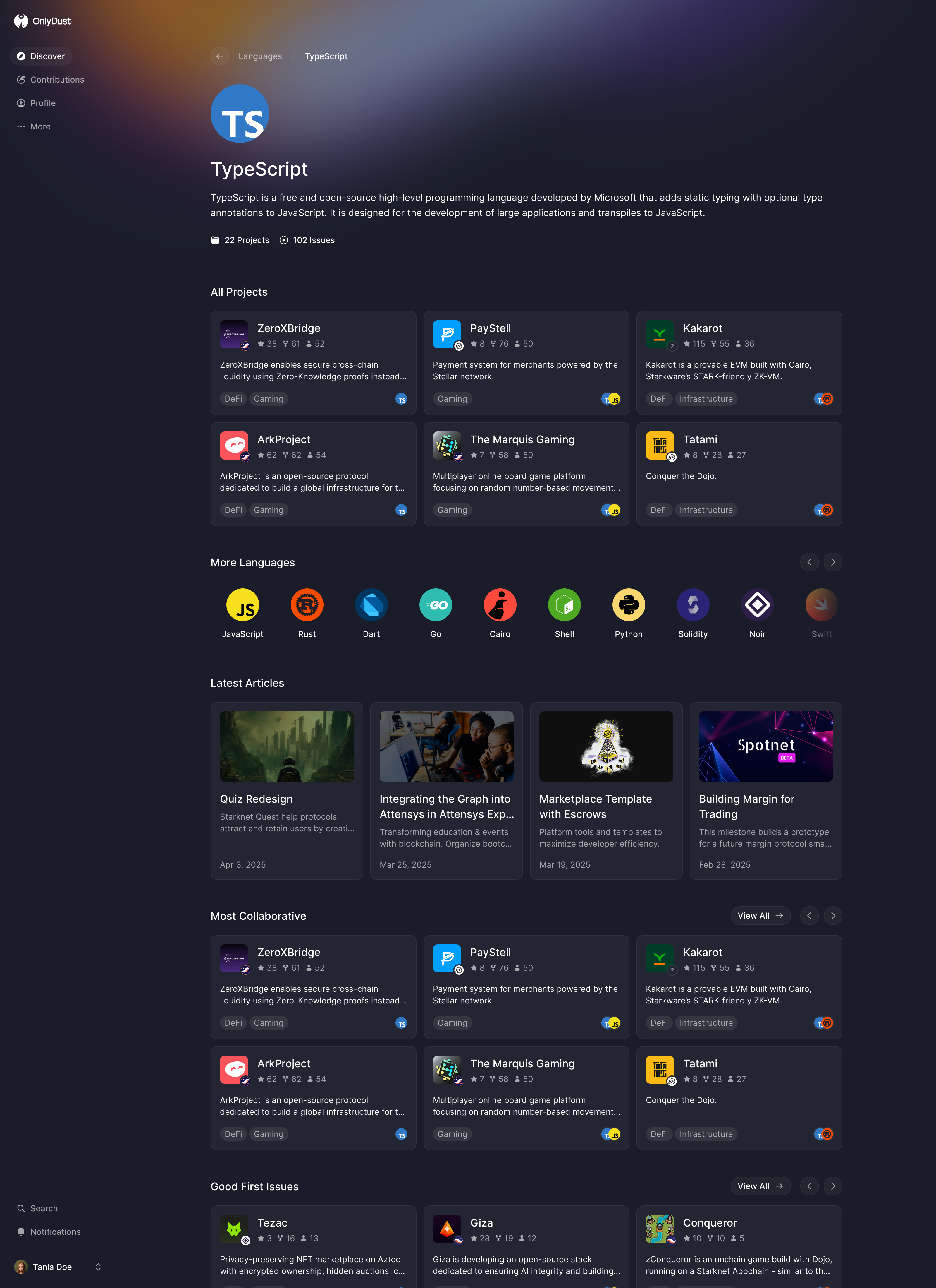
A shelf leads to a page of its own, and the same shelves repeat there, so browsing doesn't stop at the first click.
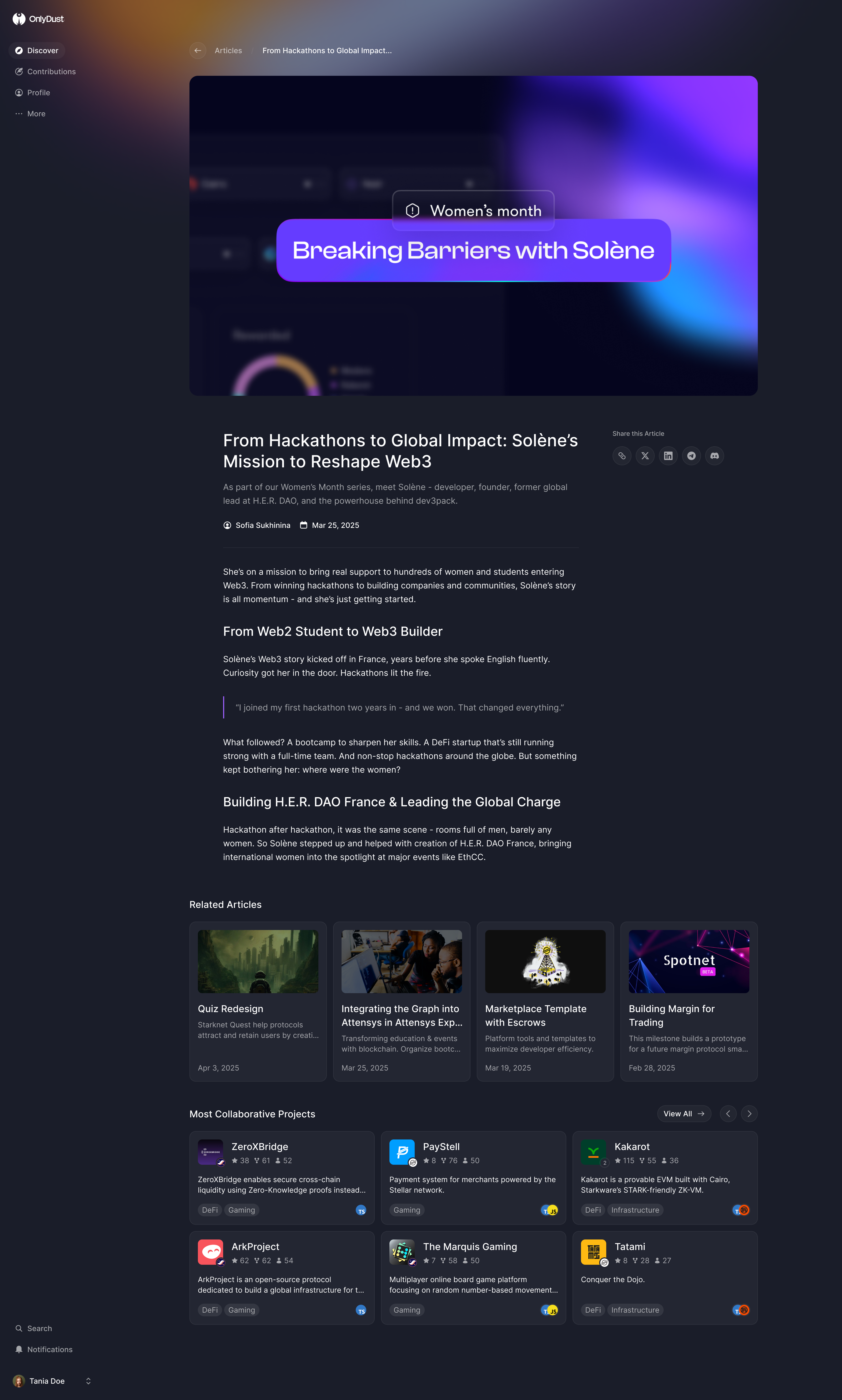
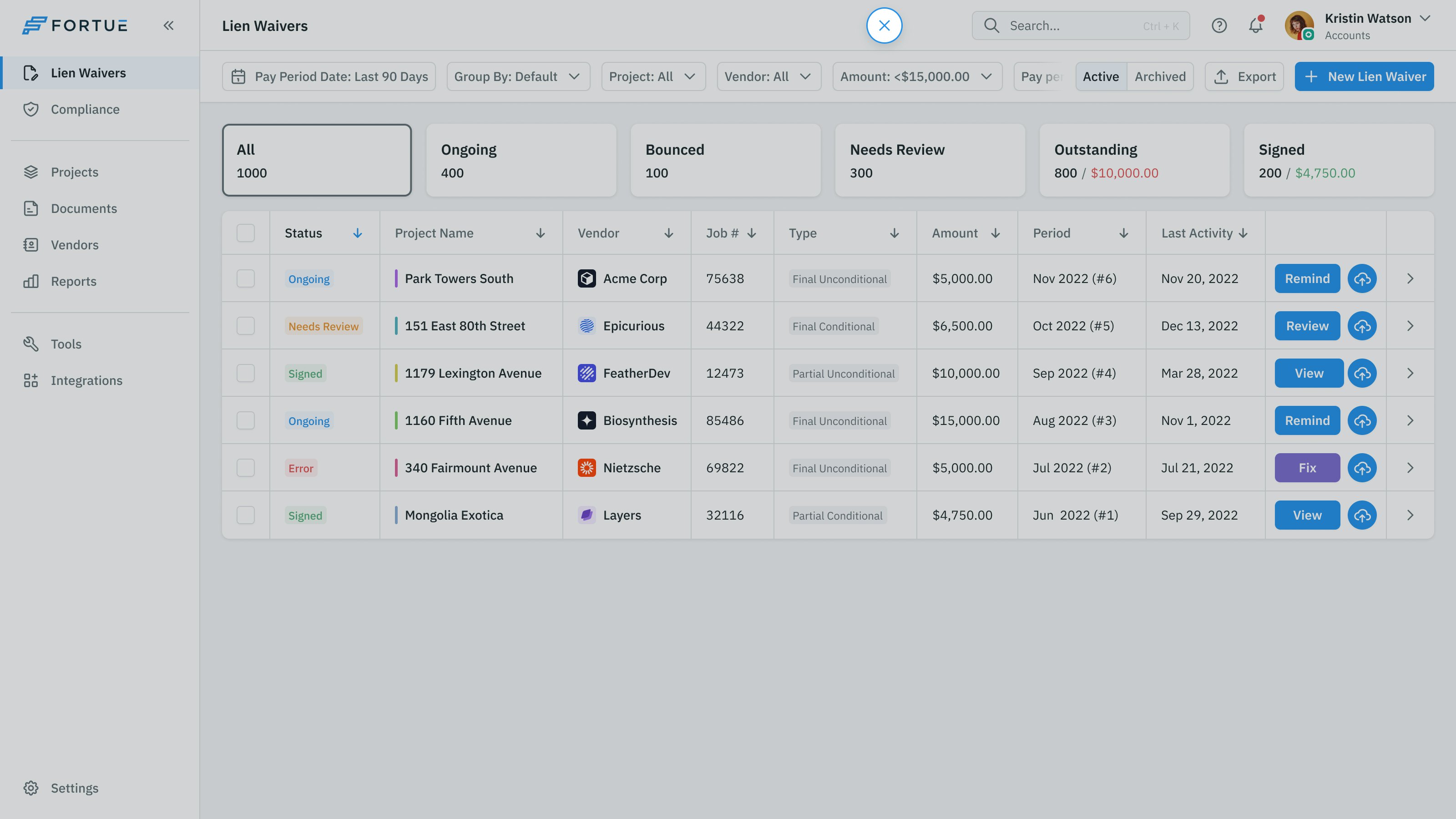
Paco had already explored a cleaner project page using Luma's event pages as a reference. We developed that hierarchy: what the project is, its starter issues, then every issue, with contributors and maintainers down the side.
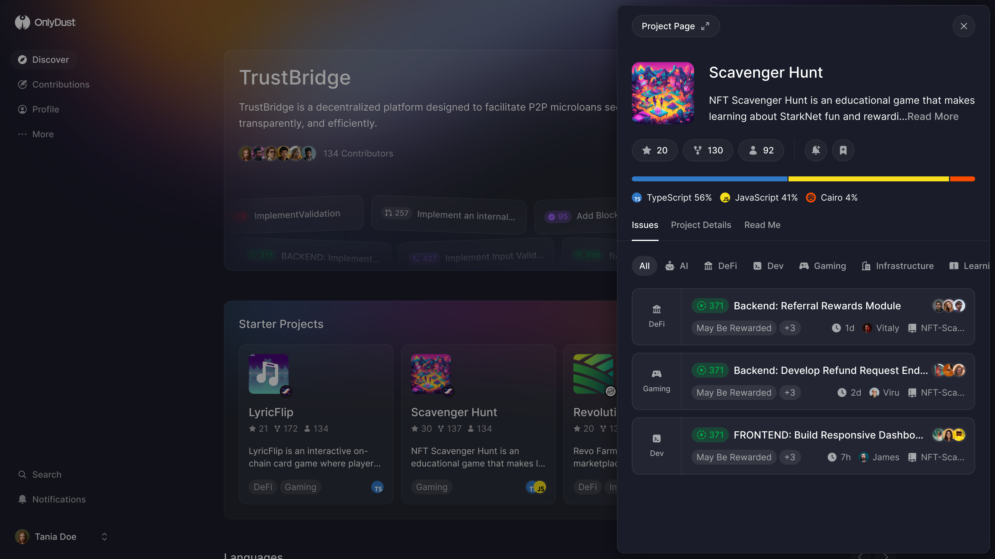
Inspect a project without losing the shelf
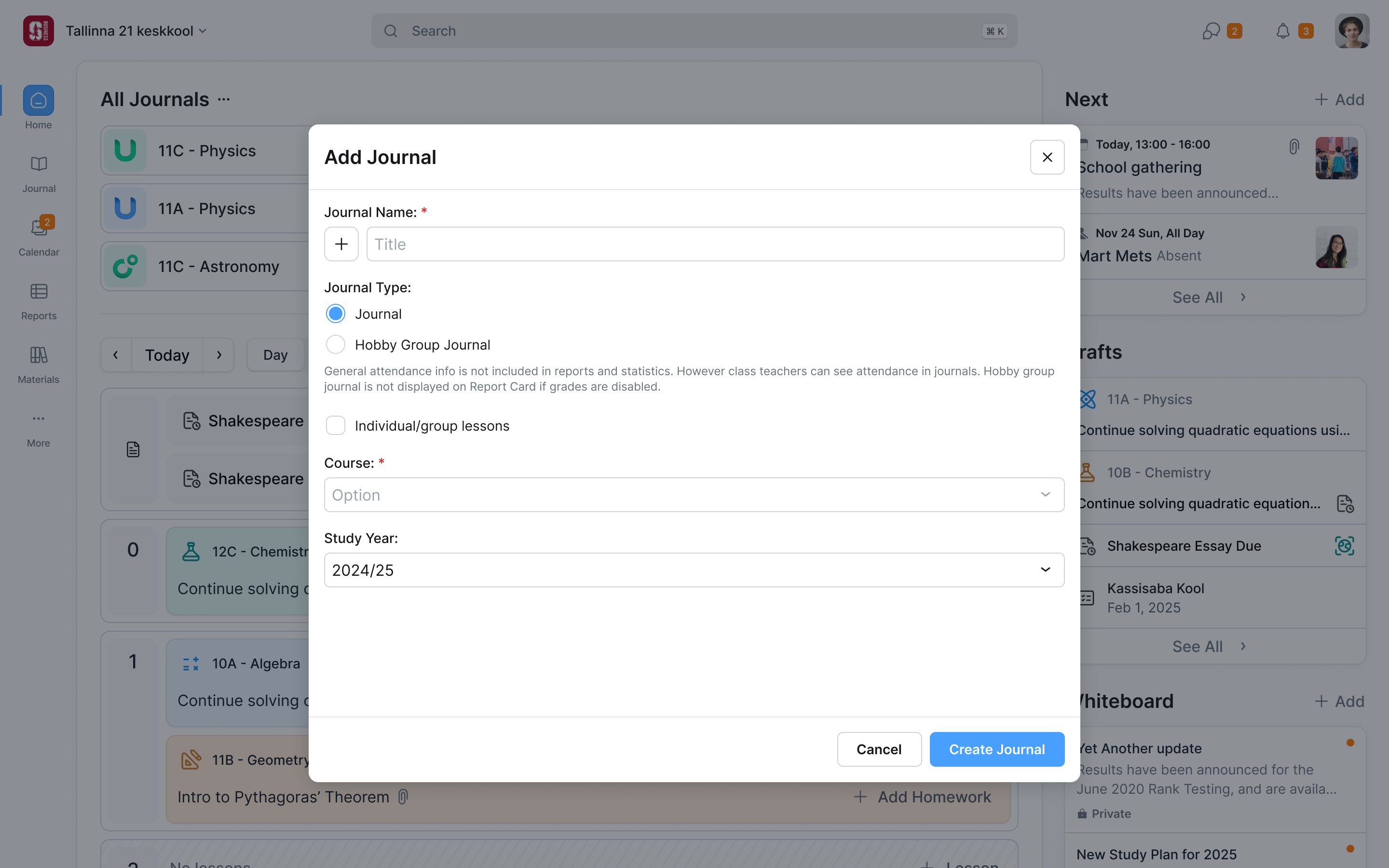
A project, a language or an issue opens in a panel over the page you're on, with a button to the full page. Close it and you're back on the shelf. That lets someone inspect a candidate before committing to it. The full-page view remains available when they want to read more closely or share a link.
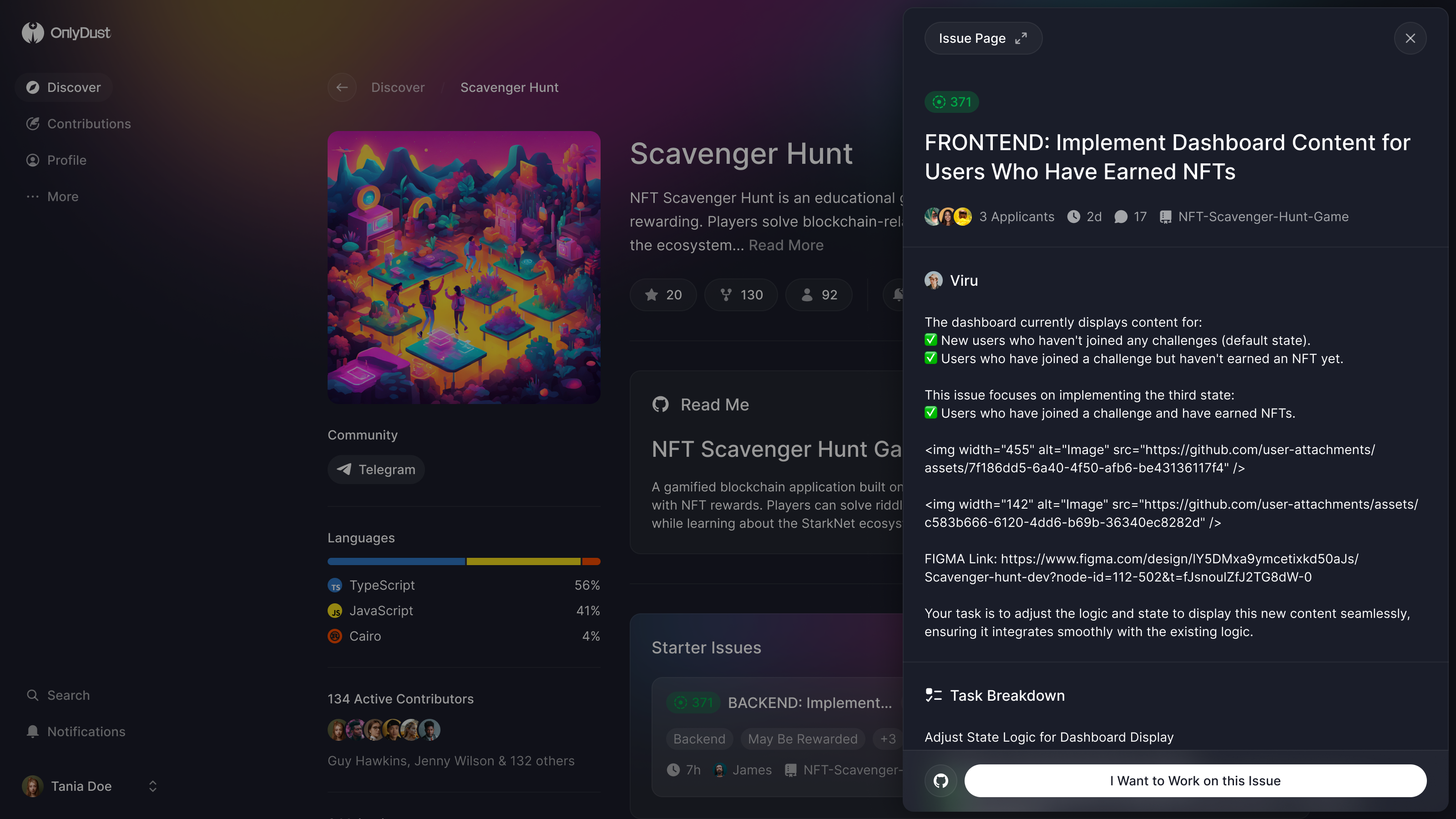
The issue panel ends in one button, "I Want to Work on this Issue". From there, the application entered the existing GitHub flow.
By our fourth week the engineers were building Discover with real data. Paco said the components let him try things far faster, and asked for onboarding built the same way, from parts he expected to rearrange every week.
The skill test has no pass mark
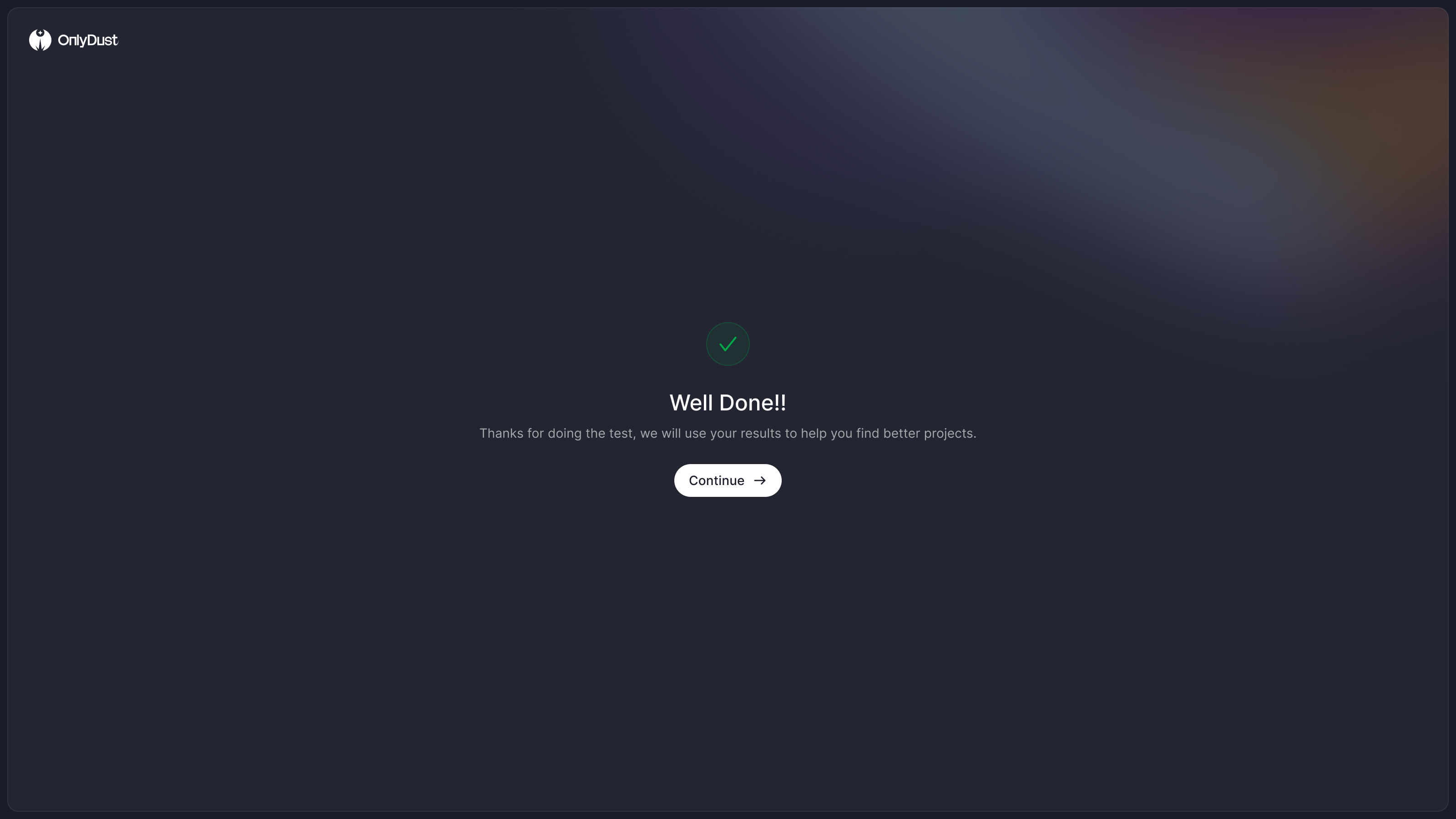
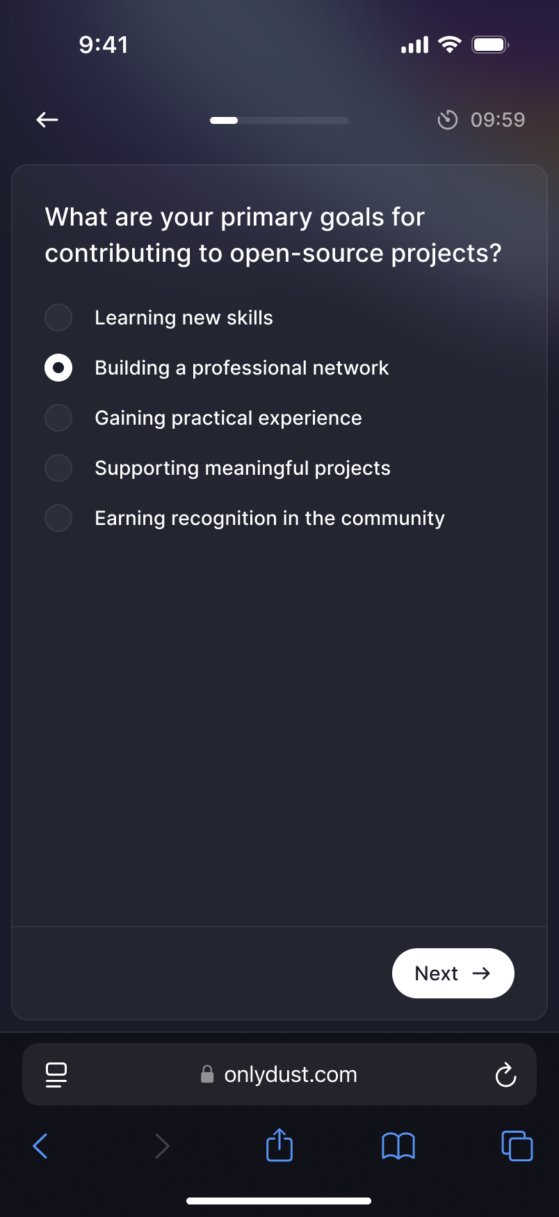
Paco wanted a short skill test during onboarding. I'd drafted a flow that ended on a score, and asked whether a low one would turn anyone away. It wouldn't. The answers would help OnlyDust decide which projects to recommend. Showing a result as though someone had passed or failed would misrepresent what the test was doing, so we removed the score from the ending.
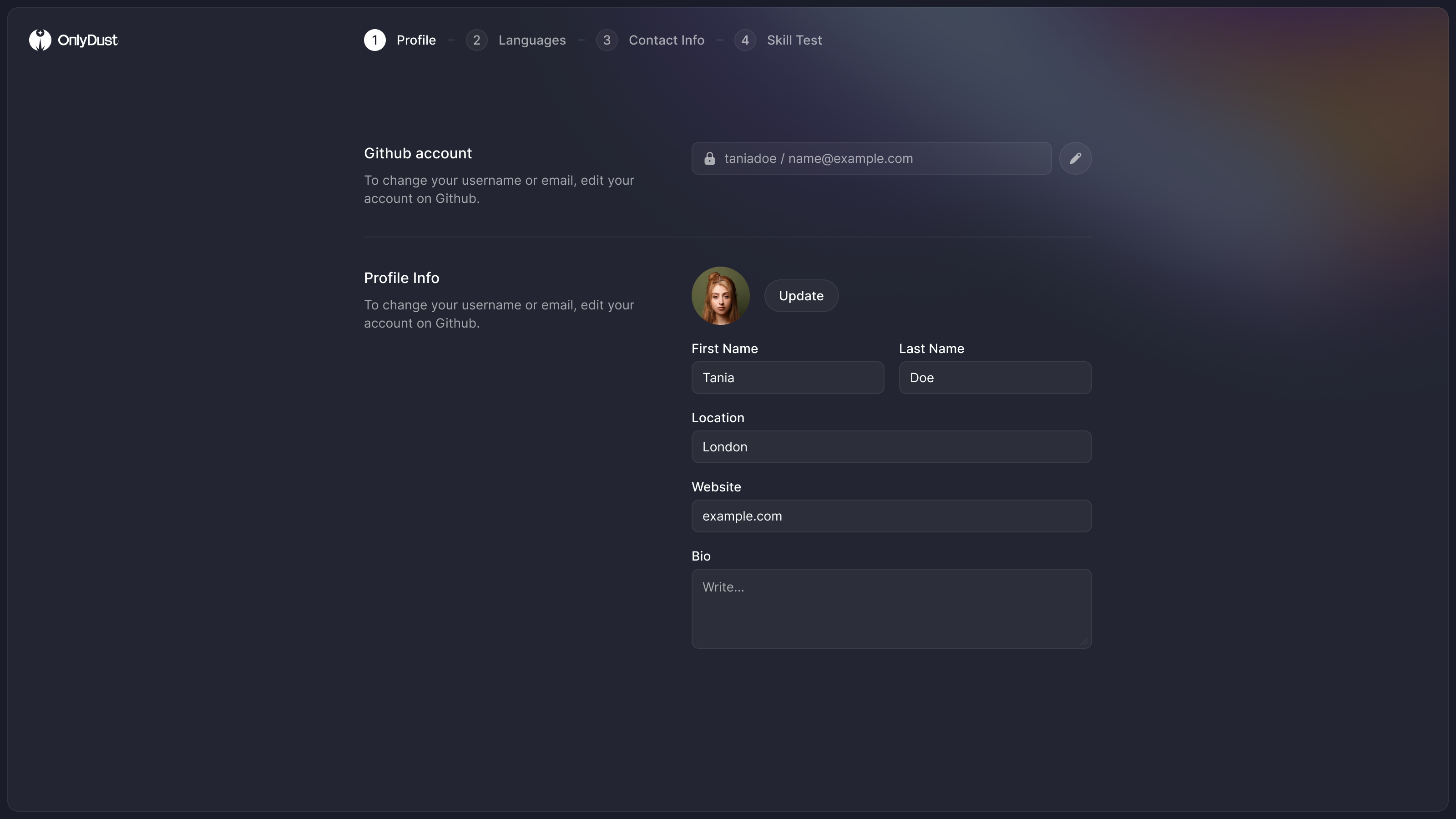
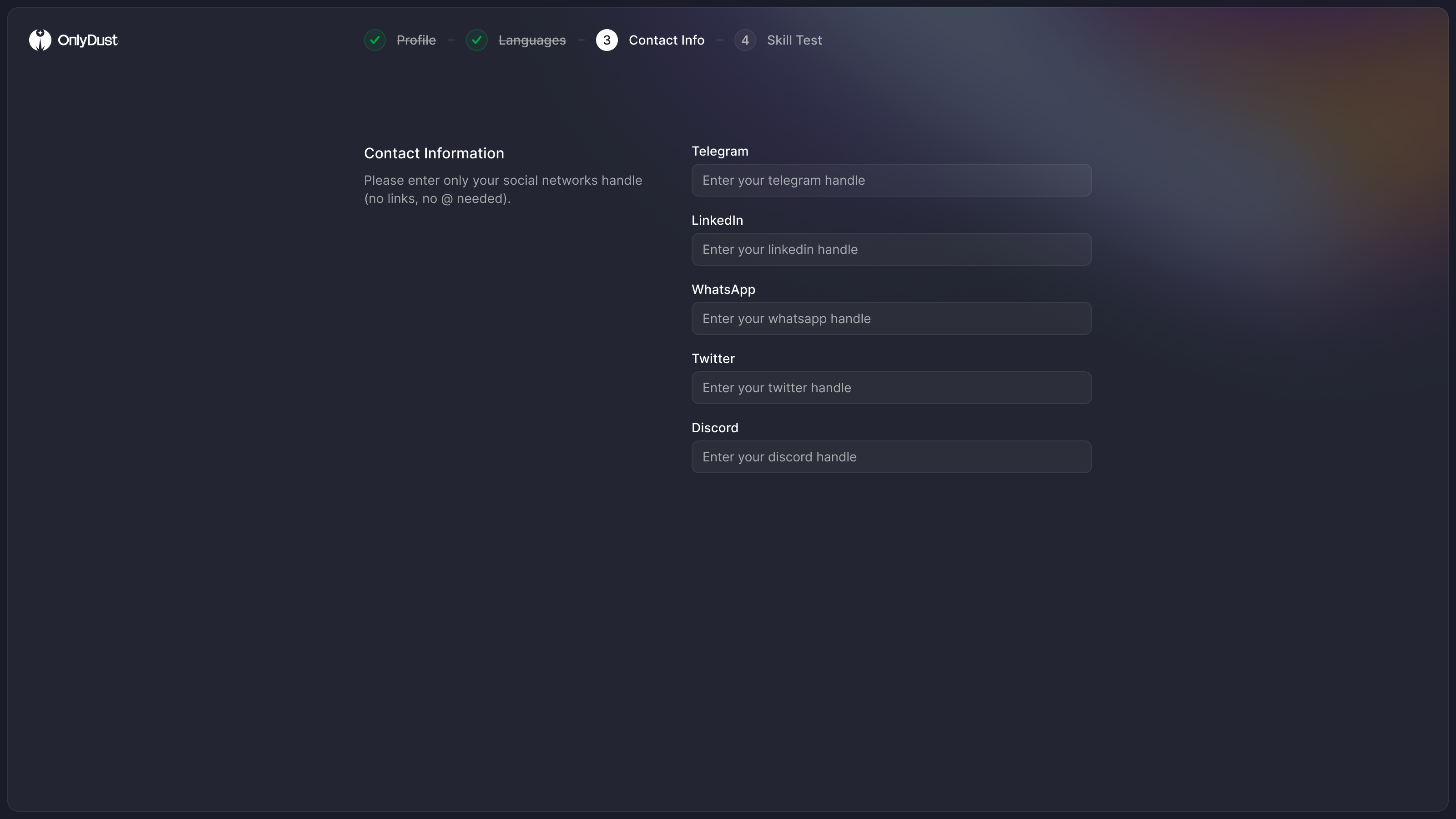
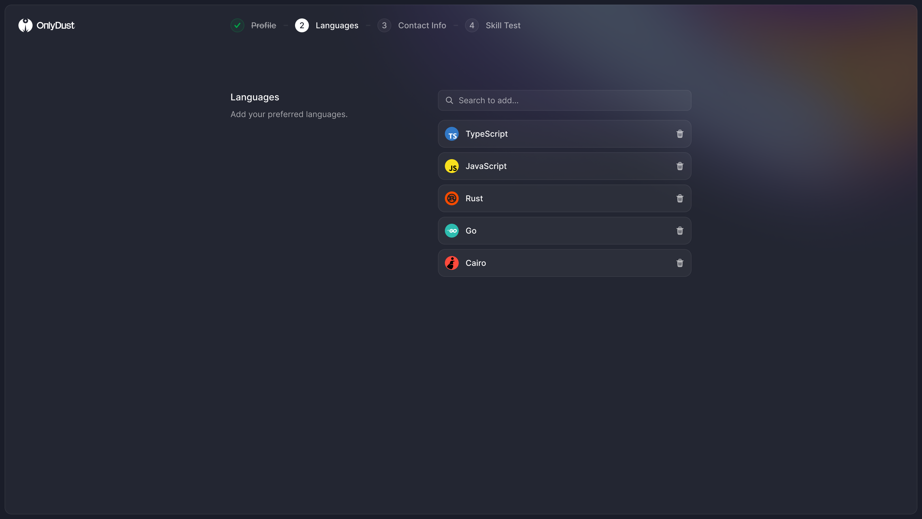
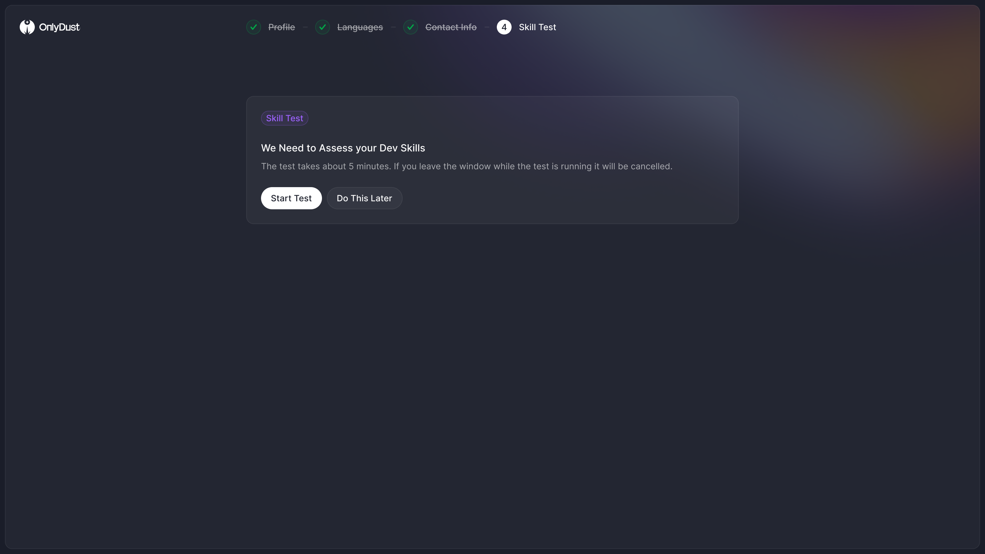
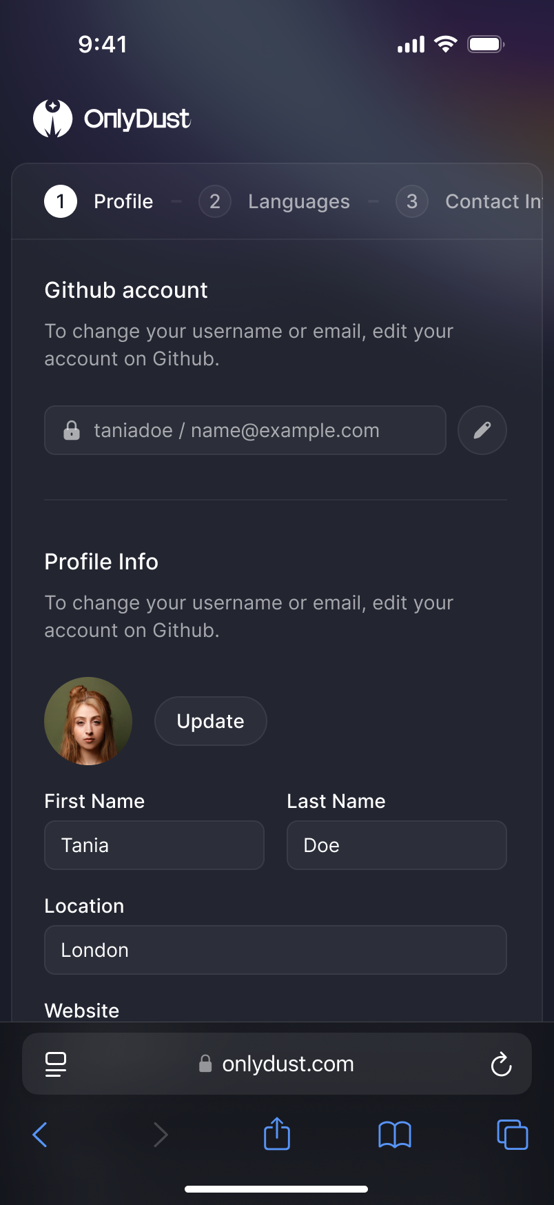
Signing up became four steps, profile, languages, contact details, then the test, instead of one wall of fields. We designed the test with a ten-minute timer and a warning that leaving the window would cancel it. It supported multiple-choice and free-text answers for a language model to read. I asked about a code editor too, and Paco said no, too much. He was right. It would feel like Codecademy, and patronising to most of the people taking it.
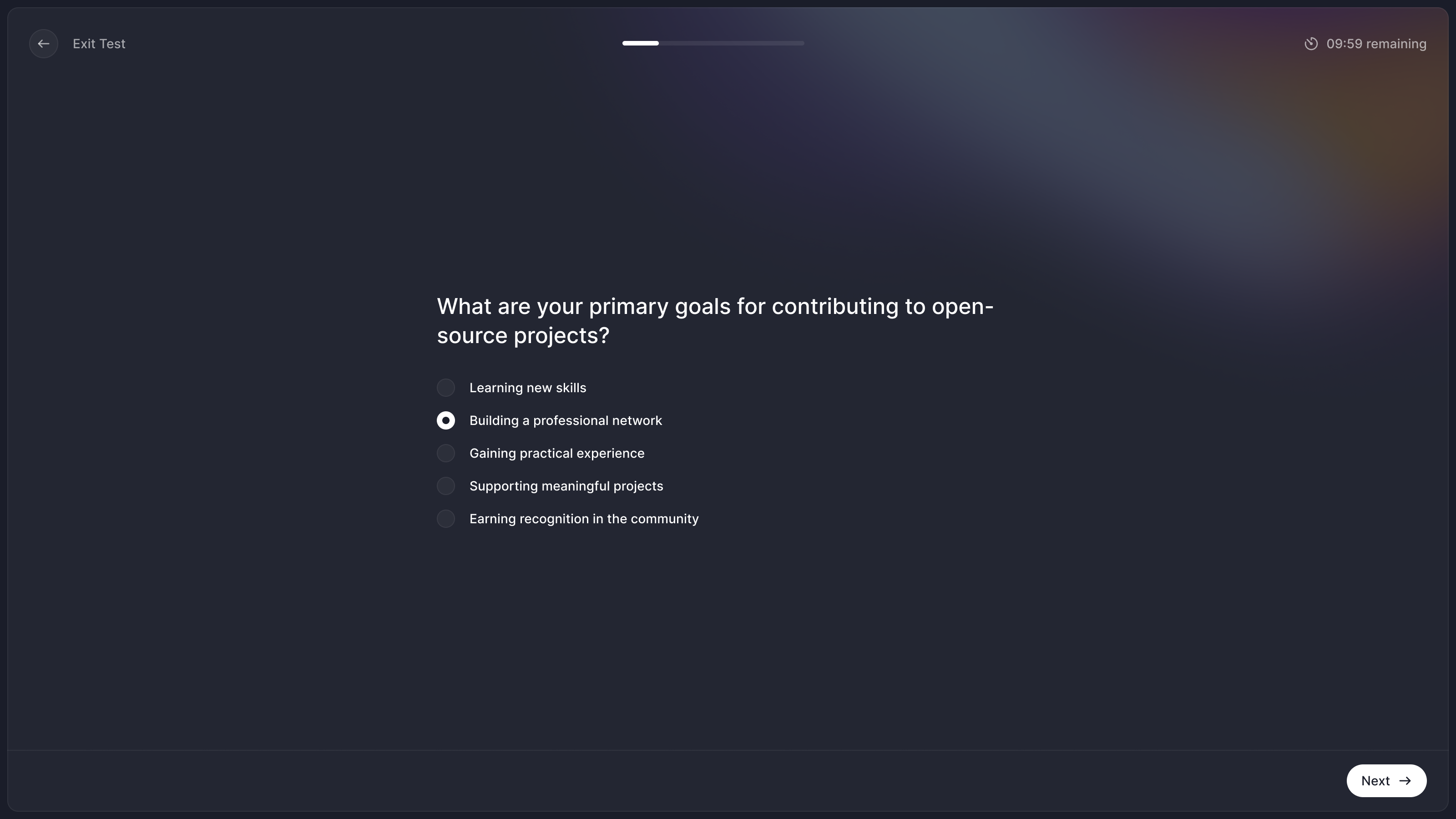
For developers OnlyDust could match, the ending led straight to Discover with recommended projects. Paco wasn't sure the system would be able to recommend projects for every kind of developer immediately. We therefore designed a second ending that promises an email and has no button into the app. Those were two explicitly different states: ready to recommend, or still processing someone's profile.
the ending depends on whether OnlyDust can recommend a project yet
A profile is something developers post
Looking at my own profile I noticed there was nowhere to share it, and asked Paco whether it had a job as a resume. It had a bigger one. Developers shared their profiles constantly, mostly as screenshots, so the profile had to look right cropped and posted, and look like a person rather than a project. Circles for people, squares for projects.
It shows time on OnlyDust and GitHub as a span of years, and the numbers a maintainer wants when reading an application sit in a row near the top: rewards, projects, issues in progress and merged pull requests.
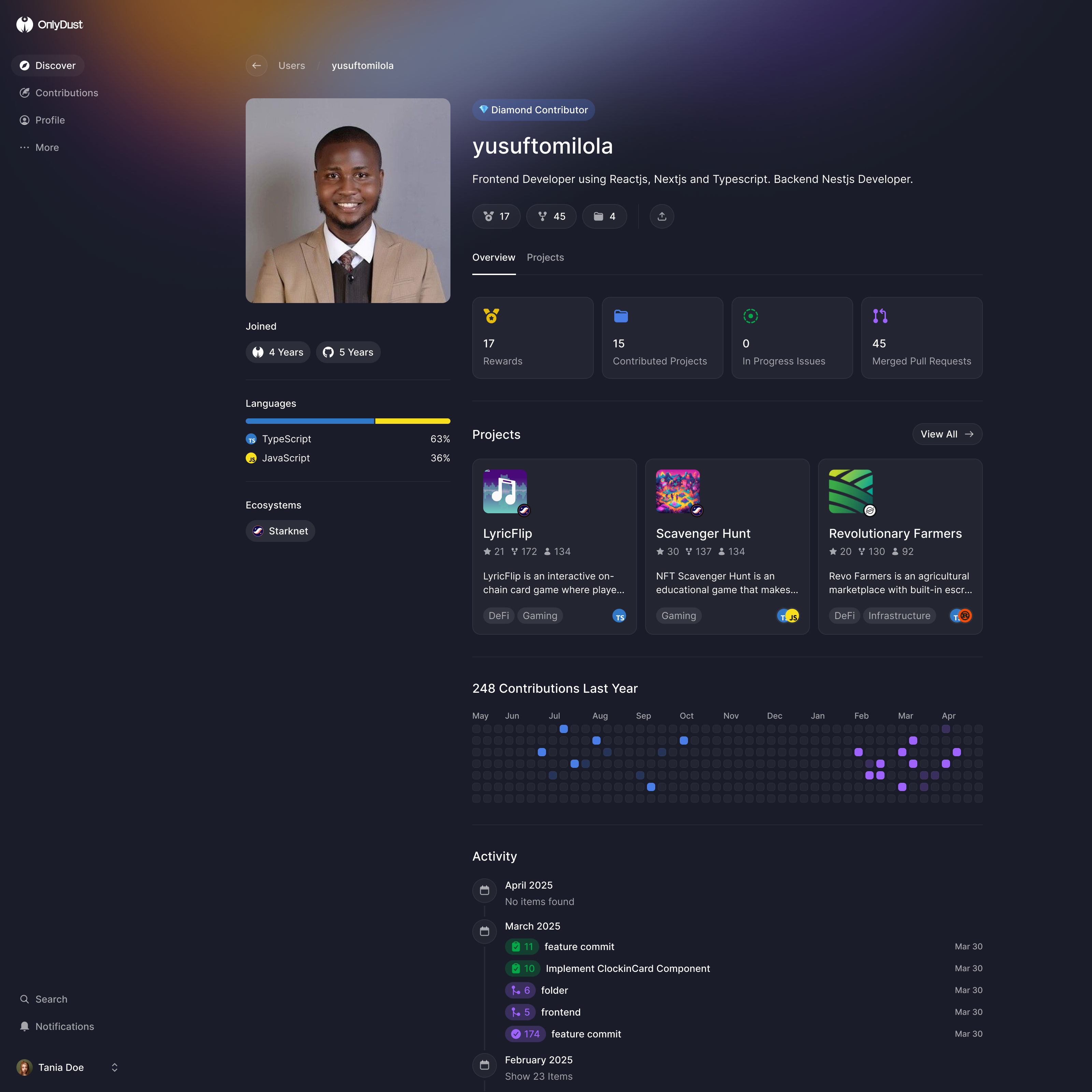
I also asked to bring in contribution history from GitHub. A developer new to OnlyDust might have years of work behind them, while a graph limited to their time on this platform would start empty. Paco confirmed OnlyDust already had the data. The profile could show that earlier work alongside the projects they joined here.
new to OnlyDust does not mean new to open source
The old app had been weakest on a phone, so Discover, sign-up and the profile all got mobile versions.
One public site instead of a website and an app
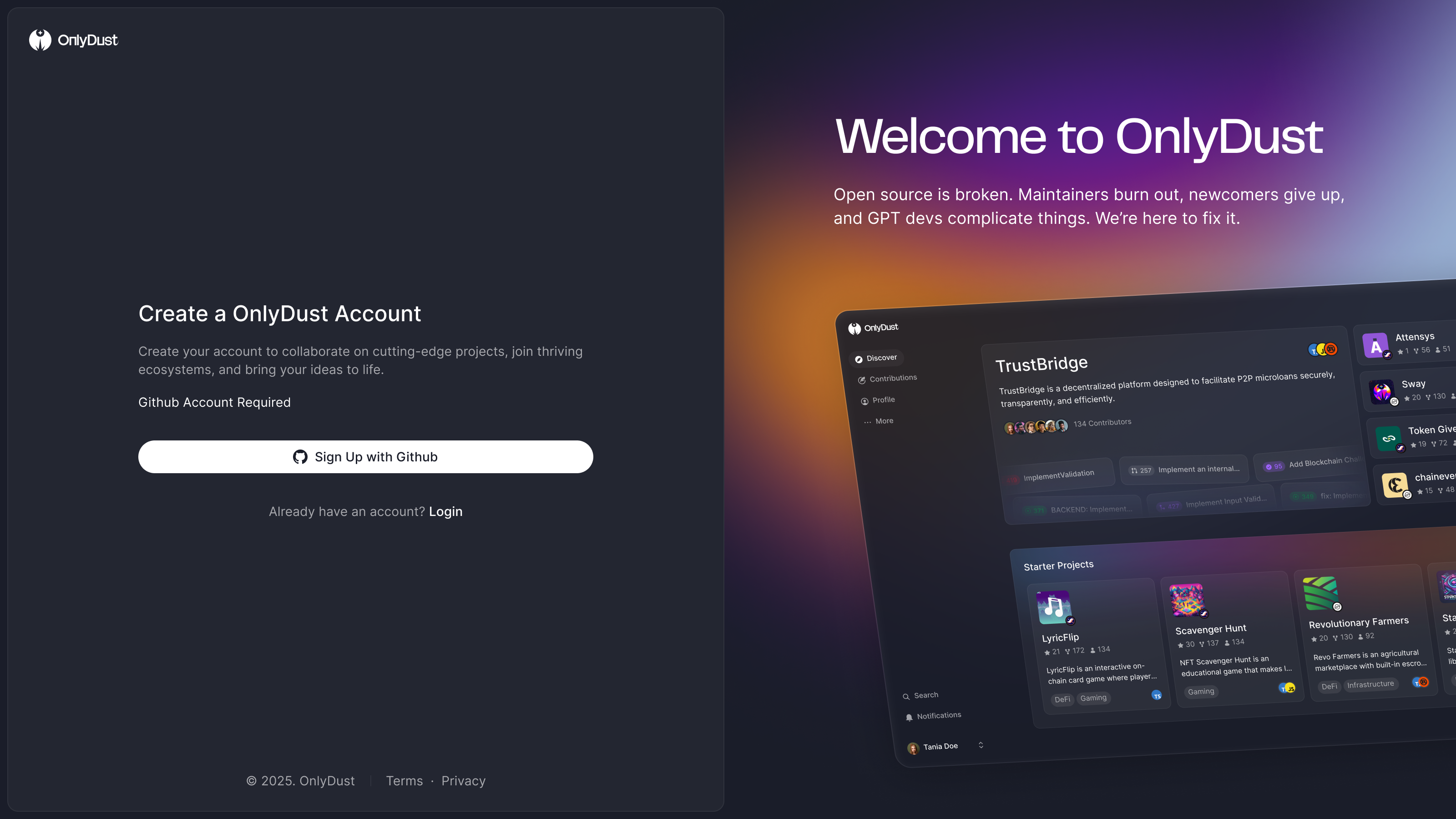
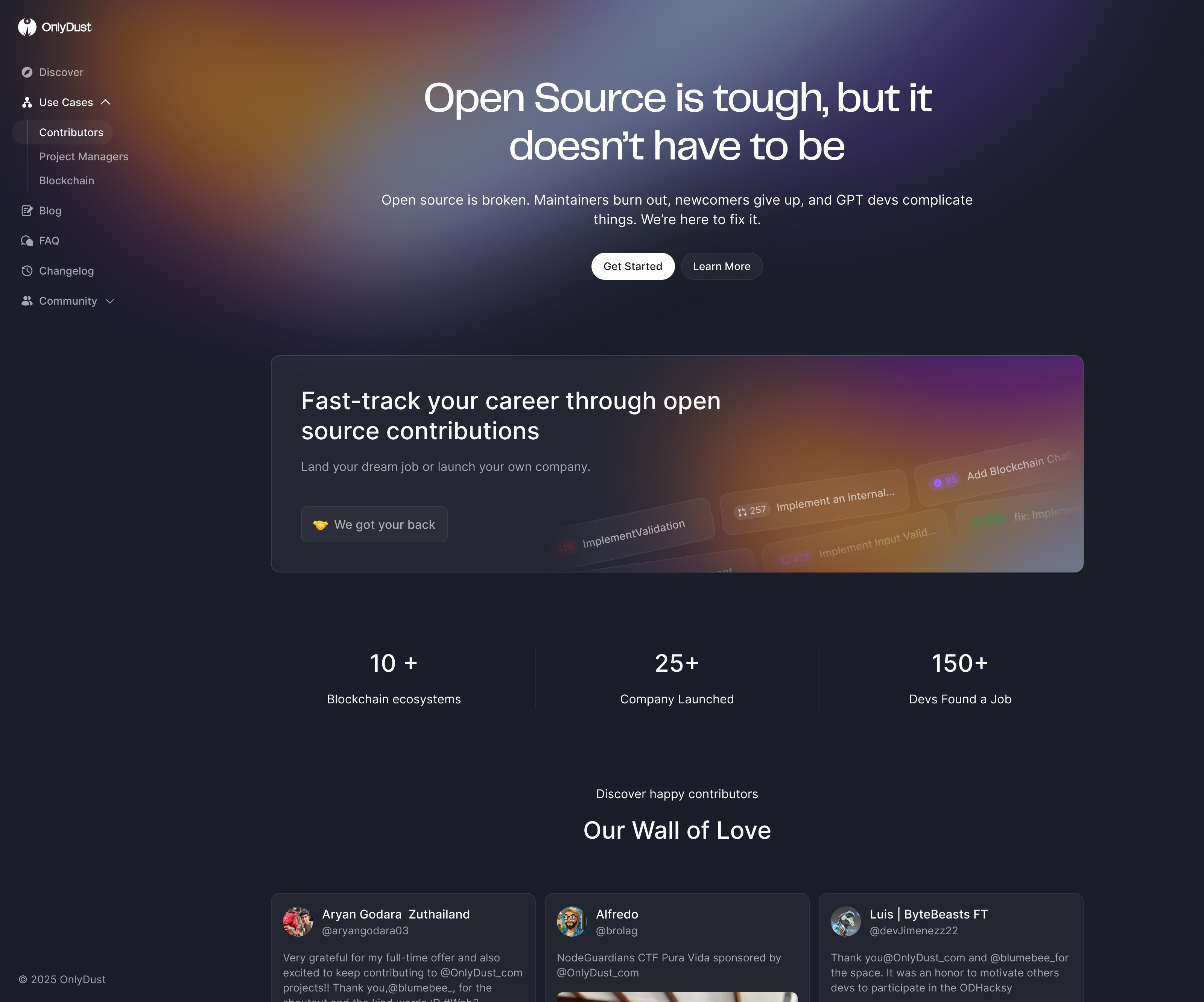
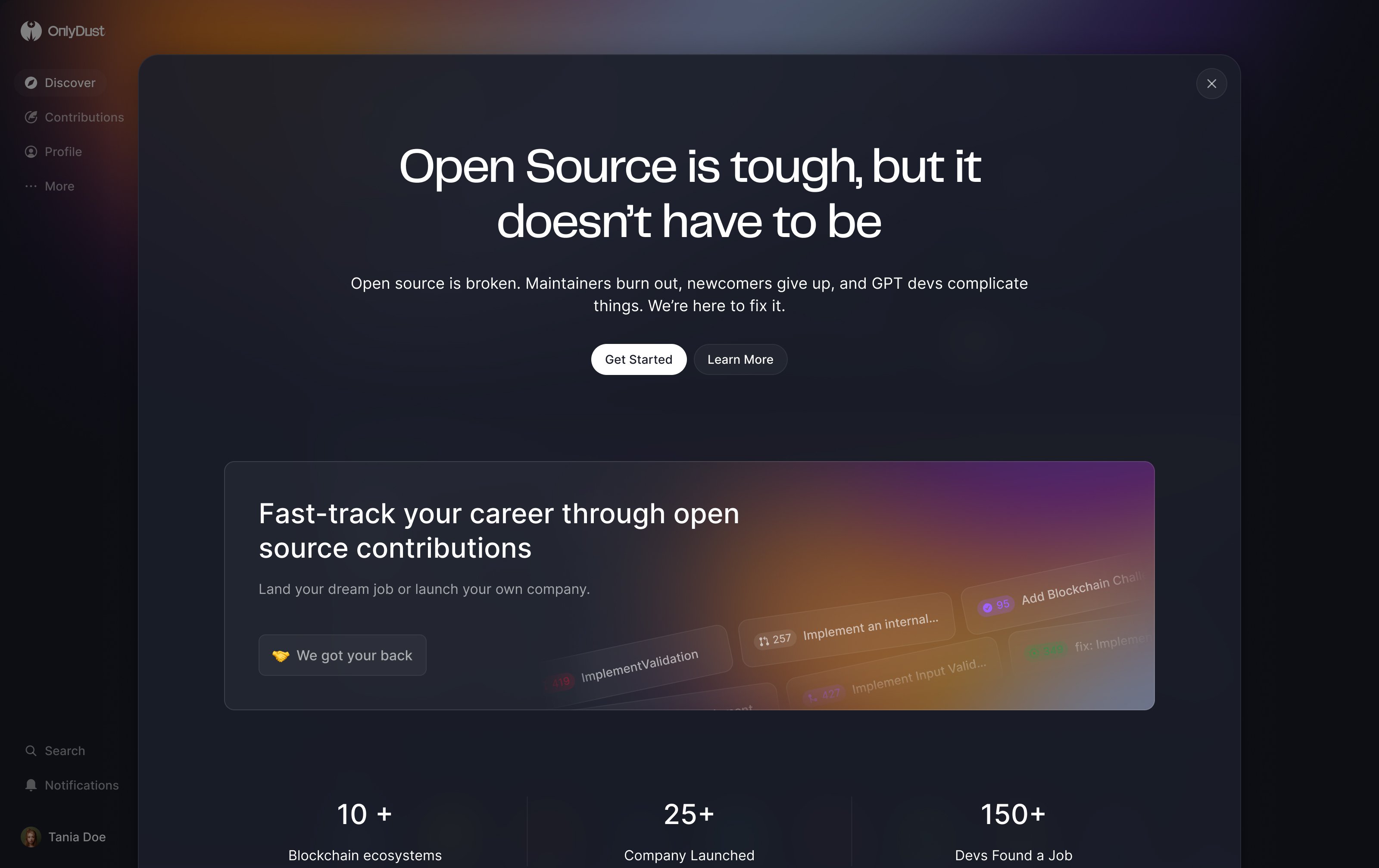
In our last week OnlyDust was rebuilding its platform to sync all of GitHub, millions of repositories, and Paco wanted the website and the app to stop being two things. Stack Overflow's answer is a separate marketing site on its own domain. I argued for building the website into the app instead, so everything is public, linkable and on one domain. Paco, who'd done a lot of SEO, knew pages like "open source gaming projects in TypeScript" would rank. So: one domain, everything readable without signing in, and the app as the website.
There wasn't much to market anyway. A contributor needs no pitch, just Discover. A maintainer needs one plain page, and sponsors were reached directly. Paco also wanted the crypto vocabulary gone, because OnlyDust was moving from Web3 to open source as a whole.
He asked for a week of rough layouts to argue over: a top bar over Discover, a side menu with the marketing pages under use cases, and the pitch as a layer over the app.
What happened next
At our last review, OnlyDust's engineers were preparing the rebuilt platform for launch. Paco's team continued the implementation and recommendation work.
OnlyDust has since closed. In their closing note, the founders describe maintainers withdrawing from outside contributions as AI-generated submissions became harder to review safely. Greg and Paco went on to build ctrlg.com.
More from OnlyDust