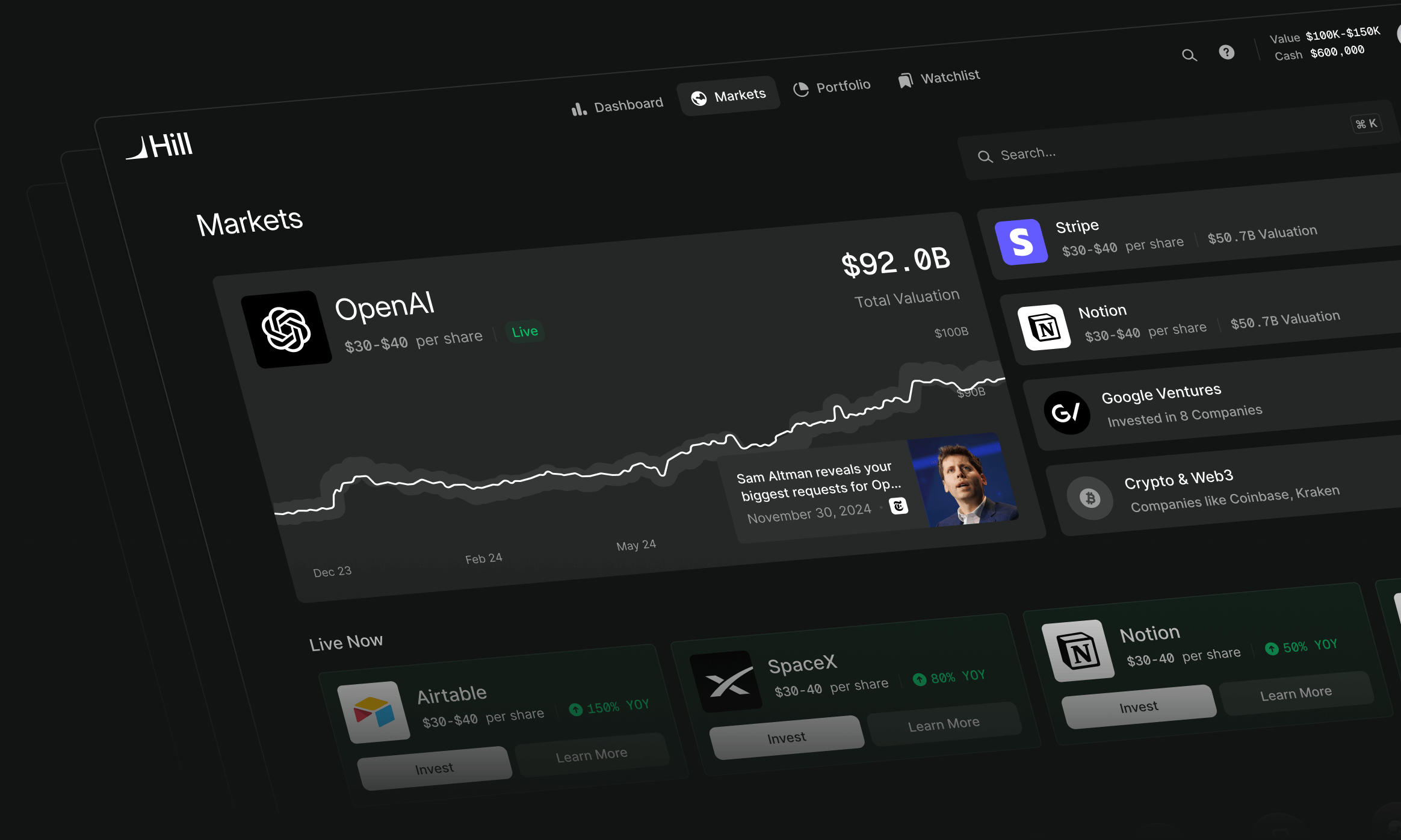
Hill lets accredited investors buy and sell stakes in private companies such as SpaceX and OpenAI. A purchase can involve several legal entities, different prices for different blocks of shares, and documents running to sixty pages. We designed the marketplace and investment experience to make those transactions understandable without pretending they worked like buying a public stock.
Andrew Benson, who co-founded the bitcoin brokerage River, first called us in November 2024. His institutional private-markets business, Gondola, was ready to build a separate product for individual investors. It needed to feel approachable to someone putting serious money into a company, without becoming a trading terminal or a colourful crypto app.
Andrew brought the market knowledge, compliance requirements and early wireframes. He deliberately kept his FigJam sparse: he wanted us to think through the problem, rather than make his existing ideas look better. We became Hill's design team, working on the product, design system, logo and website. Hill's engineers, Hugo Pereira and Victor Takahashi, built the application.
In January 2025 I also joined Hill as Head of Product. The studio continued as its embedded design team. That distinction matters here: the early product framing was an agency engagement; the later launch and product decisions included my role inside Hill.
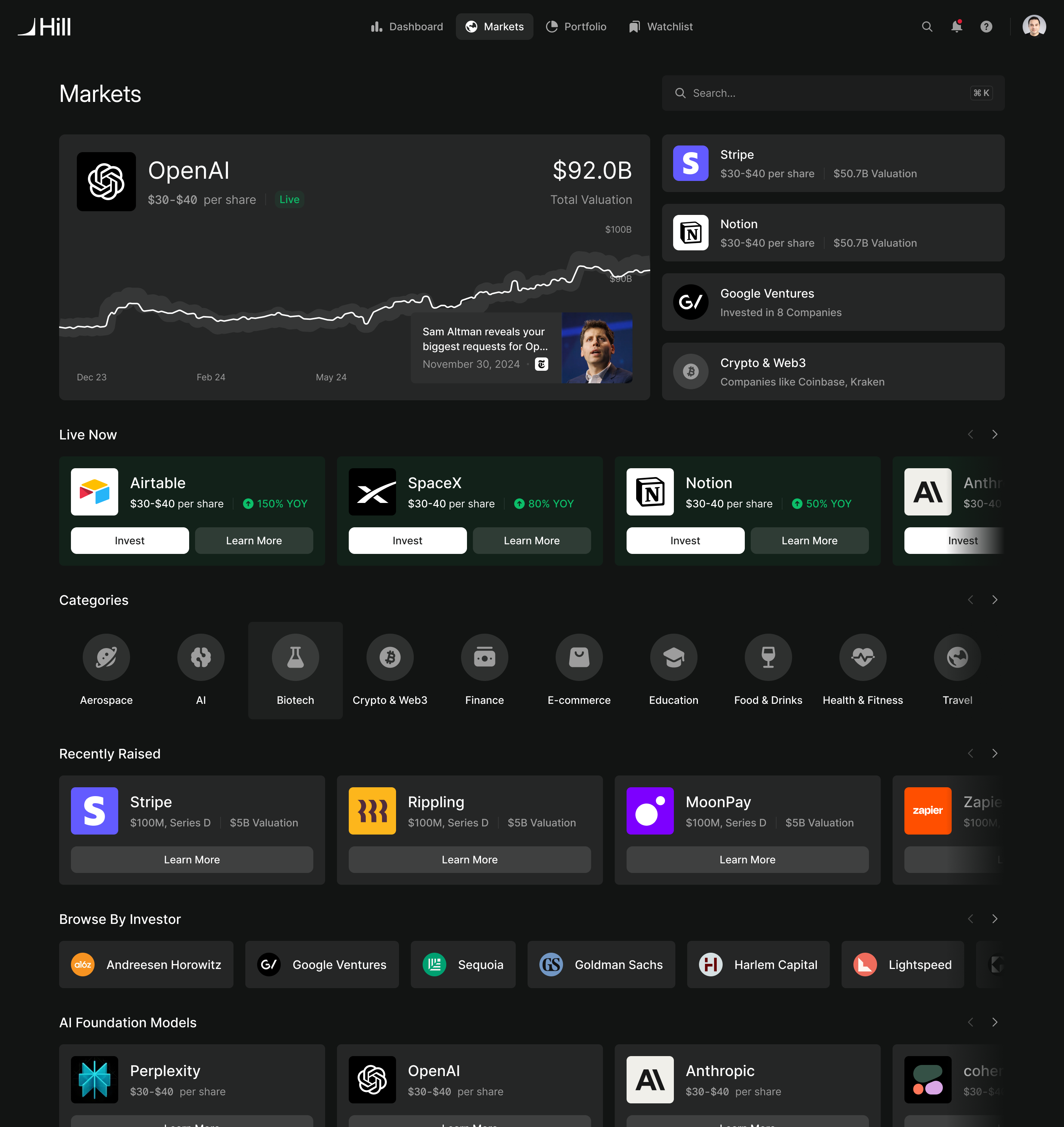
Browse a company. Understand the vehicle before buying.
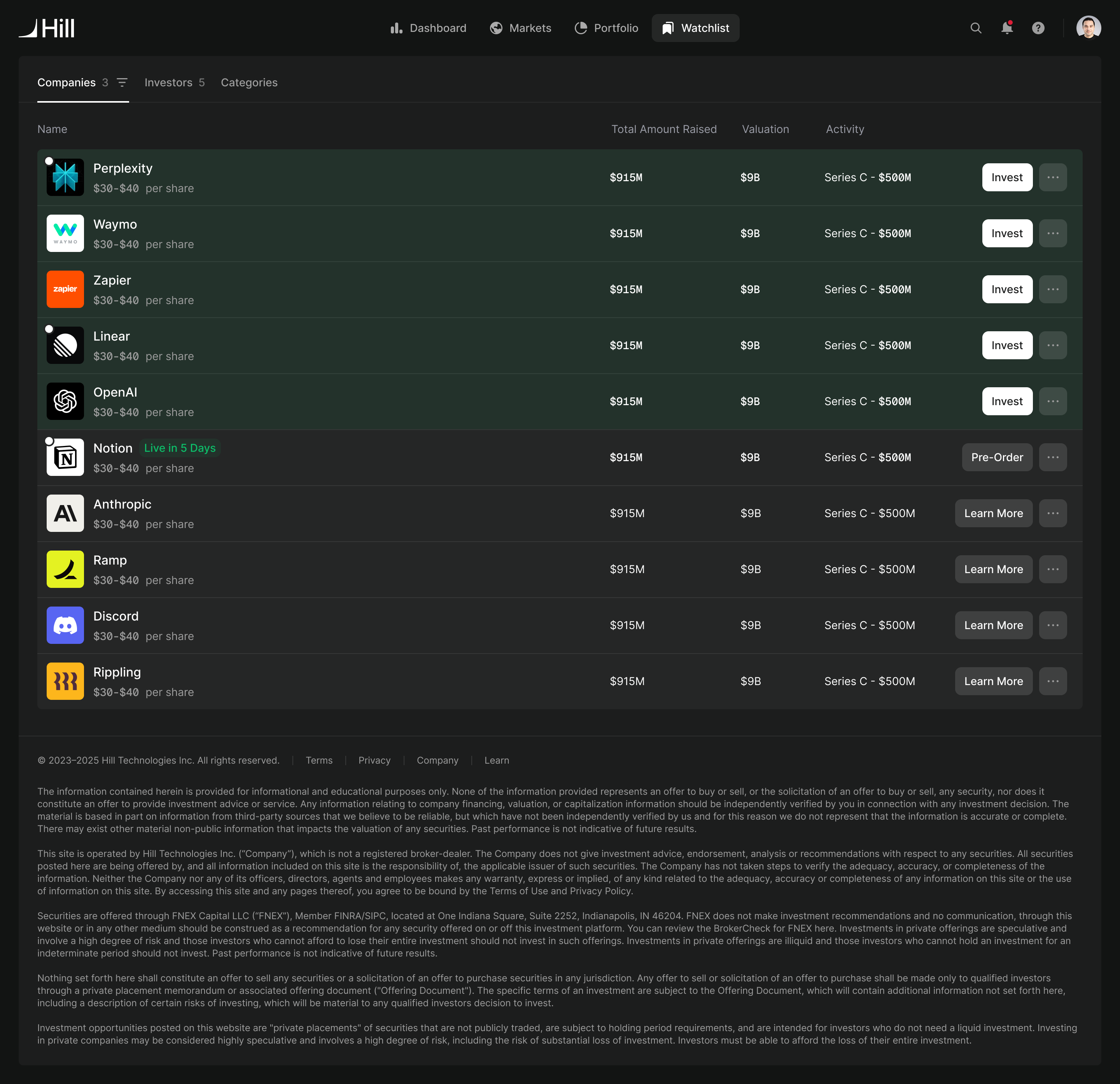
Someone arrives wanting to invest in SpaceX. What Hill sells them is a unit in a special purpose vehicle, or SPV, which holds the underlying shares. Sometimes that vehicle holds an interest in another vehicle. Each layer can have its own structure and fees.
That creates a difficult information problem. Leading with the legal entities would make the marketplace hard to browse. Hiding them throughout would leave someone misunderstanding what they had bought.
In our kickoff, I asked Andrew how far we could abstract the vehicle structure. His distinction set the direction: the company could lead while someone explored, but the transaction needed to make the actual security clear. We designed around that change in detail. The marketplace organises companies; the order flow and portfolio expose the individual trades and the vehicles behind them.
the company is how people browse; the SPV is what they buy
Price needed the same care. There isn't one universal price for a private company's shares. Blocks trade at different prices depending on their size and structure. Andrew described the market as a scatter plot, rather than a line. A price from a large institutional transaction could create a misleading expectation for someone placing a smaller order.
We discussed a calculator that would show pricing for the amount someone intended to invest. The simpler answer for browsing was a range of prices per share, alongside the company's valuation. Exact pricing would be resolved against the order. Someone could understand the approximate opportunity before entering the flow, without being promised a price that their purchase couldn't achieve.
Make compliance a sequence people can understand
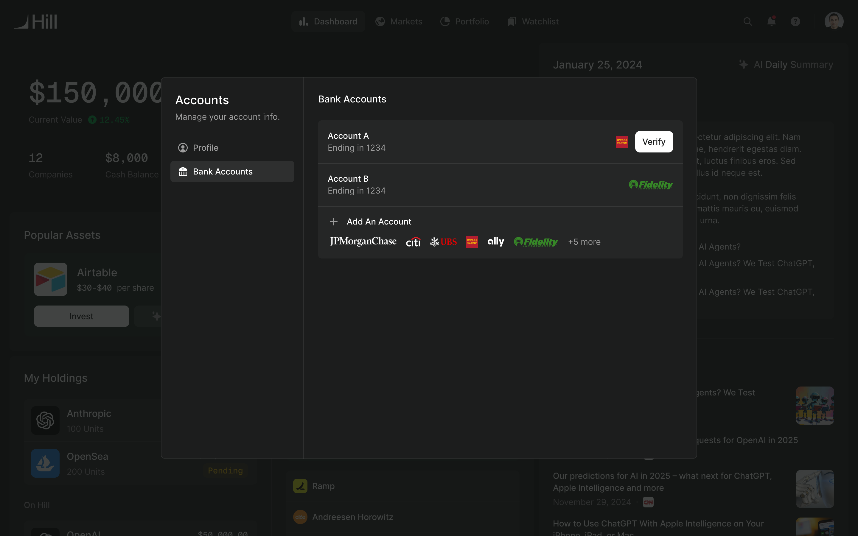
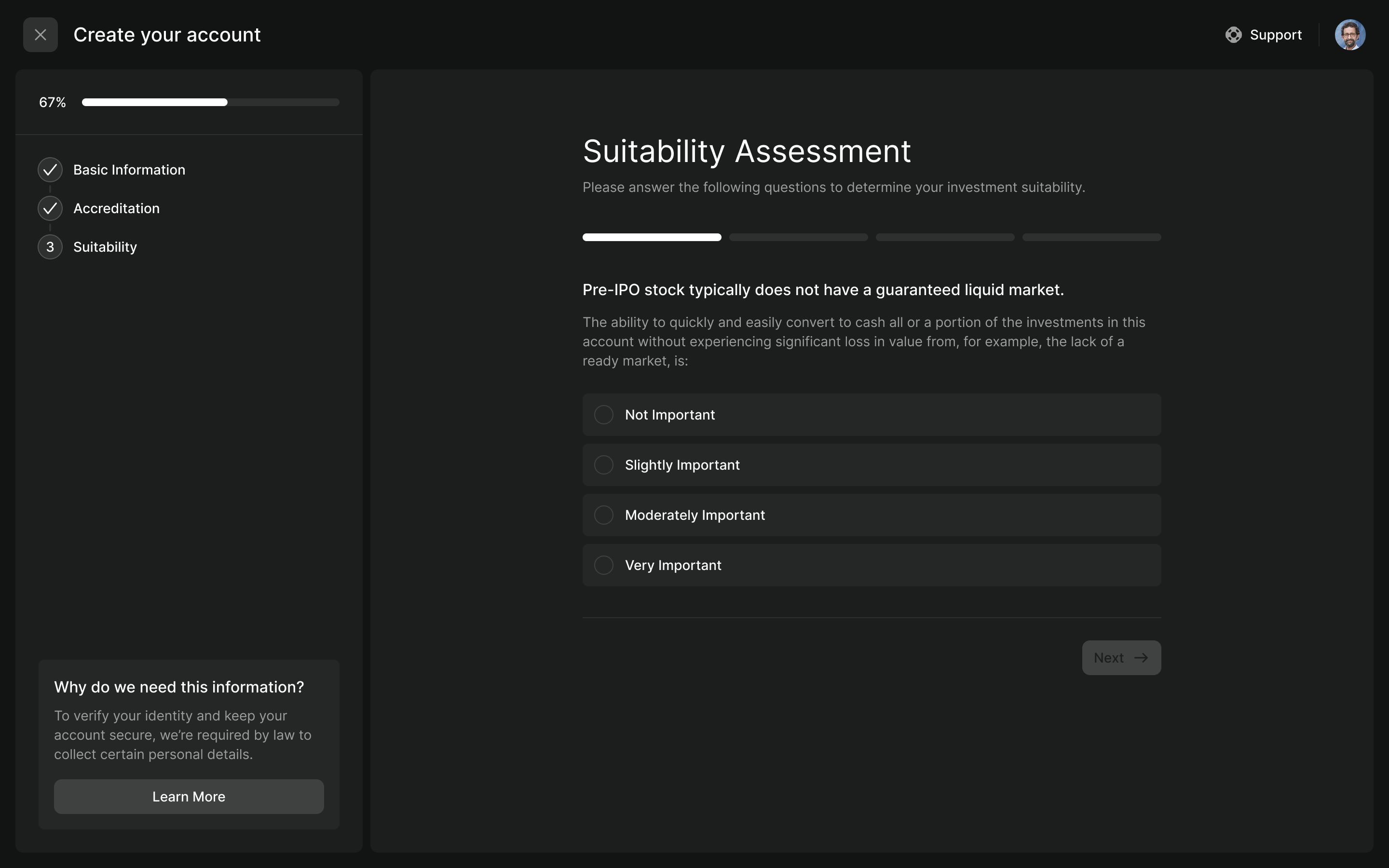
Before an investor could transact, Hill needed identity verification, accreditation and a suitability assessment. Andrew wanted the high-friction identity check as late as possible, so people could see why the product was worth joining before doing the paperwork.
I suggested treating unfinished checks as tasks someone could return to, rather than forcing every requirement into one uninterrupted sign-up. I also asked how people would arrive. Someone exploring private markets has a different reason to tolerate paperwork from someone who has already decided to buy a particular company.
Those questions helped separate what was needed to enter the product from what was needed to transact. They didn't remove Hill's compliance obligations. The launch flow still put identity verification in the first step, through Plaid, followed by accreditation and suitability.
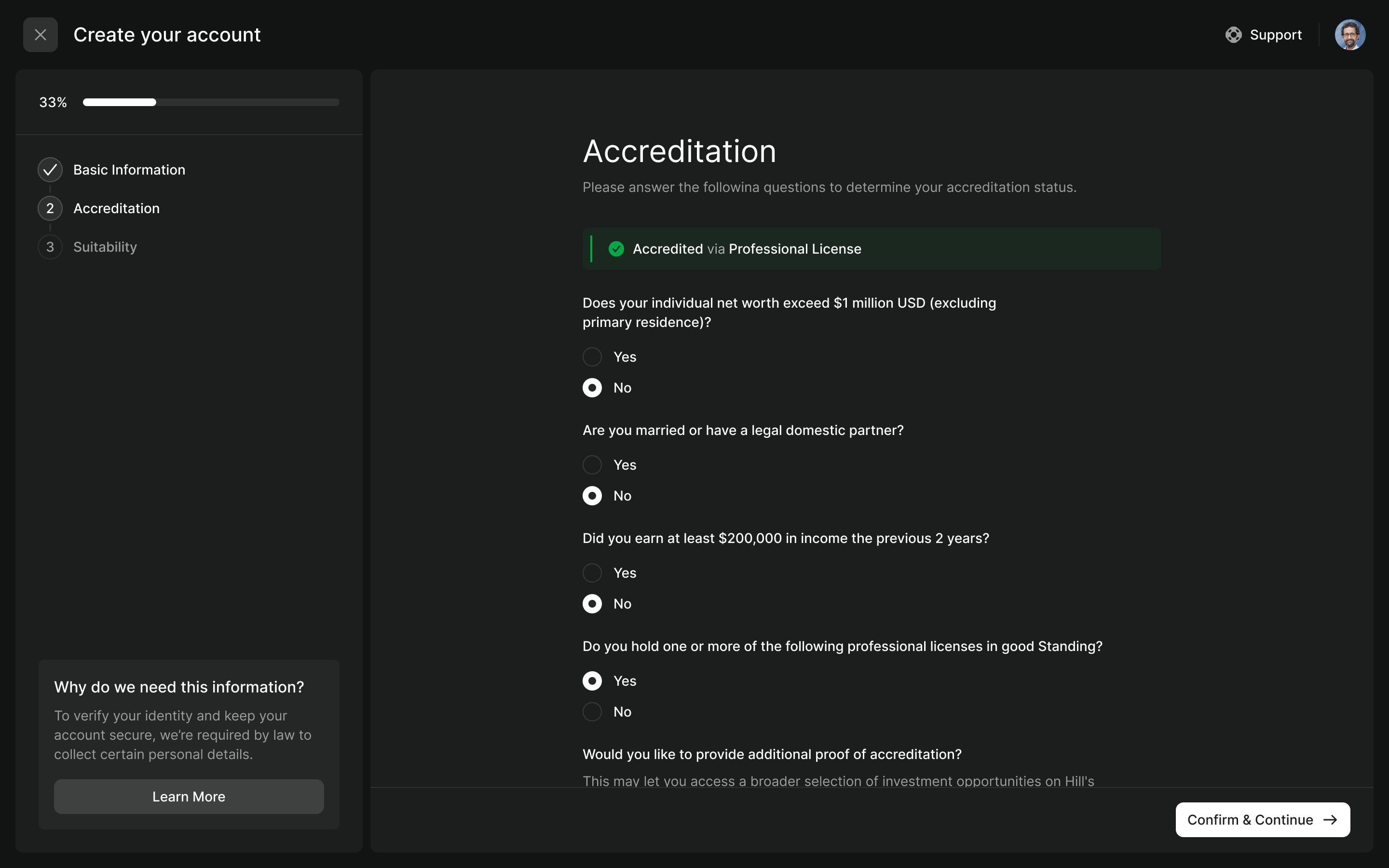
Hill's initial brief distinguished two offering types. For its 506(b) offerings, investors could attest to their accreditation; 506(c) offerings required evidence. We made that additional proof deferrable during onboarding, with a further prompt when an investor needed it for an offering.
The distinction gave the form a useful boundary. It could collect the information needed now, explain why more might be needed, and let someone continue without finding a document that wasn't necessary for their next action.
Help investors find companies without choosing for them
Another requirement came from Andrew's compliance brief: avoid personalised investment recommendations. We needed discovery that helped people explore the market while leaving the selection criteria in their hands.
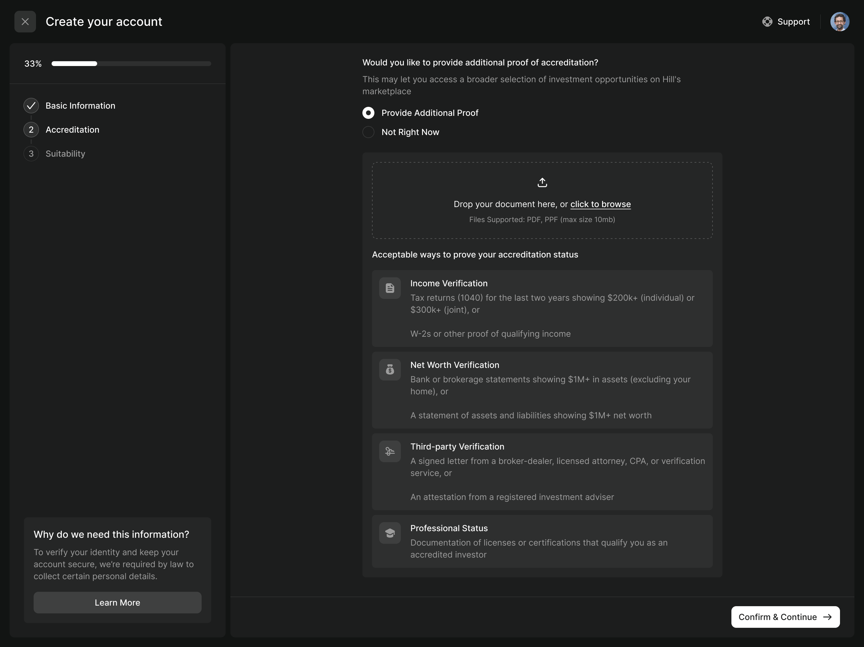
I proposed explicit search and filters, so the results followed what the investor asked for. Categories drew on the market maps Andrew used on the institutional side. A company had a primary category and could carry additional tags, giving the marketplace an understandable structure without needing a personalised feed.
Search also had to understand the names people actually knew. Someone might search for ChatGPT without knowing that the company they wanted was OpenAI. The same relationship applies to Starlink and SpaceX. We brought products into search alongside companies, investors and categories.
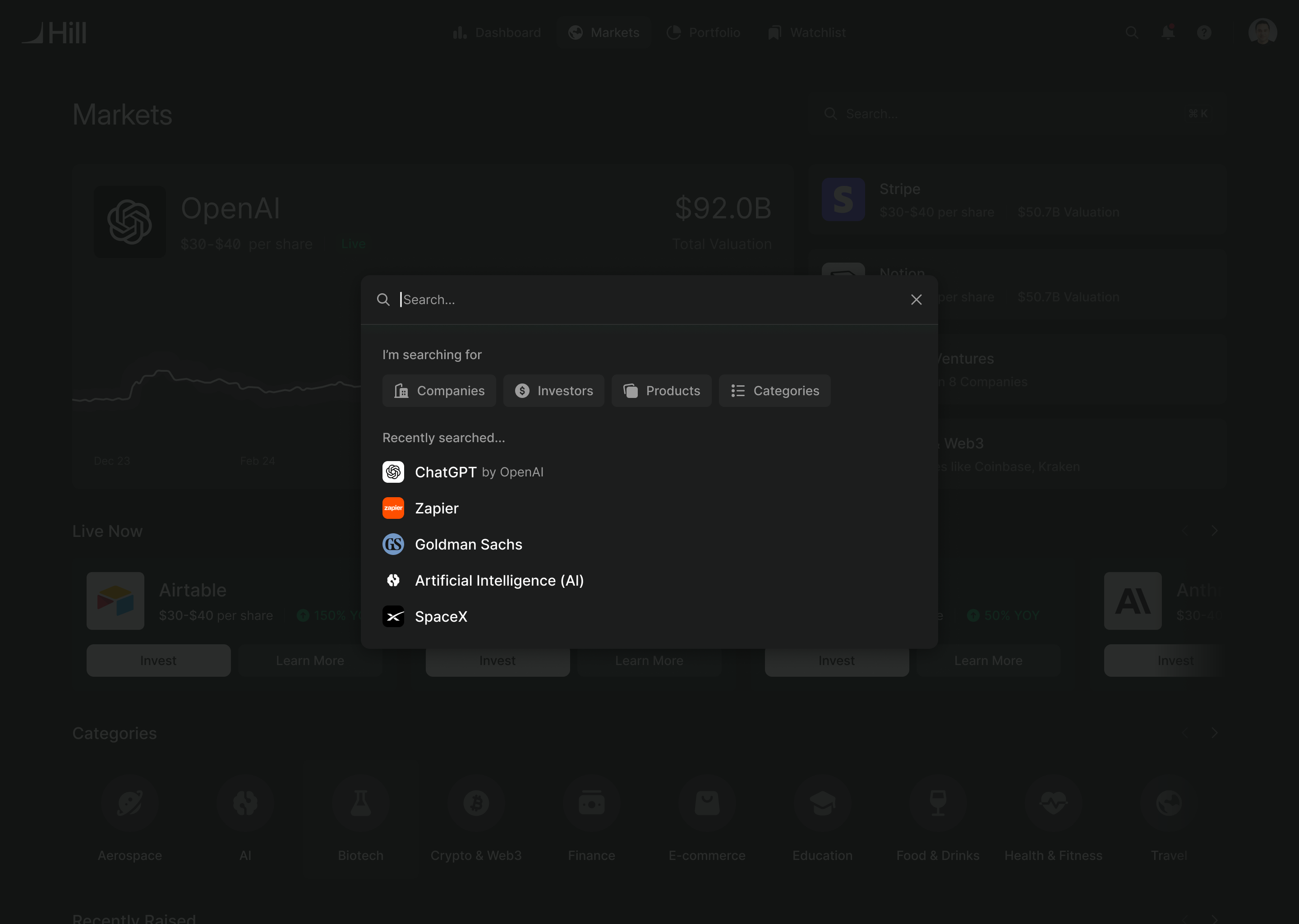
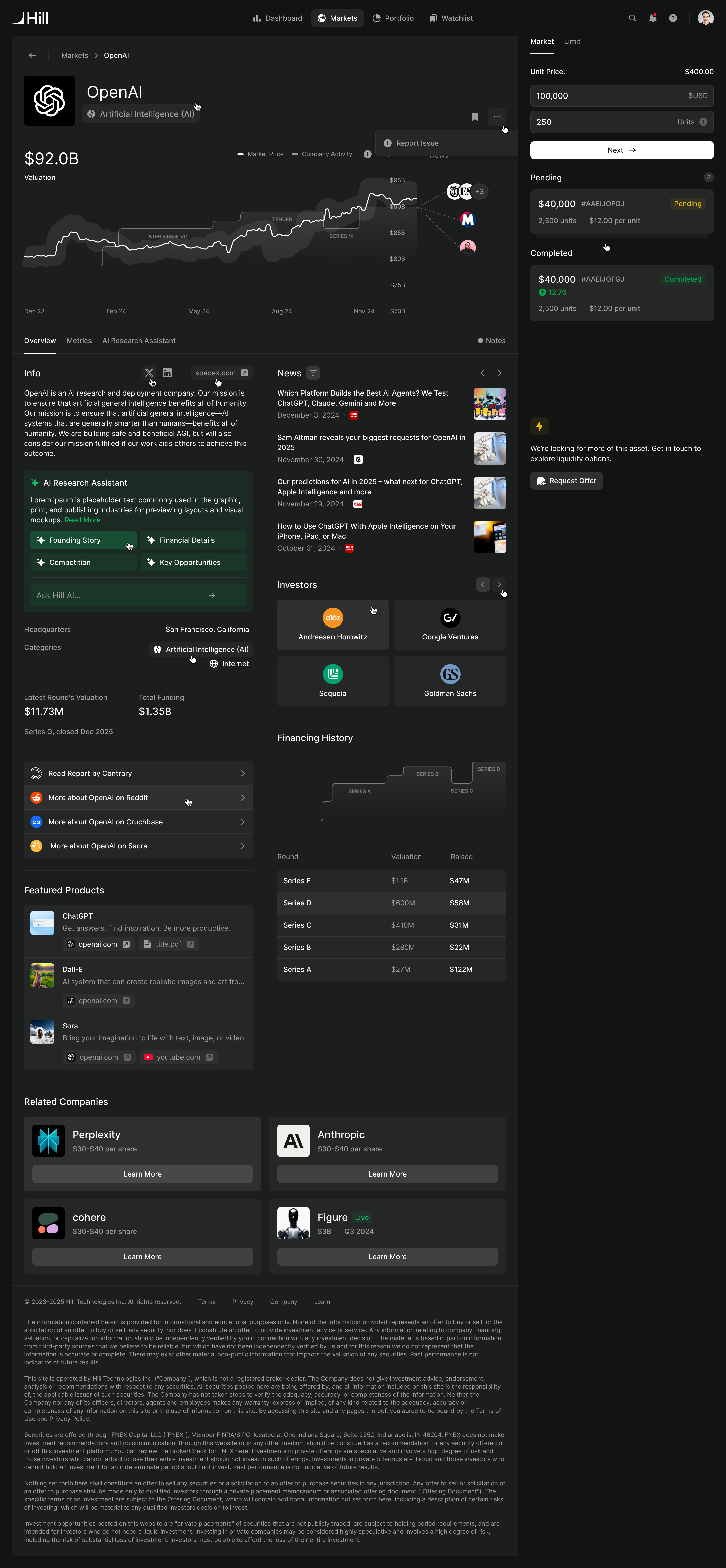
The company pages needed to tolerate uneven information. Gondola tracked many more companies than the retail product would actively trade, and not every company had the same depth of data. We used a fixed information panel beside a stack of content blocks. If a block had no data, it could drop out. The page kept its structure without drawing attention to a collection of empty sections.
One order can contain several trades
The investor chooses how much to buy. Behind that amount, Hill may need to combine shares from different SPVs at different prices. Andrew brought that trading model; our task was to make its consequences legible through the purchase.
We organised the flow around setting volume, funding, any additional questions, signing and confirmation. The sequence could expand for an offering that needed more information before its documents could be prepared. Someone shouldn't encounter a form for one SPV simply because another SPV required it.
Market and limit orders shared the volume screen. When supply was available, the flow could begin with a market order. Without it, a limit order let someone specify the price they were willing to pay. The screen also surfaced minimum investment requirements and better pricing available at a higher volume.
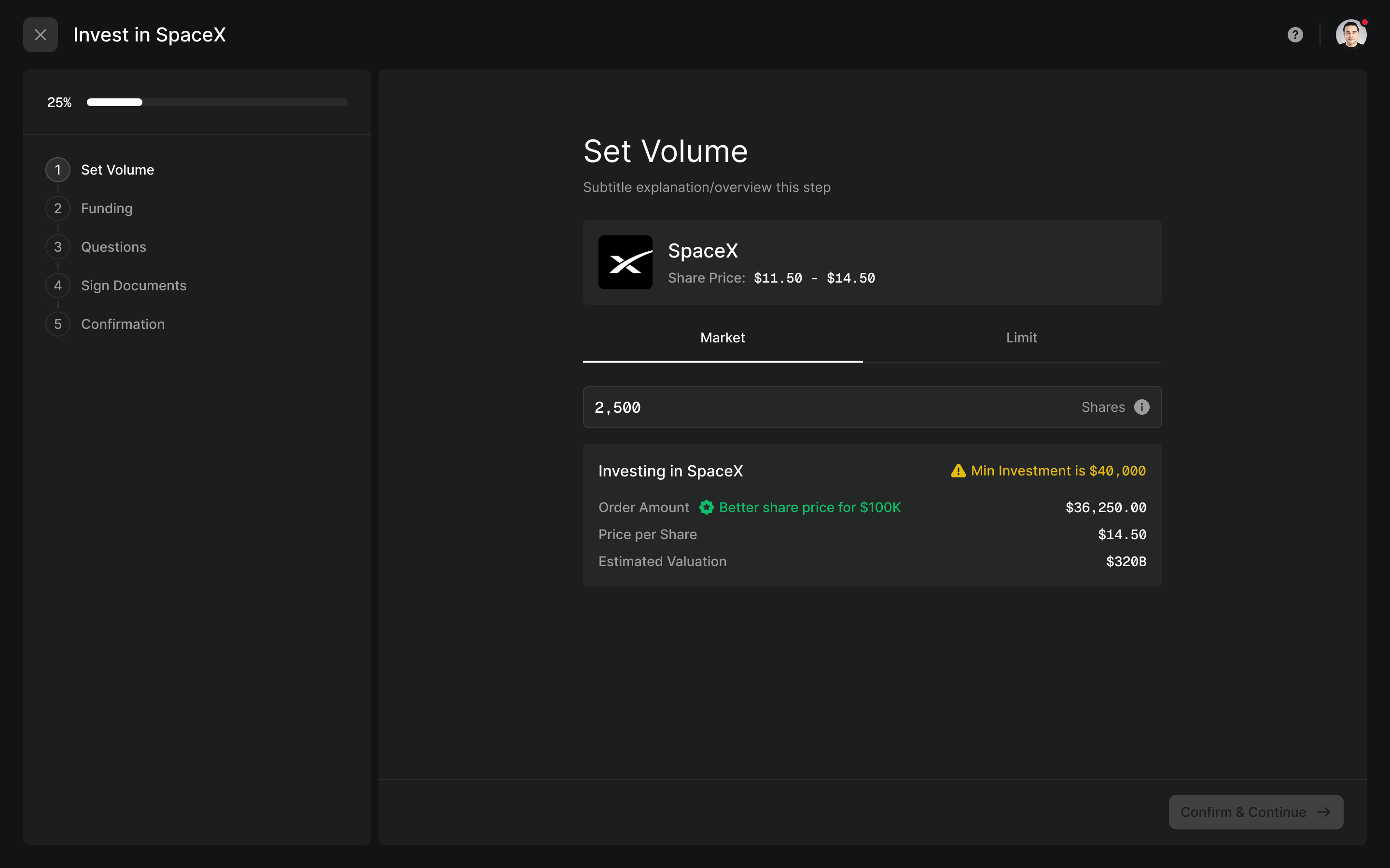
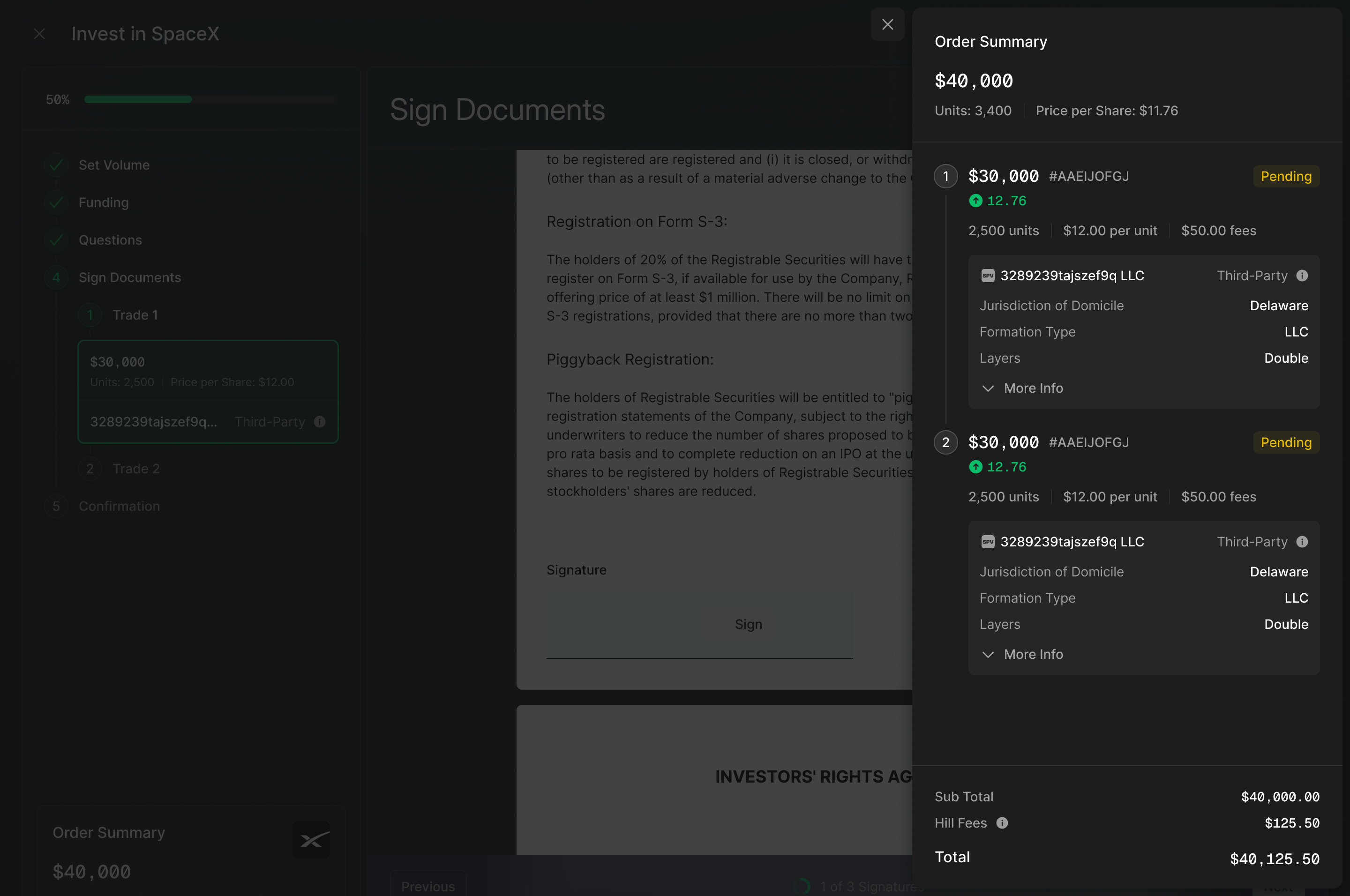
The order summary then needed to account for the actual trades. A single total wasn't enough: each trade had its own units, price, fees and vehicle. We made those details available inside the flow, so the investor could inspect how their intended purchase was being assembled.
one purchase amount can become several separately signed trades
Keep the order in view while someone signs
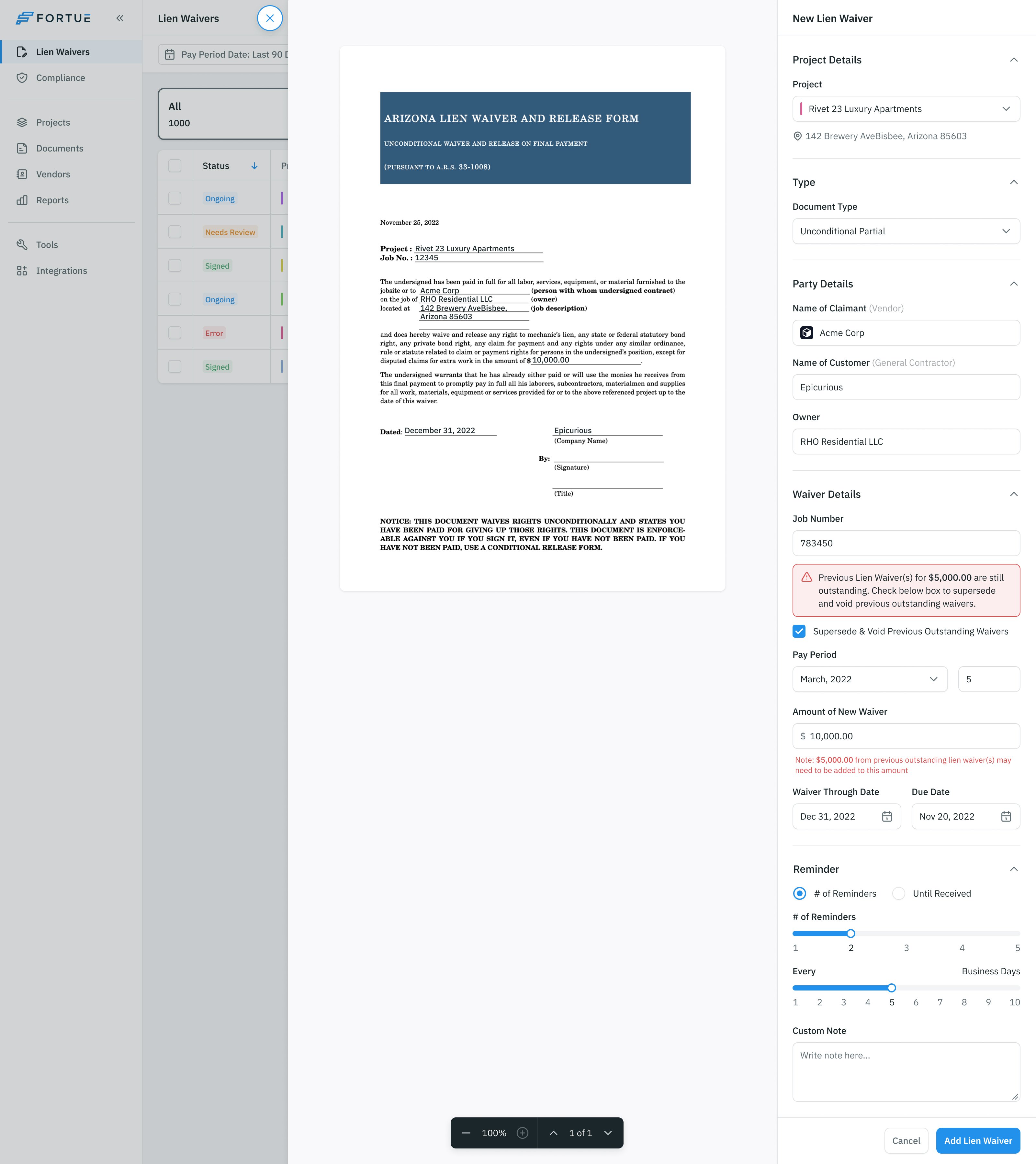
Investment documents could run to forty or sixty pages, sometimes more. Moving into signing couldn't mean losing the explanation of what the person was buying. We kept the order summary available beside the document, with the trades and their SPV details intact.
Early in 2025 Hill replaced its off-the-shelf signing tool with its own implementation, giving the team control over the interface and its reliability. Andrew and the engineers settled on rendering document pages as images with signature fields over them, so the signed output matched what the investor had seen. Andrew proposed capturing a signature once and reusing it at subsequent fields. I worked that into the reading experience: a prompt to scroll, a sign control at the relevant field, then guidance towards the next place that needed a signature. A remaining-signatures count made the unfinished work visible.
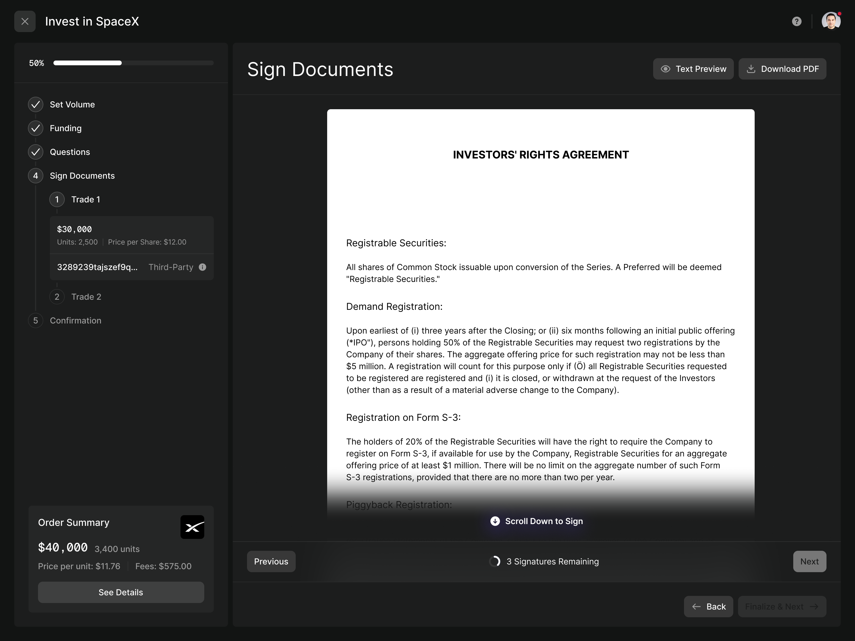
Andrew also clarified that each trade executed independently. Someone could finish one trade while another was still awaiting signatures. I proposed renaming the step from Term Sheet to Sign Documents, with a nested stepper showing the individual trades. The navigation could distinguish the one already executed from the one being signed, while leaving room for the document itself.
Each trade's documents were signed as an envelope. The final action executed that trade, so its wording had to distinguish a commitment from moving to another page. The button said Execute Trade.
A wire transfer leaves the app. The order must not disappear.
Large purchases used wire transfers. The investor had to leave Hill, open their bank and send the money. A conventional confirmation screen would have suggested the work was finished at precisely the point when something important was still outstanding.
We gave the wire its own step before confirmation. It showed the amount and bank details, with a unique reference code for matching the money to the order. Each field could be copied individually. The instructions also went by email and could be downloaded as a PDF, so the investor didn't have to keep Hill open while working through their bank's form.
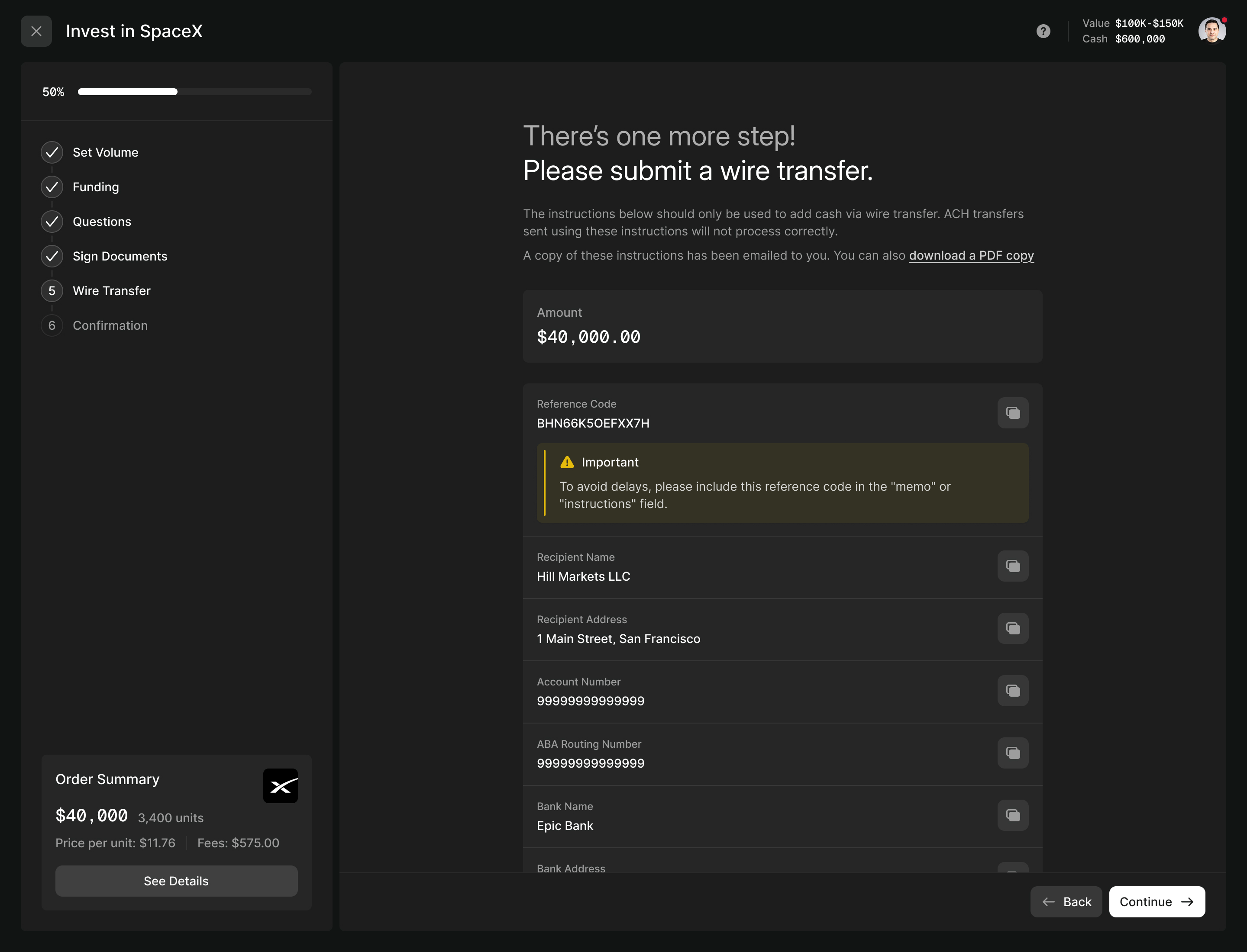
If someone left to pay later, the outstanding transfer stayed attached to the trade in their portfolio. The next action could be recovered where the investor would look for their investment.
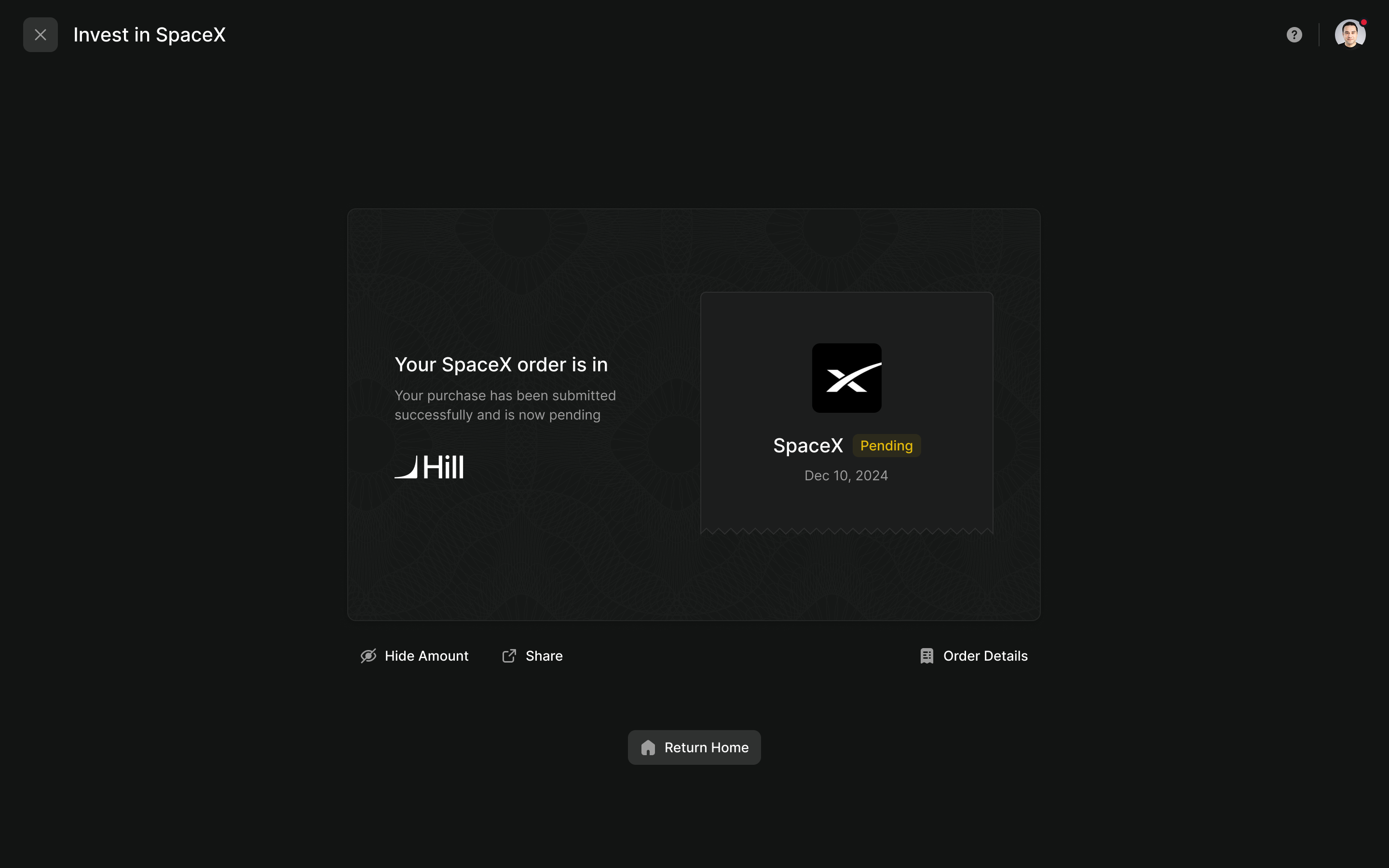
Andrew also wanted a confirmation people could share. We designed a shareable company card with a control to hide the amount. The confirmation could celebrate the order while keeping its pending state visible.
The portfolio has to remember the unfinished work
A private-market order could remain pending for weeks. Grouping everything into one holding per company would obscure whether a trade had completed, which vehicle it belonged to and whether the investor still needed to act.
We kept the company-level overview, then split its details into individual trade blocks. Each carried its status, dates, fees, SPV structure and documents. An outstanding wire appeared with the trade it would fund.
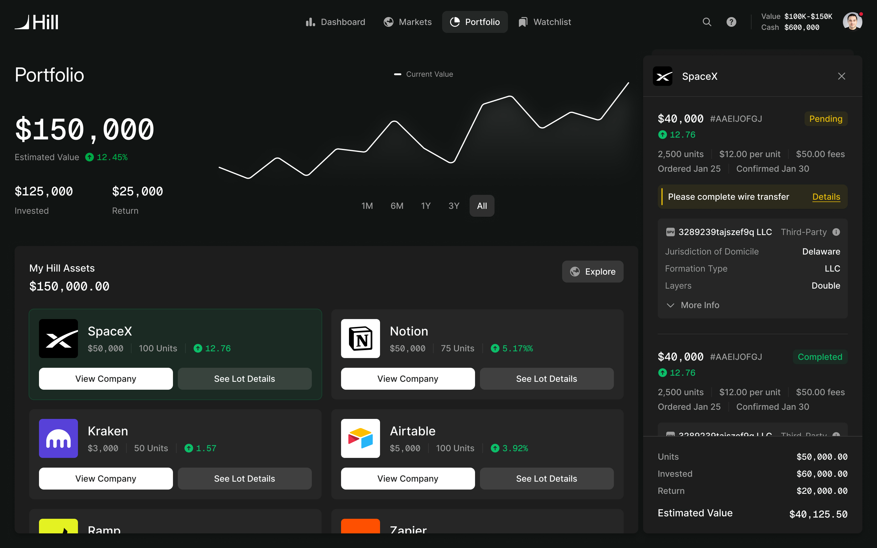
pending and completed trades stay separate
In my product role, I worked through the specification before asking the team to tidy the visual design. The trade block reused the component already built for the investment flow. That kept the information consistent as a purchase moved into the portfolio, and saved Hill's engineers from building another representation of the same thing.
Performance needed a separate decision from Hill's product team. Because fees came out of the investment, a new position could appear to open at a loss. The team chose to list fees separately and show no gain or loss for the first thirty days. The chart used percentage return so adding a new investment wouldn't look like a sudden improvement in performance.
For demo day, finish one investment path
Hill joined the HF0 residency in San Francisco in early 2025. Its March demo day gave the product a firm deadline. Three weeks out, Andrew and I cut the AI research assistant, metrics tab and search from the launch scope. Those were useful parts of the broader product, but none was necessary to complete an investment.
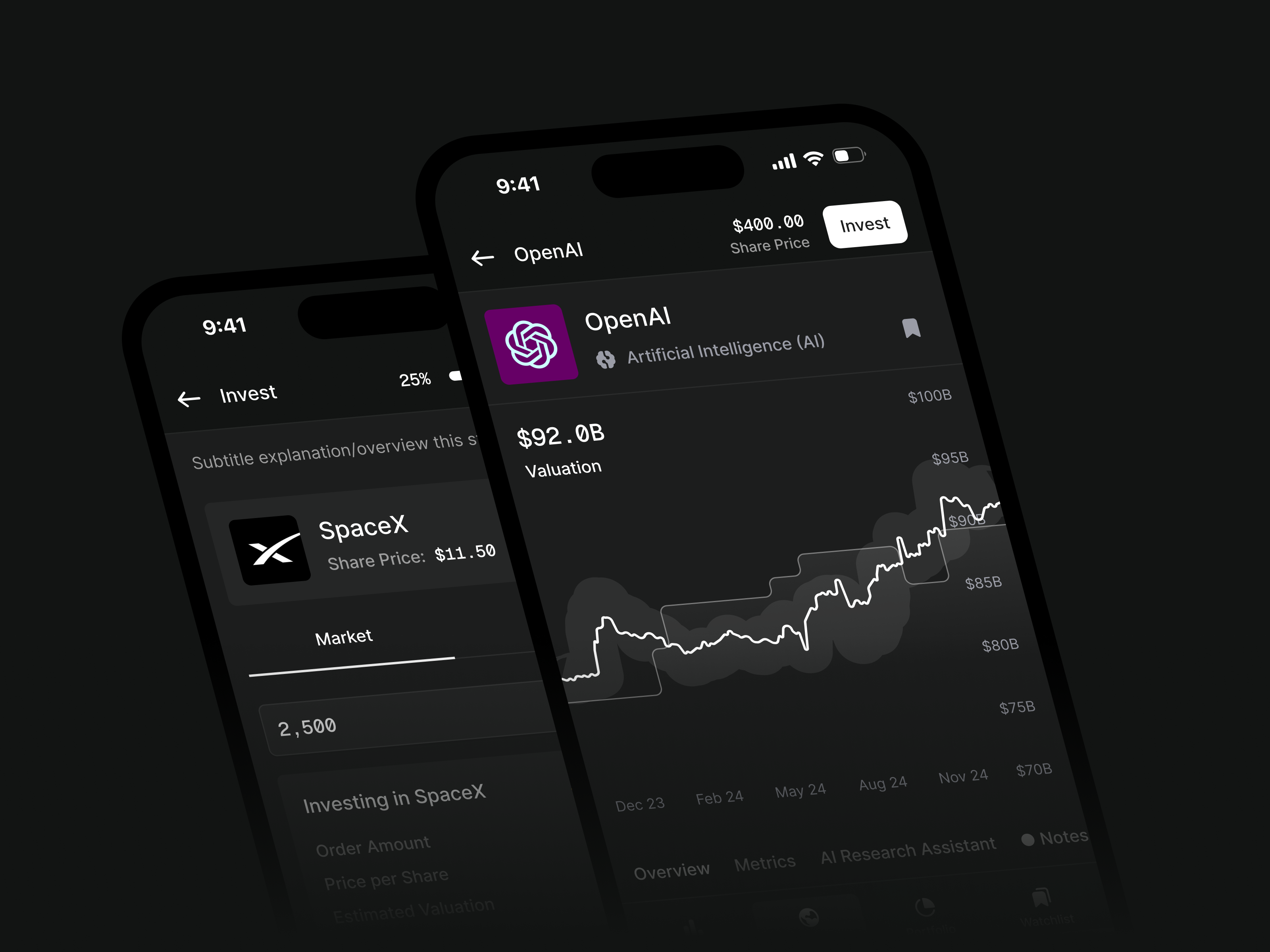
With people likely to invest from their phones, mobile came first. The dashboard became a single SpaceX card and unfinished pages redirected home. That left a narrower product with a complete path through it. The deferred work returned afterwards, and Hill opened a beta in May 2025.
A restrained brand for a complicated purchase
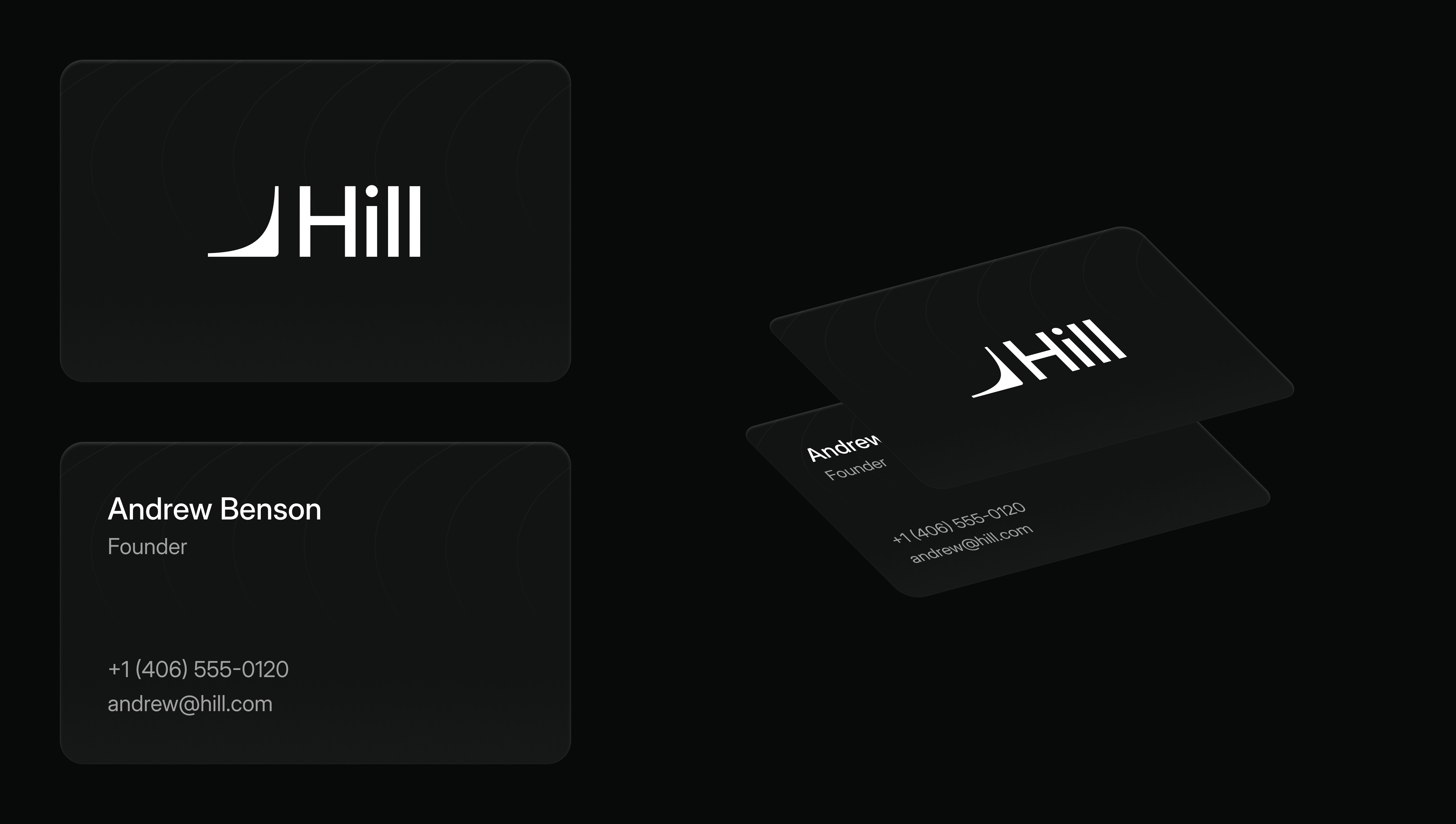
The product's visual direction changed as Hill took shape. Andrew initially chose a purple direction with gradients and shadows. After the company acquired the hill.com name and brought in a brand agency, a mark we'd sketched became the preferred direction. The agency refined it.

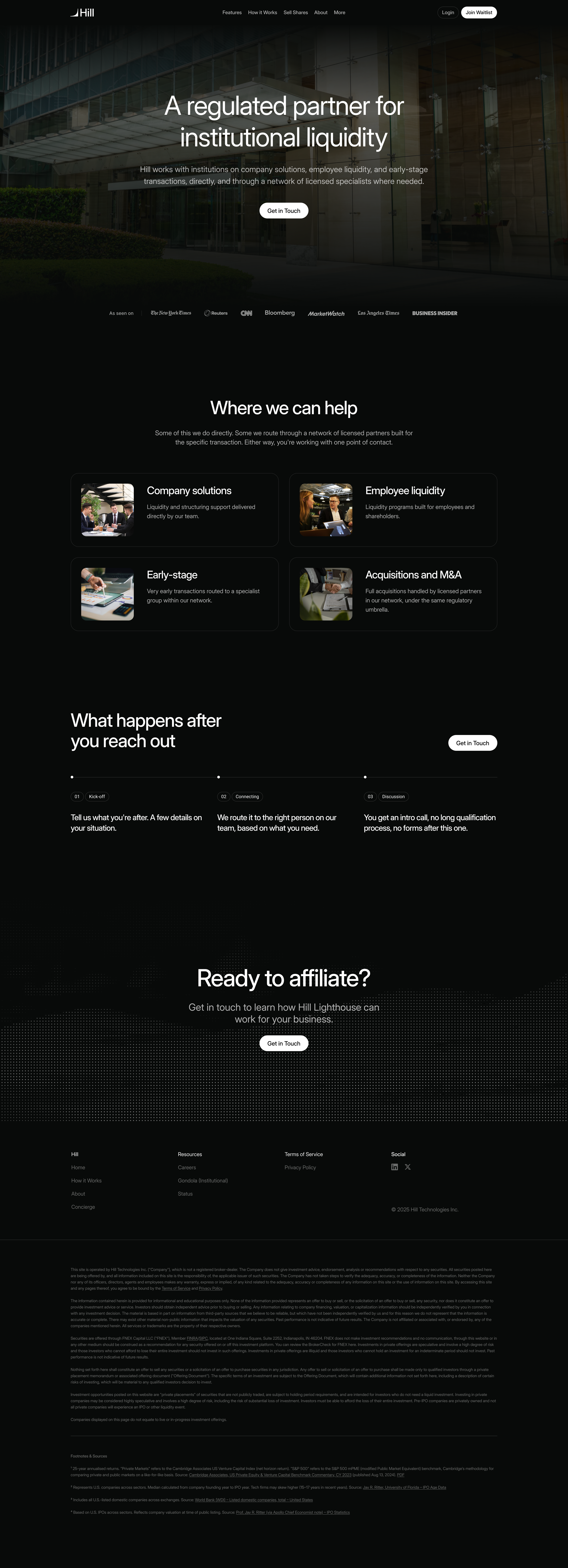
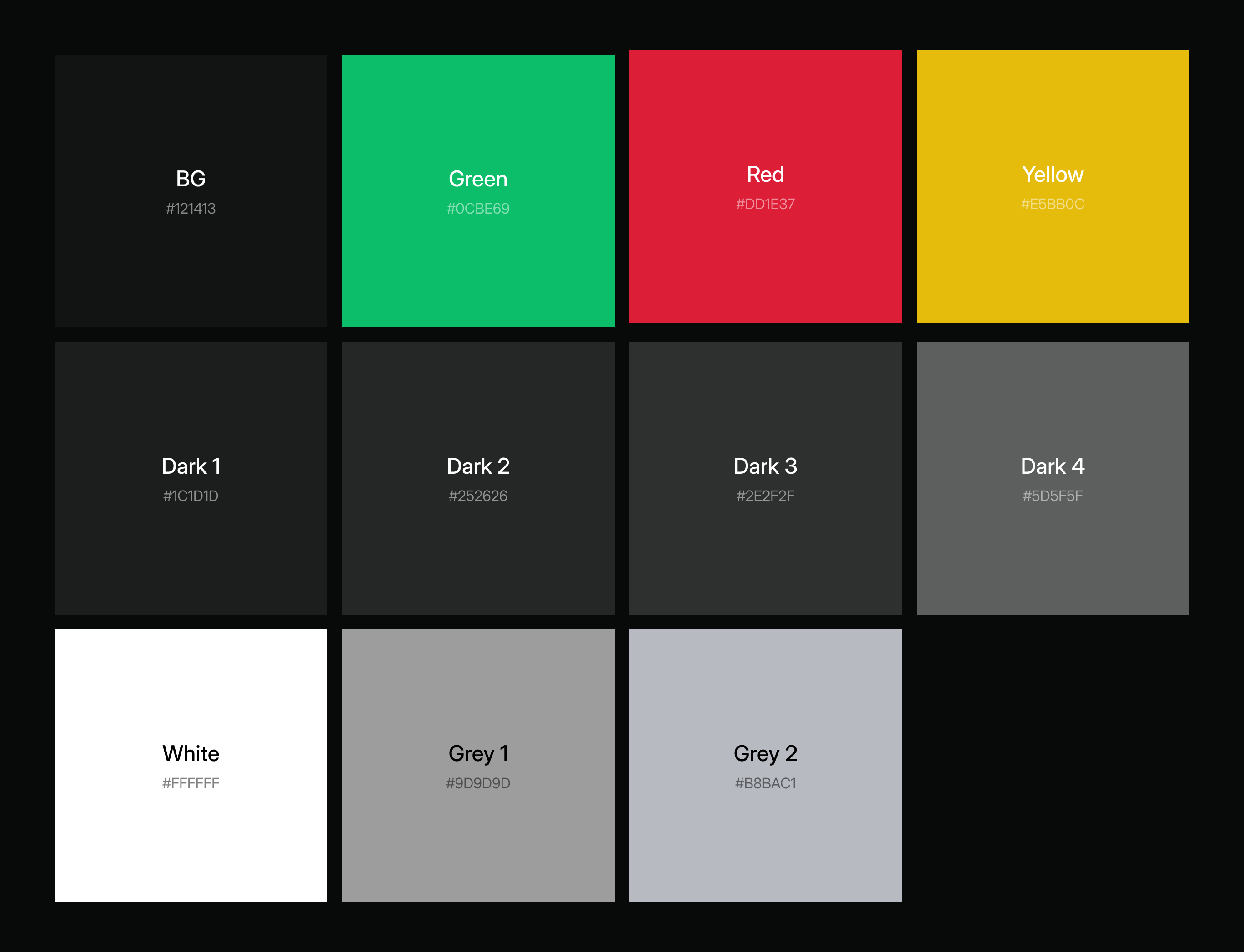
Andrew and I then took the wider brand towards black and white, with green used sparingly and photography of cities and hills. The interface could put the attention on companies, prices and transaction states. The website had another job: explain the appeal of private markets before explaining the application.
A week before demo day, I argued for restyling the existing site first. Building the larger new site against that deadline would force a choice between rushing it and arriving late. Andrew agreed. The subsequent website opened with “Private is the new public”, while its wording was reviewed against Hill's compliance requirements. Terms such as “automated” carried implications beyond the product feature they appeared to describe.
The studio has continued designing for Hill alongside my product role, including further onboarding work and pages for institutional investors. Hill is live at hill.com. We announced the original partnership in December 2024.
More from Hill