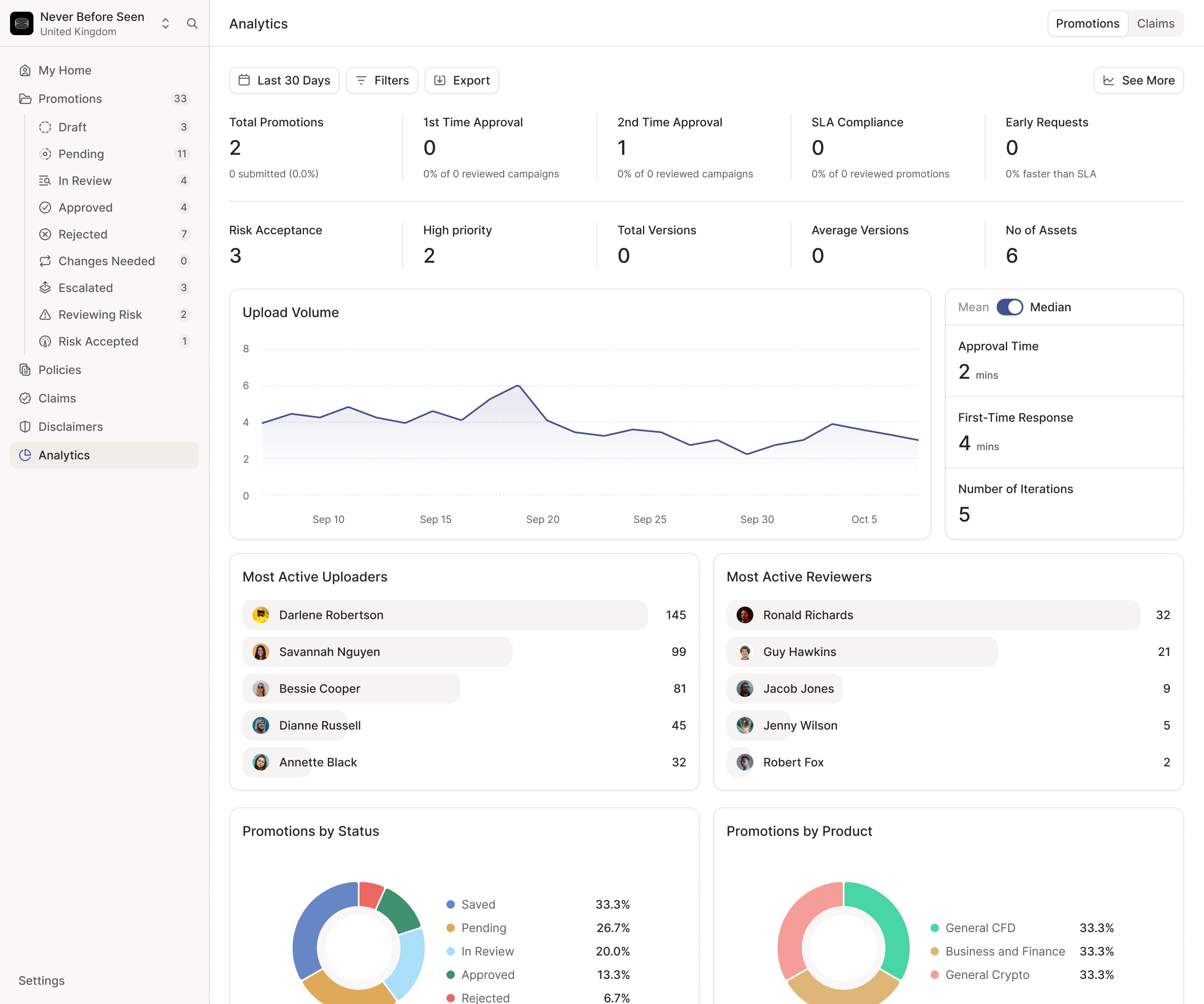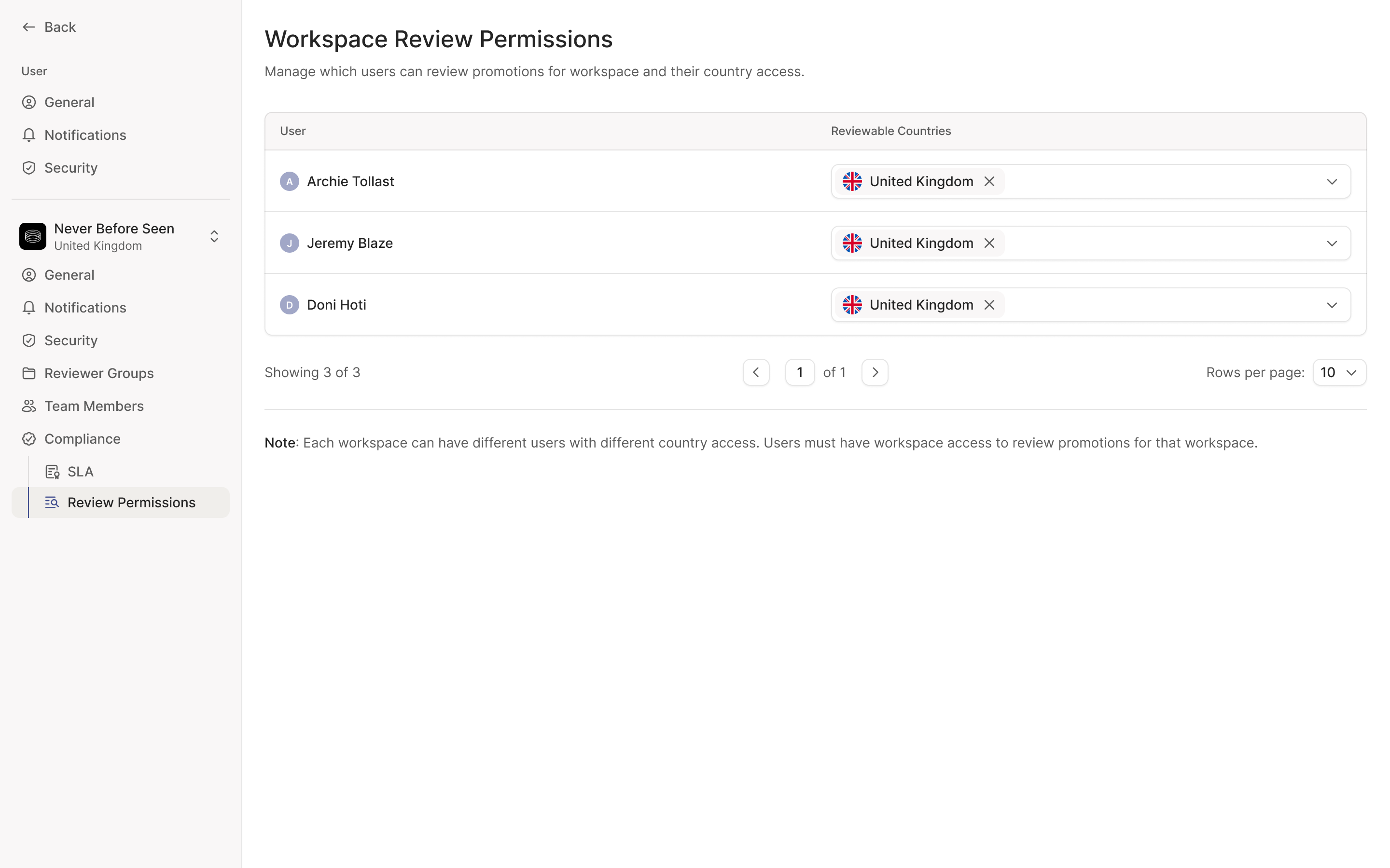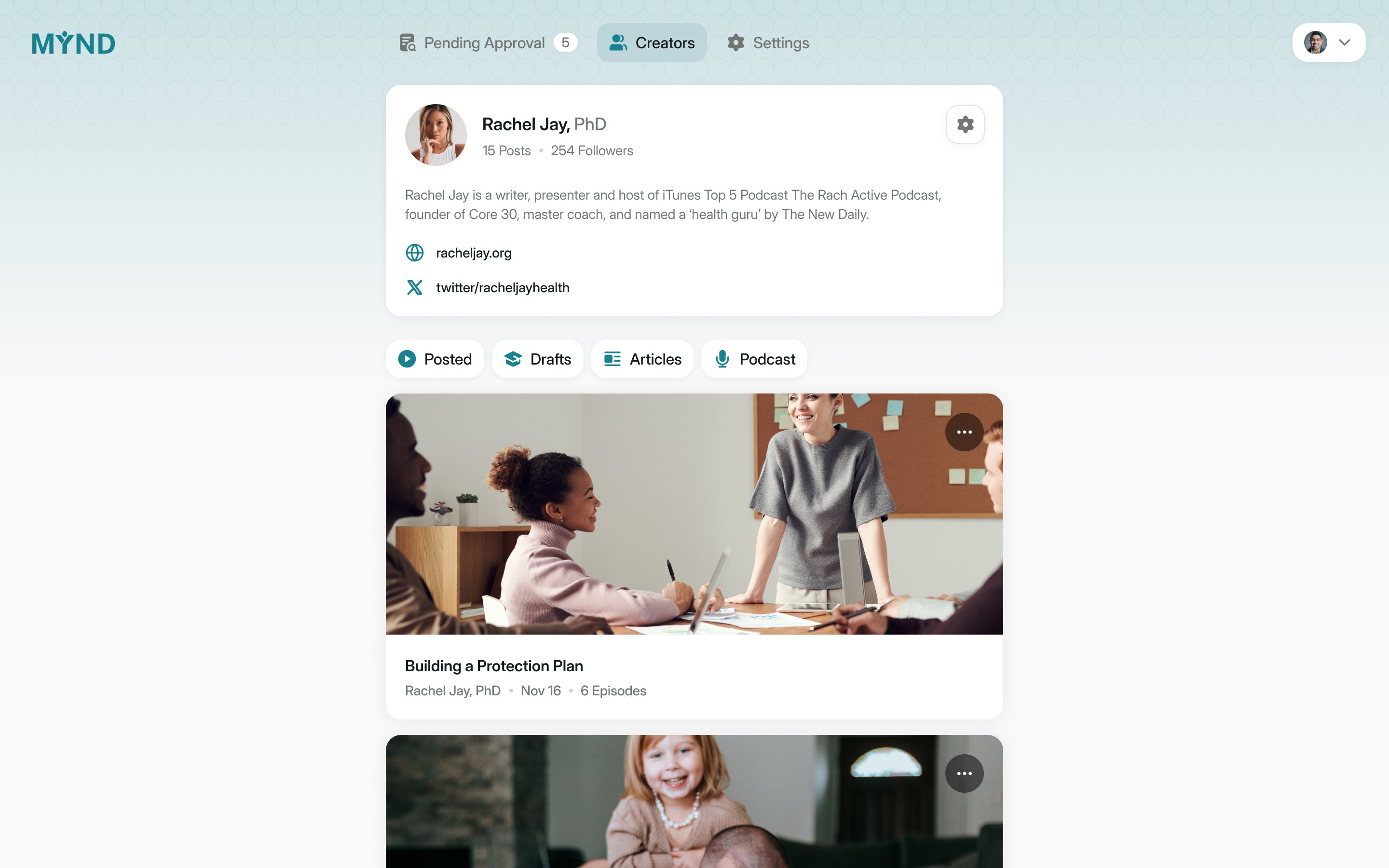
Adclear helps financial services companies review marketing before it goes live. A marketer uploads an ad, email, video or product screen. Adclear's AI flags potential problems, marketing responds, and compliance decides what needs to change. The difficult part of designing it was making that three-way conversation easy to follow without blurring who had the authority to approve the work.
We worked with founders Doni Hoti, Joe Jordan and Cameron Ward from September 2025 to January 2026, redesigning the product and building a design system around the shadcn components their engineers already used. They brought the product spec, the regulatory knowledge and direct experience of how their customers worked. We worked through the information model and interactions together.
The brief was closer to Linear, Figma and Notion than the usual compliance tool. That made sense for the people spending most time in it: marketers and designers submitting their work. Our first dashboards went too far, with colours and icons the team felt looked like a game. We pulled the visual treatment back, keeping the interface familiar to creative teams while giving a compliance decision the seriousness it needed.
Start with the work a marketer recognises
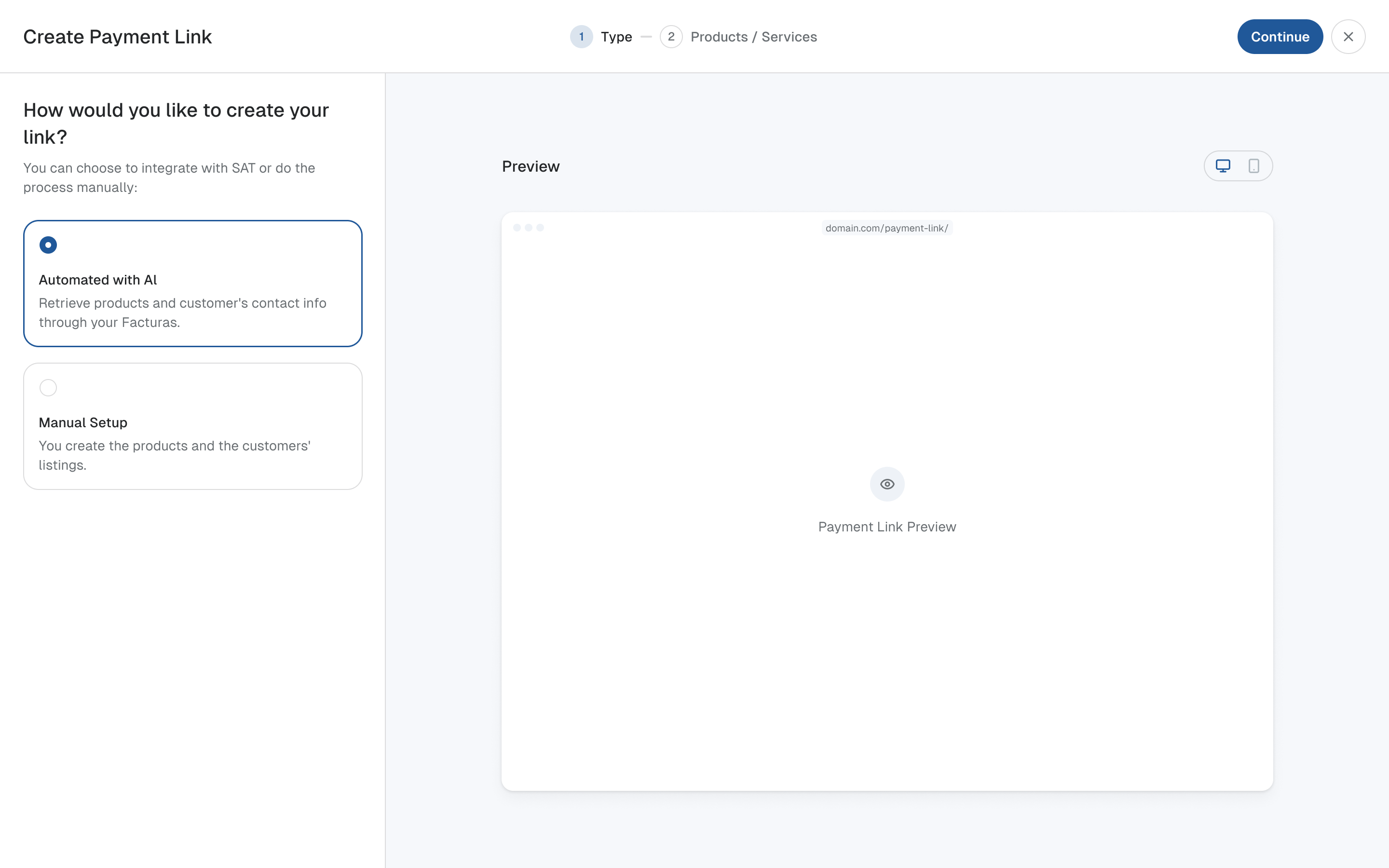
The upload flow was the team's biggest concern at kickoff. It began by asking people to choose single, batch, carousel or variations. Those distinctions mattered to Adclear, but a marketer arriving with an email or an Instagram ad had to learn the product's terminology before uploading anything.
Joe had mapped the kinds of marketing their customers made and how each was uploaded. We used that as the starting point: social posts, PPC, emails, blogs, product screens, web pages and audio. Choose a familiar format down the left, and the page presents the appropriate way to submit it. The technical options remain as tabs across the top for people who already know what they need.
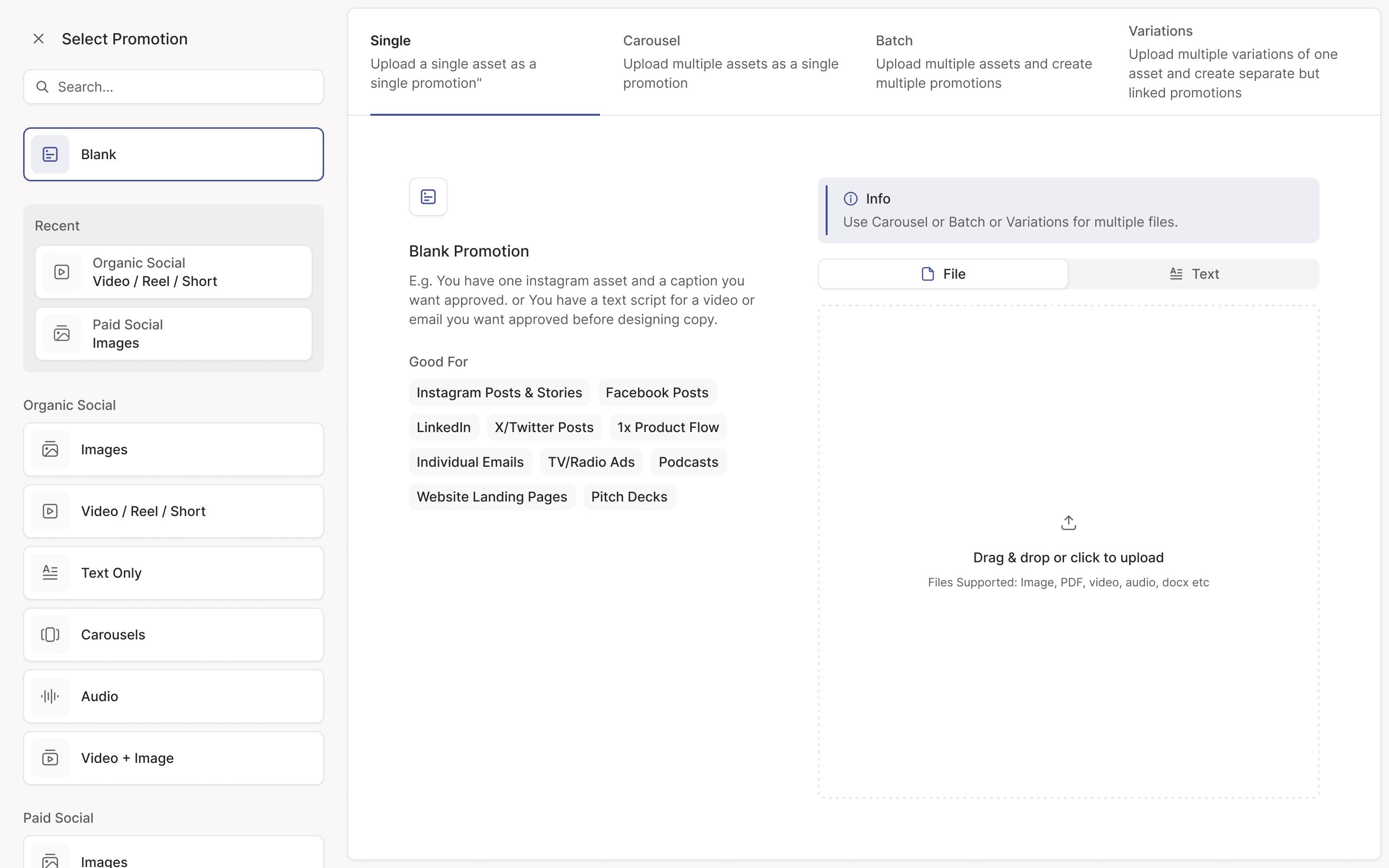
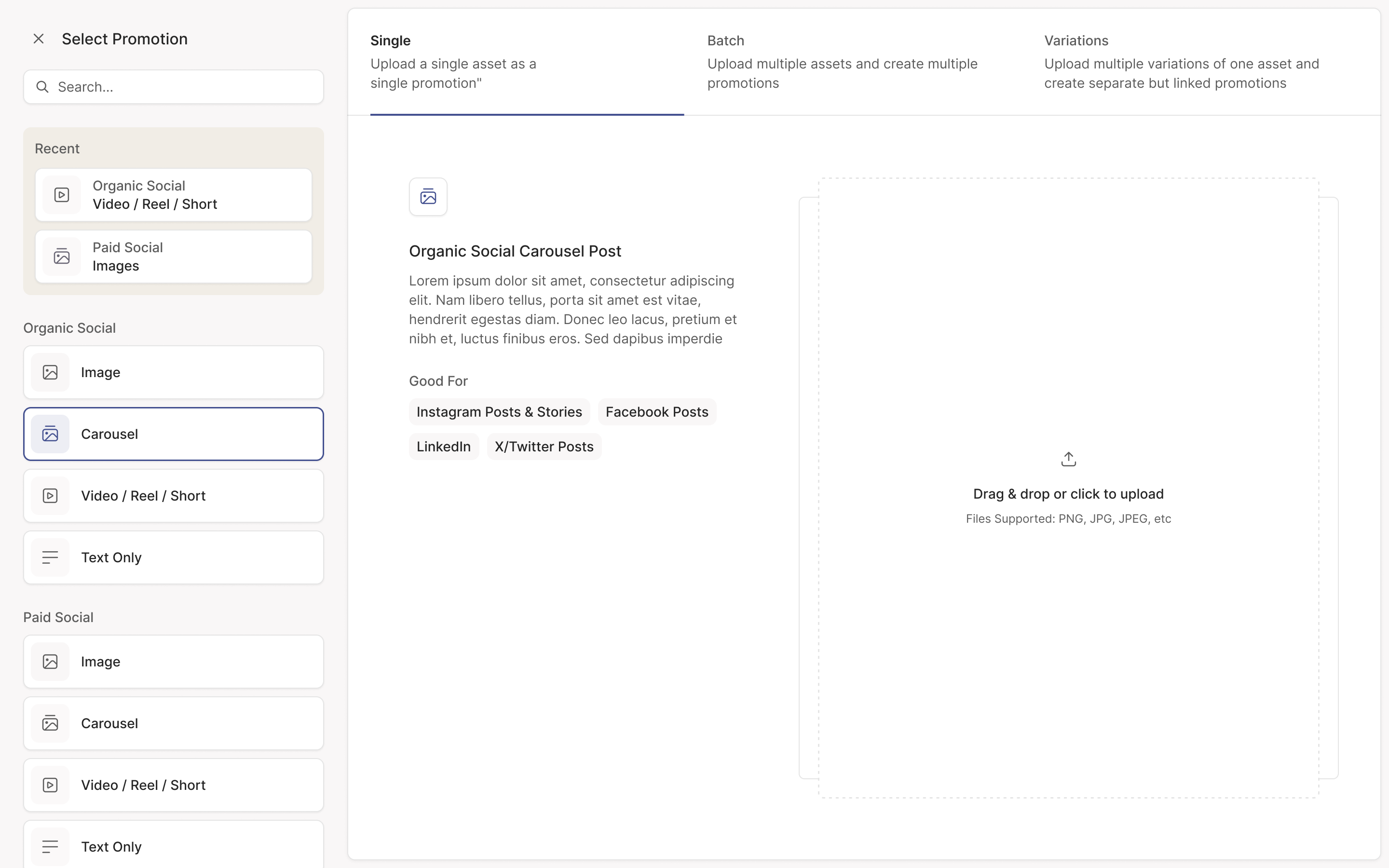
We didn't need a separate flow for every label. I wondered whether someone with an Instagram story ad would look under ads or social. Organic social and paid social could be separate entry points into the same upload experience. Dropping several PDFs into one field could create a batch automatically, without making the person choose that term first.
let people find their format before asking them to understand the upload model
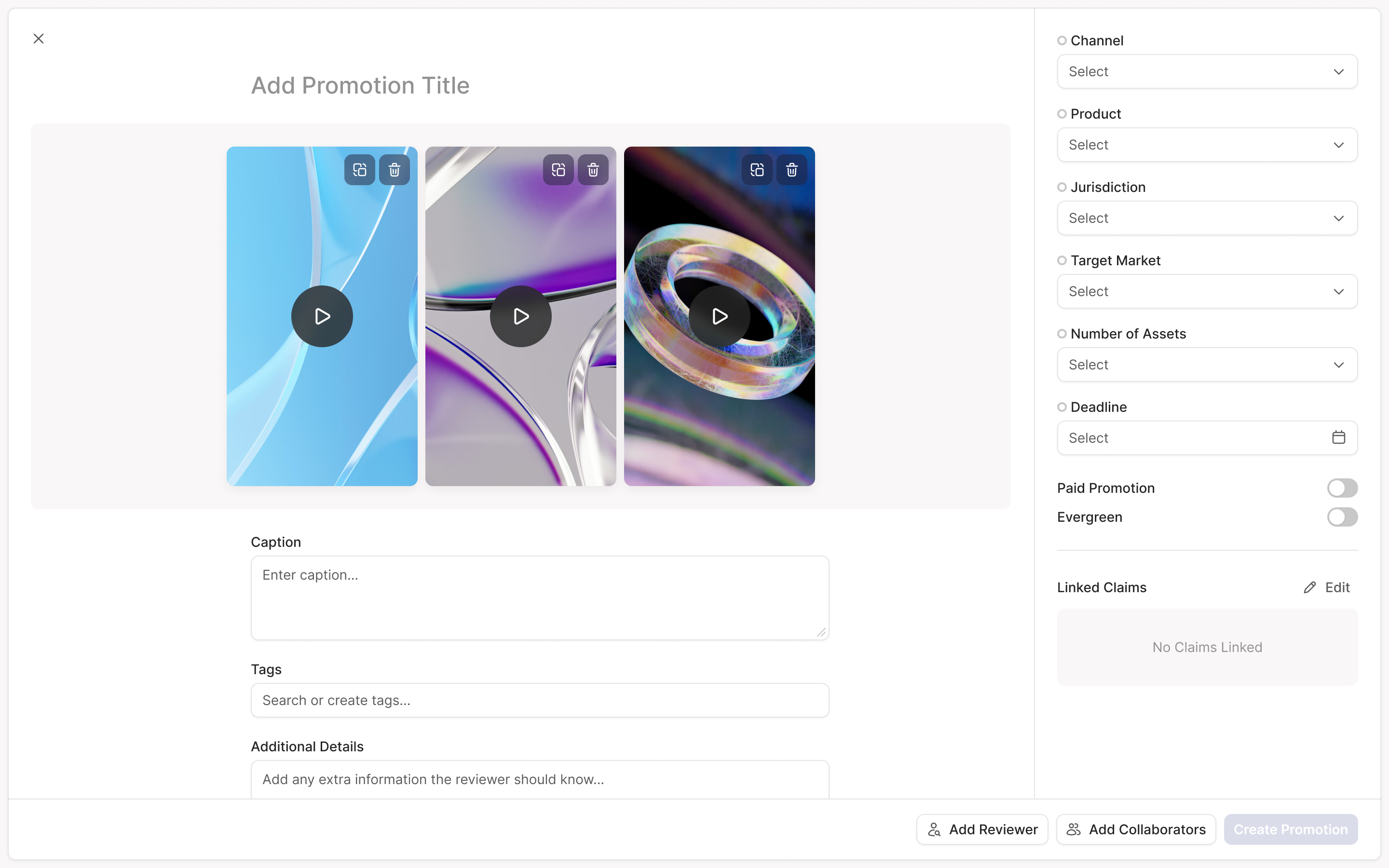
The form also changed as the person committed to the task. Initially, the important thing was getting the material in. Once it was uploaded, its preview stayed beside the fields that describe where and how it would run: product, channel, jurisdiction, target market and deadline. That kept the asset and its review context together.
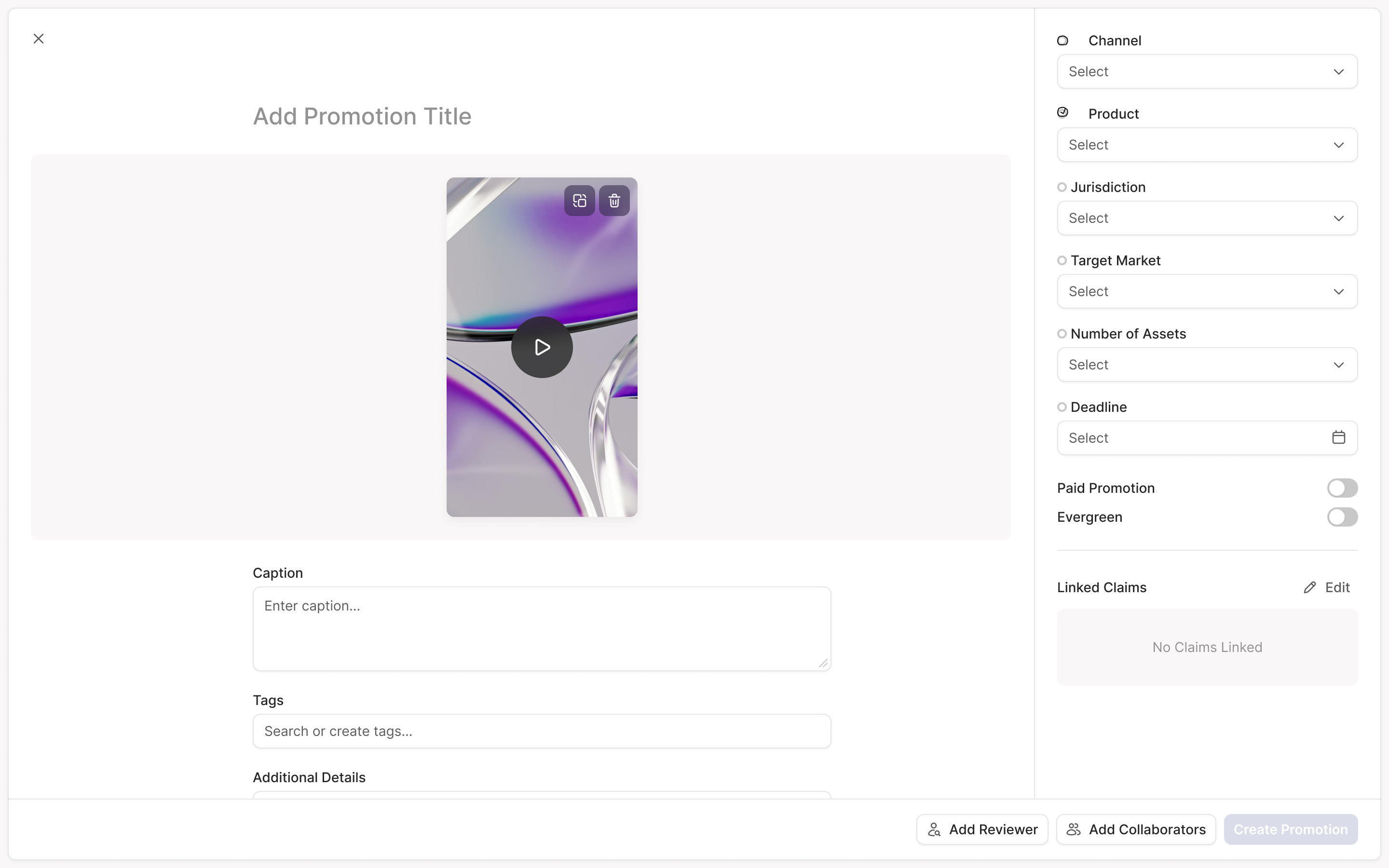
Separate what changes from what needs its own approval
Simplifying the entry point still left a complicated model underneath it. A promotion is a piece of marketing for a product. Editing it creates a new version. A carousel has several assets reviewed together. Variations are related pieces that need separate decisions, such as different wording for different audiences. A batch is several unrelated promotions submitted at once.
Those distinctions affect much more than upload. They determine what appears in a list, what a comment refers to and what an approval covers. Even the existing names had drifted: the product called a promotion a campaign and a version a promotion. We renamed both throughout the interface.
Jurisdictions exposed an important boundary. One promotion could run on TikTok and Instagram, but approval in one country couldn't stand for approval in another. The countries have different rules, and Adclear's exchange customers worked through markets separately. A country therefore needed its own variation, rather than another tag on a shared approval.
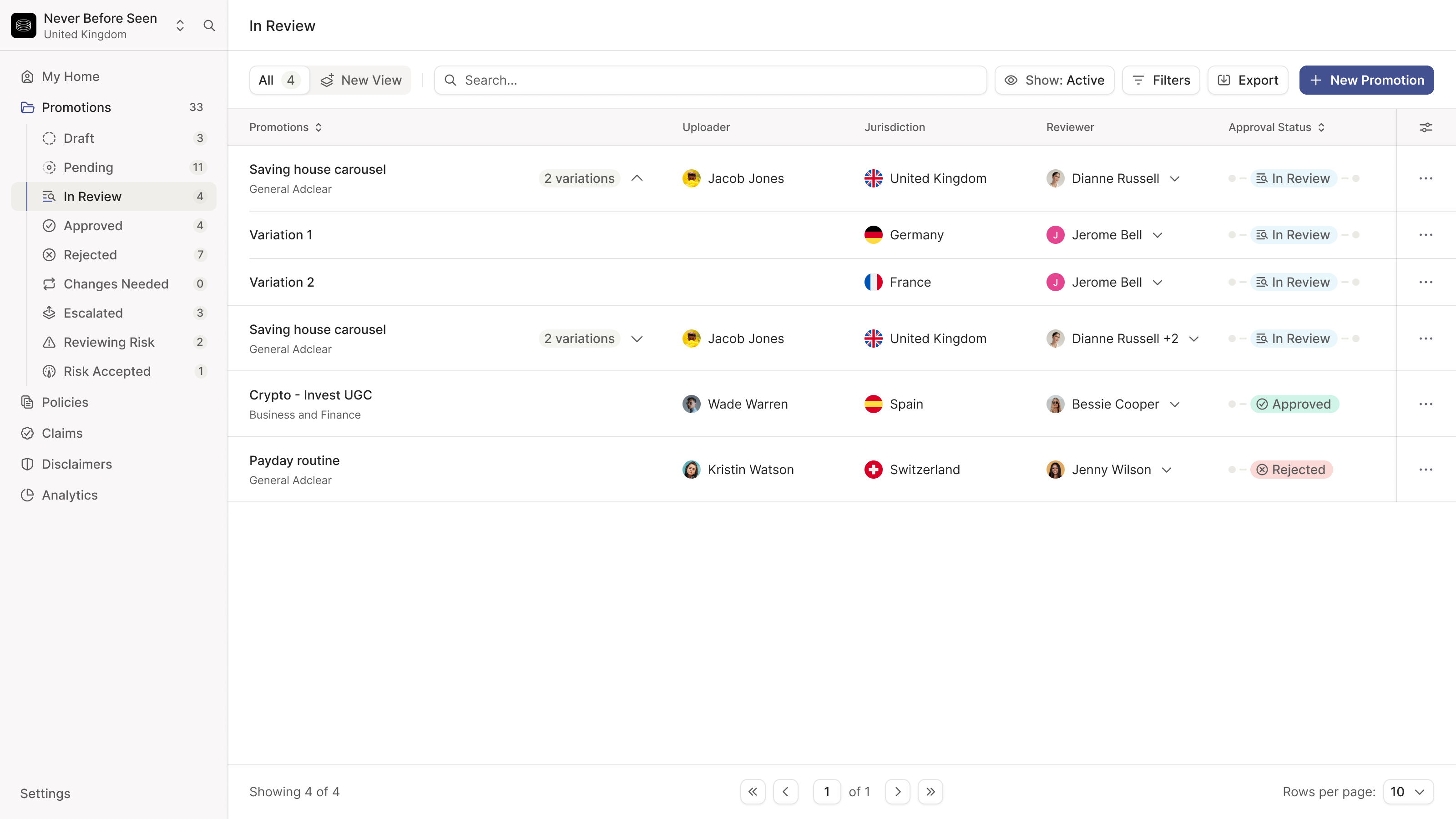
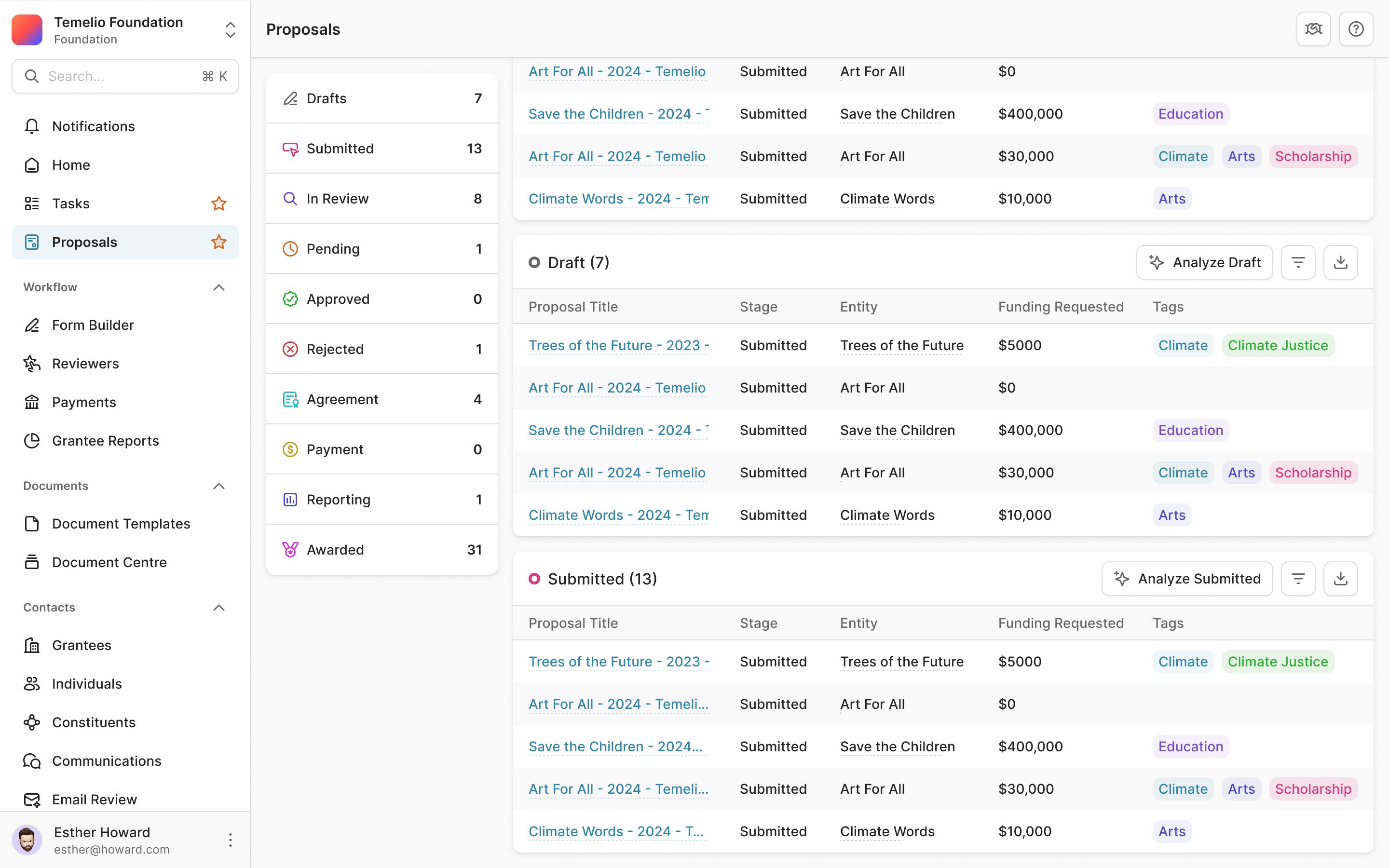
In the list, variations fold under their parent promotion. The parent shows the least advanced status among its children. A group shouldn't look approved while one of its variations is still waiting for a decision.
an approved variation cannot make the whole promotion look approved
We also had to preserve what made variations useful. I'd simplified a flow by removing the ability to upload new versions of all variations together, without raising that change with the team. Joe caught it. Updating related ads together was part of the job, and one-at-a-time replacement would have taken that away. We restored it and began walking every flow through with the founders before calling it complete.
Make an AI comment specific enough to act on
Adclear's AI has three kinds of review to perform. Its rules agent checks the company's requirements. Its disclaimer agent checks for wording that needs to appear. Its claims agent checks statements of fact that the company needs to substantiate. Putting all three into an anonymous stream of warnings would make the reviewer work out what each objection meant.
We put the promotion on the left and comments on the right. Each AI comment names the agent behind it. Priority has a coloured indicator, while the comment describes the actual issue and suggested change. A reviewer can tell what kind of problem they're assessing before reading the discussion underneath.
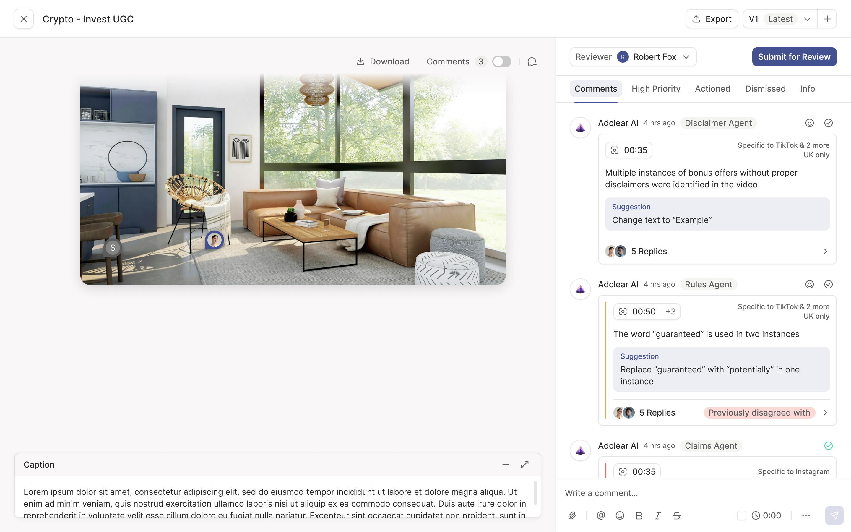
A comment also needs an address. It may apply at a timestamp in a video, to a passage of text, or only to one of the channels and countries on the promotion. We show narrower scope on the comment itself, such as TikTok and two more channels, UK only. A reviewer shouldn't have to infer that a warning covers only part of the work.
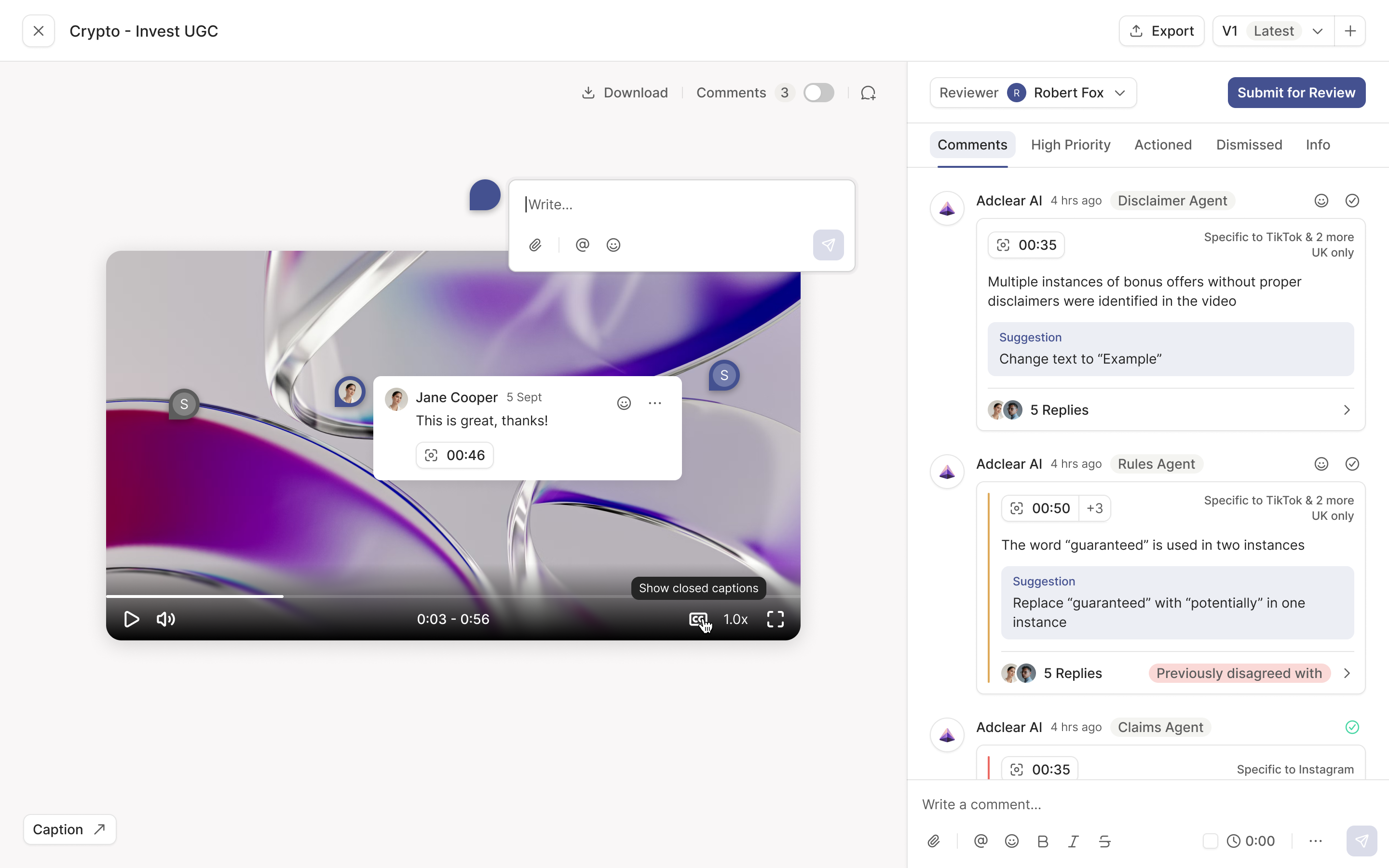
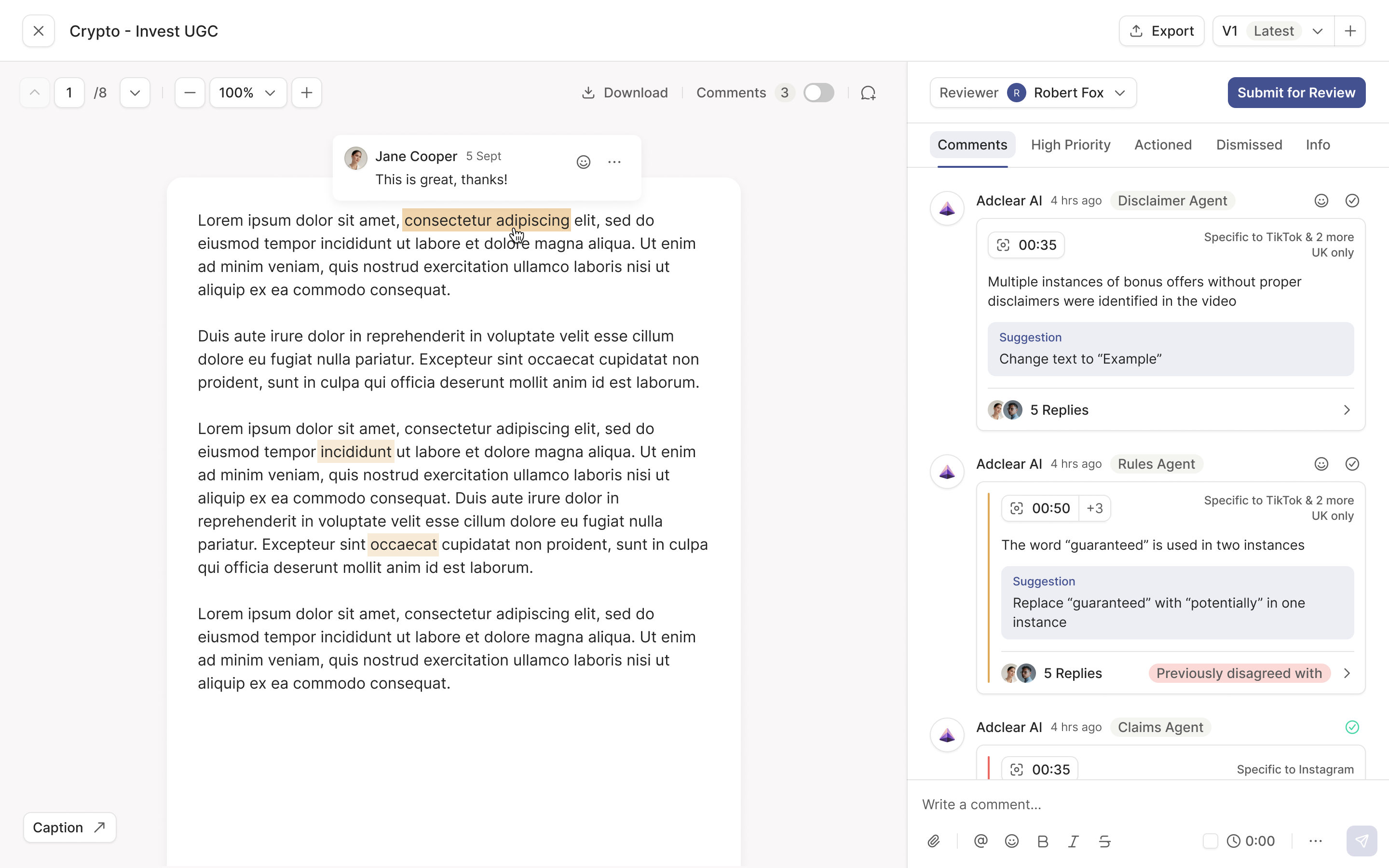
Version history matters here too. If marketing disputed a comment on version one and the AI raises it again on version two, the earlier disagreement comes with it. The new review can pick up the argument rather than making people reconstruct it.
Keep marketing's response in the reviewer's view
Our first comment design opened replies in a separate side thread. It kept the main view tidy. But after further review with clients, Doni explained why it would slow the real workflow: compliance was reviewing marketing's response to the AI, not just the AI's original comment. Five issues could mean opening five threads to understand the work.
I asked for examples of actual conversations and suggested summarising resolved threads, as Linear does. Cameron pointed out that these discussions were usually one back and forth. More than four replies was unusual. A summary would add another layer to a conversation that was already short.
We brought the discussion inline, with expansion in place when someone needed more detail. Then we worked through the decisions inside it. Marketing can agree with an AI comment or dispute it. Dismissing the issue is compliance's call.
marketing can dispute an issue; compliance decides whether to dismiss it
Agreeing sends the response immediately. Disputing opens a reply box and requires a reason, so the reviewer has something to judge. Joe brought the distinction between those behaviours; I worked through how the buttons could reveal the right interaction without opening a text field for every response.
The statuses describe what happens next: to action, disputed, dismissed. They are recorded selections, alongside the person and time of the change. Free text holds the explanation; the status gives Adclear something consistent to display and count. The design had to support both without asking a reviewer to interpret a paragraph just to know where an issue stood.
Reading a notification doesn't finish a review
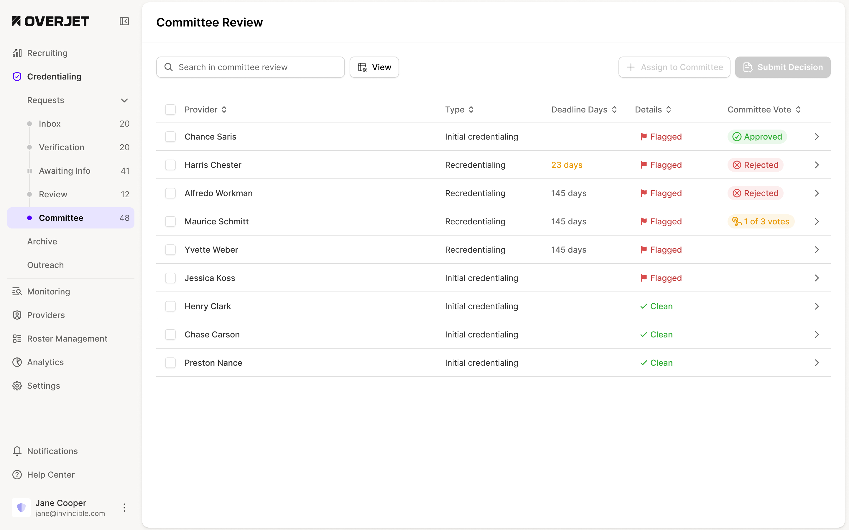
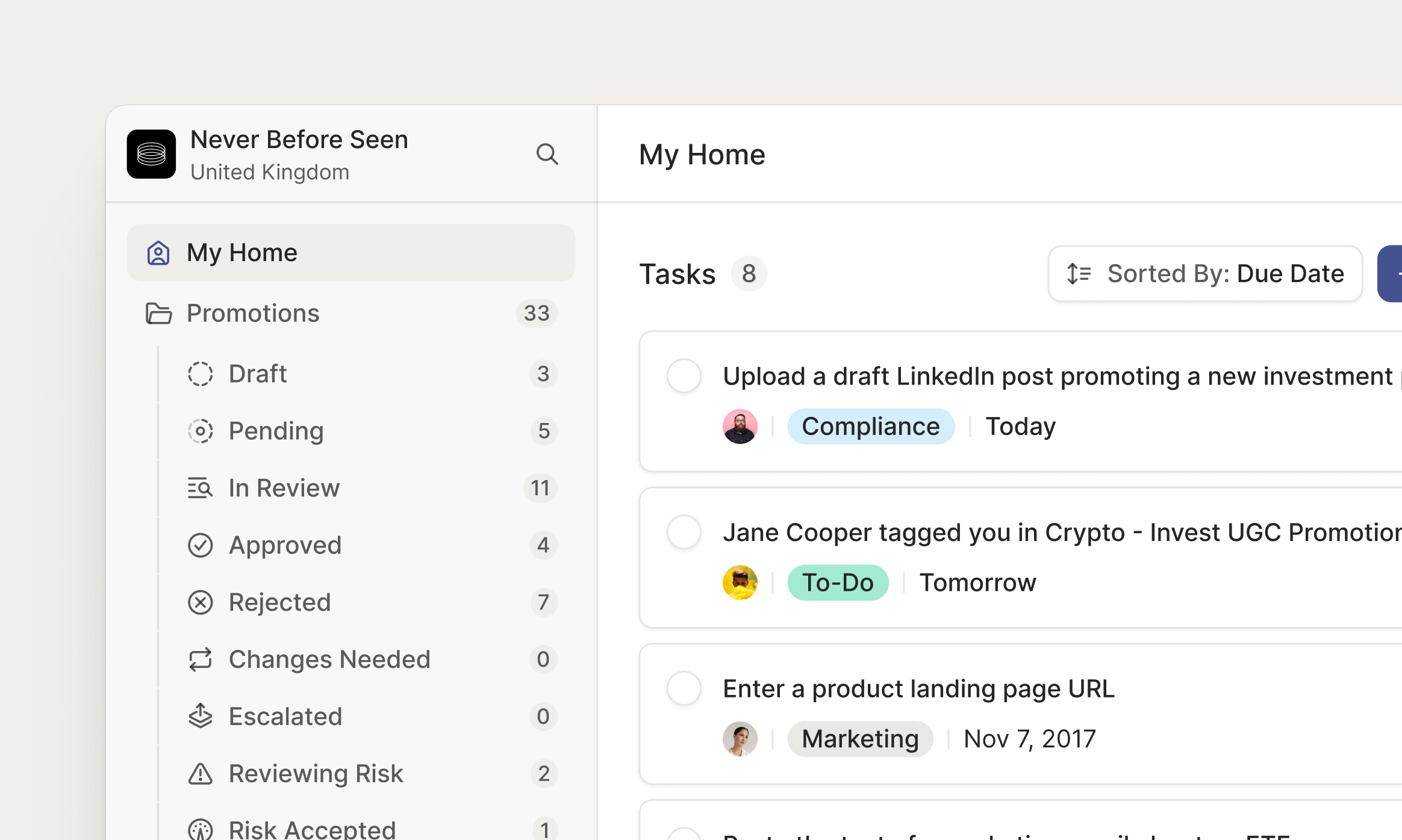
The home screen had a related ambiguity. We first designed it as a feed of events around a person's promotions: assignments, approvals, rejections and mentions. The team couldn't tell whether it was a notification inbox or a to-do list.
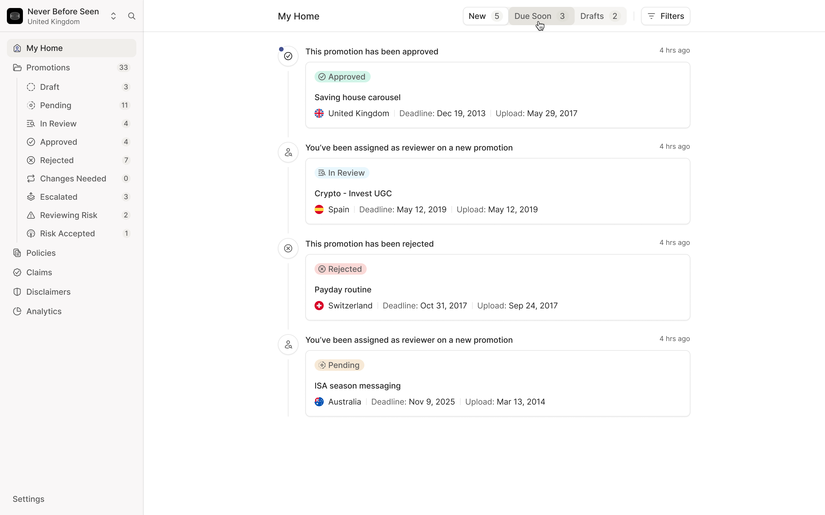
A reviewer might read an assignment notification, open the ad and leave some comments, yet still owe it a final decision. Clearing the notification couldn't mean the work had gone away. Doni wanted a place where compliance could work through its pending pile without continually rebuilding filters in the promotions table.
Doni proposed splitting Home into Inbox, Reviews and My Submissions, and we worked through the permissions and empty states together. Inbox carries events. Reviews contains work waiting on you or not yet assigned. My Submissions holds your own promotions and claims. Tabs depend on permissions, since a marketer might also review other people's work. I initially suggested hiding Reviews at zero. Doni argued for keeping it visible: clearing the queue should be something people can see. We kept it for everyone with review permissions.
the notification can be read while the review is still unfinished
Keep the proof with the claim
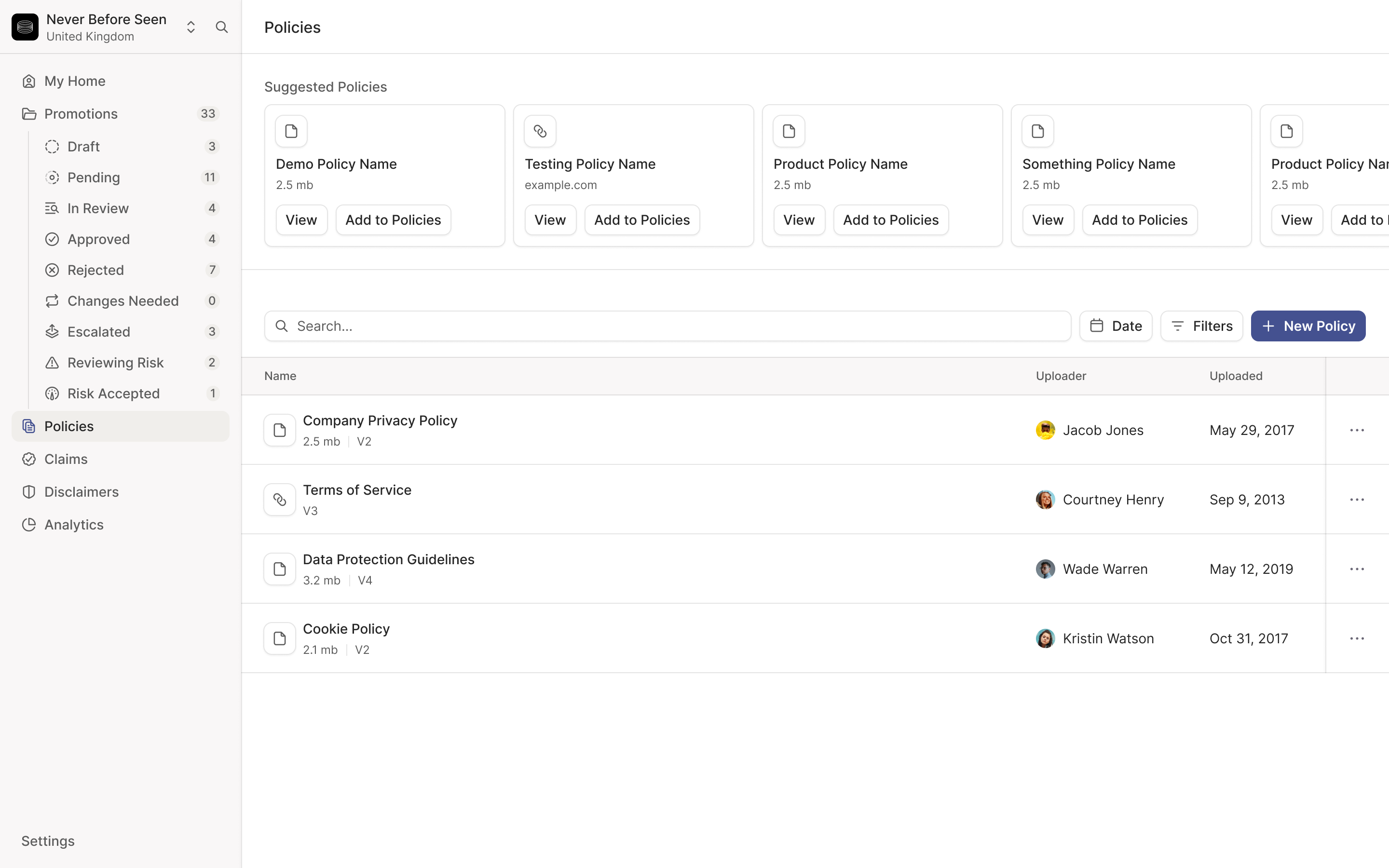
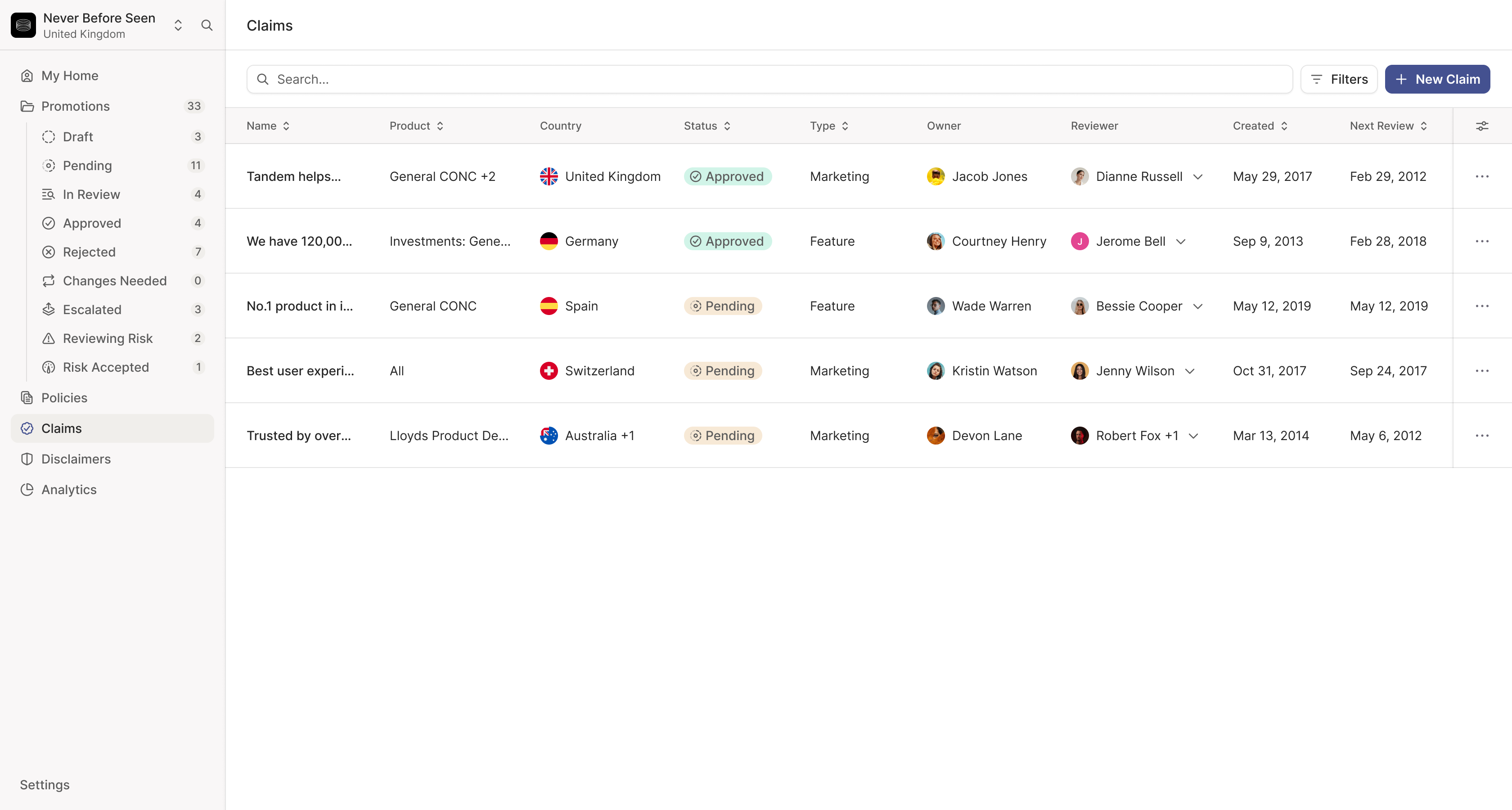
The same claim can appear across many ads. Approving the sentence in isolation isn't enough: the company needs the material that supports it, any disclaimers that qualify it, and a date to review it again.
We brought those relationships into the claim itself. Substantiation can be a file or a link. Linked disclaimers sit below it, followed by the promotions using the claim. The reviewer can inspect the statement and its supporting material in one place, with the next review date in the details panel.
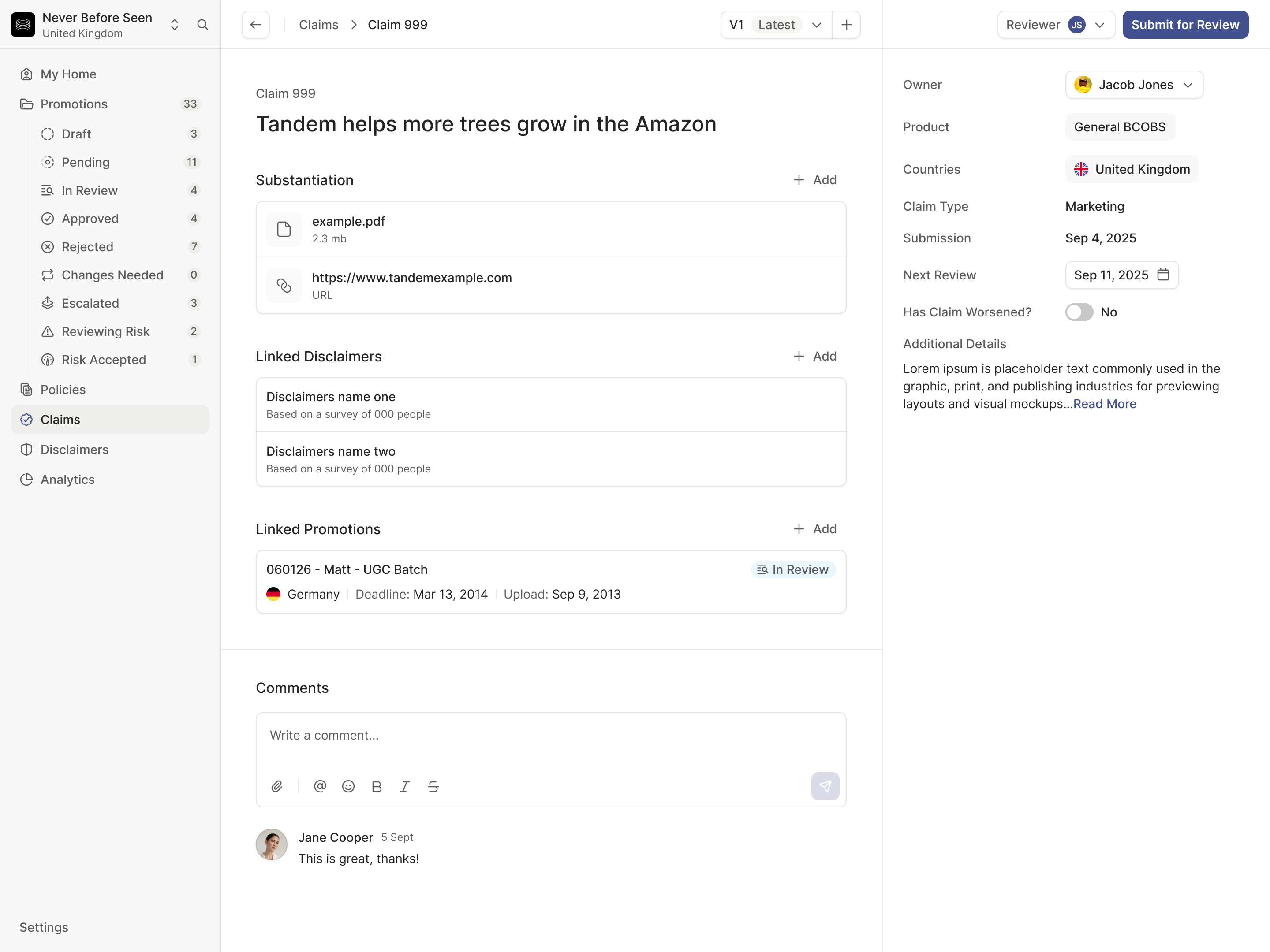
This needed a different layout from a promotion. The claim's text and proof were the material under review. Its details took the right-hand panel and comments moved below the content. Keeping every module visually identical would have squeezed the information this review depended on.
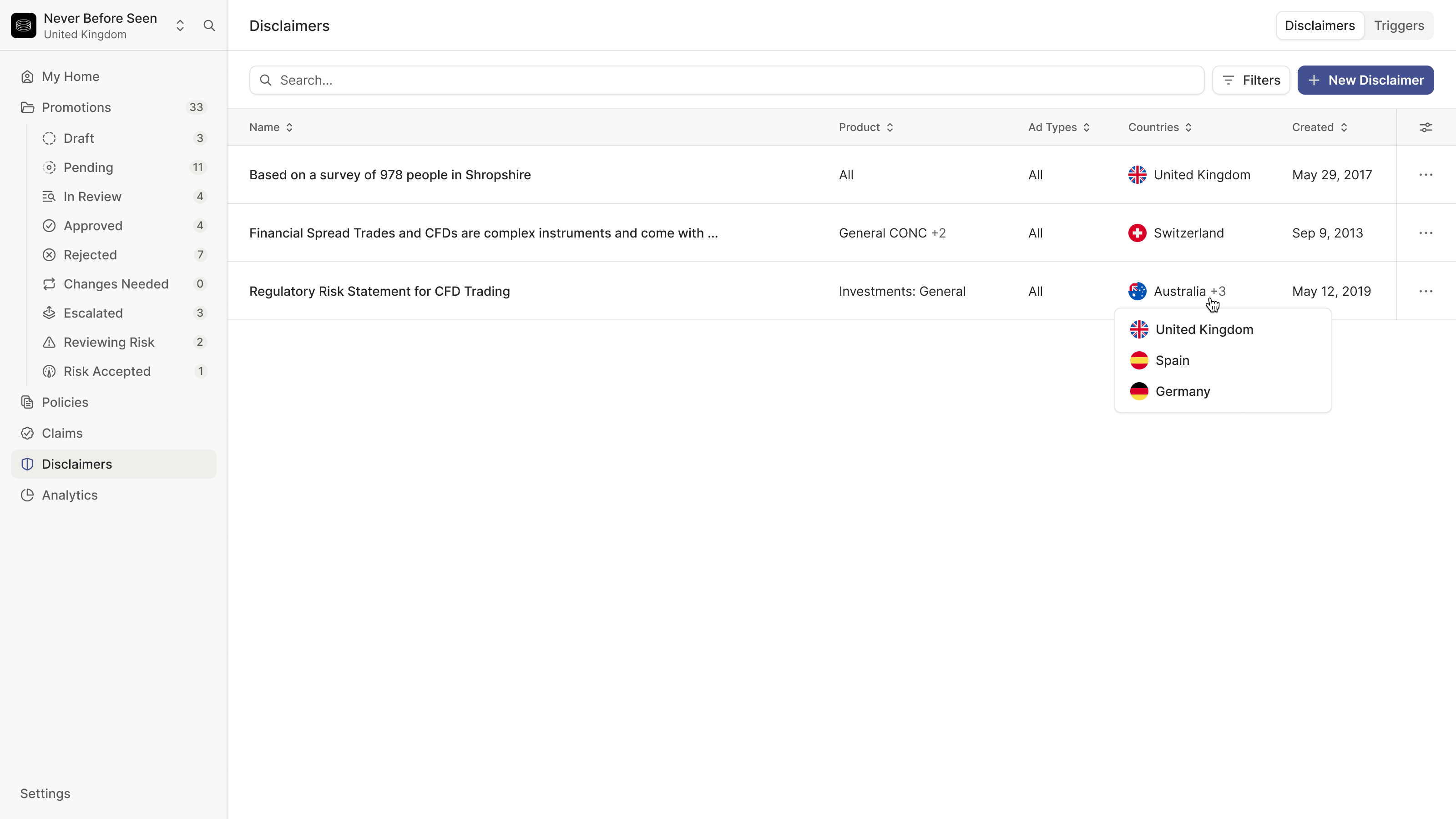
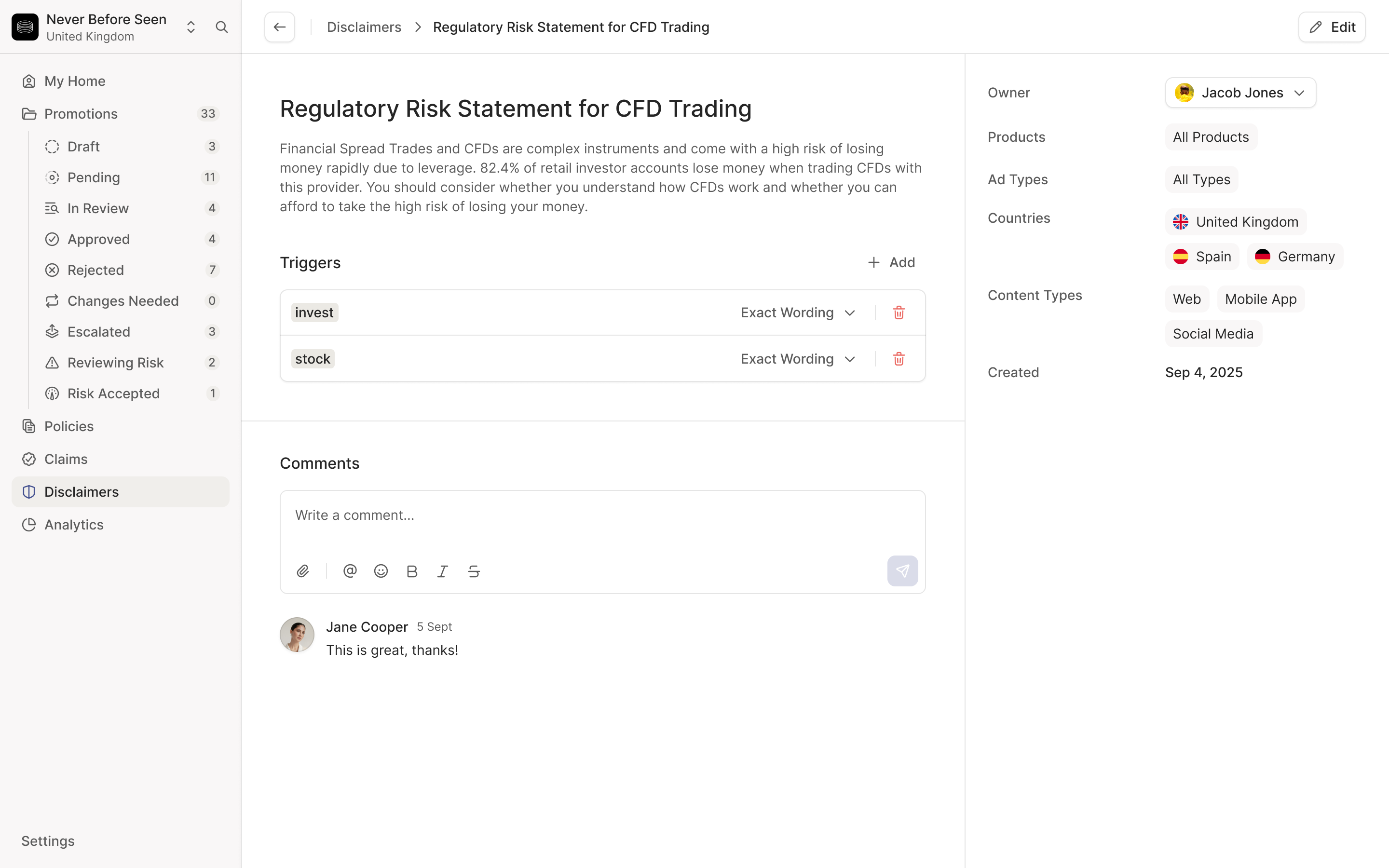
Disclaimers have their own conditions. A risk warning can be triggered by particular words and limited to certain countries or content types. We kept those conditions visible beside the warning, so somebody maintaining it could see both the wording and where it would apply. AI suggestions still need a person to confirm them.
Adclear raised a £2.1M seed round in November 2025 while the redesign was underway. Read the funding announcement. Our final call in January was Joe and me working through the comment interactions before the engineering team built them.
More from Adclear