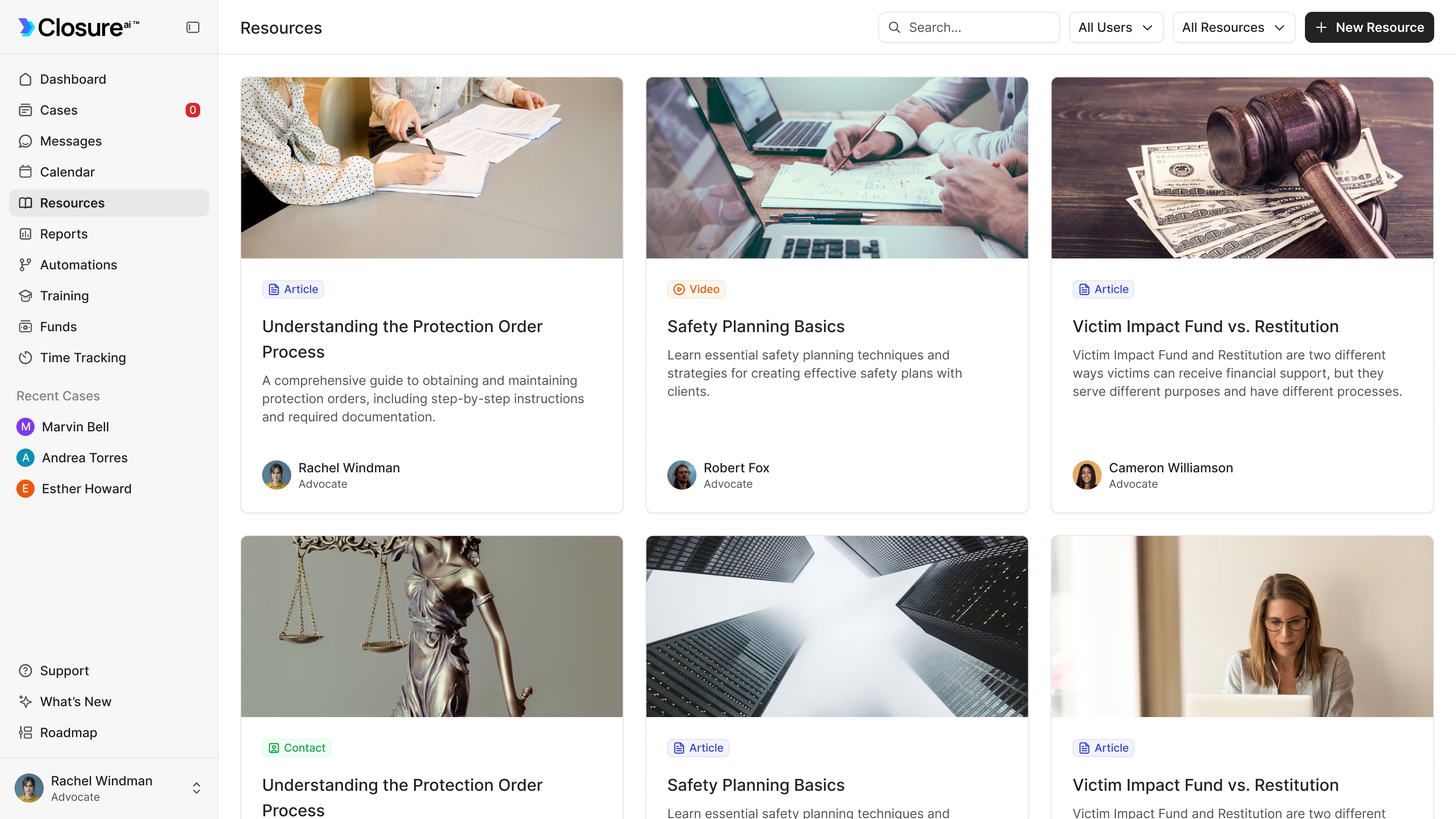
Closure is case management software for victim advocates, the people in nonprofits, district attorneys' offices and police departments who help someone recover after a crime and navigate the court process. It connects the advocate's working record to a mobile app for the survivor. We designed both sides of that connection: the casework, the reporting it feeds, and an app whose presence on a phone may need to be discreet.
Founder Jack DeWolf came to us with a clickable prototype, wireframes and a detailed specification of the fields the product needed to hold. He'd already worked through the domain with advocates. Our job was to turn that structure into interfaces their teams could work from, and design files his developers could build.
The core product design ran through June 2025, followed by the marketing website in July. The case record came first. Jack described it as the nucleus of the product: get that right and it would guide almost everything else.
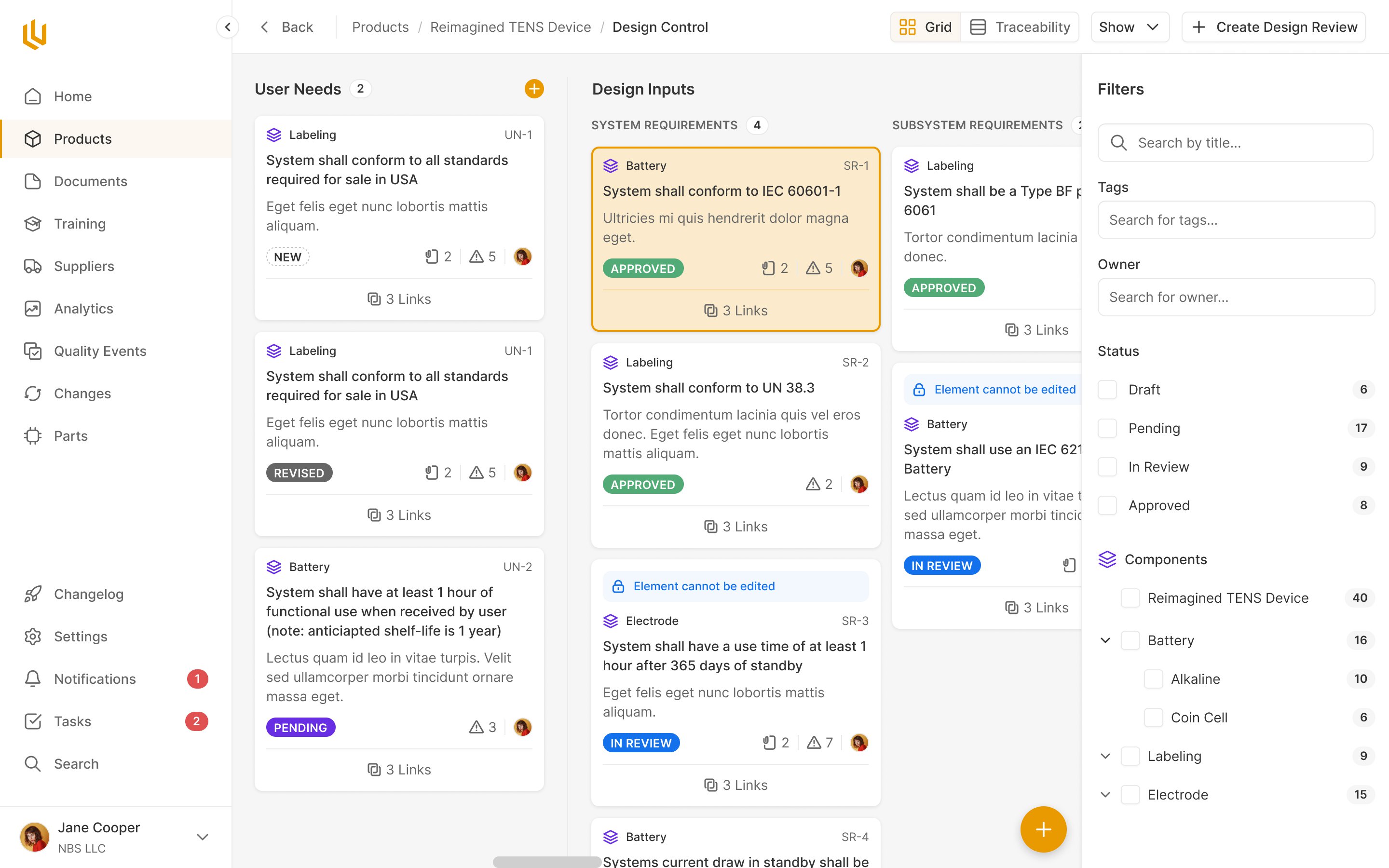
A case has to support the work and the report
An advocate needs to know what happened, what help a person needs and what comes next. Their organisation also needs to report on the services it provides. Jack explained that grant funding brought its own reporting obligations, including the people served, the types of crime and the initial response time.
That shaped the case creation flow. We split it into configuring the case, collecting the person's information and setting up the legal details. The grant and response-time fields sit in the first step, alongside assignment and case source. Information needed later for reporting enters through the same record the advocate uses for their work.
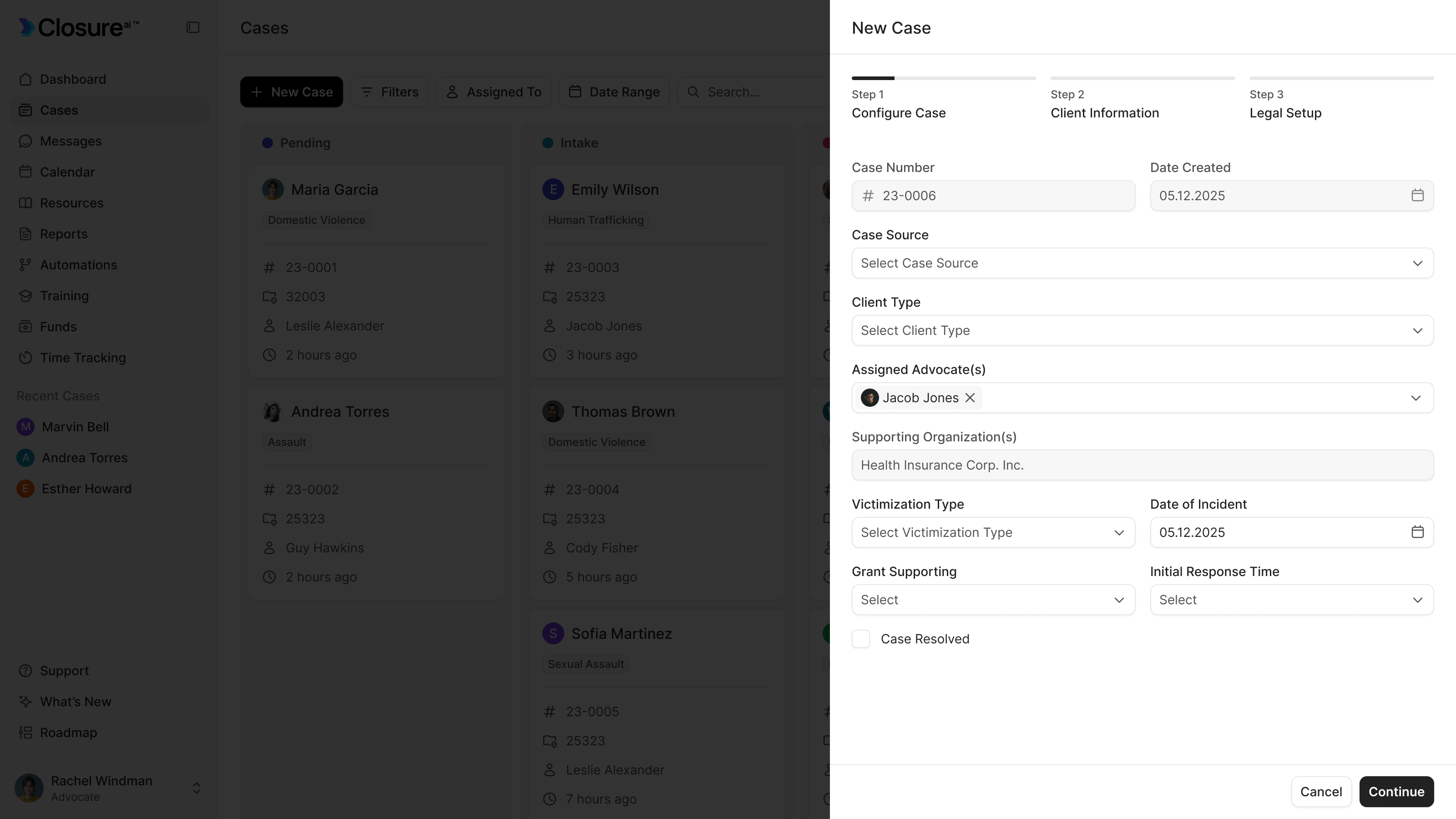
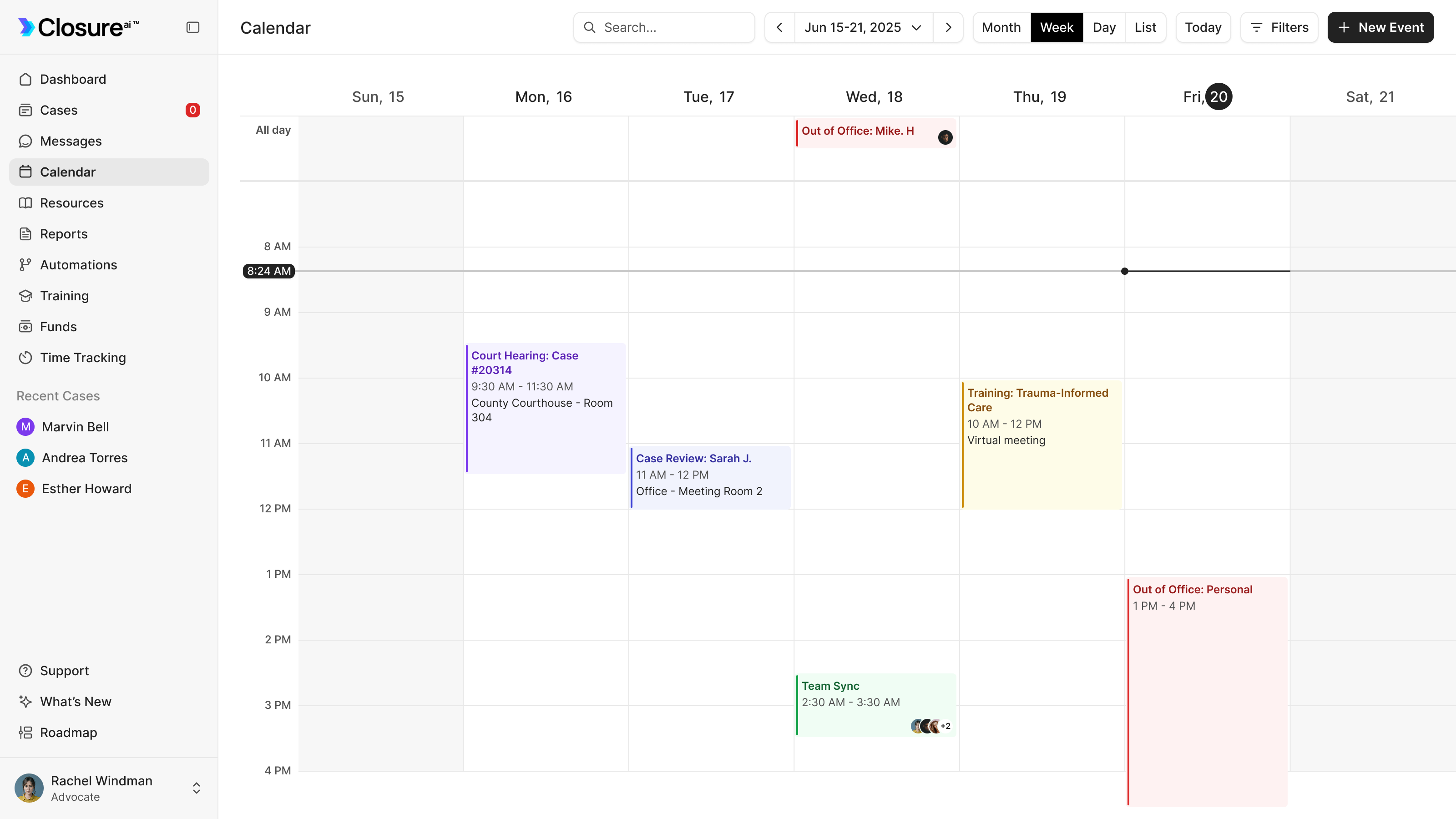
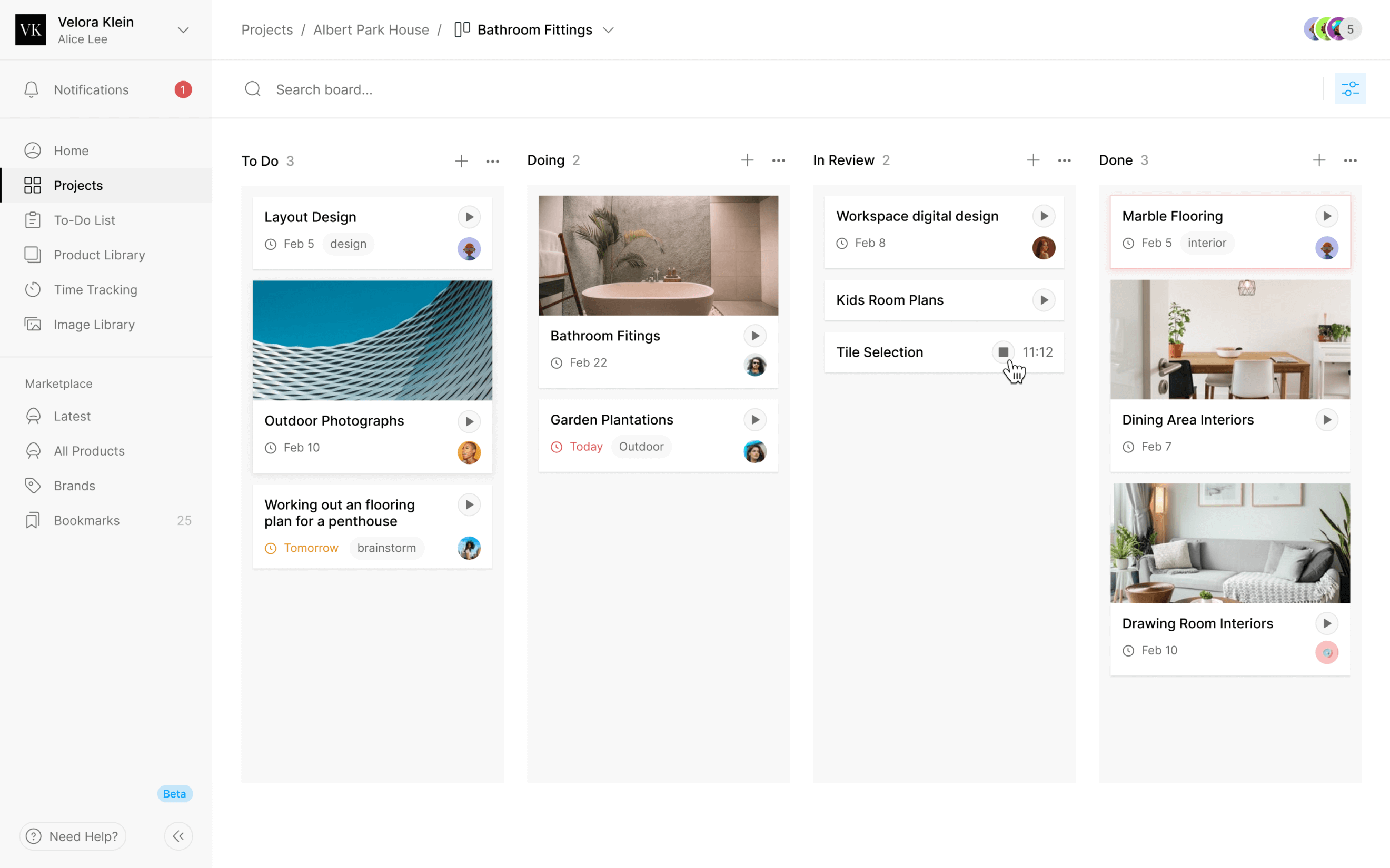
The index gives advocates a board organised by stage and a list for scanning cases in volume. Those are different ways into the same work. Jack later asked for stage changes to be possible through a button in the list, because dragging a card wasn't a useful answer when there were many cases.
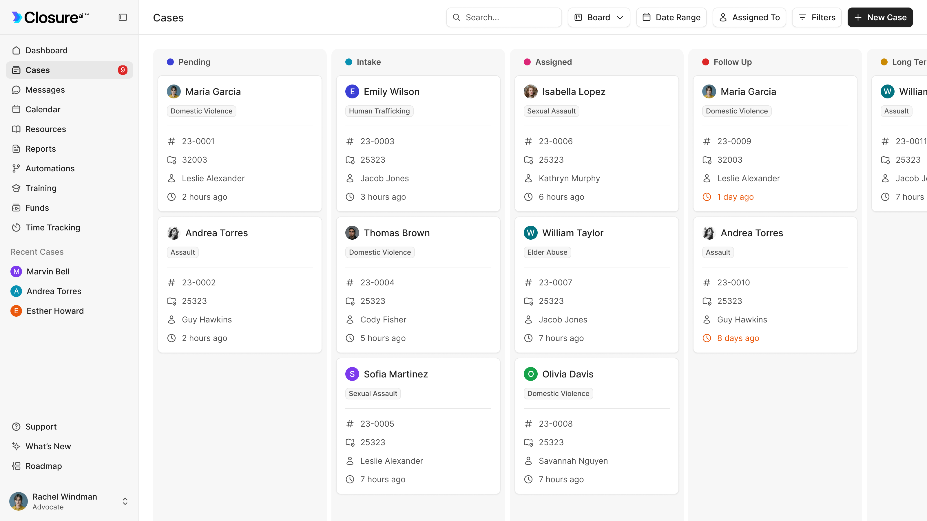
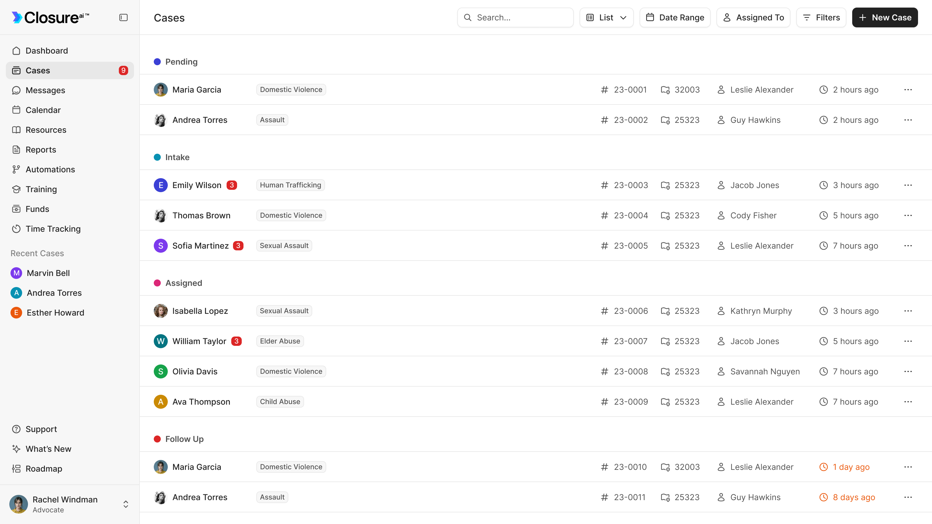
a board for the stages, a list for working through volume
Keep the person in view while the work changes
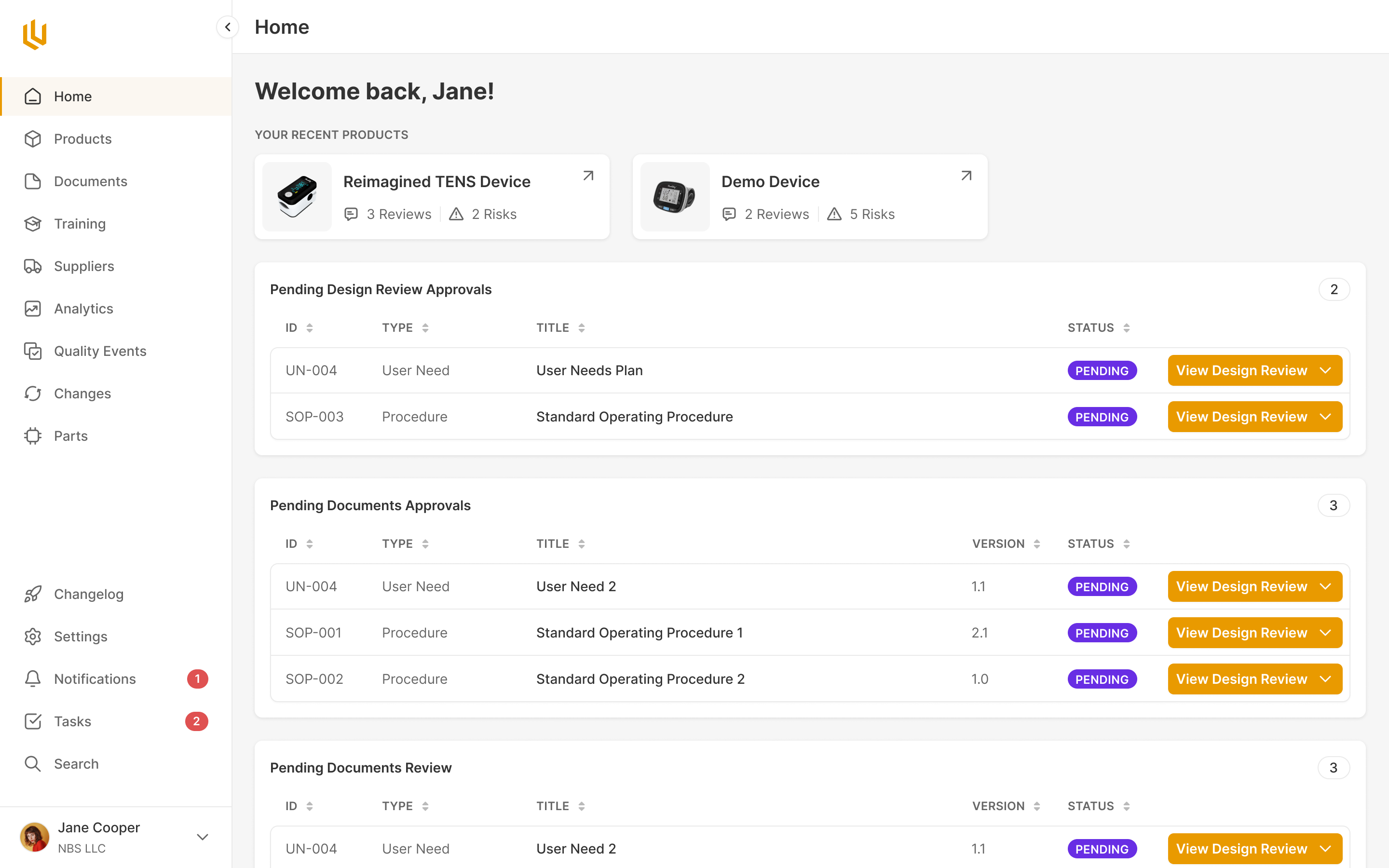
Within a case, the person stays in a left-hand column while the right-hand side changes between Activity, Details, Legal, Documents and Assessments. Language, app use, emergency contacts and related people remain available as the advocate moves between jobs.
The same record has to support returning to a case quickly and investigating it in detail. Activity brings recent messages and upcoming events above the longer timeline. AI-generated summaries sit in the persistent case column and at the top of Activity, with the underlying work still available below.
We refined that hierarchy over several passes. Vitalii moved the summary above the missing-information section and worked on its visual prominence. The advocate could get an overview before being asked to fill gaps in the record. The summaries were part of the information layout, rather than a separate place advocates had to visit.
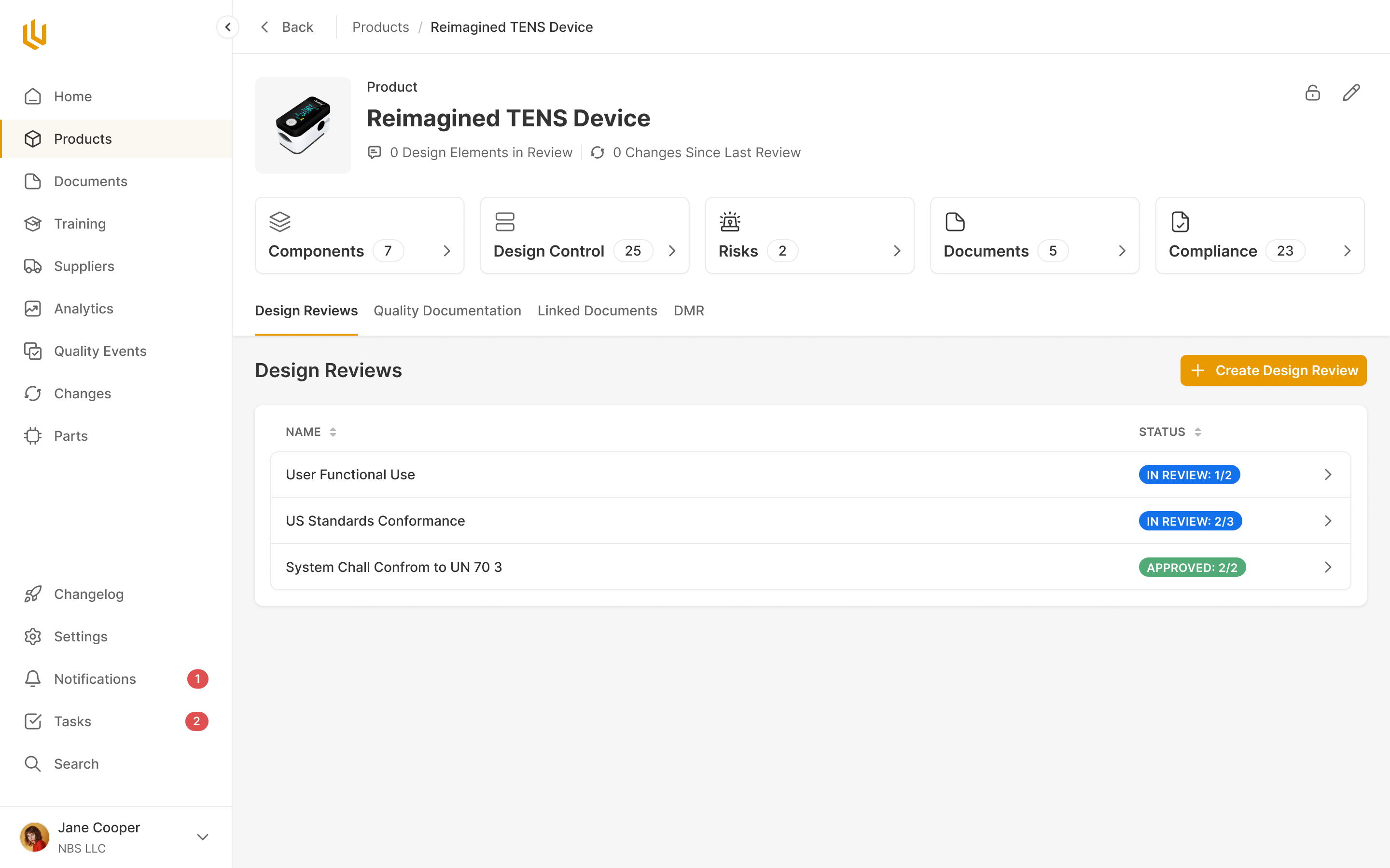
The Legal tab posed a smaller naming problem with consequences across the product. An advocate's case can contain a protection order and a criminal proceeding. Calling each of those another case would make the relationship harder to explain. We explored several names and used matters for the legal records inside the broader case.
one advocacy case can contain several legal matters
Give missing information a route back to the survivor
An incomplete field needs a next action. In Details, the case counts missing information in a banner and flags the individual gaps. Request Info lets the advocate select what they need and send that request to the survivor's app.
That makes the connection between the two products useful in ordinary casework. The advocate can identify the missing information in the record they're already using. The survivor receives a specific request on their phone, rather than having to find the right section of a large profile form.
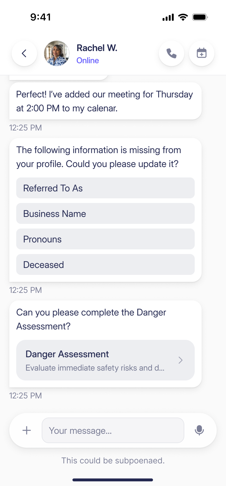
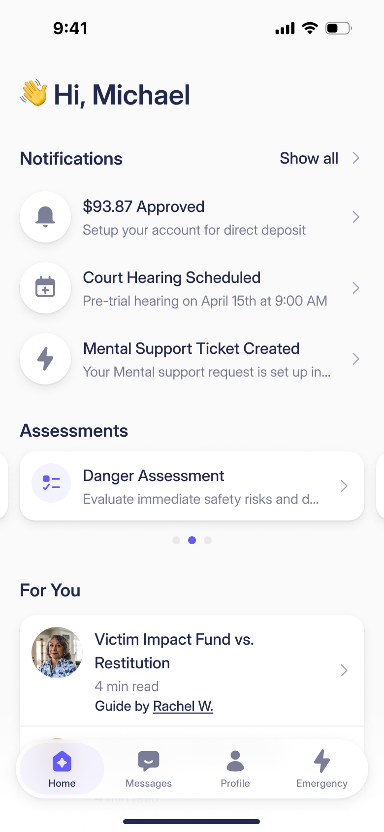
Assessments use the same connection. An advocate can complete one with the survivor or send it to the app, then request a follow-up later. Jack brought that requirement in his prototype. We designed the two routes into the workflow so the person collecting the information could choose how to do it.
Reporting needed a table builder
Our first reporting direction focused too heavily on charts. I'd suggested a separate reporting tool connected to the database, and we'd designed around that. Jack corrected us: his customers needed to extract bulk case data for several agencies. The report itself was a table they could shape and export.
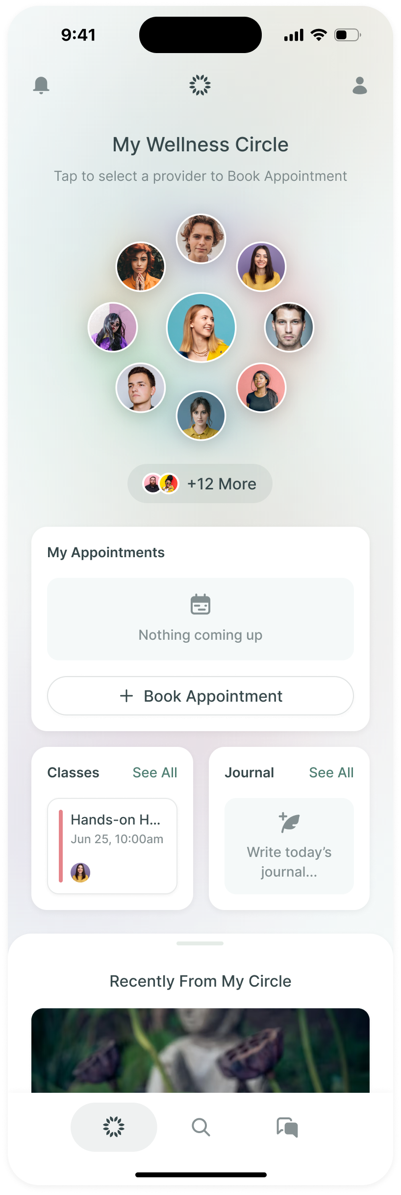
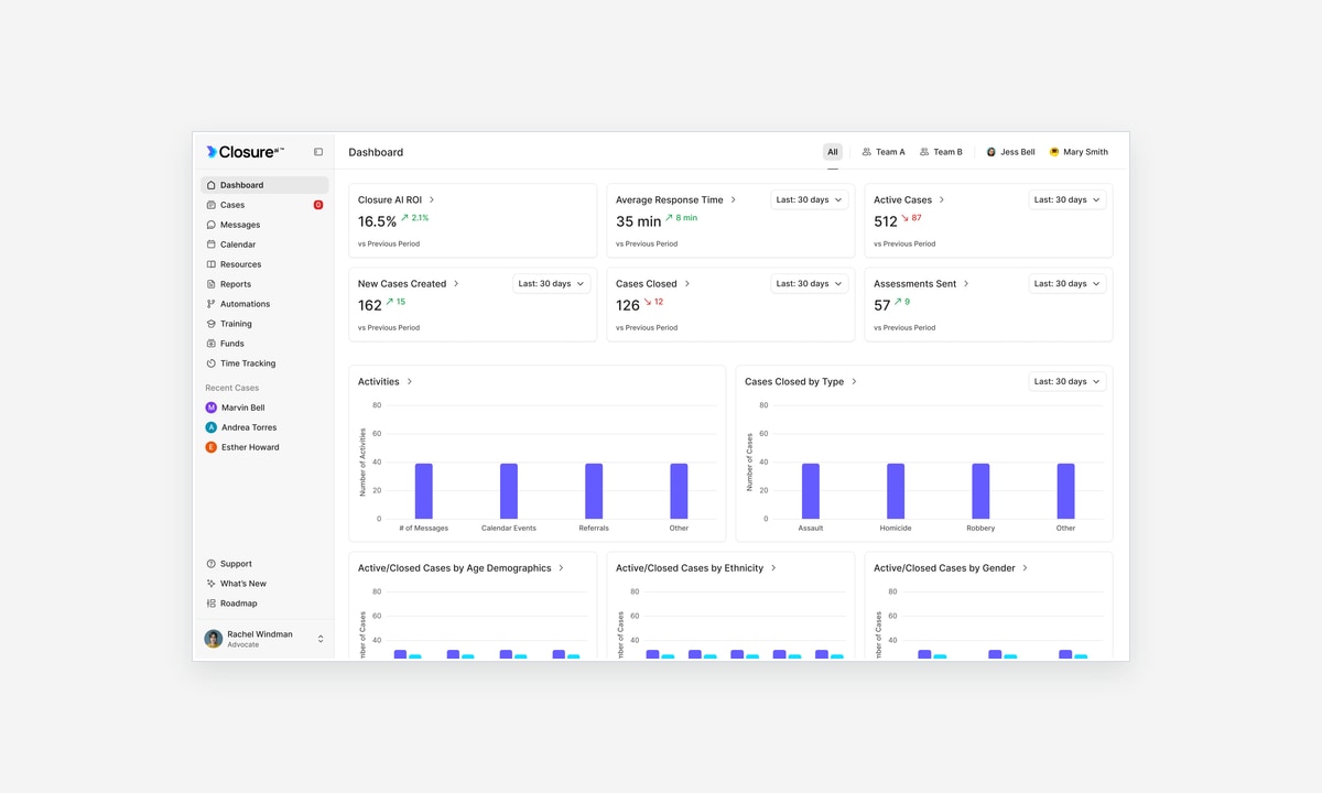
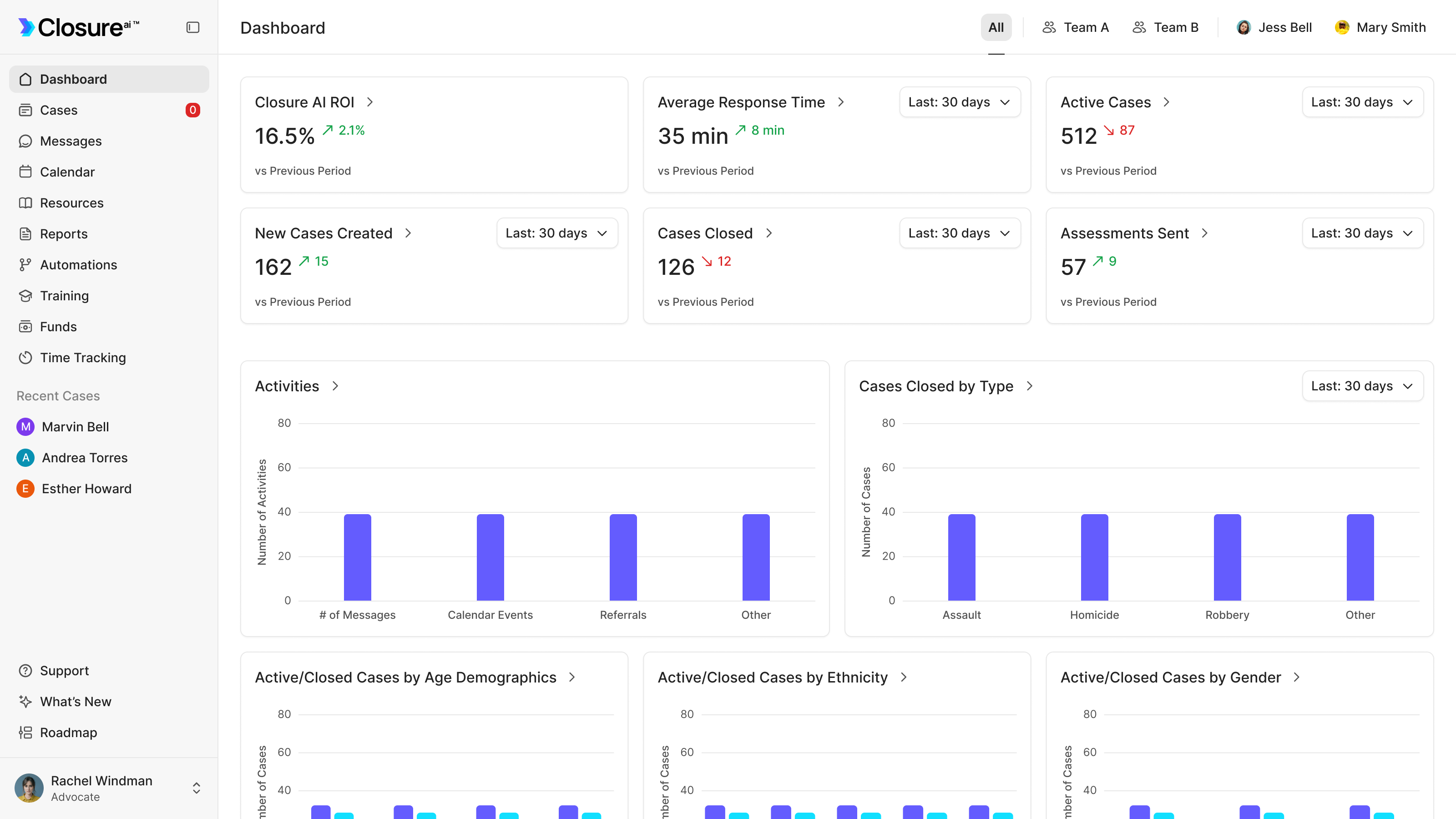
We reworked the design around choosing columns, filtering the cases and saving the result as a CSV. The table stays visible beside those controls, so the advocate can see the data they're preparing. A dashboard still provides the headline numbers; it serves a different job from constructing an export.
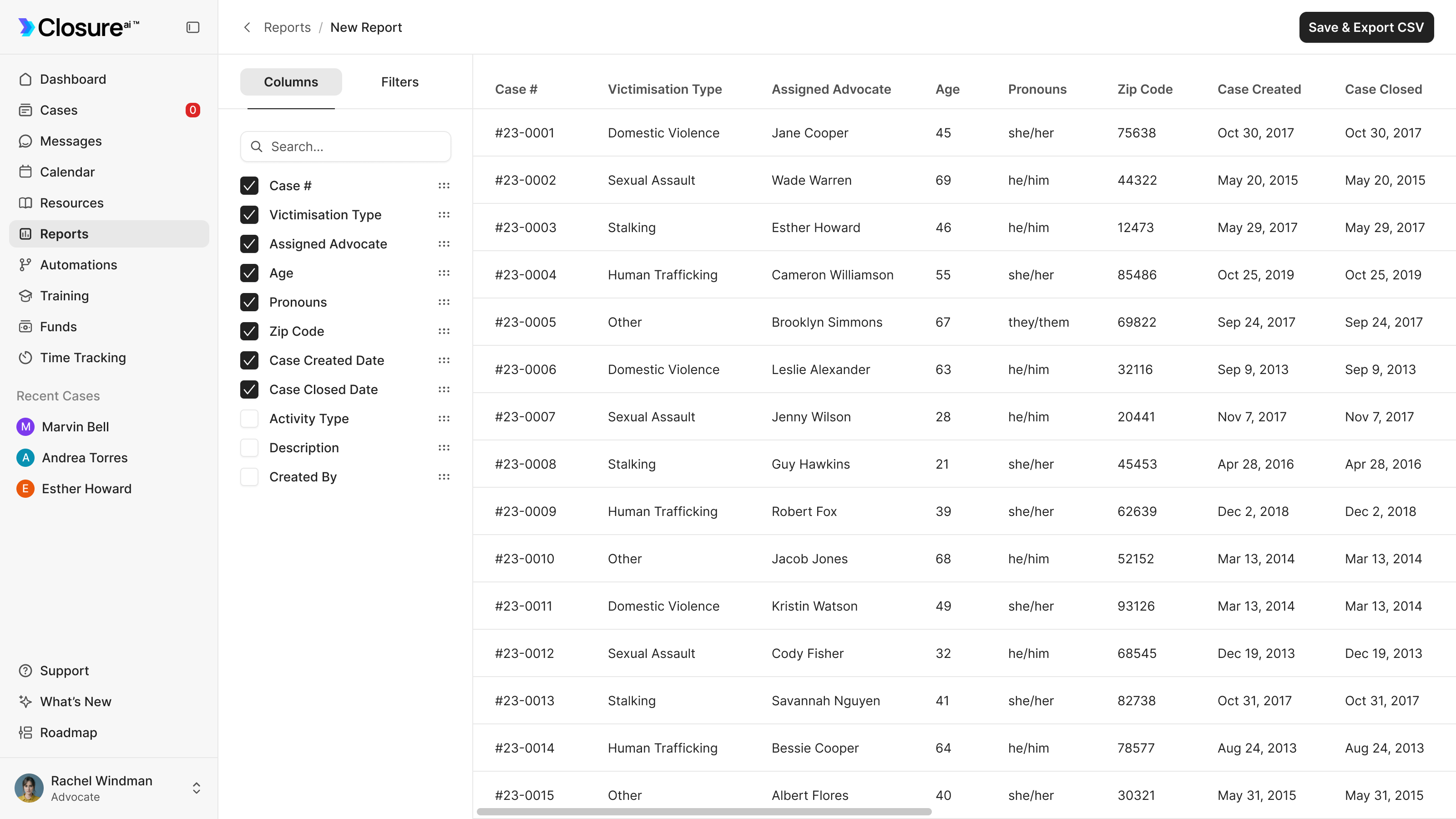
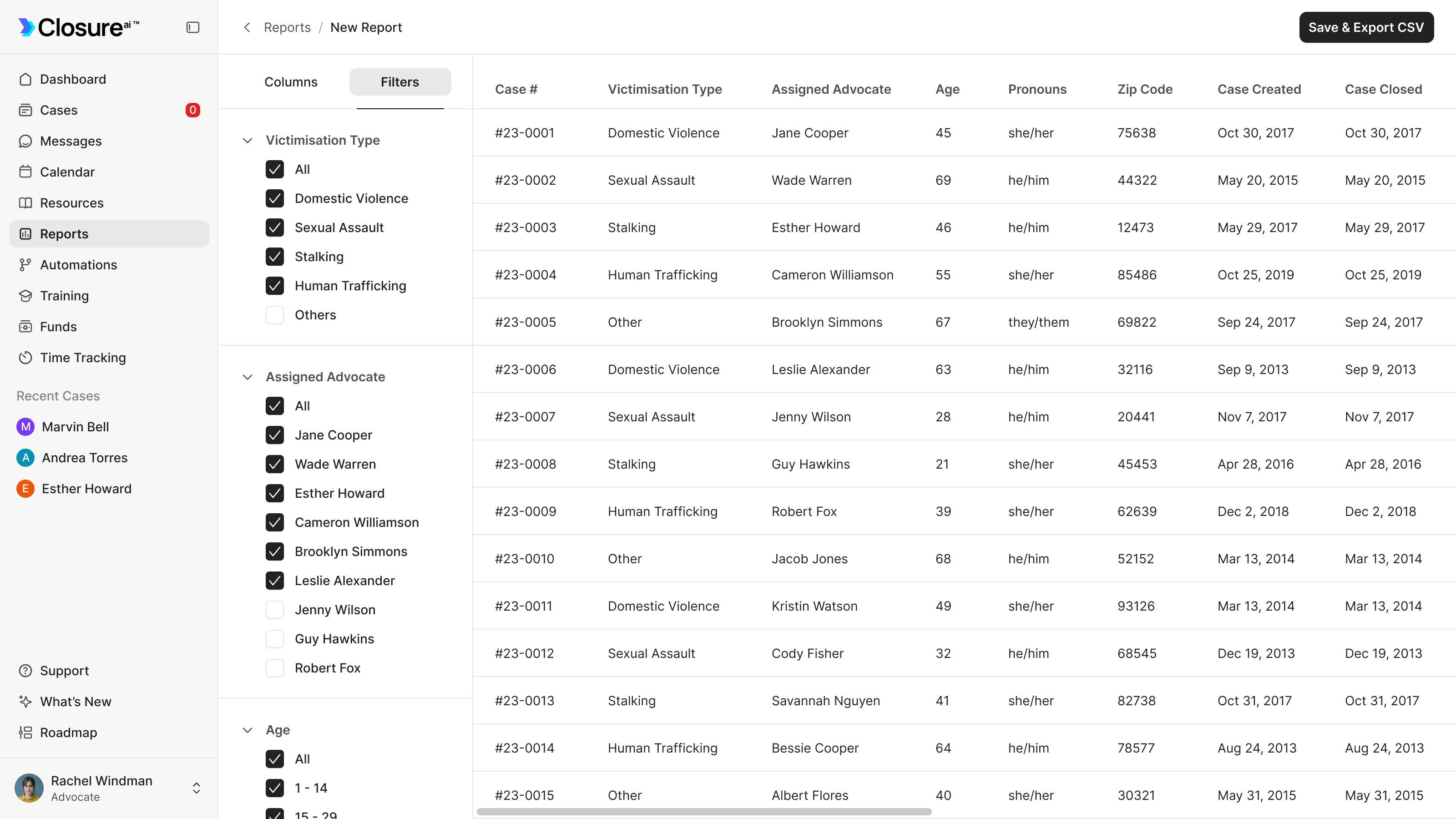
That correction changed the centre of the reporting experience. The dashboard helps an organisation look at its work. The builder helps it prepare the particular data another agency has asked for. Jack's understanding of that handoff was more useful than our first interpretation of the word reporting.
The app needs a discreet way in
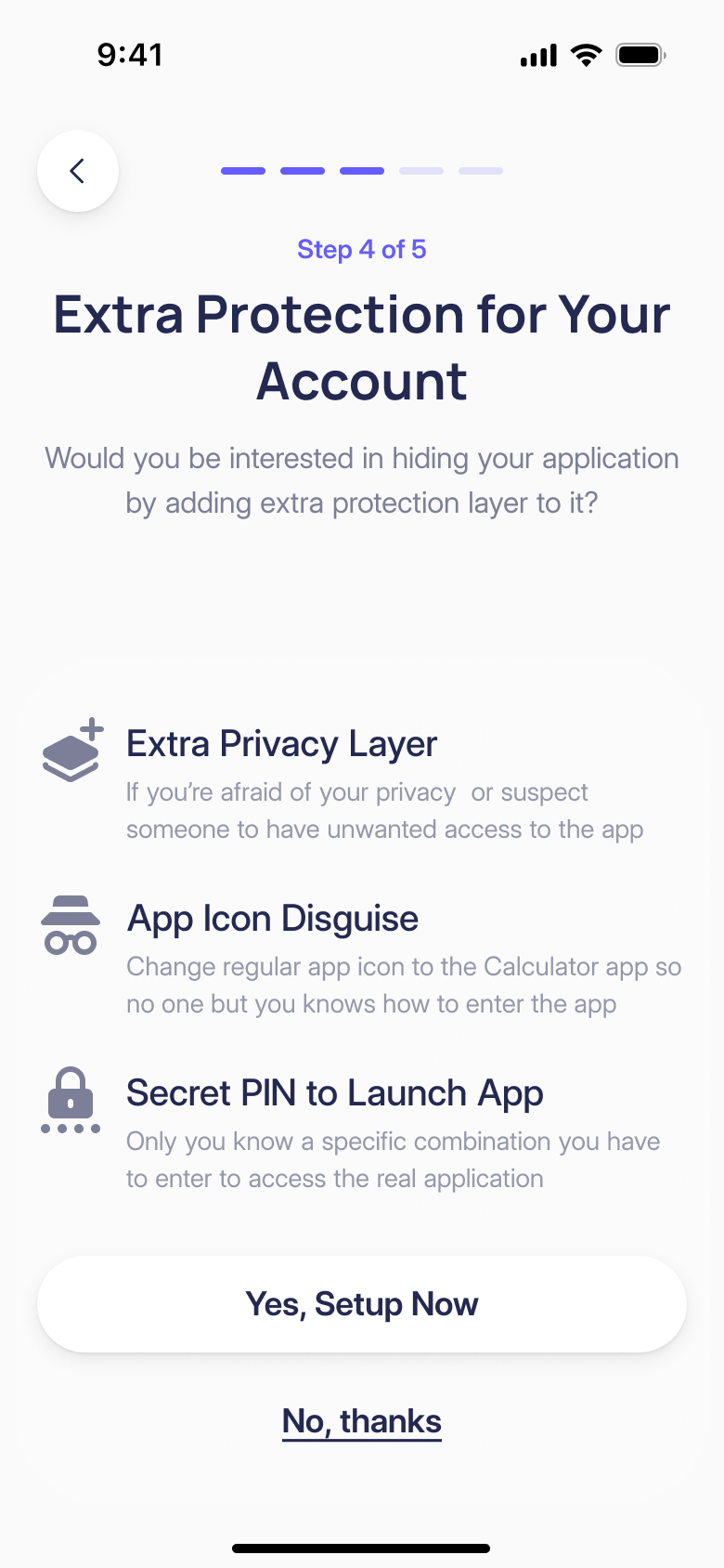
The mobile app couldn't assume the survivor was the only person who might pick up their phone. Jack raised app disguise in our first conversation. We also discussed what a notification might reveal, and how asking for personal information immediately after a QR-code invitation could affect someone's willingness to continue.
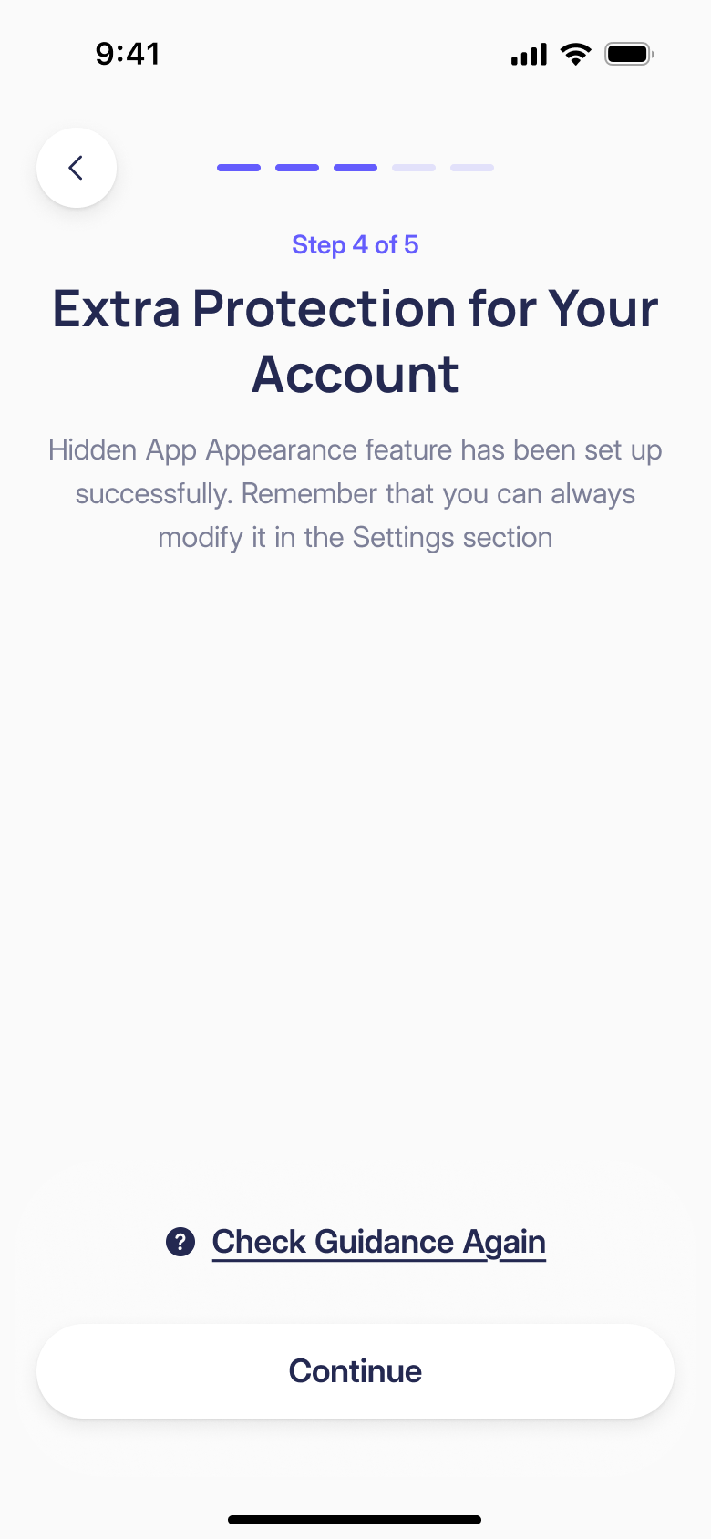
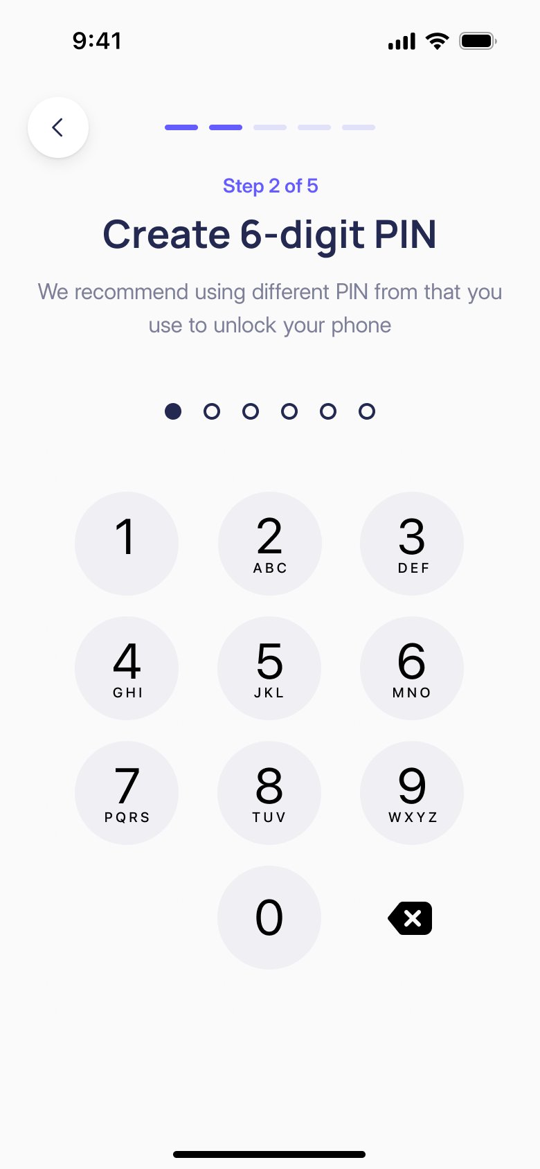
The disguise flow changes the app icon to a calculator and opens a currency converter. Entering the six-digit PIN in the amount field provides a route into Closure. Vitalii worked on the custom calculator design, then refined it to a financial calculator theme.
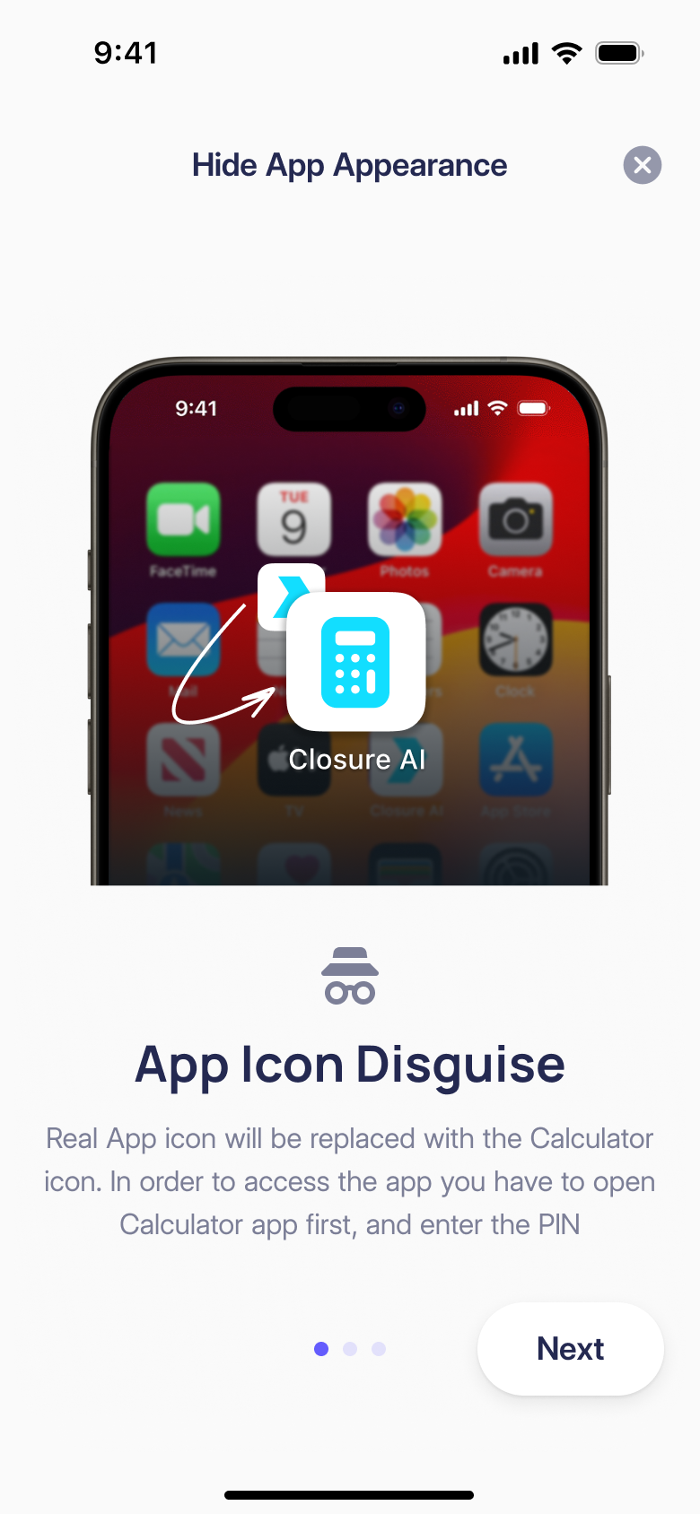
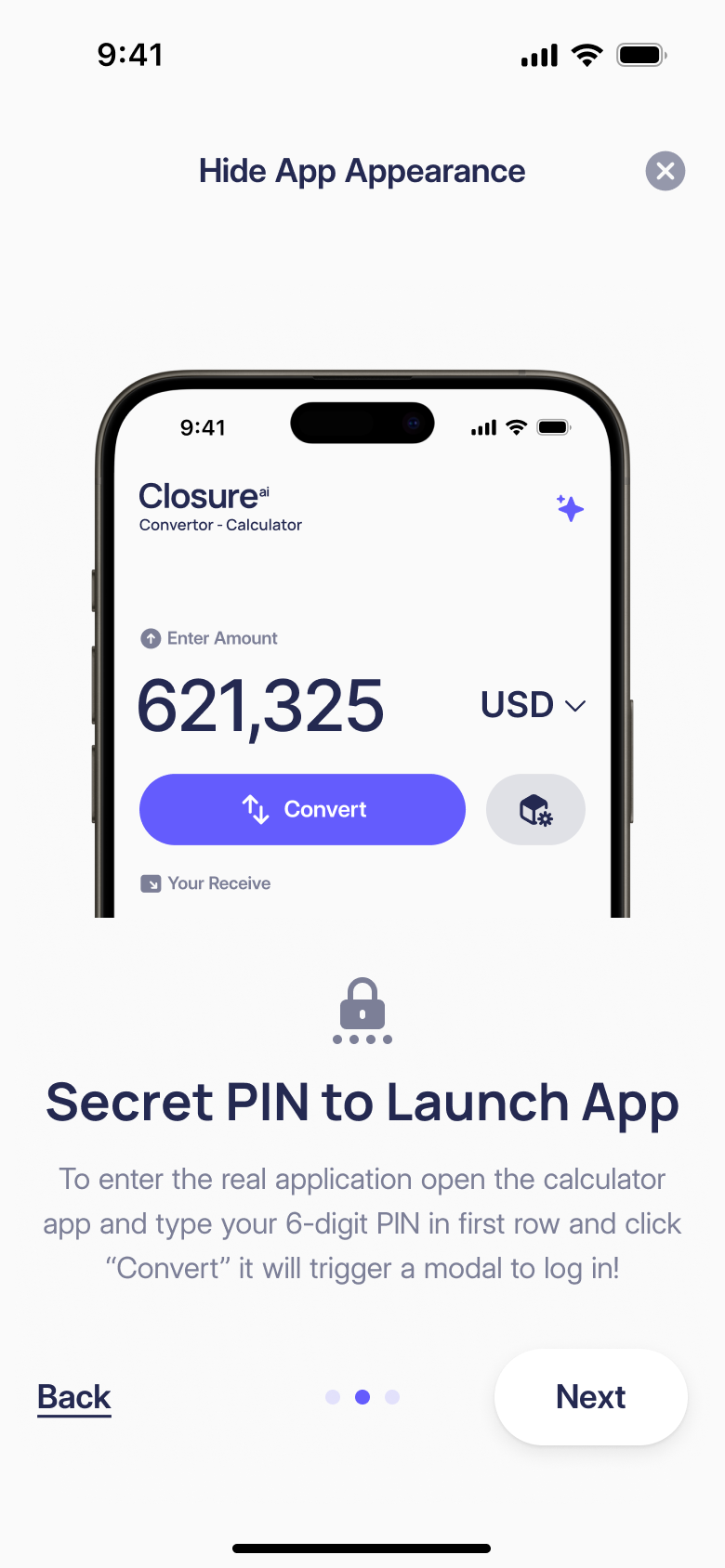
That introduces another design problem: the person has to remember how to get back in. Setup ends by spelling out the sequence, including entering the PIN in the amount field and selecting Enter Application. A confirmation control asks them to acknowledge the instructions before completing setup.
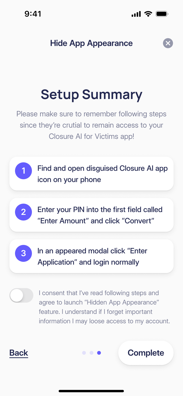
disguising the entry adds instructions the survivor must be able to remember
The calculator icon needed a further revision when the developer implementing the disguise raised an App Store requirement. Anas redrew it for that constraint. We treated disguise as a behaviour to work through with the client and developer, including the less visible setup and access states.
Keep the exit and the warning close to the action
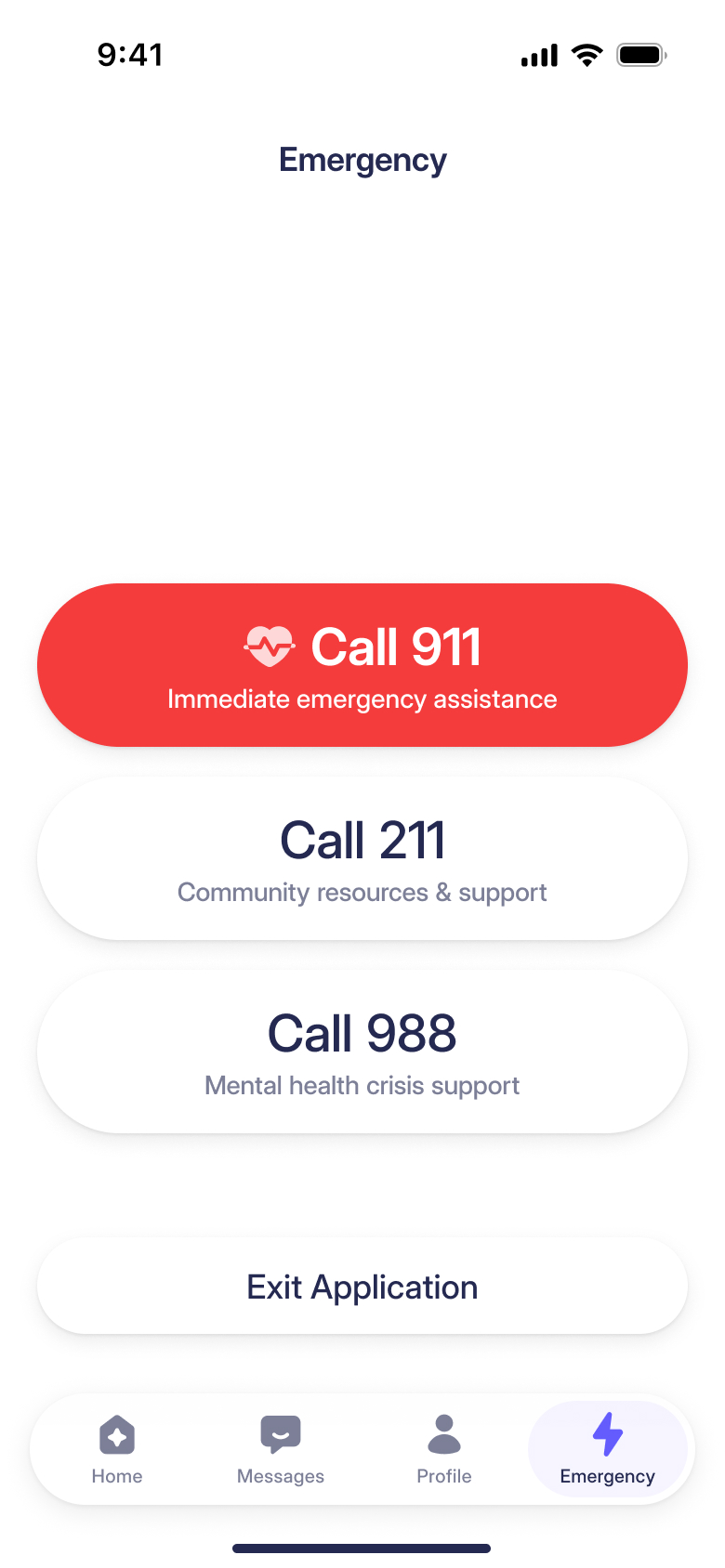
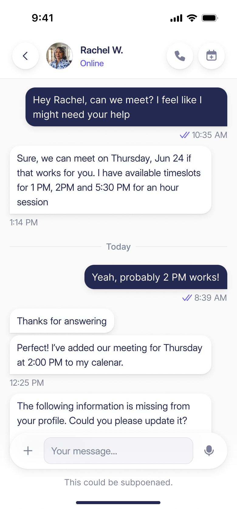
Jack's prototype also put an emergency exit within reach. We made that control more prominent alongside the emergency calling options. In messaging, the interface carries a different kind of caution: a line directly beneath the composer explains that the conversation could be subpoenaed.
The engagement extended to Closure's marketing website with Prakash Ghodke. The company now operates as Restore AI, with the advocate platform and survivor app still connected.
More from Closure