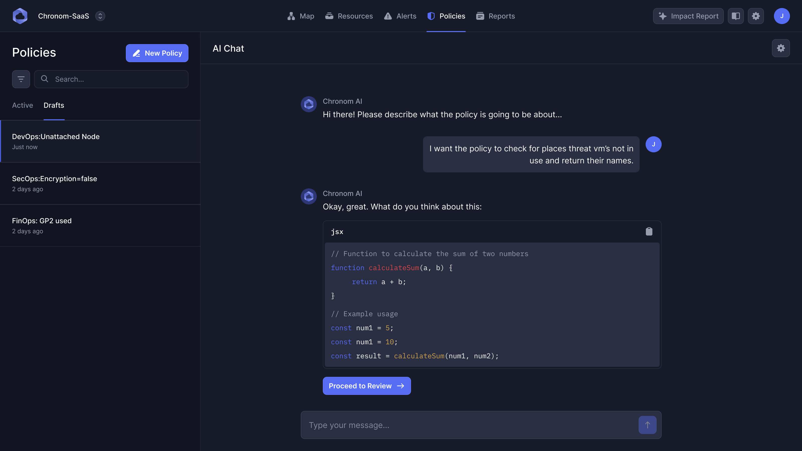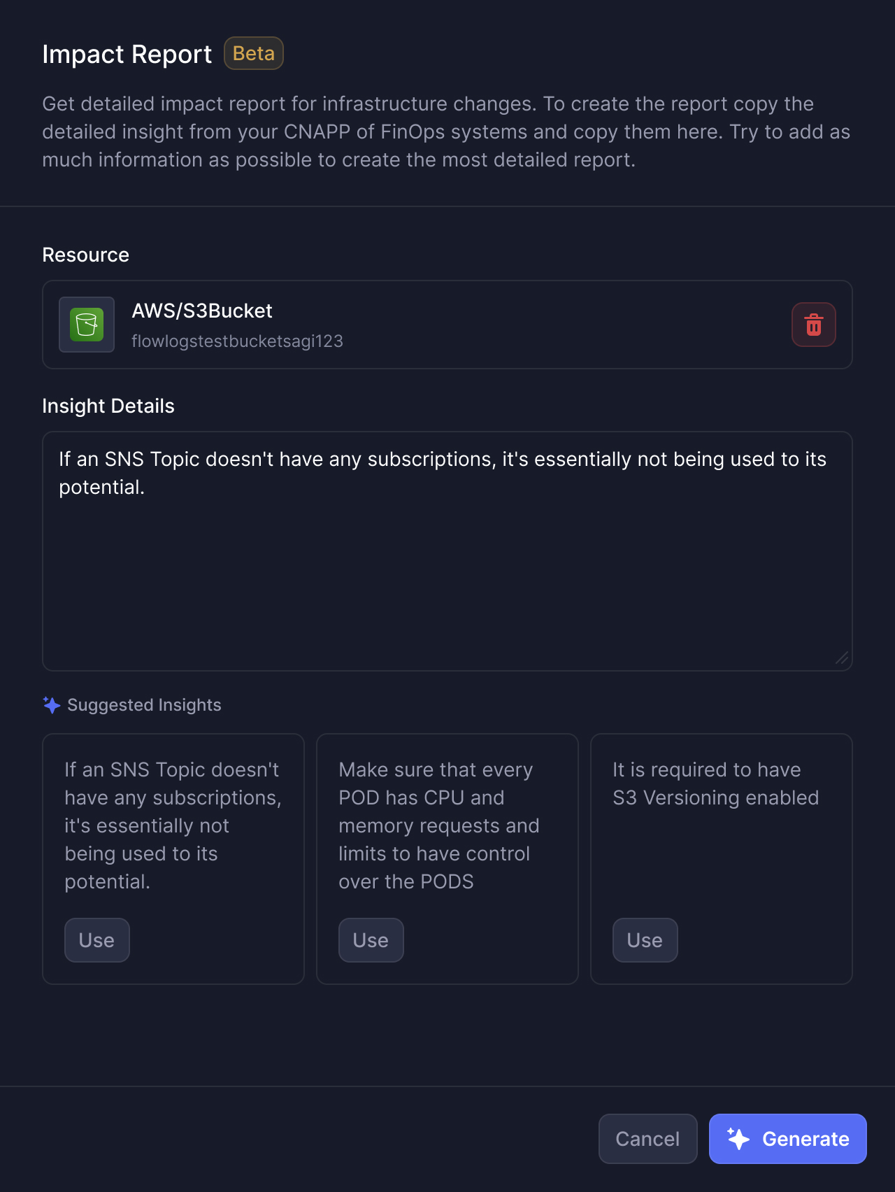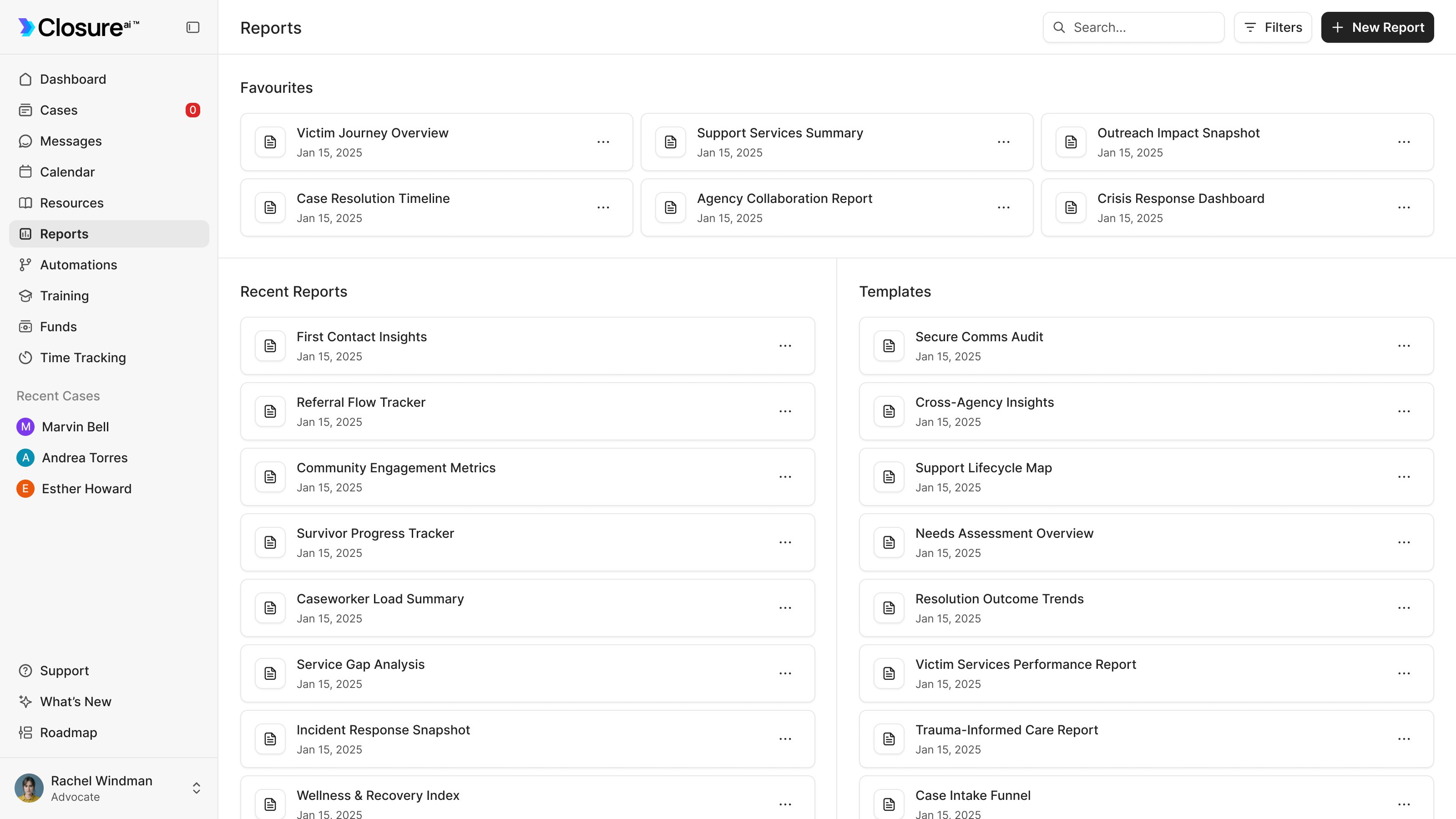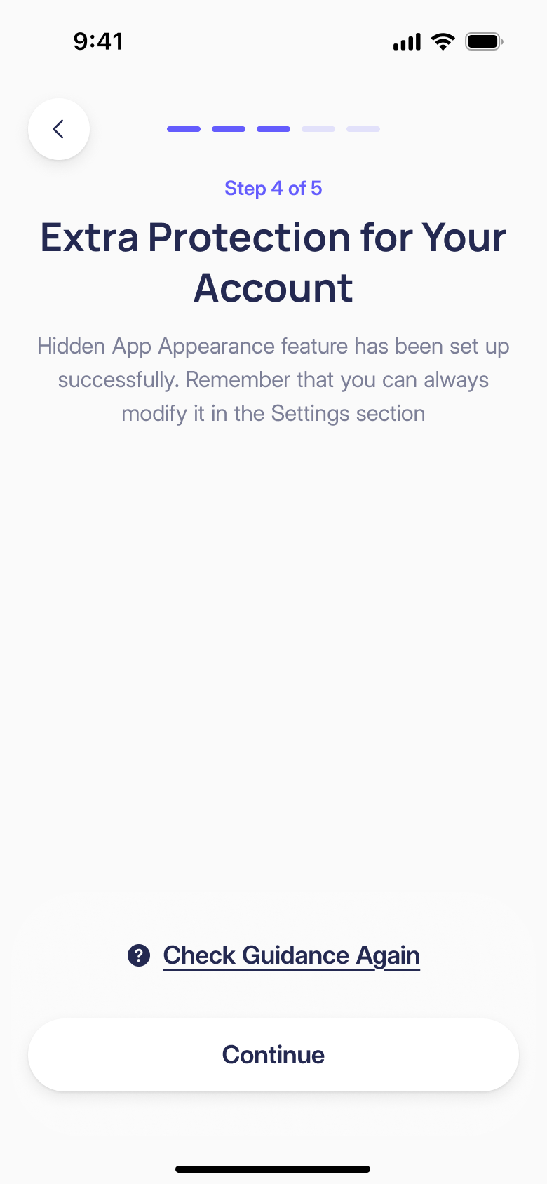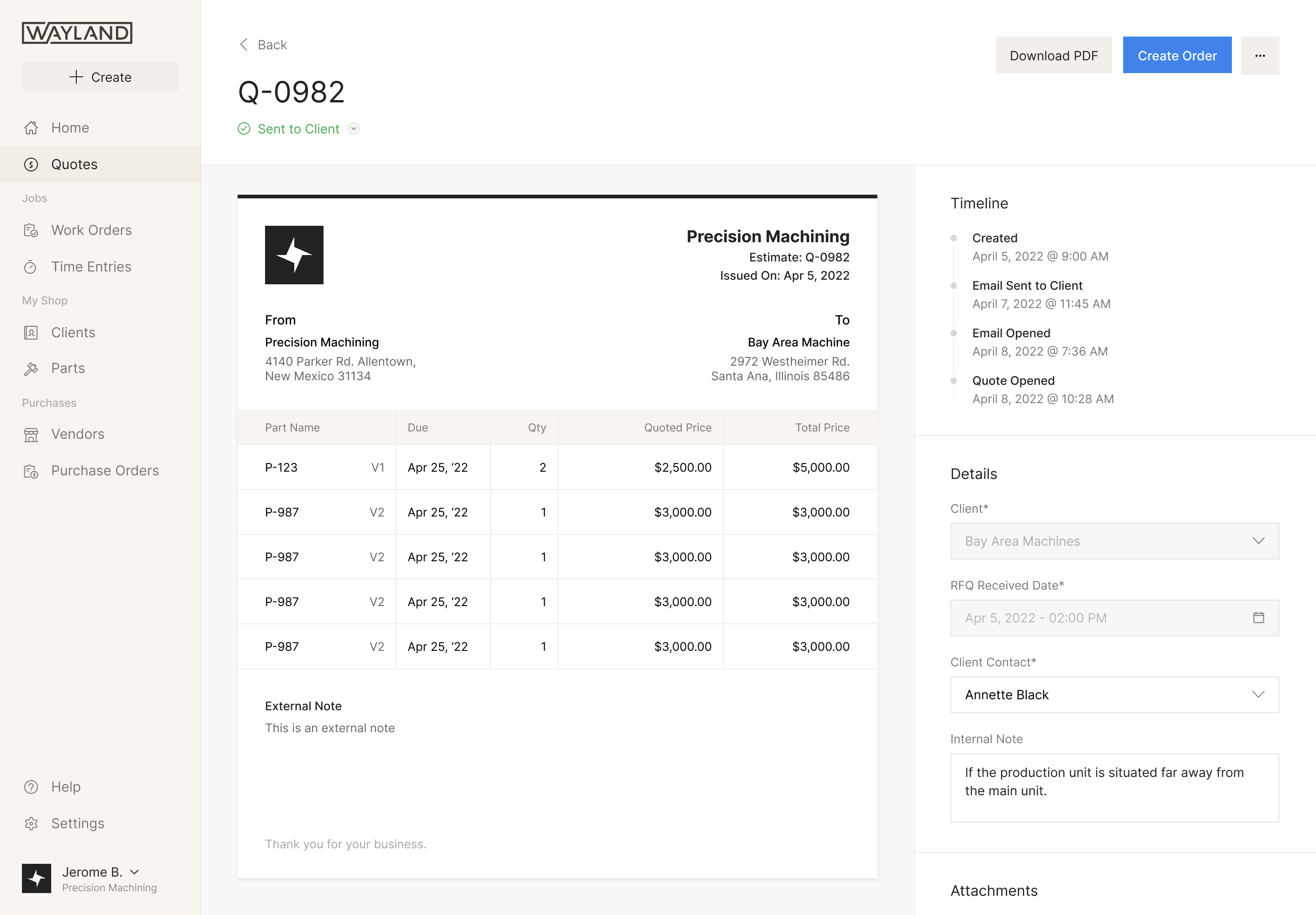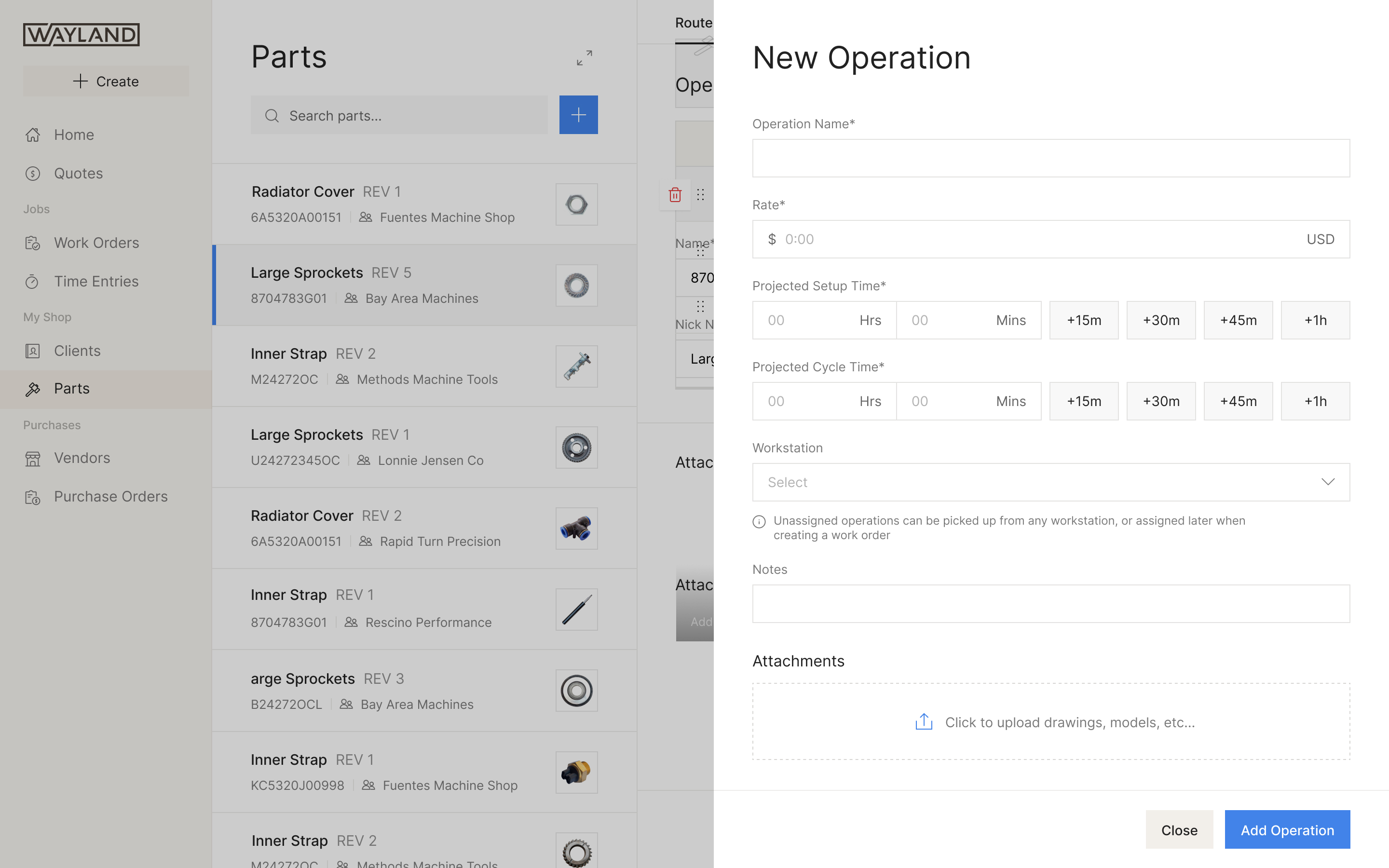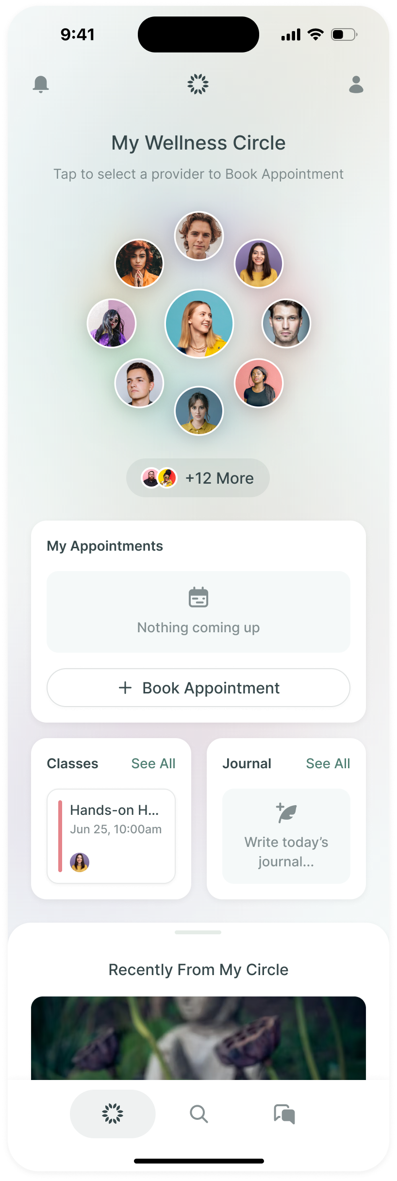
Koinly works out your crypto taxes. You connect the exchanges, wallets and blockchains you've used, Koinly pulls in every transaction, and once they all add up, the tax report is a download. Its users run from first-time filers to DeFi traders and accountants with hundreds of clients.
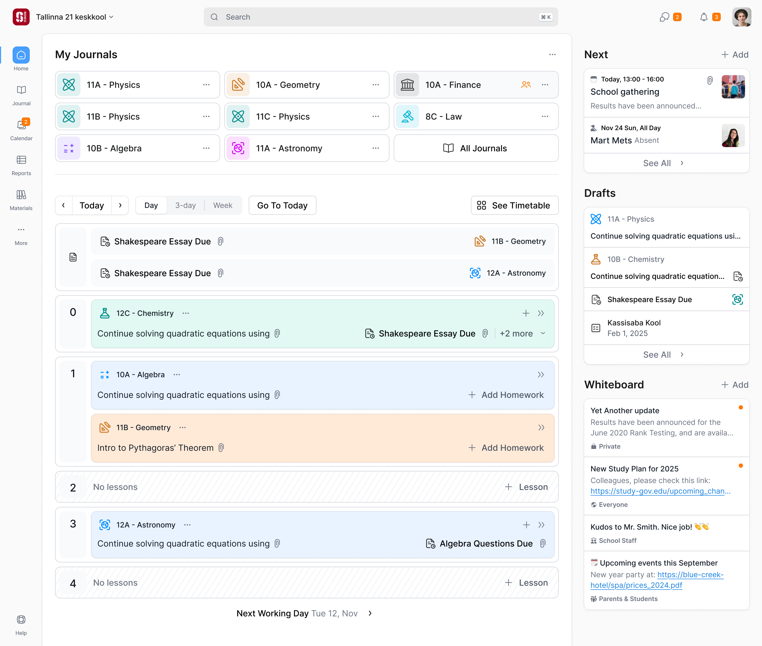
Robin Singh, Koinly's founder and CEO, got in touch in January 2026. In five years in market the product had mostly been designed by its engineers as they went. Koinly was rebuilding its front end on shadcn, and over six weeks, from late January to early March, Prakash and I redesigned the web app to go with it: the look, a design system on shadcn's components, and the main screens. I took the UX, Prakash the visual work.
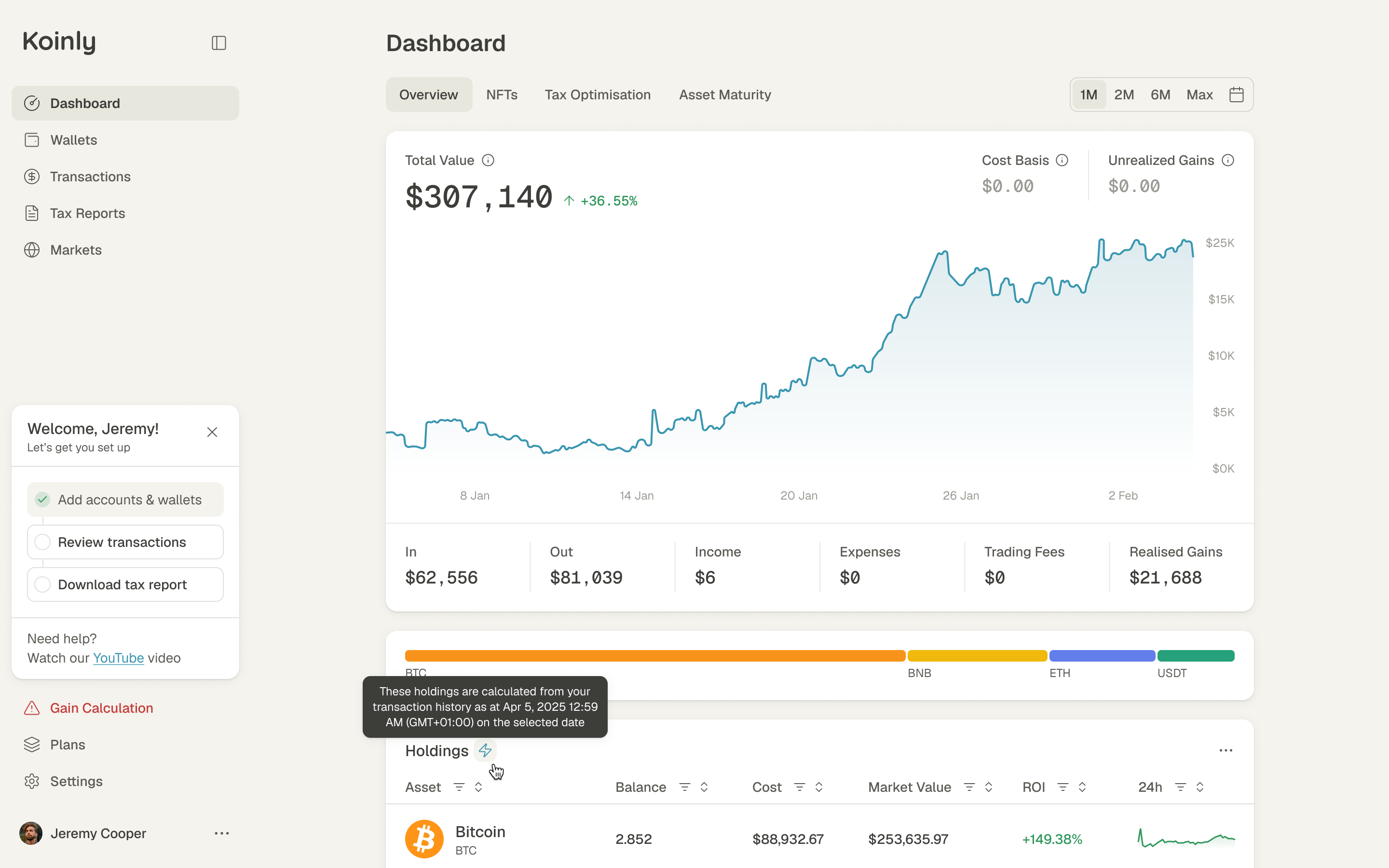
Crypto tax is mostly reconciliation
Robin described Koinly in three steps: connect your data, reconcile it, download the report. The middle step is where people spend their time.
To calculate a gain, Koinly needs to connect a disposal with what the asset originally cost. If a coin turns up in a wallet without its earlier history, the calculation may be missing its cost basis. Someone has to find where it came from. Transfers between a person's own wallets make this particularly easy to get wrong: the coins have moved, but they haven't necessarily been sold.
So most of the product is finding and fixing gaps: missing wallets, transactions that look wrong, a transfer between two of your own wallets read as a sale. The interface needed to make those problems approachable for a first-time filer while preserving the detail and bulk tools an accountant needs.
Playful, but you'd trust it with your tax return
Robin pointed us at Claude and Intercom for clean interfaces people trust, and Wise for clear fintech writing.
Our first round leaned too hard on those references. Robin said it looked like Koinly's dashboard inside Claude, and he had checked: he'd given Claude the same two screenshots and got much the same mock in two prompts. He wasn't sure it was worth carrying on.
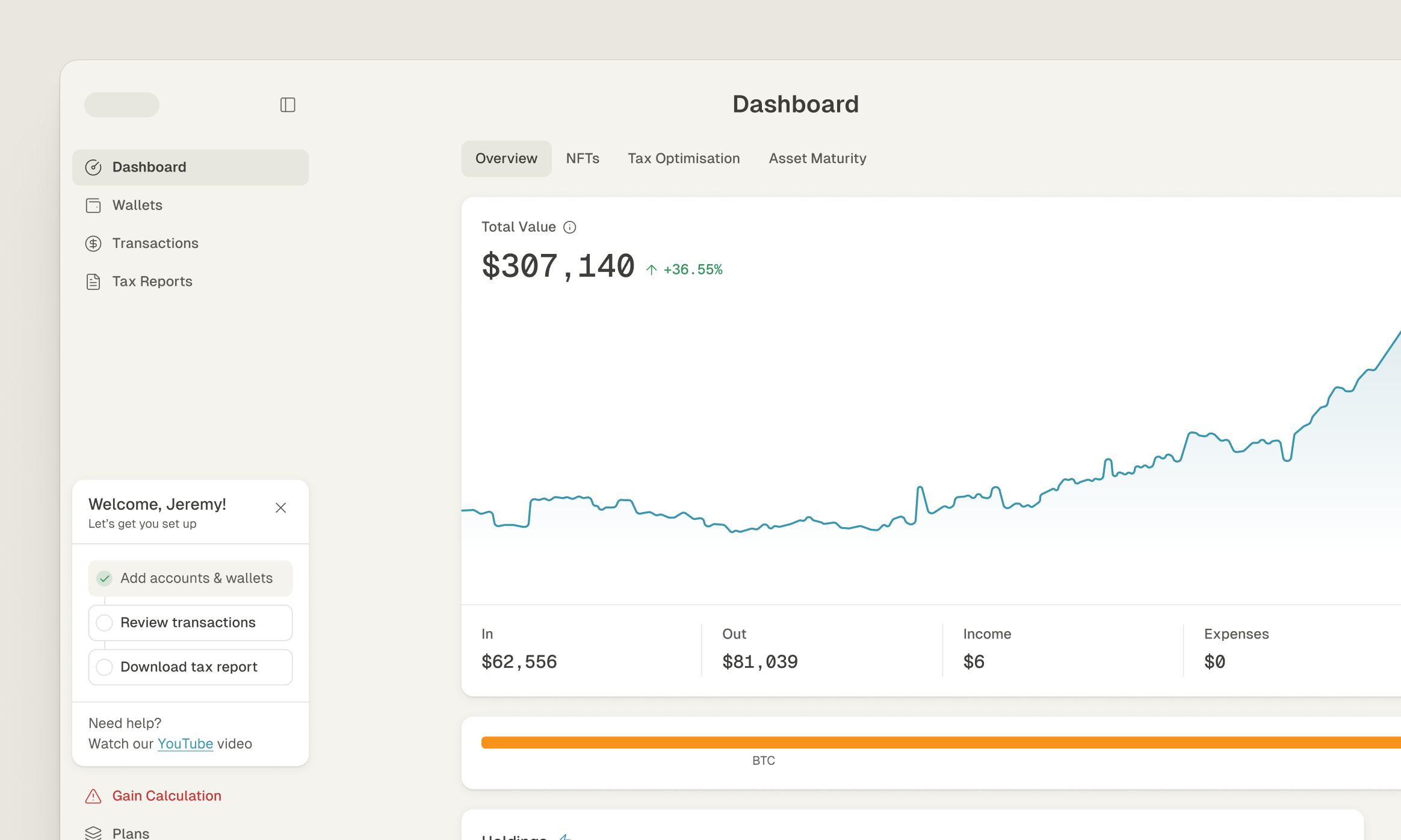
That feedback moved the discussion from the application shell to the detail inside it. We agreed to continue through the second week and make the dashboard specific enough to judge. The next round cut back the rounding, tried monospace for the big figures and filled in the tables. A week later he called it a level up.
the new look had to work in the tables, not only around them
Keep the detail, share the controls
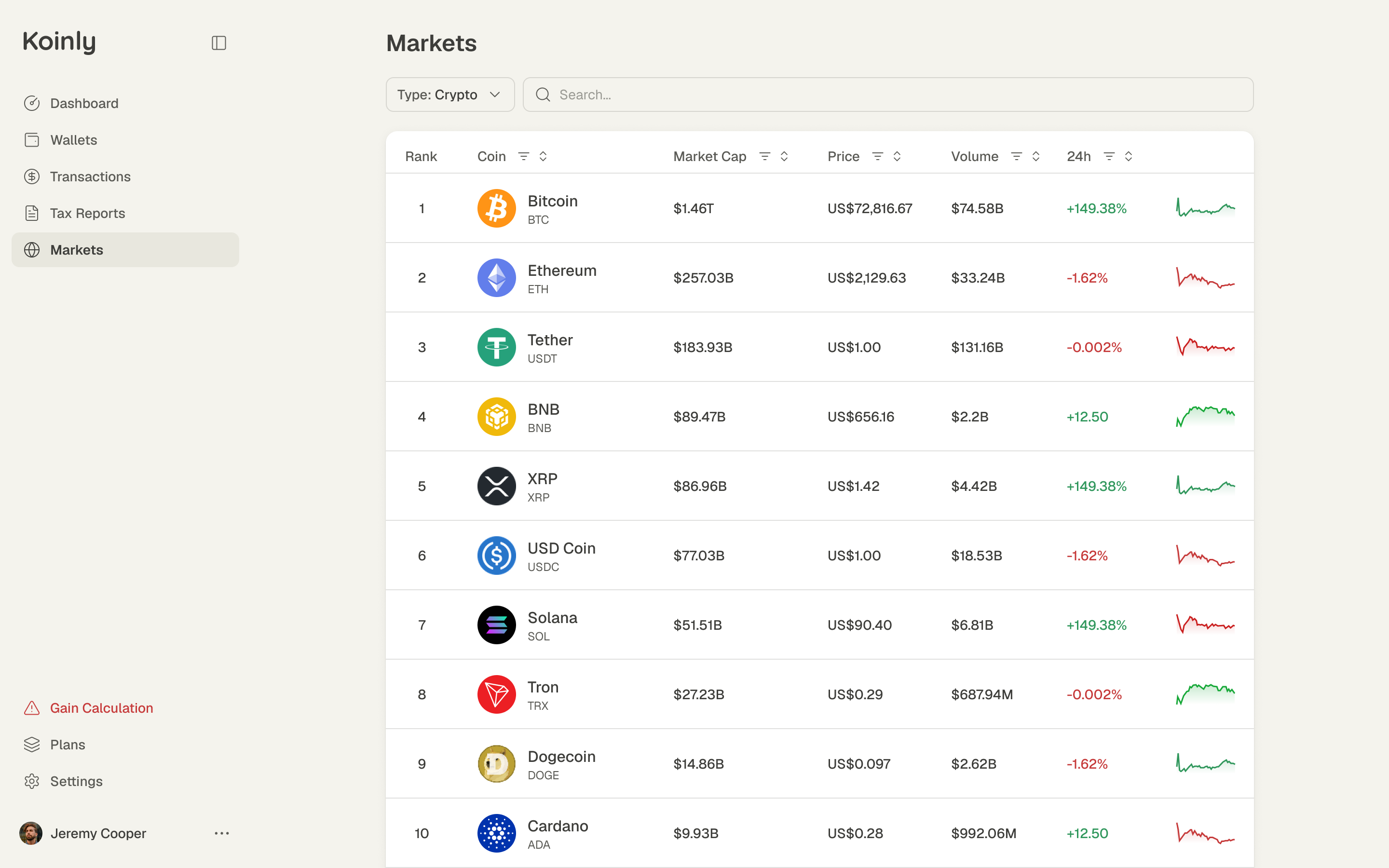
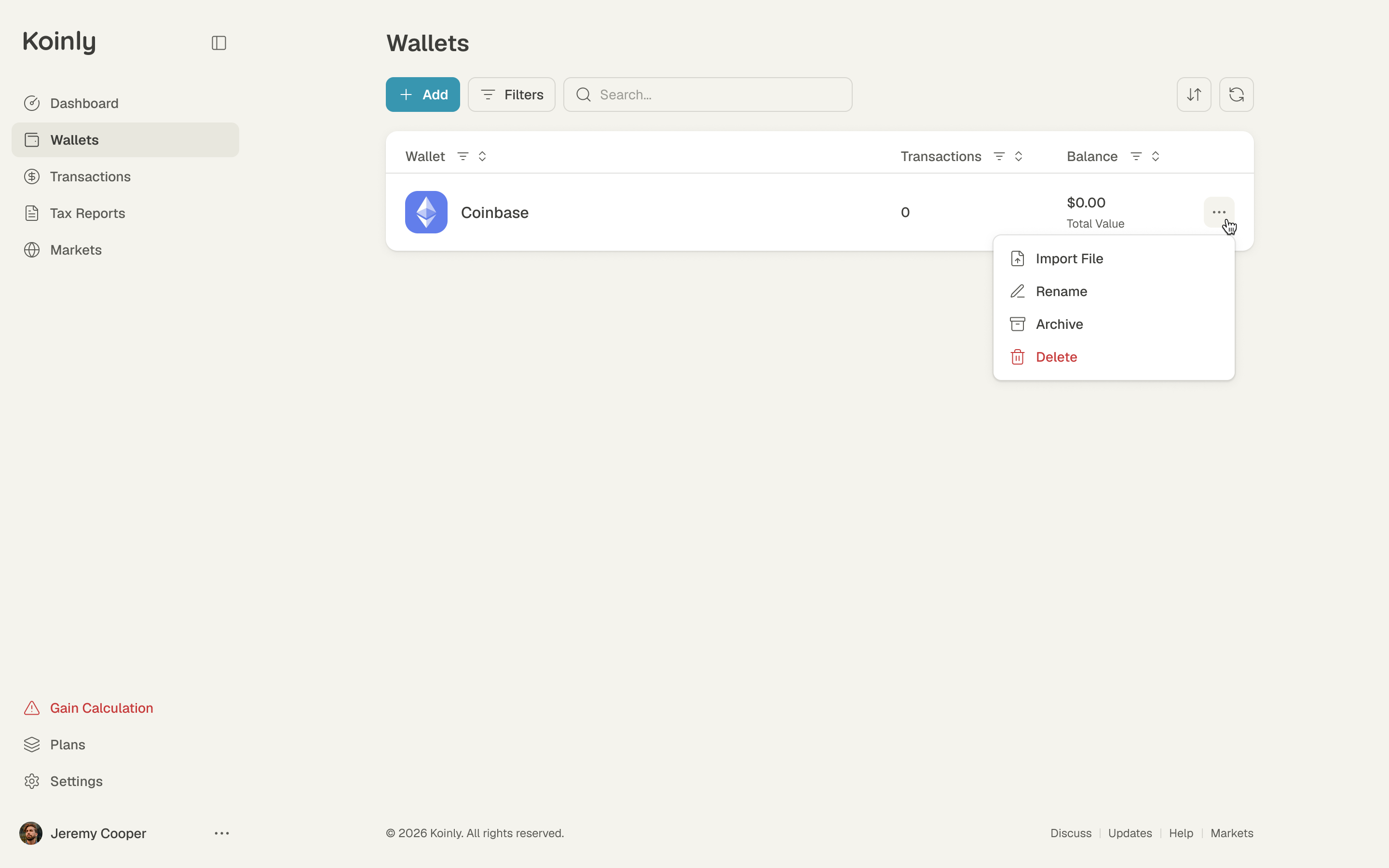
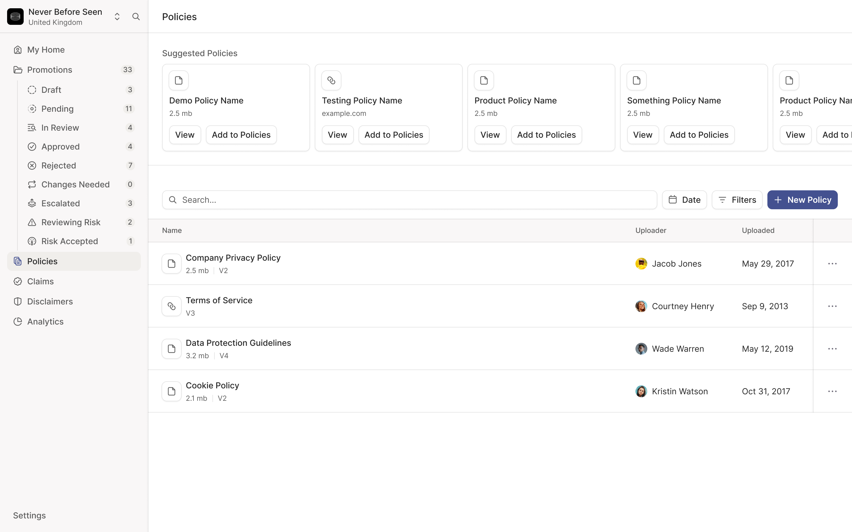
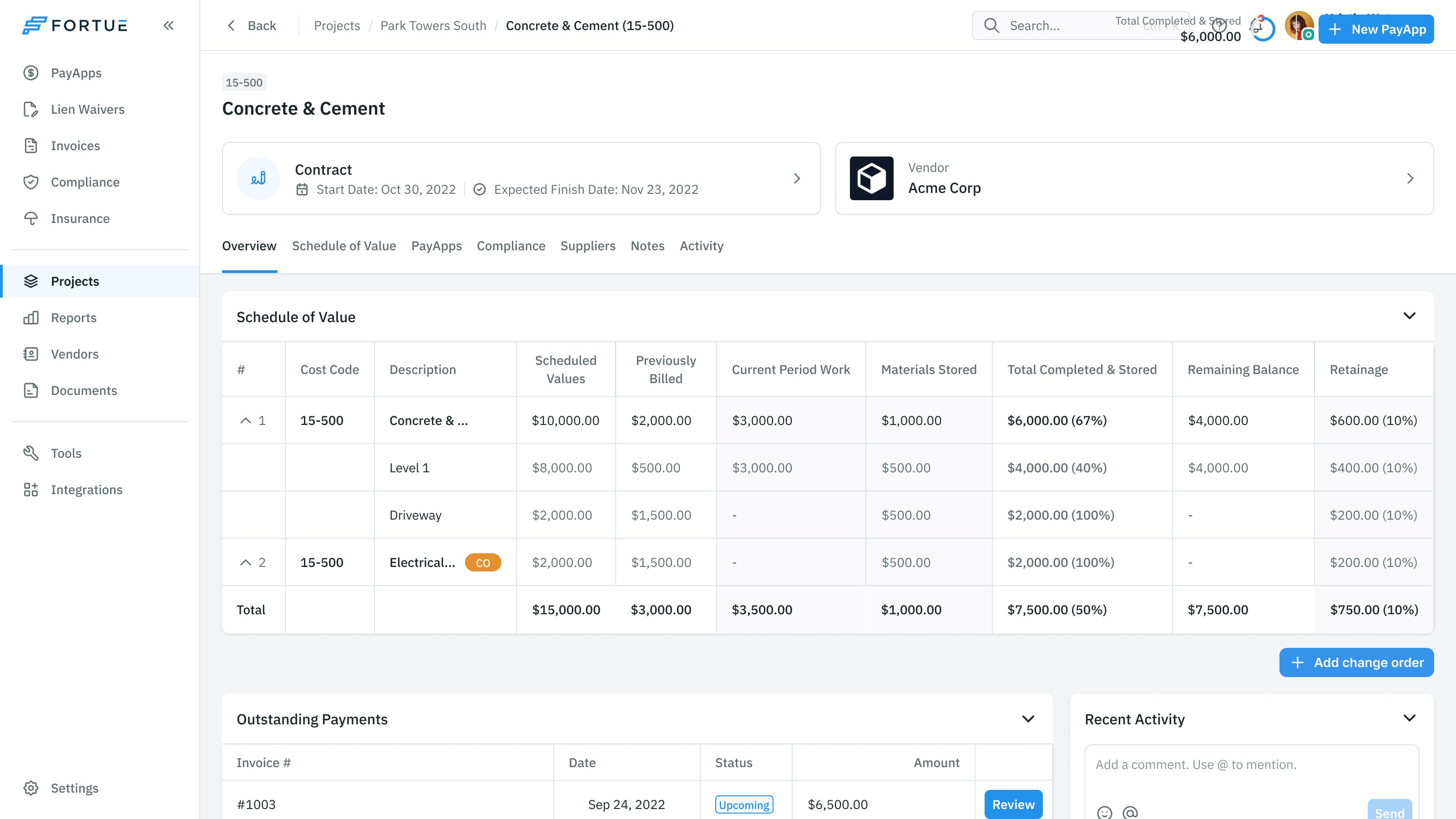
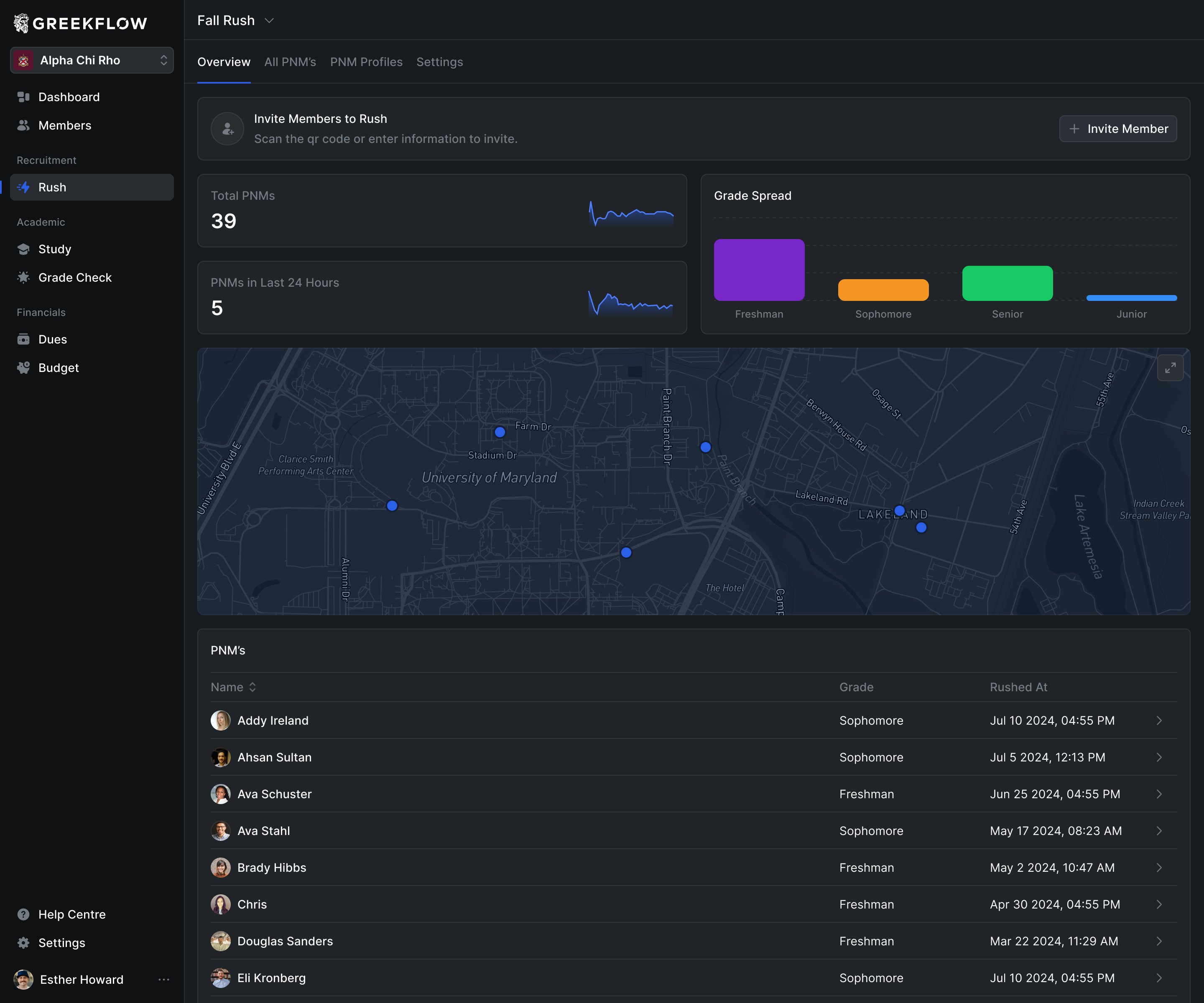
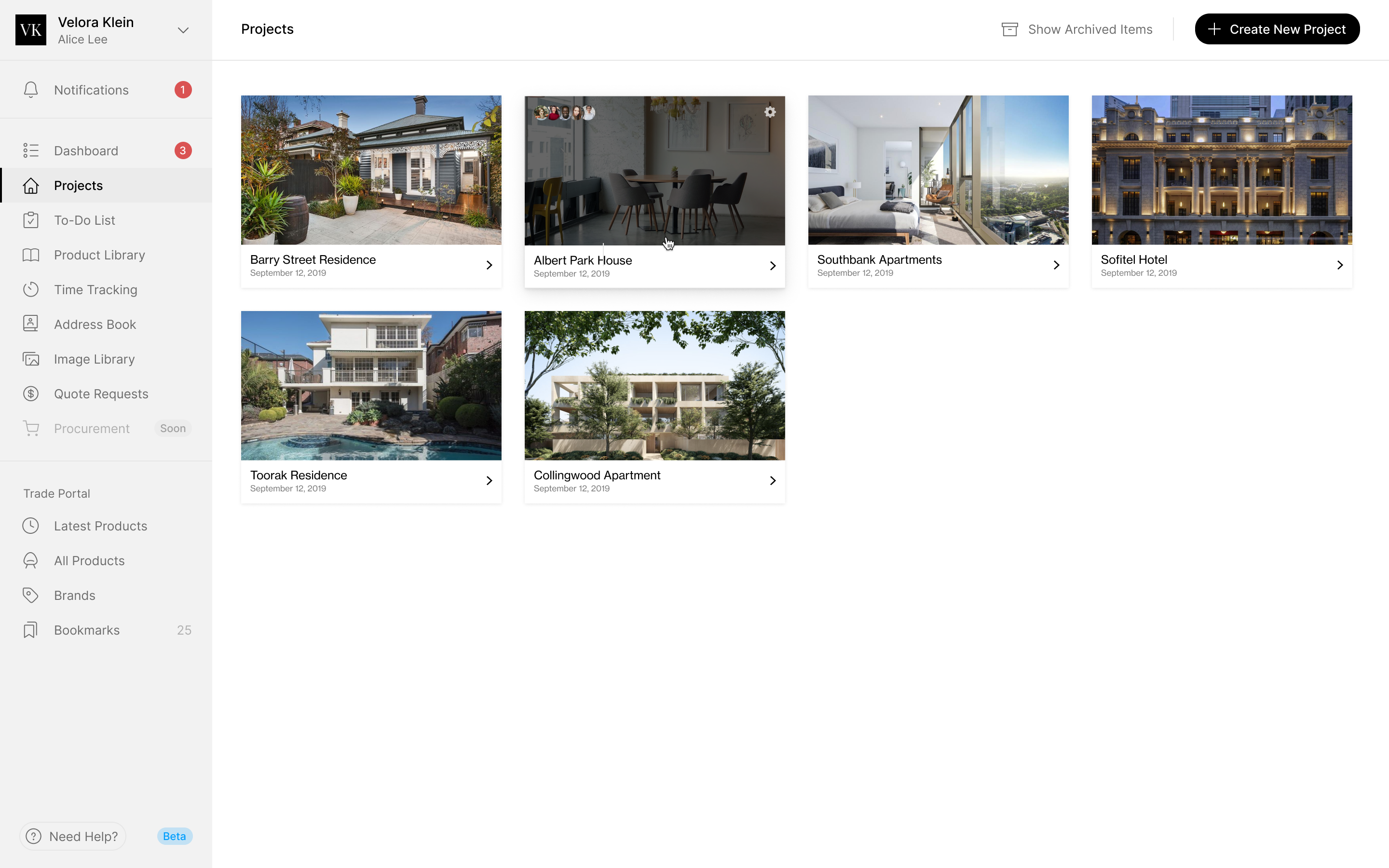
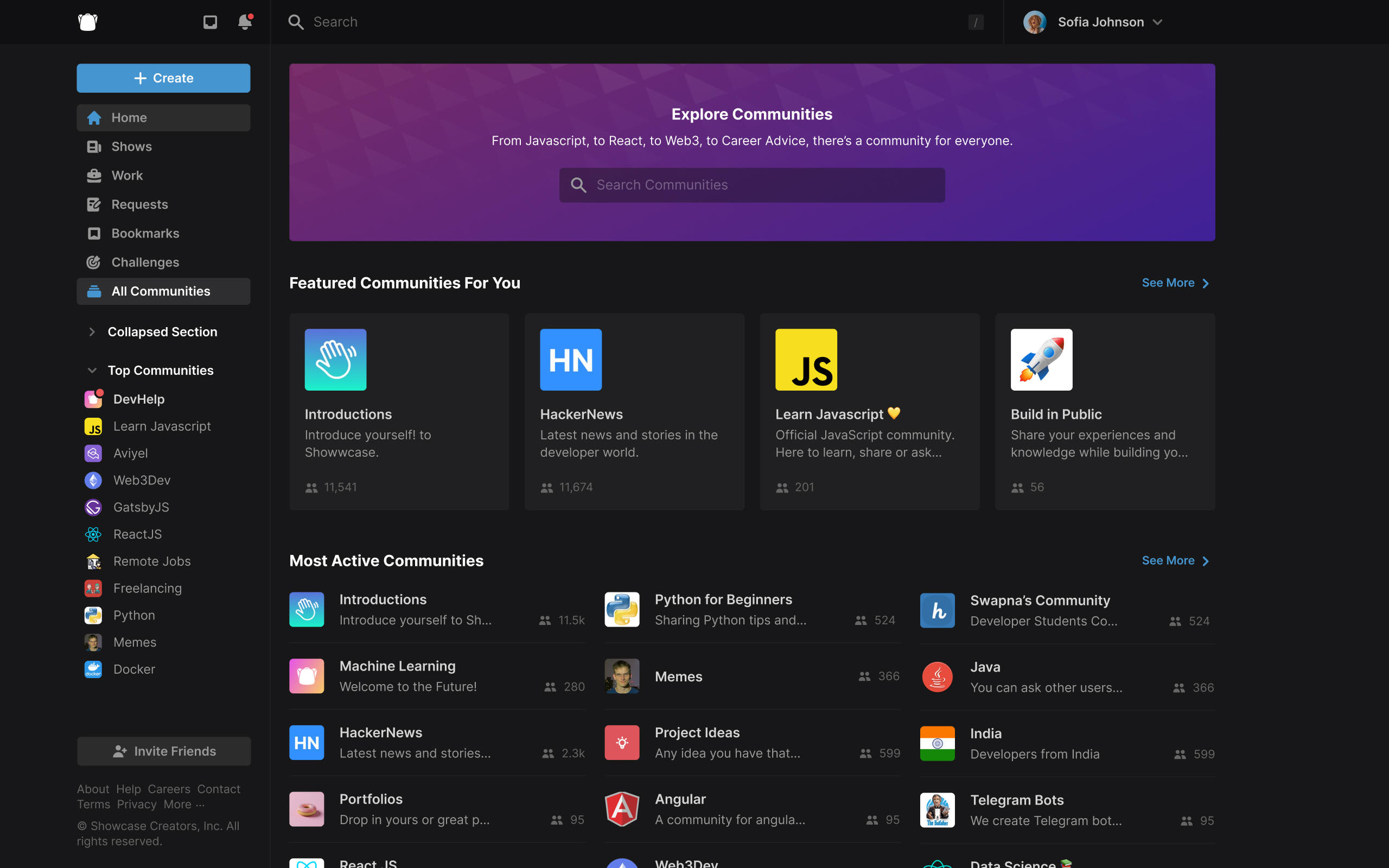
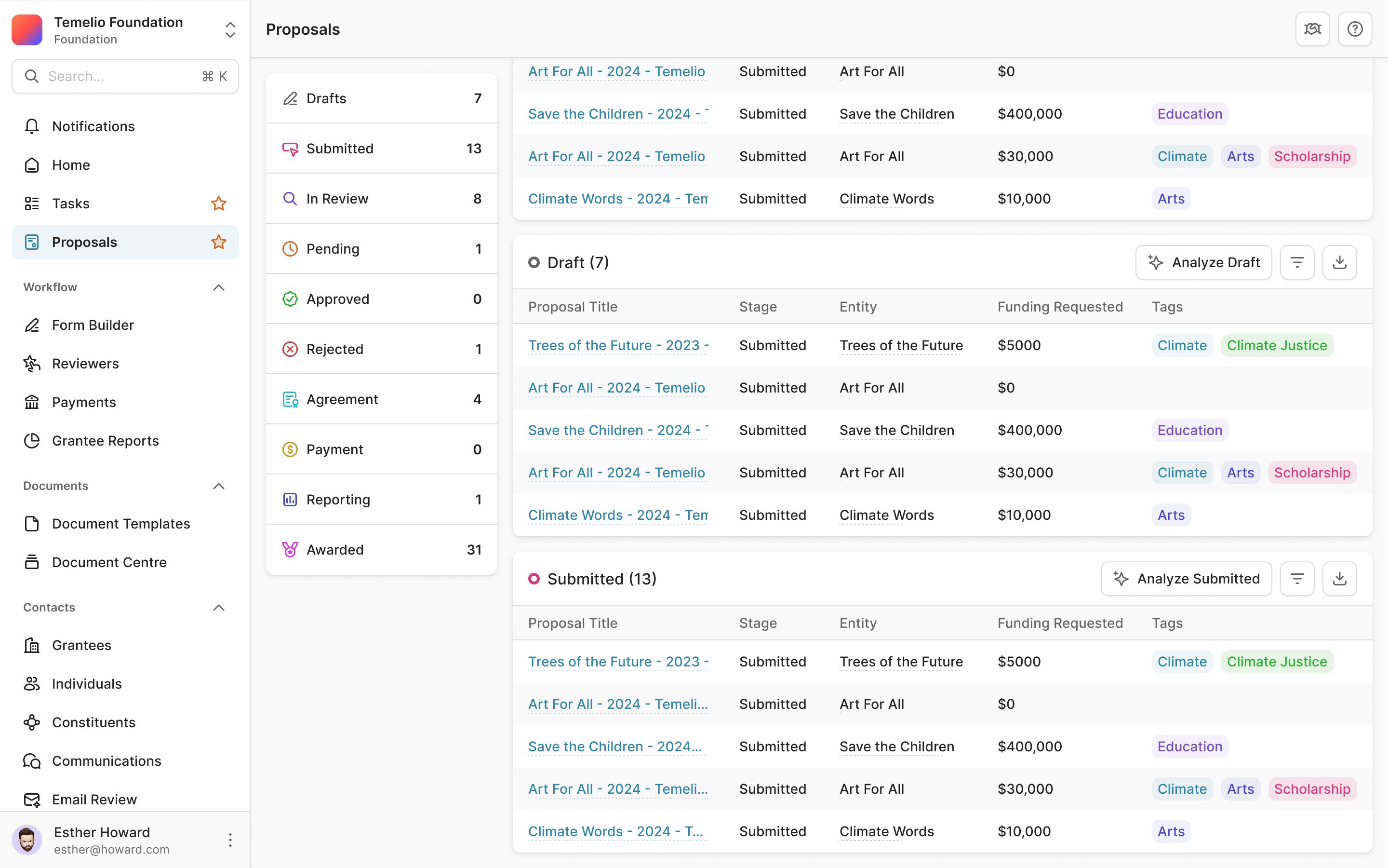
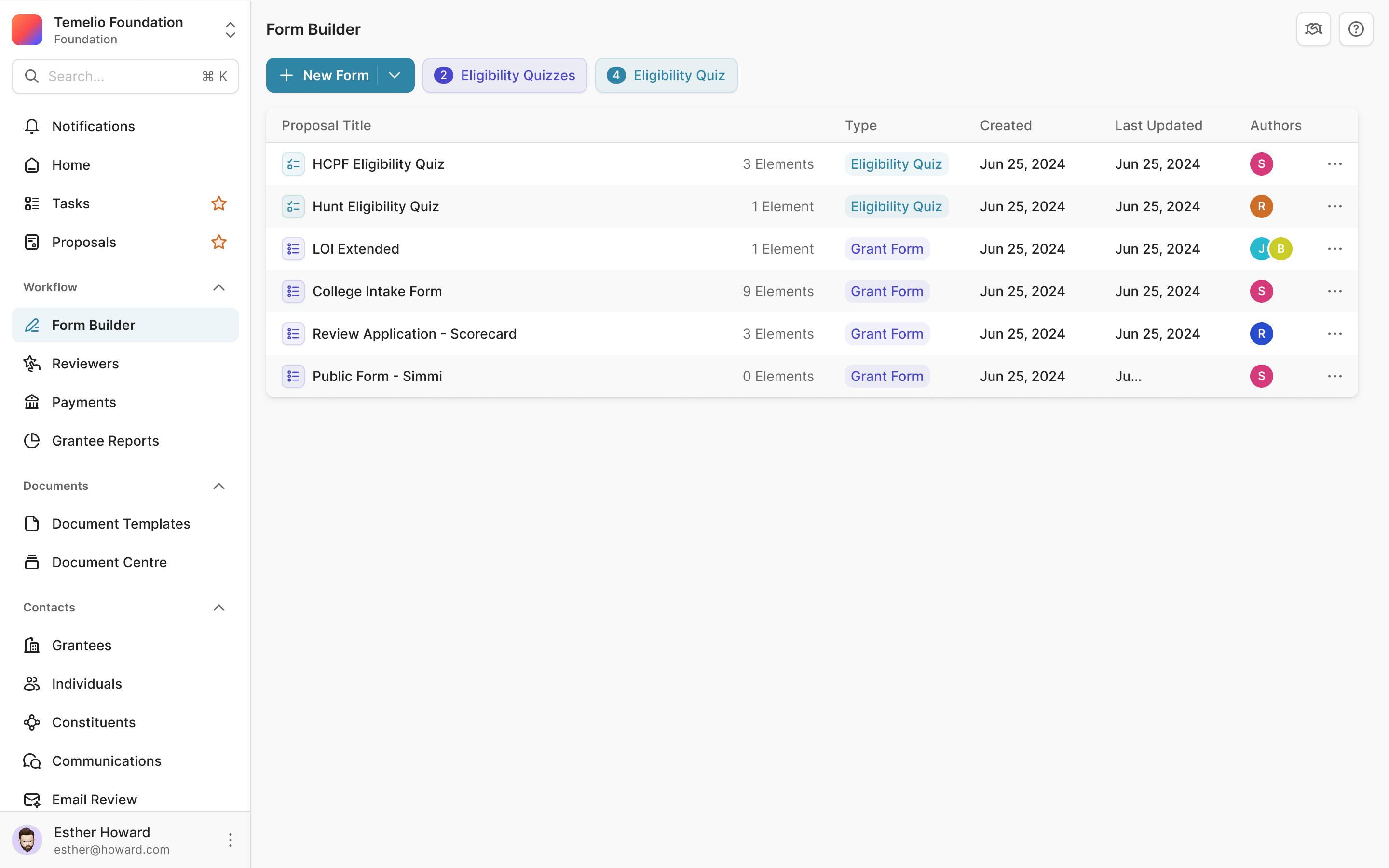
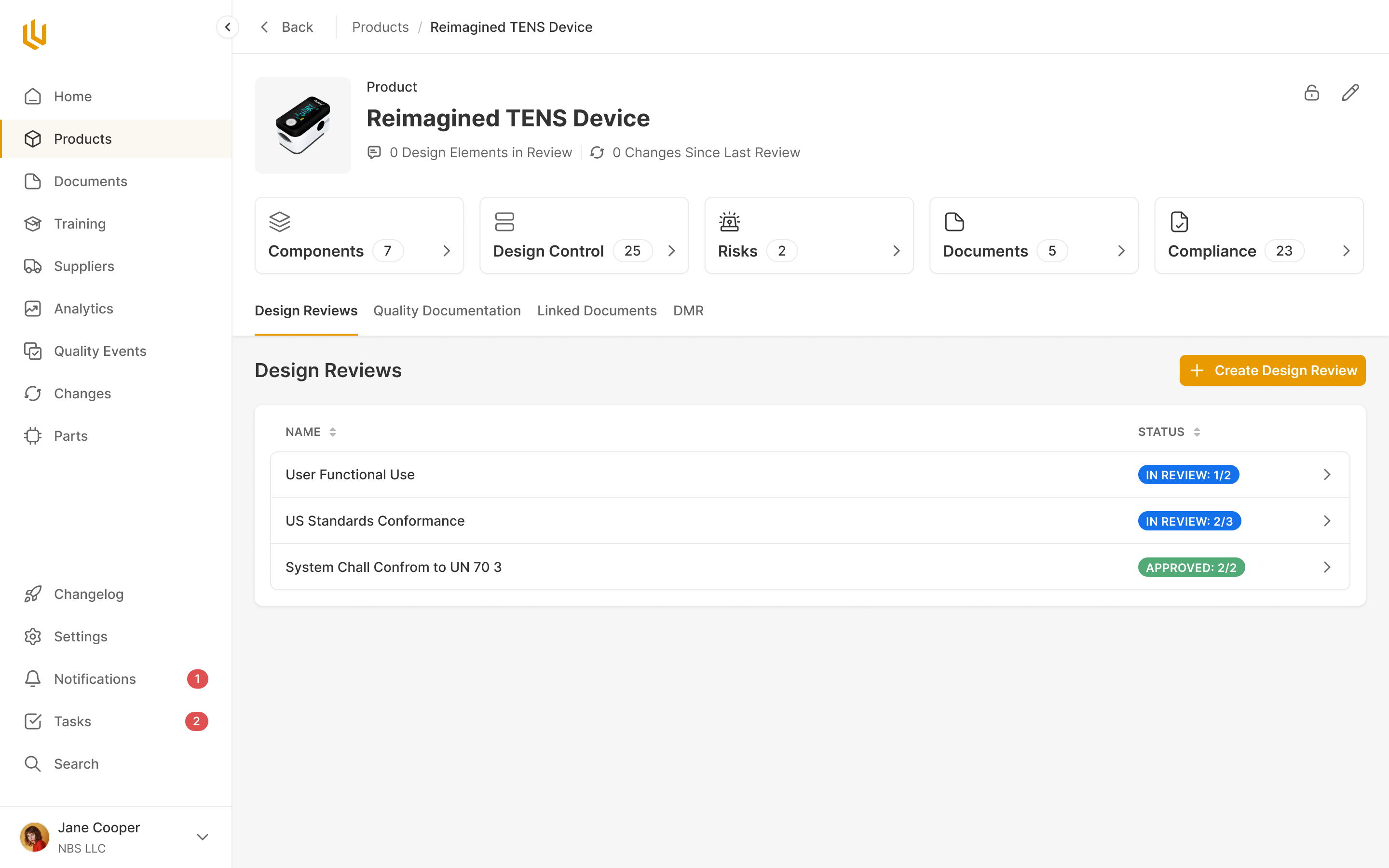
Robin wanted the dashboard's holdings table reused for wallets and transactions, so the tables share one design. Sort and filter controls sit in each column header, because Robin asked of the first round how anyone would know a column could be sorted. Add sits on the left of the toolbar, next to Filters and search. That one was mine: a button in the top right corner gets missed.
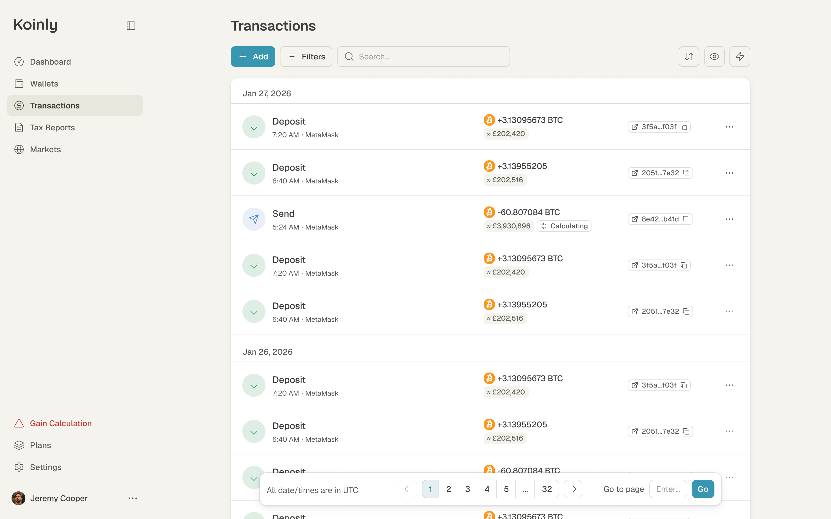
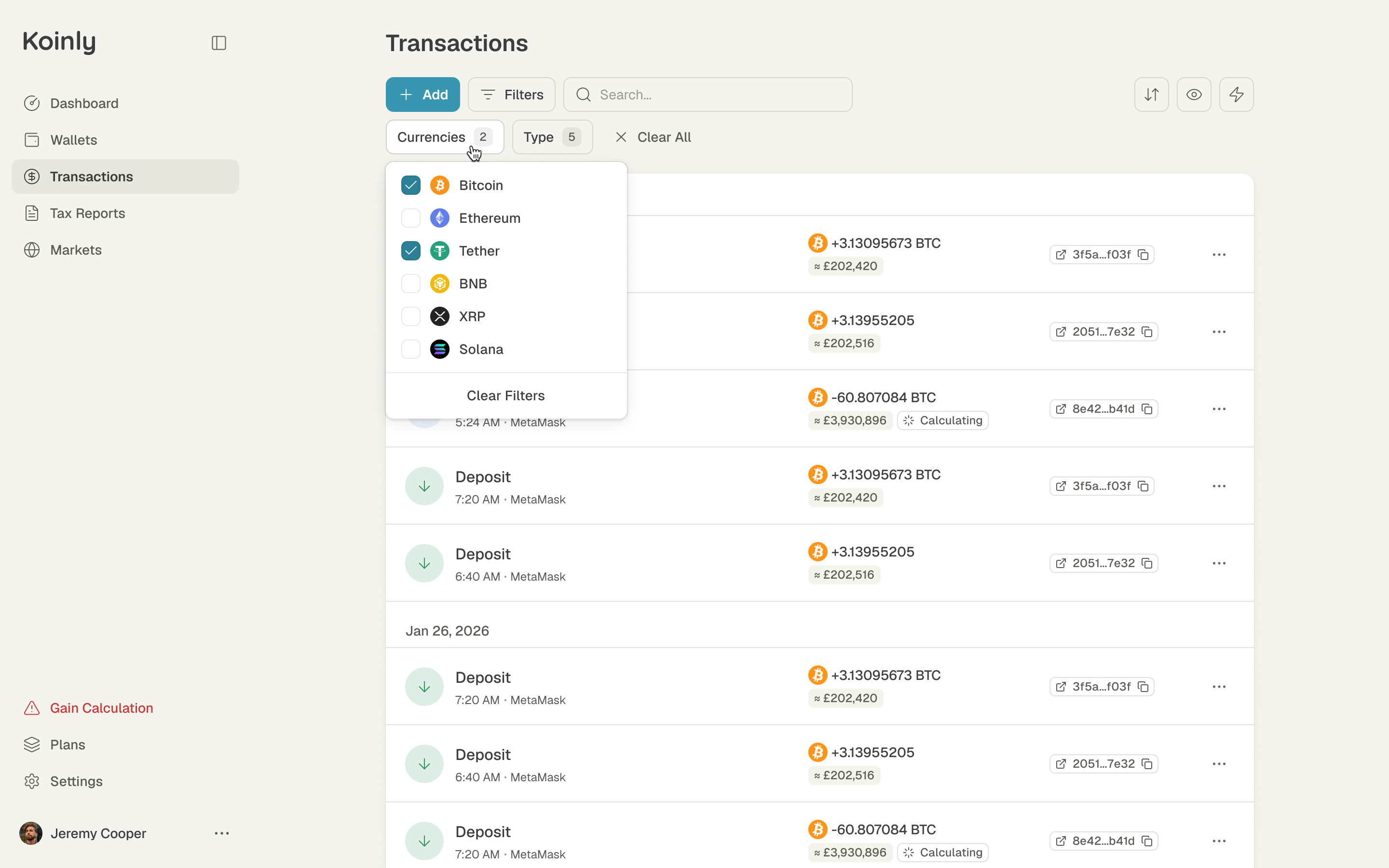
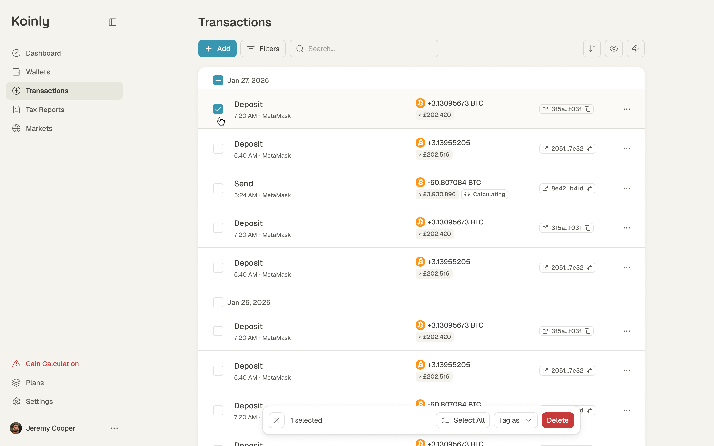
Someone reconciling a long trading history needs to narrow the list without losing track of what they asked for. Filters open as chips under the toolbar, where the selected categories and counts stay visible. Selecting rows brings up a bar to tag or delete them in bulk. Those controls support detailed work without making every transaction row carry all the available actions.
Adding a wallet starts with one search box
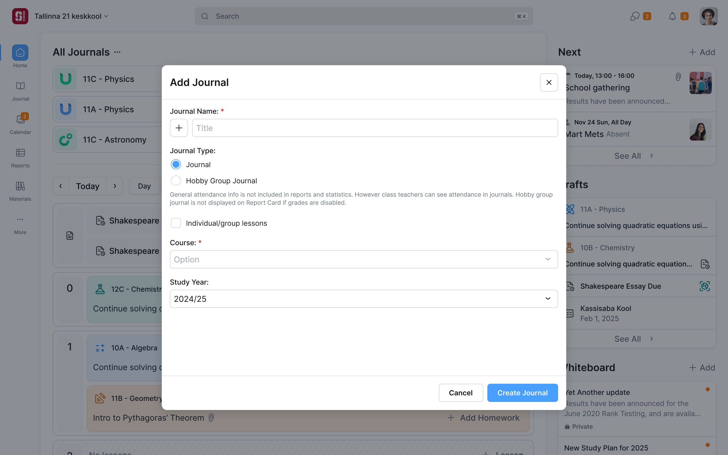
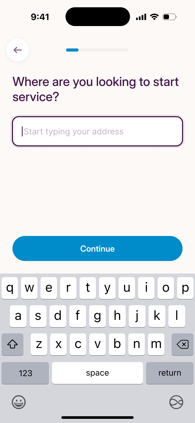
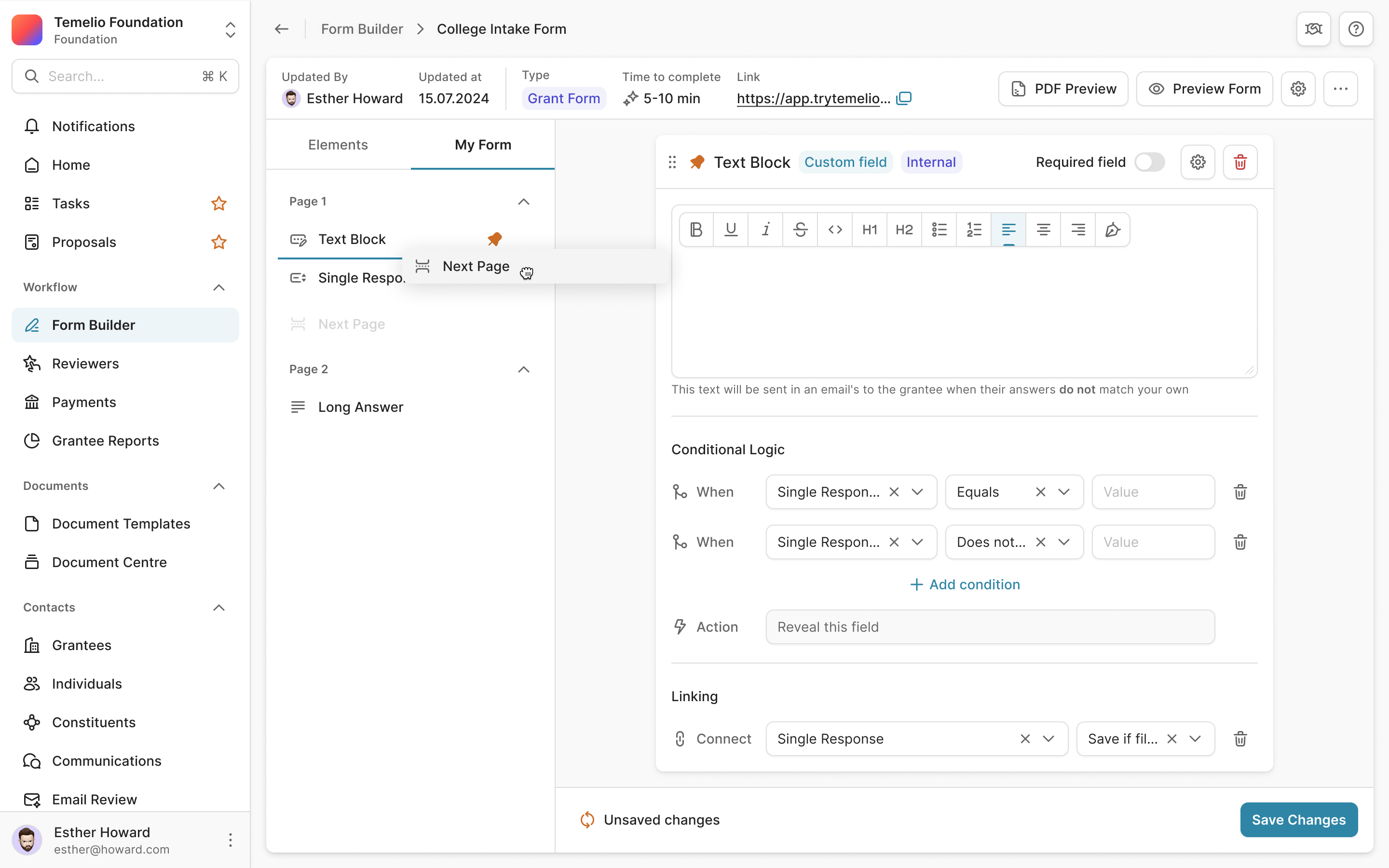
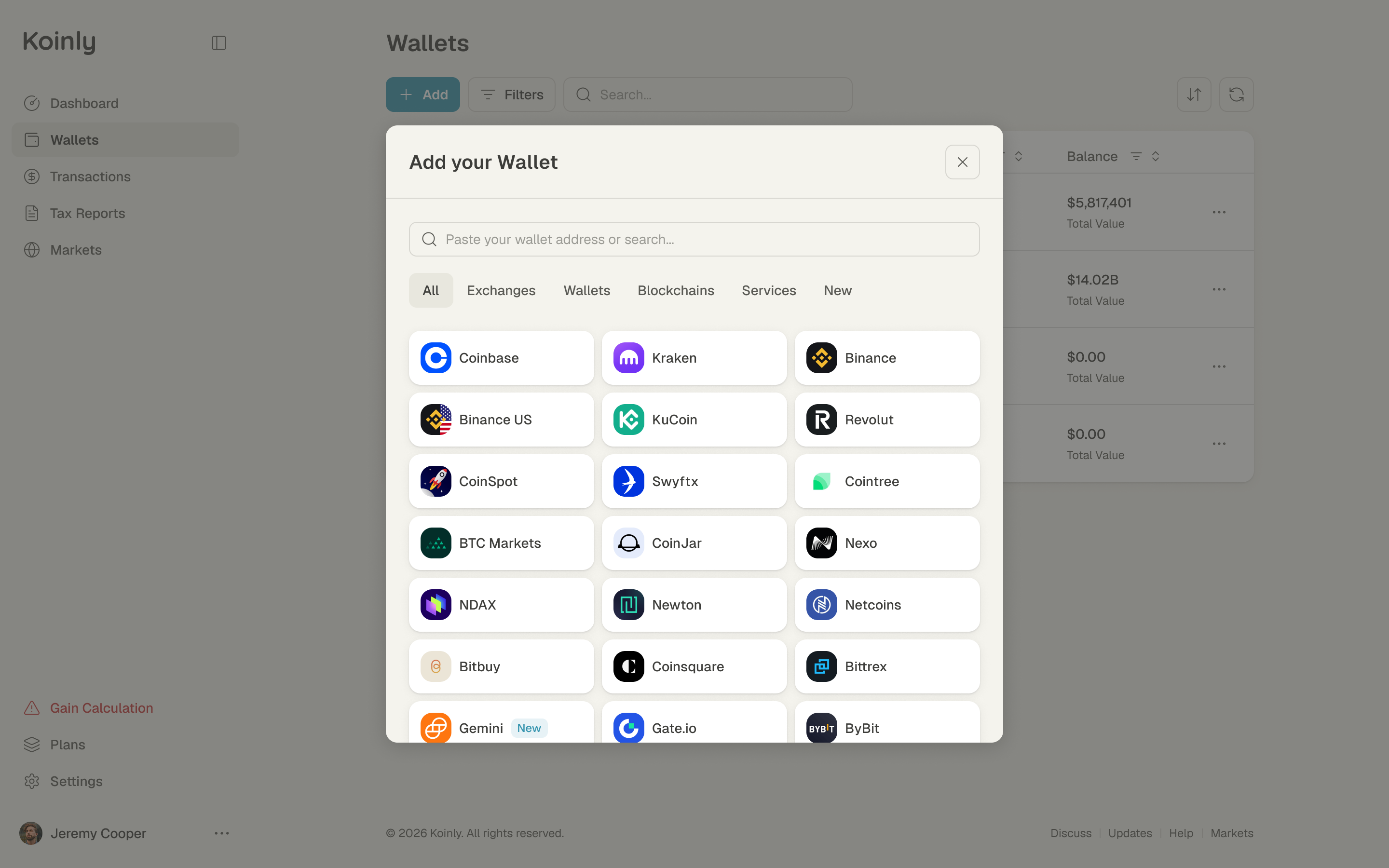
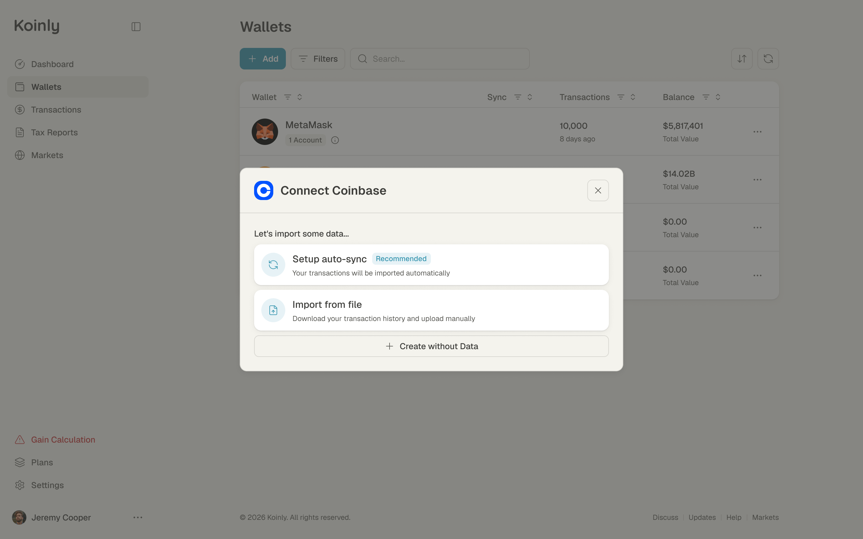
Adding a wallet is the first thing anyone does in Koinly, so we designed it early. It opens on one field to paste a wallet address or search by name. Pick an exchange and auto-sync is recommended over importing a file. Both routes remain available, with a short explanation of what each one does. The person starts with what they know, such as Coinbase or a wallet address, before choosing how to import its history.
Sign-up asks who you are
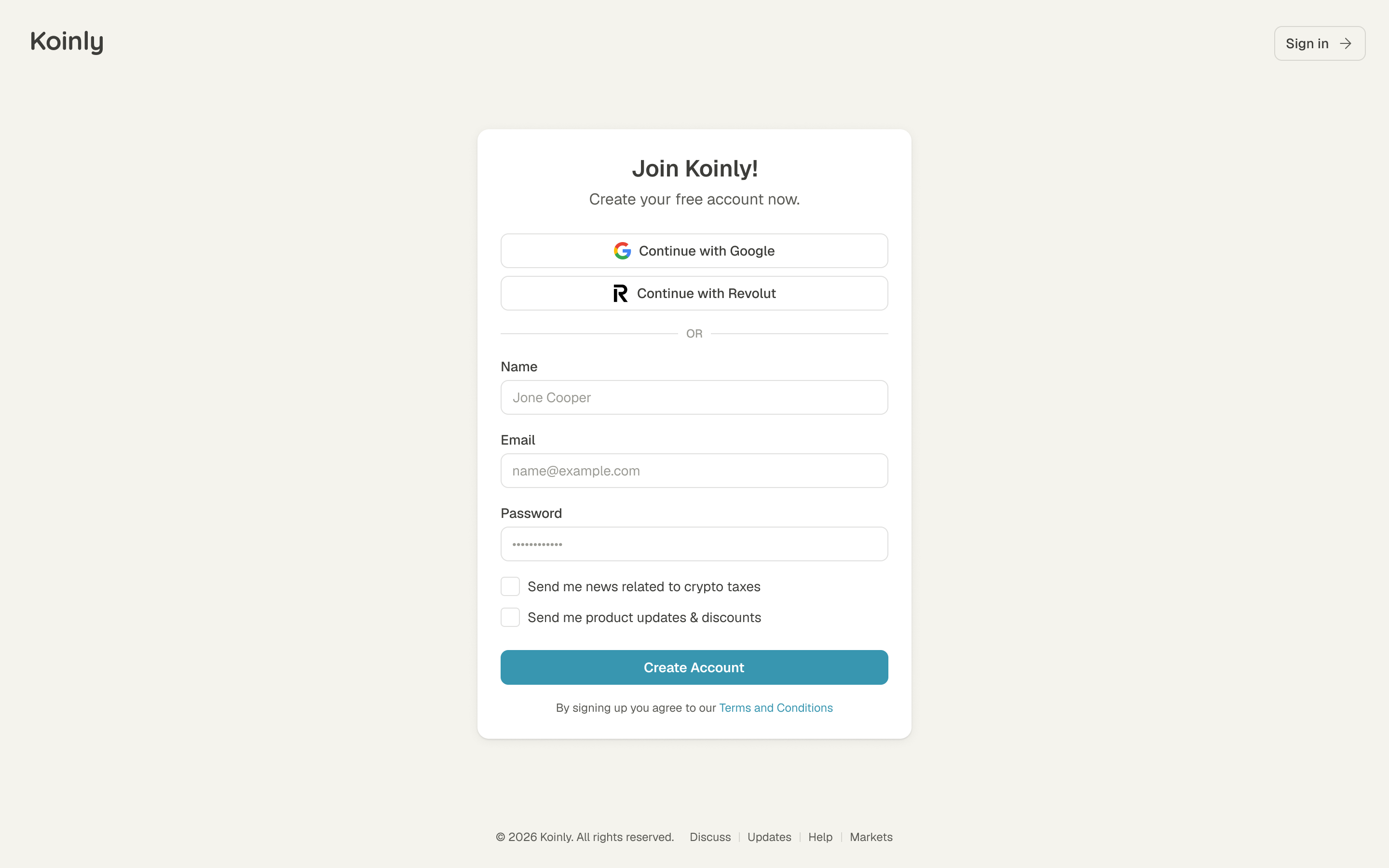
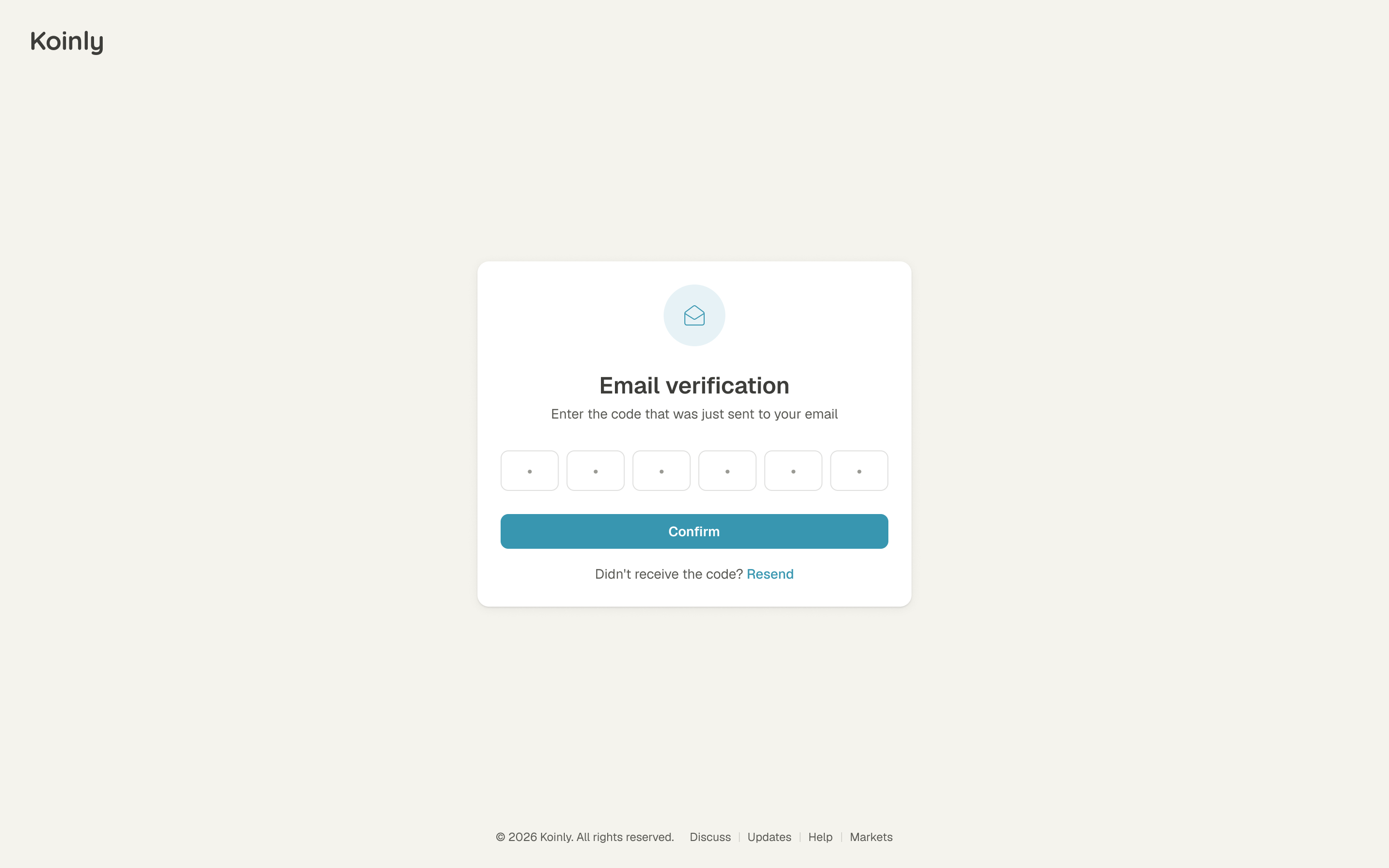
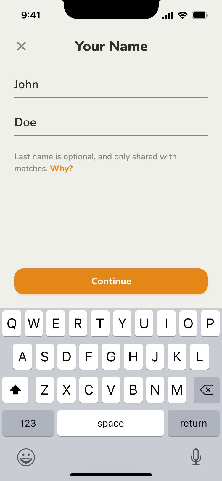
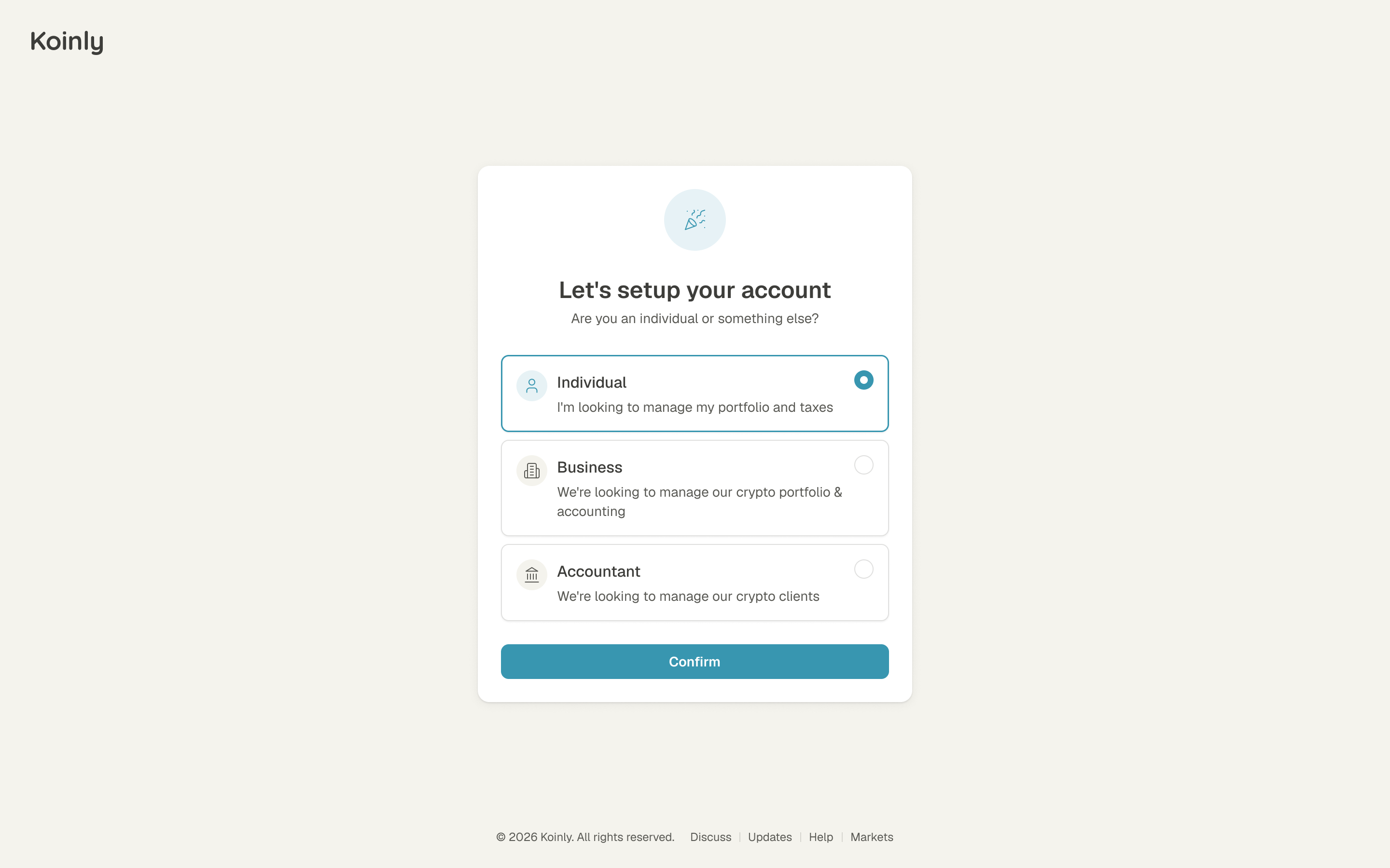
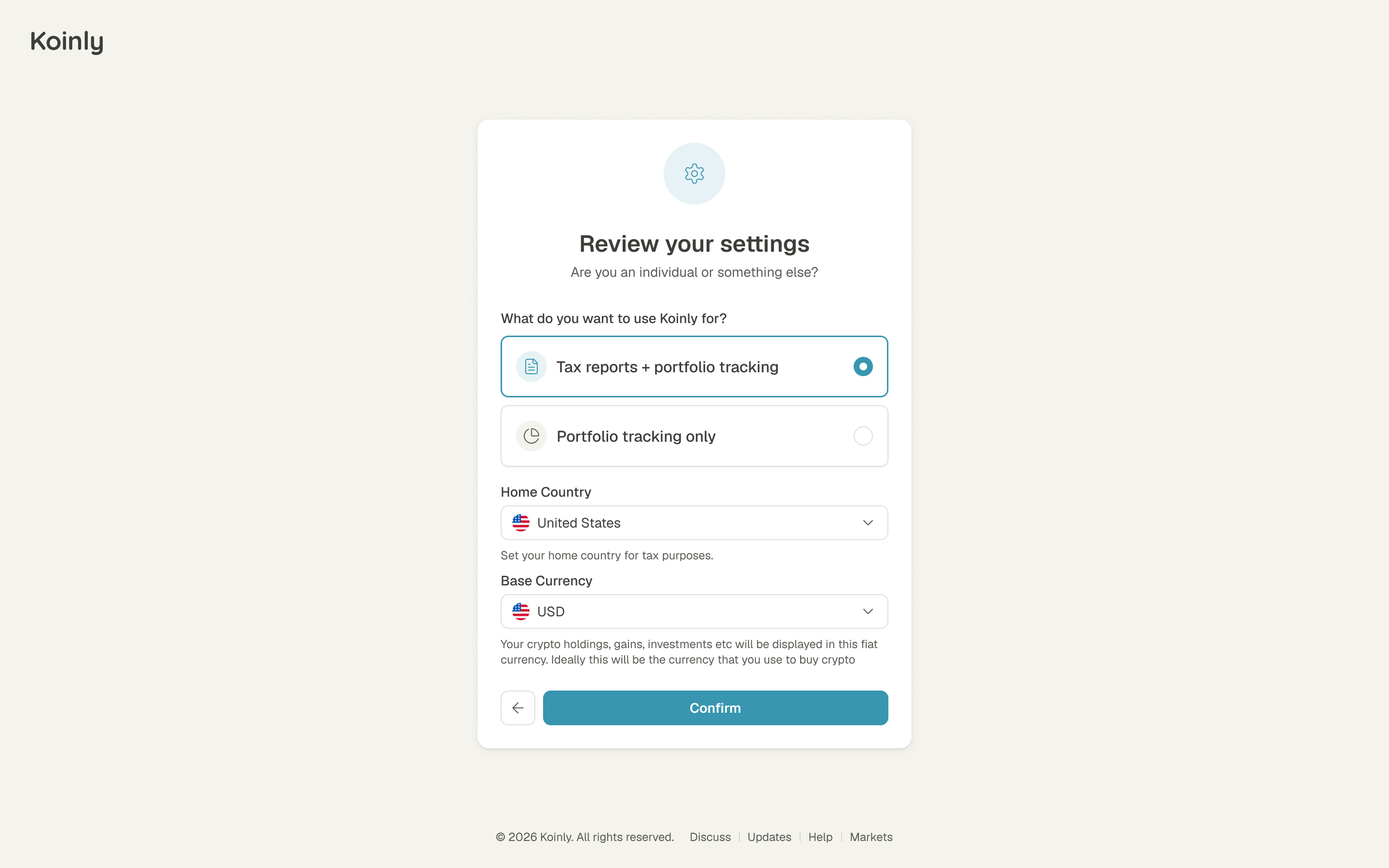
The first question after sign-up is whether you're an individual, a business or an accountant. The next asks whether you want tax reports or just portfolio tracking. Those are different reasons to connect the same financial history. We made the distinction explicit during setup, alongside home country and base currency, so a person could describe the job they wanted Koinly to do without first understanding its navigation.
the same data can serve a tax return or a portfolio
Settings explain themselves on the page
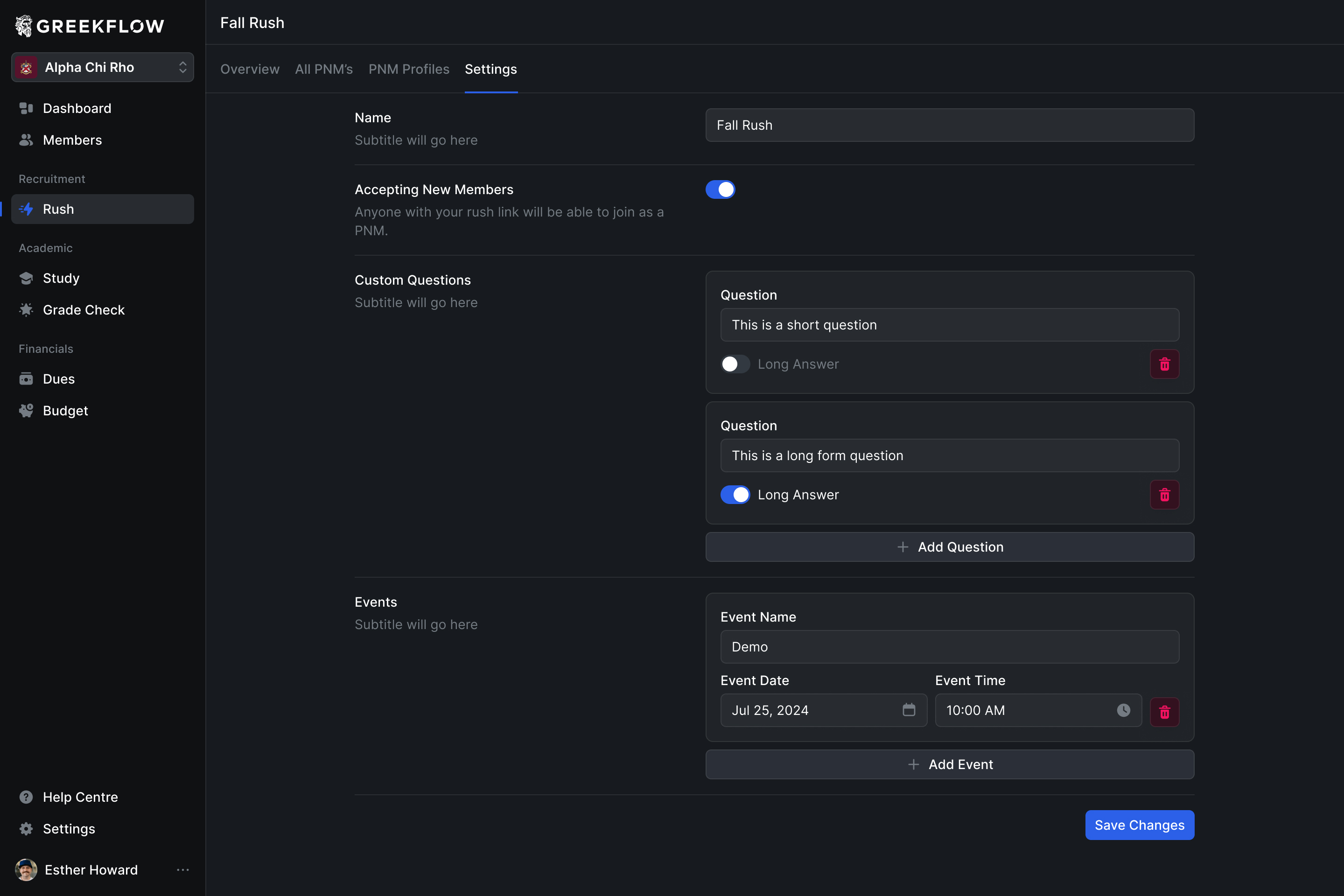
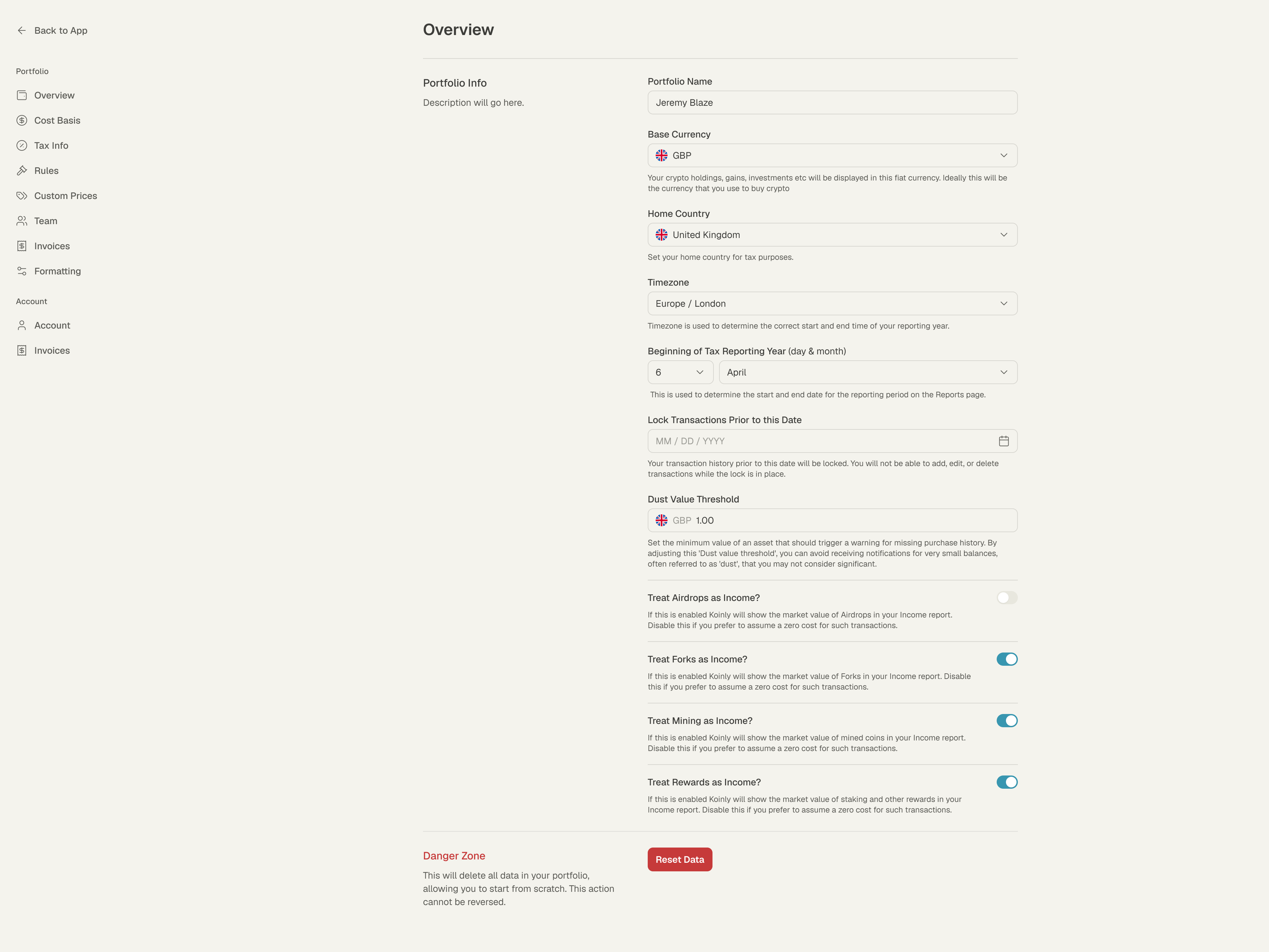
Robin's first ask was to lean less on tooltips, settings especially. Our first concept put every setting on one full page; he liked it, and sent a screenshot with the titles down the left to try too. A line under every field says what it does, like the timezone deciding where your tax year starts and ends. The help stays beside the choice instead of requiring a hover to discover it. Grouping the settings mattered too: base currency, home country and the tax calendar need to be understandable together, while more specialised rules can sit further down the page.
The tax report starts with what needs fixing
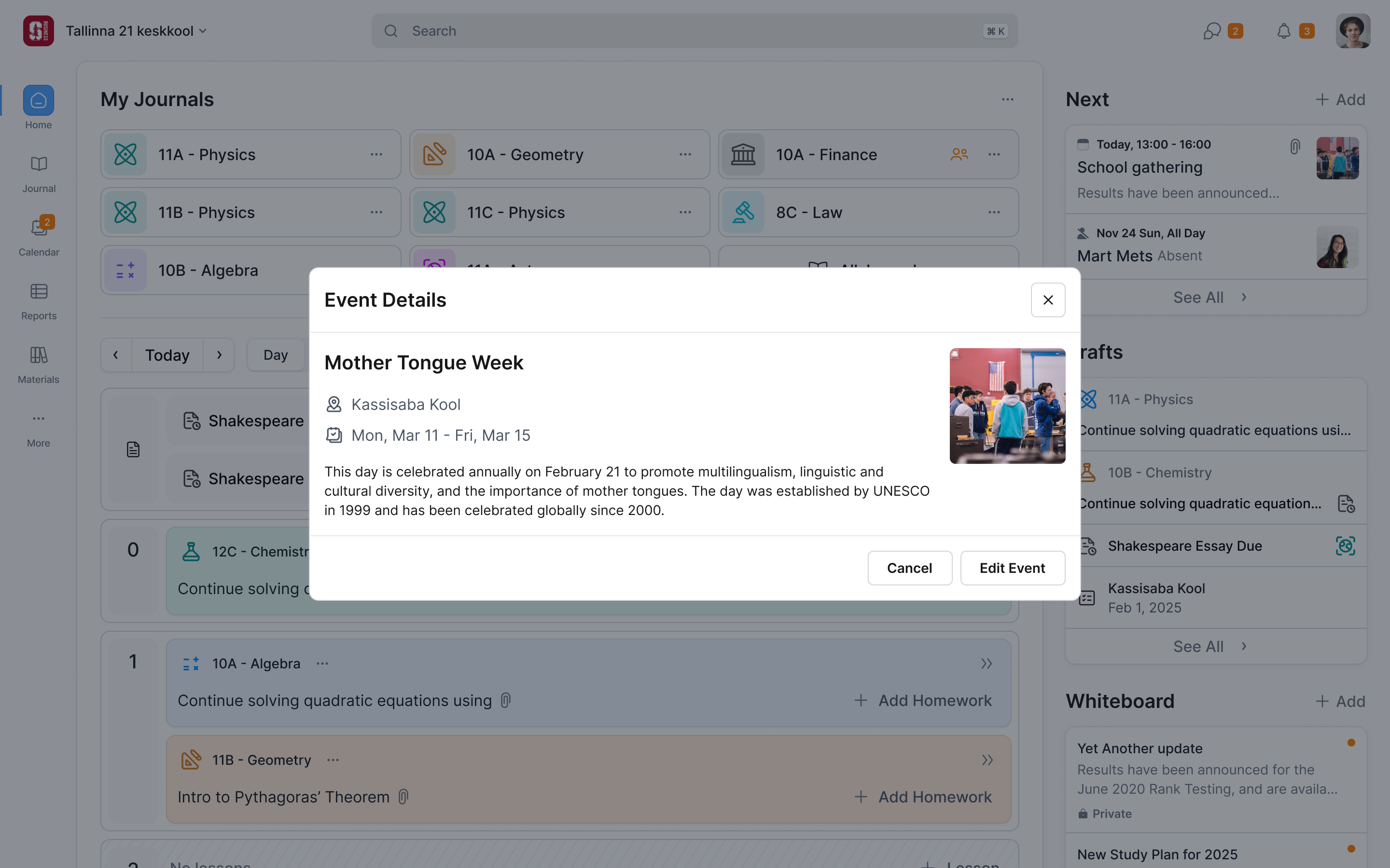
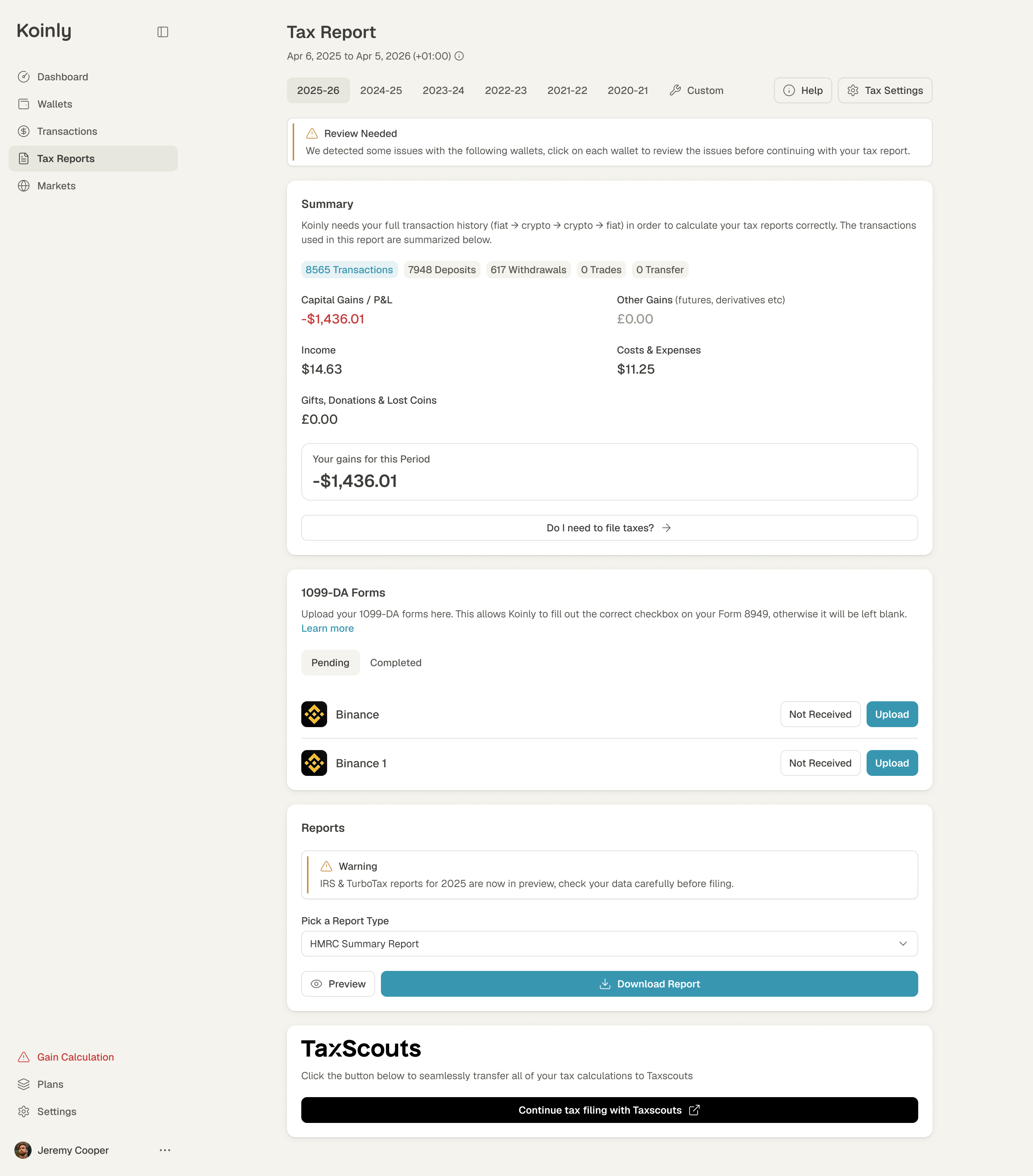
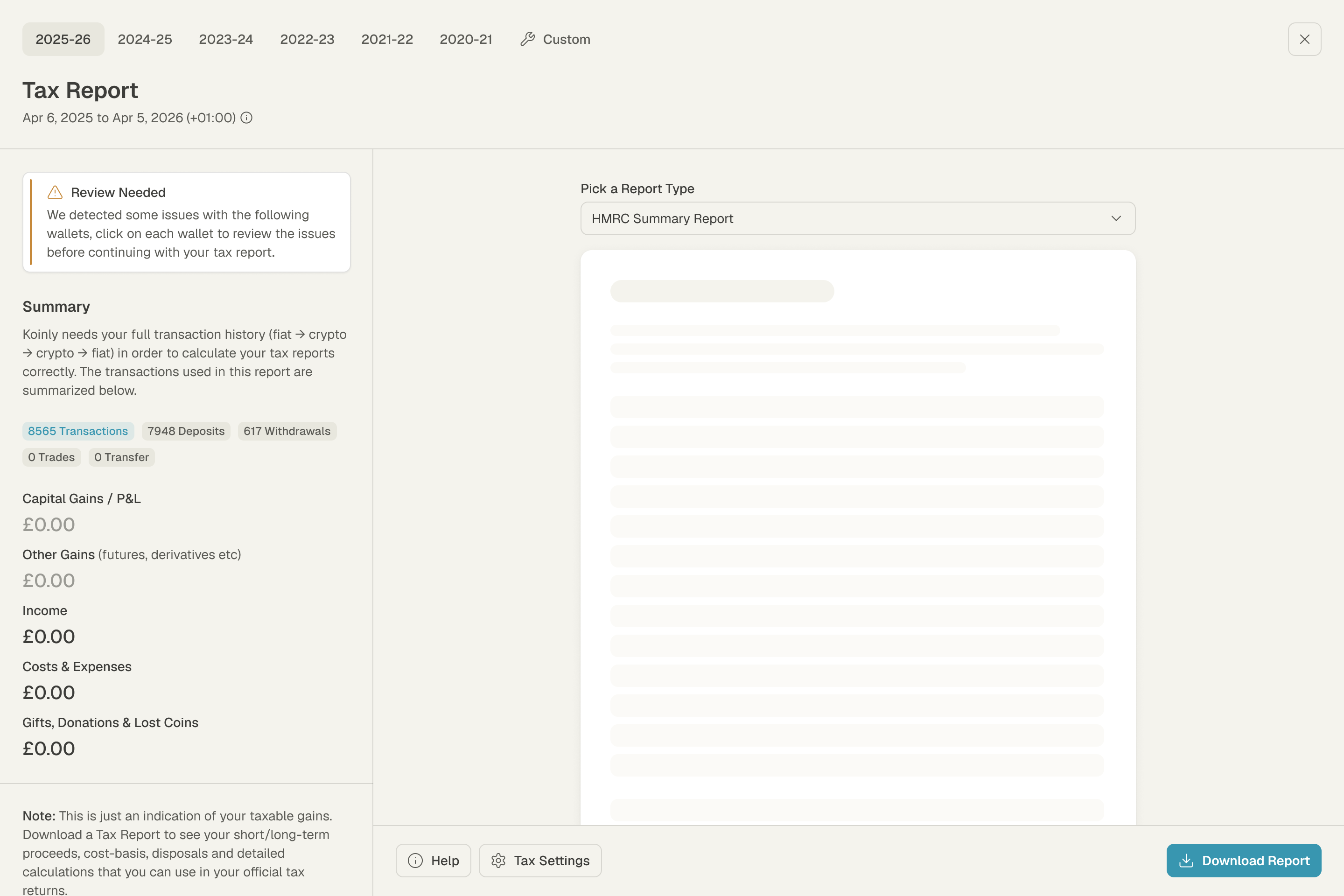
A report is only as good as the history under it, so the report page opens on what needs reviewing: wallets with problems, and how many transactions the report is built on. The year's gains, income and costs come after. This puts the condition of the underlying data before the apparent precision of the result. The review warning keeps those checks visible even when someone arrives at the page ready to download.
show what needs reviewing before presenting the report as ready
Plans are priced by transactions
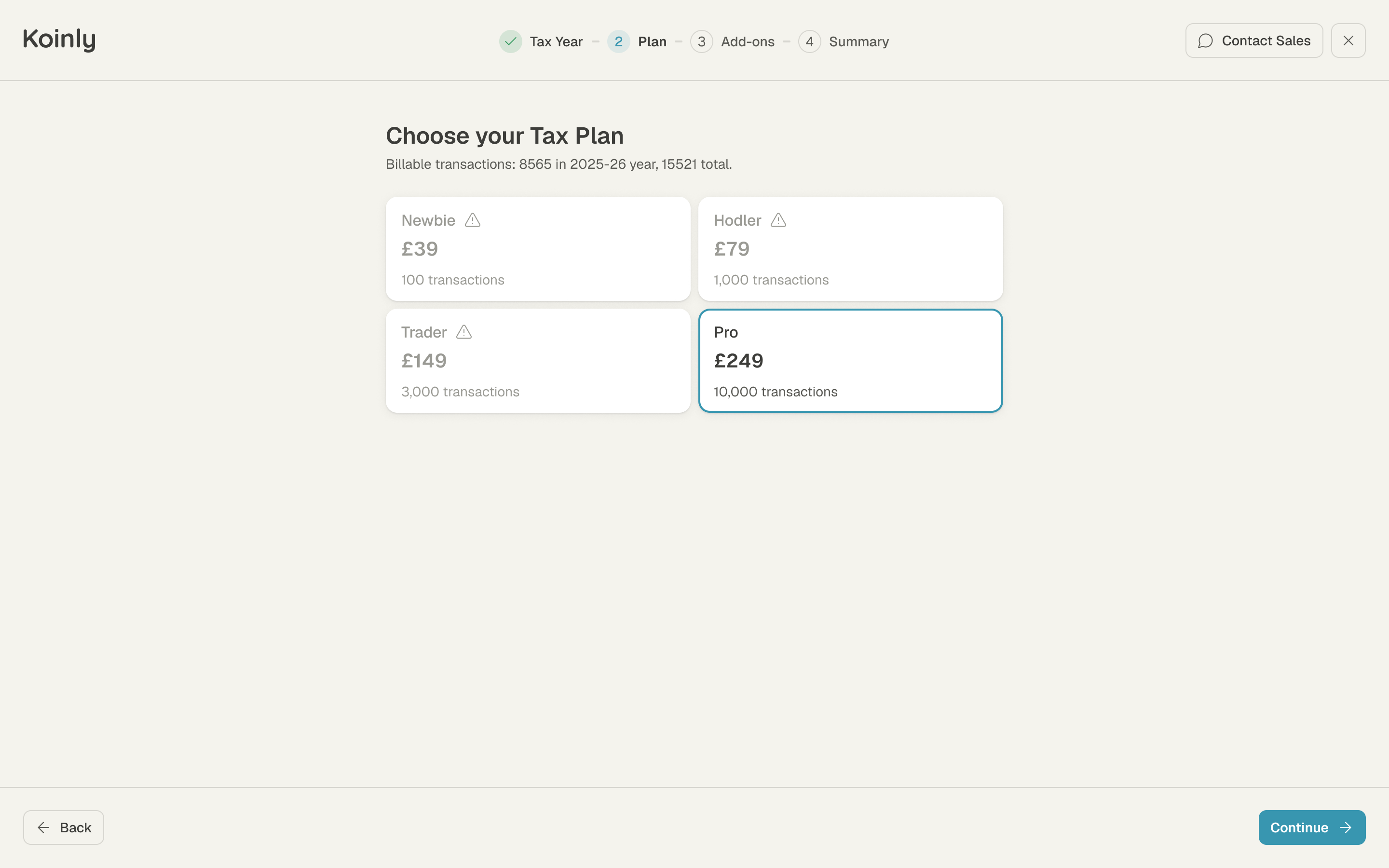
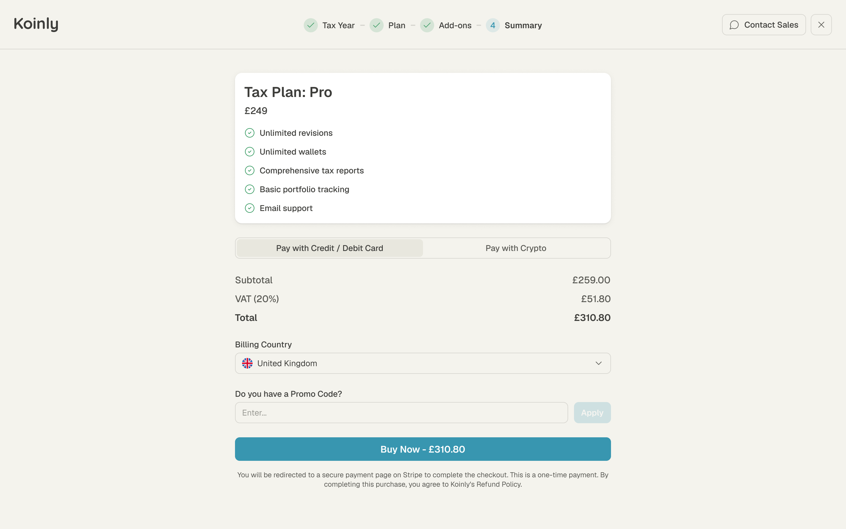
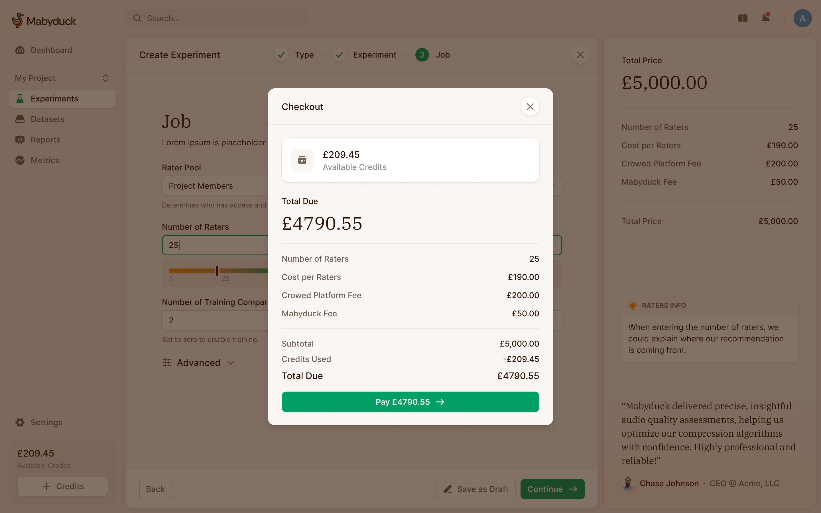
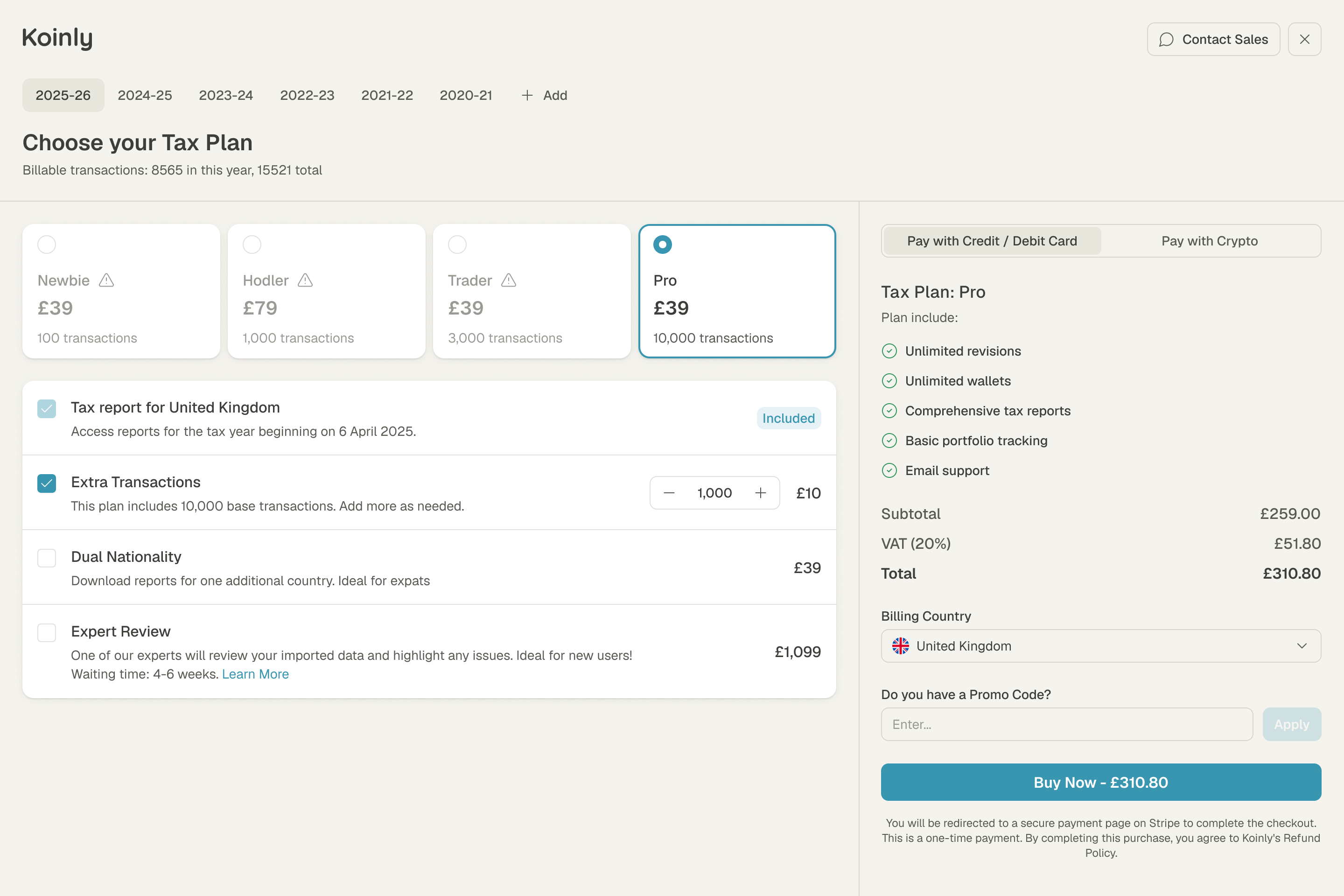
Koinly charges per tax year, by the number of transactions in it. The plan screen shows your count up front and greys out the plans too small for it. We explored it as one page and as four steps. In the one-page version, the transaction count sits above the choices and the order summary stays alongside them. A person can see why the smaller plans won't cover their year, then check additions and the total before paying.
Give the developers a system they can keep using
The same system needed to work outside a desktop mockup. Robin called out medium screens, very wide screens and phones. We worked through icon-only navigation for narrower layouts, a maximum width for large ones, and cards in place of tables on mobile. A dense transaction table couldn't simply shrink until it fitted.
Robin had raised the longer-term requirement in our first call: the engineers needed to add things such as settings without waiting for a designer to draw every screen. Their move from Bootstrap to shadcn gave us a shared starting point. We restyled its components and kept established behaviours where they already worked, including table filters and pagination. Reusing the same controls across the core pages also gave the developers examples of how to assemble the next one.
More from Koinly